Words Miguel Llona
Images PIID and WAF/INSIDE


Since 2014, Filipino architecture firms have been making waves at the prestigious World Architecture Festival, taking home the top prize for some categories or getting high commendations from the jury. Each year has seen more firms shortlisted than the previous year, with 2021 proving to be the most successful yet with 9 projects from 6 firms shortlisted in over 11 categories. It’s a reflection of Filipino architecture gaining more recognition internationally and has encouraged more and more architects to join each year.
But what about interior designers? In contrast to the Philippines’ strong presence at the WAF, the country has barely made a dent in INSIDE, the WAF’s counterpart for interior design. There have only been two Filipino projects shortlisted for INSIDE, and both were done by an architect (Jorge Yulo, for Mecha Uma and La Cabana de Resureccion). It is a global opportunity that has yet to be maximized by the local interior design industry, despite the abundance of talented designers in the country. To address this, Kanto partnered with the Philippine Institute of Interior Designers (PIID) to host online watch parties of the winning entries from last year’s INSIDE, in the hopes of preparing and inspiring interior designers to join the competition. With Kanto having exclusive access to the boards and crits from last year’s competition, professionals and students alike had the opportunity to see how designers defend their work in front of a three-man jury, or simply be exposed to innovative designs from around the world. Guiding the audience throughout the watch parties are pairs of architects and interior designers for each day, with the former being a past WAF finalist to provide a firsthand perspective of the competition.


Day 1: Bars & Restaurants and Education
For Day 1, the winning entries from the Bars & Restaurants and Education categories were exclusively shown to more than 300 viewers. Invited as mentors who provided their insights during the watch party are IDr. Rossy Rojales of Hurray Design and Ar. Jorge Yulo of Jorge Yulo Architects and Associates, with the discussion facilitated by IDr. Holly Dychangco of Hollidawn Design Studio and Judith Torres of Kanto. The mentors were asked to provide tips on how one can get shortlisted, and advice on the best way to present their work. The session was a great learning experience for both the audience and the mentors, further stoking optimism for Philippine interior design’s chances in future editions of INSIDE.


Bars & Restaurants
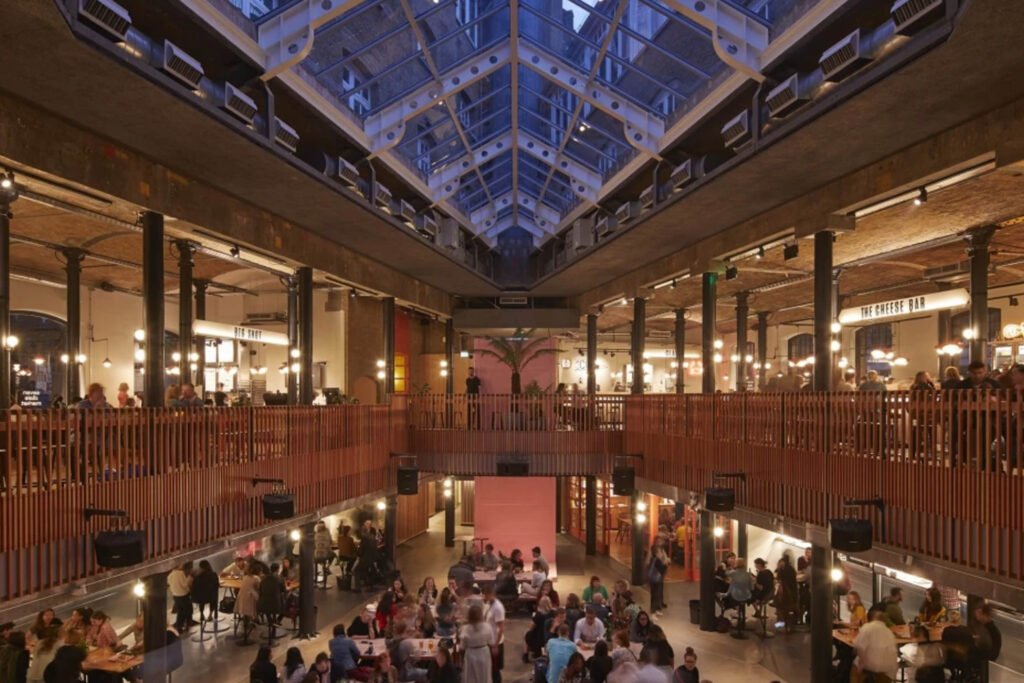
Seven Dials Food Hall by Stiff + Trevillion
Winner – Bars & Restaurants category
The winning entry for the Bars & Restaurants category was a food hall in London’s Covent Garden, designed by Stiff + Trevillion. Seven Dials was designed to respond to both the historic built fabric and the more modern architectural additions of a former banana warehouse, making for a project that serves its surrounding community while preserving the history of its context.
The mentors’ key observation for the boards was the drama and intrigue the project photos brought, which they said was a huge reason why it got shortlisted. Says Yulo, “You need to immediately go straight to the point, which Seven Dials Food Hall did. [The designer] shows the cheese bar picture for the hero shot, which doesn’t really capture the entire project, but gives you enough of a detail to put yourself into the project.” He also pointed out that boards should have “shock value” in that it has to grab the attention of the judges, compared to the presentations where the designer can delve into more detail about the project.
For the crit, Rojales lauded the thorough project documentation that the designer included in his presentation. She liked how the documentation of the historic location and the community around it allows the jury to imagine the setup right from the start. “It really guides you [on] how the space is transformed,” she says.
The mentors did point out some things that the presentation could have improved on. Yulo feels that the designer spent too much time introducing his firm which ate into his presentation time, and he advised the audience to ensure they had a punch list of things they needed to say so they don’t waste time. Rojales wished the designer could have explained the branding of the project more, seeing how the jury were curious about it during their Q&A. Their questions about the plates and cups used in the food hall also aroused her interest, noting that it’s a detail one should be mindful of especially when marketing a project as a sustainable one.
On the more technical side, Yulo advised the audience to make good use of plans and sections for their presentation should they ever get shortlisted. “Use your plans and sections strategically, so you can somehow draw the viewer into your space, put themselves there. Even just in the boards, it makes it very understandable and comprehensive,” he says.


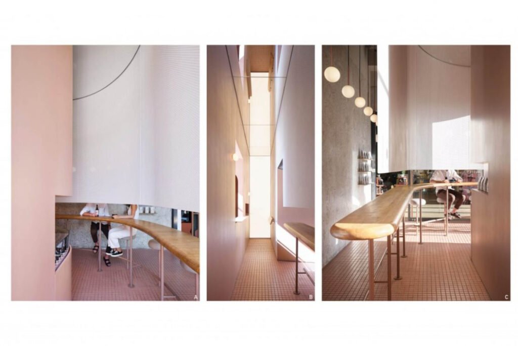
Basic Coffee by Office AIO
Highly Commended – Bars & Restaurants category
Office AIO’s Basic Coffee, the Highly Commended entry for this category, was the next crit the mentors were shown. The coffee shop aims to provide a “self-exploratory experience” with its winding layout and veils that obscure the faces of sitting customers, which aid in removing social distractions so people can focus on the coffee. To frame the discussion, the question of why Basic Coffee didn’t win over Seven Dials Food Hall was posed to the mentors, despite being a seemingly sexier project in terms of aesthetics.
According to Yulo, juries often favor “conscientious designs” over more aesthetic ones, and that larger-scale projects have an advantage because they are able to address more social issues—reasons that Basic Coffee failed to check. He observed that Basic Coffee, while a beautiful project, was a little too exclusive because its design was predicated on keeping people out and discouraging them from staying, which is antithetical to the coffee shop experience. In contrast, the design of Seven Dials Food Hall was more pluralistic, as it was able to address community needs and promote local commerce.
However, Rojales pointed out that there were still similarities between the two projects, such as their location in historic places and their reinvention of experiences within the spaces. She did share Yulo’s sentiment that Basic Coffee was a “one-liner of sorts,” and said that she didn’t “feel the journey” while watching the presentation because the designers mostly shared interior photos and details instead of telling a story.
The watch party’s chat room was abuzz with discussion over this project as well. Most of the audience concurred with the mentors’ points, as interior designers such as Tina Periquet criticized the project’s betrayal of its stated goal of creating a “delightful experience.” Periquet felt that Basic Coffee’s decision to put design elements shielding customers’ faces “robs one of the sense of community that draws one to a coffee shop in the first place,” and lamented that its anemic and flat color scheme fails to arouse the senses, as coffee shops are supposed to do.


Education
The Schoolhouse by Rapt Studio
Winner – Educational category
For the Education category, the winning entry was The Schoolhouse by Rapt Studio. Designed in collaboration with The Google School for Leaders, the Schoolhouse is “a prototype space for in-person learning that shifts how faculty teach, how participants engage, and how experiences are delivered.” The space is designed for flexibility to provide different levels of engagement among users, with mechanical raised curtains, movable seating and shelves, and breakout rooms for small groups.
According to the mentors, its boards succeeded in establishing the mood of the palette, and effectively shows the spatial flow so the jurors can have a good understanding of the space. “All the images show a tactile experience; someone is holding a pillow, a marker, a planter, so it really shows how you can experience the space on different levels,” says Rojales.


The crit made clear why the jury crowned the Google Schoolhouse as the winner for this category. Rojales noted that the presentation was done really well, and was short and clear. That the designer started the presentation with a question was interesting, and her repeated use of phrases like “sensory” and “theatrics” that further drove the design concept into the jury’s heads.
The strength of its concept is what Yulo attributes to its win. He describes the Schoolhouse as a “very cerebral space like it was a brain that was thinking of different modes depending on how you raise the curtain…the repurposed materials they used also help define the function of the space which I think made it really successful, and as you can see, the judges were smitten.”


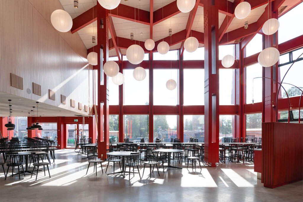
Kunskapshuset by Liljewall, MAF Arkitektkontor
Highly Commended – Educational category
Located in the mining town of Gallivare, Sweden, Kunskaphshuset (House of Knowledge) is a secondary school and learning center for adults whose interiors draw inspiration from elements of its environment and community. A mining company paid for the construction of the school, so mining elements were introduced into the interiors, such as a staircase resembling a mine shaft, and a 20-meter high fireplace to warm the spaces. Most of the furniture are custom-made by local artisans, and made from the repurposed materials of the furniture from the previous school. The focus of the design was on the experience between the interiors and its context, so the interiors’ visual aesthetic coheres with the exterior.


The overall presentation was noted to be strong, as the designers touched on cultural integration, the surrounding wildlife, and the geography. The discussion among the mentors, however, veered towards the question of why such a project was considered for an interior design competition, given its dominant architectonic element that dictated its interiors. “It’s hard to look at as a purely interior project…there were actually very little design decisions after the spaces were defined by the structure,” says Yulo.
Rojales pointed to the utilitarian nature and materiality of the spaces as the merits of its interior design. “I appreciated that they discussed the materials, so even at the start of the presentation, he explained the materials for acoustic absorption, considering the space will be a high-traffic space. In a way, those are the details that interior designers should focus on, not just on decorations, colors. It’s really more of what are the needs of the space, like the lighting,” she says.


The discussion then turned towards the importance of borderless design, with Yulo noting how crucial it is for international competitions. He says, “[The terms] architect and interior designer really just makes it easier for us to talk about it, but really, where does it end and where does it begin? You have people like Tadao Ando who says he likes to bring the outside in. We should recognize the integration and go beyond semantics.”
Final Takeaways
The mentors’ takeaways from this watch party ran along similar lines: learning is the first step and concurrently the key towards succeeding in the international stage. They used this point to encourage and challenge the audience to elevate their game by continually absorbing knowledge and applying it into their practice.
For Rojales, “having conversations like these are really interesting, and gives us energy. Moving forward, this is a challenge for everyone, especially for PIID members to think about designing in a global scene and designing on a different level. We should all learn from this not just to compete, but also how the designers present their designs, solutions, and different aspects of design we can apply in our practice.”
In response to a question on why he attends WAF and INSIDE frequently, not just as a finalist but as a delegate, Yulo explains that it’s all about immersing and indulging. “I like to travel. I like to immerse in meeting everybody, looking at what people are doing in different countries. I like to immerse and indulge. I like trying the food from that country where it’s being held. It’s really about the journey. As far as the design of my project, I lose enthusiasm as soon as I submit. Beyond that, it’s more about what I can absorb from other people to improve myself, or my next design exploit.” •
Want to join INSIDE? Kanto readers get an exclusive discount and other benefits.
Just message us on our social media accounts for more information


One Response