Words San Studio
Editing The Kanto Team
Images San Studio and Isabel Herpacio
Tucked in between a row of shops in one of Cebu City’s old buildings, The Good Cup Coffee is characterized by its minimal glowing white signage and clear glass walls that provide a peak into its interiors. The project’s renovation was performed by Cebu-based architecture firm San Studio, aligning the design with coffee shop owner and Philippine Brewers’ Cup Winner Gio Visitacion’s vision to “create a distinct coffee experience for Cebuanos while educating them about and eventually elevating local coffee.”


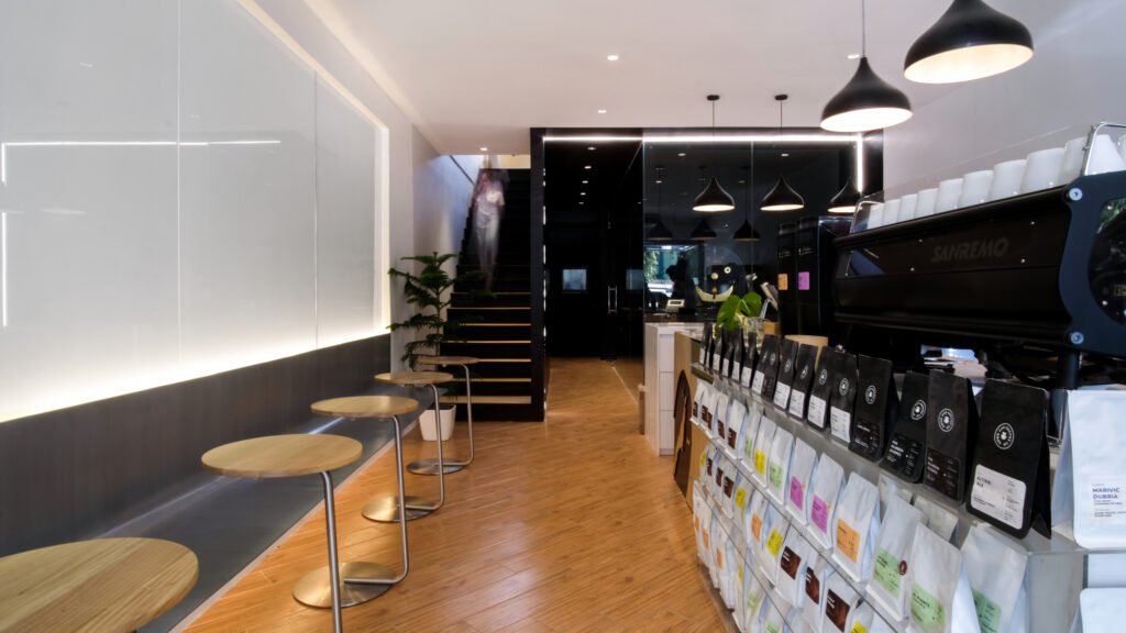
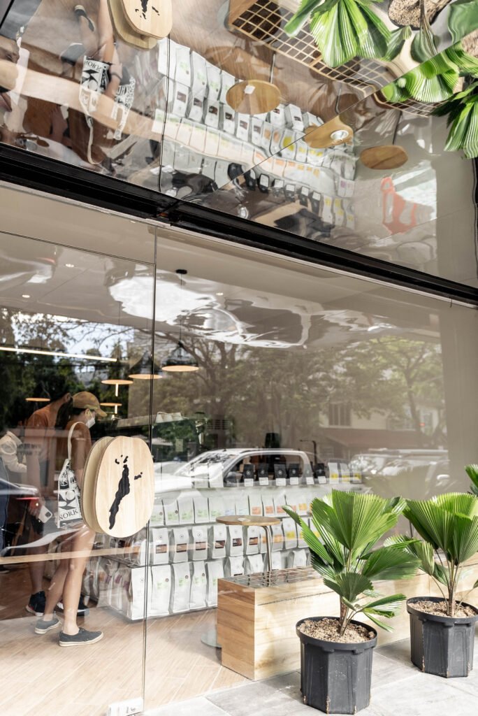
A conversation over coffee between the designers and the client was the initial step in the design phase. This is where they learned about the shop’s products, values, and aspirations and determined which ones are to be translated into the space’s design. “What makes Good Cup different from other coffee shops is the range of beans that they offer to customers. This is why we incorporated floating acrylic shelves to hold rows of coffee beans,” San Studio shared. “Each type of bean tells a story and resonates differently with different kinds of people. We celebrated this not only by highlighting the products but by making them an actual part of the coffee counter’s design.”


The colorful line of bean bags creates a subtle yet striking contrast from the cafe’s subdued and monochromatic interiors. From a certain standpoint, they can also act as a secondary facade to the coffee shop. This complements the open concept of the café, as the space provides inviting interiors and generally good street views from the outdoor and indoor perspectives respectively.
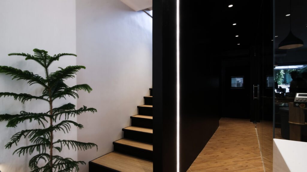



San Studio also made sure to pay attention to the details. If one were to look closer, a symbol of a coffee bean with a map of Cebu is etched on the shop’s coffee counter and door handle. The designers said that they used CNC cutting on gmelina wood for this mechanism, adding that they initially noticed the symbol at the back of Good Cup Coffee’s coffee bean packages. “We loved it so much, we thought, why not make it part of the architecture?”


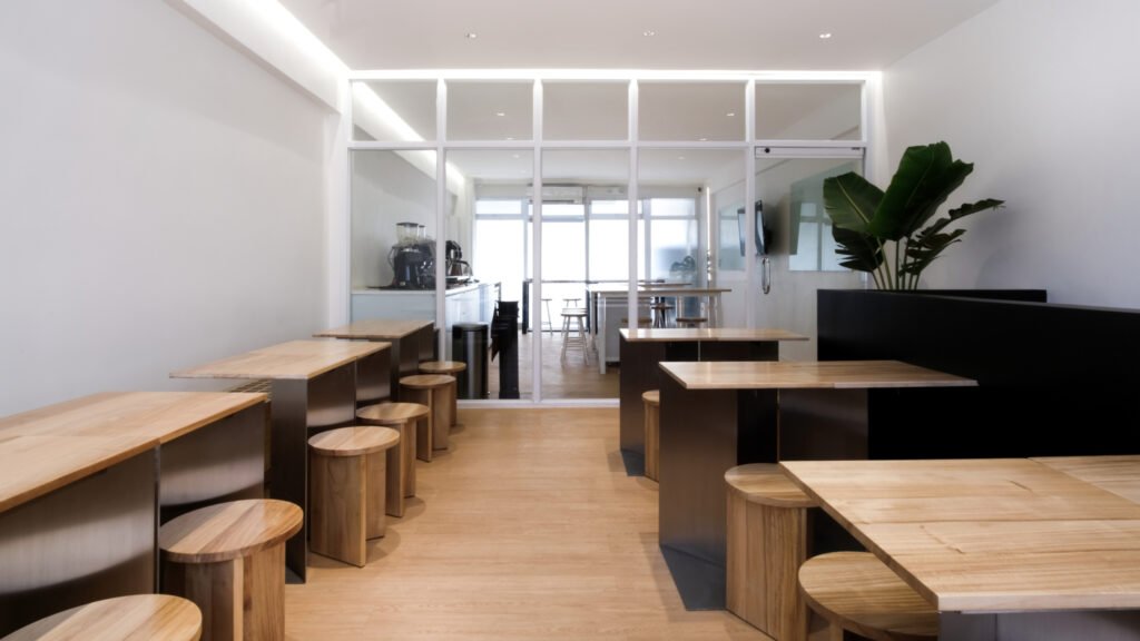
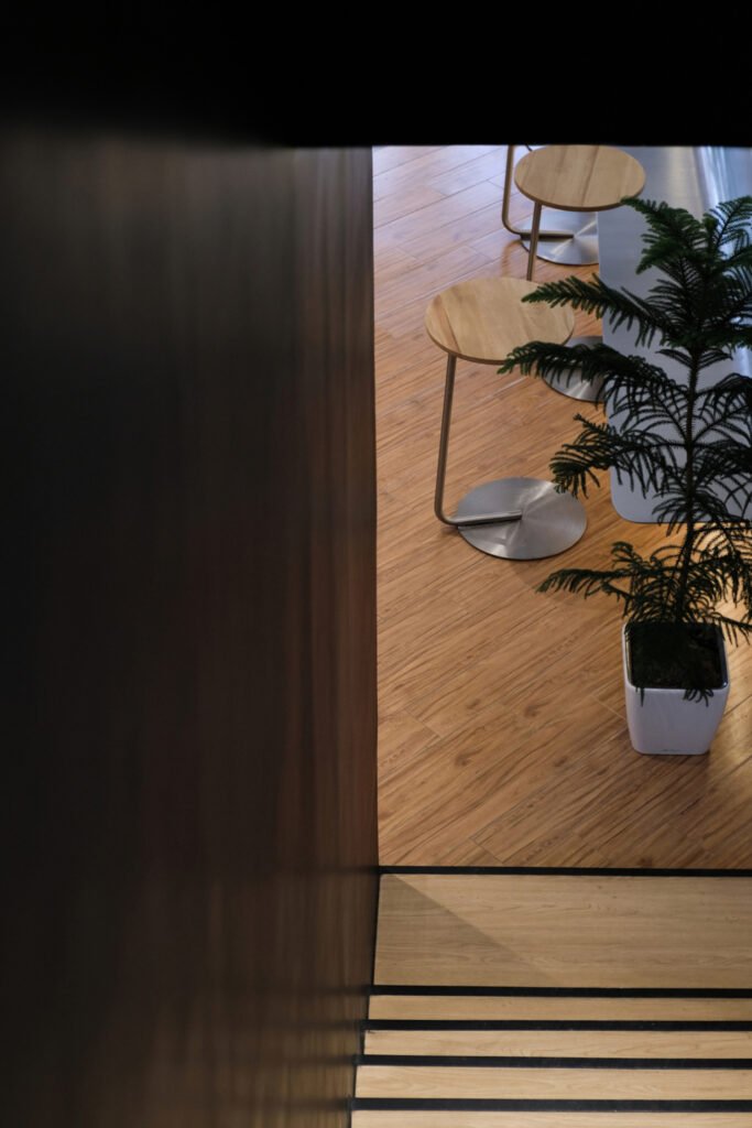
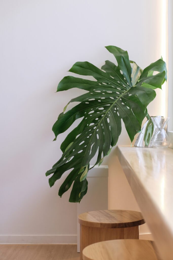
In terms of material, San Studio revealed that they mostly used a combination of solid wood and brushed steel for the furniture. “We initially thought of using High-Pressure Laminates for all wood pieces for lesser maintenance in the long run. However, upon further sampling, we found that the natural quality of solid wood evidently elevates the experience of the furniture pieces and an added warmth to the spaces.” To maximize space and create multiple combinations and varieties based on the cafe’s needs, most of the furniture pieces are also modular and moveable.
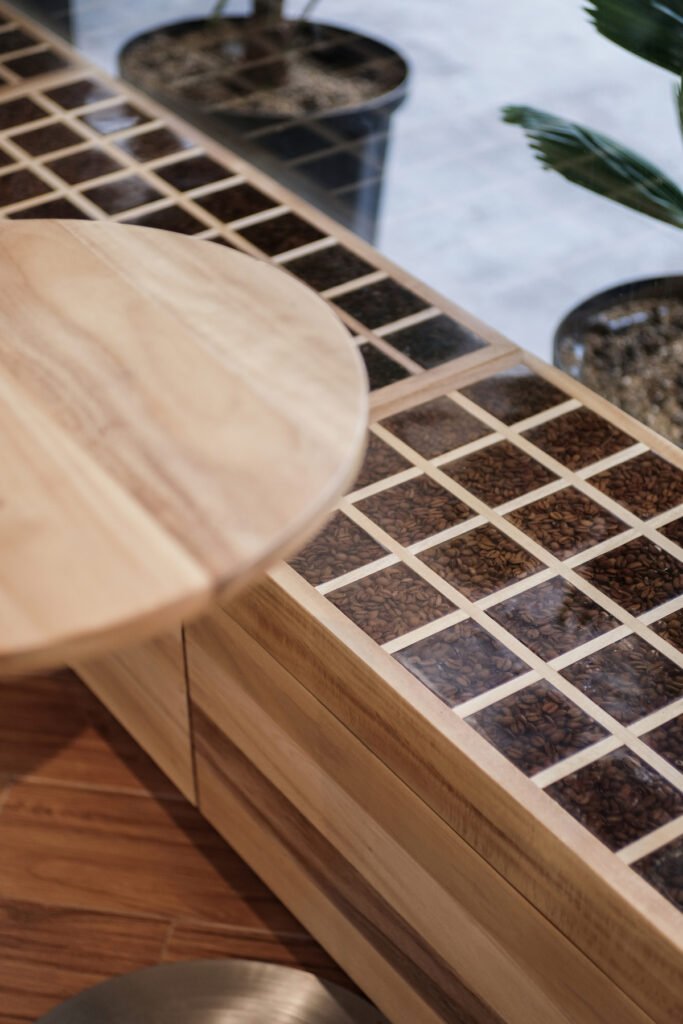
Arguably the most distinct piece of furniture in the café is the “bean bench,” where San Studio encased coffee beans of different roast levels. “What started out as a fun idea of sitting on a bed of coffee beans instantly became something we wanted to seriously execute,” the studio shared. “That isn’t to say that there weren’t many challenges getting to the final output… we had to make sure that the bench is functional and that it could serve as an additional storage compartment for the cafe.” San Studio also mentioned that as they were making furniture adjustments and the space’s overall design, they had to stay away from complications so as not to drive up costs and stick to the client’s budget.


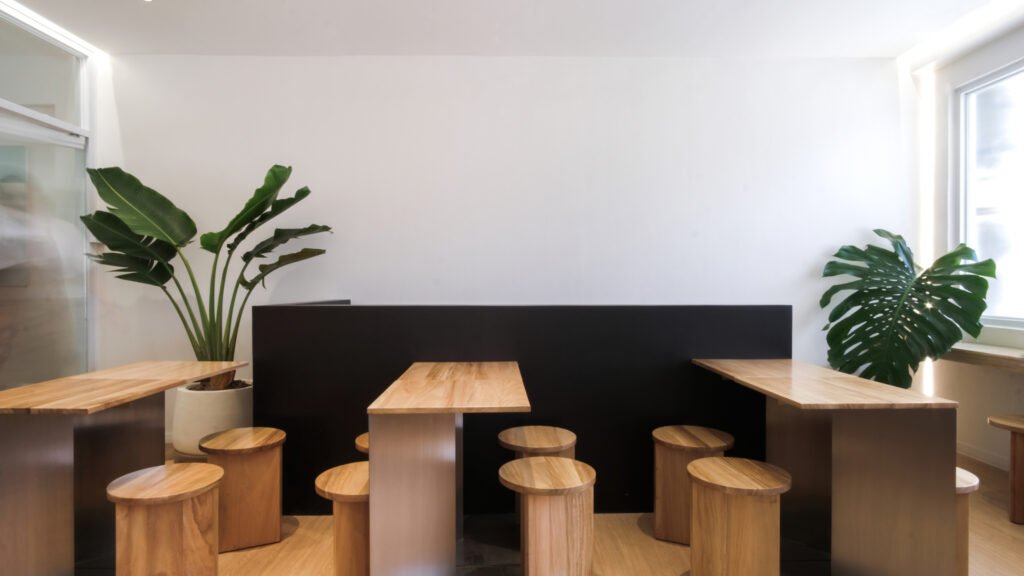
The Good Cup Cafe is designed to be bustling with life and energy, to be a space where baristas and customers can converse and interact. At present, it is a place where people can enjoy, learn more about coffee, and share all sorts of stories in between. In the end, San Studio is proud to be able to deliver a design that is straightforward, transparent, and one that elevates and celebrates the coffee experience. •


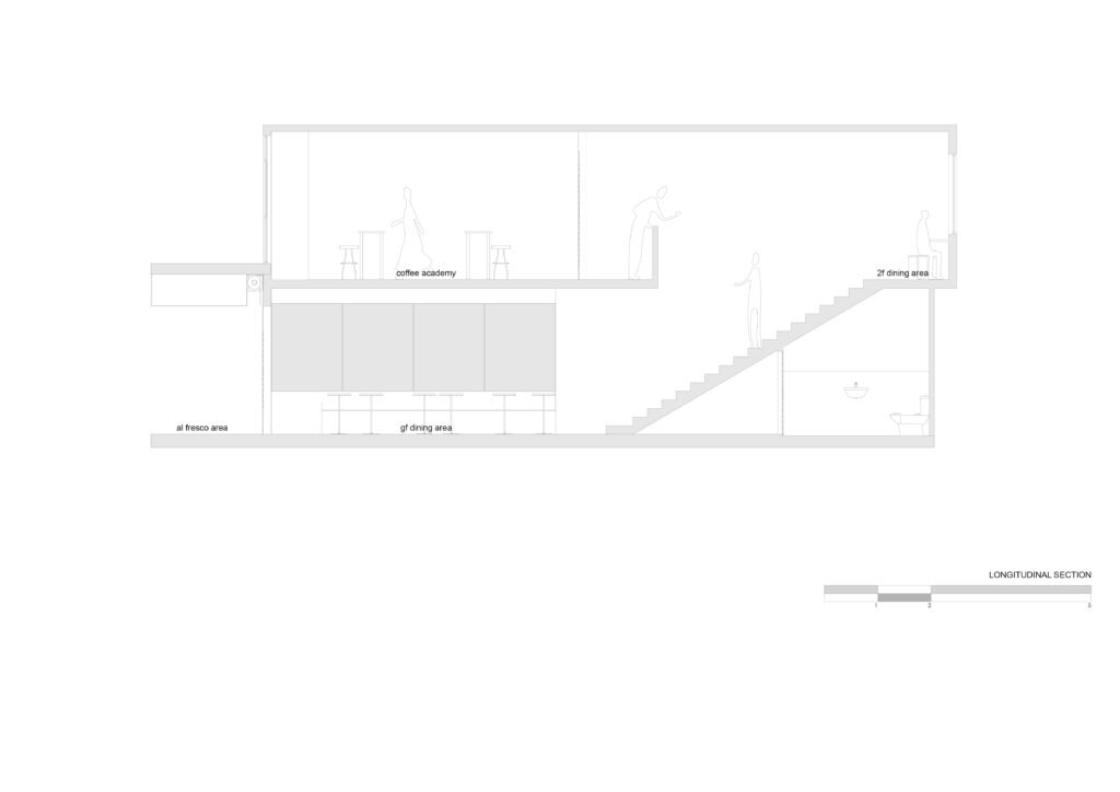

Project Information
Client: Good Cup Coffee
Year completed: 2022
Project Location: Ramos Street, Cebu City
Floor area: 200 m2
Project Team
San Studio
Design Team: Keshia Stephanie Lim and Allen Celestino
Photography: Isabel Herpacio
Video Documentation: Keshia Stephanie Lim and Allen Celestino
Write up: Keshia Stephanie Lim
Collaborators
Contractor: Strato Builders
Project Manager: Strato Builders
Year completed: 2022
Joineries and Counters: Fine Impressions
Furniture: Berben Wood




One Response