Words Patrick Kasingsing
Images Amanda Kho
The bubble tea market in Hong Kong is just as madly competitive as anywhere else in bubble-tea crazy Asia. BBT outlets can be easily picked out in many a street corner through their garish colors and loud graphics, more visual noise to add to the urban cacophony of Hong Kong. In this heavily-saturated slice of the F&B pie, one wonders; do we really need another bubble tea outlet?
The folks behind new bubble tea player Mother Pearl however bring a fresh proposition to the table; for starters, they are advocating for healthy bubble tea with a vegan twist, in response to a growing number of health-conscious consumers who wanted a treat without any of the guilt. Mother Pearl also wishes to draw emphasis on their usage of freshly-sourced, Asian heritage ingredients for their nutritious concoctions. A root-to-stem approach ensures that there is minimal food waste (straws and cups are biodegradable) and that every ingredient’s potential is drawn out and utilized. After solidifying their concept, all that was left was to find the perfect branding and interior design partner to crystallize their aims into physical form.
Enter A Work of Substance. No stranger to Kanto’s pages (Read our piece on Substance’s shipping container showroom for Goodman Westlink here), the Hong Kong-based multimedia studio specializes in place branding that encompasses both brand identity and interior design. When Mother Pearl approached them for help, the talented Sheung Wan-based studio knew what they had to do: their body of work shows an expert grasp of putting process, tradition, and culture at the forefront. “We wanted to highlight the beauty of the craft and processes that make this bubble tea outpost different,” Maxime Dautresme, creative director and founder of A Work of Substance tells Kanto. “Our approach is also informed by how bubble tea drinkers buy and drink the beverage as an indulgence, an escape from everyday realities. We wanted our branding and design for the space to encapsulate that.”


Complementing its serene but playful brand identity, Mother Pearl’s flagship outlet stands out in bustling Central with a calming, yet whimsical presence.
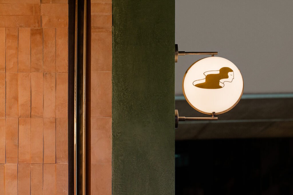
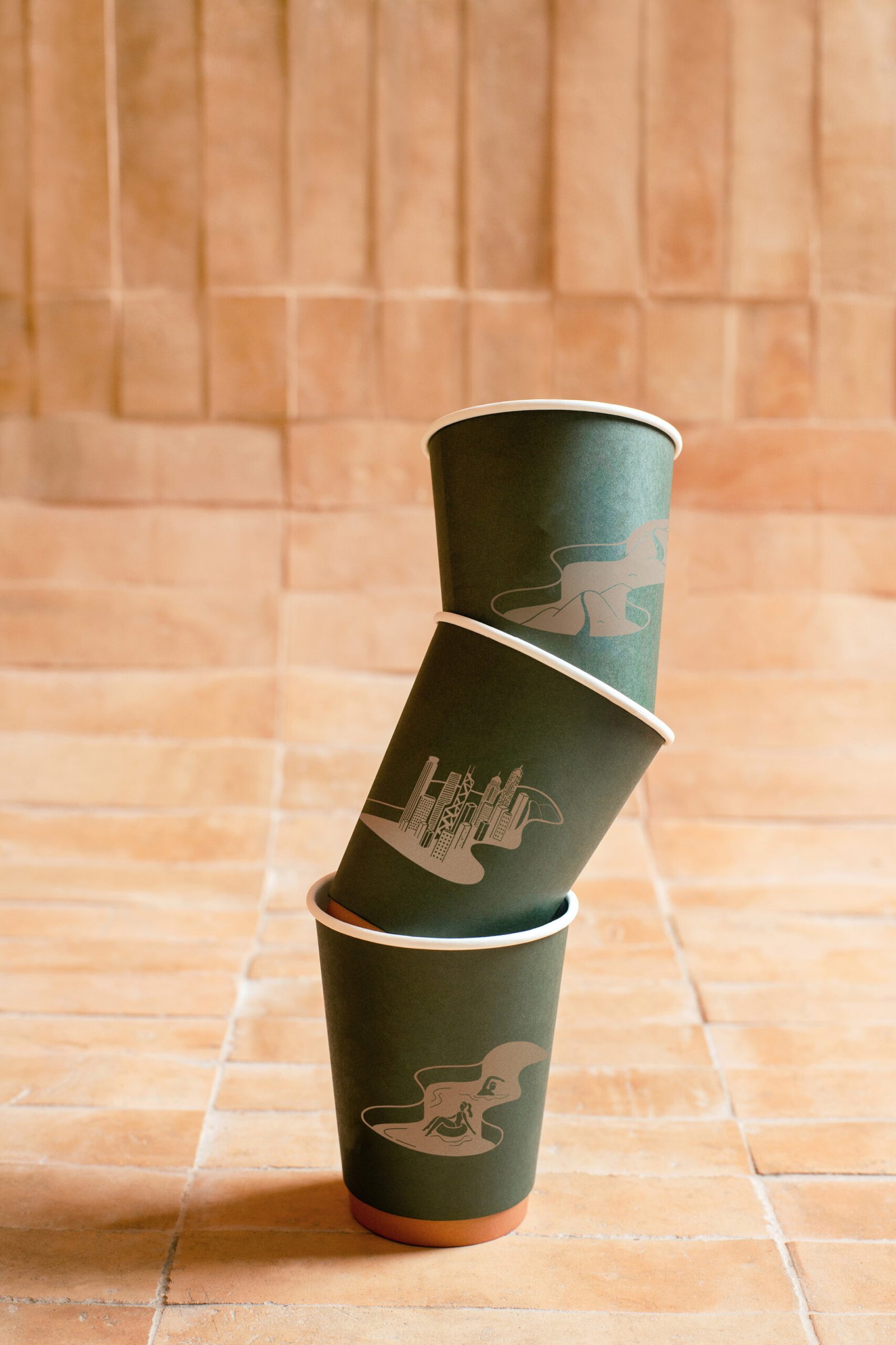
What is immediately noticeable in Substance’s brand identity work for Mother Pearl is its simplicity and pared-down aesthetic, a far cry from the strambotic colors and cutesy graphics that characterize its bubble tea peers. The logo, an illustrated profile of a long-haired woman whose tresses morph into a lake is a visual pun: it is a literal translation of the teahouse’s name, but also a metaphor for the nurturing, natural character the brand wanted to espouse; Mother Pearl is all about peaceful coexistence with nature. The chosen brand color is a calming olive hue, which was used to great effect in the brand’s Central outlet, whose concrete exterior is painted with the shade; the resulting effect is jade-like in sheen and texture. The same soothing shade appears in the store’s cups and staff uniforms. The accompanying logotype is beautifully imperfect, mirroring the organic, asymmetrical geometries of nature.
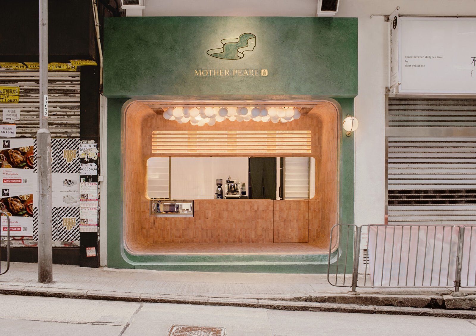
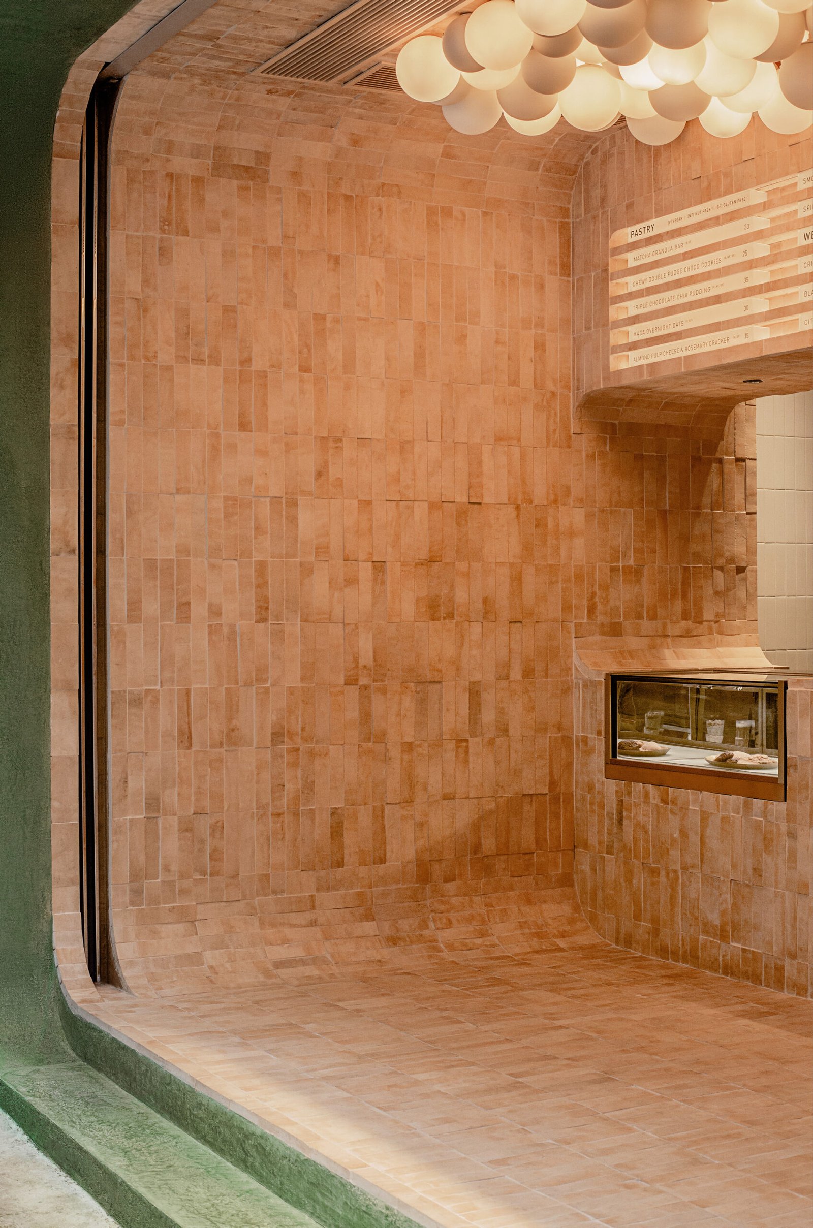
Complementing its serene but playful brand identity, Mother Pearl’s flagship outlet stands out in bustling Central with a calming, yet whimsical presence. An olive-hued frame with rounded inside edges delineates the store outside, a spherical lamp (undoubtedly inspired by boba pearls) with the brand logo and logotype complementing the main signage, which is etched and embedded into the concrete frame.
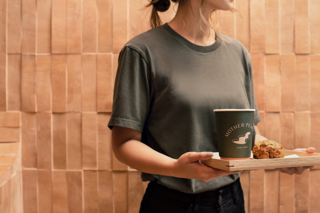

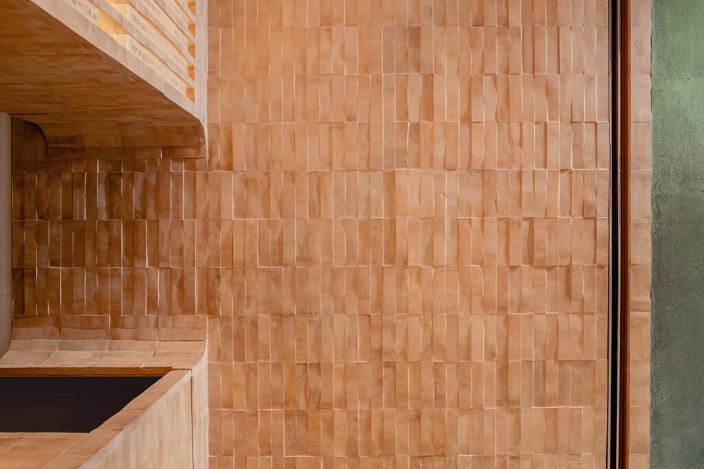
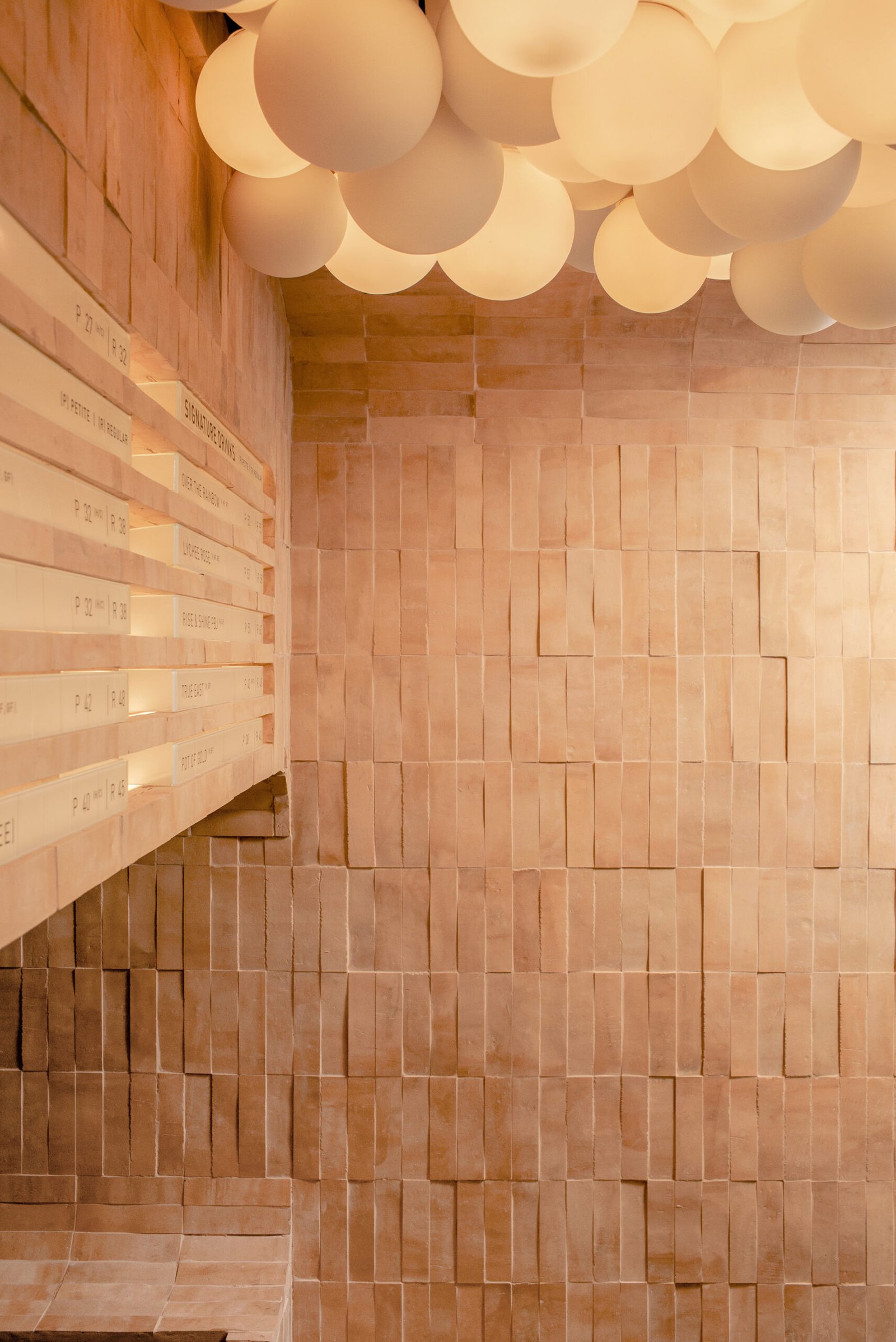
Inside the 33-square-meter space, the rounded inner edges of the store opening are extruded two meters inward, where it meets the filleted counter and store display cutout. The immediate effect of the terracotta brick interior finish is breathtaking; everything, from the floor to the counter is finished in the same sand-colored material. A playful array of pearlescent light orbs in the store’s ceiling can either suggest boba pearls or clouds, a visual element that triggers the viewer’s imagination as he patiently waits for his drink or as she slurps at the calming tea drink she just ordered. Speaking of ordering, the menu items are set against sandblasted rectangular glass prisms, which then rest on tiny alcoves carved out of the wall above the counter. Light peers through the sand-blasted prisms with a warm, muted glow.
The combination of natural textures, soothing earth tones, and organic shapes has resulted in a space that feels like a portal to a quieter time, a place where time slows down, if only momentarily. “For many, drinking bubble tea is an indulging ritual, a momentary escape from the world. Our flagship store is a reflection of the delightful and unique bubble tea drinking experience. We want you to stop, slurp and pause at our store,” Dautresme shares of their spatial intention. And paused and gawked they did. When the store opened last 2020, the store became a hit for bubble tea fanatics and curious onlookers alike, entranced equal parts by the store and its delectable yet healthy offerings. The public response encouraged the client to seriously consider further expansion, and attributed much of the success of the store to the well-thought-out and all-encompassing design solutions crafted by A Work of Substance.
Do we really need another bubble tea shop? Why, I don’t see why not, if they are all as well-designed and well-intentioned as Mother Pearl. •
CREDITS
Designer A Work Of Substance
Area 33 square meters
Location 25 Lyndhurst Terrace, Central, Hong Kong
Completion Date 2020
Scope of Work Architecture, Interior, Products, Branding


All Substance, no filler at aworkofsubstance.com




One Response