Interview Judith Torres
Photography Marc Heinrich Go, Eric Beltran and Kevin Evora
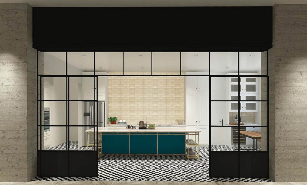
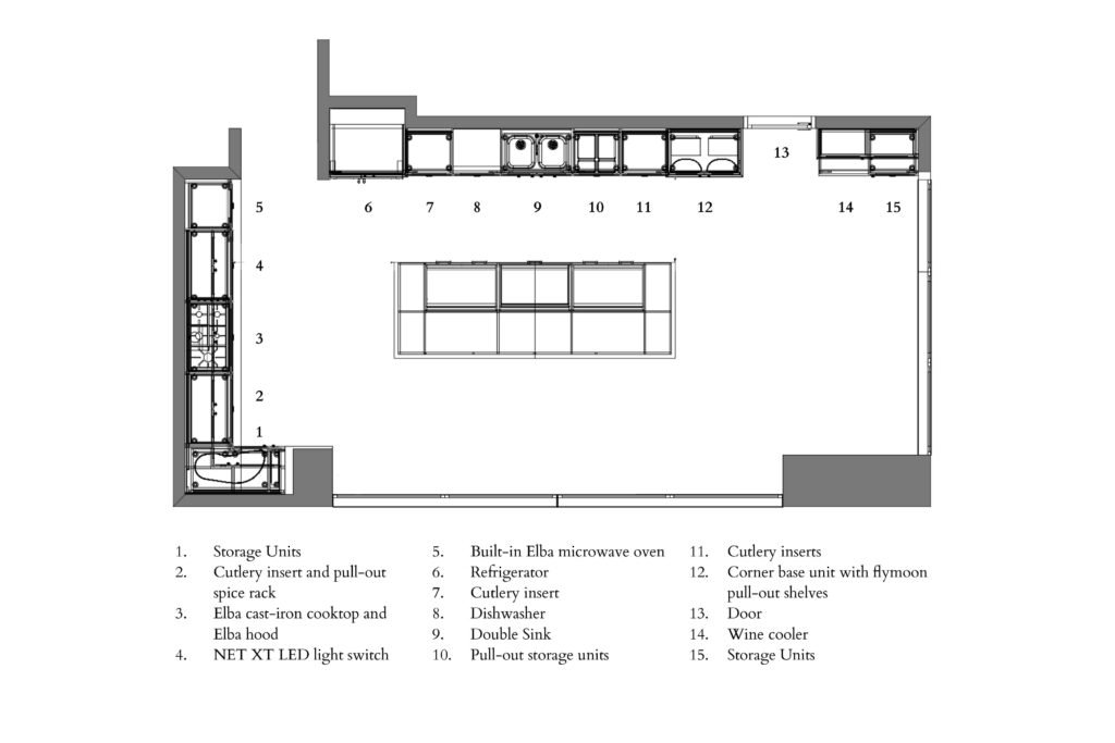
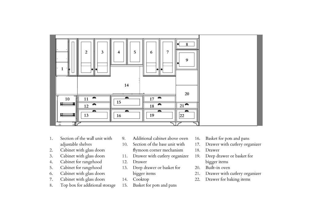
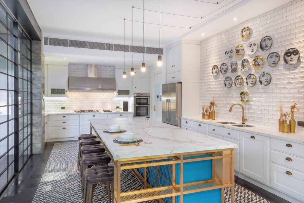
The airy white Scavolini kitchen with its bright turquoise blue island beckons to people as they enter the front door. All lines lead to the kitchen; they draw the eye there. It’s as if the living and dining areas are a mere processional space to that inner sanctum of yummy smells and friendly banter.
“They like to entertain, they have so many friends in the neighborhood, and they’ve migrated from eating out at restaurants to having people over at their home. And so that was a big part of the brief, making the kitchen a gathering place sizable enough for friends to hangout at the kitchen island itself or at the kitchen table nook,” says Jason Ruperto of Studio MNL, which designed the house.
Ruperto and his wife, Emmy, are both architects formerly based in Los Angeles, who returned in 2013 to practice in Manila. They are also furniture designers who fabricate much of the built-in work of their projects. Right next to their office is a pottery studio, further evidence of their love for craft and detail.
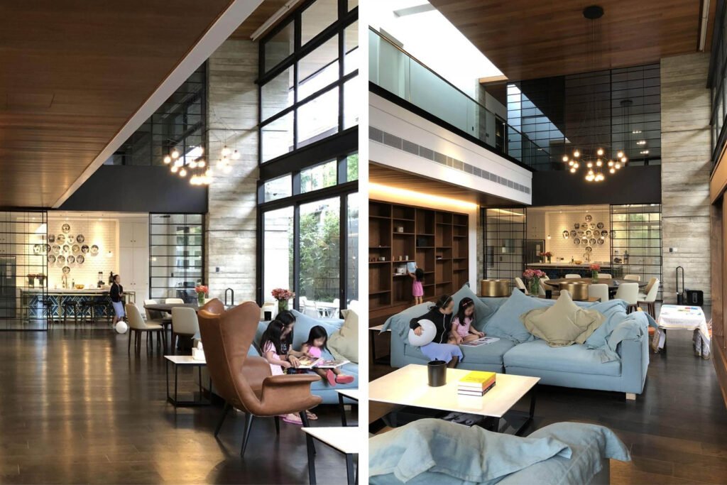
Studio MNL’s open plan allows the clients to see friends as they arrive, who’s chilling with the kids at the sofa, and who’s serving up chismis at the dining table.


Knock out
“We had to knock this one out of the park because the kitchen is the focal point as you walk into the house. We did several studies, maybe four different kinds of looks, but we got to this place and the decision to use Scavolini fairly quick. The first decision we made was making it white on white. Then we had to figure out, okay, what white tile do we use? What white counter? Is it strictly everything white? Where does the punch of color come from? What about black? How much do we bring in?”
Ruperto says the clients were great, which is as it should be because they are his sister-in-law and her husband. “It went as smooth as you can hope for but it’s a big house and a lot of spaces and attention to detail required. So as designers, we did a lot of editing of ideas to make sure the storyline made sense, you know, that the house isn’t just a bag of tricks. In the end, our clients wanted it to feel homey and to make them want to spend time in it.”

Storyline
The kitchen’s material and color choices took their cues from the client’s personality and the design concept of the house, which is a play of contrasting textures and tones. A good part of the home displays exposed formwork—walls imprinted with the wood panels that held the poured concrete in place. Juxtaposed against the walls’ rough and cool planes are the warm and smooth surfaces of wood planks on the floor and ceiling.
“Pseudo industrial glass and steel” wrap most of the home’s public areas. “We have this blend of unrefined and refined elements and a palette of natural hues and neutral earth tones. Nothing flashy, but soft and warm. So, when it came to the kitchen, we wanted it cool and just as airy as the rest of the house.”
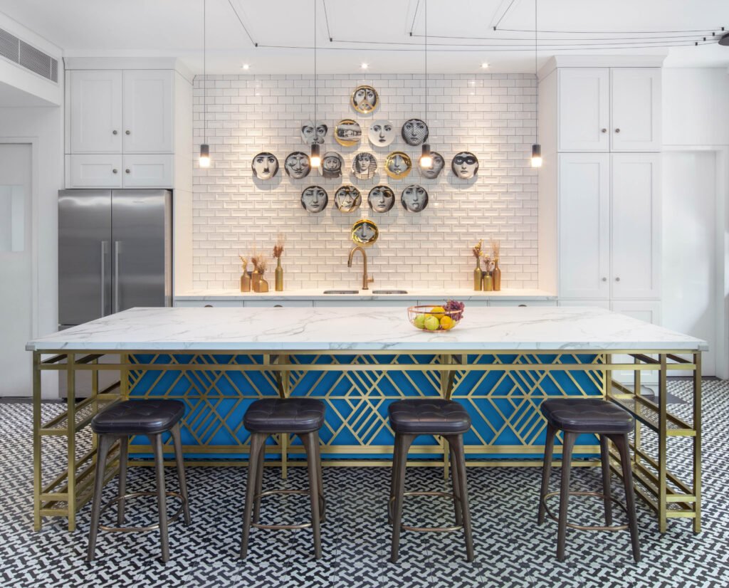
They chose a high-gloss subway tile with a recessed profile to contrast the silky white matte lacquer cabinets. The black and white Machuca tile brings a rustic charm to the space; the black Machuca tile border delineates it.
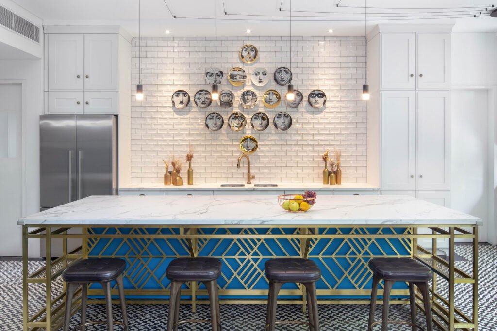
“And then we injected little bits of color here and there to make it a happy, bright space. Yes, our client is a bright and cheerful person. We knew the counter had to be striking, very vivid. If you block out the blue in the photos, the kitchen gets all muted out, so that blue really, really does a lot for the space.”
The brass geometry encasing the kitchen counter, the pops of golden warmth from the cabinet handles and faucet, and the gilt glinting on the assemblage of plates on the wall resonate with metallic counterparts in other parts of the house.

Collaborating with Scavolini
Although Studio MNL did not design the kitchen with a Scavolini model in mind, they knew they were going to use the brand.
Ruperto explains: “We started first with the concept, not thinking who’s got what particular line of cabinets. We have to come from a place where we think the ideas will work. And then we look at what Scavolini has to offer. Then we match up or we see what they have—there might be something we like better than what we did—and then we see if that works. So, there’s a good bit of back and forth going on.”
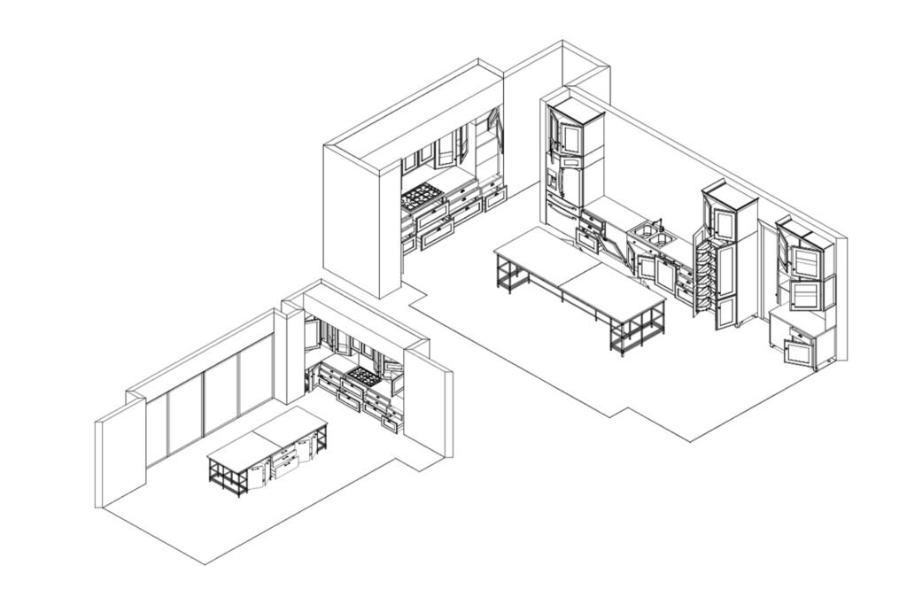
As expected, Ruperto had great fun creating the brass shell for the turquoise blue island to slide into. “Scavolini was great to work with. There were challenges for them on this project because of my requests for this custom island. I don’t think Brian has dealt with integrating so much with a custom piece. Many great kitchen brands have a system and it’s hard for them to break away from their system and integrate with other parts or blend in with a custom piece. You have to understand your product pretty well to do that.”
Thankfully, Brian Hontiveros, general manager of Modularity Home, which distributes Scavolini in the Philippines, knows his products pretty darn well. After 60 years of producing kitchen, living room, and bathroom cabinets and accessories, Scavolini models are so plentiful and integrate with each other the way Lego toy pieces do, you’d have to be completely unimaginative (or lazy) not to succeed in helping the designer achieve what he wants.
“This kitchen was a fun project. It really showcases the personality of the client and how Scavolini translates that personality into a physical space. We like doing that,” says Hontiveros.
The blue cabinets are from a Scavolini model called Sax; the white ones are Favilla. It takes more work to match elements from different models and even more to fit in with someone else’s fabrication to realize what the designer envisions. But it’s the creative side of the business that keeps Hontiveros engaged and happy. He just doesn’t like doing the same old stuff over and over again. “Our philosophy is to give the client a kitchen only they have, so long as the final product doesn’t compromise the brand.”
Scavolini è la cucina più amata dagli italiani—is the kitchen most loved by Italians. Hontiveros wants Scavolini to be most loved in the Philippines, too.

Favilla means spark
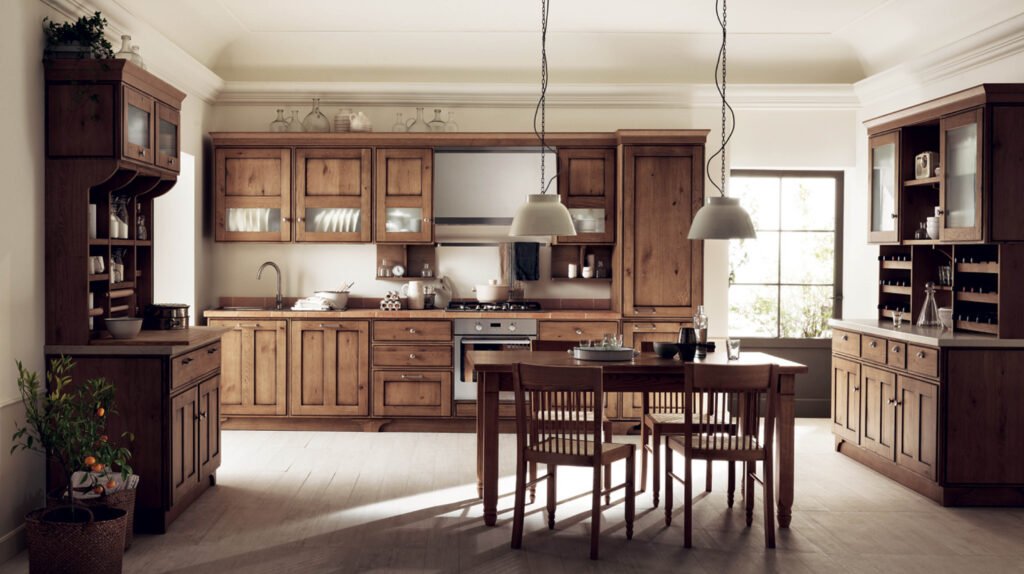
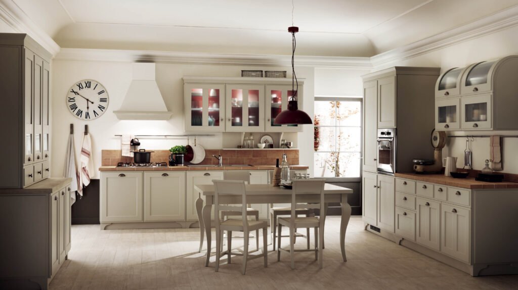
Scavolini’s design philosophy is pragmatic. As Valter Scavolini, the carpenter who founded the Scavolini empire, says: “Always look ahead without ever forgetting where you came from.” This means acknowledging their customers’ tastes, as wide-ranging as they are. “They keep creating new models to anticipate contemporary tastes, but they never stop producing the traditional and transitional kitchens,” says Hontiveros.
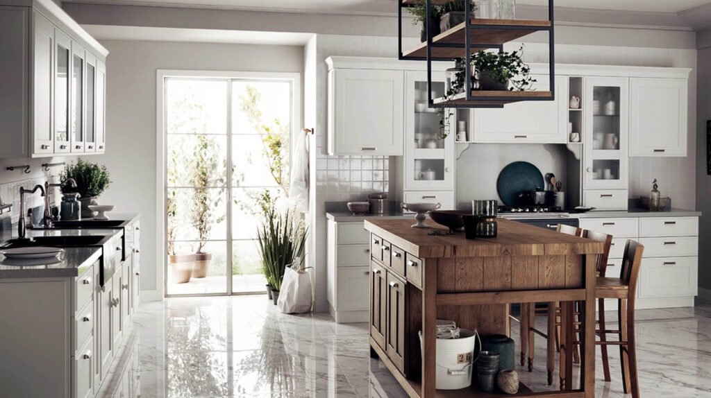
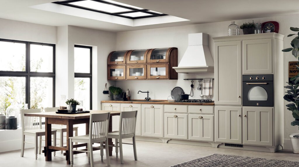
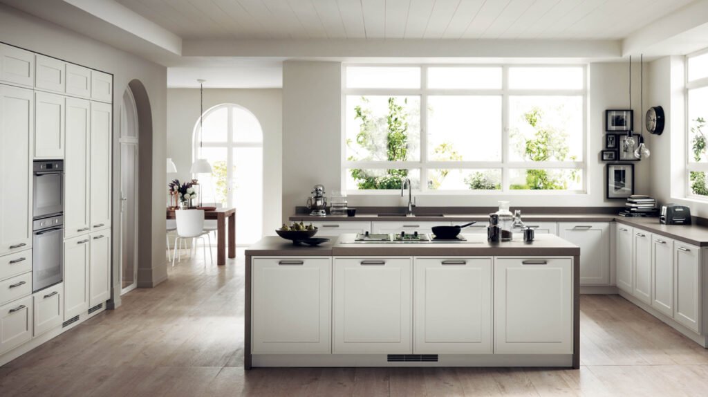
Scavolini’s Favilla kitchen is popular in the US and UK for its crafts-y, shabby chic look. But Favilla’s industrial details and clean-cut silhouettes work well in contemporary compositions, which is just what Studio MNL pulled off in their clients’ white kitchen. It’s modern but not sterile; homey but not frilly.
Favilla in Italian means “spark,” as in the first spark that begins a fire. In English, it is the term for a small incandescent fragment of lava from a volcano. In this kitchen, Favilla very much refers to that special warmth that comes from the daily ritual of parents preparing a meal and partaking of it with their children and, on days when they feel like it, with friends and extended family.


After-dinner
The entertainment doesn’t stop in the kitchen and dining room. “They are wine connoisseurs and create their own cocktails. Before the pandemic, they’d have different sets of friends come over, people they regale on almost a nightly basis,” says Hontiveros, who is good friends with the clients.
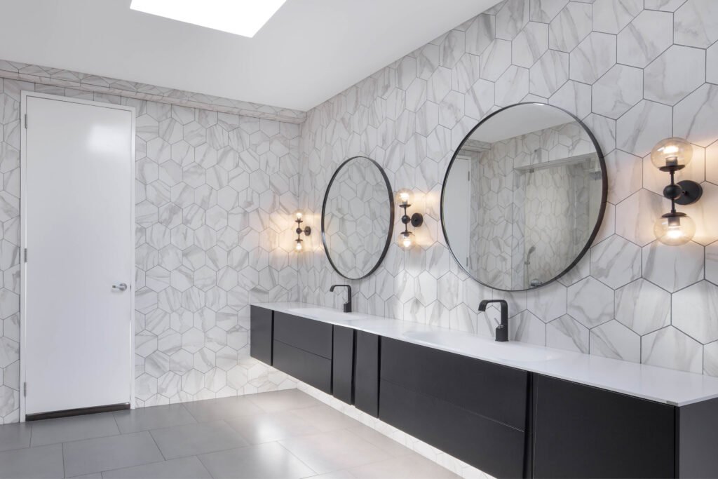
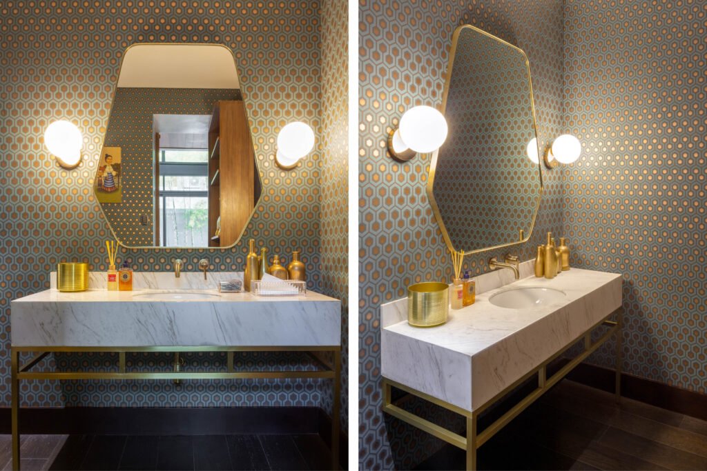
Other parts of the house that use Scavolini are the basement bar and bathrooms. The powder room, for example, continues the kitchen’s design story with a brass frame holding up the lavatory, the metal accessories, and the brass and blue wallpaper.
It’s a design story that has held up very well since the family moved into the house seven years ago. “There is a service kitchen, but my sister-in-law cooks for the whole family. So, she cooks in this kitchen every day. And it looks exactly like this still—I don’t know how they keep it so clean,” Ruperto says.
But of course, the architect knows. Studio MNL chose a white Dekton countertop that withstands the nastiest spills and splashes just as well as Scavolini’s white matte lacquer surfaces do.
And as far as design goes, the great thing about Modularity’s philosophy of catering to custom needs and mixing elements from different Scavolini lines is it prolongs the kitchen’s nowness and aesthetic relevance. It is current but it recollects the past. It is Filipino, Italian, and American. And it’s got that magic spark that will keep the family’s traditions burning bright till the next generation takes over. •
