Words Gabrielle de la Cruz
Interview Patrick Kasingsing
Images Pierre Go and Riverside Residence
There is a peculiar tension when one looks out over the Pasig River. New, glossy skyscrapers rise alongside clusters of aged, ramshackle structures, this patchwork view extending in all directions as the river meanders through the city. The contrast between scale and condition is immediately apparent, a juxtaposition of the cool indifference of lofty newness against fraying urban grain, grain that has had the time to percolate, acquire texture, and find rootedness.
For Riverside Residence, this tempestuous view became the starting point for a design conversation between architect Pierre Go and, possibly, the hardest of clients: his sister Steffi and her husband Julian Cua, balikbayans from England. “The unit was specifically chosen to have a view of the Pasig River, as much as we have a love‑hate relationship with it. Facing west, the windows capture the sunset as it falls over the water, and many of the choices we made pivoted around emphasizing that experience,” Go shared with Kanto.
The couple decided to move back to Manila after five years of living and renting in London. The dream was to have a space they could call home, one that not only belongs to them on paper but, more importantly, in feel. “Steffi and Julian got married here in the Philippines before moving to London. Julian pursued a master’s degree at the London Business School. Steffi followed and studied a bit later on at the University of Arts London,” Go explained. After years of living in tiny city flats and grey skies, the couple had a change of heart about what they wanted for their forever home.
Condo constraints
Go described the two-bedroom unit as a typical flat with basic, hard-wired essentials. Certain built-ins were in place, but it lacked any loose furniture. “It was essentially complete, but still felt like a shell. It didn’t have any personality to offer just yet.”
Kanto: Let’s step back a bit and recall your first conversation. Were you your sister’s first choice as architect? What were some of their non-negotiables for the space?
Thankfully, I was their first choice. People may think working with your sibling makes things easier and more convenient, but there is more pressure to get things right, given their belief in you. Add to that that Steffi and Julian are well-traveled, so they have a good sense of what good design looks and feels like. Steffi works in fashion and retail, so she was very specific about the visuals, accessories, and décor included in the space.
Julian, on the other hand, is particular in having an integrated and well-defined experience. One non-negotiable was that they be heavily involved in the process. They made the hard choices, and my job was basically to advise on yes-or-no decisions and put things together.
Tell us about day one. How did you go about working on the project?
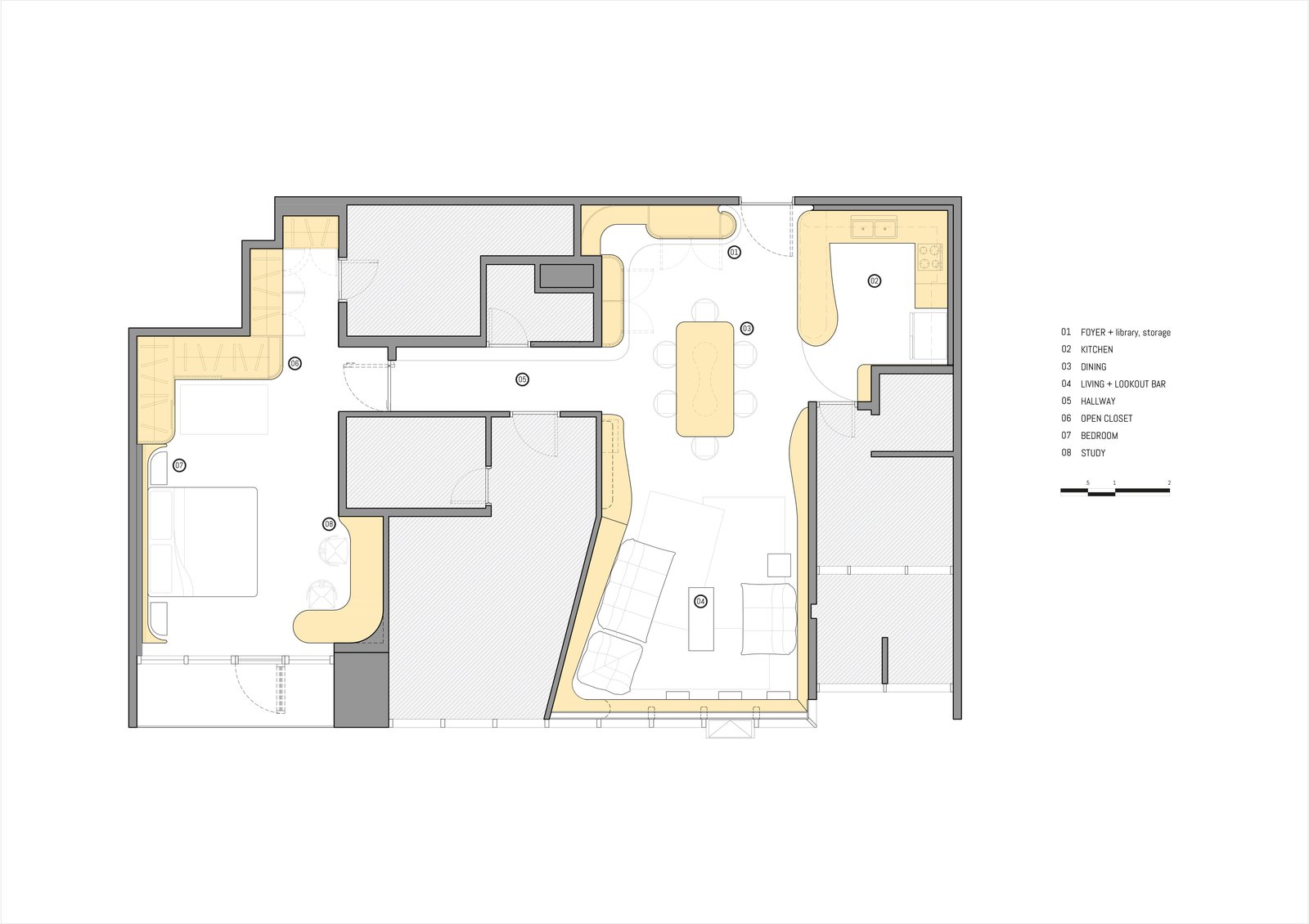
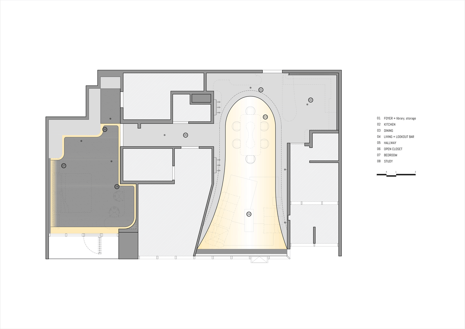
Instead of fully gutting the unit in one go, the renovation was approached in phases. We concentrated the renovation effort on three spaces: the bedroom, living room, and hallway. It was all about funneling budget into spaces that they will use the most. We also found that doing this makes future changes easier, should they decide to switch something.
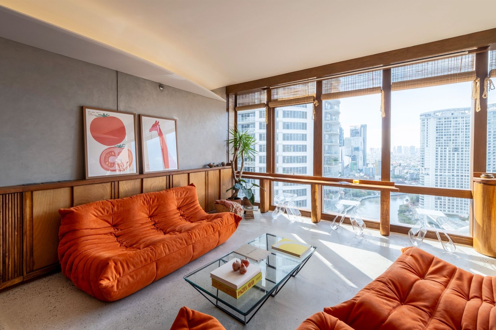
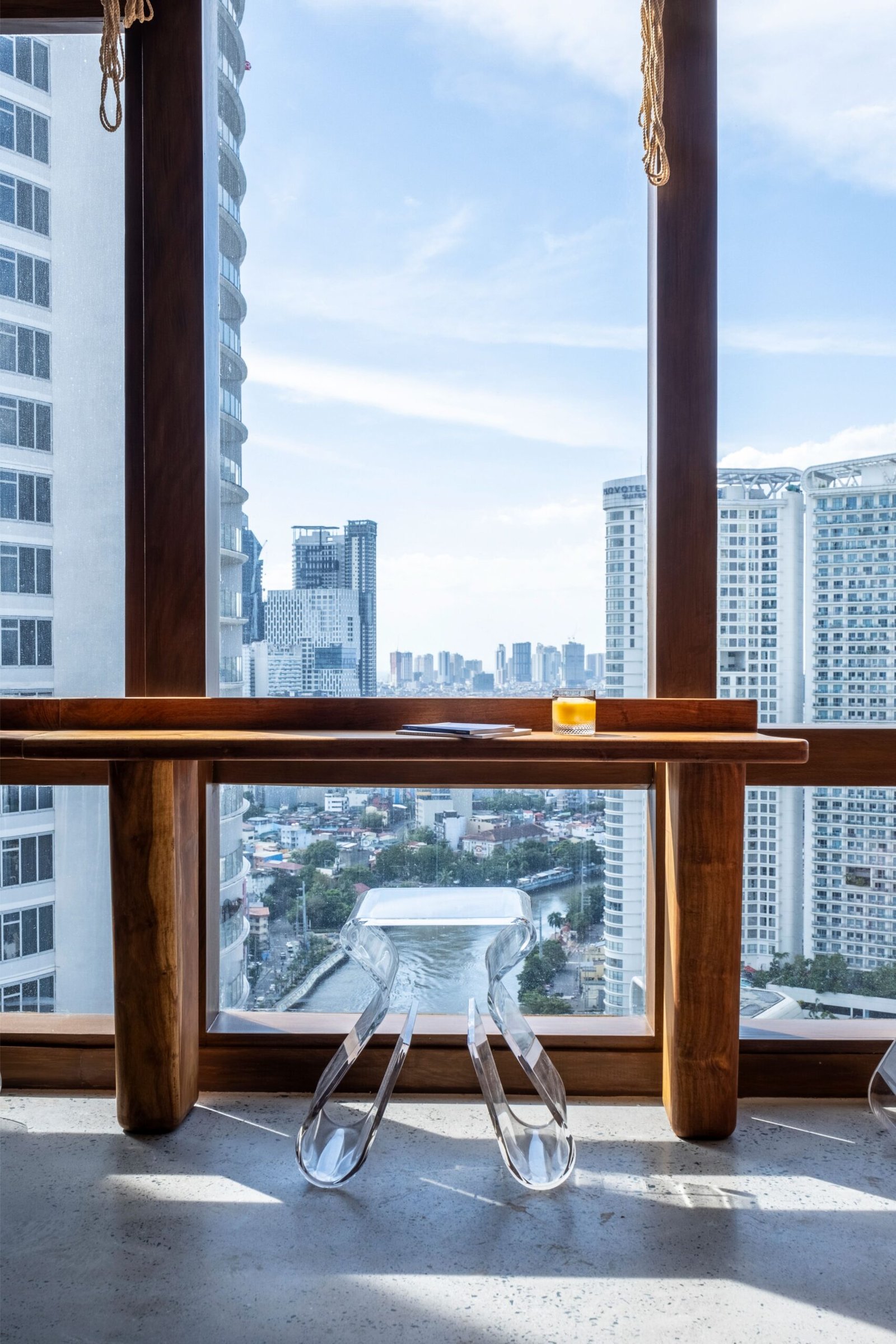
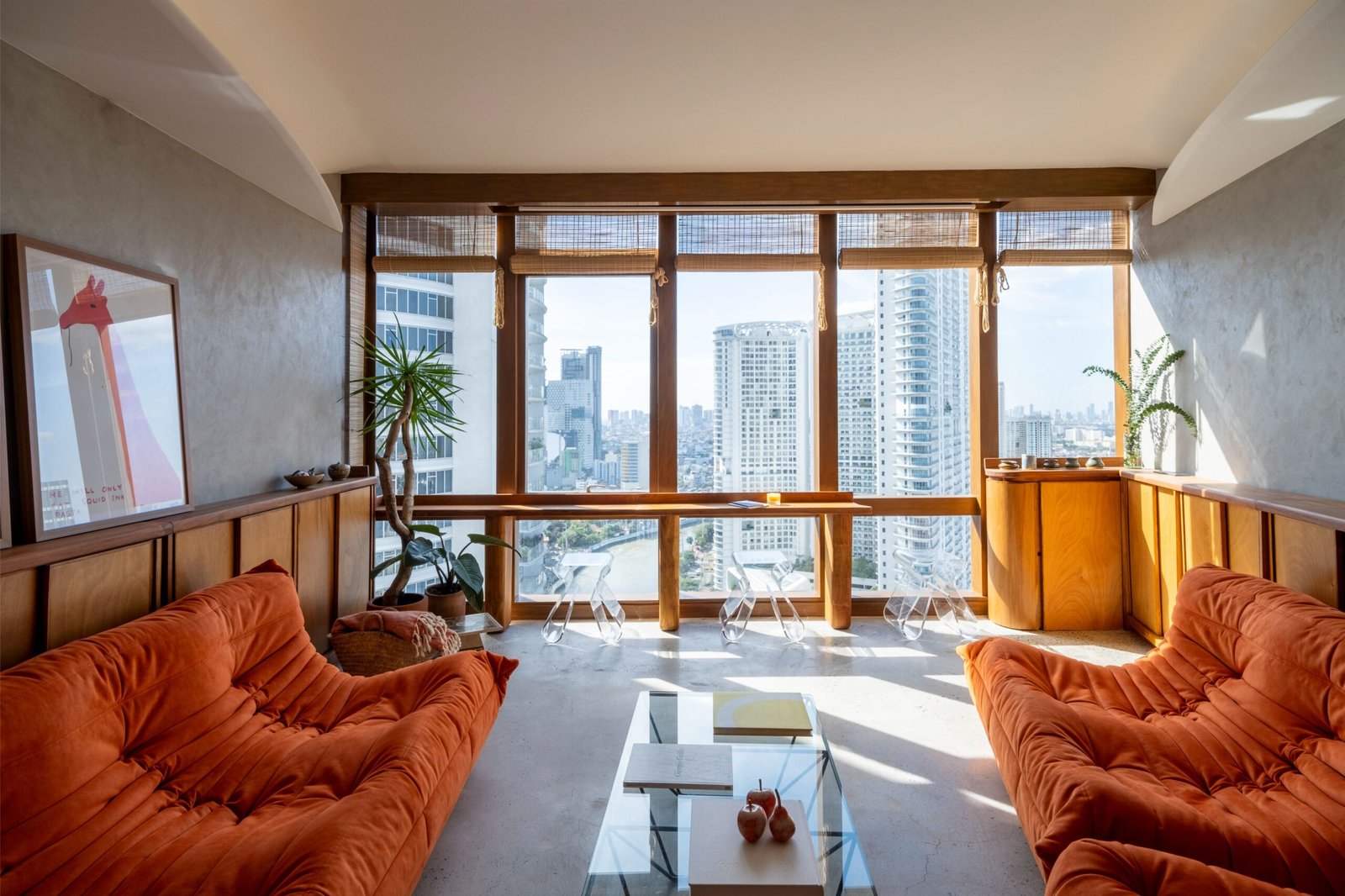
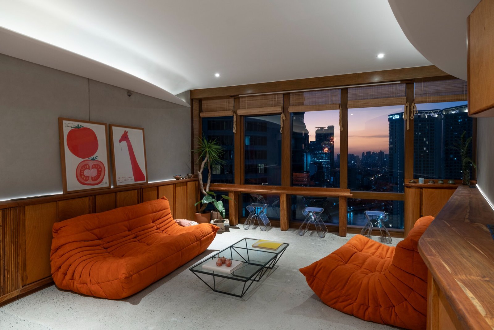
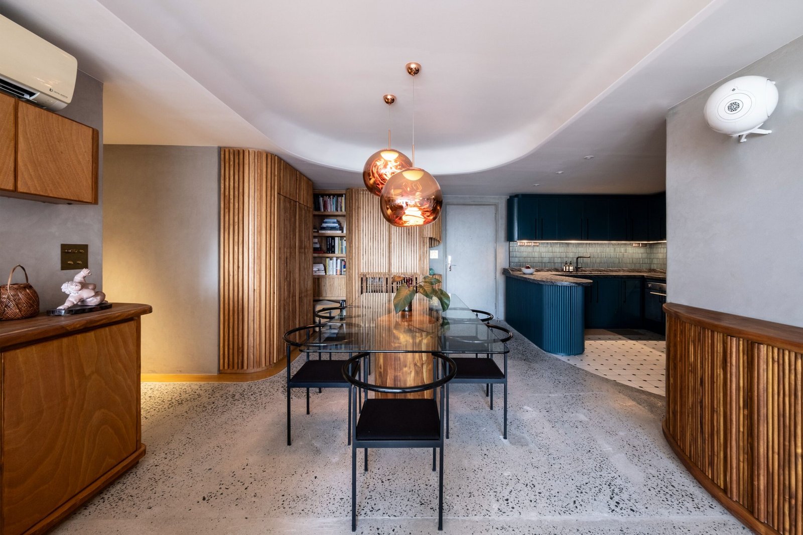
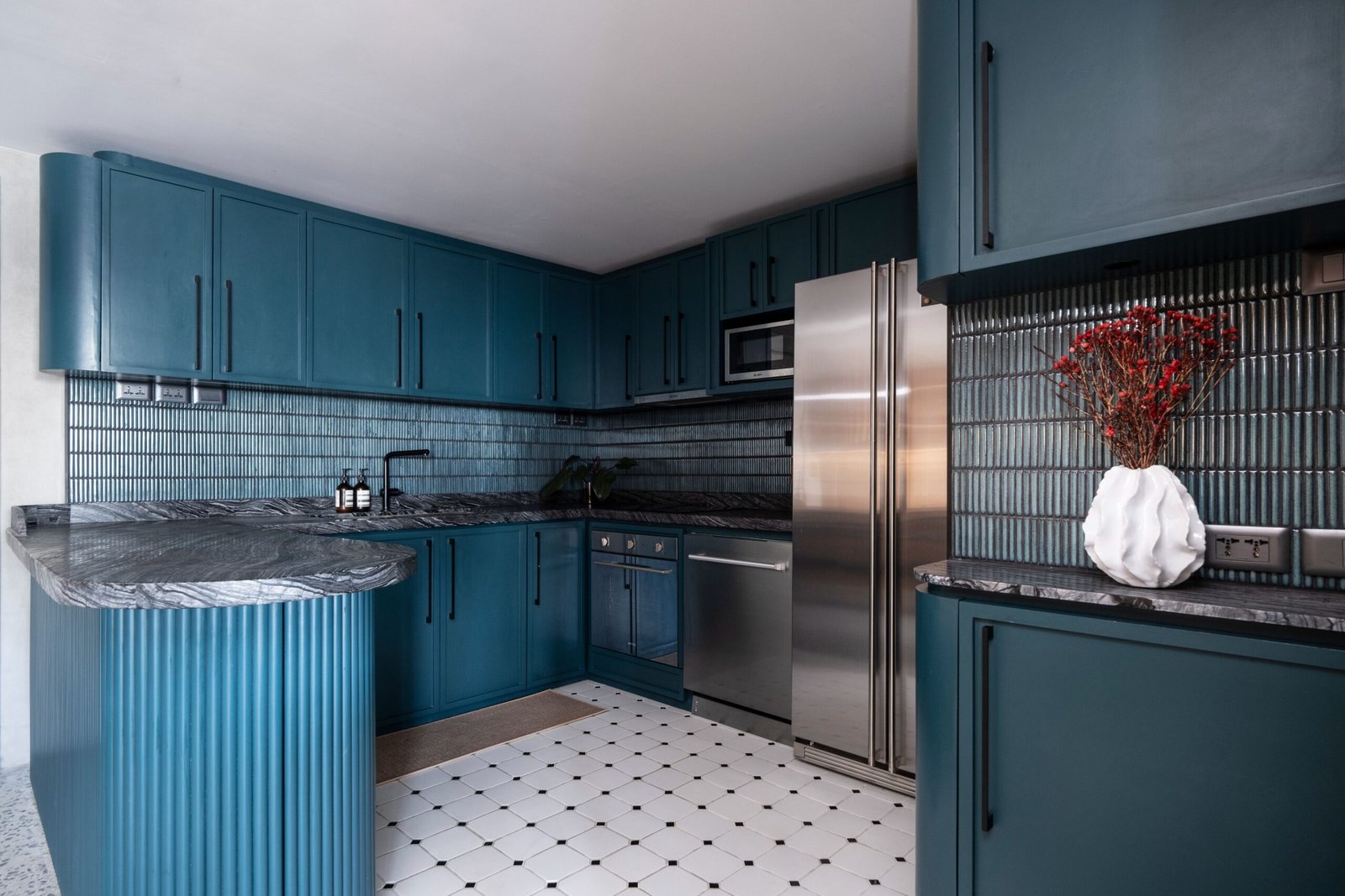
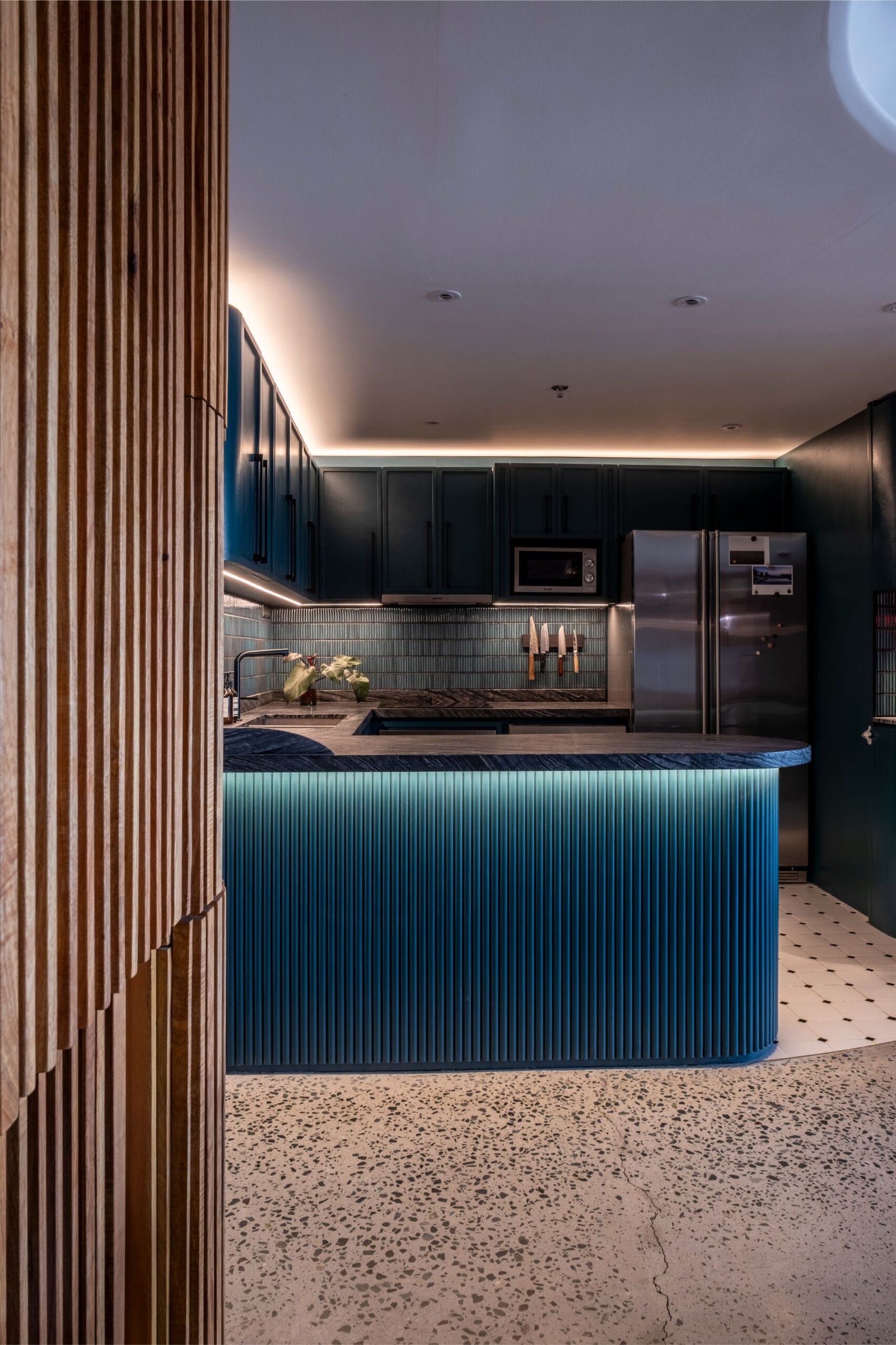
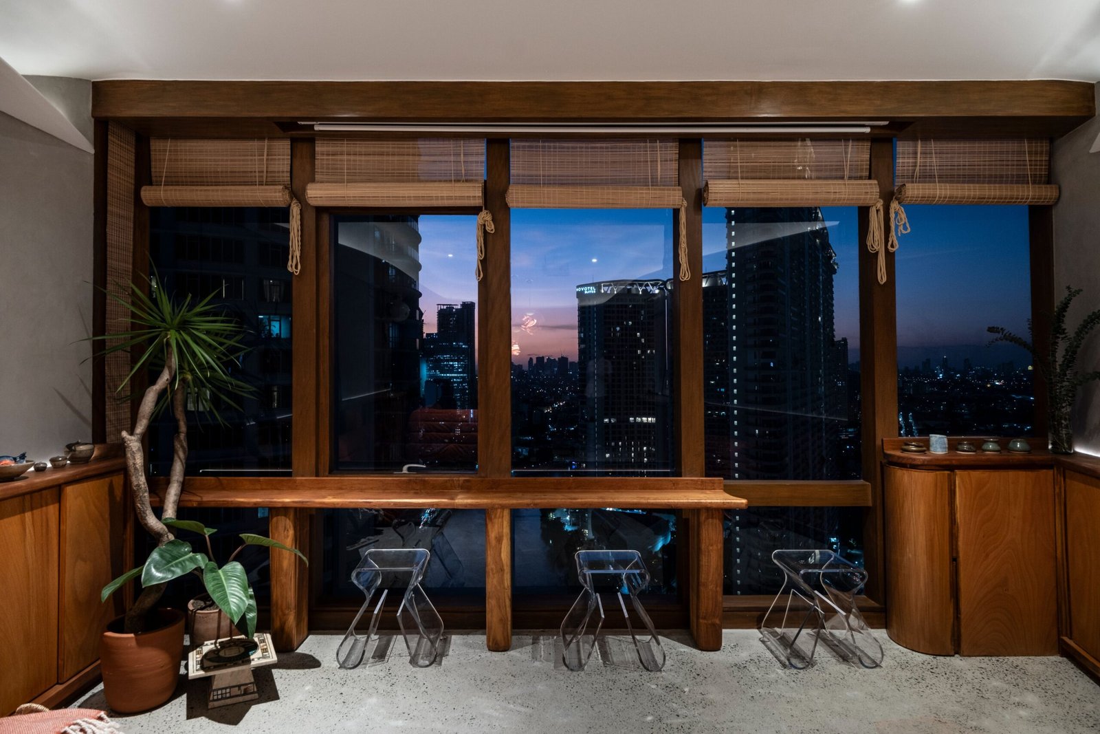
One of the most significant moves was expanding the living area from four window bays to five, opening the unit to a fuller experience of the river view. This was a direct response to the typical shoebox feel of rectangular condominiums. By skewing the wall and having the living area take one window bay from the adjacent bedroom, we broke the symmetry of the space. It was a strategic gesture where a simple shift in the floor plan provided a multiplicative gain in both volume and perspective.
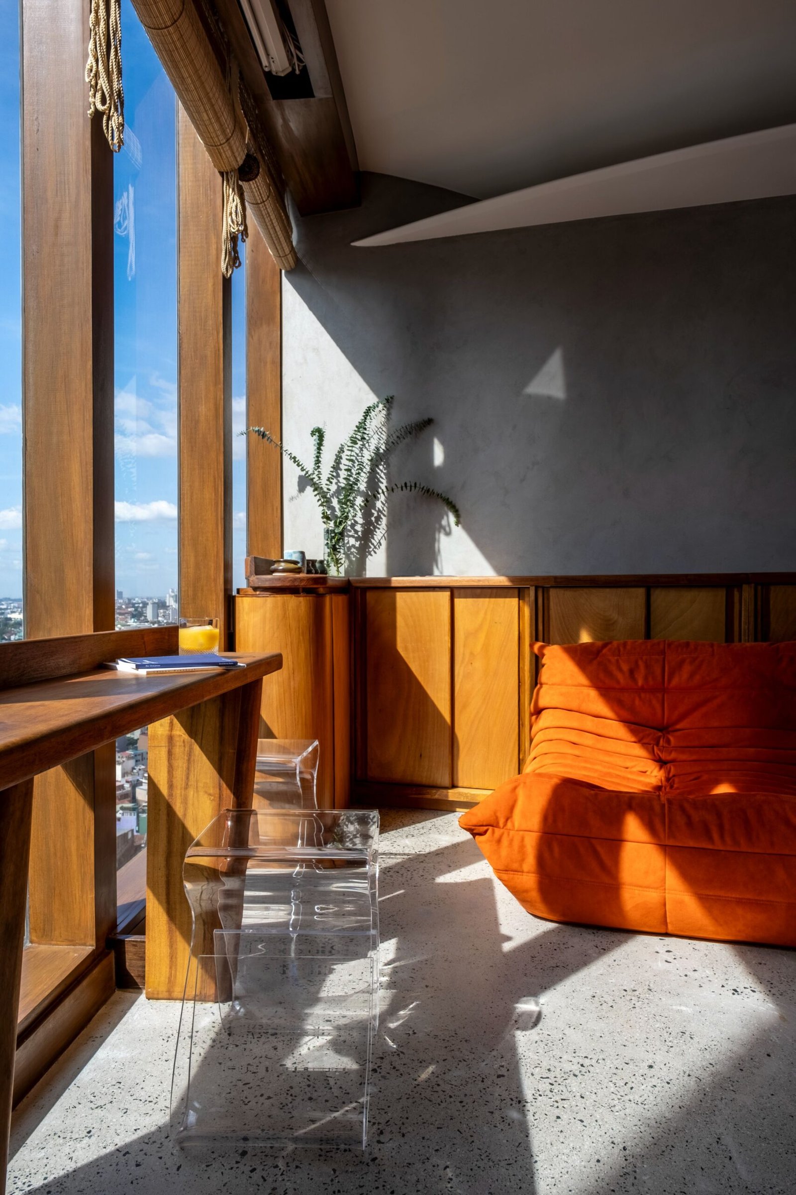
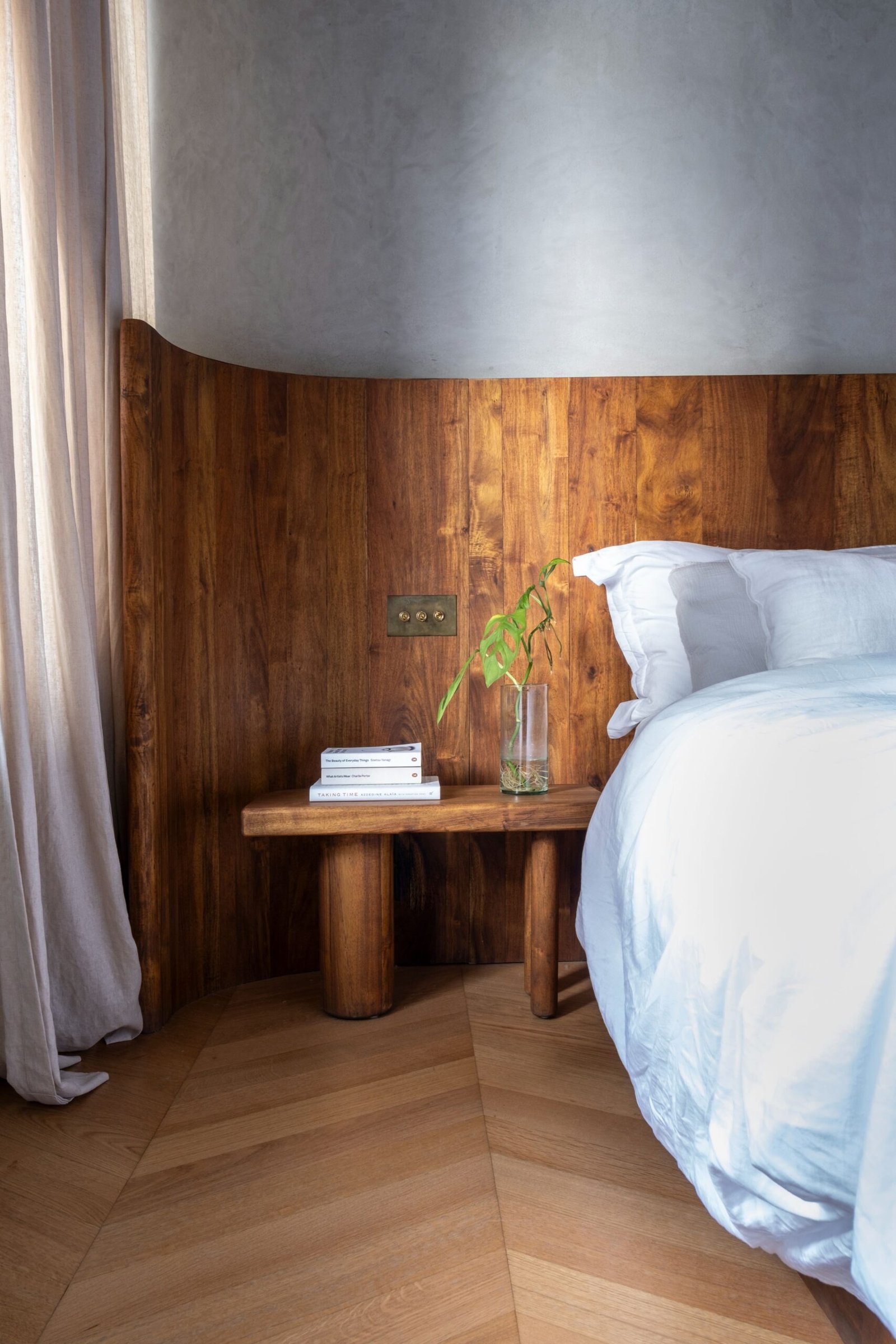
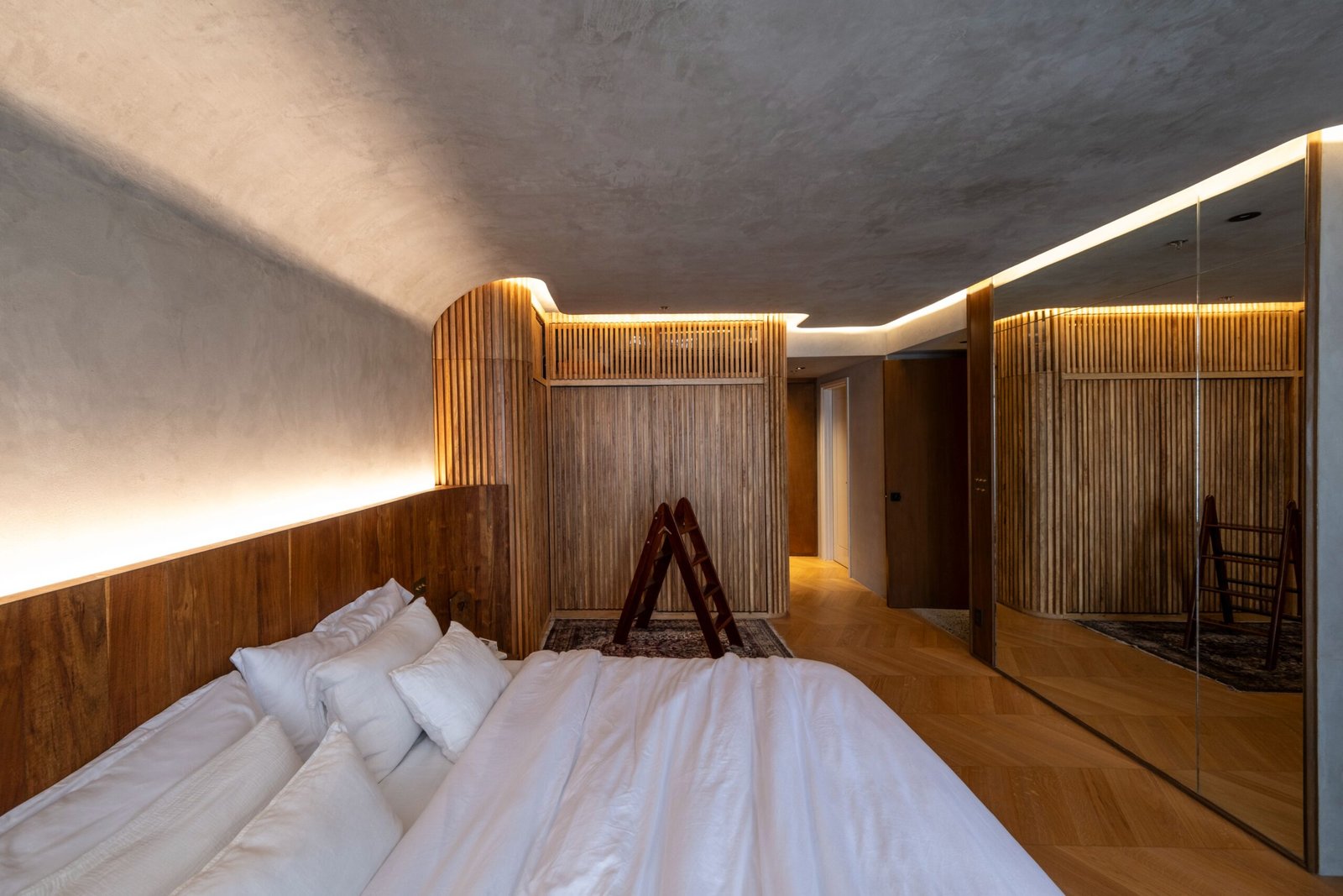
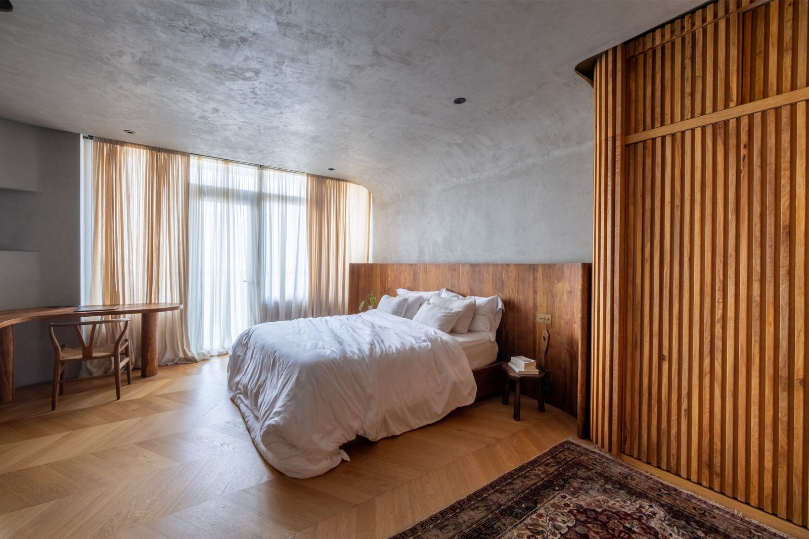
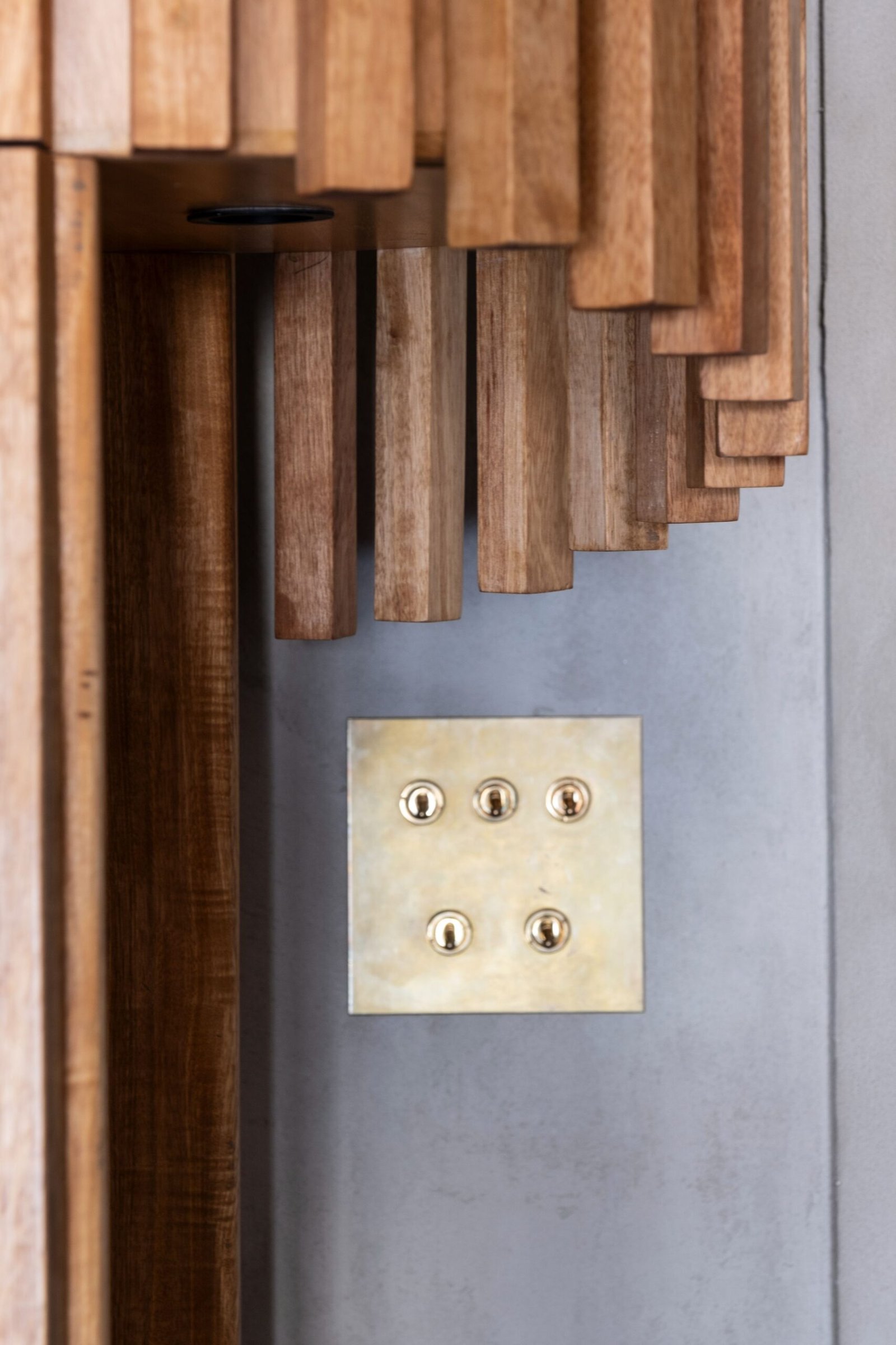
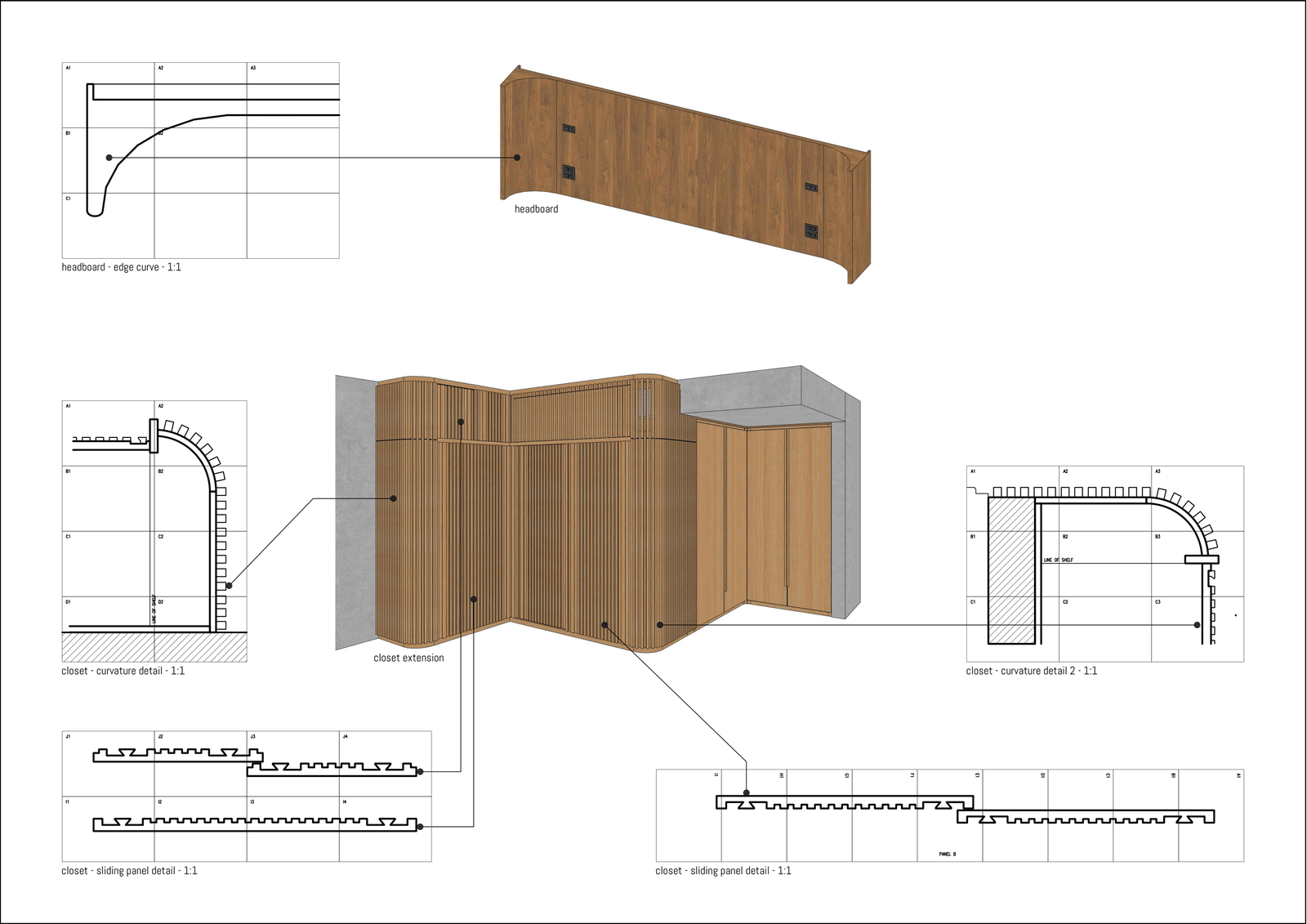
If anything, what truly changed the windows was how we clad them in local mahogany to frame the view. Fortunately, the building administration approved the modification, provided we only used adhesives. The frame also comes with an integrated viewing bar with outlets underneath and back lighting.
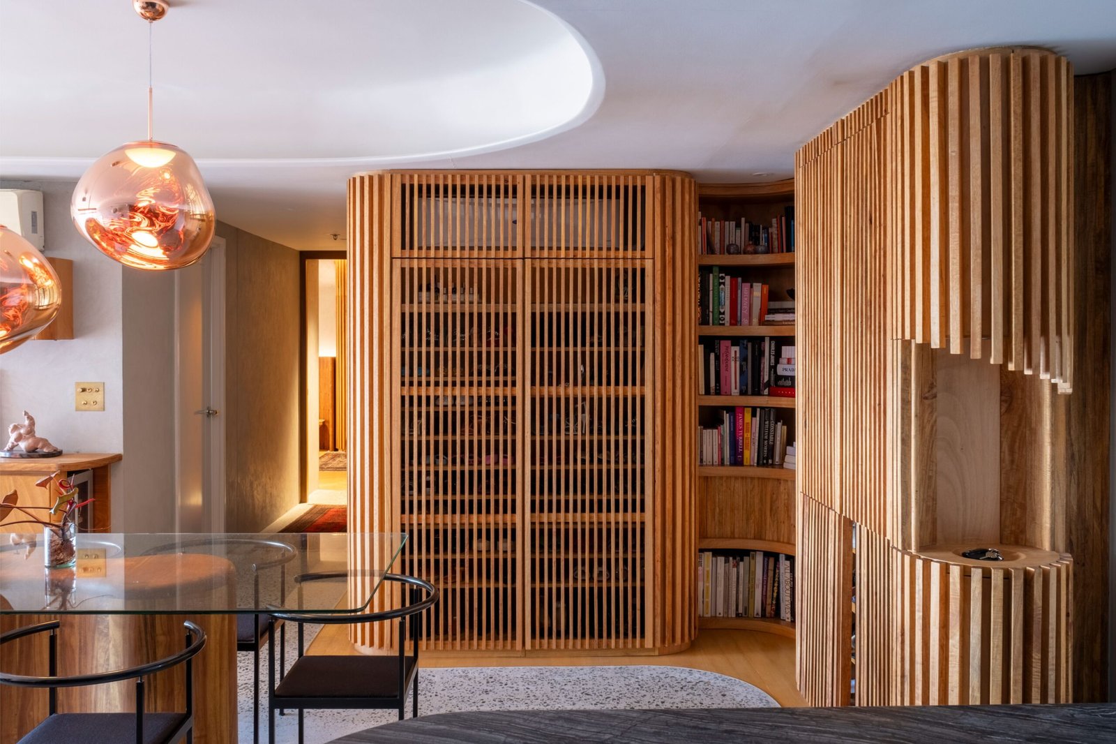
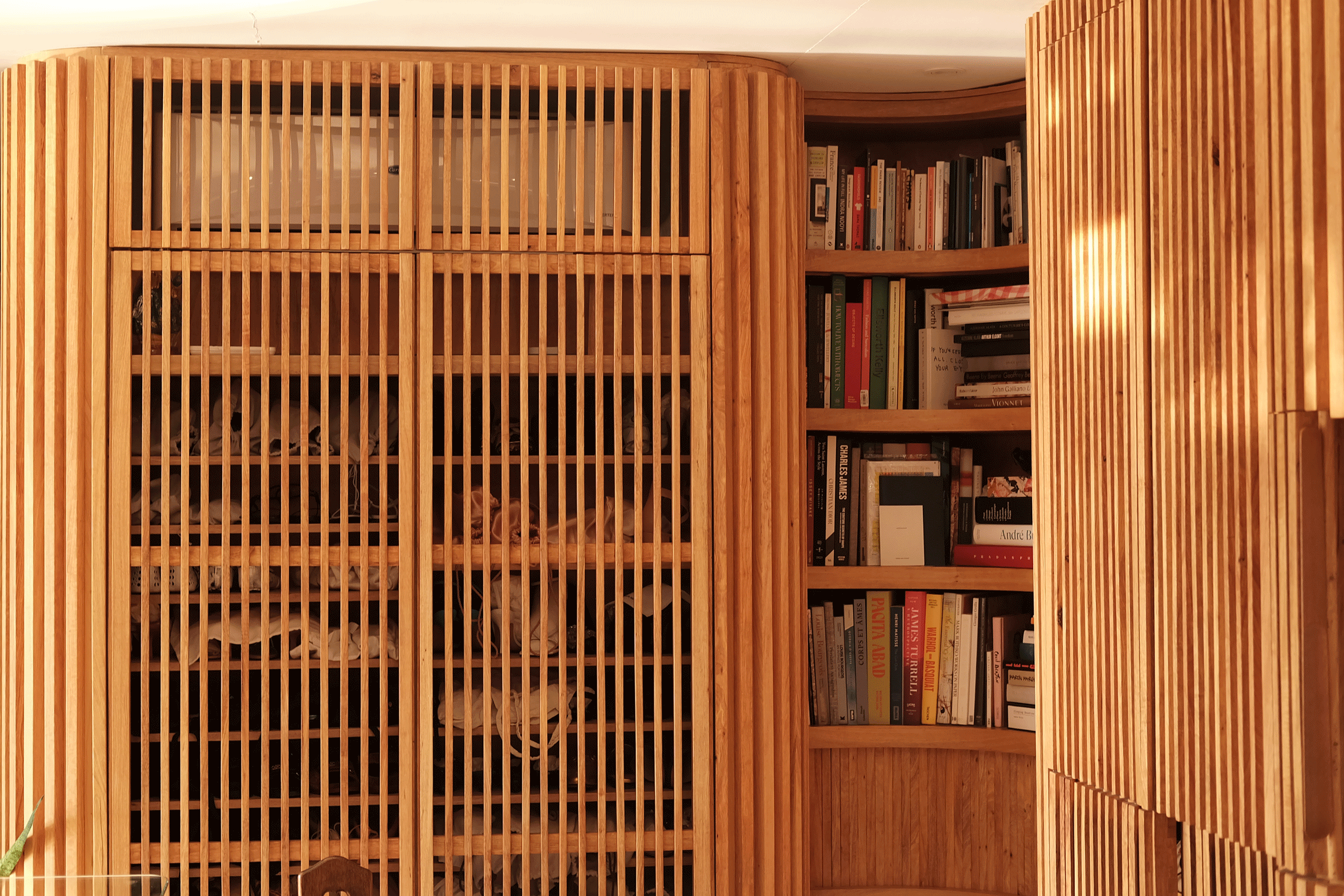
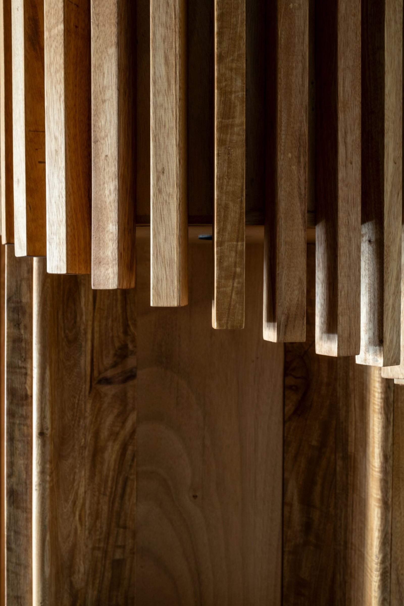
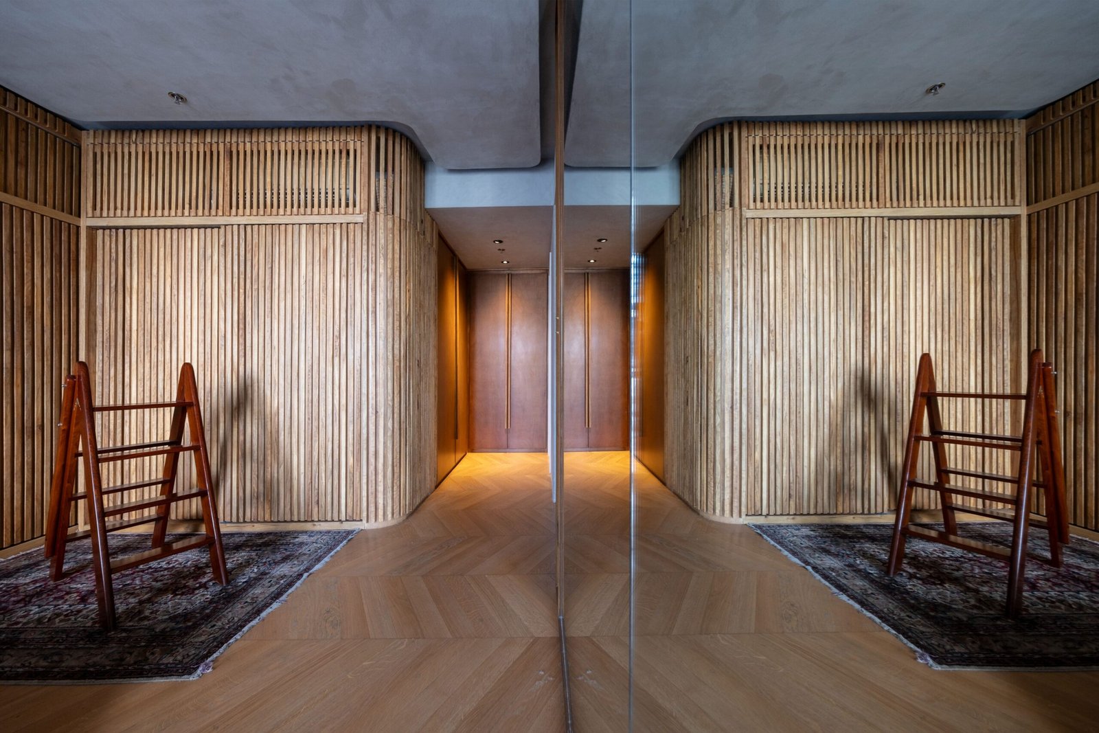
Adding to the warmth within the home is the use of balakat, an underrated local lumber of exceptional quality. I first saw the raw wood with Jeric Rustia of Gusto Design, among the friends I turned to in my journey of designing this residence. When we saw balakat’s characteristic spikes, it was easy to comprehend how the grains would shift into wavy, marbled patterns once treated.
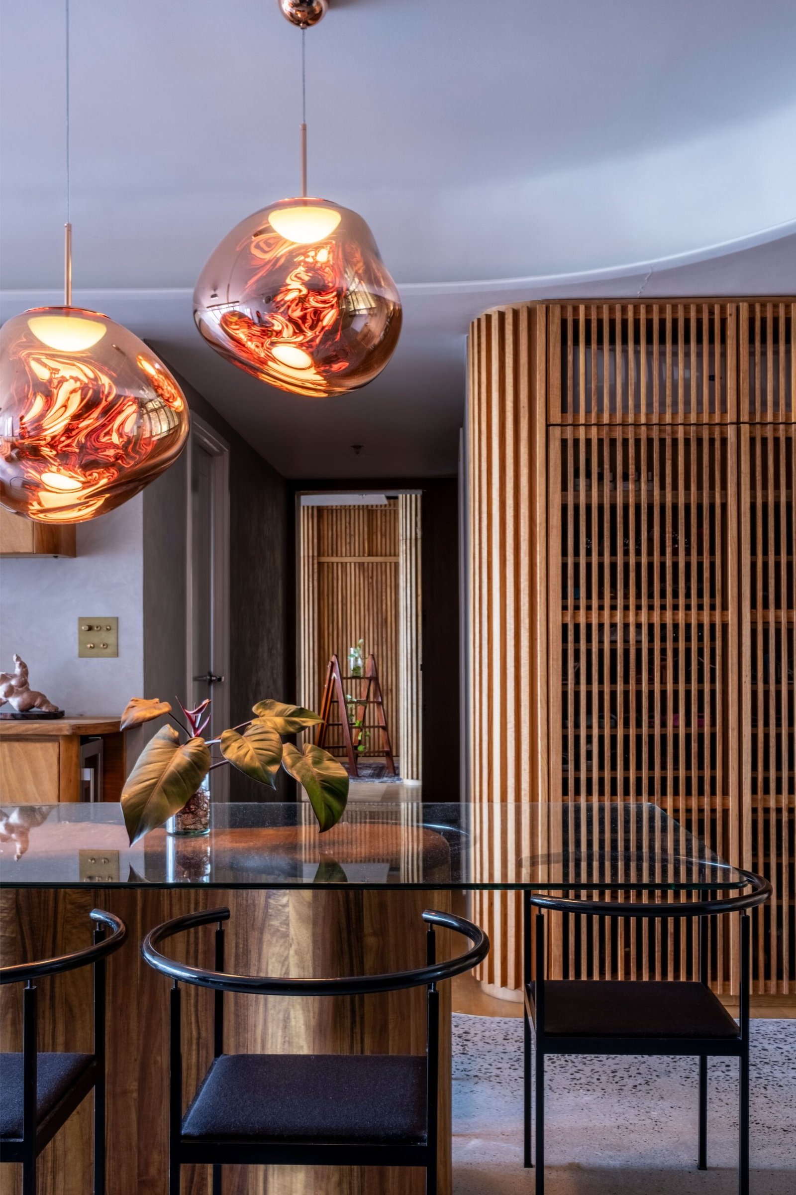
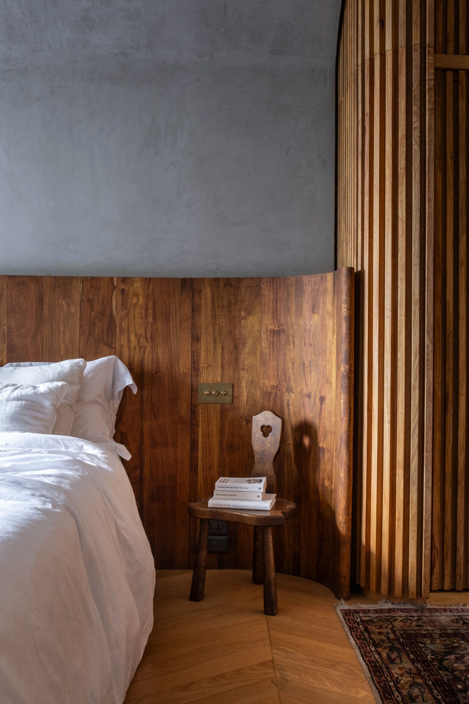
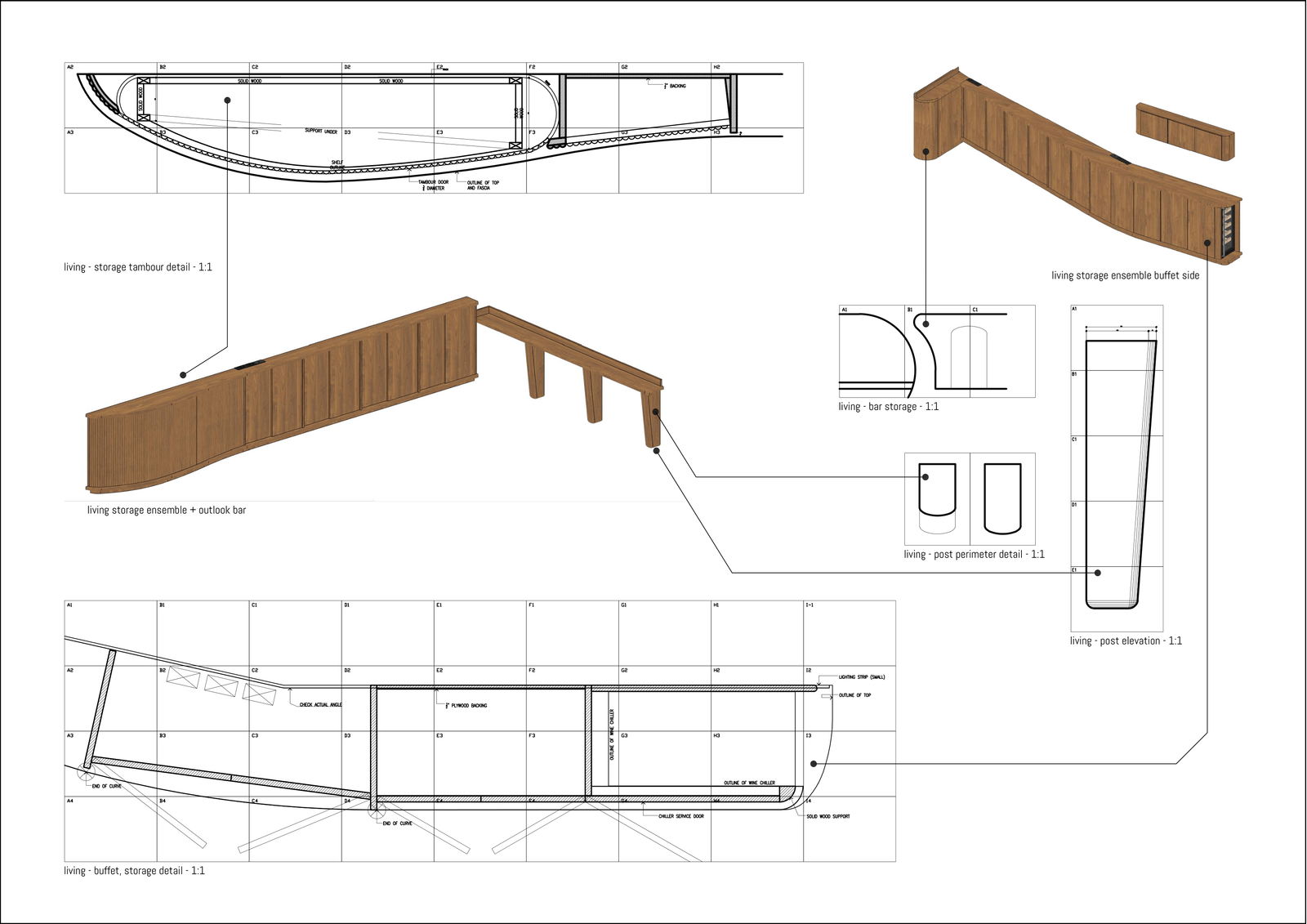
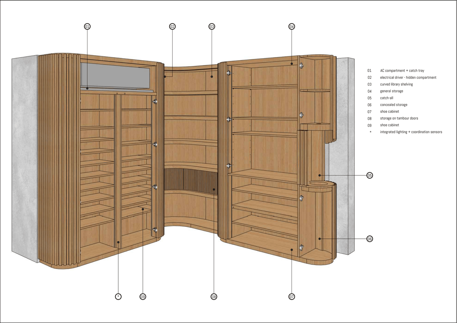
Balakat features alternating light and dark streaks, providing warm brown tones that soften the natural light when it penetrates the home. This yellow hardwood serves as the primary material for slatted elements such as the custom shoe cabinetry, the library shelving, the various storage units, and the walk-in closet.
“Julian also thought of extending the cove all the way into the kitchen, which we couldn’t do because of the utilities. It was also his idea to place the retractable ceiling projector by the window!” Go added. DIY-built-in HDMI and sound cables connect to the ceiling projector, integrating the Devialet speakers the couple had owned for years into the space.
Breaking the box
Besides the expansion of the window bays, the renovation did not include other major structural overhauls. “Columns, plumbing stacks, and other fixed elements were left untouched,” Go shared. “We focused on design mechanisms that would eliminate this sense of confinement in the unit.”
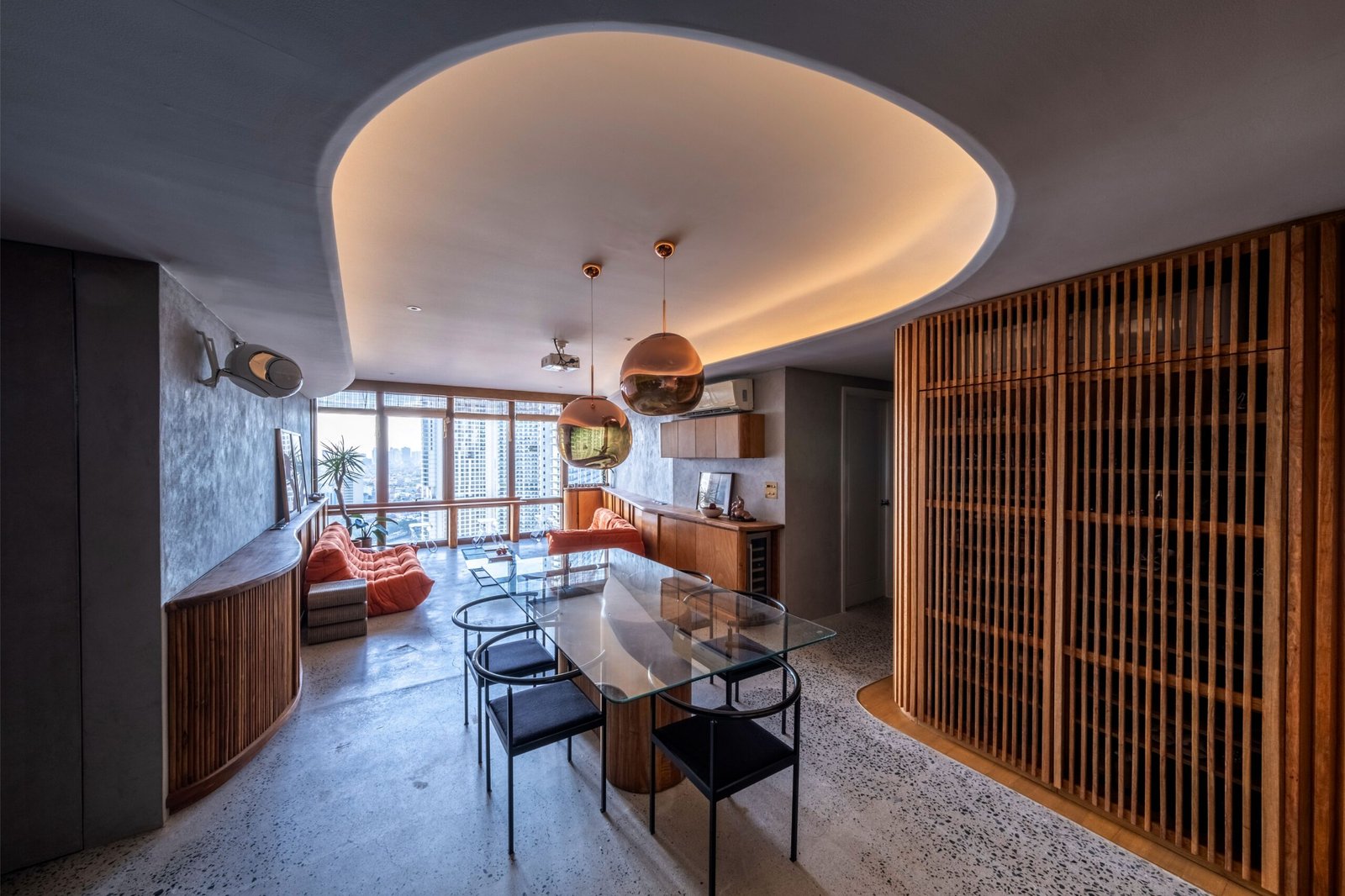
The integration of curves and rounded corners seems to have softened that rigidity.
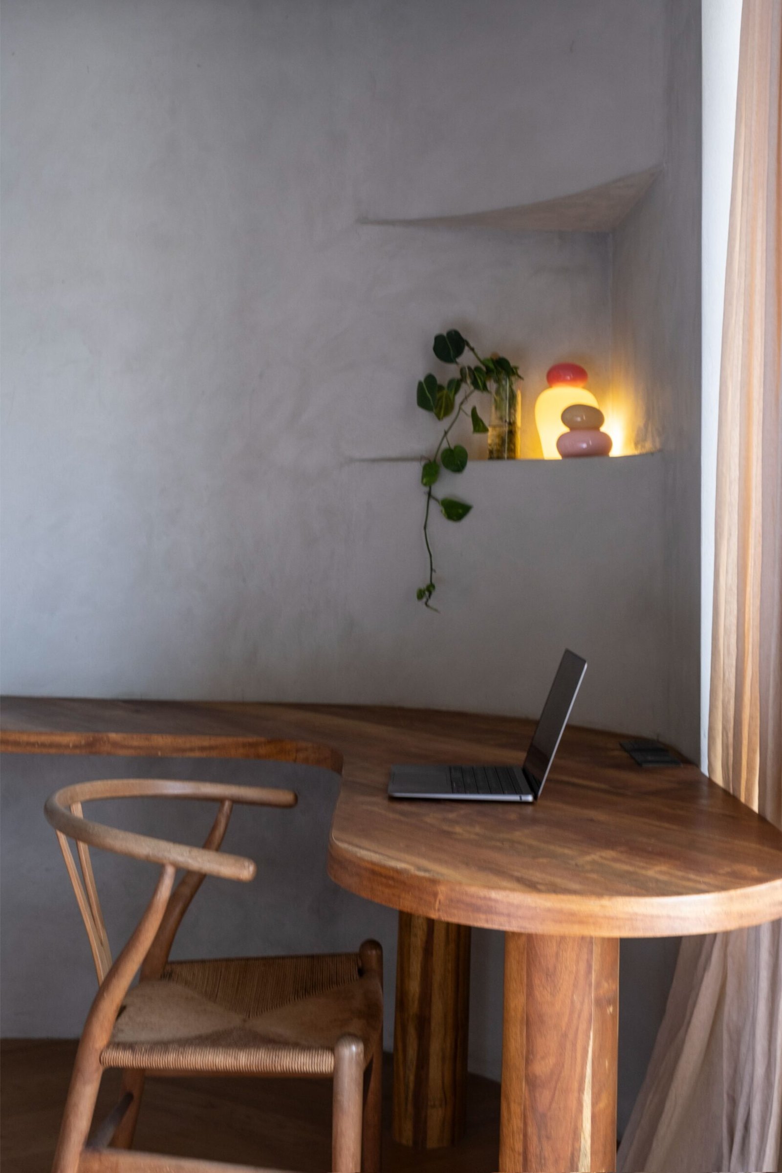
The rounded corners and curves manifested as we waded deeper into the process, and we realized the space just called for them. I also had this realization of how sunny days in the province often feel. On one side, there is shade; on the other, the beach fully opens to light and exposure. I wanted that contrast to show through the gradual transitions within the home. I especially interpret the living area and bedroom to be opposites. The living area is the sunny side, while the bedroom is the shaded area.
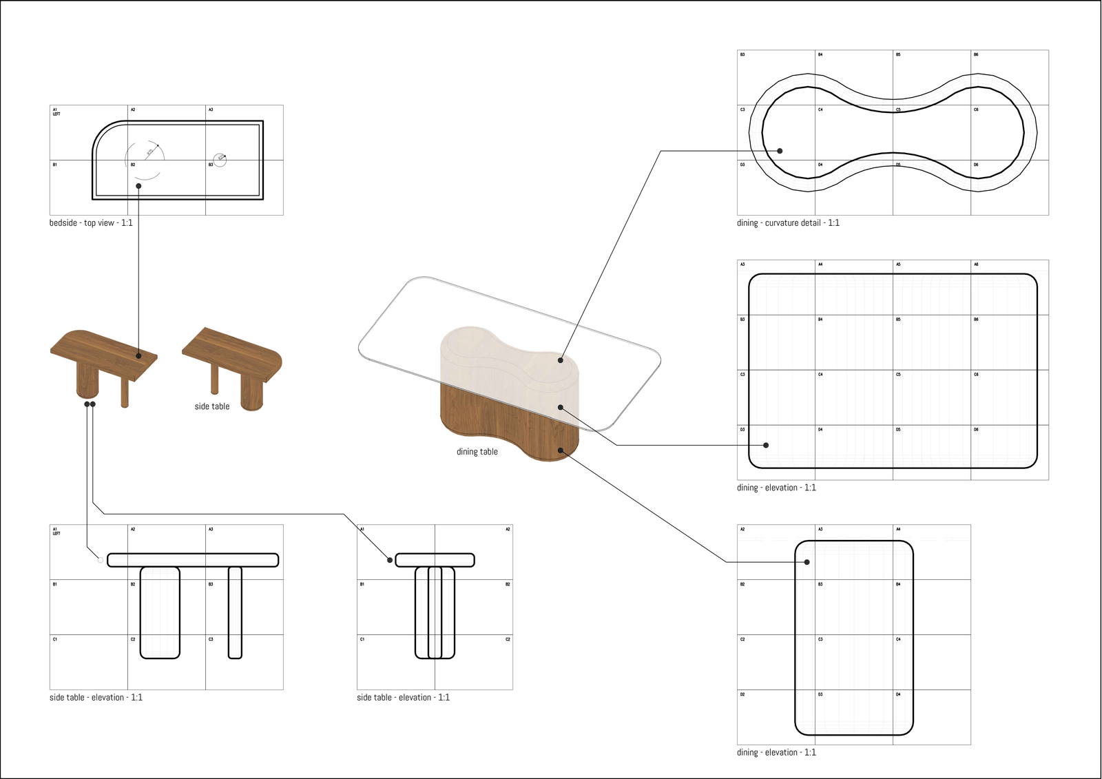
There is also a nod to architectural legends. I learned about this concept of compression and release, as emphasized by Frank Lloyd Wright, in my first job with Leandro V. Locsin Partners, and I always find myself using it. The hallway embodies this idea. At 1,180 mm wide with a ceiling height of 2,350 mm, it is deliberately narrow and low, creating a sense of compression. As you move through this passage, anticipation builds until you arrive at the living area. Here, the space expands from 3,780 mm at the dining side to 4,700 mm near the windows, while the ceiling rises from 2,350 mm at the lower cove to 2,700 mm at its highest point. The release is felt not only in the dimensions but in the way the view opens toward the river.
This continues to more intimate spaces of the home. Entering the bedroom, the ceiling height lifts to 2,600 mm, while the width stretches from 3,700 to 4,500 mm. Even the open closet portion offers a usable span of about 3,200 mm, reinforcing the sense of openness after the compression of the hallway.
In effect, the layout is framed by two larger, more expansive volumes, with the hallway in between creating that moment of tension before release.
Concrete wall finishing at the home was done by Greyscale Concrete Finishes, while concrete floor finishing is by Sanrose.
Building the vision
“While this is my first time working with Steffi and Julian, this is not my first project,” Go revealed. “But I have to admit that this is by far the most meticulous, ambitious, and determined I’ve been, as we had to make adjustments down to spatial requirements that can be as granular as when the refrigerator door is opened. It also helps that the team I worked with here are people I’ve worked with in previous projects, including commissions for our family’s former woodworking studio, Pako PH.”
Working with a familiar team on a project such as this helps ensure the outcome is closer to the plans, as they are already accustomed to achieving the level of perfection you aspire to. But naturally, changes are unavoidable. How much has shifted from design to construction?
With all honesty, I am not after perfection. What I need the designed object or space to be is correct, to simply fulfill what they’re supposed to do. I even had full-sized, 1:1 drawings for everything to ensure the building is done right! Especially for the curves, because poorly executed curves are my pet peeve! If you can’t do them right, then what’s the point?
I find that having these drawings bridges the gap between the architect and the builders, because you can’t expect every person to read your plans as is. This also meant clearer communication between everyone involved and reducing the need for revisions! We spent about a year in the design phase, refining every detail until we were certain of the vision. While that thoroughness didn’t make the construction itself any less difficult, it was the key to our timeline. For a project with this level of custom detail, construction typically would have stretched well over a year. Because of our preparation, we were able to achieve that same high level of intention in just six to eight months.
It’s one thing to have people follow a plan and another to see how something is supposed to look. And I agree that this creates a more harmonious relationship among the people involved, from vision to construction.
How about on the client side? Was there anything from the experience that was new to you in terms of communicating with clients?
Nothing out of the ordinary, just the usual back and forth to ensure things were to their liking. One thing this project called for was redoing the kitchen, as Julian likes to cook and wanted the space to support his system. I’d say he transforms into both a problem-solver and a designer when he is in his element. He had a clear sense of what he needed and would layer details, often using sticky notes to map out what goes where. Once the design was set, he would “role-play” in the space, first in imagination before demolition, and again after the internal structures were in place. In every step, we created 3D models for him to examine and tell us which works. This way, it was more efficient to build or rearrange the kitchen.
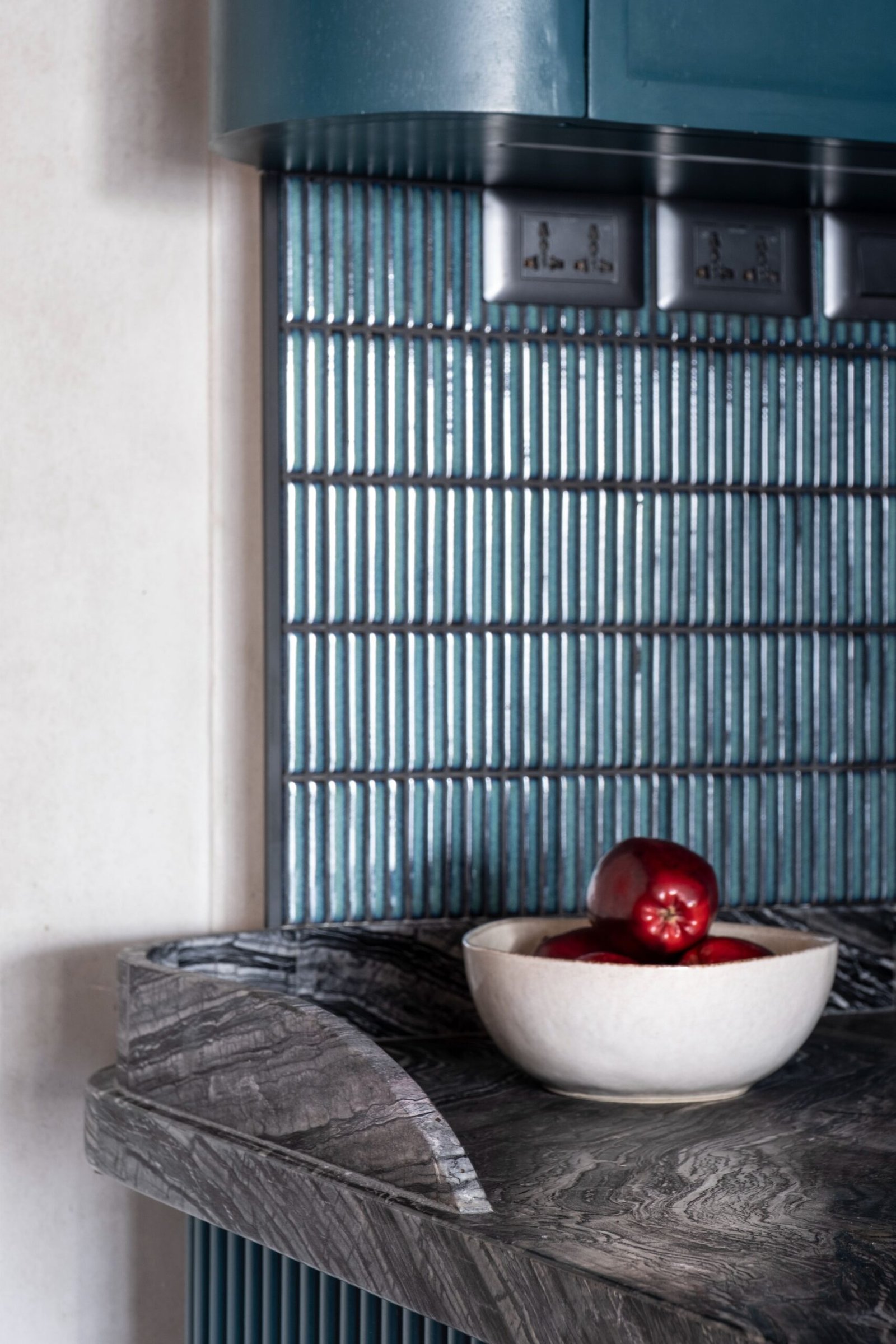
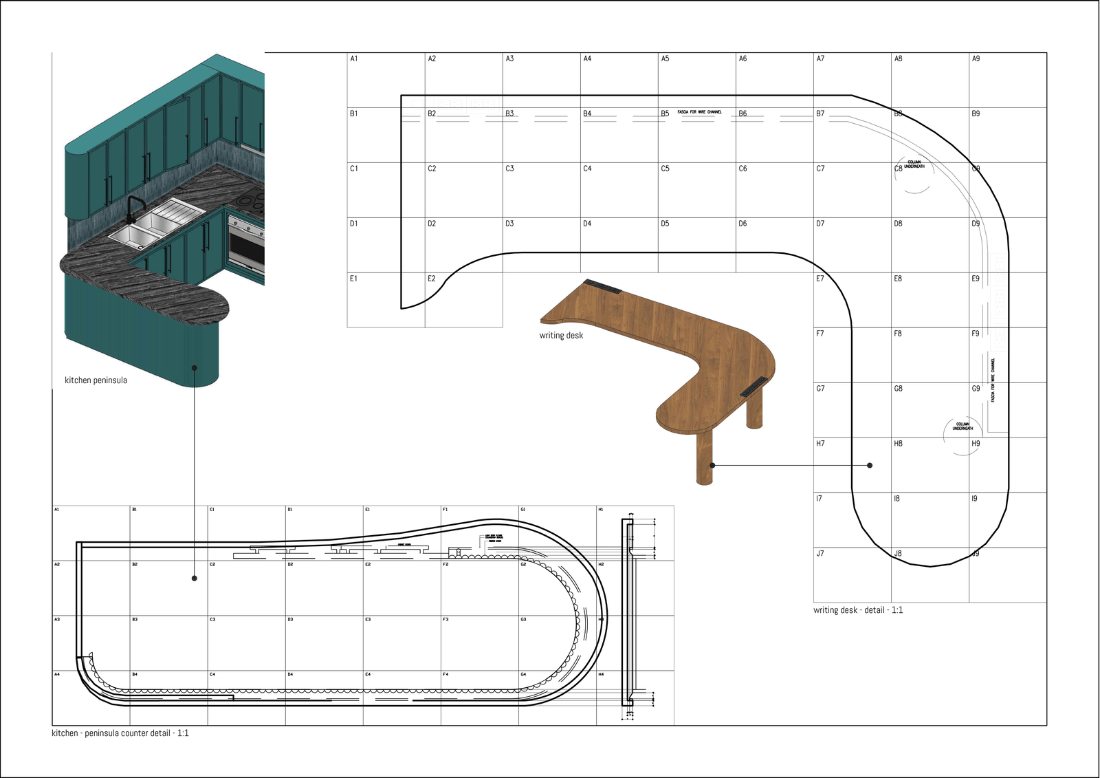
The unit came with an L-shaped kitchen, which simply didn’t align with Julian’s preferences or the overall design vision for the home. We decided to tear it down to better define the space. By keeping the original appliances and integrating a new dishwasher, we introduced a 1,900 by 600 mm peninsula that anchors the room. Curving to 730 mm at its widest, this addition brings the entire kitchen together, serving as an expanded prep area, extra storage, and a casual standing hangout for the family.
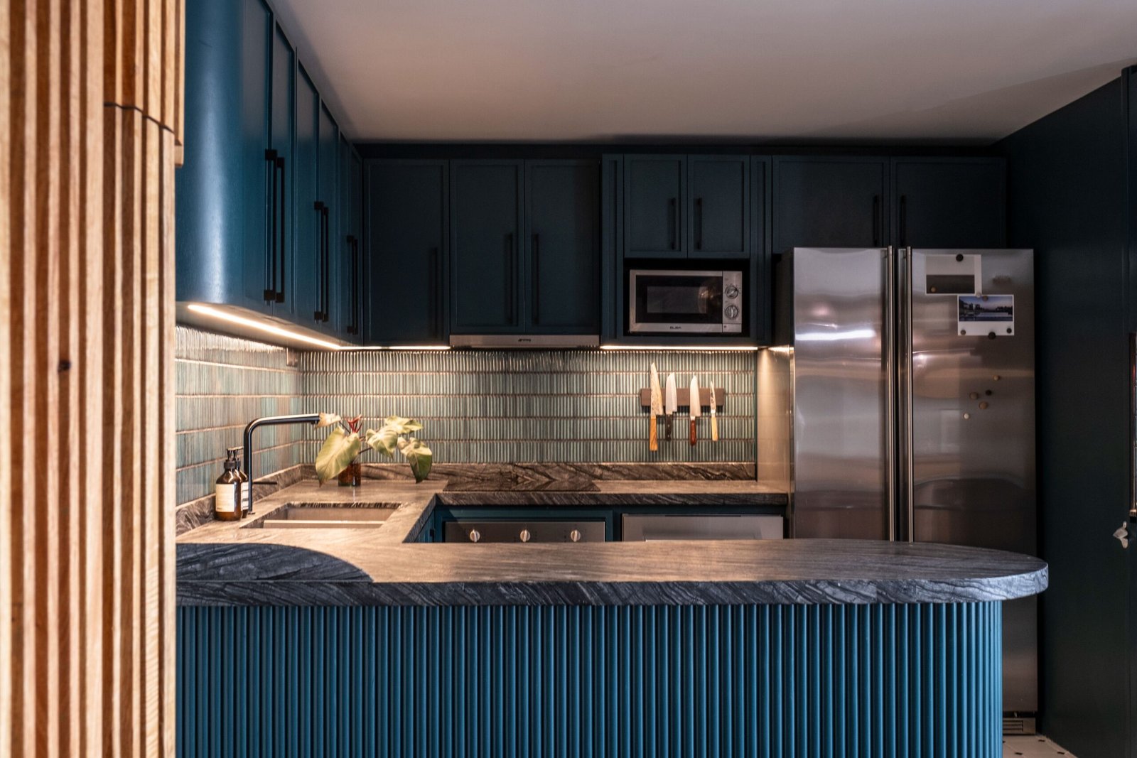
The counter also features a silver wave marble with a leather finish from Eurasia, which did not have a ridiculous price tag. I’m into the inherent value of things and reject society-based value, so I’m happy Steffi and Julian looked at this material’s inherent qualities rather than its perceived value. We also used kitchen cabinet handles from Hong Kong Hardware.
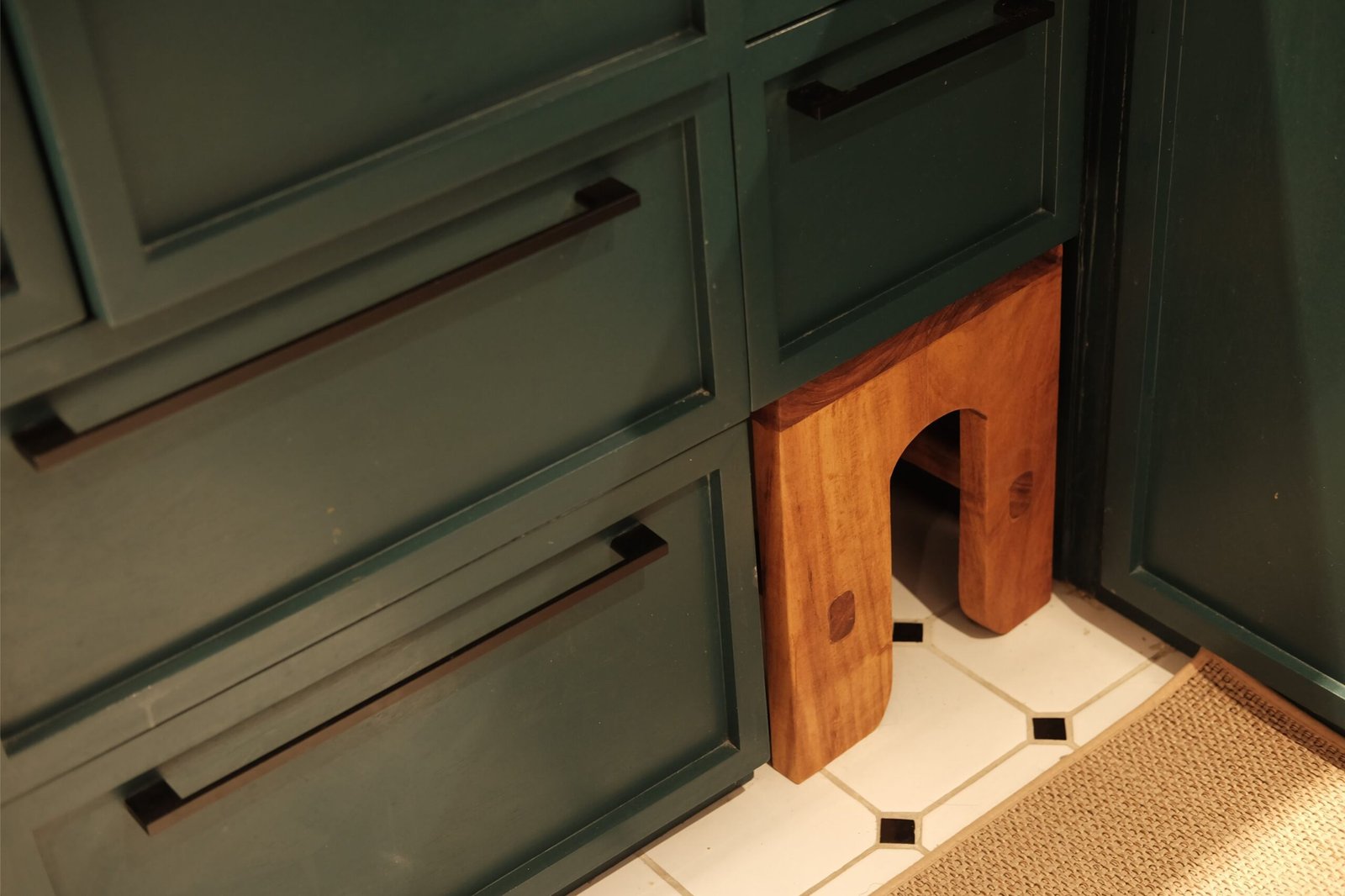
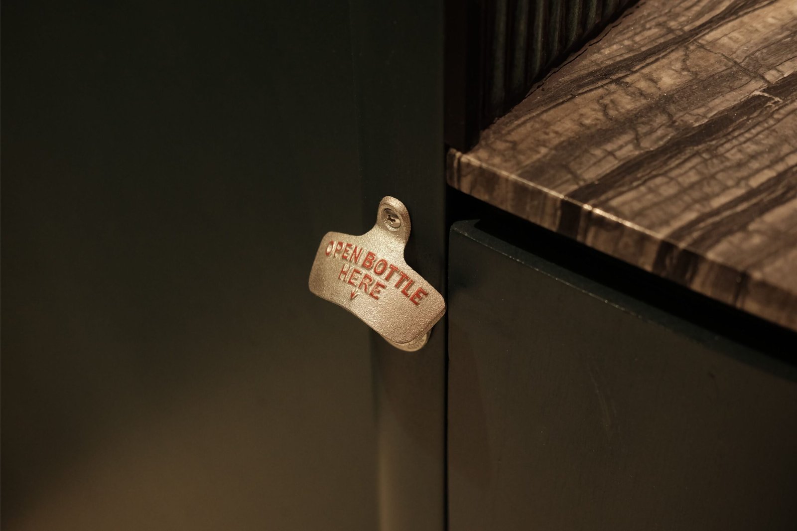
Small things also mattered a lot, such as extra shelving for cups and glasses, a utensil organizer that fit perfectly, and a tucked-away bottle opener. We even dedicated a hollow area in the kitchen for a footstool, allowing users to tuck it away when not in use. We all felt better to give everything the space they needed. We also made sure all the cabinets, not only in the kitchen but throughout the home, had space to hold the lighting drivers. Concealing the drivers keeps visual lines clean and ensures the cabinetry remains orderly. By integrating them into the design, the lighting system reinforces the composed atmosphere we wanted for the home.
In terms of materials, we chose a hex-and-dot floor tile as a homage to Steffi and Julian’s life in London. The kitchen is painted a deep forest green to complement the Kitkat tiles we installed, and to cool the warmth of the wooden cabinetry and furniture in the dining. Both tiles were sourced from Tisa Home.
Details, details
The influence of Parisian apartments and London throwbacks surfaces in subtle ways throughout the home. Moldings articulate walls, storage is disguised, and built-ins carry a sense of permanence without adding too much weight.
“We wanted to challenge the idea of moldings. I drew on Steffi’s inspiration board and translated its visual cues into a spatial element that breaks the flatness of the surfaces while also serving as integrated storage. Looking back, we were all caught up with the details; it was kind of insane,” Go shared. “Steffi has a natural inclination toward honoring original design, a trait likely sharpened by her work. She decided that select pieces had to be flown in to align with her commitment to craftsmanship and design history.”
Can you walk us through some of the pieces the two of them handpicked?
An unexpectedly spot-on piece is the Tom Dixon Melt lamps set chosen by Steffi and Julian for the dining area. It was one of the things they really wanted, which they even hand-carried from Europe! They are available here in the Philippines via Mos Design, but at that time, they already had their trip planned, so they decided to just get them from the source. We also tried out locally available lamps, but nothing fit quite like them. When they were installed, and we saw how the cove’s curvature enveloped them, we knew we had found the right piece.
The Shigeru Uchida October Chairs in the dining area were also their pick, sourced from Midcentury Manila. The original dining table was an 8-seater that turned out to be too big, so the one you see now is an oiled giant ipil-ipil piece we custom-built to comfortably seat six people. Julian’s family is a little bigger than ours, so they wanted to have something with ample space for hosting or gathering, but also cozy enough for their everyday shared meals.
We designed the table with a hollow structure as a strategic solution for the initial ingress and installation. Visually, the table serves as a heavy, fixed anchor for the home, with its thick base offering a sense of permanence.
I do want to share that I later found out that ipil-ipil is classified as an invasive species. Rather than hiding that, I think it’s worth acknowledging, because it is an important lesson. It made me rethink how material choices are made, not just in terms of aesthetics or availability, but also in ecological context and impact. In a way, this reminded me that design decisions are never fully closed. As designers, our material choices evolve even after the object is already built and in use. It is also part of our job to make certain materials, especially local ones, more desirable. I have always believed in the potential of our own resources. Using more local items in this project reinforced the idea, including appreciation for other local wood species that deserve recognition such as the balakat. I hope someone out there starts a plantation, because balakat deserves to be cultivated and celebrated!
How did this shift in the way you think about material provenance influence the overall palette of the home, especially with concrete and other local wood coming into play?
I want the palette to remain grounded, as I’m a fan of things that feel lived-in. Local woods such as balakat bring warmth, while concrete adds weight. Some of the wood is local digaa hardwood and plywood; we oiled and stained them to blend with the rest of the materials.
I’m not a material purist. I select based on feel. Even more so after doing this project, I realized that I don’t need things to be real; I just need them to feel like they’re pulling each other into a sensorially complete experience. That sense of coherence matters more than material authenticity alone.
Lighting plays a central role in how the home feels. At night, it becomes just as crucial as the materials themselves in sustaining that sense of openness and intimacy. How did you choreograph the lighting transitions between social and sheltered spaces?
We had Crystal Ventura from Light Space Architects as our lighting consultant. Programming the lighting was all about communicating between spaces. For example, we had to showcase how the ceiling cove continues from the living to the dining area. For intimate spaces like the bedroom, we had light switches against the headboard for contrast and a feature light to add a bit of flair. In most cases, lighting had to either blend with, contrast with, or highlight certain materials or portions within the space. The default setting is 2,700 Kelvin, so you can imagine how warm it makes everything feel, including Greyscale’s lime plaster concrete.
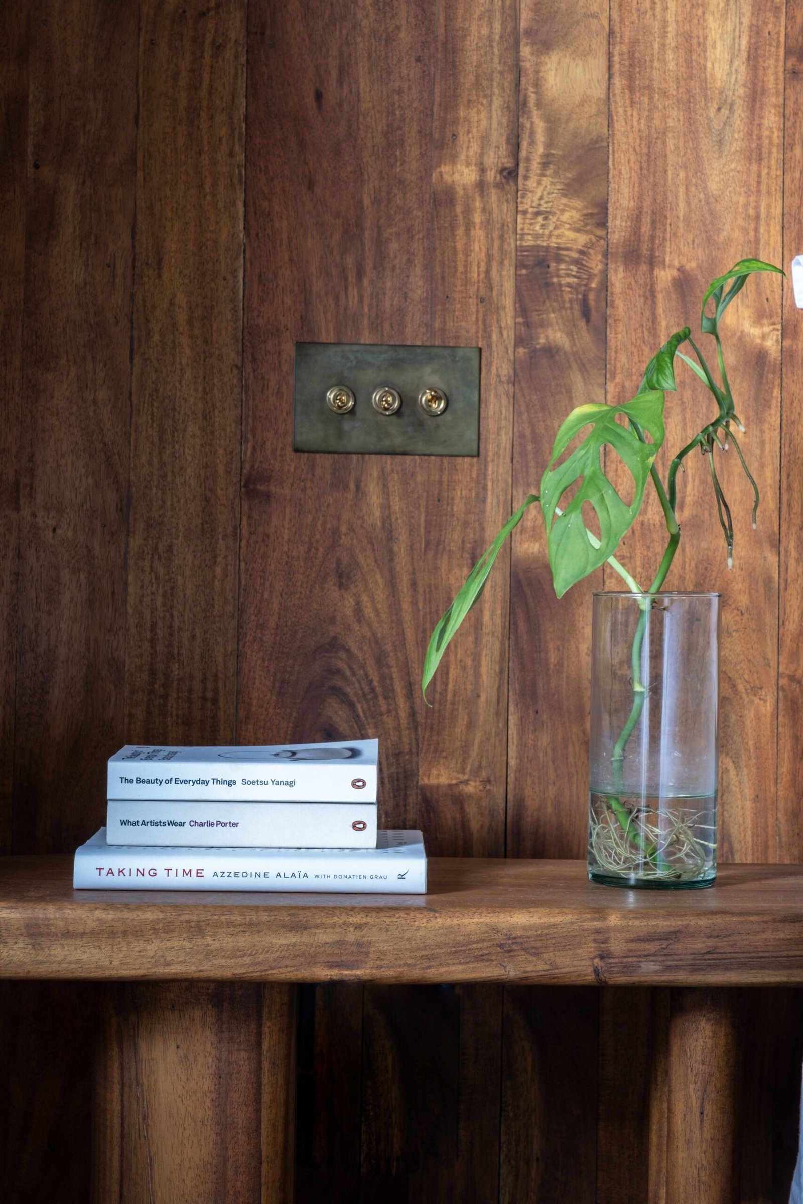
The clients specified antique brass switch plates from Forbes & Lomax. These were also among the things we went out of our way to have, as they are not locally available. While the ‘Invisible Lightswitch’ line is known for its clear and color-matched panels, we chose the antique brass specifically for its character. Steffi had discovered the brand during her time in London and it never left her mind. She and I both felt the local offerings in the Philippines were far too limited. We didn’t want these to disappear into the walls. We wanted them to be visible, beautifully crafted accents that stood on their own.
The switches come with the usual up/down, paired with a rotary switch with a dimming function, though the implementation wasn’t without its hurdles. The standard F&L switches have a maximum capacity of 200 watts, which proved to be a limitation during the build. To achieve the nuanced lighting scenes we wanted, we integrated Casambi add-on devices. While I personally would have preferred a purely analog method of control, this digital workaround allowed us to maintain the level of intimacy and atmosphere the space required.
From flat to home
Riverside Residence is shaped by references—from London, to Paris, to the Philippines. But ultimately, it resolves into simply feeling. In use, the space has proven itself. “So far, they haven’t reached out to me for major changes. They did have two of their old and one of their new air-conditioning units replaced, and needed some help with information on building. They also had feedback for me recently for the tambour doors, adding that the slats needed to be smaller, or had a bigger turning radius to function properly,” Go shared. “I’m hoping that overall, they are happy with it!”
This isn’t far from being your first residential project, but it is your first collaboration with family as a client. How did that dynamic shape the experience for you? And in the greater scheme of things, it appears this project embodied a lot of things you wanted to do as a designer. Would you consider this project an evolution or a break ushering a new design chapter?
It feels like a culmination of my intentions. This is the project that brought together everything I’ve been trying to explore, all my hopes and dreams for how I want to practice. It’s not often that you encounter clients who are this open-minded and willing to go through that kind of process, so in that sense, it’s a huge milestone. I’m not usually the type to put my work out there, but this is one that I genuinely am proud of.
What made it even more meaningful was how collaborative it became. Everyone contributed solutions, from the makers, builders, and the clients themselves. It turned into this shared effort, and because of that, I feel more than willing to give back to the industry by sharing what I’ve learned here. Things like what works, what doesn’t, what to ask for, and how to approach documentation in projects.
At the same time, there’s a practical side to it. Sometimes you just have to leap, but in this case, it only worked because I was also careful. I had a backup plan for almost everything, even for the overall space. And whenever I didn’t know something, I reached out to friends and creative peers like Jeric (whom I mentioned earlier), Vanessa Gaston, Dominique Mayordomo, and Franz Mayo. I made sure I had people to turn to whenever I got stuck. I think I would’ve gone crazy otherwise.
I’ve been practicing as a solo architect for only three years, coupled with five years in Locsin and five years in Pako PH. Practicing on your own can feel isolating, but it doesn’t have to be. You have to learn how to ask for help and surround yourself with the right people. Being part of a creative community keeps you grounded.
Another important lesson I learned from this experience is to lean into what you feel. Intuition is never an exact science. The beauty lies in how it all harmonizes.
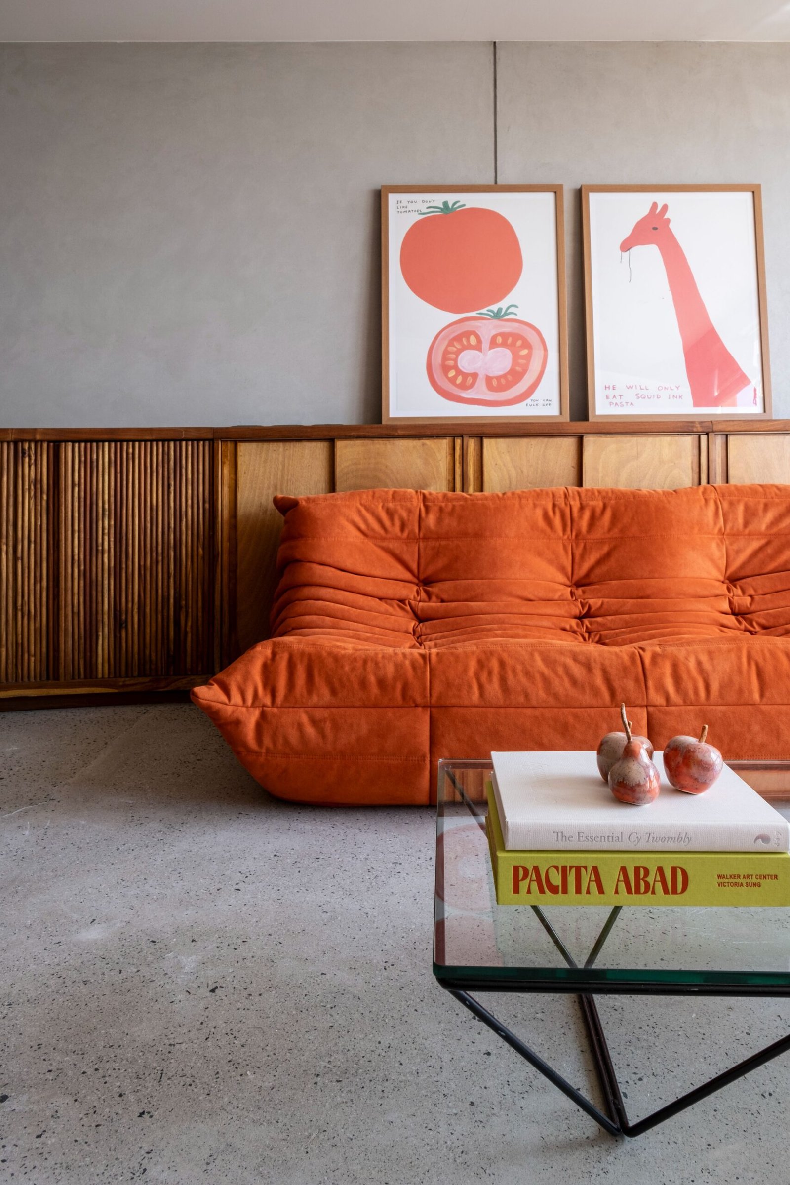
Adding character to the living area are humorous David Shrigley prints.
How has the couple found their new flat in comparison with their European flat? How was the process and experience different when they first moved into these two homes?
I have visited a few times. To me, the difference is obvious in two things: the quality of the build and the concept. It’s easy to see the quality of build in other countries, because here in the Philippines, we are constrained from the get-go. I’d like to think we could compete if the economics were equal.
Steffi shared that even buying things there was easier, since you could talk to people who knew how to troubleshoot certain items. Here, you mostly go through mental gymnastics, and sometimes even feel underwhelmed when you receive your order.
The new home is a step up in terms of space and concept in every way. Their London flat was smaller, about 50 square meters, and was expensive to rent. Here, they get an entire 142-square-meter unit to themselves, designed for them. About 88 square meters of the flat was renovated.
From a positive lens, I hope the narrative is that once upon a time, they were the ones adjusting to their flat, but now they have a home that is made for them to live in and feel alive.
What’s the most memorable comment or anecdote you associate with the project? Something that has stuck with you or affirmed a gamble you made for the space?
One line lingers. Julian’s brother-in-law called being in the space an “uplifting and positive experience,” saying, “it just felt light and is a good place to live in.” It hits because this was what I sought to do when I started working on the project. I just wanted something better for everybody. There was even this ambitious feeling of wanting to do better for the Filipino design industry, because there’s this whole thing about us Filipinos being talented but constricted by circumstance, and I feel like we forget it’s part of our job to inspire each other as well.
For this project, I knew I wanted to leave something behind if it ever made its way into the world. Just like the river it looks out to, holding both memory and possibility.
In the end, the space was reshaped into something lighter and calmer, all while learning to keep what doesn’t need changing. In all the ways that matter, I hope it feels like coming home every time its residents open the front door. •
Project Information
Location: Makati, Philippines
Total floor area: 88 sqm
Completion: August 2022
Project Team
Architectural interiors: Pierre Kayser Go
Clients/collaborators: Steffi and Julian Cua
Contractor: William Brothers Manila
Engineering: VBo Architects + Engineers
Lighting design: Crystal Ventura / Lightspace Architects
Landscape consultant: Zayra Bulawan
Lighting supply: Sparklight, Greengroup Inc., Hafele
Planting supply: Ayzaris/Zayra Bulawan