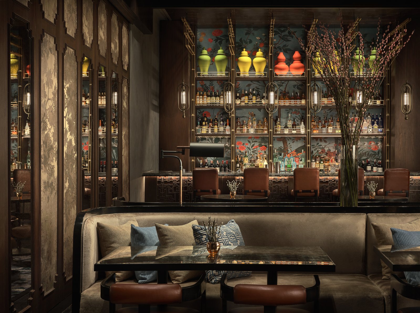
Columnist Judith Torres With Isabella Robles Go
Images EDG Design
“I was in awe when you sent me the photos,” says Isabella Robles Go, founder and principal designer of Living Innovations Design Unlimited in Iloilo City, Philippines.
To prepare for our interview with EDG Managing Director Michael Goodman, I sent Robles-Go the photos, floor plan, and fact sheet of one of EDG’s latest projects, The Chinese National restaurant at the newly opened Swissôtel Jakarta. The digital packet included write-ups on EDG Design, an American firm with headquarters in San Francisco, and the team members of the Singapore office that worked on the project. Also included was a transcript of my interview with Piya Thamchariyawat, EDG’s creative director for the firm’s Middle East, Asia, and Australasia projects, who showed me the swatches and sources of inspiration for the restaurant’s design story, F&B concept, design elements, and interior design.


Michael Goodman, EDG Design Partner and Managing Director 
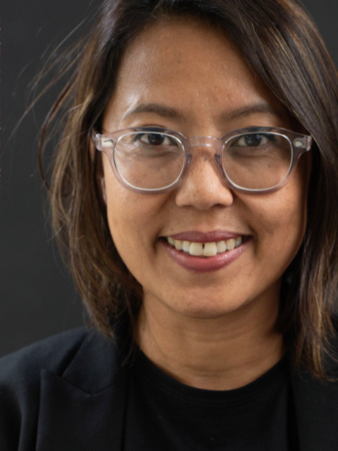
Piya Thamchariyawat, EDG Design Principal and Creative Director
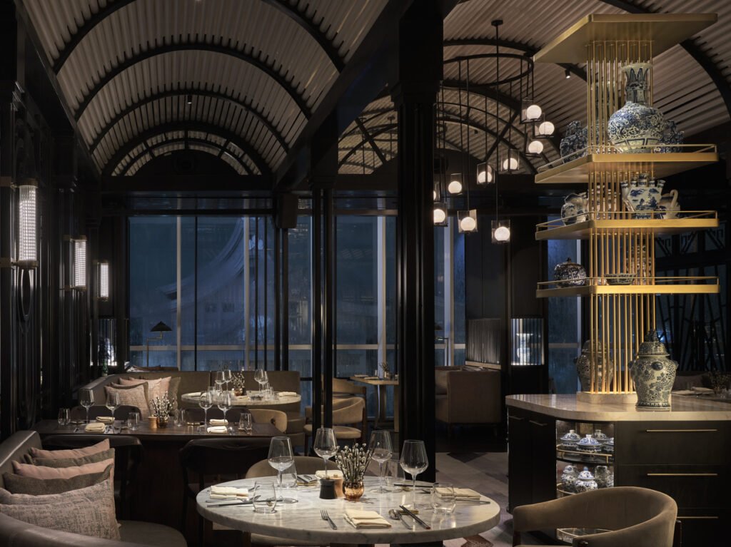
The 885-square-meter Chinese National is an exquisite fusion of Art Deco, Shanghai and Hong-Kong chinoiserie, and industrial chic. In the morning, it seats 260-plus hotel guests for breakfast. After breakfast, it transforms into four Chinese specialty restaurants that offer distinctly different culinary experiences.
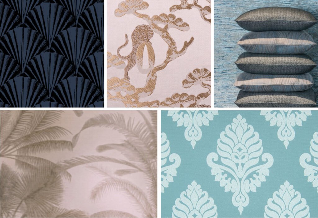
Asked what went through her mind when I invited her to be my partner in the maiden issue of Kanto’s Optimistic Critic and Form Follows Values columns, Robles Go said, “I’m very young in the practice and still have a lot to learn. I didn’t think I was in a position to critique the work of an award-winning global hospitality and branding studio in Singapore. But I was excited that I could ask Michael firsthand about their approach to design projects, their methodology, values, and company culture.”
We were given an hour to talk to Goodman on Zoom. I allocated time limits to a list of questions to ensure we would cover sufficient ground and make the three-way conversation a satisfying experience for Robles Go.
It was a packed one-hour as Goodman, a former executive chef based in California and then Bali, who now owns three restaurants in Singapore (designed, of course, by EDG) generously explained the thinking behind the firm’s processes and priorities. This took us off some of the nitty questions we wanted to ask about the restaurant, but gained us inspiring insights for design practice.
Looking back at Goodman’s interview transcript, what struck me, apart from the extraordinary depth of EDG’s scope of services, was how Goodman, who heads EDG’s Singapore office, started and ended the interview praising his design principal, Piya Thamchariyawat. Goodman’s lavish praise of her work speaks to his character and leadership style and to EDG’s corporate values.
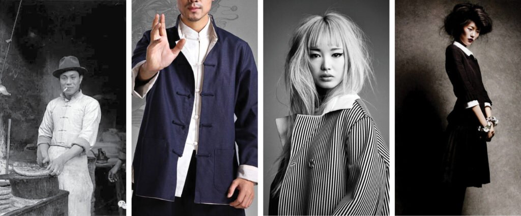
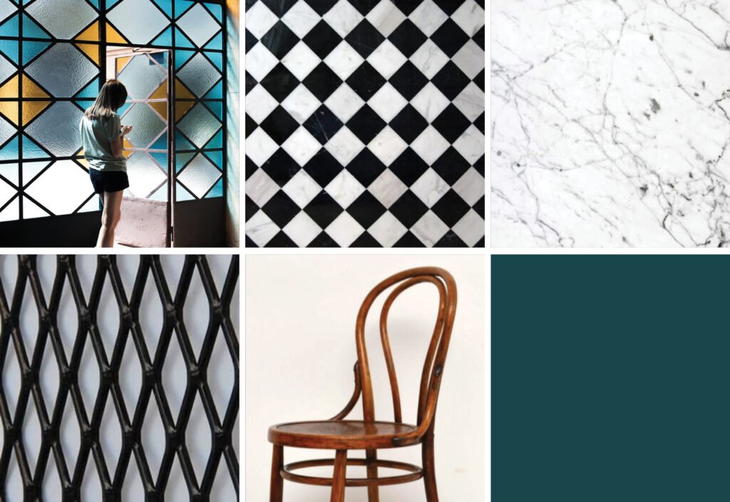
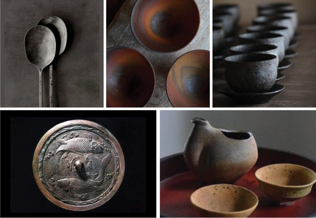
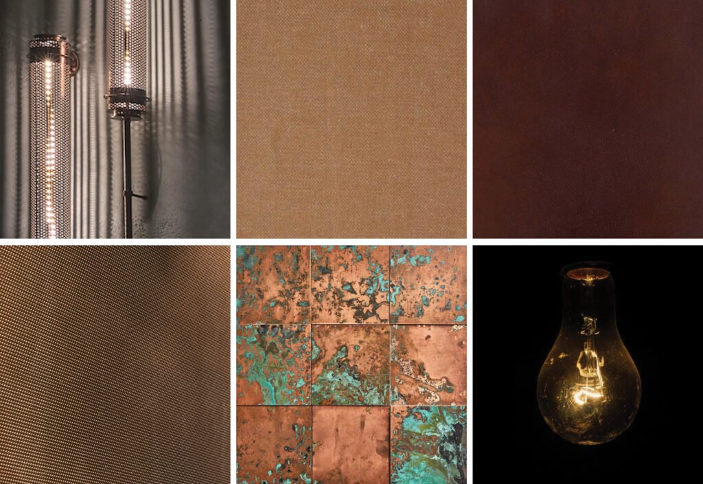
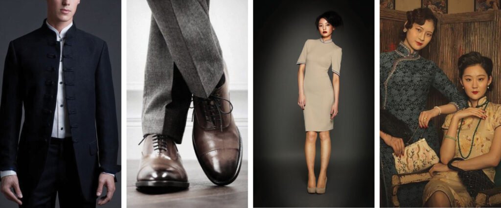
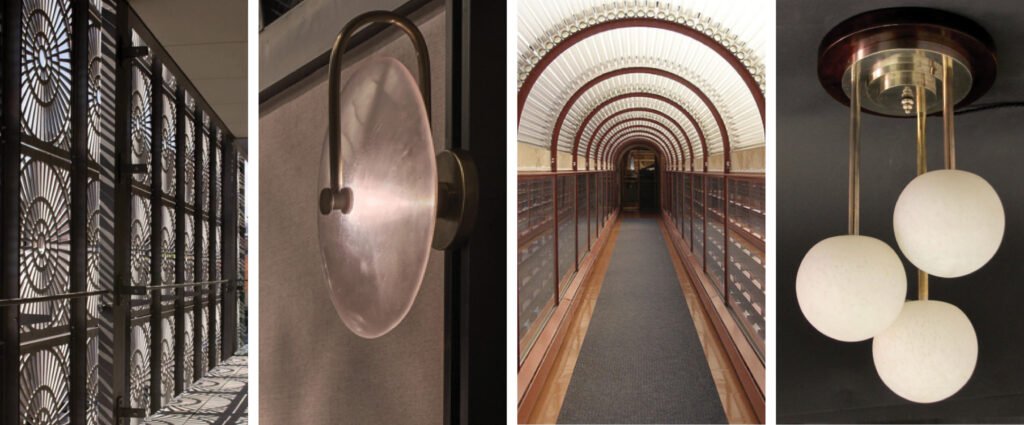
Note: Except for photographs of EDG projects, the images in this article are meant only to simulate those used in EDG’s schematic design presentation and mood boards for The Chinese National restaurant. The credits for non-EDG images are listed in the endnotes.


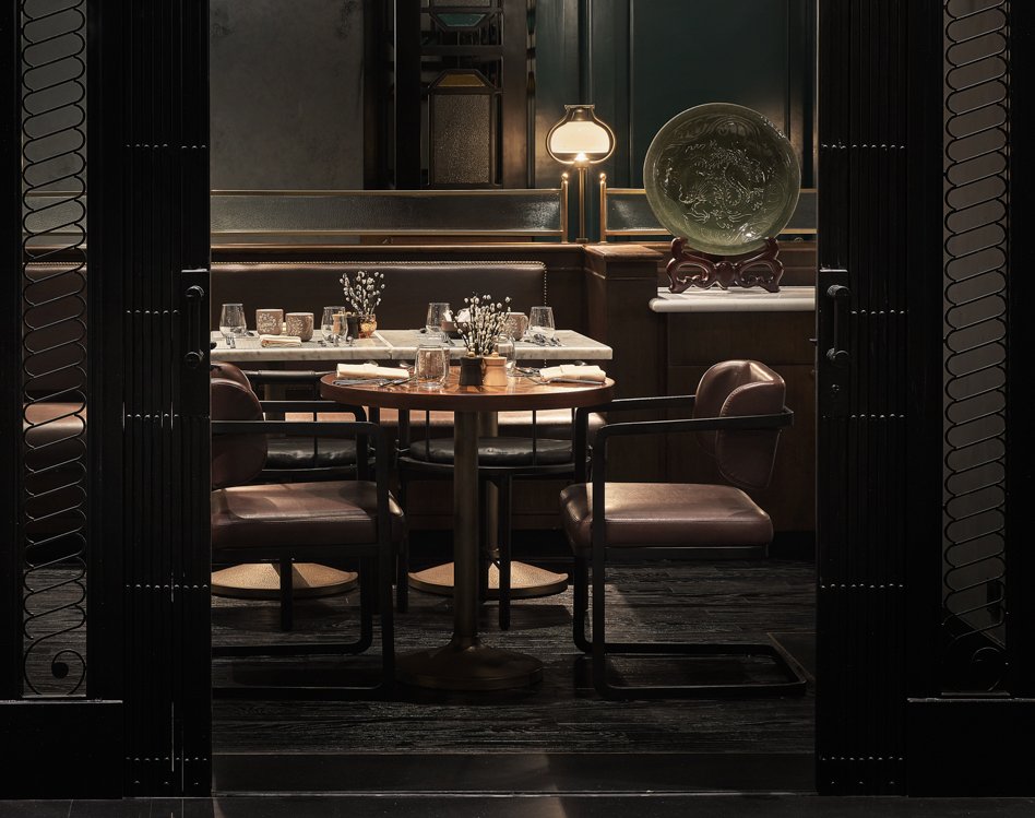
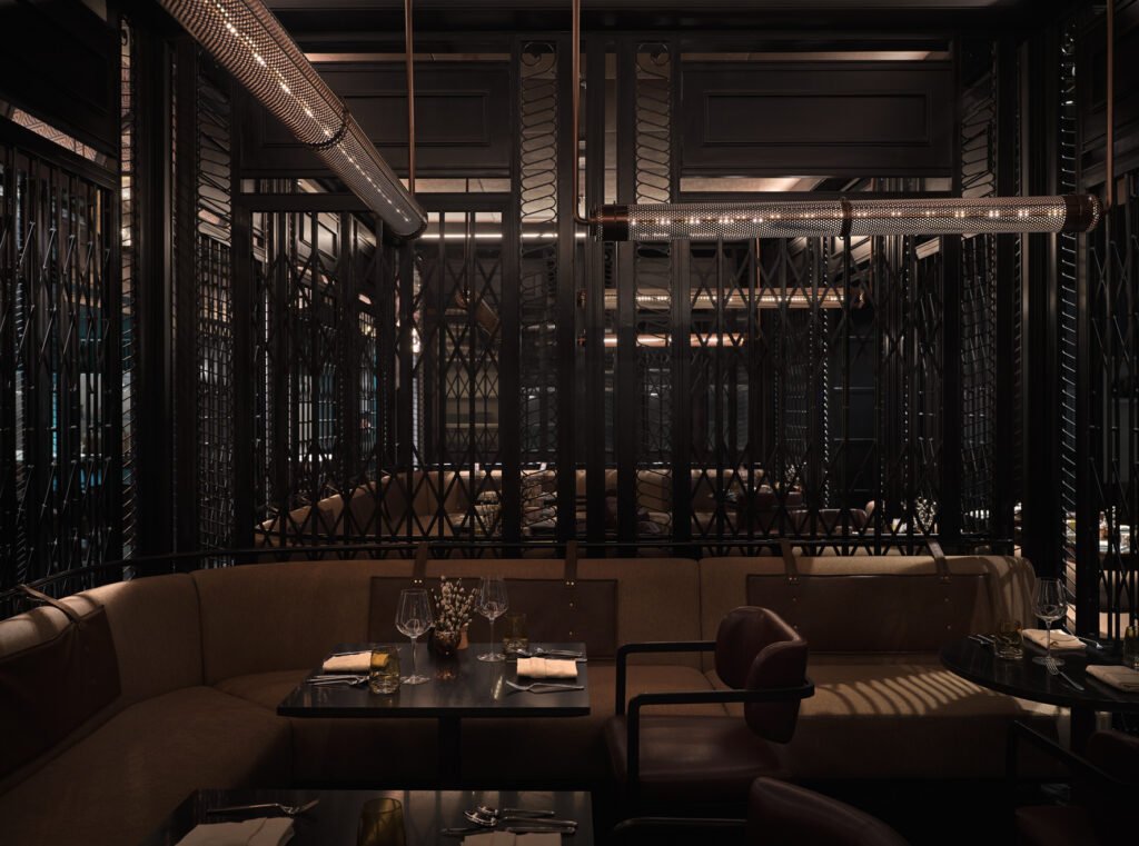
The Chinese National’s noodle and dumpling restaurant, Iron Needle 
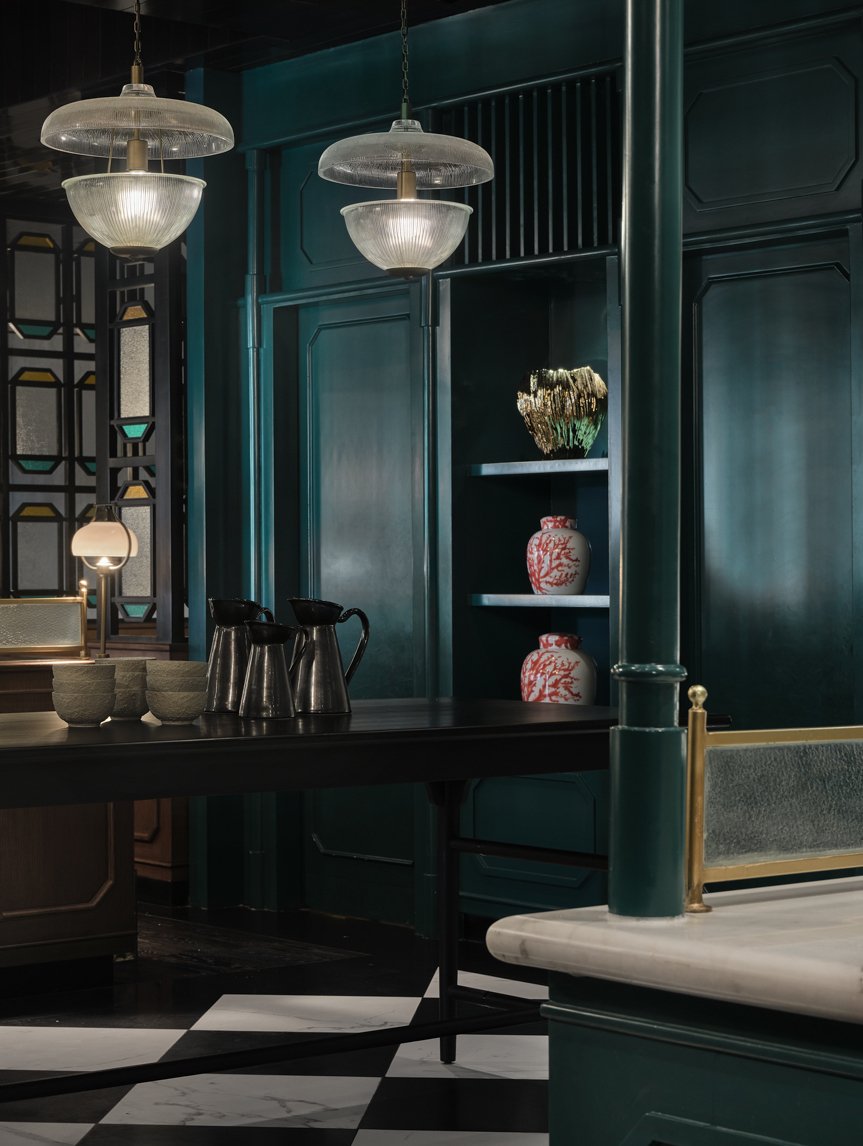
The Iron Needle can accommodate 56 guests at a time.
Robles Go: Before we start, Michael, I’d like to say your designs are amazing. And I am so inspired by the way you think of interiors and how you integrate culinary discipline with interior design discipline.
Goodman: Thank you. We’re pretty excited about what we do. Piya, who Judith spoke to previously, makes beautiful, beautiful design work. She and I play different roles in the project, so there’s a true collaboration there between the two of us.
Robles Go: For the first question, what were the requirements of the client? And because you are a multi-disciplinary team, where does EDG’s scope start, and where does it end?
In terms of what the client asked us for, there was little brief for us. She needed an all-day dining restaurant, and she needed a certain number of breakfast seats (around 260). She has a father-in-law who loves Peking duck, and he’s chairman of the company, so they wanted to have the best Peking duck around. They are in a Chinese neighborhood, so that was important to her, and she was excited about having a Chinese direction. That was pretty much it! She wanted something exciting and hip and cool. There wasn’t a lot of guidance in that regard, either. So we set out from that point, and that’s when our scope begins.
Now in other projects, our scope begins before that. Sometimes our scope starts with the client saying, “I have this building. Tell me what I should do.” And then we go out and do a market study. We review the demographics and the psychographics, understand what’s available in the market and the best business decision for our client. We’ve got a strategy division that works on that. But in this case, it’s the creative brand that really puts this restaurant on the map.
Our scope includes everything from graphics, menu design, tabletop design to pre-opening support. We didn’t do the menu design on this project, and we didn’t do the logo, but we did name everything. Every project varies. But the entire concept of the venue, the fact that it’s four venues in one, the fact that each venue meets a different price point and a different market segment, and the brand positioning of all four venues—that came from us, along, of course, with the design and execution.


Robles Go: Wow, that’s a massive task for the team! Here in the Philippines, interior designers design interiors. With EDG, you’re involved in the entire process, including the business side.
Yeah, and that’s not just the Philippines. To be honest, that’s what it’s really like in most places. There are a few firms that go above and beyond interior design. You know, it’s hard for me to say that we’re multi-disciplinary because when you say “multi-disciplinary,” people think, oh, you do architecture, engineering, interior design, and so on. What we do is another kind of multi-disciplinary.

Torres: It sure is, doing the identity design, marketing, even the F&B.
Yeah, we’ve got brand positioning. We’ve got brand development. We’ve got market strategy. So it is multi-disciplinary. It’s just not what people typically think of when you say multi-disciplinary. We consider it a vertical approach wherein we’re trying to hit every aspect of the process to give the owners the best chance for success.
When we were kids in the States, we would play the “Telephone Game,” where there are twenty of you, and you think of something, whisper it in one person’s ear, and then they whisper it in the next person’s ear, and he in the next person’s ear, and so on. And you see that what the last person hears is always different from what you started. The model for the way the design industry is set up is just like that. Somebody comes up with a concept, and they tell it to somebody else, who comes up with a brand positioning. Then they tell it to somebody else, who comes up with the interior design, and they tell someone else, who does the graphic design, and they relay it to somebody else. And you end up with a mish-mash of different things. By being a part of everything in the vertical, we can make sure the outcome is as originally intended. That doesn’t mean the design doesn’t develop or transform. It does. That’s a natural part of any progress. But instead of it being all over the place, we’re able to drive towards a solid concept that makes sense. One of the biggest things that helps a restaurant become successful is executing a clear concept through all the aspects, including the tabletop.
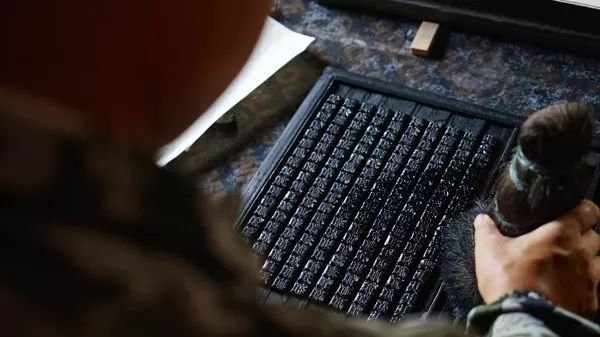

Torres: Yes! I saw the presentation material with the swatches, the tabletop concepts, and uniforms—everything was conceptualized. Awesome.
Yeah. First, we had to develop the F&B concept, and then we start to tell the design story. We actually develop a menu—the types of food items in each restaurant, the types of beverages that might be in each one, the uniforms, tabletop, all these things. The idea is to paint a thorough picture of what the experience will be so that everybody working on the project can really see it. It’s one thing to say the words “Art Deco” or “Modern” or “Industrial,” but those same words mean different things to everybody else and how, potentially, it would look. So when you see things visually, when you paint a thorough picture, it really starts to frame the concept together.


Robles Go: That’s brilliant. A brilliant approach to business and design. Tell us what the timeline was like. How long did conceptualization, design, and construction take?
Let me take you through a typical project, not The Chinese National because I don’t remember it off the top of my head, although I don’t recall it being atypical.
Typically, the whole conceptualization process starts with the F&B concept, which takes us three or four weeks to put something together. Once that’s approved, we get into the entire interior design process, say, six to eight months.
Once we’ve started the interior design, we don’t wait until the end to start working on the graphic design. Most projects wait until the end before they do the graphic design. We bring the graphic design in within the first two months of interior design. That way, if we want the interior design to influence the graphic design, or if we want the graphic design to influence the interior design in any way, we can do that. So any motifs generated during the graphic design process within the first two months, we still have the opportunity to make sure those get involved in the interior design.
From there, the client would tender, and that usually takes a couple of months before they go into construction, which depends obviously on the state of affairs, and which can take anywhere from three to four months to three to four years. I’m working on a Saudi project right now, it’s the tallest building in the world, one kilometer high, and I think I’ve been on the project already for five years, and I have no idea when it’s going to open. I believe they are about a third of the way up. So the construction time varies from project to project.


Torres: How does the menu or food offering affect the design?
The menu doesn’t necessarily affect the design per se. If I gave you five menus—a fast food menu, a bar menu, a casual bistro, an upscale restaurant, and a luxury Michelin star restaurant—reading the food on the menu does several things. You would have an understanding, maybe not what the whole restaurant is like, but you would begin to understand its positioning and how much something might cost. The fast food menu might have some fish and chips on it, the bistro menu’s got oysters, and the luxury restaurant has a tasting menu. You have a picture now of what’s happening. I don’t think the food necessarily influences the design per se, but all of it creates this holistic image that helps you visualize: Is this a restaurant where I’m going to spend five dollars? Five hundred dollars? Or anything in between?
And even though it doesn’t have prices, you get that sense—Is it a restaurant that’s meant to be gone to every day? Is it a place I’d go to lunch rather than dinner? I think you start to see all of this when you begin to picture the food. And that’s why we have a lot of food imagery on our menu and schematic design. We’re always showing what we expect the food might look like. To really help people with their visuals and understanding.
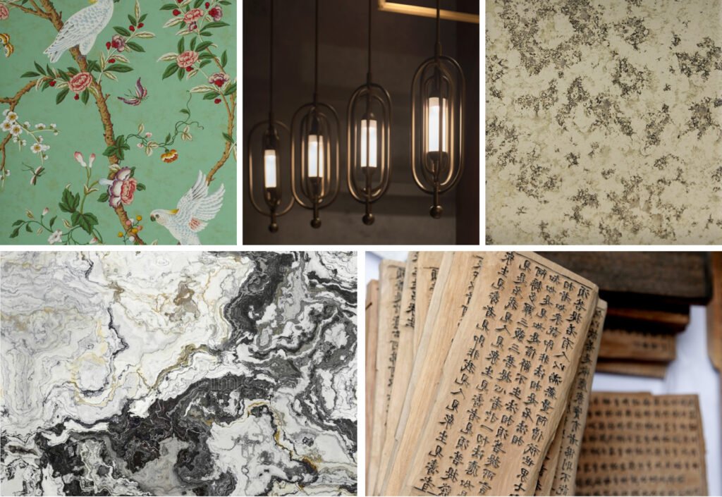

Torres: Which comes first, the food or the business plan? And how involved is EDG in crafting the business plan?
The term “business plan” can mean different things to people. We don’t provide financial support. And we’re not providing projected profit and loss statements, pro formas, or anything like that. What we provide is a business strategy for the clients to build their business plan from. And so, what always comes first for us, whenever possible, whenever a client will bring us on for it, is the strategic foothold.
I’ll give you an example. We did a project in Brisbane. We looked at what was around town and what people thought they wanted from a food hall in a Brisbane CBD. The owner was really thinking of fast food. But when we looked at who lived in that area and saw all the numbers, we realized that there was actually a huge market for something better than fast food, but there was nothing better there than fast food! There was no go-to culinary destination for city-goers. We were going to gear this place for lunchtime and weekend traffic, but there was a massive opportunity for culinary exploration for tourists and others. There was an opportunity to create something here that people would use on an everyday basis.
We didn’t come up with that idea until we looked at the numbers and the statistics and saw who was there. Who were the people that were there? And what did they want? There’s a difference between knowing the demographic (who is a person) and psychographics (what does a person want). It’s essential to get to the psychographics and not just look at how much money a person has and how old they are. You have to understand what market segment they’re in. And that varies significantly from location to location.
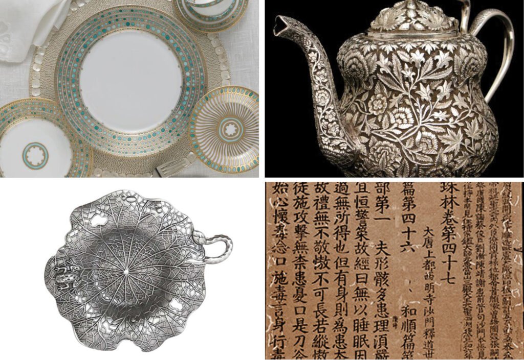

Torres: So where does market study fit in, and how long does that take?
That would be before the F&B concept. It would take six to eight weeks. It’s usually done for the larger projects. When people do a single restaurant, they don’t often ask us to do it. It’s usually when someone needs to reposition an entire property or a mixed-use development.
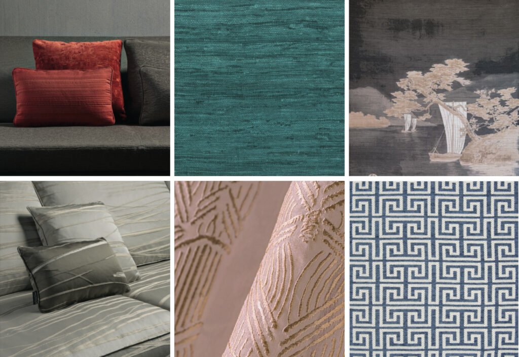

Robles Go: Let’s go back to The Chinese National. There was another team, right, that did the back-of-house?
Right, right, we don’t design kitchens. We’ll design the front-of-house kitchen or show kitchen, and we’ll design the critical pieces of equipment. For example, if you’re going to have a duck oven, we’ll say we want the duck oven here, and the display over here—that kind of thing. We don’t do all the little sinks and fridges. We just say, “Here’s a counter, you go under there.”

Robles Go: Just up until that point? Not on the flow of the back-of-house affecting the other entrances of the restaurant?
The thing we always do is walk through the space when we’re designing a floor plan. And as we design seating, we try to sit in the space. We have to really use our visualization. Now with SketchUp, it gets a lot easier. But the truth is, we don’t get to three-dimensional SketchUp most of the time when we’re in the planning stage. Usually, it’s just Piya and me picturing what it’s like three-dimensionally in our minds. We try to envision what that’s like—her from a design perspective, me from a strategy and operations perspective. So she’s thinking about the look and feel while I’m thinking how people move within the space—from space to space and area to area.
And we’re both thinking about the emotions of the people in the space. What are the emotions of the guests? And what are the emotions of the staff? You want a successful restaurant; you can’t leave out the staff. They are the single most important thing driving the restaurants’ success. It’s critical to envision that. Piya spends a little more time on the guests, and I spend a bit more time on the staff.

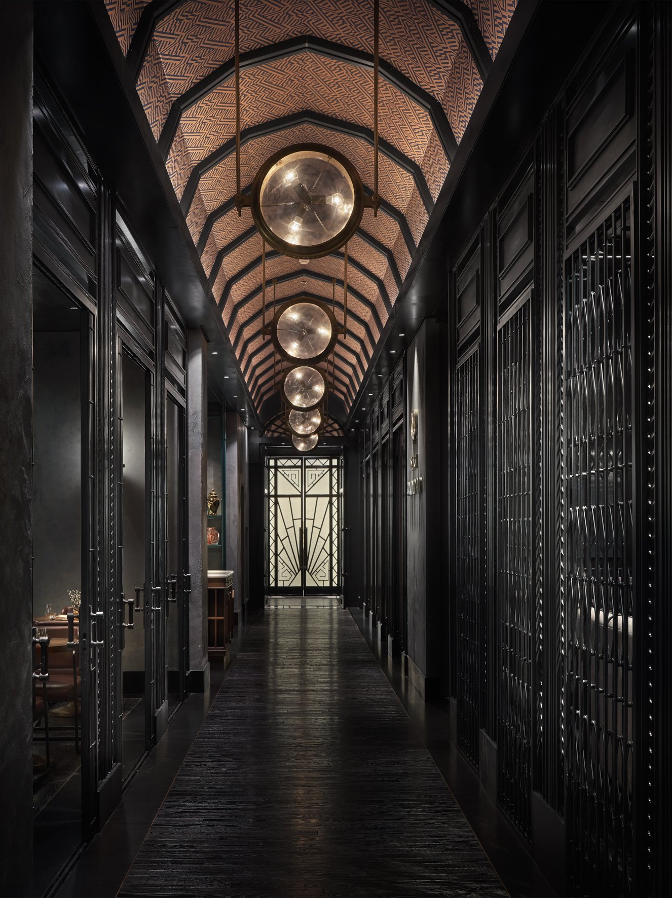
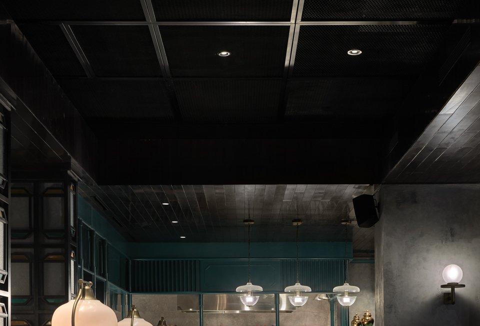
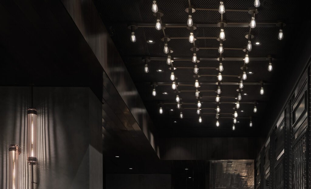
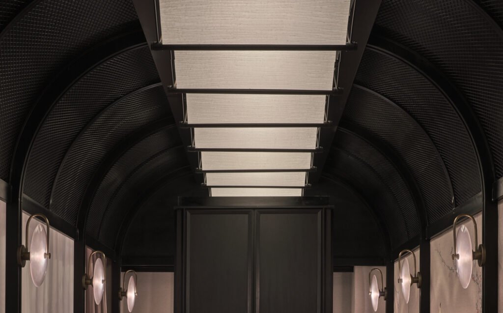
The Chinese National’s 50-meter-long hallway. The doors on the left open to Iron Needle. The grills at the near right enclose Szechuan dining Black Powder Red and further down, Letter Press 
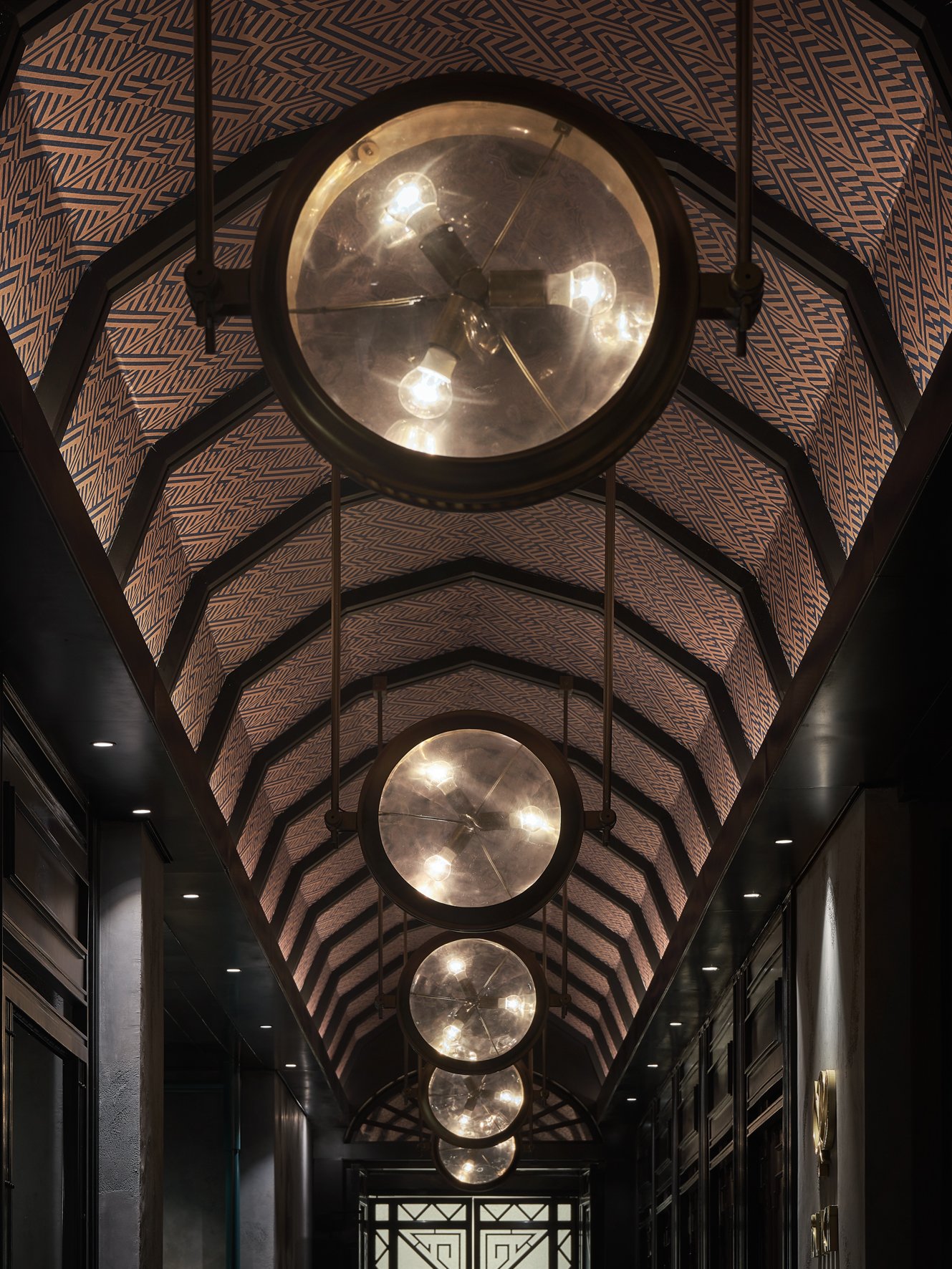
Custom-designed orbical luminaries inspired by Shanghai Art Deco are suspended from the hallway’s segmented arcade ceiling. Bold geometric patterns line the whole length of the hallway’s ceiling.
Torres: Could you describe the emotions you pictured for the customers and staff?
Sure, yeah. For The Chinese National, the emotion starts when you walk in. You have this massive Art Deco corridor that is just, I mean, it just hits you over the head. We wanted this powerful sense of arrival. We wanted this whole thing to have a spine that everything came off of. And that spine really brought everything together and held everything together, so it all works together.
We needed to make sure that as guests walk through the space, they didn’t feel like it was jarring in any way. So when you’re designing four restaurants that all work off of one spine, it could be jarring to go from one space into another space because they look totally different.
That’s an emotion that would be uncomfortable, right? If you go in and have this jarring experience, it feels like you’re in a shopping mall or something. But we want you to be in the experience from the minute you get in and stay in the experience the whole way through.
We didn’t want to have completely different experiences. We wanted to have a tiered experience financially, of different market segments of what people wanted at different times of the day. We wanted you to enter one story, and you’re just in different chapters of the same book, right? Unlike in a retail mall, where each store, each restaurant, is an entirely different book.
So, we’re thinking about how a guest might feel this. Now a guest may not walk in and ever go, “Oh! It’s like a book with different chapters!” Of course, they don’t know that. But there’s this emotional connection that can happen when you do a space well, and that’s what we were shooting for.
And so, to make sure that everything was not jarring, we set a rule for ourselves—the floor, wall, ceiling for the main architecture is the same in all venues. That way, as you went through the space, you saw a repetition of floor, wall, ceiling that brings it together, like a thread that ties it all together. You were then able to differentiate each space’s decoration off of that floor, wall, ceiling, and identify with those “chapters” that we talked about. That is the experience we wanted to create emotionally, and I think that’s the experience you have when you walk through The Chinese National.



Torres: And for the staff? What experience did you want them to have?
The experience for staff, no matter the restaurant, is always the same. Let’s make their jobs as easy as possible, with as few obstacles as possible, so they can focus more on time spent with the guest, getting the guest what they need, and less time fighting their environment. How close does the service station need to be? How big does the service station need to be? What needs to be at the service station for everybody to successfully do their job?
It’s as simple as: Where will they get their water from the water pitchers and the bottled water? What happens when they have to reset a table? Where are the napkins and the tableware? All of this plays into the design. How many steps do I have to take to get to the food? Is the food going to get cold by the time it reaches the table? If the guest asks me to check on something in the kitchen, will it take me five minutes to get there? And when I come back, is the guest going to be annoyed because it was too far? How do we do all this? How do we identify the shortest ways to make things successful?

Torres: Yes, with an area of 885 square meters, not counting back-of-house!
That was why, with The Chinese National, we have the main kitchen, and then we have the satellite kitchens that deliver food. And so if you’re ordering something in the Szechuan restaurant, Black Powder Red, it’s not coming from the main kitchen. It’s coming from the Black Powder Red kitchen. And the Iron Needle food comes right out of that Iron Needle kitchen. And because Iron Needle is right next to Letter Press, any food for Letter Press is designed to come out of Iron Needle because that kitchen is right there. Now, the Szechuan kitchen is also pretty close. It’s probably 20 steps away. But why make a server go 20 steps when you can ask them to go three?
All that happens in the planning stage when we’re thinking: Do they have what they need? Is the space big enough to put the equipment that they need? Is it close enough? That’s what we always do. The emotion with staff is always the same: success, fewer obstacles, keep them happy, less wear and tear on their feet and bodies. It’s a physical industry. Let’s make it as easy on them as possible.





Robles Go: I’m so filled with emotion right now! I’m so inspired by what Michael just said I have goosebumps!
(Goodman smiles widely) Aw!
Robles Go: My family owns a restaurant, but my design knowledge is limited to our restaurant’s functions. Now I’m learning about other types of restaurants.
Yeah, yeah, the type of service matters, right? Quick service restaurant, where you order at the counter. You don’t need as many service stations and things like that. It’s about thinking through and understanding what the workers are doing.
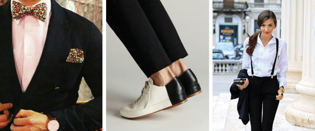

Robles Go: I love Letter Press because it’s the most colorful part of the restaurant. Why so? And why is it closed during the day?
It’s not closed during the day. During the day, Letter Press is a tea lounge. And at night, it becomes a cocktail bar. All the panels to the corridor, the main spine, are open during the day. Then there are panels to close off the bar, so you can’t see the bar during the day.
We wanted the tea lounge to have a sense of luxuriousness to appeal to that market. The whole thing is attached to a mall; we wanted people who are shopping to come on up (to the 7th floor) and have a little afternoon experience, a post-shopping or shopping break. And for that, we needed brightness. We felt that color was a good option here. It also took us in a different direction from the other spaces.
Black Powder Red has minimal color; it’s very copper-based. Even the chair colors, upholstery colors have that coppery color. We really wanted that black and copper feel with amber lighting. Then you get these fabrics in Paper Duck and that blue color in Iron Needle. So when you get to Letter Press, we really wanted to make it pop a little bit, and we needed a big transformation from day to night. And so you see less color during the day, and when you open the panels, the bar really pops out with the multi-colors at the back. It really changes the way the space feels. When that wall to the corridor closes off, you can’t access the bar from the corridor at night. There’s a separate entrance from around the corner. And that was done because the clientele has a sensitivity around being seen going into a bar.
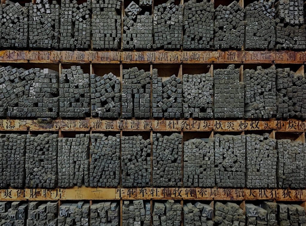

Robles Go: We’re curious how the secret passage to the bar looks.
It’s a black passageway; you don’t see much of anything. It’s dark on purpose because we want to take you out of whatever experience you just came from. I wouldn’t say it’s long. I’m gonna guess it’s six or eight meters? But the idea is that in the six or eight meters while you’re walking, you hear the music in the distance, and the only things we have there as you walk along are some millwork. And that millwork has items you would find in print mills.

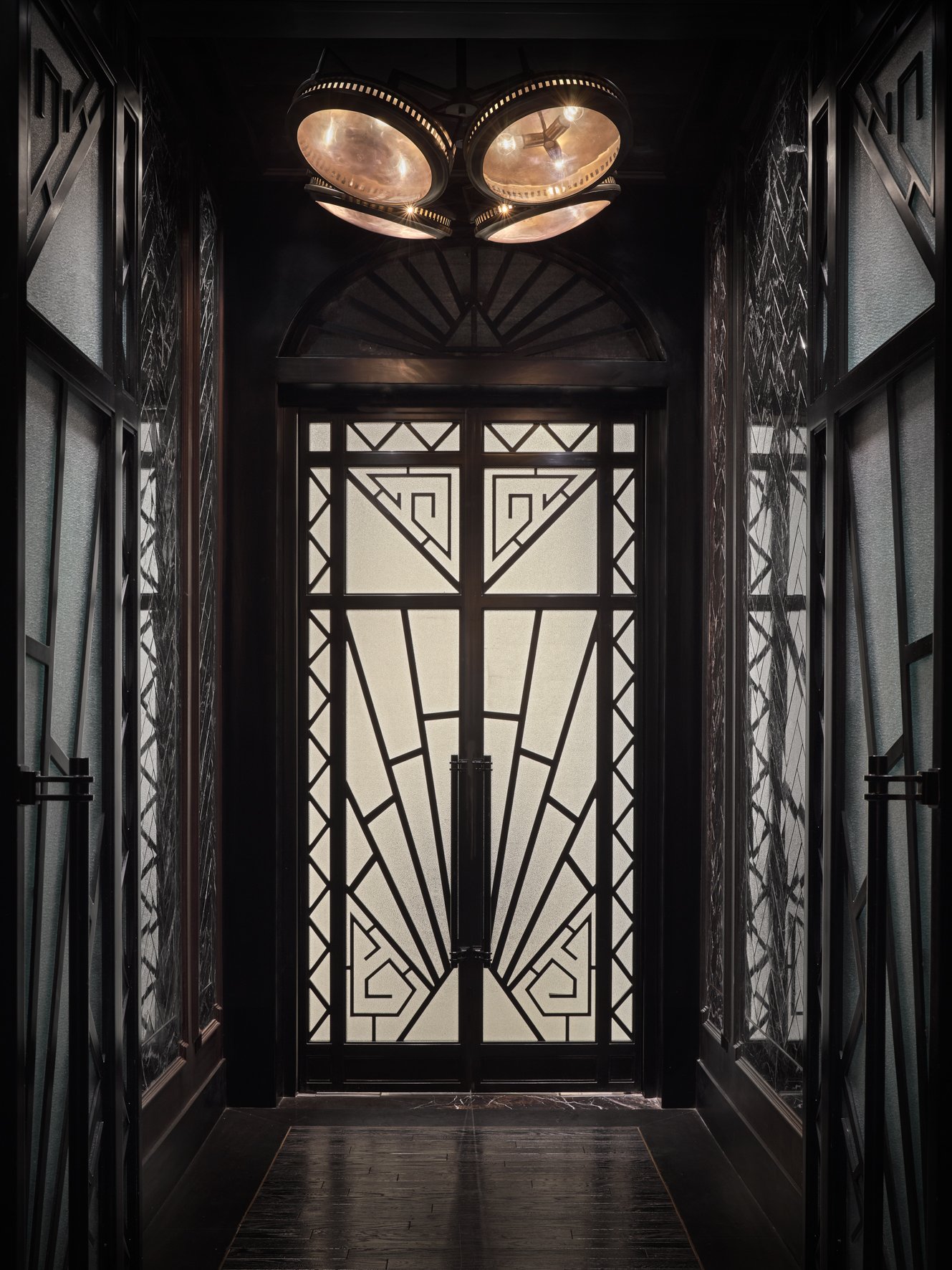
Art Deco in large strokes and details 
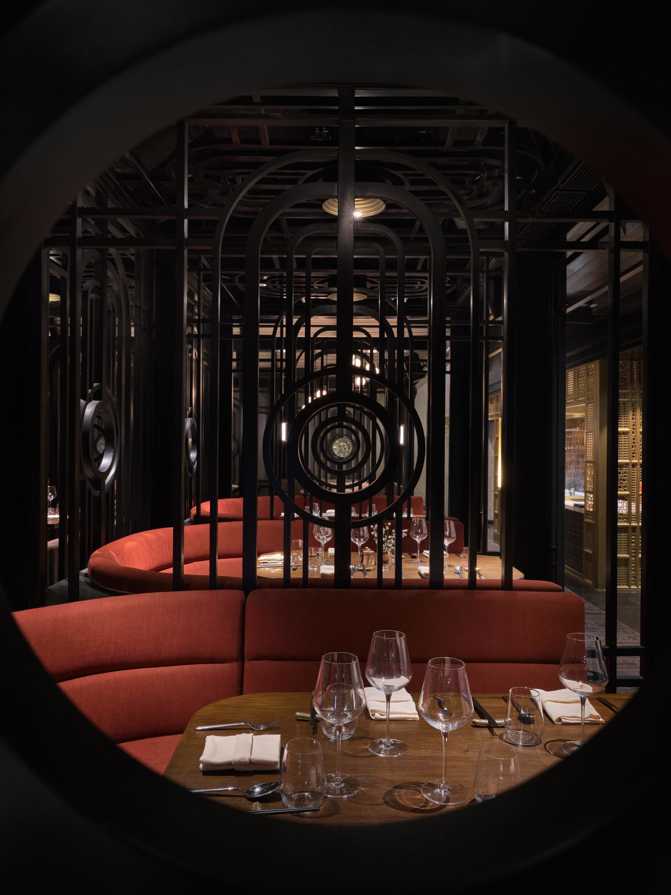

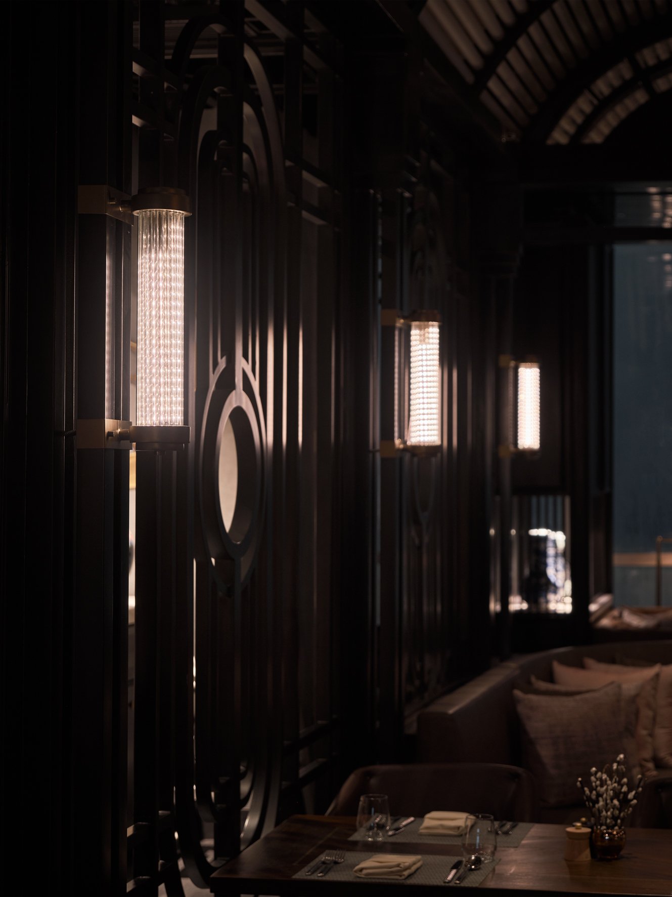
Robles Go: Why did you choose Art Deco to be fused with Chinese concepts?
That’s a good question. The concept we came up with was the four great inventions of China—printing, compass, gunpowder, and paper. That’s what we were spiraling off of. We tried to think of what we thought was the most inspiring and versatile era in Chinese architecture and design. And we thought of early-twentieth-century Shanghai, which had this incredible Art Deco vibe, this fun party vibe about it. And we thought that’s something we could easily adapt to multiple venues and the easiest thing for us to get four different concepts out of.
When I look at modern Chinese design, it has an obvious contemporary slant that if I tried to apply that, I feel it would have that jarring thing where we would have to make every space really different. But if we made every space contemporary, they would all blend as one, which we didn’t want either. It’s about finding a balance. We didn’t want the four restaurants to blend as one, but we didn’t want the differences to be jarring. And if we went with classic Chinese, I think we would have had some of the same problems. With Art Deco, it allowed us to do something high end, it allowed us to do something dim and dark in the bar, it allowed us to do something casual that felt a little bit like a street corner shop, and it allowed us to do something industrial coming out of that era. All of that together made sense for us to go with Art Deco as the backbone. With Art Deco now as the spine, we’ve got our four design stories, four different chapters that all fit together.



Robles Go: We love the design! But it looks high-maintenance. How did you take cleanliness and maintenance into consideration when you designed the restaurant?
We know that this venue’s audience is not going to be—it’s not like when I worked with Disney Shanghai. When you do a Disney project, you better have everything bulletproofed because that place is going to get destroyed! But in The Chinese National, it’s still a high-end establishment even though there are tiers. It’s not going to take the same intensity of wear and tear.
Still, any time you’re working on a restaurant, it’s essential to make sure you have materials that can hold up to a certain degree of intensity. I own restaurants as well, and my restaurants are the same. We need to make sure there’s a certain amount of durability that’s built-in. Every restaurant, even those I own, is different in how much intensity we think it will undergo.
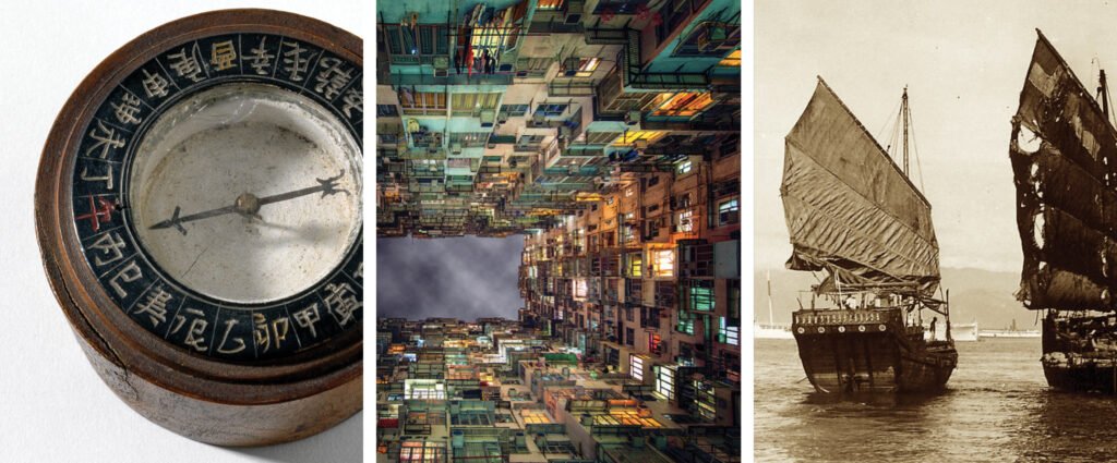

Torres: How would the intensities differ?
The most intensity you’re going to get in The Chinese National is at breakfast and the weekend dim sum. The weekend dim sum could get a little bit intense. But at a high-end establishment like Swissôtel, I don’t think it’s going to be too bad. So generally, what we’re looking for are materials that can withstand spills, materials that have high double rubs to make sure they’re not ripping and shredding, and stain-guarding. We use a lot of hard surfaces. When we use carpet, it’s not directly under where the guests are eating. And how we design the carpets, the way they look, the patterns on them, the colors, are all done to withstand spills.
It’s not rocket science, right. Sometimes we use fake leather, which is pretty much bulletproof in high-traffic areas. At the dumpling and noodle bar, Iron Needle, we use a lot more hard finishes there. Less fabric. Whereas in Paper Duck, the most luxurious restaurant, we have a lot more fabrics in there because there’s less wear and tear on that side.
We don’t do white. Every single time I have someone come to me and say, “We want to do a restaurant in white,” you better really let me know why it has to be white because there’s no way it’s going to hold up! It has to be an excellent business reason. Otherwise, forget it.
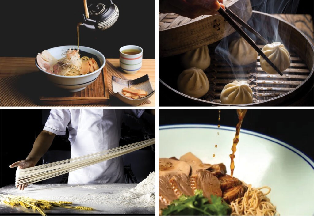

Torres: Don’t food smells stick to the fabrics, though?
Smell from the kitchens? That sounds horrible. Sounds like the kitchen consultant doesn’t know to work with their extraction. At the end of the day, you need a good kitchen consultant to ensure your extraction’s working. If it’s not, any restaurant is going to smell. No restaurant should ever smell. You shouldn’t ever walk out of a restaurant and say, “Boy, that place smelled.” If you did, that’s either a cleanliness issue—let’s hope it’s not, or it’s an extraction issue. Extraction issues are easily fixable.
Torres: Just the food on the table is enough to make clothes smell. Isn’t it like that in many restaurants here, Isabella? (Laughter)
I’ve actually encountered this reaction a lot. I was on this project where somebody wanted a wood-fired grill and said, “Oh, how are we going to deal with the smell?” I said, “You’re going to buy the right extraction.” It’s like having a Ferrari and putting a Honda muffler on it. Of course, it’s going to sound loud! The muffler’s not designed to take the intensity that the engine puts out. But if you design the right muffler for the engine, then you’re good. It’s the same in any restaurant. We work with good kitchen consultants who do their jobs well, and it’s essential to the venue’s success.
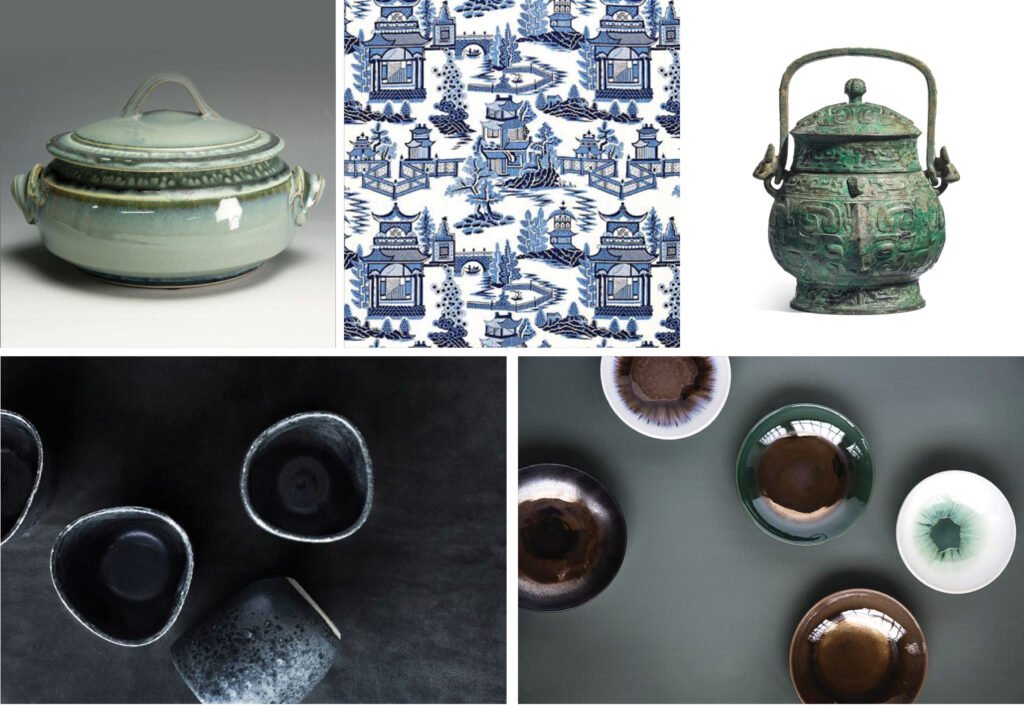

Robles Go: Does each restaurant have its own music?
Each room has its own music control. You’re able to run one music for all four venues or run them as separate channels. When everything works together, you can have one music channel. When you get to dinnertime, and each runs as an individual restaurant, you can schedule each one to have their own music, related to the clientele’s psychographics.
Robles Go: Where is that control located?
If I’m not mistaken, if I’m looking at the duck oven, just to the left in the corner is a small service station tucked into a little room. The music control panels are in there.

Robles Go: The light panels and air conditioning as well?
The light panels are in each of the service stations throughout. So, for example, if I’m in Black Powder Red, I don’t have to go all the way to Paper Duck to set my light. The aircon is controlled by the building system.
Robles Go: How were you able to hide the grills of the aircon in the hallway? It’s a very long hallway, and I can’t see where you hid the grills. There are enough openings on all sides of the corridor that airflow through there wasn’t a problem. We didn’t actually put any grills there.

Robles Go: How about response to the pandemic? Is the client able to apply COVID-19 safety measures in the restaurant?
It’s about spacing tables properly. As a restaurant owner myself, I’m doing the same thing. In 98 percent of our designs, some components are fixed, and some are moveable. The moveable parts give you the flexibility to manage large groups. If you can manage large groups, it’s much easier to manage small groups. All you have to do is dial back, and that allows you social distancing.
We’re in Singapore, where we’re very fortunate. We only need to maintain a one-meter distance because we don’t have a large community spread. We can just place our tables one meter apart or pull some tables out of the restaurant or identify a table as non-usable. Either works okay. We’ve been fortunate we haven’t had to put up big glass partitions or things like that. A certain amount of flexibility has to be built into every restaurant. Many places overdo that, putting in too much flexibility, so the whole place feels like a sea of tables and chairs. You need to have some architecture. I think the most important thing is social distancing.


Robles Go: Did you incorporate signages in the restaurant? We didn’t see any exit signs in the photos. We were wondering about that!
Yes, there are exit signs. We have a very good photographer. He wraps all the exit signs in a black plastic bag, takes the picture, and edits them out. (Laughter)
Robles Go: Tell us how you work with your team. What are your design values? And how do you apply them in your work?
We’re a very value-based organization. We spend time focusing on what our values are. Interestingly enough, of our five values, only one of them is related to design. And so I would say our design values come down to “Push creativity.” How can we be as creative as possible? Sometimes that means what something looks like, although most of the time, it’s about how something works or how it ties to the venue’s story.
But ultimately, our values are about people. Our organization is purely based on what humans in collaboration bring to a process. There is no high guru of design. No one dictates to the team what the design is going to be. We don’t have that superstar mentality. We have this mentality that if we all get into a room together and everyone is completely unafraid to get their ideas totally shot down, that means that we all share whatever crazy ideas we have, and, eventually, we’ll come up with something cool. That’s the environment we want to create. That’s the environment we aim for. That value is equally important to design as anything would be about design itself.


When you look at our work, they each look different. We don’t have projects that look the same. There may be a couple of similarities here and there, but you wouldn’t say, “Oh, I see that thing in every EDG project.” We love design. We don’t love a design style. It doesn’t matter to us which style you end up going with; we want to make it amazing! There are some styles you wouldn’t see us doing too often, maybe Baroque or something like that. We don’t do a lot of that stuff. But there’s also not a lot of call for it.
We’re not trying to re-invent what everybody shouldlike. We’re trying to create stuff people will connect with because, ultimately, that’s what will make the business successful.

Torres: May we know what the five values are?
Yes, you may know what the five values are! Now you’re going to test me off the top of my head here! (Laughter) I’m going to do it backward.
Number five is “See something, say something.” That means anytime you see something wrong, call attention to it.
Number four is “Positively work towards solutions.” We always focus on trying to be positive and finding solutions to the problem.
Three is “Push creativity.”
Number two is “True teamwork.” We work together, no matter what. Whatever it takes to work in teamwork.
Number one is “Take ownership.” Those are our five values. Wow! I remembered them all!

Torres: Do you collaborate only with licensed designers?
We collaborate with anyone who’s on a project with us. I don’t think there are any specific requirements that we have. We collaborate with lots of different people. We collaborate with artists on projects, for example.
Torres: When the artists get interviewed about their involvement in interior design projects, does it ever become a problem or source of resentment among interior designers?
No, I don’t think so. Four years ago, we worked with a graffiti artist in Singapore on one of our projects.
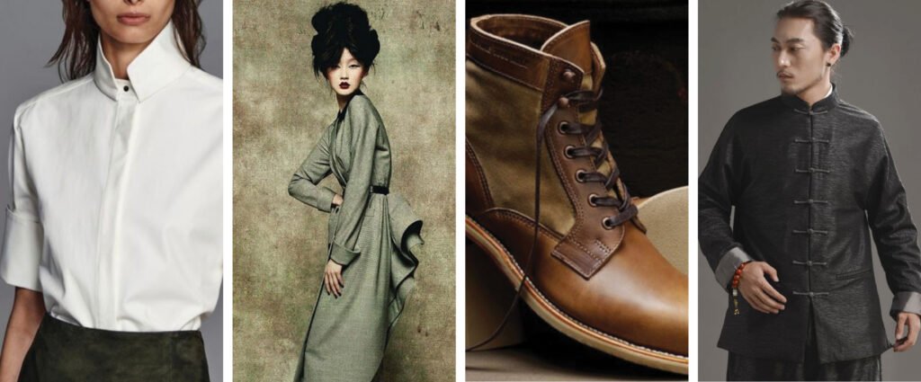

Torres: Graffiti in Singapore?
I know, right? I called him a month ago, asking if he wanted to work together again, and he said, “Are you kidding me? I got so many people talking about that first project that we did together. Every other project I’ve gotten the past couple of years, it seems I get from that project. So, yeah, I’m excited.”
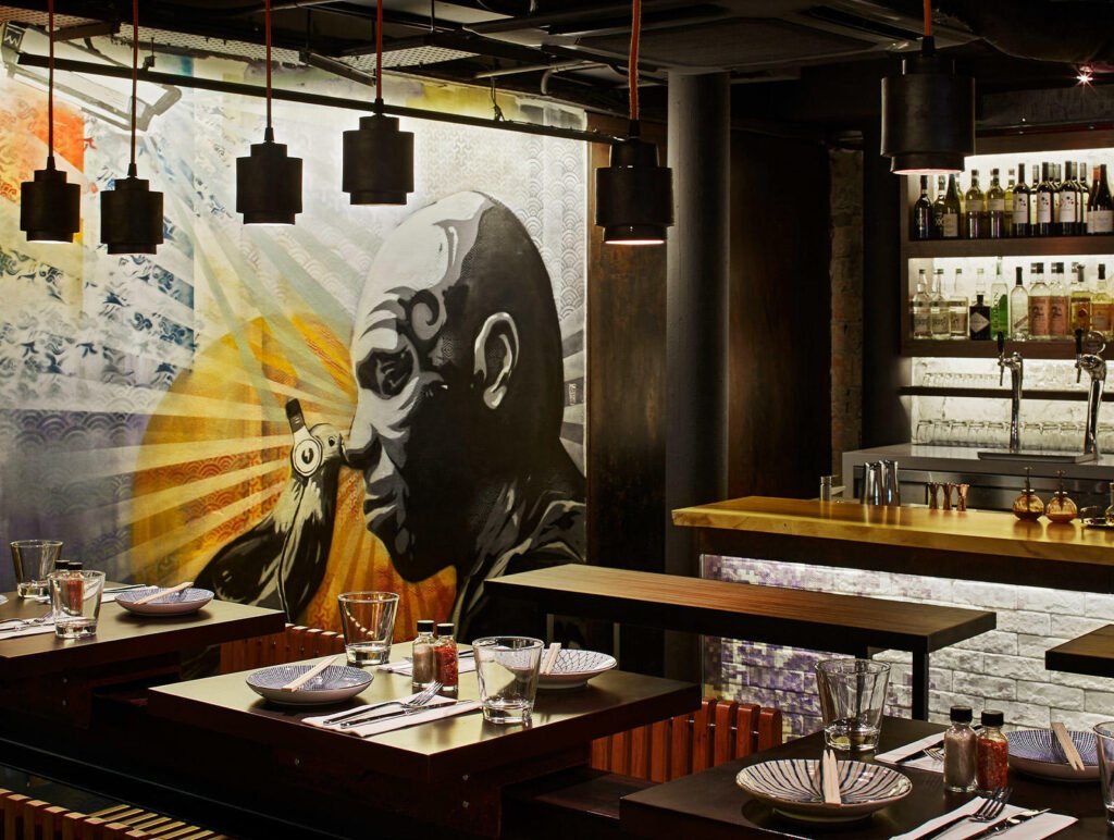


Torres: How did you collaborate?
I am personally very involved in the art with him. He’s the artist—he’s brilliant. I’m not an artist; I can’t do what he does. But I can art direct. And really help him stay on-story and help him understand the design vision. So we work together back and forth where he sends me sketches, and I give him feedback, and it’s a great relationship.
I don’t think every artist would want to work that way. But we are a collaborative firm, and collaboration is in our blood. It’s in our values, as I said. That’s one of the main things that we do—work together as a team, collaborating. That’s our second value. We collaborate with anyone. So if that’s not who you are, we’re probably not going to work together.


Robles Go: Which came first for you in your career, was it being a chef, a restaurant owner, or an interior designer?
Chef first, interior designer second, restaurant owner third.
Torres: Which do you love most?
Haha! That’s like asking which child you like the most! What I love is the creation of the whole thing. I love that I have been able to be a part of everything over the years. And the last three, four, five years, I’ve really gotten into brand strategy and spent a lot of time with our strategy team, and I’m leading up that effort in Singapore as well. The California team does a lot of it.
I’m a big-picture guy. I do not care about each little detail of the design because I know that Piya does care about it and doesn’t need me to care about it. It’s my job to let Piya know when she could do better when I think she could push herself further. But other than that, I really am just there to bounce ideas off of, work together, and collaborate. When it comes to all those details, she’s really sorting them, and I’m just the cheerleader and maybe an editor from time to time. But really, I’m trying to just be supportive because I know that she is amazing. She and I have been working together for a decade. Non-stop, for a decade. There’s a trust we’ve developed where I know I don’t have to worry about what the trim will be because she’s going to think about the trim. And she doesn’t need to worry about the sides of the strategy that I bring because she knows I will do it. It doesn’t mean she doesn’t get involved. It’s just that she doesn’t get involved to the level of detail that I get involved in and vice versa.
So I’m a very big-picture kind of guy. I like to see it all come together. I like the entirety of it, and I really like this vertical approach.

Torres: Since you’re a big-picture guy, when you critique Piya’s work, what do you look at? You don’t check her choice of textiles anymore? Or do you?
I’ll take a look, and if there’s something I think I can add of value, then I will.
Torres: So what do you look at?
The first thing I do is step back. And I’m saying, “Okay. We had this conceptual idea a couple of months ago. And now, here we are on the page. Did we do everything we can to bring that conceptual idea to life? If the answer is “No,” we have to start taking apart details somewhere, right? But it’s about looking at that big picture first and asking, “What isn’t working?” or “What did we not do well enough?” or “What could we push?”
In general, I’m not saying, “It’s that detail we could push.” But I will look at a detail and say, “I don’t think we’re getting enough out of this area.” Maybe it’s the detail, maybe it’s the material, maybe it’s the wall. If I have a thought, I’ll share it. Otherwise, I’ll encourage Piya to push further.

Torres: Could you give us an example in The Chinese National?
Yes. The floor, wall, ceiling that we discussed earlier. That came from me. Piya and the team had started going down the road, and I looked at what they were doing. All the designs were good, but everything was all over the place.
I asked, “What makes this one space? What makes this unified? How do we bring this together? What are the rules that you guys set out for yourselves?”
And the answer was, “We didn’t really have any rules. We thought this would work with this, and this would work with that.”
So I said, “Okay, cool, let’s take a step back, let’s get out, let’s take a look.” In that case, it wasn’t a detail per se. It was materiality, I guess, for the most part. It could be materiality in one project, it could be the details in another, but in the case of The Chinese National, we needed something that tied it all together. I think, until then, it was a lot of exploration. And from that moment forward, we were all unified in our vision, and we drove.
So that’s what my role is. I didn’t say, “Make the floor this,” “Make the wall that,” “Make the ceiling this.” I said, “Conceptually, we’ve got to bring this together.”
Now, we looked at images together, and I’d say, “Yeah, I like this one the best.” But everybody else said what they liked best as well, and then we all decided together on what we thought it should be.
But ultimately, that was a turning point for us in the project. And I’m not saying it from a sense of, “Hey, look, I made a turning point in the project! One hundred percent of what you see in the project is Piya, Piya, Piya. I’m pure story, concept, emotion, big picture. But all those beautiful details—and they are stunning—are all her. I don’t want to give any false impression that I made the project. That’s not what I’m saying.
What I’m saying is that we can explore and explore and explore as designers do, but at some point, you’ve got to know the direction you’re going. My job is to give us that direction. When I do that successfully, designers can do what they do.

Torres: Wow, Isabella, isn’t he a fantastic boss?
Robles Go: He is. I’m a fan already!
Listen, I’m tough to work with, don’t get me wrong.
Torres: Michael, I’ve met designers who talk as though they thought of every single thing. So I’m moved by how you acknowledge your team.
My favorite thing about a project, to be honest, is when I get to walk into it at the end, and I get to remember what everybody worked on. “Oh, I remember when Piya came up with that,” or “Oh, I remember that time Shirley came up with this thing,” and I can see all of the people who worked on the project and what they brought, and that brings me a great deal of pride, getting to see what everybody did.
I genuinely believe that either you’re Beethoven or you’re not. I’m not. And I don’t play every instrument better than everybody else, I can’t write a full symphony; it’s not who I am. I’m a conductor who can bring things together. EDG doesn’t have a Beethoven. We have the best violinist, a really amazing cellist, a great timpani player. We bring them all together and do this without a prodigy. We are not a prodigy, superstar-based organization. I just think that I recognized very early on my own limitations, and I’m honored to be able to work with someone like Piya, who recognizes her own limitations. Thankfully, she’s really great at what I’m not really amazing at, and I’m good at what she’s not really great at. So that’s why a decade later, here we are.

Torres: Aw! And I was just about to ask you what you appreciate most about Piya. About her work, that is.
About both! First of all, what I appreciate most about Piya is that when I tell her she can do better, she really searches her soul to see if she can do better. She doesn’t take it personally; she doesn’t get hurt; she just asks herself, “Can I do this better? What does he need? What does he think?” from a working-together perspective. The quality of her work speaks for itself. She understands space. She understands what it feels like to be in a space.
I’ve heard people over the years, in Asia, complaining about built quality. When I joined an American team, and I went back to the States for a while, and I saw a bunch of their projects, I saw their built quality, and they must have thought I was like a special-needs kid or something. Because I was looking at everything, like, “Oh my god! Look at this built quality!” Yeah, they must have thought I was nuts!
But Piya recognizes that they can’t take away your proportion. And if they buy the right materials, and you approve them, they can’t take away your materiality. And they can’t take away your flow, right? How the floor plan flows and works together. Materiality, proportion, floor plan—that iswhat creates emotion! So every space that Piya has designed feels good to walk in.
So if you want one thing that Piya does really well, among all the amazing things she does? You walk into any space she’s designed, and it just feels good. That’s huge, right?
Torres: It is.
Robles Go: It is!
The Debrief
And that is how the interview ended, with EDG’s PR agency informing us our hour was up and Goodman was needed at another meeting. In a debrief after the interview, Robles-Go and I went over what impressed us most about the project, the firm, and Goodman. Here are excerpts of our exchange:
Torres: I am just floored by EDG’s vertical end-to-end approach! Just the interior design alone and the fact they designed the wall art, furniture pieces, and many of the luminaires is already a big deal.
Robles-Go: I agree with you, Ms. Judith! Their approach is truly inspiring and filled with so much thought and passion. Everything we talked about with Michael moved and inspired me. His regard for his team and the way he acknowledges their strengths and contributions, the way he brings out their best efforts and their company values rouses me to do and be better as a professional and team leader.
Remember what Michael said about built quality? Even though many designers in Asia complain about built quality, “they can’t take away your proportion, they can’t take away your materiality, and they can’t take away your flow. And together, proportion, materiality, and flow create emotion.” Do you agree? And how do these stand up in The Chinese National, in your opinion?
Even in the photos, I think the built quality of this restaurant is excellent. Beginning with the entry where diners are greeted with the exciting cooking in the show kitchen already sets a strong imagery for culinary exploration. Then the hallway—the strong but mysterious hallway—does a lot in building excitement for the diners. The series of luminaires moves the eyes toward each end of the hall. Although long, the grilles provide an effective division without actually enclosing the spaces. The hallway is long but beautiful and wouldn’t cause one claustrophobia.
Materiality and its durability are vital for commercial spaces and Michael explained well why such choices were specified, based on the dining intensity in each restaurant. Being a high-end restaurant, traffic and usability is not as intense as fast food or diners, and I guess the luxurious ambiance forces most, if not all, customers to observe proper decorum. I believe that the emotion Michael talked about also drives behavior.
I’m wondering though if part of EDG’s service includes a guide for proper handling and maintenance of finishes (like what cleaning materials should or shouldn’t be used in cleaning the antique mirror or veneer tables, or the copper finishes).
I think it’s so cool that Michael, Piya’s family, and your family all own restaurants! What insights did you gain from the way Michael and Piya made one space flow into another, the distances of the seats to the kitchen, proportions, and all that?
Being on top of the strategy and operations, Piya and Michael have an in-depth understanding of how restaurants should flow and function. For designers not involved (or who don’t have a voice) in the operations, I think a lot of research and immersion, such as sitting-in and breathing in the space, and visualizing the flow while doing the floor plan is what every designer should do to target design and align with strategy and operations. EDG’s vertical approach (and close collaboration with other professionals) made the layout and other systems (mechanical, lights, sound, BOH) effective, efficient, and thoughtful, most especially for the staff, not just the customers.
Overall, the layout is practical but not boring. The proximity of the service stations in each restaurant makes service efficient. The ratio of built-in and moveable seating is also balanced, giving enough space for flexibility and privacy.
It’s smart that they incorporated tables and counters that are easily converted into breakfast buffet counters, and during the rest of the day, serve as communal tables or carving stations, and not just empty buffet tables. The refrigerated vertical buffet as a divider and food display is a remarkable design solution too!
I understand why EDG placed Paper Duck closest to the back-of-house or main kitchen since it is the restaurant with the bulk of the cooking. Being at the very end sets it apart as it is the most high end and luxurious dining space. I am not sure though what the market there is like, but here in the Philippines, Peking duck restaurants use lots of large round tables for big groups and families.
Right, right. The booth seating is good for only six people, I think. The floor plan shows seating for only four, though.
It makes sense also to position the Letter Press tea lounge closest to the mall elevator for afternoon tea and desserts targeting mall-goers. Also, the movable partitions and pivoting panels easily transform the space into a bar with a separate entrance.
Utilizing a pop of color in Iron Needle because it’s the restaurant farthest from the window created an inviting instead of dark ambiance. I also like the play of elevations to separate certain dining areas like the semi-enclosed dining space in Black Powder Red and Paper Duck.
I’m just curious though as to where the restrooms or at least the hand washing areas are located.
Right, we didn’t ask that.
Or why they did not provide one for such a large restaurant. Hand washing is truly essential in restaurants. If I were to sit in the private room of Paper Duck, the restroom’s too far if it’s outside, even if it is right next to the elevator lobby.
I could ask. Maybe they’re just not in the plan they showed us.
I also regret not asking Michael about the bussing out of the dishes and what the process is. Do they dish out used plates and utensils using a (custom-designed) cart? Do they bring it to the farthest right (the washing area after Letter Press) or to the BOH? Is the dish drop a station for used plates or a station for fresh plates and utensils?
Apart from that, I admire and am in awe of how they developed a concept, created a story and articulated it in the interiors for the customers and restaurant staff to fully enjoy. The whole project simply goes beyond imagery and aesthetics. The Chinese National truly has a beautiful, healthy, functioning body with a beautiful soul, bringing joy to the people in it!
If the local industry and students and teachers in design schools could take away one important lesson or insight from EDG or Michael Goodman, what would that be?
I think the importance of collaboration needs to be strongly established and rooted early on during the formative (college) years. We have to rethink the professional organization’s insistence on exclusivity, which causes divisiveness, factions, or issues of overlapping of scope, etc. We can learn from EDG and uphold respect for each individual’s contribution as professionals, giving each person the freedom to express creativity, at the same time practice responsibly and accountability.
How would it be helpful to Filipino designers? What difference would it make in the industry and practice?
I truly admire the words of Michael and the evident humility. He said, “I’m not a Beethoven. I can’t write a full symphony, it’s not who I am. We are not a prodigy, superstar-based organization. I just recognized very early on my own limitations and I’m honored to be able to work with someone like Piya who recognizes her own limitations. Thankfully, she’s really great at what I’m not amazing at, and I’m good at what she’s not really great at. That’s why a decade later, here we are.” World-class designs and projects are all products of strong collaborations and that is what we should be encouraging among Filipinos. I believe there’s enough work fit for everyone’s competence and we should all be driven towards the goal of society-building and making Filipino design a global benchmark. •
Isabella Robles Go is the founder and principal interior designer of Living Innovations Design Unlimited. She is one of the youngest awardees of the Asia Pacific Property Awards, winning the Residential Interiors category in 2020 for her work on the WW House in Iloilo City, Philippines. She was a nominee for the 2018 Haligi ng Dangal Awards, Interior Design Category and a finalist of the 2017 Kohler Bold Design Awards for Prodigy: Rising Star Category. She graduated magna cum laude from the University of Santo Tomas and placed tenth in the 2007 interior design board exam.
Judith Arellano Torres is the former editor-in-chief of BluPrint magazine, which she led for ten years. She edited four books, Blueprints for 2050, Design Better, Tropical Architecture for the 21st Century Books 1 & 3, and co-wrote the latter two. Before BluPrint, Judith worked for 17 years in television in a variety of roles, including COO of the ABS-CBN News Channel (ANC); COO, executive producer, and editor at Probe Productions, Inc.; and producer for CNN International, covering the Philippines, Indonesia, Malaysia, and Singapore.
| 1. Movable type printing by China Xinhua News @XHNews, September 2016 |
| 2. Chinese movable type from kknews.cc; Woman in store from candidapaleo.com; Brick of Pu’er tea by Vladimir Sazonov via Shutterstock; Pu’er tea wrapped in bamboo by Pixabay.com |
| 3. Cocktail drink from winedharma.com; Boxes of tea by soyim.com; Tea bar from Pinterest; Cocktail drink from dreamstime.com |
| 4. Wallpaper by kravet.com; Lighting fixtures by EDG; Antique mirror tabletop by murraysiw.com; Woodblock printing by Wei Lizhong via South China Morning Post; Marble tabletop from dreamstime.com |
| 5. Tableware by Haviland & Parlon Syracuse via scullyandscully.com; Engraved teapot by Michael Backman Ltd; Woodblock print by Beinecke Rare Book and Manuscript Library via news.yale.edu; Silver lotus leaf coaster from houzz.com |
| 6. All fabrics by Rubelli for Armani Casa, catalogues 2013, 2014, 2016, 2018, except for Blue chenille in Greek key pattern by Greenhouse Fabrics |
| 7. All fabrics by Rubelli for Armani Casa, catalogues 2014 and 2016, except for the HHF teal damask pattern by Haute House Home |
| 8. Black coat and printed bowtie from canalmasculino.com; Black and white shoes by Feit via honestlywtf.com; Black and white female outfit from amulher.com.br |
| 9. Cabinet with moveable lead type from Rita the Nerdy Travelholic |
| 10. 15th century Ming Dynasty map of the Americas from viewofchina.com; 200 BCE Song Dynasty compass from sciencesource.com |
| 11. Chinese magnetic compass from ancientpages.com; Montane Mansion housing by Hong Kong’s Quarry Bay by Peter Stewart via wallpaperflare.com; Junk boats in Hong Kong Harbor by South China Morning Post Pictures |
| 12. Noodle soup dish from elle.com.hk; Dim sum by Shaiith from Shutterstock; Beef brisket and noodles from kknews.cc; Hand-pulled noodles from Omni Palace Noodle House via dailyhive.com |
| 13. Glazed green tureen from pinterest.es; Pagoda and blue willow pattern from Shumacher Chinoiserie via pinterest.fr; Shang Dynasty bronze wine vessel by Christie’s Images Ltd. via alaintruong.com; Dipping bowls by Line Thit Klein via pinterest.de; Dark blue gray cups from pinterest.com |
| 14. 1945 Shanghai baker by Michael Arrufat via pinterest.co.uk; Man in blue Tang reversible jacket from aliexpress.com; Woman in dark dress with white collar by Victor Demarchelier for Vogue China via fashiononerogue.com; Blonde in striped jacket by Patrick Demarchelier for Vogue China via designscene.net |
| 15. Teal and yellow colored glass from pinterest.at; Black and white checkered tiles by New Laxmi Tiles via indiamart.com; White marble tabletop from tradeindia.com; Black metal mesh from pinterest.ph; Bentwood Thonet café chair by Retrospective Interiors; Teal Green by Pantone |
| 16. Szechuan Opera fire breather from windhorsetour.com |
| 17. Szechuan Crispy Chicken with Chilies by Xiaomei Chen via South China Morning Post; White and Black Gunpowder by Marcus Nillson via foodandwine.com; Dried Szechuan peppers by Tanya Stolyarevskaya via Shutterstock; Exploding pottery caltrops from the Yuan Dynasty by Babelstone via Wikipedia; Black pottery cauldron from ceramicafandom.com |
| 18. Serving spoons from analogue-life.blogspot.com; Earthenware bowls by Gallery Utsuwa Note; Cups and saucers by Atelier Katsumi; Earthenware pitcher and bowls by Gallery Utsuwa Note; Engraved back of bronze mirror from en.chiculture.net |
| 19. Luminares by EDG; Royce Oatmeal leather upholstery and Inn Coffee leather upholstery by Haute House Home via hautehousefabric.com; Lightbulb from pxsphere.com; Oxidized copper cladding by Indigenous; Copper wire mesh from Indiamart |
| 20. High collared white blouse by Nellie Partow via Vogue; Dress by John Galliano for Christian Dior via surfergirl.blogspot.com; Brown leather boots from Men’s Journal; Tang suit for men from pinterest.com |
| 21. Hanging silk screens with sheets of paper to dry from sohu.com |
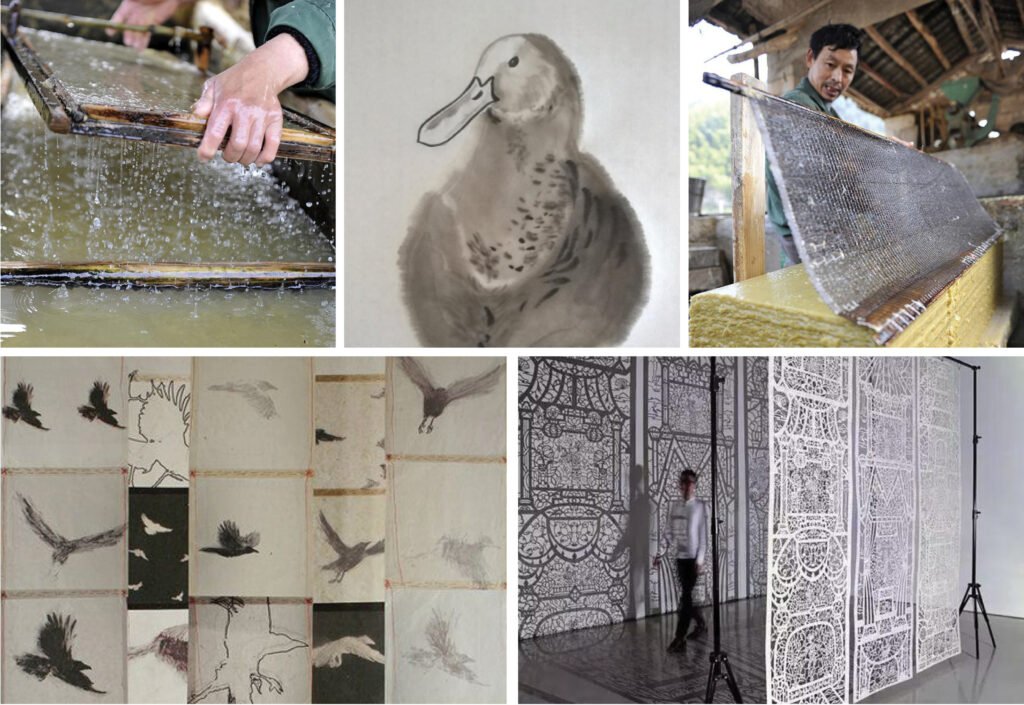
| 22. Papermaking process by Xinhua via chinaculture.org; Chinese brush painting of Peking Duck by Yabenaut via deviantart.com; Papermaking process by Xinhua via chinaculture.org; Chinese paper cutting by Wu Gengzhen via Sina Collection; Bird paintings on Tibetan paper by Catherine Skinner via Seager/Gray Gallery |
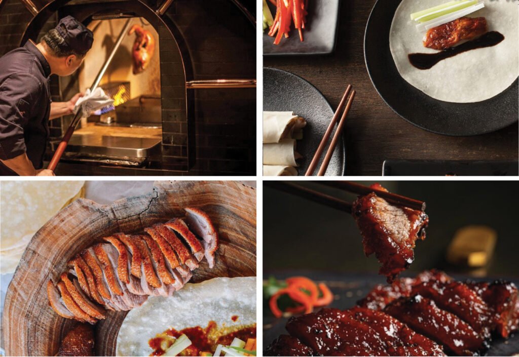
| 23. Brick wood-fired oven from mott32.com; Paper pancakes with Peking Duck from mott32.com; Char siu from Mott 32 Vegas FB; Slices of Peking Duck on wood board from The Woks of Life |
| 24. Shanghai Tang men’s jacket from pinterest.dk; Men’s Oxfords from baselondon.com; Knee-high cheongsam dress from pinterest.ph; Shanghai women in cheongsam from metricleo.com |
| 25. Metal screen divider with round pattern from hangjianet.com; Luminaire from EDG Design; Vaulted hallway ceiling of Johnson Wax building by Frank Lloyd Wright via nytimes.com; Spherical light fixtures from cgtrader.com |
