Interview Patrick Kasingsing
Images INFILL
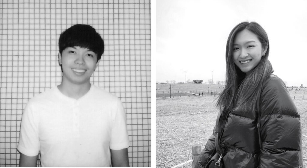

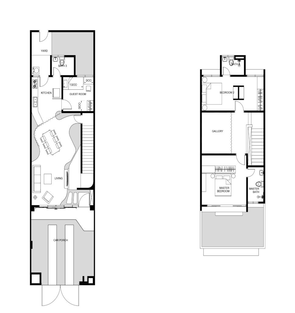
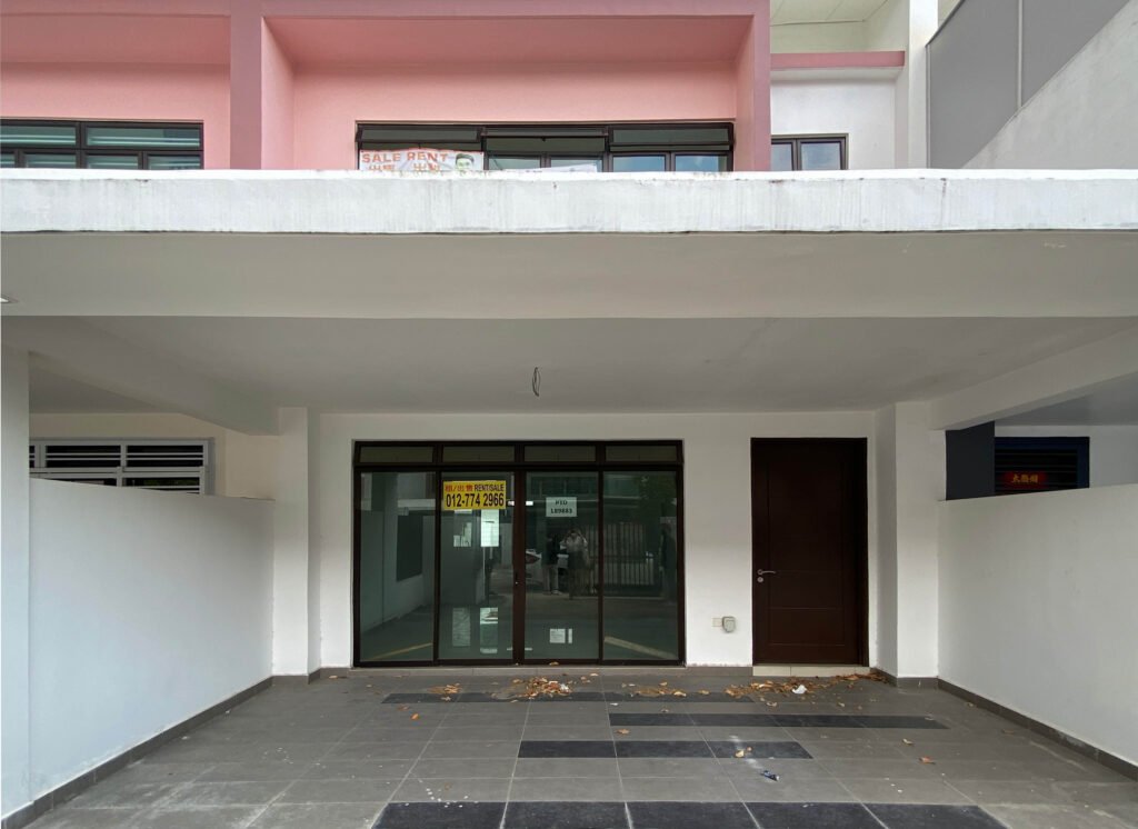
Welcome to Kanto, Kyra and Jinting! Congratulations on your new home! You both purchased a two-story terrace house in Johor Bahru, Malaysia during the height of the pandemic, whose renovation story you documented via Instagram. The once bland, cookie-cutter space has been utterly transformed into what you call an ‘industrial zen’ crib, with lots of raw material finishes, metal work, and a monochromatic palette.
Let’s backtrack a bit: What were the key design considerations that guided the transformation of the space you christened the “Zen Garden House”?
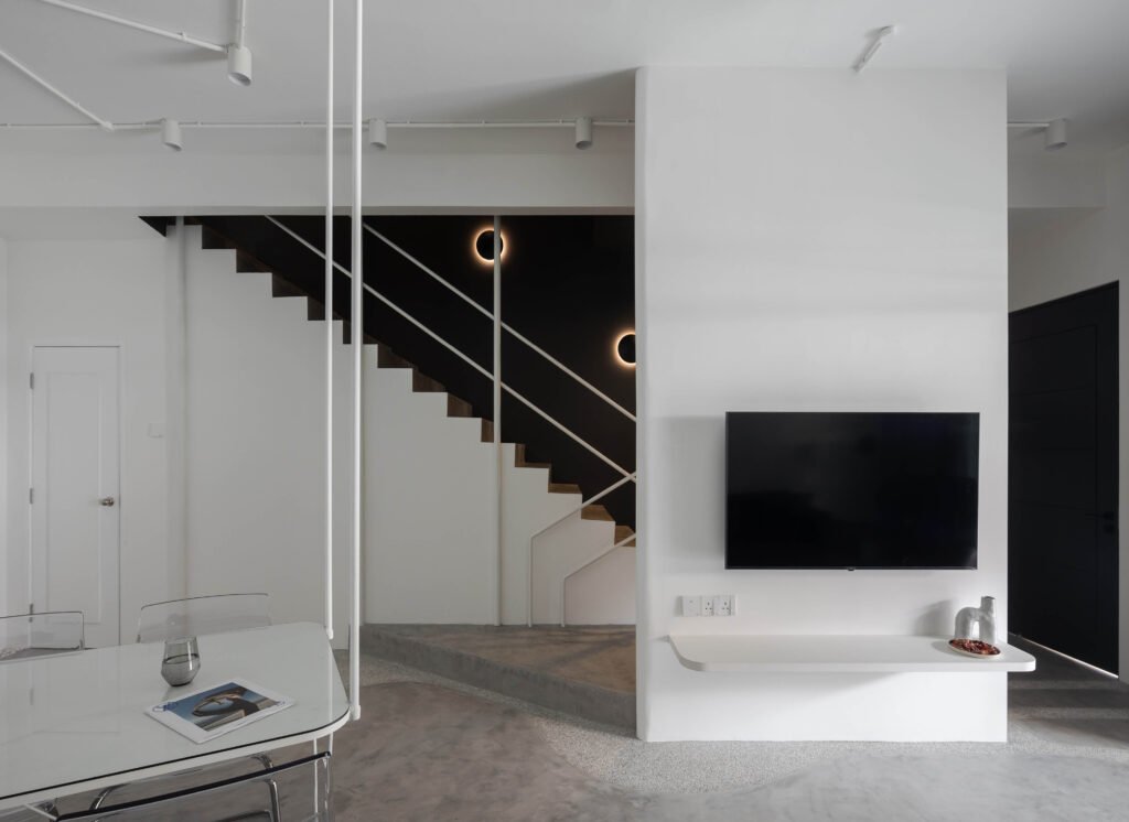
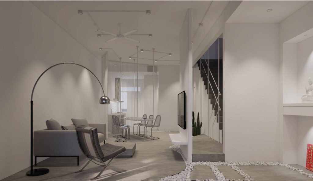
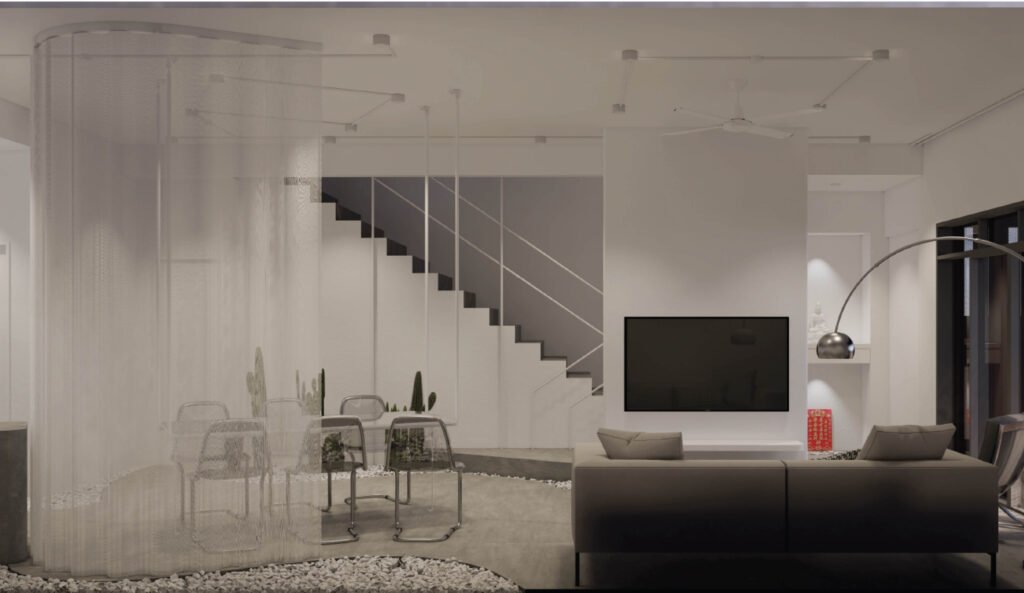
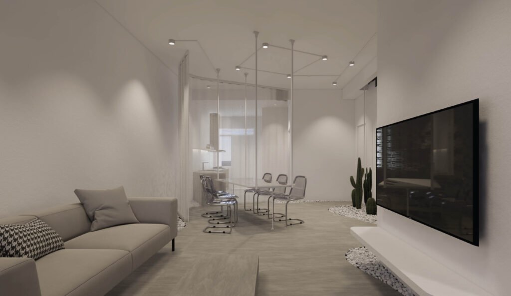
Kyra Swee Yewyong, design consultant, Foster + Partners: Thank you! For the house we bought, we seized the existing open-plan arrangement of the ground level, as an opportunity to rethink the living areas into a zen-like space, bringing calm, slowness, and peacefulness through our material palette and spatial programming. We are exposed daily to intense work environments so we wanted a home that is a balm that can help us unwind and relax at the end of the day.
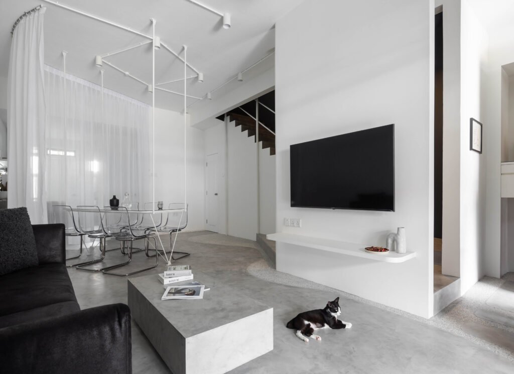
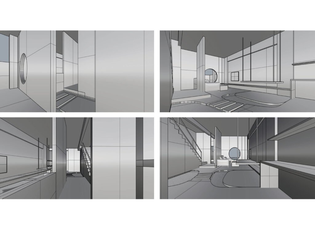
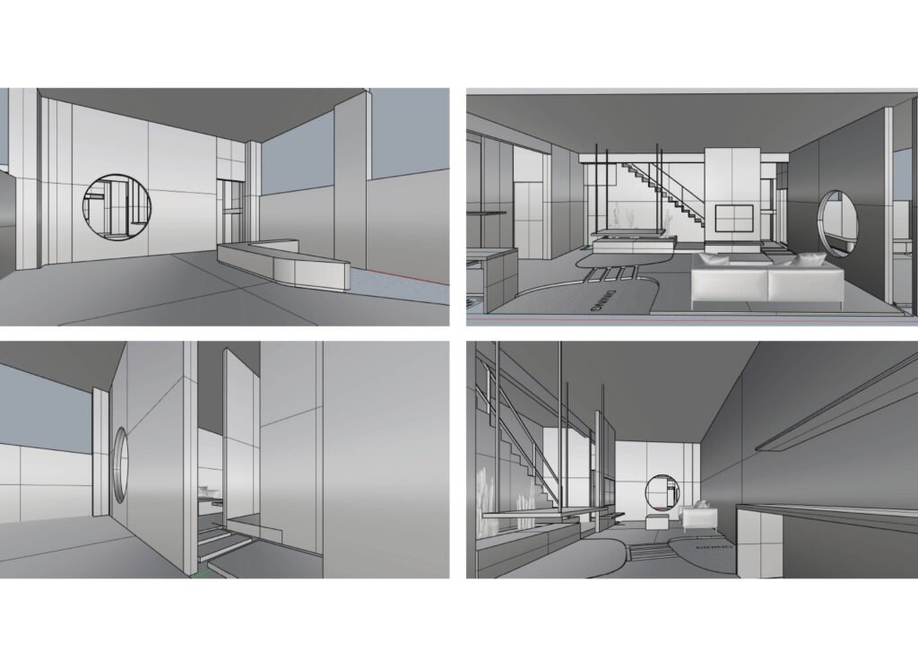
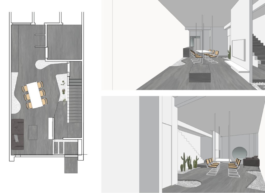
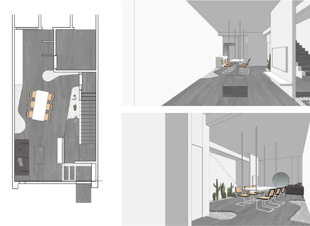
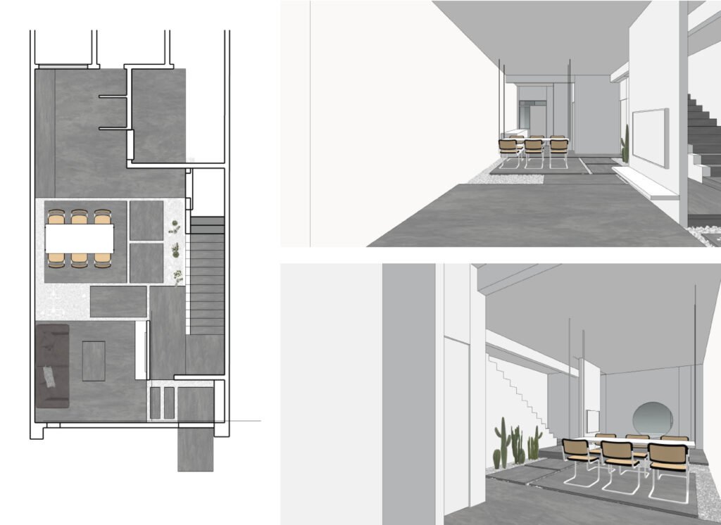
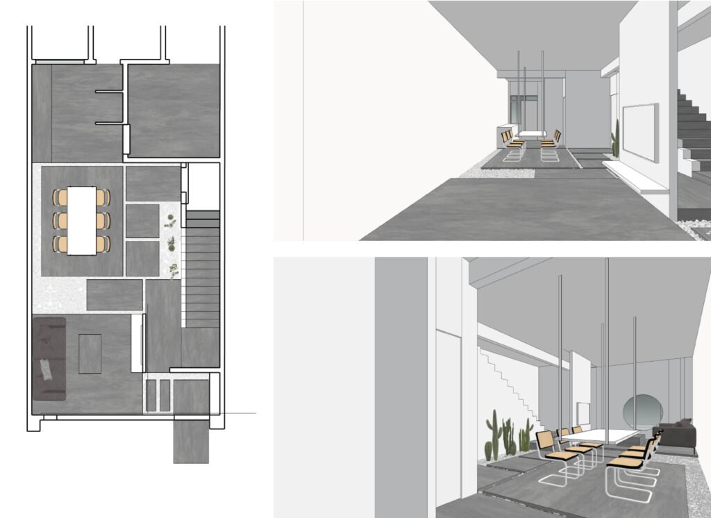
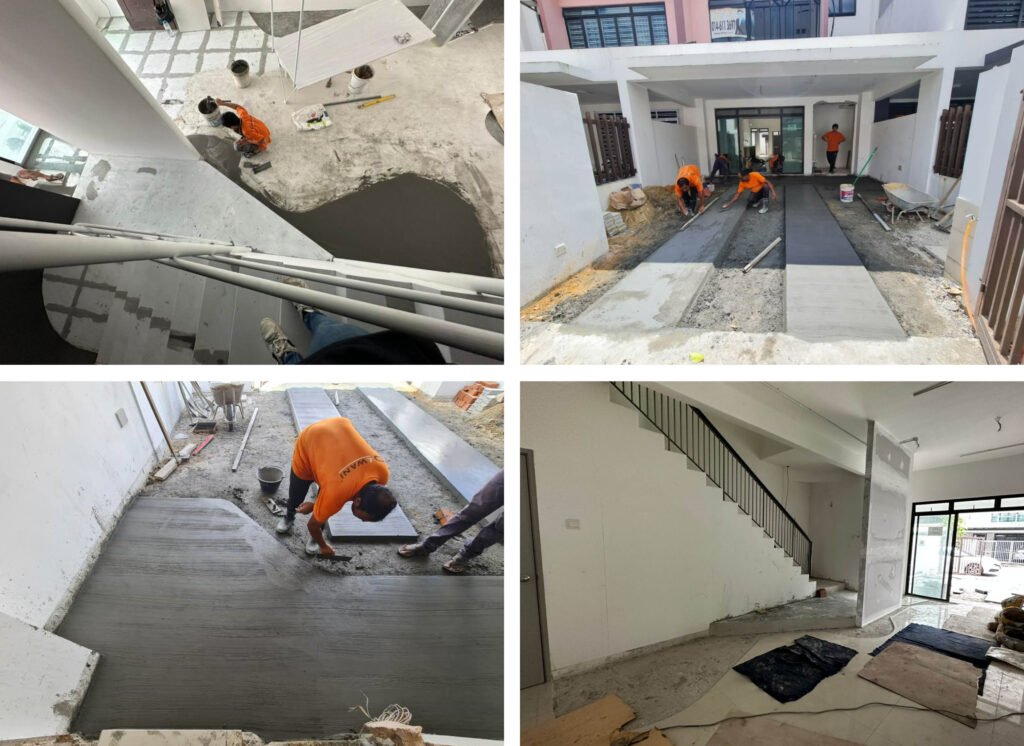
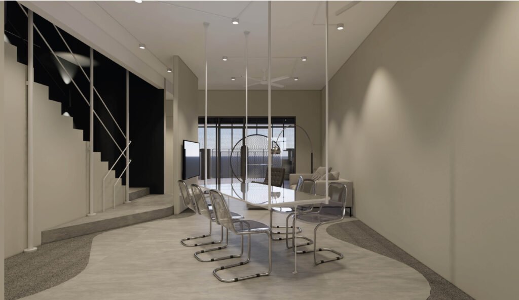
Lee Jinting, senior interior designer, SCDA: Thanks for having us! We initially thought having greenery within the house would be impossible, with its daylight penetration issues and the maintenance concerns that come with rearing plants. To address this, we thought of creating a garden setting within the ground floor living space and introduced outdoor landscape elements like pebble stones, pebble wash, and even a concrete footpath, indoors. It reflects the “Walking in a garden” concept we wanted for our living space.
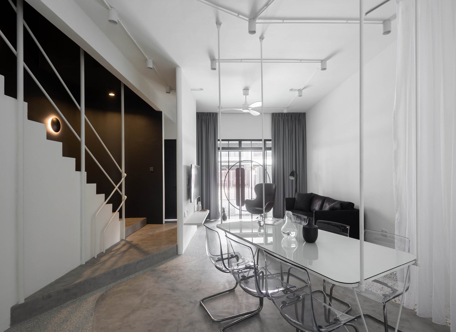
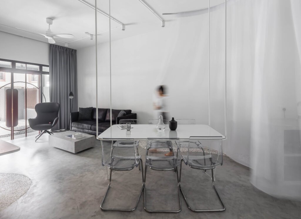
Kyra Swee Yewyong: We also had a lot of exposed metal elements that reinforced our industrial zen concept for the space, like the customized metal tensegrity dining table, the tube railing for the stairs, and the mesh gate entrance with a circular cutout.

This was a pretty thorough renovation; What were the constraints and challenges you encountered during the Zen Garden House’s renovation process, and how did these affect the resulting design?
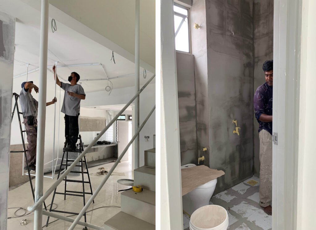
Lee Jinting: Both design and construction happened during the pandemic. As both Yewyong and I work and reside in Singapore, traveling back to Malaysia became the main challenge for this project. Thanks to technology, many design meetings with our interior design collaborator, Mr. Tan Yong Kiat (Cox Architecture), and his contractor were held via video conference to ease the design process.
However, aspects like materials, FF&E, sanitaryware selections, mock-up review, and setting out on-site still required our physical presence. As designers, we are unable to decide and approve all these things without physically touching them, feeling them, or seeing them in person.
Kyra Swee Yewyong: The pandemic severely affected the renovation with the rise in costs of both construction materials and labor. The pre-construction cost estimation of our very first design was three times greater than our budget. This led us to test more design options and submit multiple pre-construction cost estimations to meet our budget. Despite the unavoidable value-engineering, I would say Jinting and I are still quite satisfied with the outcome!
Indeed. Speaking of difficult builds, can you walk me through the conception and execution of what appears to be your house’s signature piece: the six-seat, tensegrity dining table? Are there other novel executions done within the space you want to talk about?
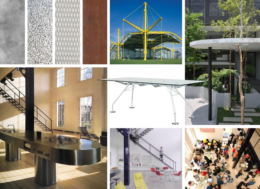
Kyra Swee Yewyong: Jinting and I were looking at Richard & Ruth Rogers’ house in London where they designed a kitchen countertop in full stainless-steel finish as a centerpiece in their living-dining area. It was fascinating to see how a simple kitchen countertop can turn into a social hub through design. In our case, we borrowed the idea and turned the dining table into our centerpiece, positioning it right in the center of our “industrial garden” space. The design is not only expressive but also functions as a social gathering spot for family and friends to eat and converse.
For the design, Jinting and I were impressed by the design of the Nomos table and desk system, developed by Foster Associates in 1980. The lightweight structural system used in the office desk allows it to delicately touch the ground with elegance. We used circular steel members to suspend the dining tabletop and connected it to the ground with pin joint bracing, akin to the diagrid system that we often see on high-tech building façades.
Initially, we wanted a more straightforward bracing where there was only a single vertical member connecting the tabletop and ground. It, however, failed to stabilize the tabletop firmly. Through many rounds of trial and error, our steel subcontractor suggested introducing diagonal members to further reinforce the bracing system and stabilize the tabletop.
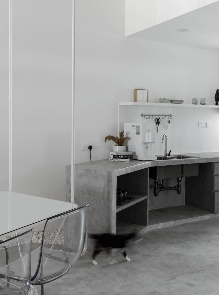
Another execution that we would like to mention is the kitchen countertop, which is cast entirely in reinforced concrete and finished in matte lacquer to ensure water tightness. We rejected the normal way for the installation of a kitchen countertop via carpentry work, finished in quartz stone or other solid surfaces. Instead, we wanted to showcase the raw, tactile beauty of what many perceive as a utilitarian material.


Now that we are on the subject of finishes, what was the most difficult material finish or execution to nail in Zen Garden House?
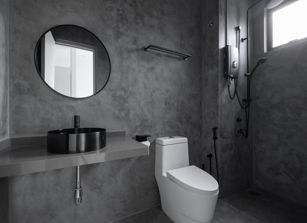
Lee Jinting: For this project, we made use of performance cement paint for our floor finish in the living, dining, kitchen, and bathrooms. The choice of finish was the result of budgetary and time considerations as using actual concrete, while preferable, would take longer and be costlier to execute.
Although a paint finish is easier to apply compared to a concrete finish, it relies heavily on the workmanship of the paint applicator to create a convincing, concrete-like effect. Yewyong and I spent a lot of time reviewing and scrutinizing the paint finish to ensure the outcome visually and functionally met our expectations.
While you’ll notice that our material palette for Zen Garden House is pretty spare, with faux cement, whites, and blacks, there is more pressure to get the finishes right as there is little to distract people (and us) from seeing the flaws.
I noticed how you demarcated the Zen Garden House’s two floors by way of color, with the ground level mostly in white, and the second-floor spaces swathed in black.
Kyra Swee Yewyong: We regard the formal living area at the ground floor and the informal living space at the second floor as two different worlds. The ground floor living area is more congenial, designed for larger social gatherings, be it with relatives and friends. The informal living space upstairs is more private and meant for only a select few. The distinct colors of black and white not only imply the idea of “two different worlds” but also reflect the privacy level of the space.
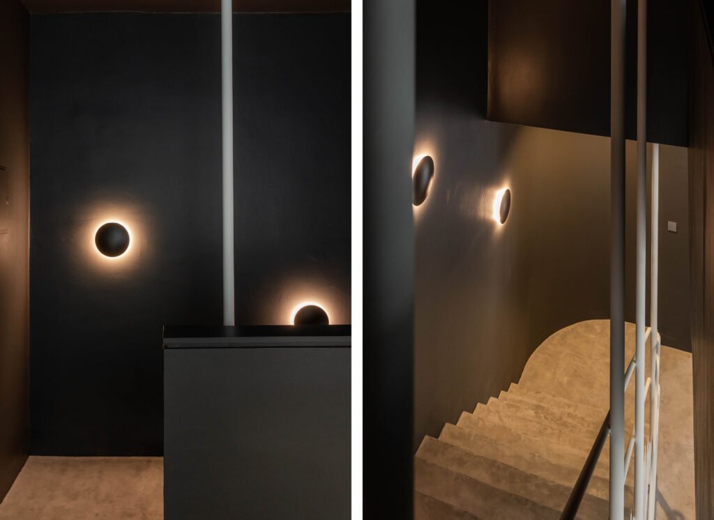


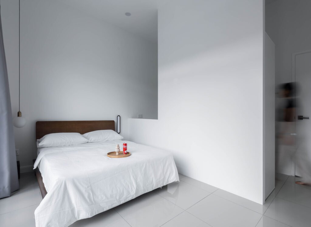
Okay, let’s talk user comfort. How did you facilitate passive cooling and cross-ventilation strategies in Zen Garden House, considering that it is walled on three sides?
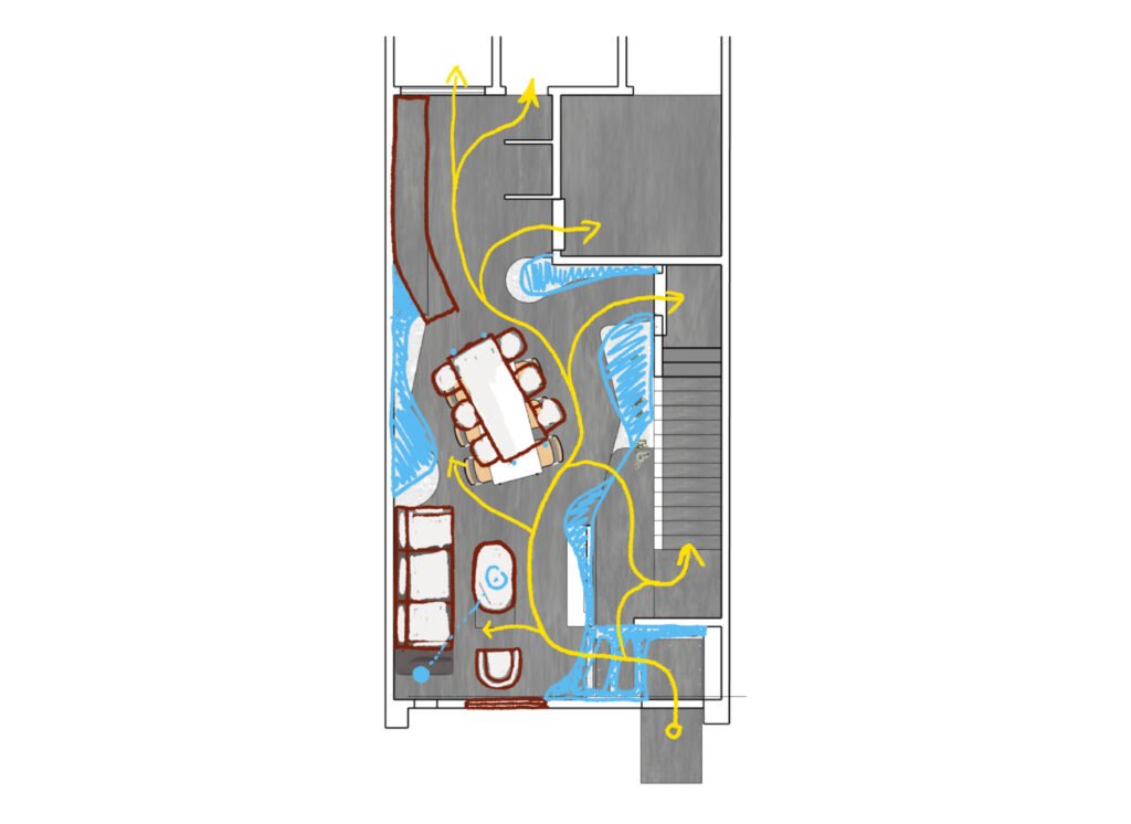
Kyra Swee Yewyong: Ventilation is naturally very important to nail when designing for the tropics, and we were fortunate that the ground floor space was open plan, making up for its lack of window openings. Instead of having walls or solid panels to delineate the ground floor spaces, we made use of an expanded mesh sliding door to segregate internal and external space and a thin veil of linen curtains to separate the dining and kitchen space. These ephemeral design elements assist in facilitating better cross-ventilation across the living spaces, allowing both light and air to flow unhindered into the home.
Kyra, I’m curious; would you say that your work experiences at Foster + Partners, and Formwerkz influenced the aesthetic and design preferences you pursued for your home?
Kyra Swee Yewyong: Haha! There are influences, yes. I have always been enchanted by Gothic architecture. To me, High-tech architecture is a reinterpretation of Gothic architecture with modern technology and materials, embodying a pioneering spirit that enables the realization of bigger, taller, and stronger structures. The inside-out design approach is not a gimmick but a truly functional way of expressing structure as well as MEP space, just like how Gothic architecture flaunts the expressive flying buttresses that enable it to stand and soar.
I am reminded of this quote by John Ruskin from his The Seven Lamps of Architecture that pertains to this approach to structural honesty: “Your building should be honest in how they present themselves. No fancy façade hiding poor construction. No wood pretending like a stone.”
Apart from Lord Norman Foster, projects designed by other High-tech architecture giants – Renzo Piano and the late Richard Rogers are also sources of design inspiration for Zen Garden House. The tensegrity dining table design is basically the realization of a long-gestating fantasy of creating something High-tech architecture-inspired.
I do think the experience that I gained while working with Formwerkz Architects somehow influenced our selection and minimalist composition of color and material, consciously and subconsciously. You could say that the end product is kind of a harmonious blend of the two very different approaches that I’ve encountered in my career. I love how it gives the space a sort of paradoxical quality by having both a lot and a little at the same time.
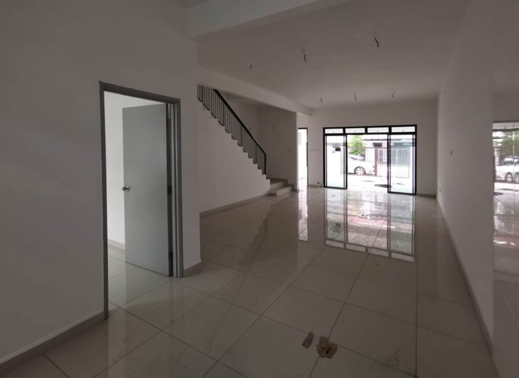
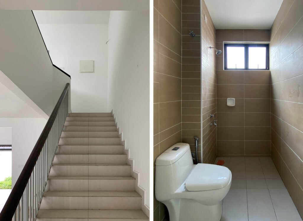

You’ve finally completed your home after months of intensive renovation! Are there any adjustments or fine-tuning you’re considering to enhance your experience within the space?
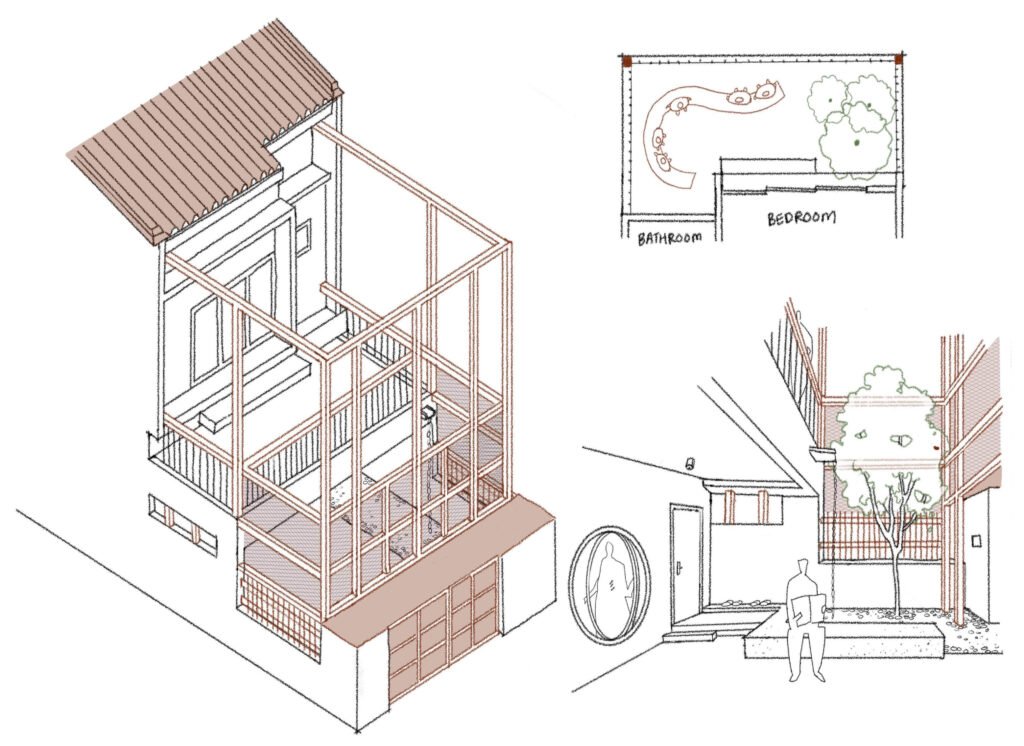
Lee Jinting: In the future, we would like to improve the terrace space outside of the master bedroom. It can be a simple one with a basic seating bench, steps to access the terrace, railings for safety, and a steel frame structure to encapsulate the space as an outdoor room, just like in our very first sketch for the renovation project.
How do you and Jinting envision the evolution of your home’s atmosphere and design as time goes on?
Kyra Swee Yewyong: We have actually yet to live in the space because of our hectic work schedules but we reckon it will be well-used by my family members. Our cat, Tuxedo, however, appears to be enjoying the spaces in Zen Garden House way more than everyone else!
What is your favorite room within the home?
Lee Jinting and Kyra Swee Yewyong: Definitely the carport-living-dining-kitchen space on the ground floor. We poured most of our creative juices and design know-how there. We are happy with how this space that we envisioned as an indoor garden turned out, how the spatial programming and materials shaped the slow, meandering movements of people going through the space, not unlike having a stroll in one’s garden.


Has the overall experience of renovating your home revealed insights or observations about spatial design or the practice of architecture you have not encountered before?
Kyra Swee Yewyong: This is our first project where we are the clients. It’s quite an eye-opening experience as we are used to being project designers for others. Being more cost-oriented is essential for us as going over budget can turn into a nightmare. However, we also strive to achieve the design intent as much as possible.
To strike a perfect balance, we spent approximately eight months with our ID consultant and contractors before work commenced to refine the design proposal based on our intent and budget. Without a QS on board, checking with the contractor and supplier on buildability and cost by traveling back and forth between Singapore and Malaysia has become the norm throughout the entire renovation process, which we never experienced in our respective office projects before.
We immersed ourselves in the process because we are not merely house owners and designers but also the builders; Aesthetics, buildability, and cost are all equally important in this project especially since we are both financing and using the house in the end.
Now that we’ve come to the end of Zen Garden House’s renovation journey…Beyond a place for shelter, how would you describe the role of a house to its inhabitants? What should it be for the people it harbors?
Kyra Swee Yewyong: I grew up in a family that had to rent their entire life due to financial difficulties. It was challenging for my parents to afford property while raising two children, so we had to move frequently. When I was five years old, my family moved from Singapore to Johor Bahru, and we had to move four to five times within Johor Bahru over the next 13 years.
Growing up in such an environment inspired me to become an architect. I hope that one day, I will be able to design and provide my family with a house where they can find peace of mind and finally call it home. This house will mean much more to me than just a place to live; it will be a sanctuary for my family to enjoy. •
