Words Pipo Gonzales
Photography Marc Heinrich Go, Eric Beltran, and Kevin Evora of Studio Synthesis
The last couple of years has given the accidental homebody ample time to reconsider domestic spaces. Before the pandemic, eating out was the norm: the kitchen was for food storage, with the stove and oven only getting workouts for special occasions. Although food deliveries offered flexibility and variety, many eventually learned to enjoy chef duties in the kitchen during the two years cooped up at home. With the easing of regulations and the reopening of the economy, newly-minted kitchen enthusiasts would naturally find themselves wanting to upgrade their culinary kits to match their desire to cook and entertain. For kitchen connoisseurs who can afford the best, options like Modularity Home, the Filipino distributor of prized Italian brands like Scavolini and Valcucine, have finally fully reopened, with a refreshed space to boot.

A new face for a storied space
For Modularity Home, the Scavolini showroom at The Peninsula Manila was already slated for a renovation—even before the world came to a standstill. Modularity Home General Manager Brian Hontiveros recalls, “We’ve been using this space for close to ten years already. But two years ago, just before the pandemic, we were supposed to refresh the designs of the kitchens.” Heeding Scavolini’s marketing traditions, the showroom changed one of its kitchens annually. The team, however, agreed it was time to have the whole place refurbished instead.
Among crucial factors were the circumstances presented by the location. “Scavolini is one of the biggest, if not the biggest, kitchen brand in Italy and around Europe,” Hontiveros shares. With brand prestige at the forefront of considerations, it was no surprise back in 2011 that the team selected the storied Pen to house its proud selection of kitchens, after an exhaustive tour of Makati and BGC spaces. The space allotted is relatively large given the composition and layout of stores within the hotel. However, space limitations demanded careful thought regarding which designs should be displayed or highlighted. “This was probably already the biggest space they could offer us. It used to be an art gallery,” Hontiveros shares.
Adding to the challenge faced by the would-be design team is fitting Scavolini’s wide range of products within the constrained space. With over 40 models and an expansive variety of finishes and fixtures, conveying every possibility for clients to envision their dream kitchens was conceptually exhausting. While it would be strategic to display as many product lines as possible, the team was also mindful of their location’s demographic. Clients that visited the site had more space to occupy and thus, preferred more sizeable furnishings to consider. The presentations needed to allow them to imagine. Hence, the team needed to narrow their options with a meticulously handpicked selection of premium lines for an immersive exhibition.

The perfect partnership
Designer Budji Layug and architect Royal Pineda of BUDJI+ROYAL Architecture+Design solved Modularity Home’s problems. Their design ethos clicked with what the project specifically needed. It also helped that Hontiveros trusts the design duo completely, having worked with them previously on several projects. He says, “We needed the expertise of Sir Budji and Arch. Royal to guide us and put us on the right path because they are more familiar with direct relationships with their end-users. We wanted it to feel like a BUDJI+ROYAL showroom. So, when a client talks to them and they recommend a product—when the client comes to our showroom—there’s a consistency in the philosophy and aesthetic.”
Arch. Pineda responds with equal praise, “Brian was great as a client. He let us see it first and was very much in listening mode. He wanted us to really give him some ideas. And when we looked at the space, we felt that it could give so much difference in terms of experience.” Layug agrees, bringing transparency to the fore, “Working with Brian is a pleasure because he’s very open to ideas; He really allows us to be able to interpret this space according to our philosophy as well. Of course, their products speak for themselves, they’re very beautiful quality products.”


Crafting experiences
Pineda compliments the setting, finding an opportunity to produce something magical, “You know, it’s also a blessing that you have a beautiful landscape in front of you because the sensibility of BUDJI+ROYAL has always been about reconciling the indoor and outdoor as one. It gets highlighted. What we are trying to showcase is that in a very tropical setting, something very European and a good quality product can adapt.”
Pineda briefs us on the highlights of the assignment, “We felt that the beautiful stretch of the windows — that glass that connects to the garden, the natural light, and the ceiling, the height of the ceiling. I think in our initial and our concept design, we made it an experience to walk through that entire stretch of the space and make that grand as every bay becomes a new experience or a different module of their products.”
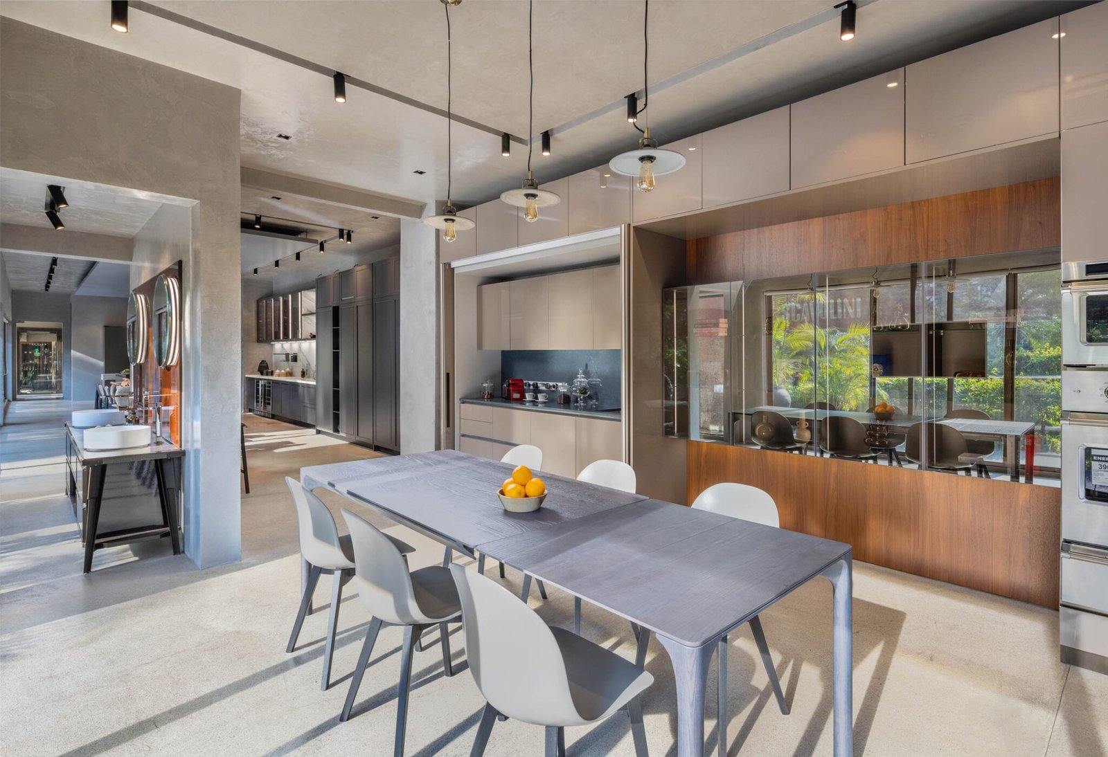
Layug confirms, stressing out the need to optimize the space with a limited amount of area. “I think it was more or less the same size as before, but what we did was really just open up all the spaces as one to create that openness and take away any of those divisions so it creates that very spacious light feeling of a whole unified space. But then, what is nice about it is that the different kitchens and styles are complementary so it feels like a home at the same time.”
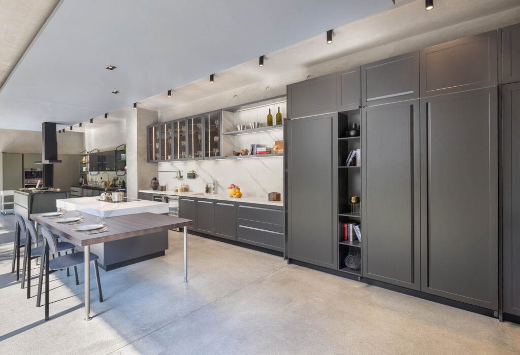
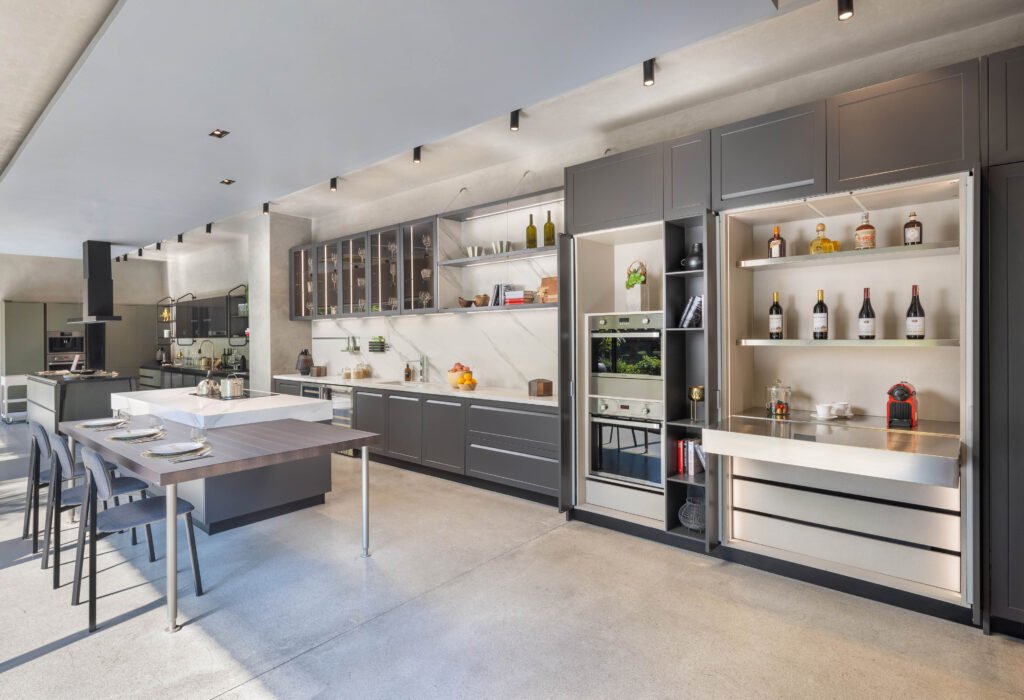
Naturally, Hontiveros was pleased with the outcome, recalling the ease of working with the BUDJI+ROYAL tandem, “I appreciated what Sir Budji told us, that it can be different models and different collaborations but it reads as one. So the material from one kitchen to the next, even if they look completely different or it has a different character, it unites because of the selection of materials that Sir Budji physically selected for us.” He also points out how the team raised the ceiling level, allowing an airier feeling and lighter ambiance.
With approximately a thousand finishes to choose from, Hontiveros jests that even they would be confused with the permutations made possible by Scavolini. The design team, however, remained focused on the objective. Hence, regardless of the transitional experience, they were able to blend the styles of three different kitchens effectively and without visual disruption.
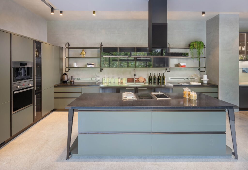
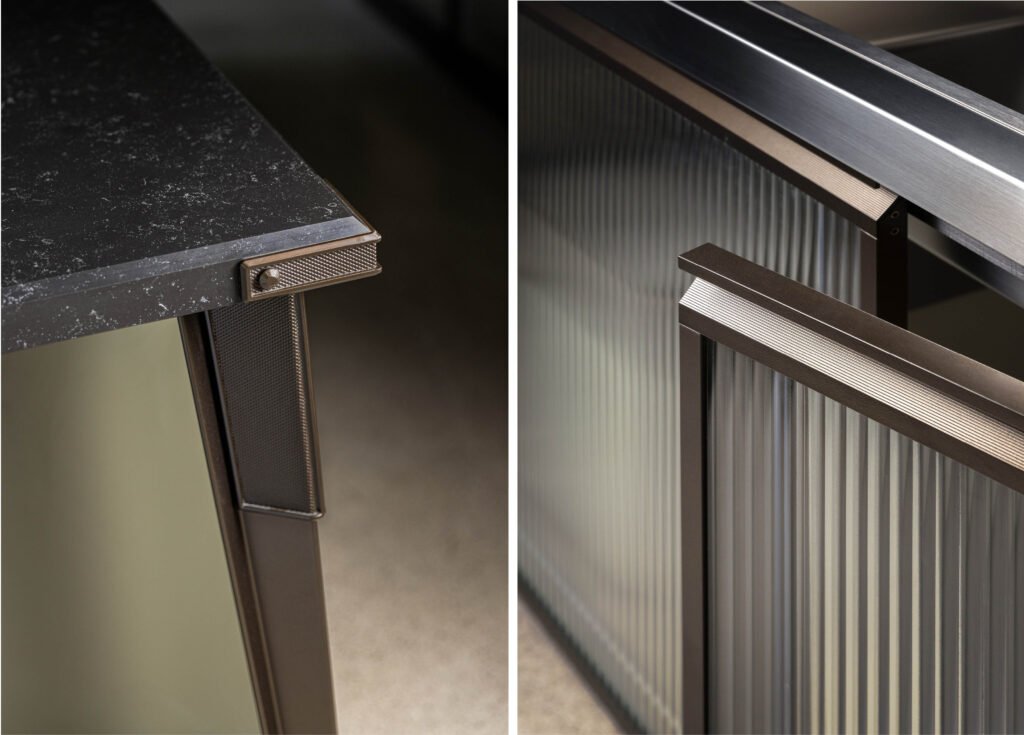
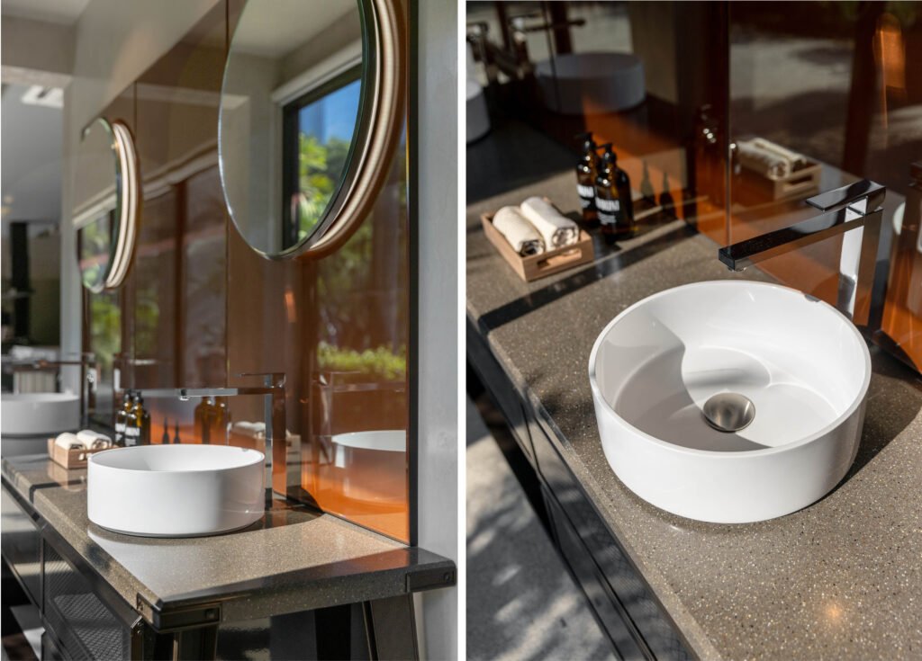
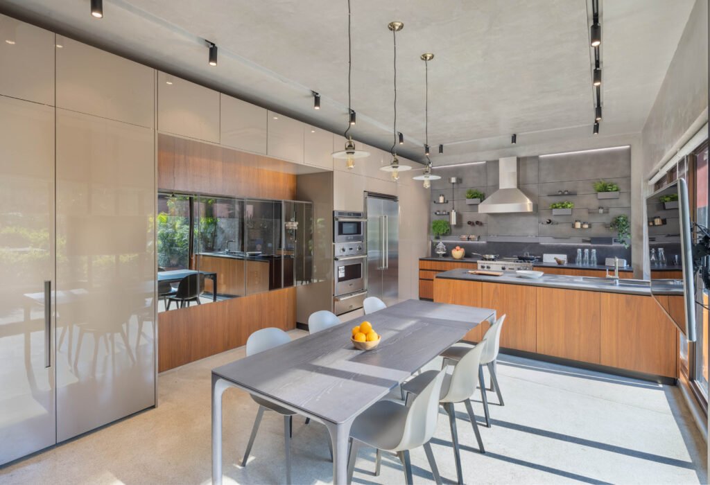
Surfaces that reflect the garden outside were also a critical element of the design. Pineda intimates, “Do you see the panels, the backsplash, and the polish panels of the cabinetries? These are very subtle touches, but it gives a different experience for the guests coming into the showroom.” Clever architectural touches —glossy panels, materials, and pieces, reflected its natural environment outside to add depth and invited the greenery into the kitchen.
He continues, “When we looked at the original showroom, these were all walls and cabinetries. We felt like it was always like you’re looking, and your back is against the garden. But this one is something that encourages the atmosphere of tropicality. Clients can easily relate and imagine these products in their home — especially if it’s a BUDJI+ROYAL home.”


A journey of touch and taste
Smooth transitions, albeit between distinct kitchen profiles display the team’s expertise in playing with form and function, creating several design stories that run seamlessly without disrupting the overarching narrative. It was a calculated and well-choreographed approach that spoke volumes about each model’s personality but also of the design pedigree, quality, and customization Scavolini offered.
The Diesel Open Workshop kitchen first welcomes guests by the door. This second collaboration with the fashion brand was a testament to the success of the first partnership, the Diesel Social Kitchen, six years ago. Combining Diesel’s aesthetic identity with Scavolini’s functional know-how, the kitchen attracts customers looking for a perfect balance between modern and industrial designs.
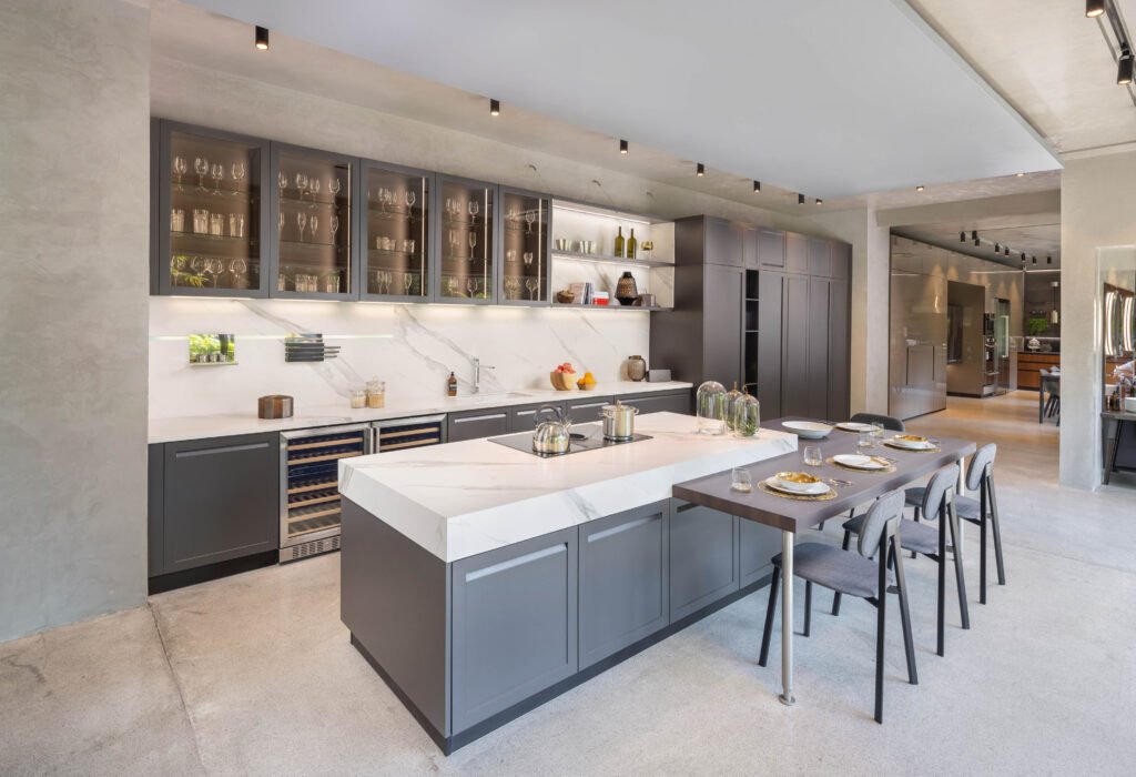
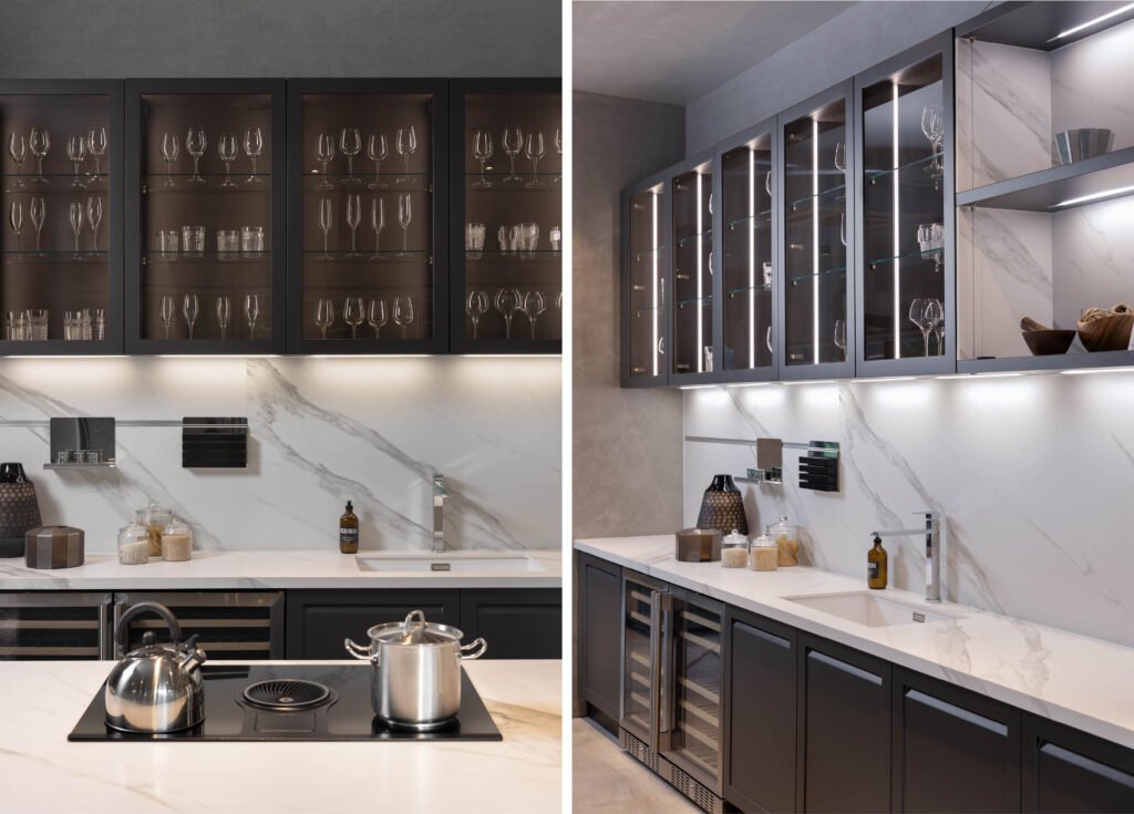
From the Diesel kitchen, guests then port over to the Caraterre. Previously nicknamed “The American Kitchen” for its design influences, its classic look is still much-desired by a young market, perhaps sold on the idea of purchasing nostalgic pieces reminiscent of trips abroad. “That’s the nice thing with Scavolini, we have the flexibility to understand, not just the budget of the client but also the kind of design they’re looking for. This is still modern. There are frame doors, but the handle is integrated into the door itself. There’s no handle jutting out,” Hontiveros explains.
Before landing at the final kitchen installation, a minimalist kitchen purposed to save space greets visitors. BoxLife is a suitable concept for cities like New York and Tokyo or countries like Hong Kong and Singapore, where small areas are matched with premium tastes. Accordion doors that appear to be walls can be slid to the side to cover the kitchen (or other home furniture and appliances) with ease and convenience.
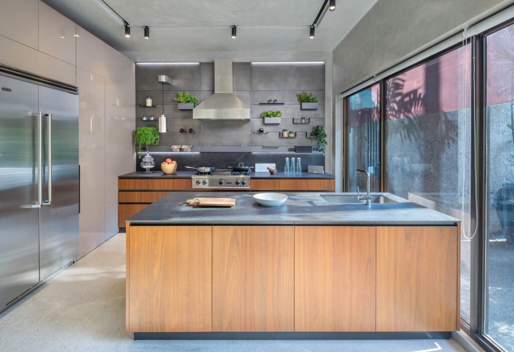

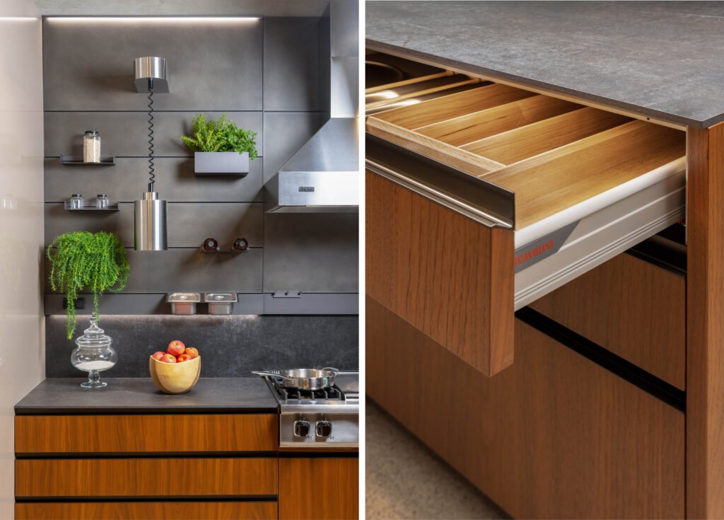
At the end is a lounge-type kitchen where one can picture hosting dinners and entertaining guests. A dining table is perched just across the kitchen decked with Viking appliances, another partnership by the brand. Right beside the Viking hood is the Mia system, this time a collaboration with famous Italian chef Carlo Cracco. The line system can accommodate several utilities such as a knife holder, spice racks, and heating lamps, among other useful items.
While the challenge exacted delicate equilibriums of feel and flourish, space and setting, the partnership between Modularity Home and BUDJI+ROYAL was able to reflect the needs of the showroom and inspire the intended messages of the Scavolini brand. In the future, Hontiveros hopes, the space can accommodate live events, with the working kitchens able to demonstrate their proud capacities. •



2 Responses