Interview Patrick Kasingsing
Images Jar Concengco for Polygon


Hello, Tim and Marianne! Thank you for giving us a tour of Taqueria Franco, another addition to your growing design portfolio of F&B projects. Before we get into the nitty-gritty of the project, can you share with us how it all started? What was the client brief? Did the client have a few pegs, or did they simply share their vision and allow you to translate that into a space?
Tim Wong, co-principal at Polygon: Hi Patrick! Thank you for letting us tell the story behind Taqueria Franco’s design. Chef Miko Calo and team reached out to us in the hopes that we can help them plan out the existing space. They did show us a few pegs, which were cafés in Hong Kong and Singapore that carried a grungy appeal. They were very particular about wanting a neutral space. They didn’t want the space to be simply Mexican or French. It had to showcase something new and reflect the avant-garde concept that the restaurant brand is introducing.
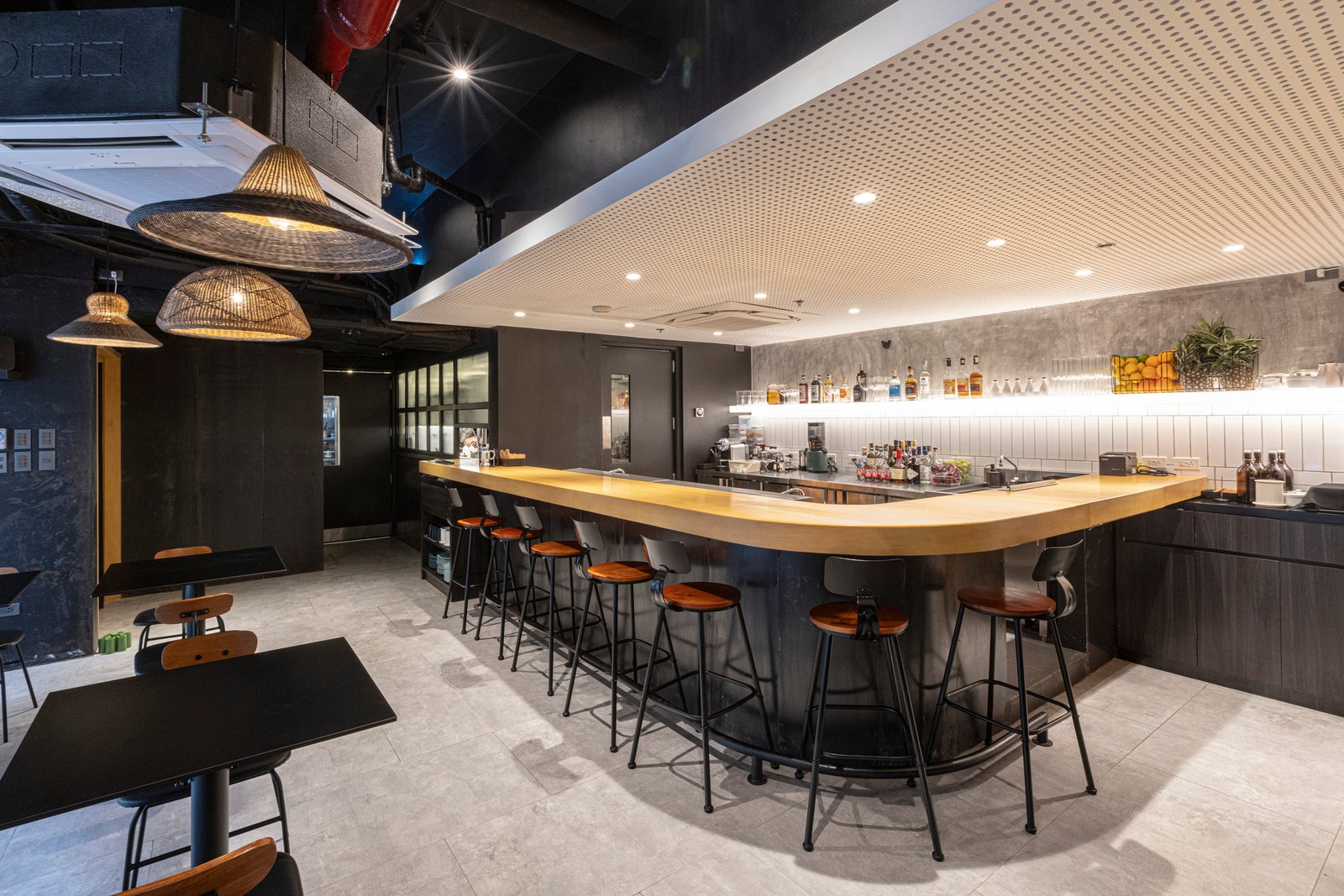
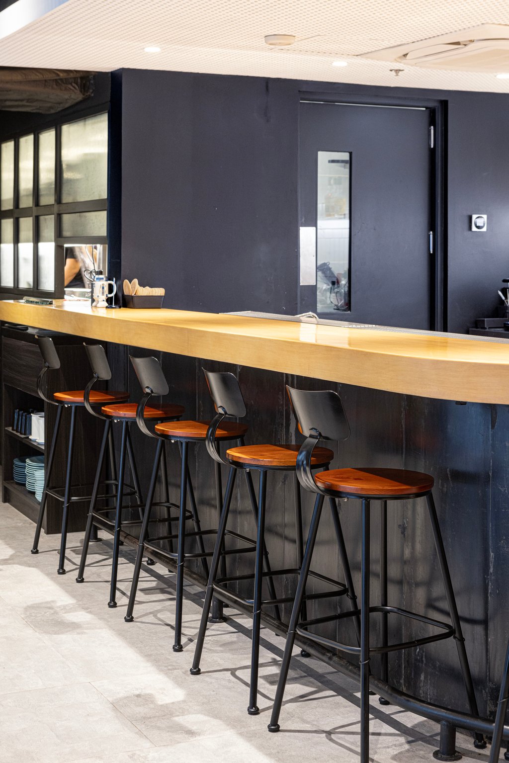
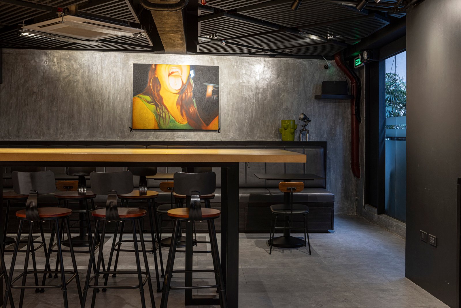
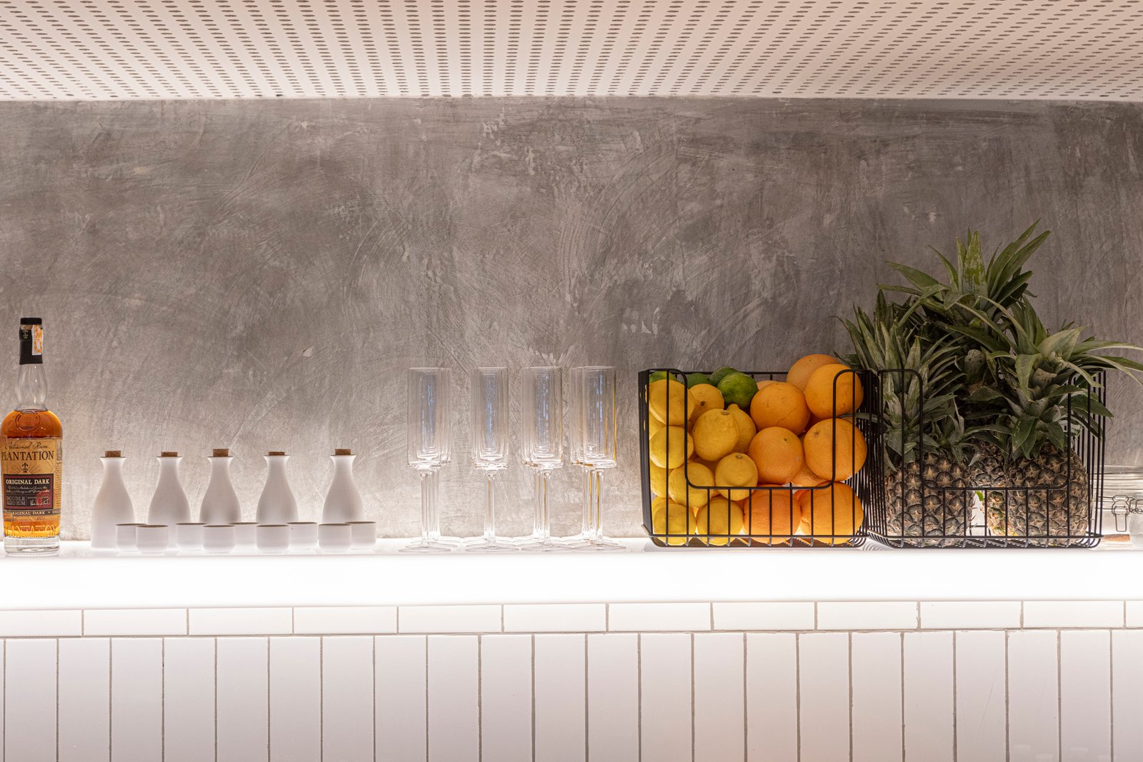
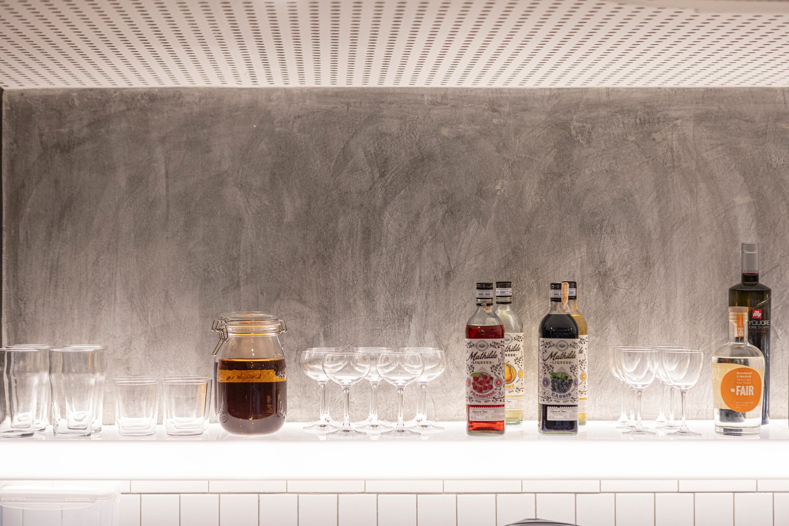
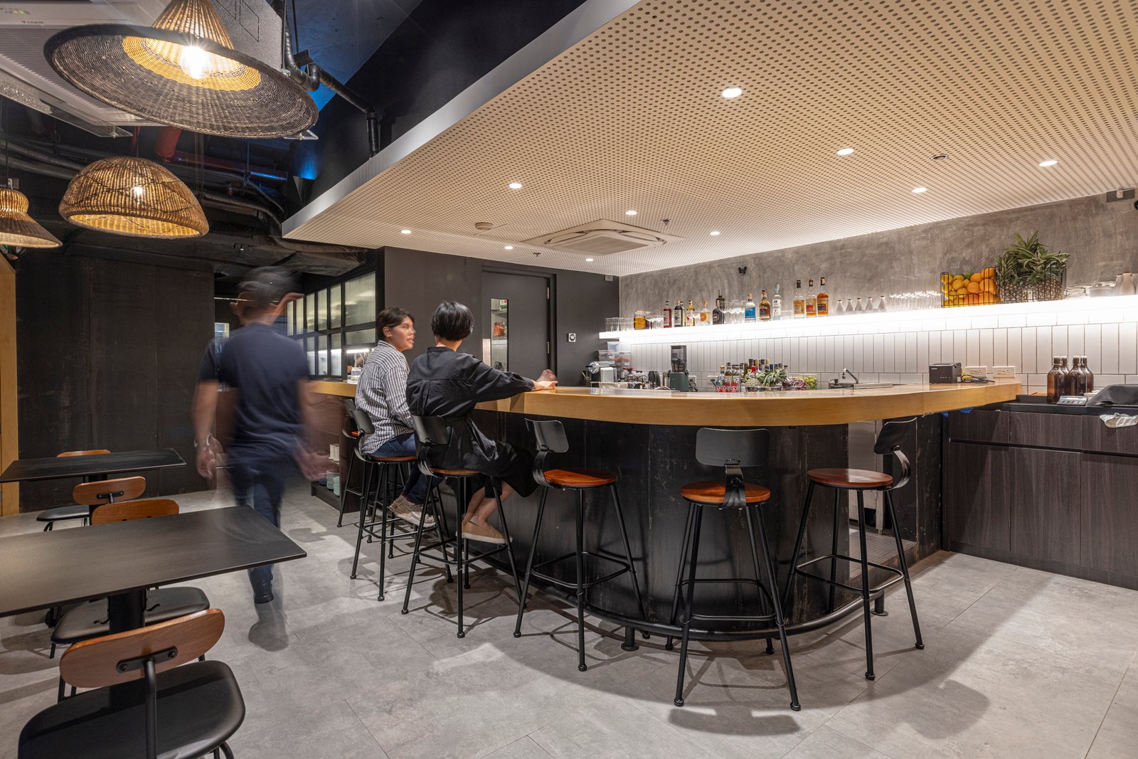
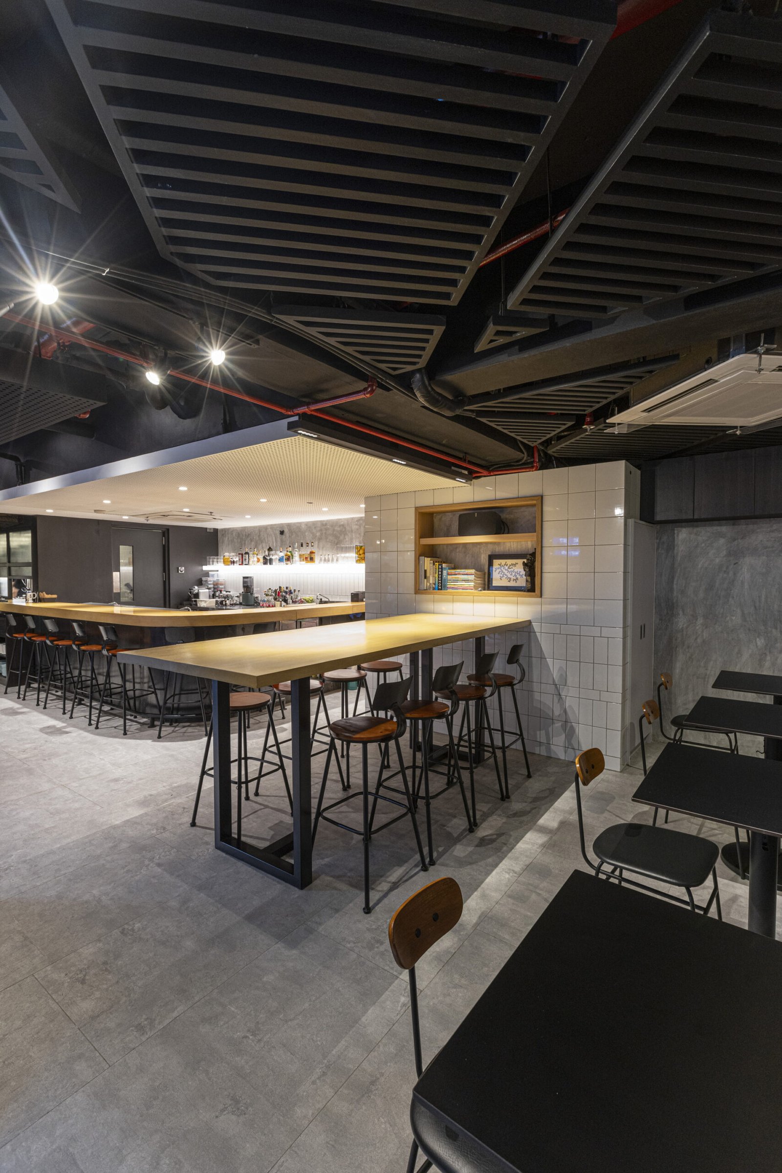
Marianne Wong, co-principal at Polygon: One non-negotiable was the use of concrete, as one of the team members loves spaces that showcase the purity of the material. What we did was scrape off the existing paint and just protect the walls to highlight the original concrete walls of the building. If you look closer, you’ll even notice how the rawness of the walls reveals holes and other imperfections. We softened this strong characteristic by using contrasting white tiles, along with warm elements around the space such as the wooden bar, which was also a non-negotiable from the client.
You mentioned that this spot used to be a restaurant as well. Were there aspects from the existing space that you carried to your new design?
Marianne Wong: We designed the layout of Taqueria Franco with respect to the existing space. The initial layout was open, with the narrow site allowing us to know where to designate essential areas immediately.
Given that the site has a low ceiling, we decided to expose all the utilities and play around with the ceiling using patterns and textures. We also had to be careful with setups as this is an old building, so we refrained from moving and exceeding loads of certain functions such as plumbing and electrical.

We cannot deny that new culinary concepts or fusion cuisine can be intimidating for some people. What did you do to address this design-wise? How is the space meant to entice people?
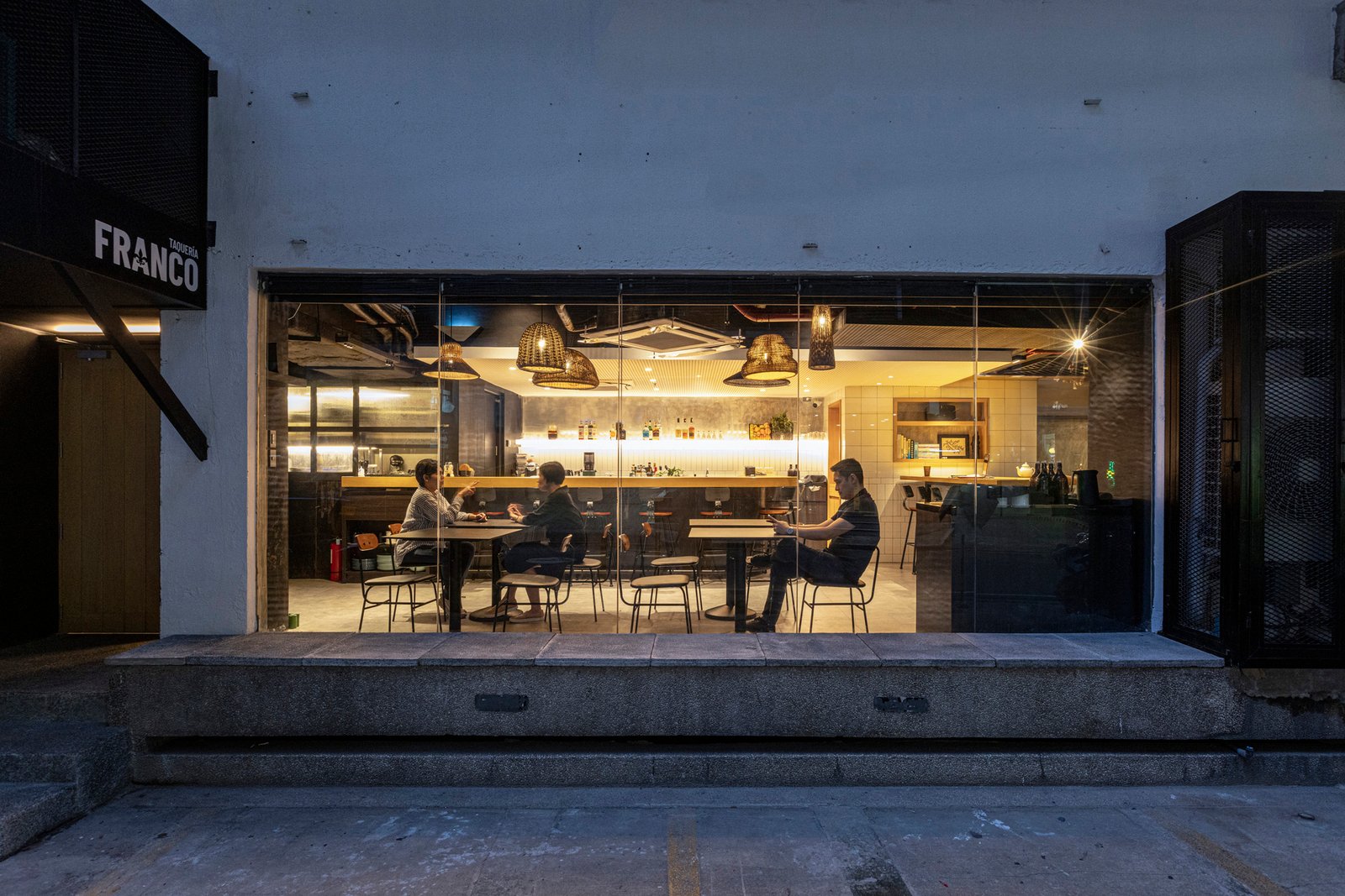
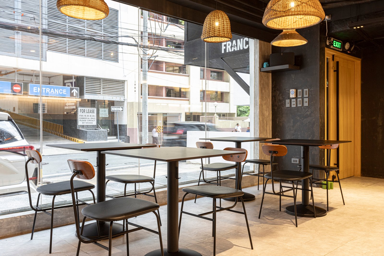
Tim Wong: The idea is that the space is supposed to be enigmatic from the outside. The simple, black and white, French bulldog logo with the brand’s name is meant to evoke curiosity and encourage people to discover the sensory delights that await inside. The blinds are usually up to let people from the outside see all the action happening inside. Other players would be the brightly lit bar and the humble wooden door at the entrance, potentially drawing more people in. It’s basically like a club. Those who know, know. For those who don’t, we hope they’ll be curious.
Another thing to note is that while the client wanted the design to introduce a casual dining experience, Chef Miko is quite known for her fine dining background. To address this, we suggested the use of common materials or those that you see on the street, such as concrete, tiles, and steel. It’s how these materials were put together that makes the space elevated. We could say that this design strategy is comparable to how they decided on their menu, as they serve common food such as tacos but add flair to it by applying French techniques that they’ve learned from training. Taqueria Franco is meant to showcase another side of the client. This is them proving that they can also let their hair down.

How about the overall form of the space? What were the things that you referred to in general? Were there any philosophies or concepts that you drew from in shaping Taqueria Franco?
Tim Wong: At Polygon, we try to expose and train ourselves in both classical and modernist architecture. Because of this, we like spaces that are defined. For Taqueria Franco, we just retained most of the aspects that characterize the existing space, such as the ceiling and its pockets.
One thing we’ve learned from experience and continue to practice in our designs is to first determine the approach and flow of a space. Once this is settled, each element and even the entire space will reveal itself. We like how this proved to be true for Taqueria Franco, as the experience of providing a physical representation for such a wild concept was very explorative for us.
I like how you went for a design that is very composed for an unconventional concept. You restrained yourselves from doing something just as wild, giving the food a space that serves as its stage rather than something that competes with it for people’s attention.
Tim Wong: Thank you for that! Chef Miko, and business partner RJ Galang, really wanted the space to showcase that while the food is different and new, people should not be intimidated or afraid to try it. This is even reflected in the lighting, with the dim atmosphere of the space providing a certain warmth. The client really wanted a space that is approachable, a lot like a welcoming bar where people can just hang out.
Even the furniture pieces were carefully selected to meld with the space. Some of them, such as the banquet seating, are meant to encourage people to stand and mingle. We saw this happen when the Taqueria Franco team hosted a friends and family night here. The bar area was the first to get filled up followed by other seating areas, with everyone moving around right after.
Cool! Was there any notable feedback from that night? What interesting comments about the space have you received so far?
Marianne Wong: The bar was a crowd favorite that night! The flexibility of the area allowed people to socialize whether seated or standing up.
Overall, what guests usually compliment is the lighting of the space. For the Taqueria Franco team, they told us that they particularly love the bar as it’s the quietest bar that they’ve used so far. The acoustic boards allow them to prepare food and beverages in peace, even when it gets noisy outside.
I do agree that the space has good lighting! I did notice the hanging lamps, which are dissonant elements to the overall design.
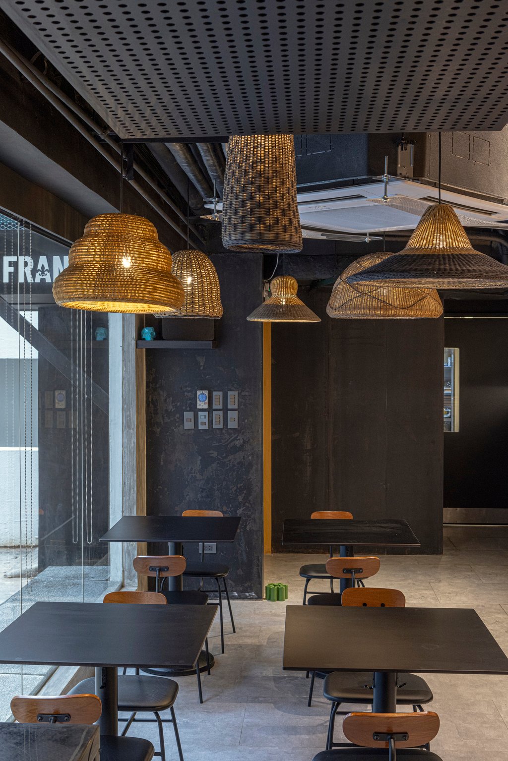
Tim Wong: Fun fact, the lamps used to be part of an older restaurant they had, one of their starting concepts. We initially placed modern lamps for Taqueria Franco, but they weren’t quite keen on those. We then remembered these lamps and suggested using them, so now they’re back! It’s these little things that make a good narrative. Even the Machuca tiles in the bathroom used to be from the old restaurant. All the art pieces that you see are from the client’s collection as well. It’s nice that we were able to include things that were there during the brand’s beginnings and allow them to take part in this new chapter.
Speaking of the brand’s beginnings, was there any point where Taqueria Franco drew inspiration from Chef Miko Calo’s previous restaurants? Any more surprises we should know about?
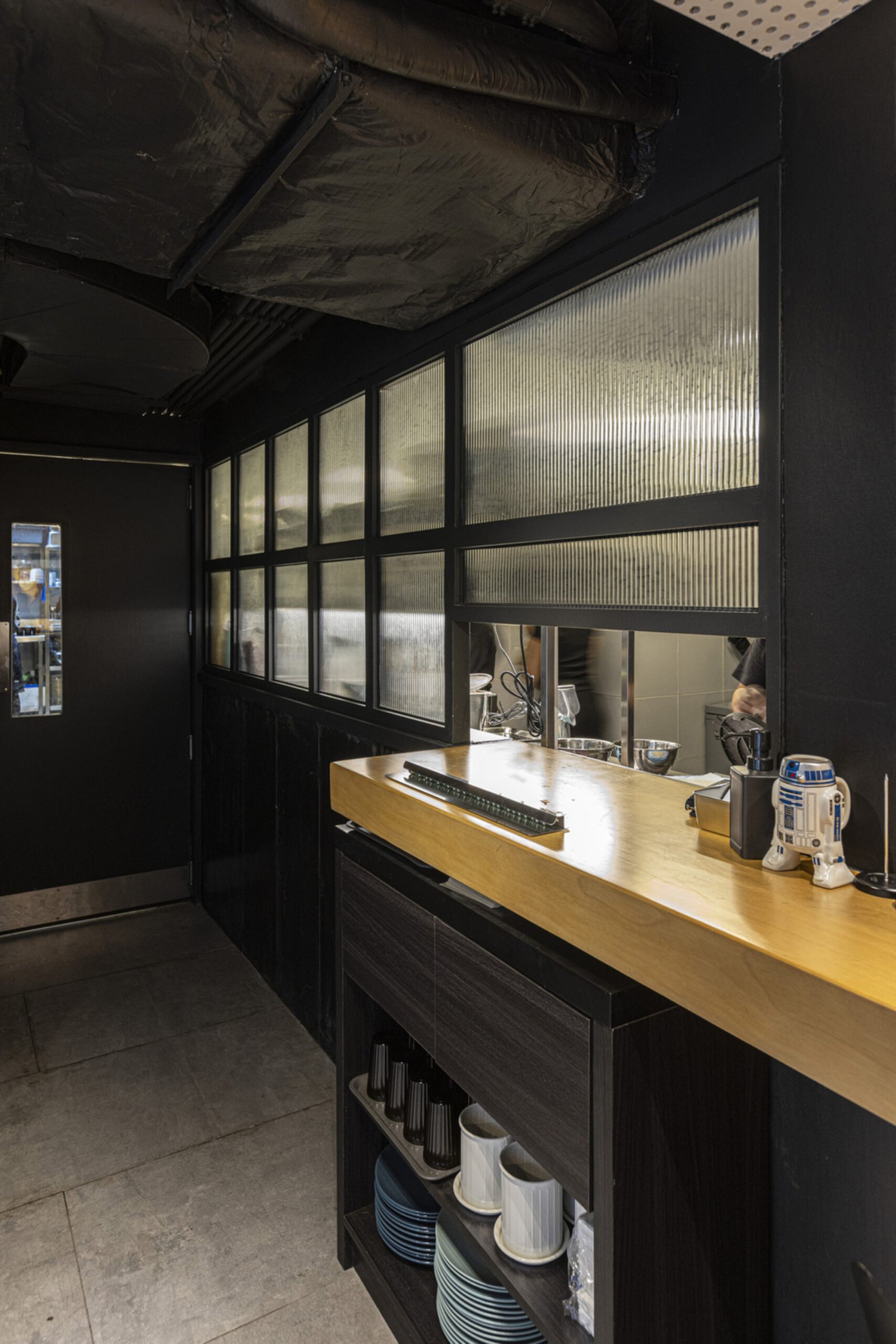
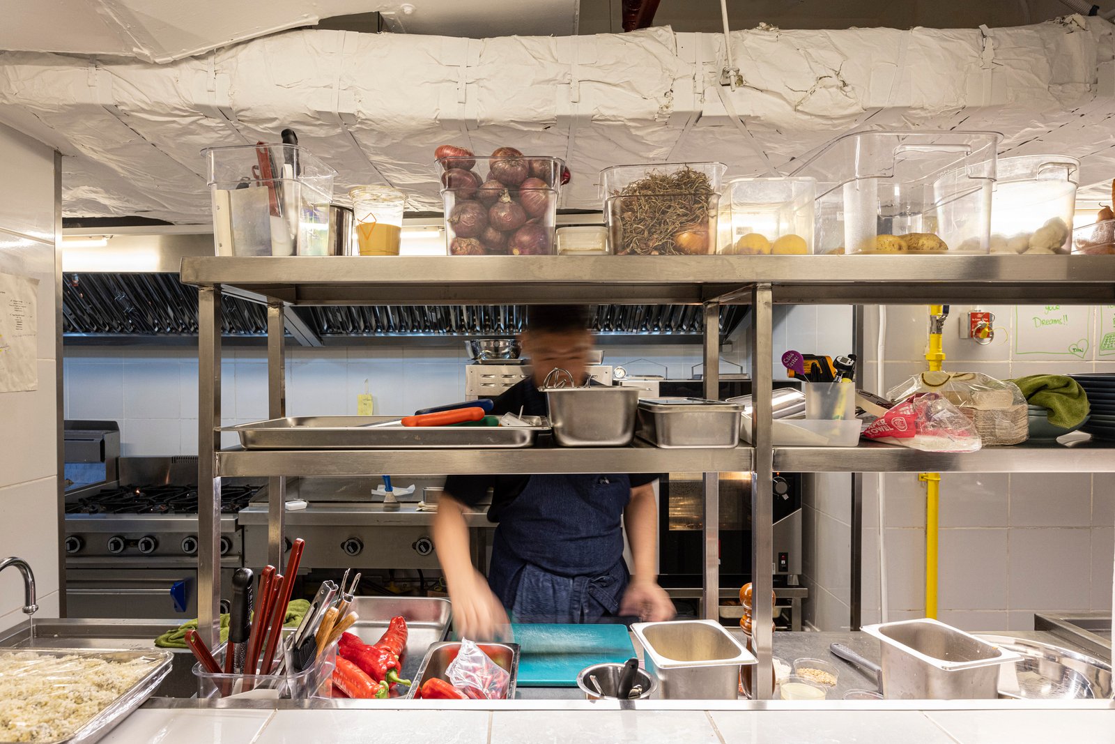
Tim Wong: Well, we’ve revealed everything we possibly could in terms of the design. No more surprises, promise! We did base the kitchen layout on their work system. Chef Miko is also very particular with the equipment she uses, so we had to make sure that all the equipment needed for a certain area would fit. They gave us specifications from the preparation to the finishing area and we complied. But in terms of the overall design, they really wanted to try new things, which we enjoyed doing and discovering with them.
Marianne Wong: It was truly a collaborative process. The decisions were back and forth, down to the seating system. We all agreed on designating areas where people can dine alone, in twos, threes, and larger groups to make the space more inclusive.
Now that you’ve mentioned seating, is there an envisioned total capacity for Taqueria Franco?
Marianne Wong: Taqueria Franco has an indoor seating capacity of 32, with space to squeeze in additional tables and chairs. We really designed the space to be flexible so the client can still experiment and move things around in the long run. We’re also planning a ledge or mini outdoor area where people can sit, enjoy their tacos, and stay for a short while.

Can you share some of the biggest challenges you encountered in designing the space and how you faced these with the client?
Marianne Wong: Water leaks were among our major problems during construction, given that the site is an old building. It’s a good thing we chose to work with a good contractor. Some of the workers were also skeptical about bringing out the imperfections of the structure at first, as they were used to polishing things instead of exposing flaws. The client helped us talk them through this as well.
With residential and office spaces above, we also had to follow a schedule. We weren’t allowed to work overnight and during the weekends. We got things lined up during the design phase and had zero to minimal adjustments from the client during construction. We’re grateful to have clients who are very dedicated and trusting at the same time. They weren’t even surprised when they saw the space, as it was all pretty clear to us how we wanted it to look.
Tim Wong: We focused on doing certain adjustments for the kitchen too. We had to ventilate it properly as it initially felt like there was no fresh air coming in. We felt like we were able to create an art piece with the resulting network of kitchen ducts! The existing kitchen also had a raised floor and we had to adjust this with the low ceiling as one of the owners is around six feet tall. Looking back, these may have been small details, but we realized that these are things that truly matter, especially for F&B projects.
You say that you were able to bring life to most, if not all the things that you imagined for Taqueria Franco. How much of the vision is reflected in the space? And above all, what did you get to take home from this tasteful experience?
Marriane Wong: If we were to quantify, we would say that we were able to come up with a design that is 85% faithful to the original vision. It’s not perfect, but none of the essentials were taken away.
Tim Wong: One thing that this experience did was strengthen our resolve to uphold the fundamentals of space. Most of our exchanges started online and communication was quite challenging. We had ideas that we wanted to push but took a pause and considered whether the space was ready for those ideas. As architects, we are accustomed to seeing innovations in a space. But we have to remember that most people don’t see that. We have to find that balance.
This project reminded us why we aren’t big on bells and whistles. We believe that a space should be beautiful but not enough to overshadow what it represents. Architecture exists to be the backbone… in the story of Taqueria Franco, it plays the role of a stage—not only for the culinary attractions inside but for the passion of the people behind it. •
Project Team
Client: Taqueria Franco, Avec Restaurant Group
Design: POLYGON: Human-Centered Space Design
Design Team: Ar. Marianne Wong, Ar. Tim Wong,
with Ar. Hazel Abrigon and Russel Bulosan
General Contractor: Medavis Builders
