Words Kara Gonzales
Images Greg Mayo

Not what it seems
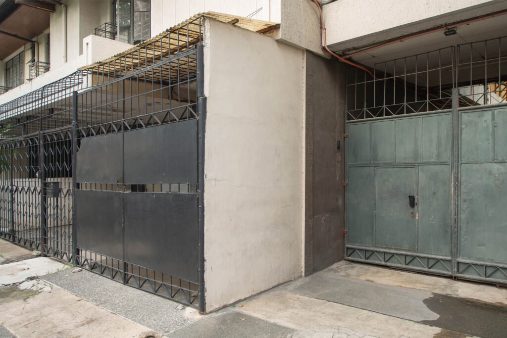
For a creative hub harboring colorful personalities, Studio Kapitbahay’s street-facing entrance can lead one to do a double take. Housed in an unassuming duplex apartment common to the area, it almost disappears from view amidst the bustling streets of Kapitolyo, a former sleepy residential quarter in the city of Pasig turned lifestyle and gastronomy destination. This run-of-the-mill duplex with a bluish-black gate along San Rafael Street harbors a secret: it is the workspace and ideas incubator of a first-of-its-kind creative community. Project designer (and studio partner) GRAAR, founded by architects Lando Cusi and Allie Principe furthers: “Studio Kapitbahay was born out of a common need to have a place to work, be productive, and inspire collaborations.”

Founded in 2020 by four friends inspired by the creative spaces they saw and admired while traveling in Europe and Asia, Studio Kapitbahay now consists of nine creative studios and professionals making a name in their respective fields. They are Soleil Ignacio (illustrator and designer), Kris Abrigo (visual artist, muralist, and designer-maker), John Ignacio of Hiraya MNL (a venture building company focused on emerging creative technologies), visual identity studio NS Design, Caloy Limjap Soliongco (any-screen filmmaker), Ralph Guibani (art director, apparel designer and aspiring toy artist), Mansy Abesamis (papercut illustrator, data artist, and potter), Ira Cruz (mobility advocate, transport planner and daily bike commuter), and finally GRAAR.

A bright idea
“The studio is set up in such a way that we each have our personal spaces where we can work on our pursuits, and then common areas that we use for socializing, leisure, or work if someone wants a change of scenery or needs more space,” Cusi and Principe explains. Together with good friends Soleil Ignacio and Kris Abrigo, they conceptualized a shared creative space that could be used for events, shoots, workshops, and other activities they envisioned could help the creative communities they moved around.
The first iteration of Studio Kapitbahay was in a 160 sqm 60’s-era bungalow, which was blessed with a sprawling 80 sqm backyard. The reuse of old structures is something Cusi finds fascinating. “Since the first location of the studio was a midcentury modern house, the space already came with interesting elements. All we had to do was enhance this and brighten up the space by adding accent colors.”
The brief then was simple—to use materials that were affordable but impactful, and to prioritize function above all else. This led to minimal renovations and carefully calculated allocation of resources. “The only thing we did was to make sure the electrical capacity was enough for all of our needs,” Principe shares, adding that the rest of the work for the first location, such as painting and carpentry, was done by the founders themselves. “It was such a good experience because everything came together organically,” Cusi says about how they came up with the colors and the general aesthetic of the studio. “We didn’t need to have a concept; we all just went with what came naturally to us.”


“It was such a good experience because everything came together organically,” Cusi says about how they came up with the colors and the general aesthetic of the studio. “We didn’t need to have a concept; we all just went with what came naturally to us.”
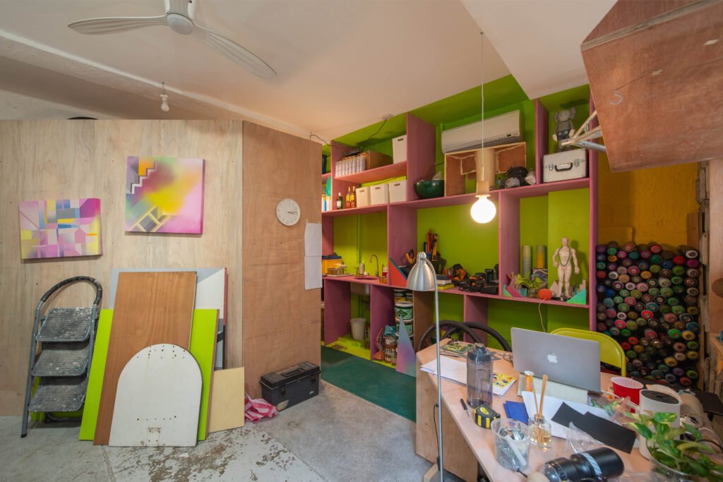
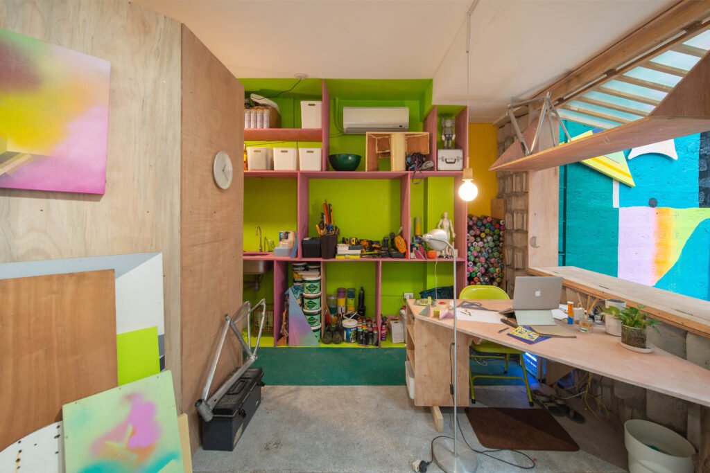
To anyone who follows the work of these creatives, it’s obvious: the bright, bold colors and geometric elements of Abrigo’s work, Ignacio’s earth tones and organic forms, and GRAAR’s crisp, clean yet playful architectural lines. Everything came together quite harmoniously, as if a testament to their connectedness, the fusion of what is similar and what is different, and how well they work together.
Soon after the studio’s launch in February 2020, the COVID-19 pandemic hit, derailing most of the studio’s plans. The intent to become an interactive creative community was put on hold, along with, well, the rest of the world. The studio instead became a second home to its artists, serving as a getaway from the monotony of lockdowns, and turned into the creative respite they all needed when projects were put on hold left and right and work were scarce.



“After the lockdown, we felt that we had to slowly gain back momentum before we could revisit those plans,” Principe shares as they recount how the pandemic affected all of them. “For the members of Studio Kapitbahay, the studio is more than just a workspace. It’s also a place of comfort—a second home almost—for most of us. It became our bubble, and we’ve always felt extremely fortunate to have had that sense of community during a time when everyone was isolated.”
When their lease was about to expire in mid-2022, the lease terms on the property changed. It was at this time that the group decided to relocate and find a space that could better serve their growing number and their evolving goals.
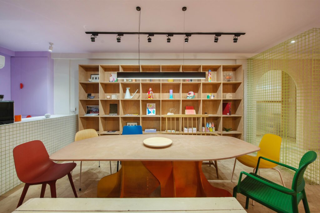

To anyone who follows the work of these creatives, it’s obvious: the bright, bold colors and geometric elements of Abrigo’s work, Ignacio’s earth tones and organic forms, and GRAAR’s crisp, clean yet playful architectural lines.
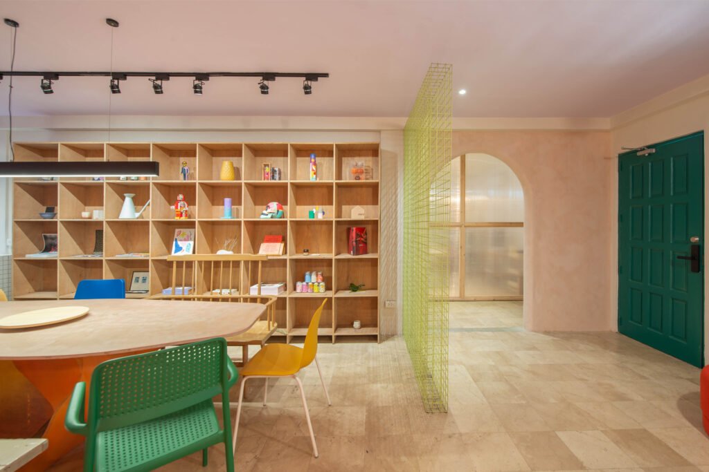

Your friendly, neighborhood creative community
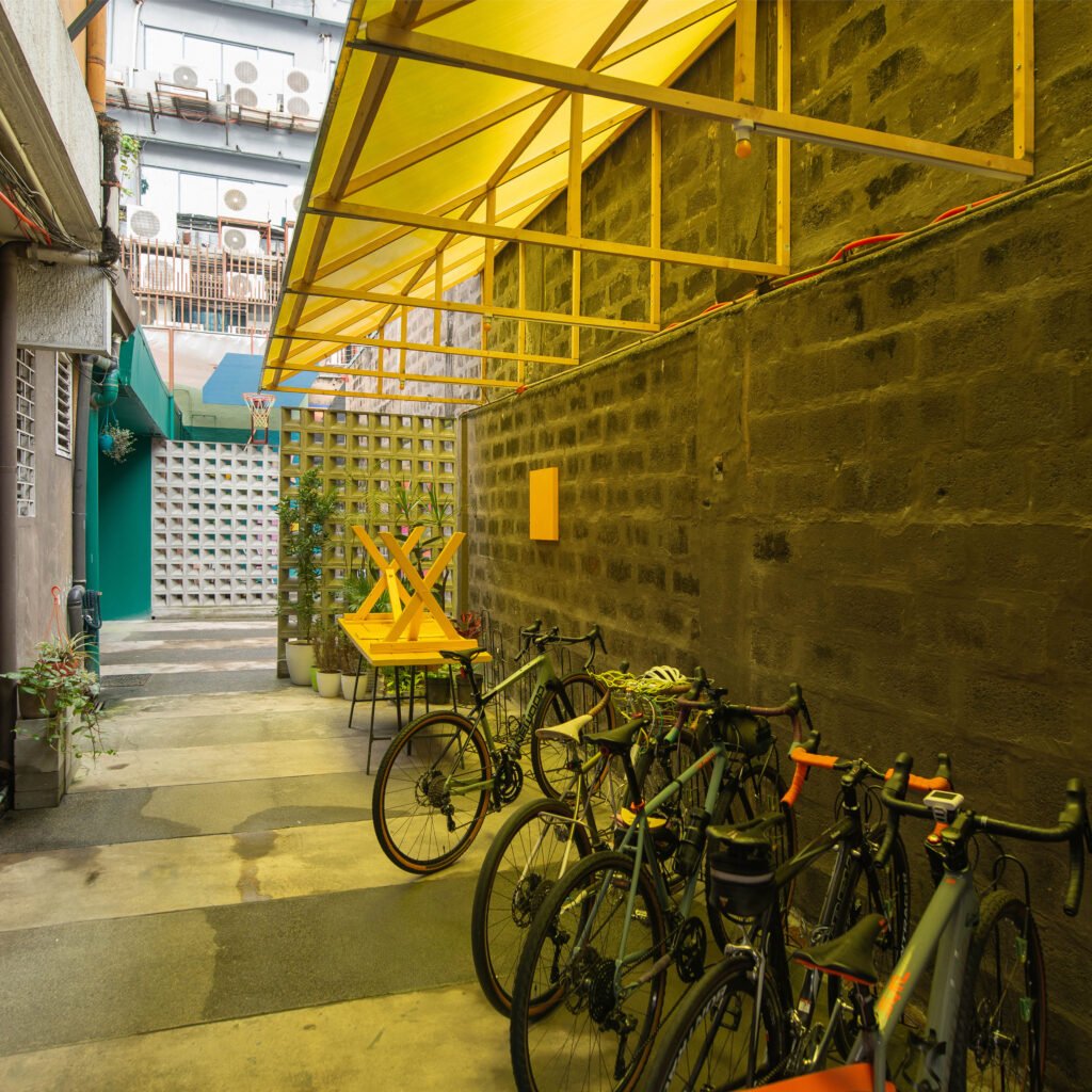
Studio Kapitbahay is now situated in a two-story duplex apartment, with a total floor area of 270 sqm, fronted by a sizable outdoor area. Though they had to let go of the large backyard, the new space better accommodates the space requirements of each party and still allows for multiple communal spaces, including a large common area, a coffee bar, and a designated area for bikes, as most of the studio members bike commute to work.
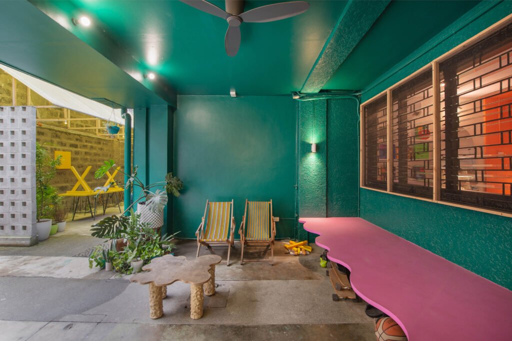
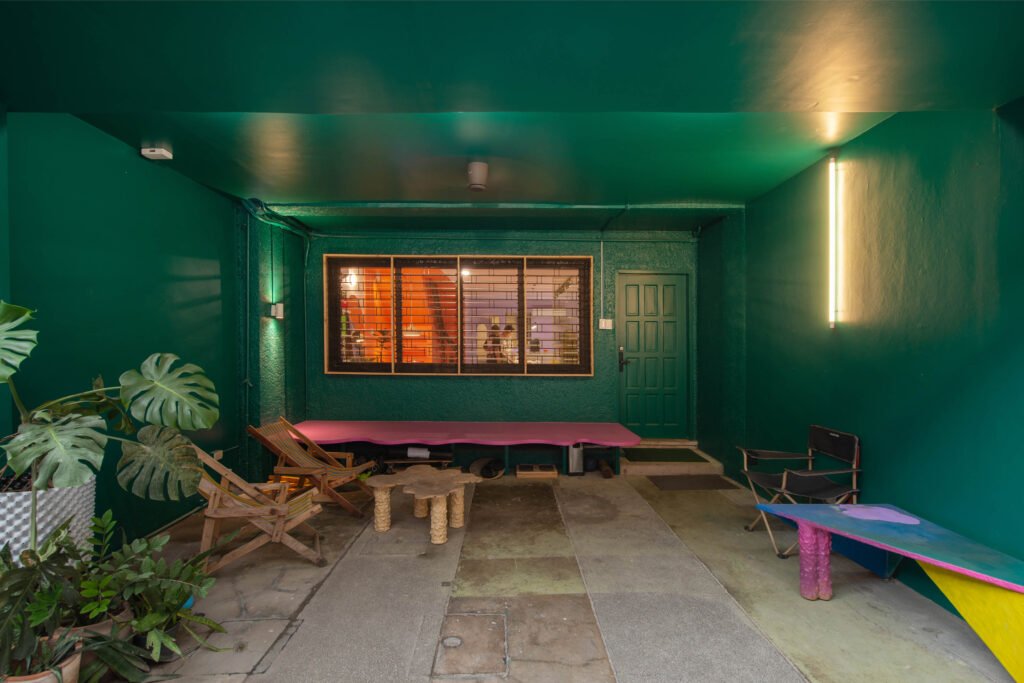
It is this bike parking area that first greets visitors entering the compound’s lofty gate. Its yellow polycarbonate roof casts a honeyed glow, illuminating a row of bikes belonging to the studio members. The view going into the main structure is flanked by two massive walls of unfinished RCA concrete breeze blocks, a tactile contrast to the mint green paint job of the duplex’s front door veranda. These also serve as screens, enticing visitors to explore while allowing privacy for the sole outdoor tenant, Kris Abrigo.
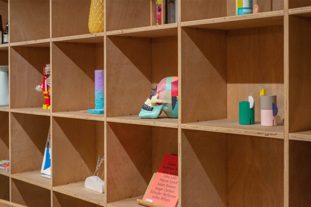

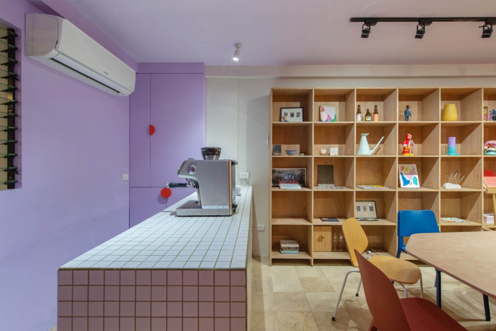

The distinctiveness of Studio Kapitbahay lies in its communal spaces—it has pockets of little ‘tambayans’ (hangout spots) here and there, implying that everything was thoughtfully and purposely put together to enable a sense of belongingness and collaboration among its users. This is most apparent in the main indoor common area, which is the first thing guests see upon entering the studio.
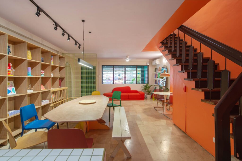
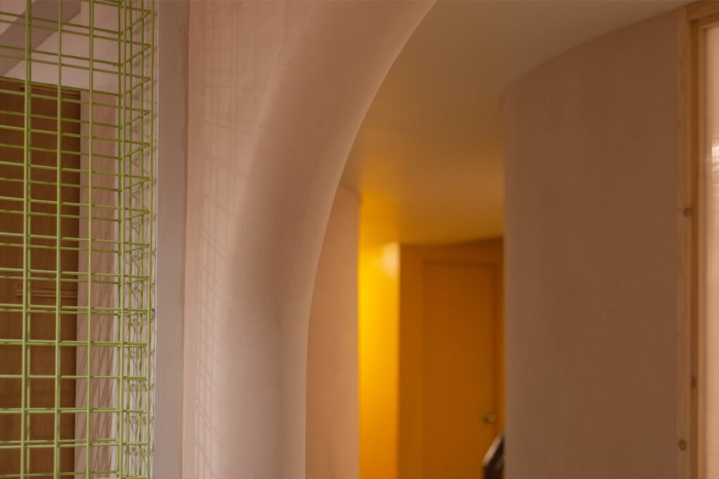
Bright orange and purple walls envelop the common area, with a light green gridded steel divider mirroring the grouting of the coffee bar across it. When asked why they went with such a poppy color palette, the architects laughed. “It was just based on feelings, to be honest,” Cusi says. He and Principe, along with studio co-managers Ignacio and Abrigo, were responsible for the space’s distinctive shades. “We don’t shy away from color; we just agreed on what we like, but it doesn’t symbolize anything. We just like it and that’s a good enough reason for us!”
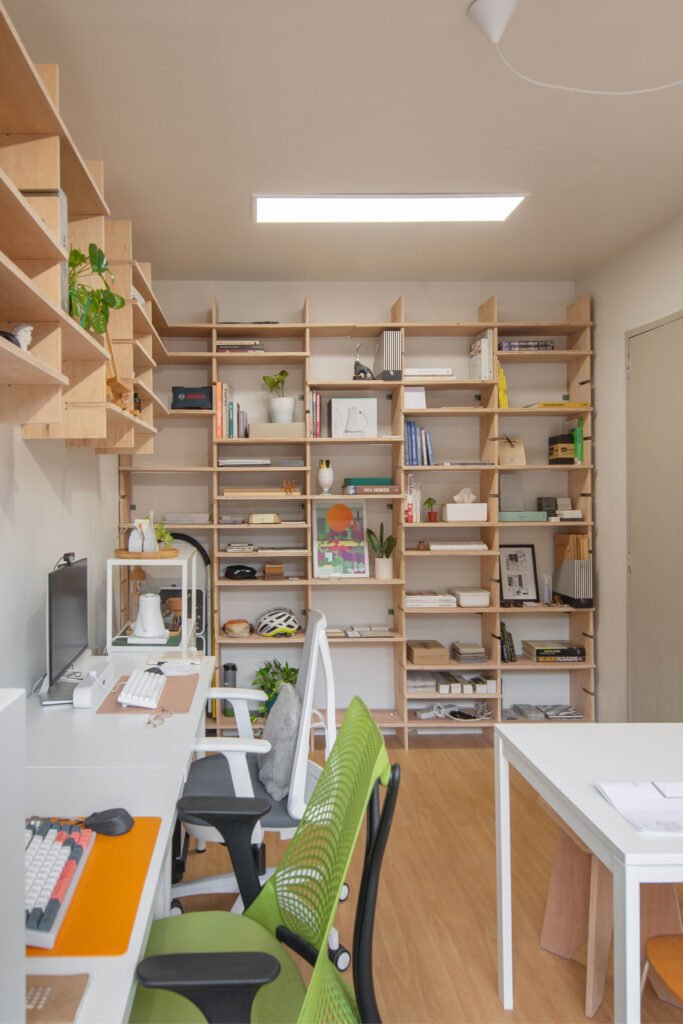
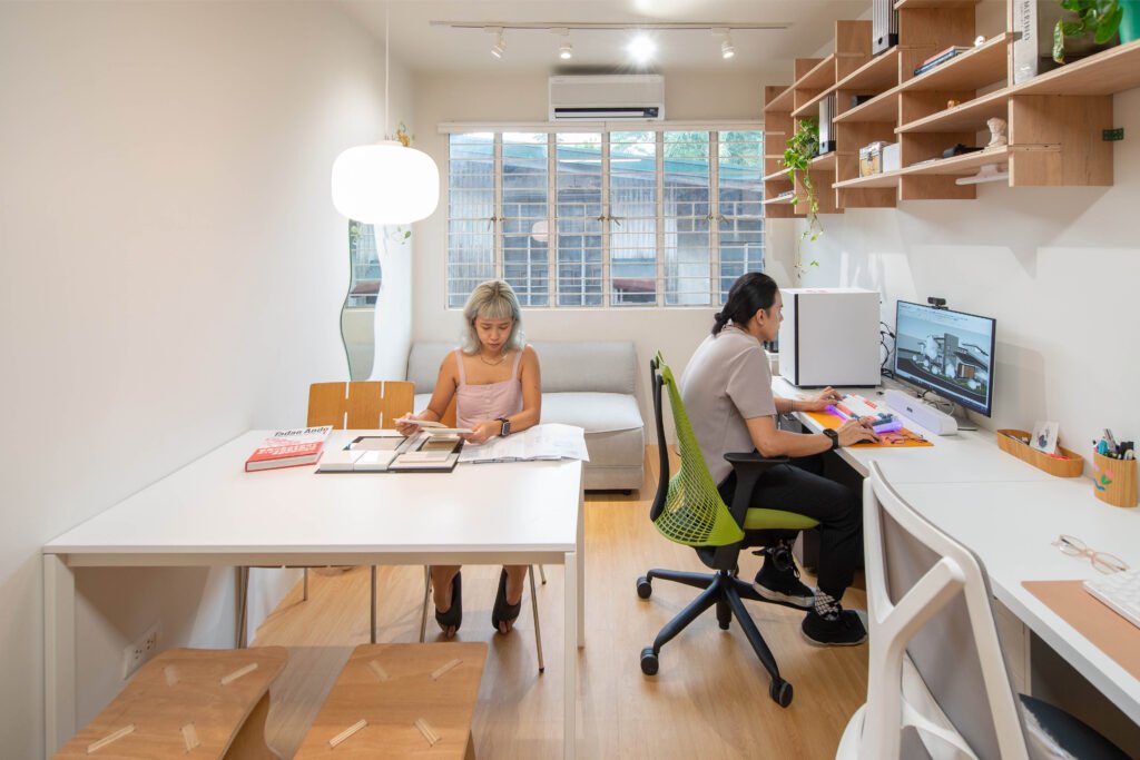
The massive wooden shelving that took up most of the common area’s rightmost wall was designed by Cusi himself. “It actually came from the previous studio. I had just learned how to work with a CNC router back then and it was a good opportunity to apply what I learned,” he shares. “It was a great way to cut down on costs, too. We decided to leave the shelving unfinished for a raw look, and we even put it up ourselves.” The shelves are now artfully filled with an assemblage of items, from art toys to prints to pottery, showcasing both the art and the personalities of all who populate the studio.
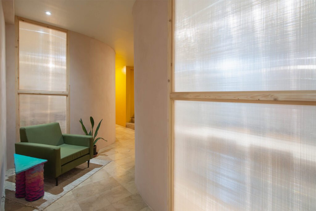
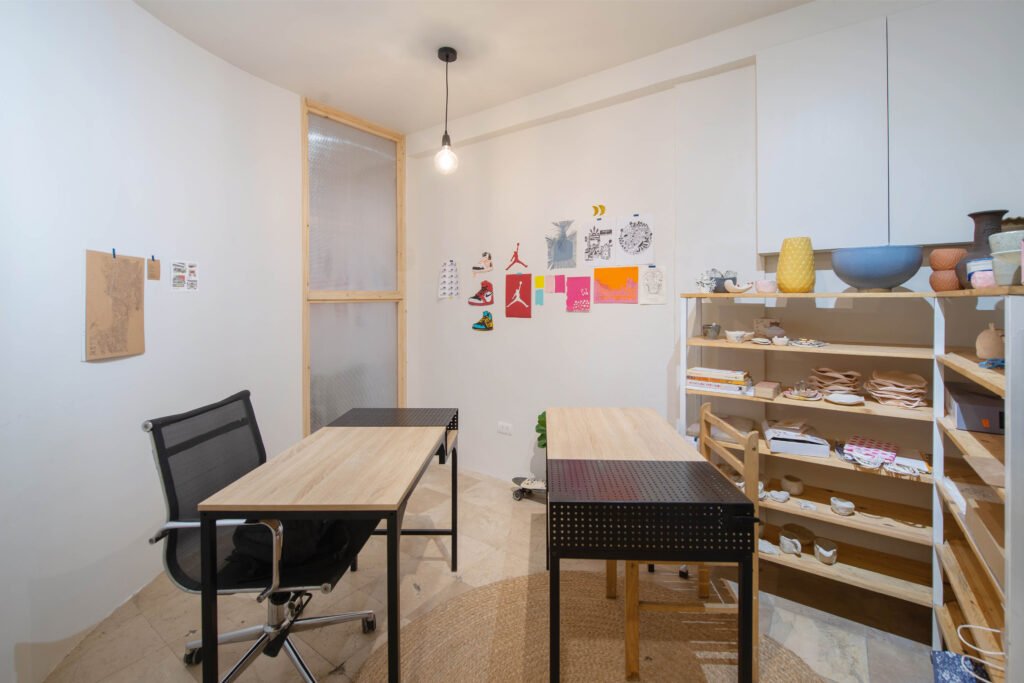

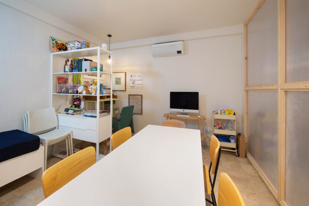

A deep orange custom sofa serves as the area’s statement seating, drawing eyes with its striking color and unconventional shape. It is complemented by an eight-foot-long asymmetrical table designed by Abrigo as a communal table for the studio partners, anchoring a medley of mismatched chairs—some handmade, some thrifted, all contributing a certain individuality reflective of its users. A large Hayes fan holds court at the ceiling, utilized on days when the heat is not oppressive. The lighting fixtures take a backseat in terms of design and emit a pristine white glow, which further enhances the vivid colors that animate the space. “We made sure there’s always something interesting to see everywhere you look,” Principe adds.
The studio’s ‘iconic’ arched mirror (where members and guests would gravitate to take selfies) takes pride of place in the common area. An archway with rounded edges fronts the mirror, creating the image of an arch within an arch. When looking at the mirror, the archway looks like a minute detail in the background, but while standing beneath the tall archway, the 6-foot mirror seems almost tiny. “The archway was really inspired by the mirror,” says Cusi, the mastermind behind a lot of the playful mirroring of shapes and colors. “The duplex units were originally not connected to each other, so one of the first things we did was to create an opening between the two,” Principe adds. “We decided to do curved walls for the two private rooms on the ground floor to match the rounded edges of the archway that connects it to the common area.” The archway and the walls beyond it are coated with lime paint, finished by the studio managers themselves. The resulting hue creates a monolithic effect very different from the adjacent spaces, a subtle cue to indicate that this wing is now populated by private spaces.


Moving on
The renovation of the new location was not without challenges: GRAAR’s initial two-month timeline extended to a little over three. A large portion of the work went into ensuring that the utilities are at par with the new users’ needs, as well as making sure the quality of the workmanship met all their expectations. It came to a point where some of the tenants decided to start working in the finished sections of the space while there was still ongoing construction. “It definitely exercised our ability to manage expectations without compromising our design intent,” Principe states. “It was a taxing couple of months for not only us as the designers, but also for the rest of the studio managers who spent a lot of time checking on the status of the construction.” The partners agreed that being both designers and clients for the project helped make their spaces more user-centric, hardworking, and cost-effective. Of the latter…
“Reusing pieces from the previous space was one of the non-negotiables of this project,” shares Cusi. Select pieces from the previous space were both well-loved and unique to the studio, such as the arched mirror and the CNC shelving. “This was done not only to keep costs down but also as a gesture of continuation; the new space carries the same creative spirit borne out of the previous studio space.”

“This [reuse of old pieces] was done not only to keep costs down but also as a gesture of continuation; the new space carries the same creative spirit borne out of the previous studio space.”
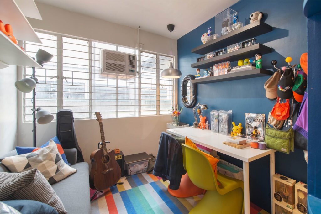

In the old studio, the original founders came in and designed the space before they found studio mates, so the other users just came in and populated the space. In the new location, nearly all studio members had a hand in designing their own spaces. “We let them talk amongst themselves and select their own rooms. All we dictated was the number of lights they can use, and the rest was up to them,” Cusi shares. “Now each room has its own personality.” While there was a danger that having multiple stakeholders might affect or dilute the original design concept, the principals demur: “There was no overarching ‘concept’ to begin with, and we think this works in a space with so many diverse users. In effect, we partners evolve the ‘concept’ together freely as both individuals and as creative neighbors.”
GRAAR was quite pleased with the resulting spaces. According to them, 90% of their plans were executed, surely a rare feat in any design project. “Of the 10% that was not followed, a big part of that involved the kitchens. They were not prioritized since they are more back-of-house areas,” Principe shares. “It would have been nice to see them up to par with the rest of the space, but there’s still opportunity to work on that in the future,” she adds. Cusi on the other hand is excited to add more soft surfaces and to make the studio feel more lived-in. “I’d like to add more accessories, more plants. But it’s still a new space, and in time it will grow into itself.”



User friendly
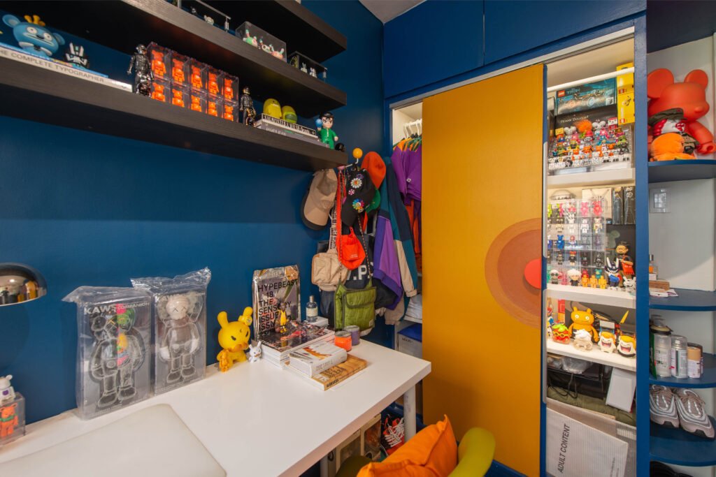
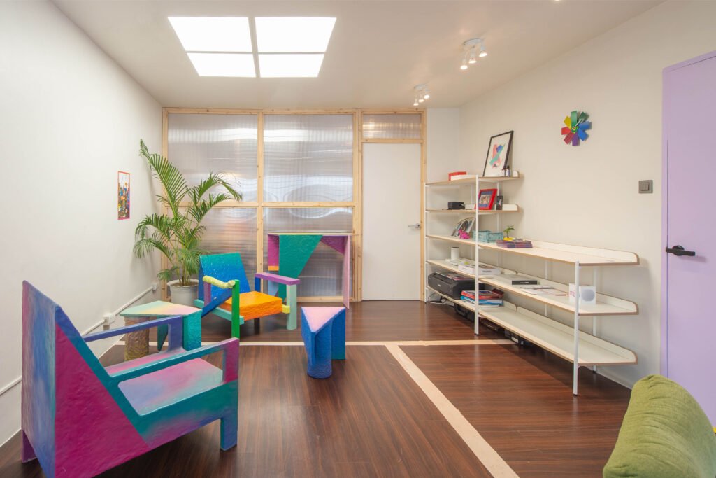
Multidisciplinary artist Ralph Guibani (or Guibs, as he prefers to be called) is quite enthusiastic about his space in the new studio. “In the old location, I was sharing a room with (filmmaker Caloy Limjap Soliongco) so I always had to collaborate with him in terms of how our room looks. It had to be both of us, and I had to remind myself that I can only mind my half. Now when you enter, this is all me,” he says about his room, filled with art toys and merchandise of his apparel brand Medium.
“The studio is pretty much the same but it’s been scaled up,” he says when asked about the new space. “Functionality has definitely improved. I’m the member who lives the farthest from the studio, so when I have all-nighters, having my own space and more facilities (i.e. bathrooms) have certainly made it more comfortable.”
Guibs misses the backyard of the old space, however, which he appreciated for it being a patch of nature in a big city. “It’s always a give and take,” he says. “There are things I like better about this new, bigger, studio, but there are aspects of the old one I liked better. Productivity is better now since it’s a bigger studio, but in the old studio it was also nice to always be bumping into someone.”
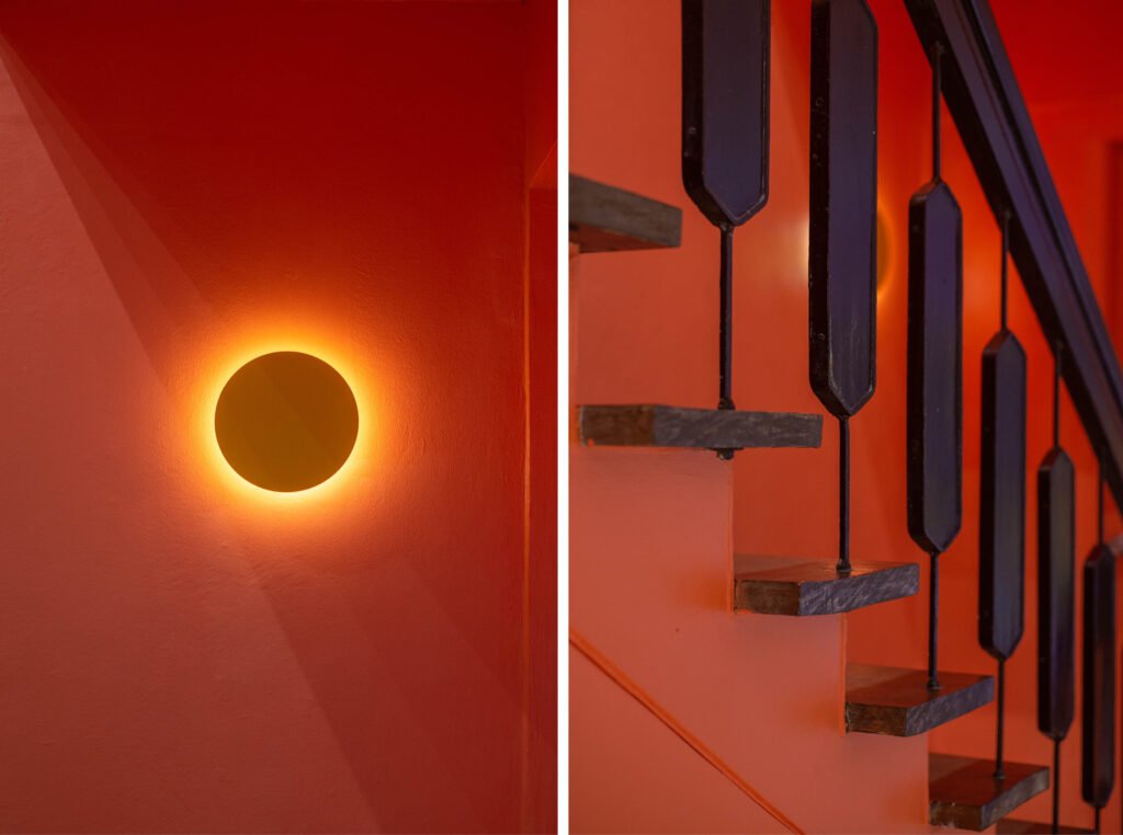

“The new space feels more polished,” according to Studio Kapitbahay’s community manager, writer Bill Barrinuevo. “There’s an air of business and much space for pleasure. I would say [it’s] a right mix of both.” He officially became the group’s community manager when they relocated. As such, he helms activities that require everyone’s participation and holds together the other day-to-day needs of the studio and its occupants.
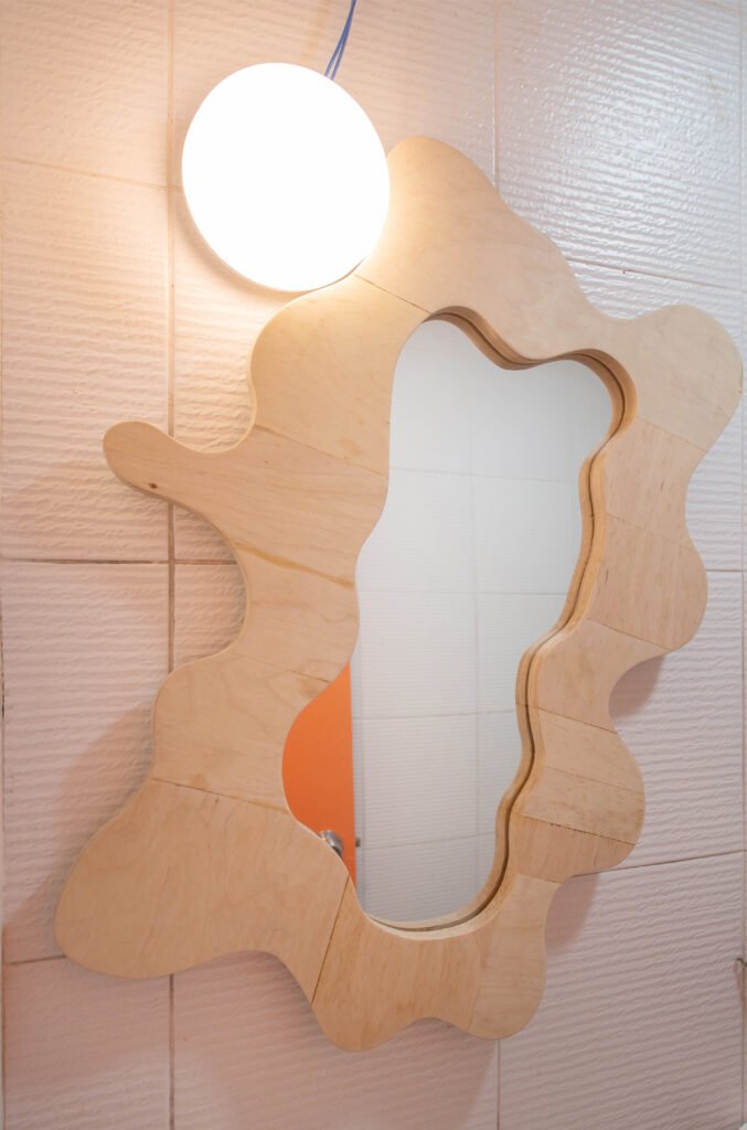
Barrinuevo feels that the new studio is well thought out, which is good for their respective clients. He particularly enjoys the coffee bar, calling it his ‘safe space’. “[It’s] my go-to place upon entering the studio. It’s my rock, many deadlines have been met because of that bar,” he shares. When asked if he wished to improve on anything, he enthusiastically answers “Why stop at a coffee bar? A popcorn machine sounds great, a runway for spontaneous lipsyncs sounds better, a dance studio sounds like a dream!”
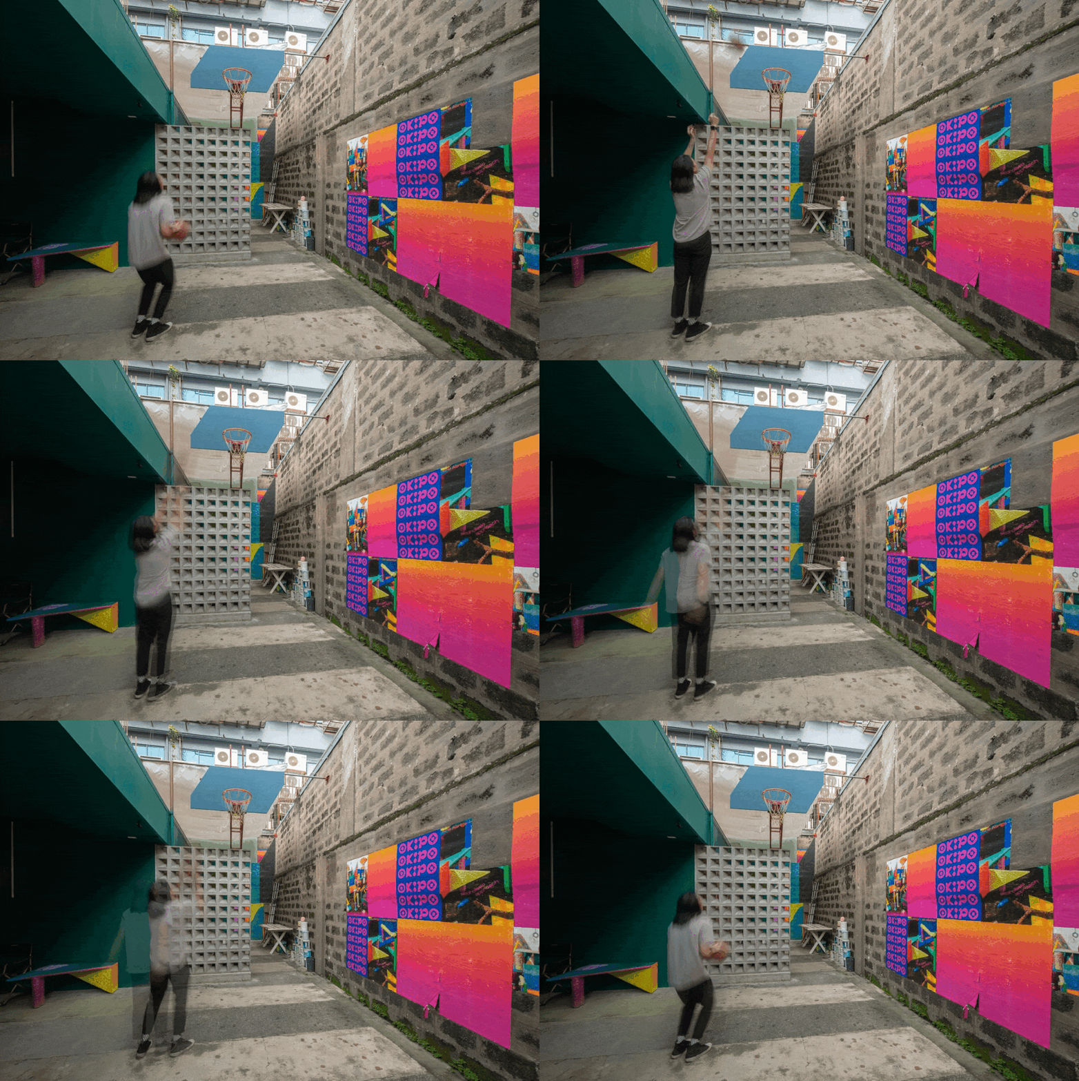
As COVID-19 restrictions continue to ease, more and more guests have been coming in and checking out the new Studio Kapitbahay. Just last month, Abrigo launched a furniture collection through OKIPO, a collaborative venture with Hiraya MNL headed by John Ignacio (who is now also one the studio managers) by way of an event held at the common area of the studio, a pilot run for the compound as it prepares to hold more community-facing events.
GRAAR has also been reaping good feedback for their work from guests that have been allowed into the space; Studio Kapitbahay’s operational model of shared studio spaces has also attracted attention from creatives of all stripes, interest that the partners wholly welcomed. “We wish for our space to spark inspiration and conversation for more creative communities to spring forth and flourish,” Cusi offers.

Opening doors
Studio Kapitbahay began as a collective that sought to inspire creative collaborations; now, they are the proud owners of a space that is a physical manifestation of this vision. The studio members, who had to momentarily shelve their community-centric plans can finally look towards an uncertain but more hopeful future, as the world opens up and people can gather again. “Just last week we were already talking about reviving the plans we had for the studio before the pandemic happened,” Cusi shares. “Since we’ve all finally settled, it’s about time to think about what happens next, and to slowly open up to the community. Stay tuned!”
The young and proudly naïve principals of GRAAR are also raring to take a bite out of new projects, carrying a brand of spontaneity that is light and infectious and with a focus on intense collaboration, a takeaway from their Studio Kapitbahay experience. “Our small practice thrives on creating simple yet thoughtful solutions, a product of harmonious play between architecture, interiors, graphic design, and other disciplines—with particular emphasis on the play. We like to have fun and we want this spirited energy to radiate through our work and everything else that we do,” Principe offers one of her trademark smiles.
Indeed, it does. •
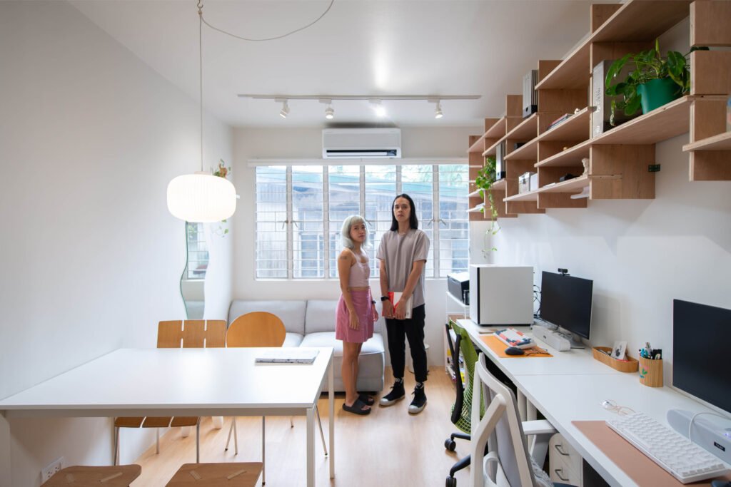

Notable pieces and finishes
RCA (Romyol Concrete) breeze blocks
Mosaic Tiles Philippines for the coffee bar counter tiles
Polylite for the yellow polycarbonate roofing
Neovega linear pendant light for the communal table
Space Encounters high back bench in the communal area
Asvesti lime paint for the Aesop area
Herman Miller Sayl Chair in GRAAR’s room
Hayes ceiling fans for communal sarea
Vitra Panton chairs, Nelson Ball Clock, and Eames Hang-it-all in Guibs’ room
OKIPO furniture pieces in Hiraya’s room


One Response