Words Miguel Llona Interview Patrick Kasingsing
Images Kengo Kuma and Associates

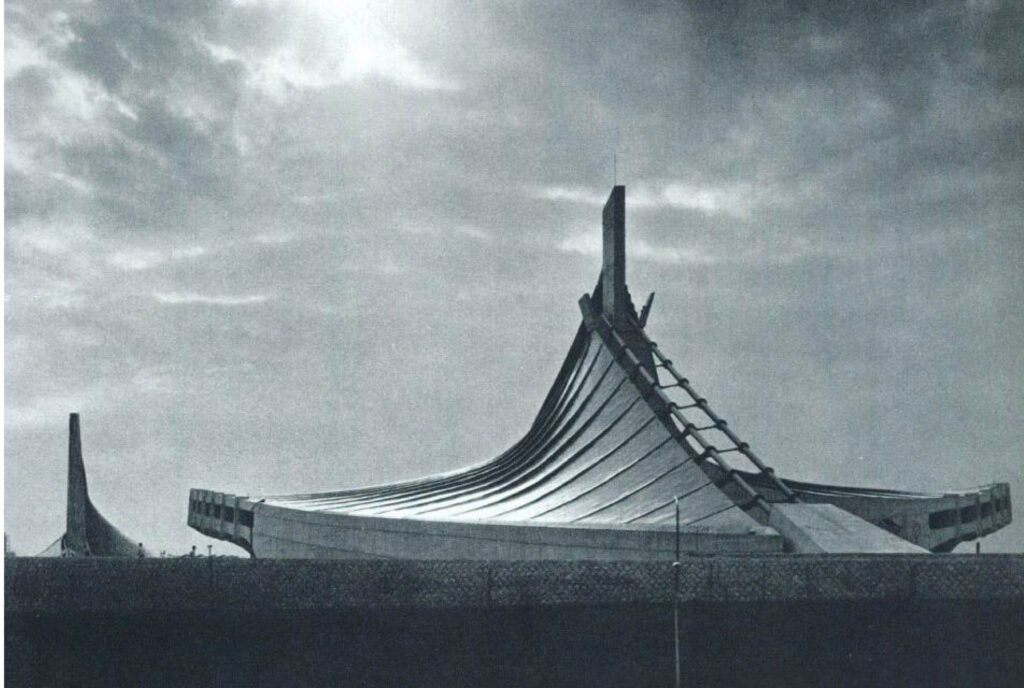
One can say that Kengo Kuma’s architectural career is defined by ironies. His fascination with architecture began upon seeing Kenzo Tange’s Yoyogi National Gymnasium, an impressive work of Japanese Modernism with its high mast and massive sloping roof, which is the kind of architecture Kuma would spend most of his career defying. He prioritized building small projects of varying typologies in Japan’s rural areas throughout his life, yet it is the quiet beauty of his designs that would lead him to international fame.
We had hoped to hear this complex man attempt to elucidate on his understanding of beauty, and the ineffable quality of his work. Alas, he only offered succinct answers in our interview, as if this brevity was his response to the topic at hand, a reflection of the understated designs he is known to create. It’s in the subtleties, he seemed to say. Kuma did open up a bit and shared what his current read is: “I am currently reading a book on Ural-Altaic languages.”
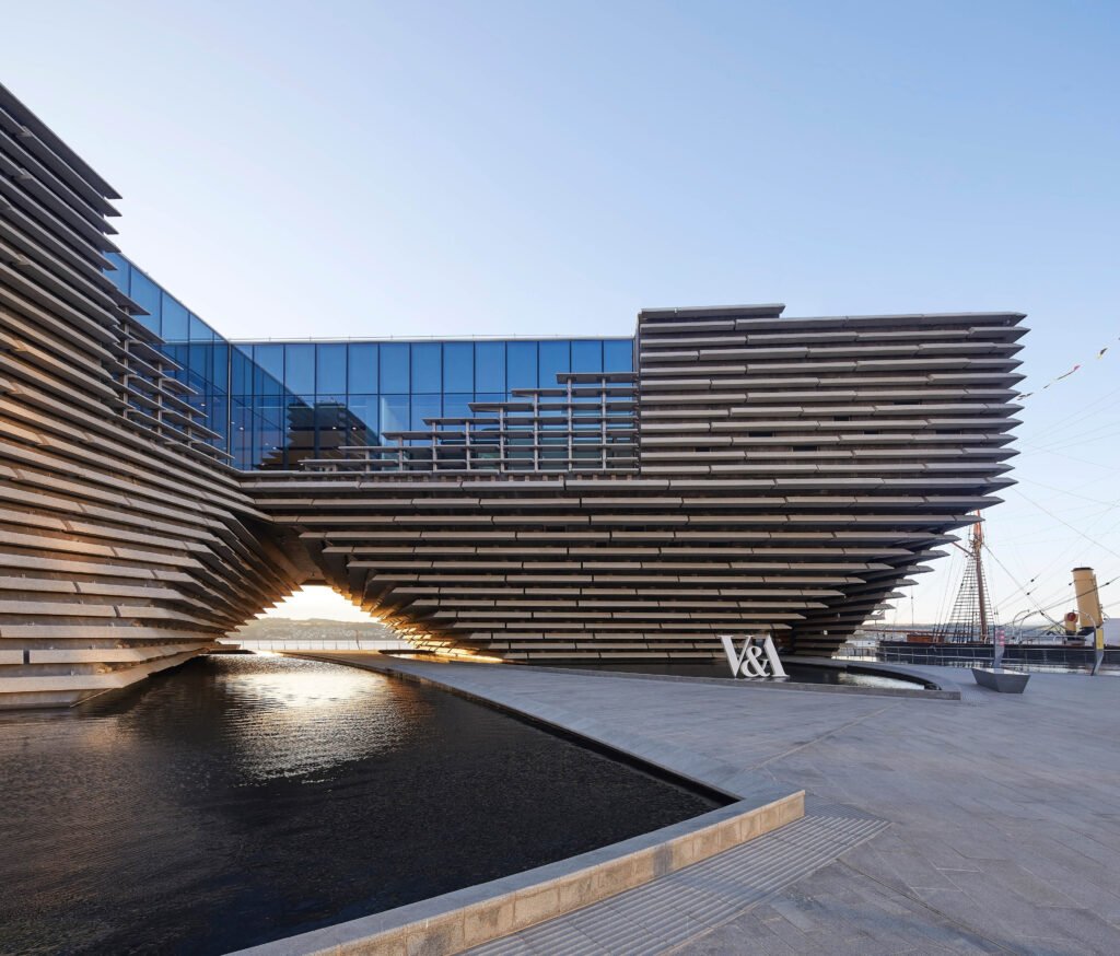
For all his restraint and reserve, his idea of architectural beauty has changed through the years. In this phase of his career, he has been venturing into bigger projects that could result in the self-aggrandizing architecture he has always shied away from, such as the National Stadium for the 2020 Tokyo Olympics and the V&A Dundee in the UK. And yet Kuma still manages to strike a balance in these large-scale projects, tempering his designs enough to make a statement of simplicity instead of the brashness that most architects would aim for.


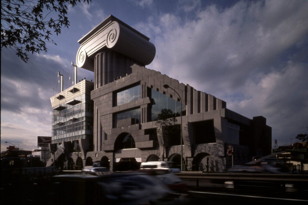
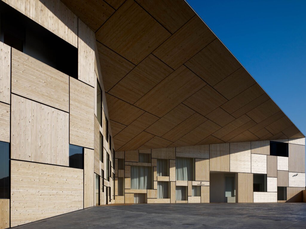
“I first became interested in the shape of a building, then I thought the experience you get from a building would be important. Now, I believe that texture and materiality should come out on top,” Kuma tells Kanto. His portfolio reflects this evolving understanding of architectural beauty. The M2 Building, his first major commission, saw him play with form to an almost comical degree. An outsized and bombastic design for a Mazda showroom, the building has mismatched design elements in its façade, highlighted by a gigantic Ionic column at its center that gives it the appearance of a postmodern art installation. As he matured, he explored new styles and eventually became an advocate of materiality and craftsmanship, in his belief that architecture should harmoniously blend with its environment and tradition. His four projects in the small Japanese town of Yusuhara, built in a span of two decades, show this philosophy at work. The buildings were built with materials found within the town itself, or at least incorporate them into the design—thatch for the outer walls of the Machi-no-Eki Yusuhara, cedar posts for the Kumo-no-Ue-no Gallery, and cedar boards for the exterior wall of the Kumu-no-Ue library.


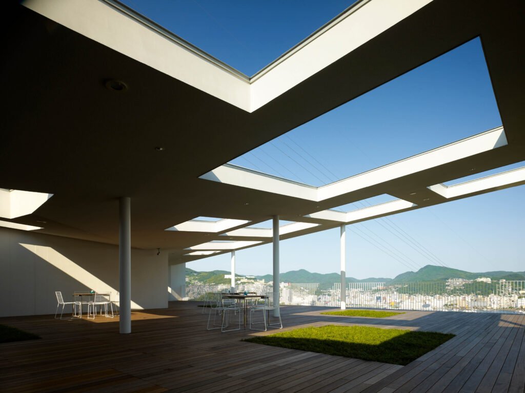
Kuma says beauty isn’t something that architecture should aim to achieve, but should be something “born as a result of the design.” Though Kuma’s values still tend toward the functional, his best works still exhibit a sublime beauty that is difficult to capture with words, despite the lack of “heroic gestures” in their form as he described it in a 2017 Dezeen interview with Filip Senk. Their beauty lies in their subtleties, mostly from the material and one’s experience within the building—the grain of untreated wood, the roughness of stone surfaces, the interstices of latticework, the shadows created in the spaces. Unifying experience with materiality has become Kuma’s signature, that his work can be said to frame nature with nature. A perfect example would be the Stone Museum in Tochigi, where he repurposed 80-year old rice warehouses into a gallery space for arts and crafts made from stone. Ashino stone, the same material used to build the warehouses, was used for the new details that bridge the structures together, further displaying the material that the gallery is already celebrating. The aforementioned Kumo-no-Ue Gallery, whose form represents a tree that branches upward, is not only made primarily of local cedar to root it to its environment—Kuma created glass openings from within the structure that frame panoramic views of the surrounding mountainside, providing visitors with the experience of being immersed into the earth itself. Even his descriptions of projects reveal his continued affinity with nature; for his most recent project, a new building for a college, he could only describe it as something that looks like “a large hill.”
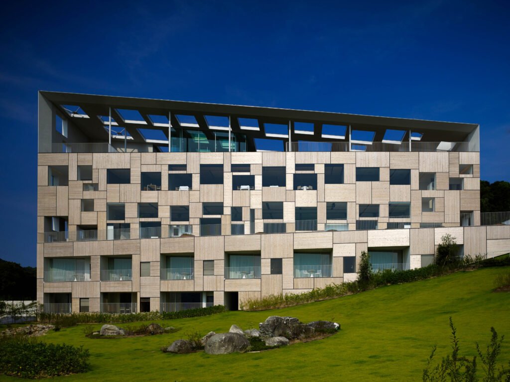


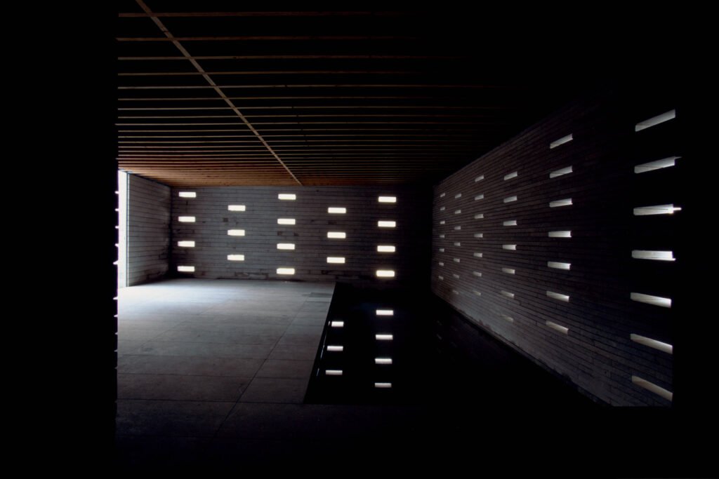

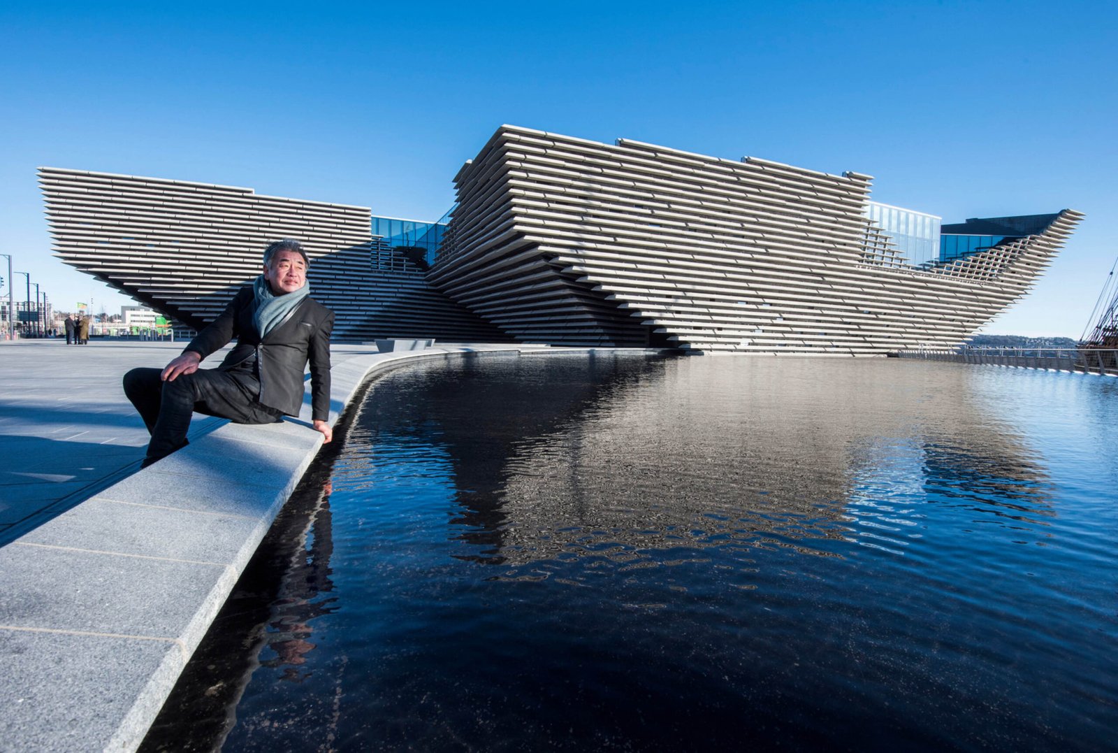
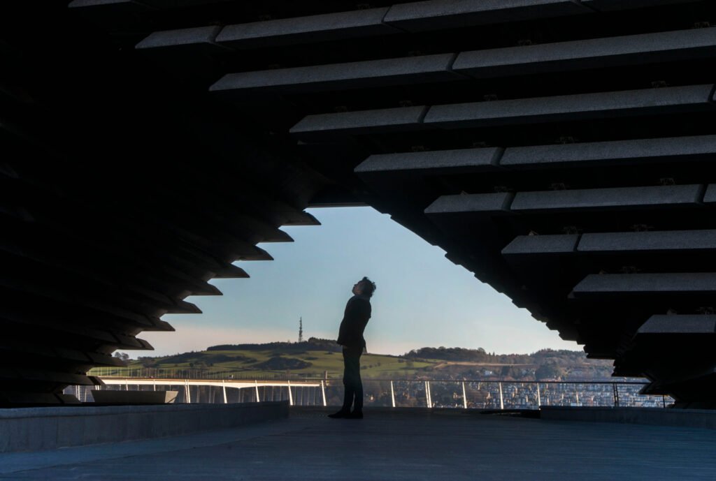
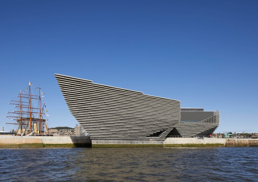
Kuma singles out the V&A Dundee in Scotland, a branch of London’s Victoria & Albert Museum, as the most difficult project he’s worked on so far because they had to “design a building that could be thrust into the water.” Its location along a waterfront forced this concept, resulting in a concrete mass that appears on the verge of drifting downstream. The building itself is another raw expression of materiality, with the façade’s multiple layers of precast concrete meant to depict Scotland’s beautiful cliffs—another harmonious balance of material, experience, and nature.
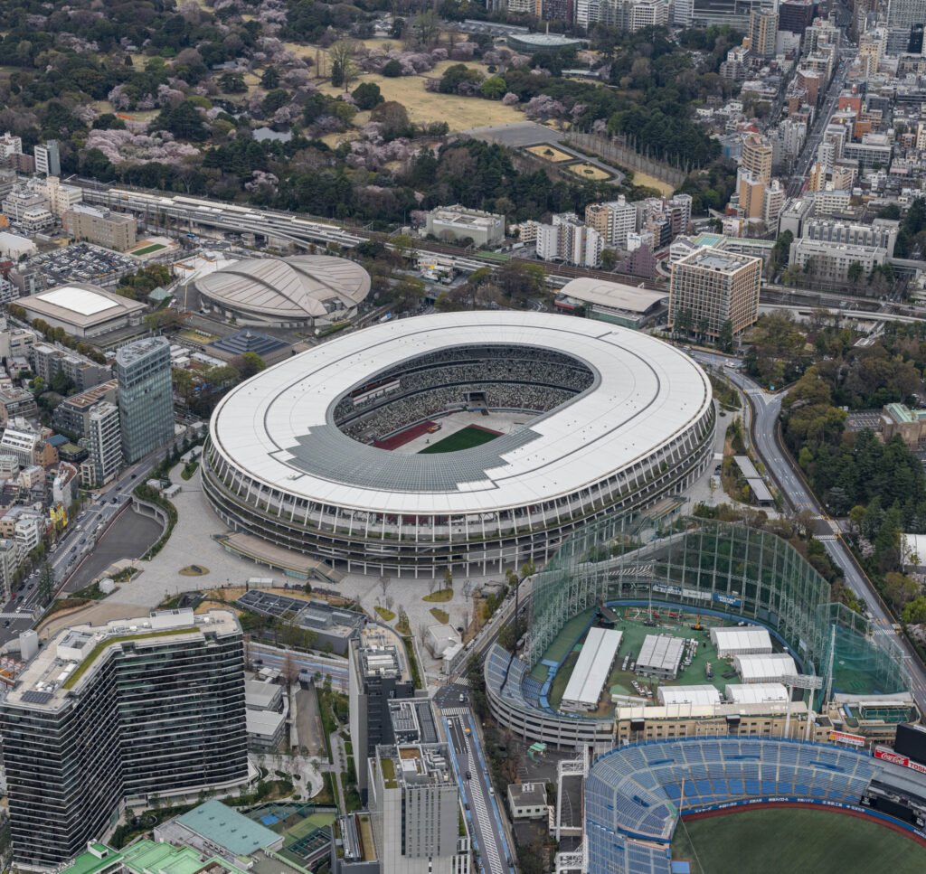
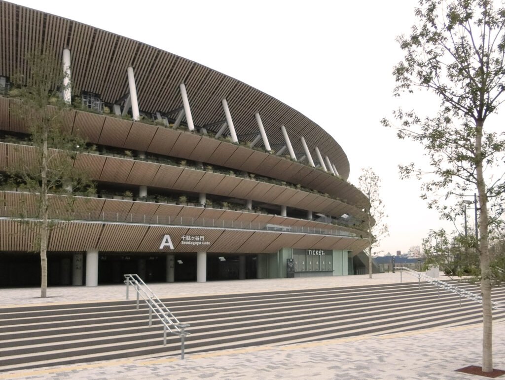
However, it is his design for the Japan National Stadium for the 2020 Tokyo Olympics where his idea of architectural beauty is arguably expressed most. It’s a project he took over after the original design, created by the late Zaha Hadid, received harsh criticism and mockery from local architects because of its size and costs. Kuma, for his part, was initially against the stadium because of its location along one of Tokyo’s greenbelts. When he was eventually chosen to succeed Hadid, he sought to respect the site’s surroundings once again and scale the stadium back to a more “human scale” than what Hadid had planned. Conceptualized as a “living tree” with its subdued form, slatted wood cladding, and built-in planters in the exterior, Kuma’s design is antithetical to the curves and sculptural flourishes of Hadid’s. Once again, he lets the material define the building’s beauty, with wood being used to clad the undersides of the stadium’s massive eaves, and laminated lumber forming part of the truss structure supporting the roof.
From afar, the National Stadium seems unimpressive, even generic for its typology and symbolic importance to the country. It’s a far cry from the monumentality of the Yoyogi National Gymnasium built by his childhood idol, located only two kilometers away. But Kengo Kuma is not intent on merely crafting iconic silhouettes; a closer look at the stadium’s design reveals that the prestige and scale of the commission did not diminish his mastery over detail, texture, and materiality. Kuma’s National Stadium is almost inviting you in, so you could see what his body of work over his lifetime has been driving at—that beauty is in the rhythms of nature, which he will continue to capture in his architecture for as long as he draws breath. •

Miguel Llona is a writer who has written for numerous print and online publications. He was a former editor at BluPrint magazine, and served as a marketing consultant for an interior design firm.
