Introduction and Interview Gabrielle de la Cruz
Images San Studio
Civic structures in the Philippines such as city halls have long borrowed their looks from Western Neoclassical buildings, often ending up with designs that fail to respond to our tropical climate and the needs of local communities. Interweaving Dualities: Reimagining City Hall Architecture by San Studio steps away from this trap, creating a modular city hall concept that centers on the allowance of daylight and ventilation, the design of open and flexible spaces, and the recognition of local culture and resources.
The concept was designed for the new city hall of Lapu-Lapu City in Cebu, which called for a responsive, easy-to-build structure. San Studio says the overall design is “characterized by its simplicity and understated elegance, seamlessly integrating the city hall into the surrounding urban environment and its unique context.”


Interweaving Dualities: Reimagining City Hall Architecture
Project description edited for brevity
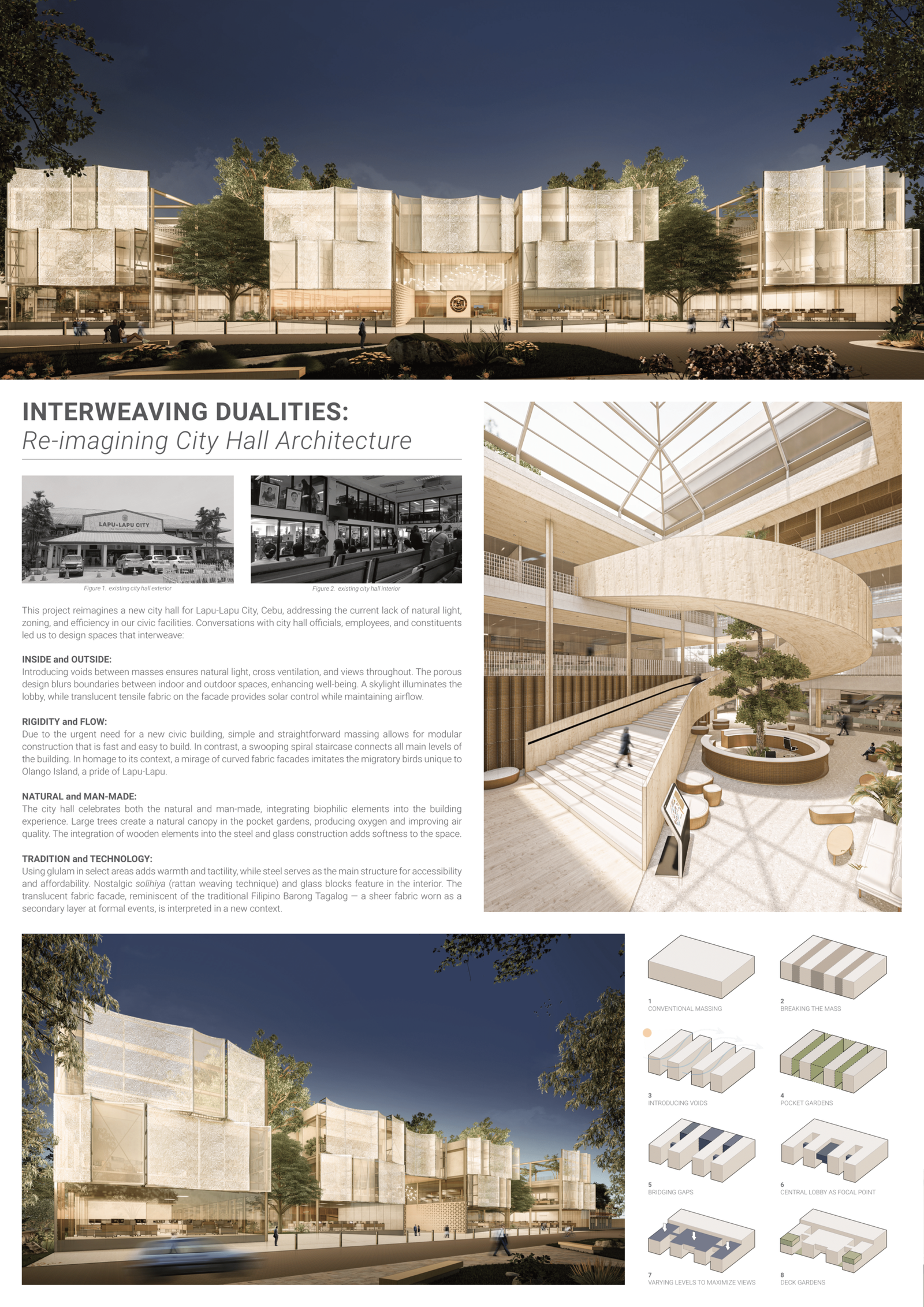
This project reimagines a new city hall for Lapu-Lapu City, Cebu, addressing the current lack of natural light, zoning, and efficiency in our civic facilities. Conversations with existing staff, city officials, and constituents have led us to design spaces that interweave:
Inside and Outside
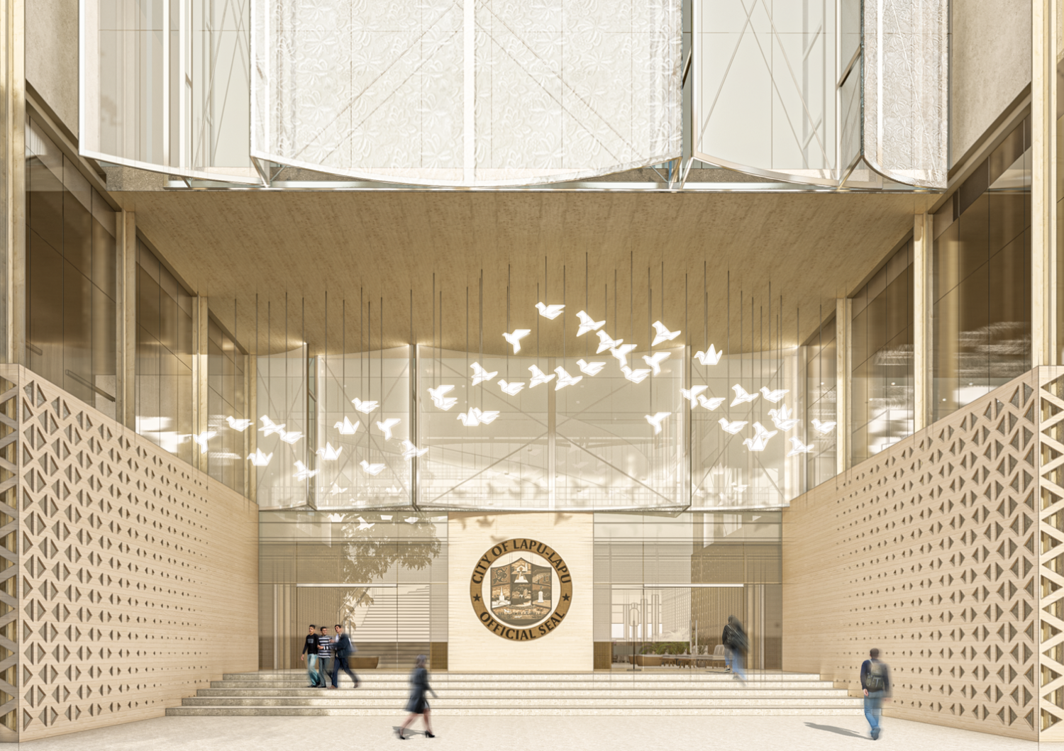
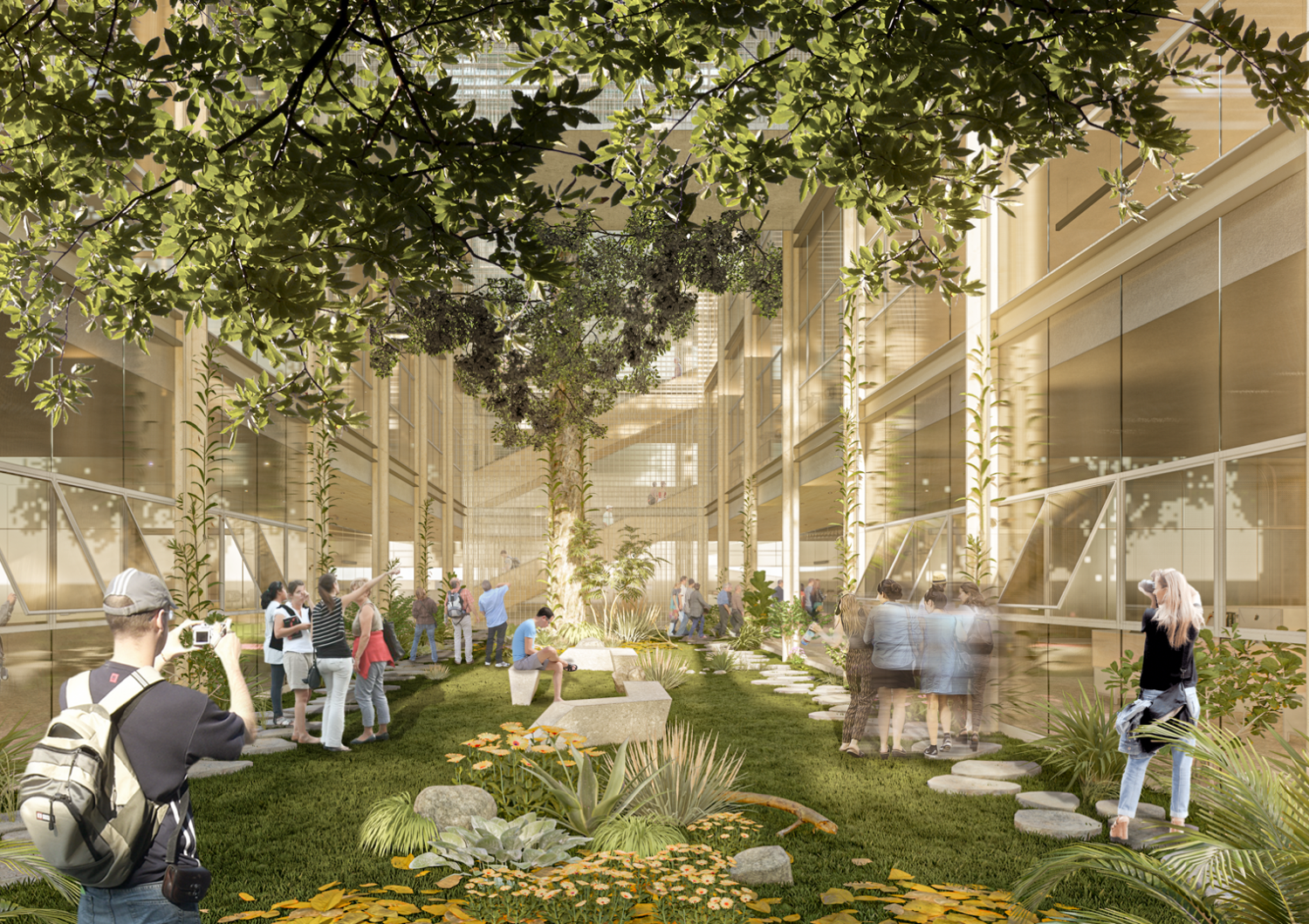
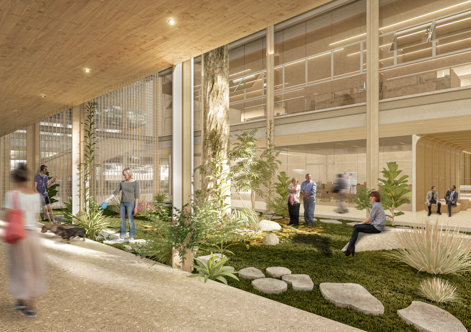
Voids are introduced between masses, ensuring natural light, cross ventilation, and views throughout the city hall. The porous design blurs boundaries between indoor and outdoor spaces, enhancing well-being. A skylight illuminates the lobby, while translucent tensile fabric on the facade provides solar control while maintaining airflow. Portions of the building mass are also carved out to create accessible rooftop gardens. These open spaces, easily reached from the office, enhance user well-being by providing a natural retreat that promotes mental rejuvenation.
Rigidity and Flow
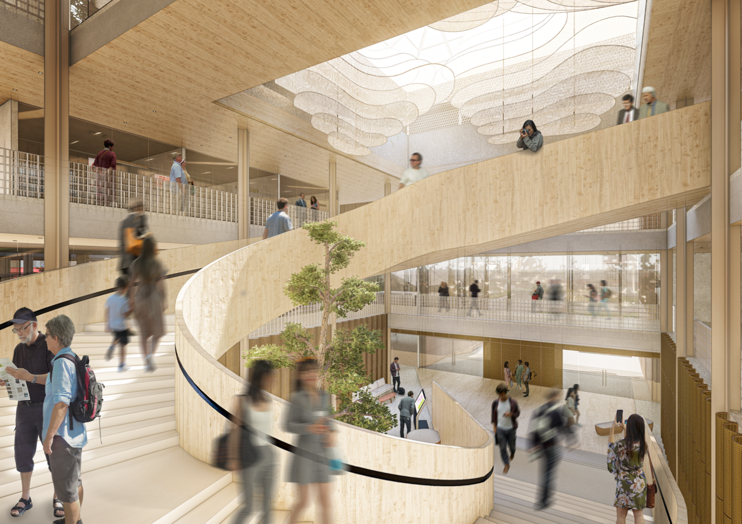
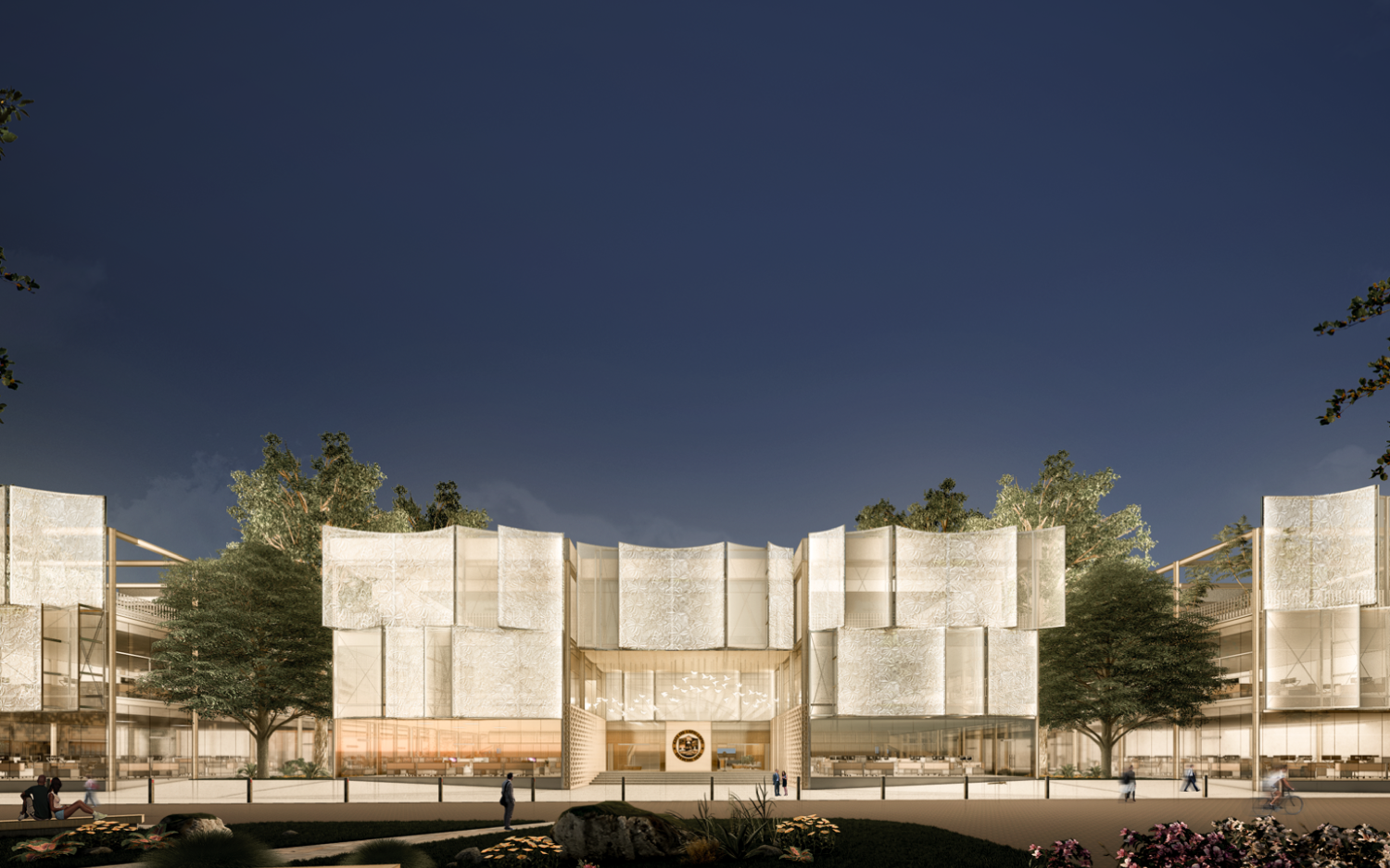
Due to the urgent need for a new civic building, simple massing allows for a structure with a repetitive module design, using a combination of 12-meter and 6-meter pre-engineered steel I-beams. This approach ensures modularity, ease of construction, and a fast, economical build process for the city hall. In contrast, a swooping spiral staircase connects different levels of the building, emphasizing the high-ceilinged lobby and enhancing both visual and spatial connections. The façade system uses four modular elements that combine to create engaging patterns. Strategically placed lighting adds a soft, dynamic appearance to the otherwise straightforward building massing. The curved fabric facade mimics the migratory birds unique to Olango Island, honoring the local environment.
Tradition and Technology
Using Glulam in select areas adds warmth and tactility, while steel serves as the main structure for accessibility and affordability. Nostalgic solihiya (rattan weaving technique) and glass blocks feature in the interior. The translucent fabric facade, reminiscent of the traditional Filipino Barong Tagalog—a sheer fabric worn as a secondary layer at formal events, is interpreted in a new context. The fabric facade features subtle embroidered patterns, adding a touch of Filipino culture and identity.
Natural and Man-Made
The city hall celebrates natural and man-made, integrating biophilic elements into the building experience. Large trees create a natural canopy in the pocket gardens, producing oxygen and improving air quality. The integration of wooden elements into the steel and glass construction adds softness to the space.
Interview with San Studio
Hello, San Studio! Congratulations on making it to WAF 2024! Your entry, Interweaving Dualities: Reimagining City Hall Architecture, is one of two projects that you considered submitting for WAF. What would you say are the qualities of this local project that make it worthy of recognition on the global stage?
Thank you, Kanto! We first looked for a project that could be meaningful to society. A city hall is perhaps one of the most significant structures in a city; it carries with it a functional and symbolic value that needs to be taken care of. Discovering the city hall, its function, significance, and the people was a big driver towards the care we put into this project. As architects, we strive to always put ourselves in the shoes of others who walk different paths from ours.
We also had to take constraints into mind: time, budget, and intricate space requirements. The design of the city hall ended up becoming a balancing act — a symphony of simplicity, infusing modern and very pragmatic values in architecture, all with building elements that are also reflective of our culture and our context. It had to be as functional and straightforward but also softened in a way that goes beyond a box for work. We wanted it to be a space where people thrive and a space that brings its people pride.
We believe that the title of this project speaks for itself— being able to interweave multiple dualities, turning constraints into opportunities; merging polar opposites and making it work; and being able to take what we have, simple as it may be, and turning it into something meaningful.
The project is located in your hometown, Cebu. Can you elaborate on the conversations you had with existing staff, city officials, and constituents? Did any of your observations or perhaps dreams for a new city hall as locals of the area influence the concept in any way?
Actually, while Lapu-Lapu is considered part of Cebu, it almost feels like an entirely different place. This is not only because of the island being separated from ours (we cross a bridge to get to Lapu-Lapu), but also because its culture and qualities are uniquely its own. Designing this city hall came with a lot of discovery of what makes Lapu-Lapu special.
When we were in the early stages of design, some officials asked us whether we already walked around the place, tried their famous seashells, or heard about their migratory birds. They even asked us for our thoughts on the tattoos of their city’s hero, Datu Lapu-Lapu!
Answering these questions proved beneficial as they influenced a few of our design decisions, such as the form of the stairs, the curves of the façade, and the patterns on the entryway.
We tried not to impose meanings when we presented the design to them, but we saw how they excitedly made the correlations on their own. We realized that this was how we could bring a sense of pride to Lapu-Lapu’s true locals. Looking back, the city hall would not have reached its current form if not for these conversations.

Interweaving Dualities hinges on the intersection between building aspects namely indoor and outdoor experiences, rigidity and flow, tradition and technology, and natural and man-made. Can you walk us through the layout of the project and which spaces or areas highlight these considerations?
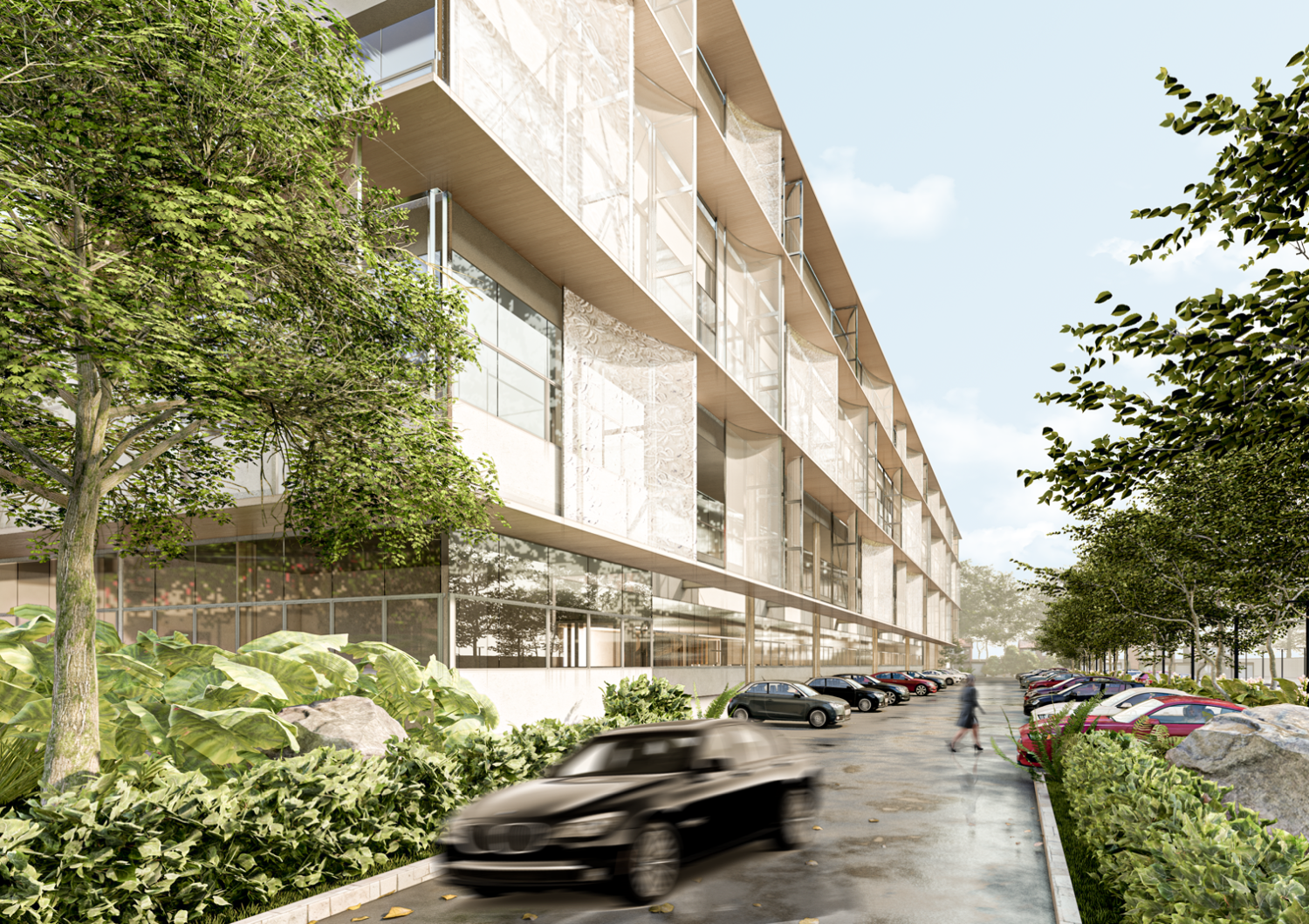
In terms of layout, perhaps the most defining factor is that the building consists of very simple, smaller, linear, repetitive structures. These are divided in a way that distributes multiple open landscaped areas, rather than having one giant structure and one giant patch of green on the side. In a way, this solved many spatial issues like way-finding, flexibility of planning, distributed access of divisions from the public, more access to natural light, more access to views, more opportunities for cross ventilation, and more organized zoning of spaces.
This layout also helps blur boundaries between inside and outside and also highlights the practicalities of rigid and modular structures. At a glance, it shows how man-made elements and nature complement each other. Its straightforward nature also allows many opportunities for softer elements to stand out, like the helical staircase at the main lobby, and the subtle curves of the facade.

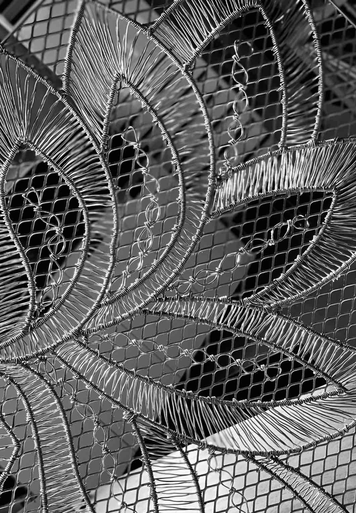
Sample of the facade mesh in collaboration with wire artist Jasper Montes.
“A repetitive module design that ensures ease of construction and a fast, economical build process” is mentioned in your concept. Following this, what are your projections for the structure’s construction needs? How much time and how many people will it take to build it? How much of the project was designed to be adaptable or replicable?
During our initial discussions of the city hall’s concept, pre-engineered steel structures and precast elements were already considered to expedite construction, especially considering the project’s scale. These procedures will also reduce labor costs and requirements.
As of the moment, the target timeline to finish construction is 18 months.
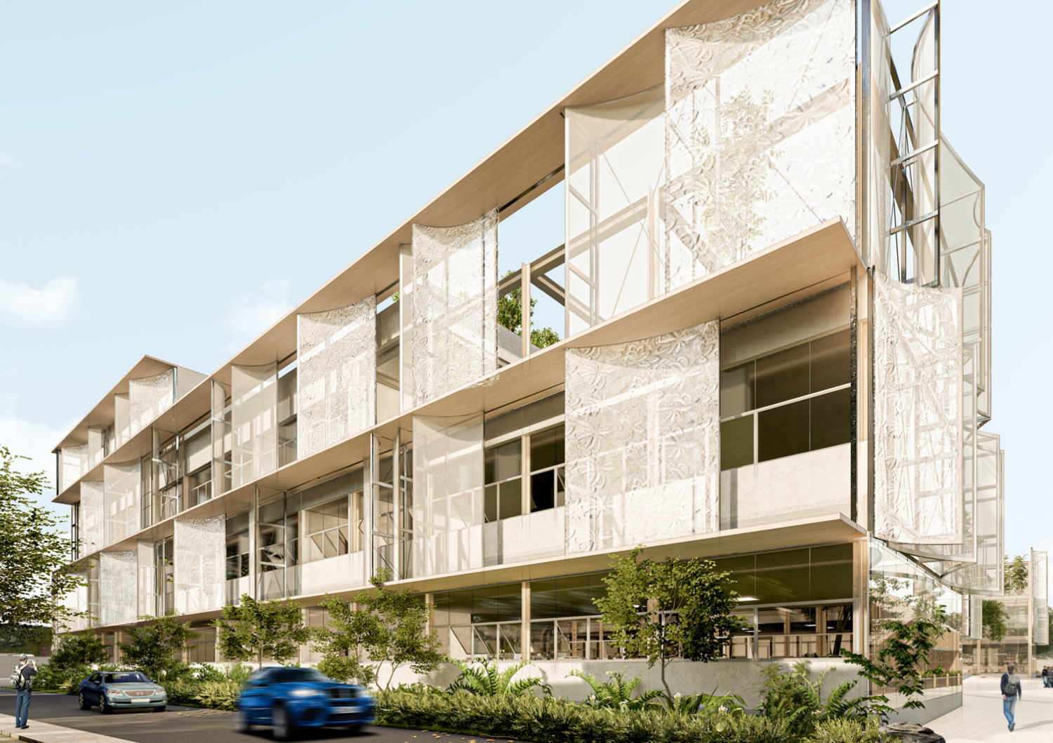


You specified the use of materials such as glued laminated timber or glulam, steel, and glass, and Filipino touches such as the use of solihiya and a translucent fabric façade reminiscent of the Barong Tagalog. Could you further on how the selection of materials, patterns, and textures of the project contribute to its architectural identity and user experience?
The use of glulam was a request from some officials as it was one of the notable features of the Mactan-Cebu International Airport and they wanted that correlation. However, using it for the structure would be too expensive, so we decided to use it in areas like the stairway that require some tactility, to add warmth to touch.
Solihiya came as a light and flexible material that could add softness to the interior, which is also quite a prominent material in our traditional weaving culture. The glass block railing adds a touch of nostalgia; it reminds us of old Filipino homes but also, glass blocks nowadays are used in a modern context.
One of the materials that we were curious about was the PTFE Mesh Fabric Membrane facade. We initially thought of using perforated metal mesh as we were more familiar with it, but we found that it would feel too cold against the glass and the steel. We liked the lightness, flexibility, and softness of the fabric facade, and we wanted to fight for the idea.
We later on realized that the material was also fitting to our tropical climate. Aside from allowing daylight and ventilation and having strong solar control properties, we later learned that this PTFE mesh membrane is actually a good fit for places that rain often. The material’s non-stick nature is almost self-cleaning, allowing it to be naturally cleansed by rainwater and preventing the lingering of dust and grime. It is also strong enough to resist debris in case of typhoons, protecting the building.
The embroidery-like pattern on the façade reminiscent of the Barong Tagalog was a touch we added to showcase Filipino identity. The Barong has existed even in pre-colonial times and has surpassed multiple colonizations, almost becoming a symbol of Filipino resistance. In the Spanish times, the transparency of the Barong was imposed so that the Spanish made sure the Filipinos weren’t carrying any weapons beneath their clothing. Through time, Filipinos have elevated it through embroidery, wearing it with pride, turning what once was a symbol of inferiority into one of dignity. We wanted the city hall to reflect and carry this spirit.
In terms of execution, this façade treatment was the most challenging as it is something we’ve never tried before. We do imagine being able to collaborate with local craftsmen so that the façade is more than just an architectural element and something that represents our community’s talents. We’ve currently reached out to a local wire artist who is helping us create a mock-up of the “embroidery” using metal mesh. We also love how this is experienced both outside and inside the city hall. There is a beautiful play of light and shadow from the inside, with pieces of art adding to the views from the offices.
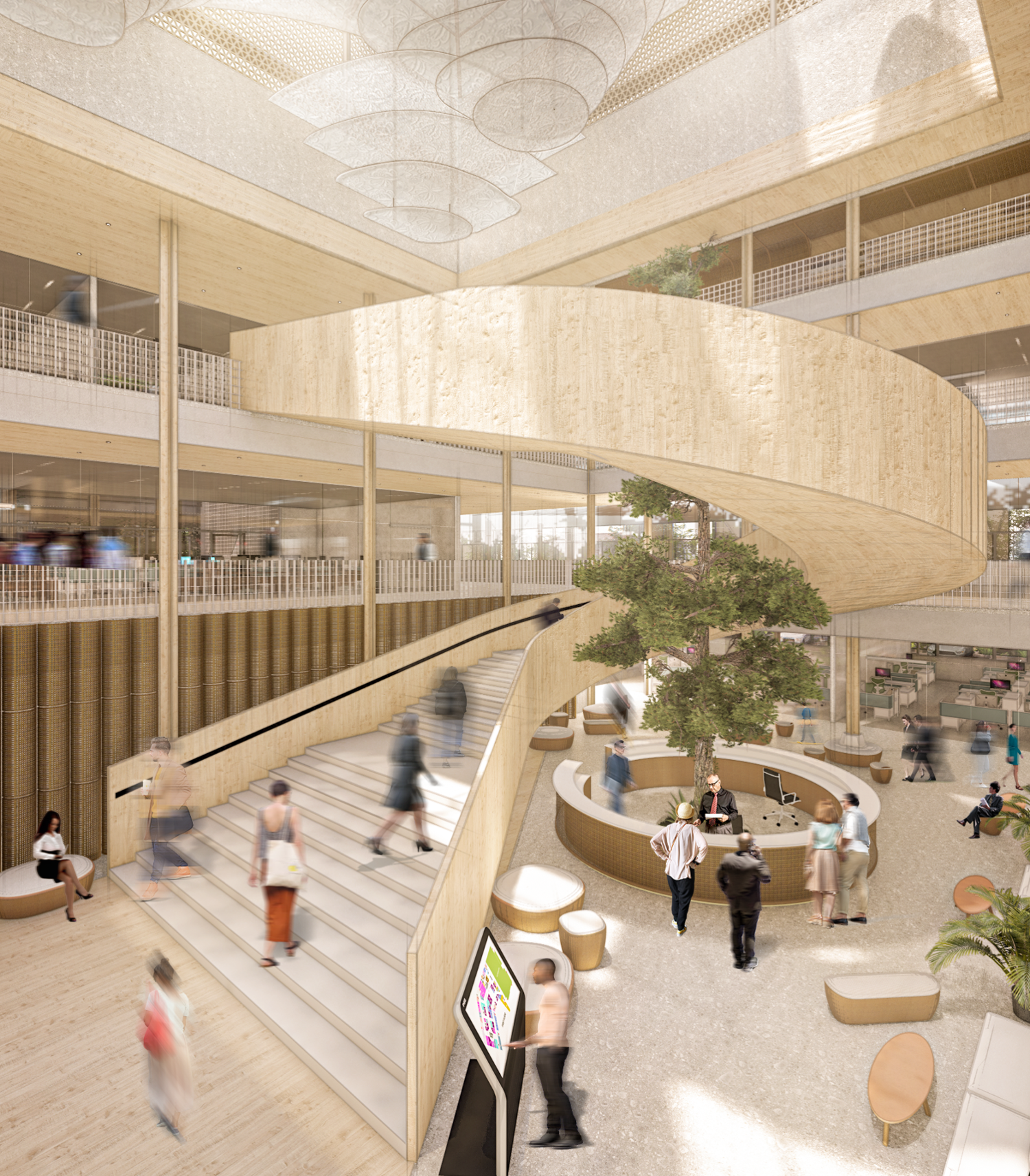

Now, what was your primary goal in terms of how the architecture interacts with the community? How do you see the project pushing the boundaries of how public spaces are designed in the Philippines?
Observing the existing city hall, and even city halls of the Philppines and all over the world, we noticed that city halls surpass as mere administrative structures. They often become places that allow multiple communal activities like zumba, yoga, seminars, community gatherings, small festivals, and fitness and cultural activities.
The porous nature of the design, having multiple open spaces in between, and rooftop gardens carved out in portions of the upper floors, allows different kinds of activities to take place. We thought that having multiple but smaller, open communal spaces compared to having one large open space feels more human, intimate, and less intimidating, encouraging different kinds of activities.
For larger gatherings, we also have a social hall on the upper floor that connects a portion of the building massing together. We also wanted to highlight transparency in design, giving a more welcoming and inviting feeling compared to the usual thick and enclosed walls.
Keshia, you participated and won at WAF as a student in 2013, under the festival’s Global Student Charette program. What lessons from this experience did you share with your team at San Studio, and how did these help shape your entry and presentation?
Most importantly, what is San Studio hoping to bring home from WAF 2024?
Keshia Lim, founder of San Studio: When we found out that we were shortlisted at WAF, the first thing I did was gather my team and show them our presentation of “Village In a Box” back in 2013. We were bright-eyed students back then, eager to make a difference and do something remarkable. After a decade of going through plenty of “reality checks” and experiencing the inevitable pains and challenges of the architecture practice, sometimes you tend to lose that sense of wonder and hope you had when you were younger.
Showing them our old presentation was also a reminder of that sense of hope and wonder, and of why I also chose to submit Lapu-Lapu city hall. This project is an opportunity to make a difference. And we believe that good design can make a difference.
WAF is an inspiring avenue (perhaps the nudge that we needed) to help us go even further. For a moment, we were also amused by how “crude” our presentation was back in 2013. I remember we did most of our graphics in Powerpoint! During the competition itself in Singapore, some architects even had to subtly coach us on how to use Photoshop.
I told my team at San Studio that the best part about “Village in a Box” is how it was able to respond to our unique context, and how we were able to tell our story. Our win in 2013 is telling of how the beauty of architecture is highlighted by the story behind it. This pushed us to pause and deeply think about what we wanted to share with our project.
If anything, we hope to bring home a renewed sense of belief in architecture, to be inspired, and to carry that inspiration into everything we do moving forward. •


