Words Patrick Kasingsing
Images Greg Mayo (Ember by Josh Boutwood)

Making sparks fly
It always starts with the name.
“For this new concept, I wanted a name that harks back to the basics of cooking,” The Bistro Group corporate head chef Josh Boutwood explains. “It had to be a word that encapsulates what our menu is all about: simplicity, accessibility, and just plain delicious food. Uncomplicated food fare.” In seeking narrative progression from his restaurant Savage, whose primal character he describes as ‘pre-Industrial Revolution,’ the British-Filipino chef gravitated towards the word for coal or wood aflame: ember. “With Ember, we have entered the Industrial Revolution itself,” he adds.
To craft the spaces of his fourth restaurant, Boutwood contacted Bistro Group regular, Headroom, who has helmed the interiors of several of the food group’s franchises for five years running. Unlike their usual assignments for Las Flores or international franchises like Denny’s or Randy’s Donuts, there was no brand-mandated ‘look and feel’ to follow. In fact, it was the exact opposite; Boutwood supplied Headroom co-founders Andrew Trinidad, Kevin Nieves, and Kat Clemente, with the vaguest of briefs that allowed both parties room for exploration and surprise. “What Josh sent was more of a mood board than a brief. He sent us a Powerpoint presentation!” Design manager Trinidad shares with a laugh. “It had one-sentence explainers and came with material pegs; he wanted to use terrazzo, clean white finishes, wood…Josh’s spatial vision for Ember was very much anchored by texture and materiality.”
Studio partner Nieves adds, “The openness of the ‘brief’ excited us and I honestly feel Josh gave us more than enough prompts for a concept. He wanted to go back to basics with Ember so we decided to design a space that contrasted it… it’s like our love letter to cooking.”


Cooking up a storm
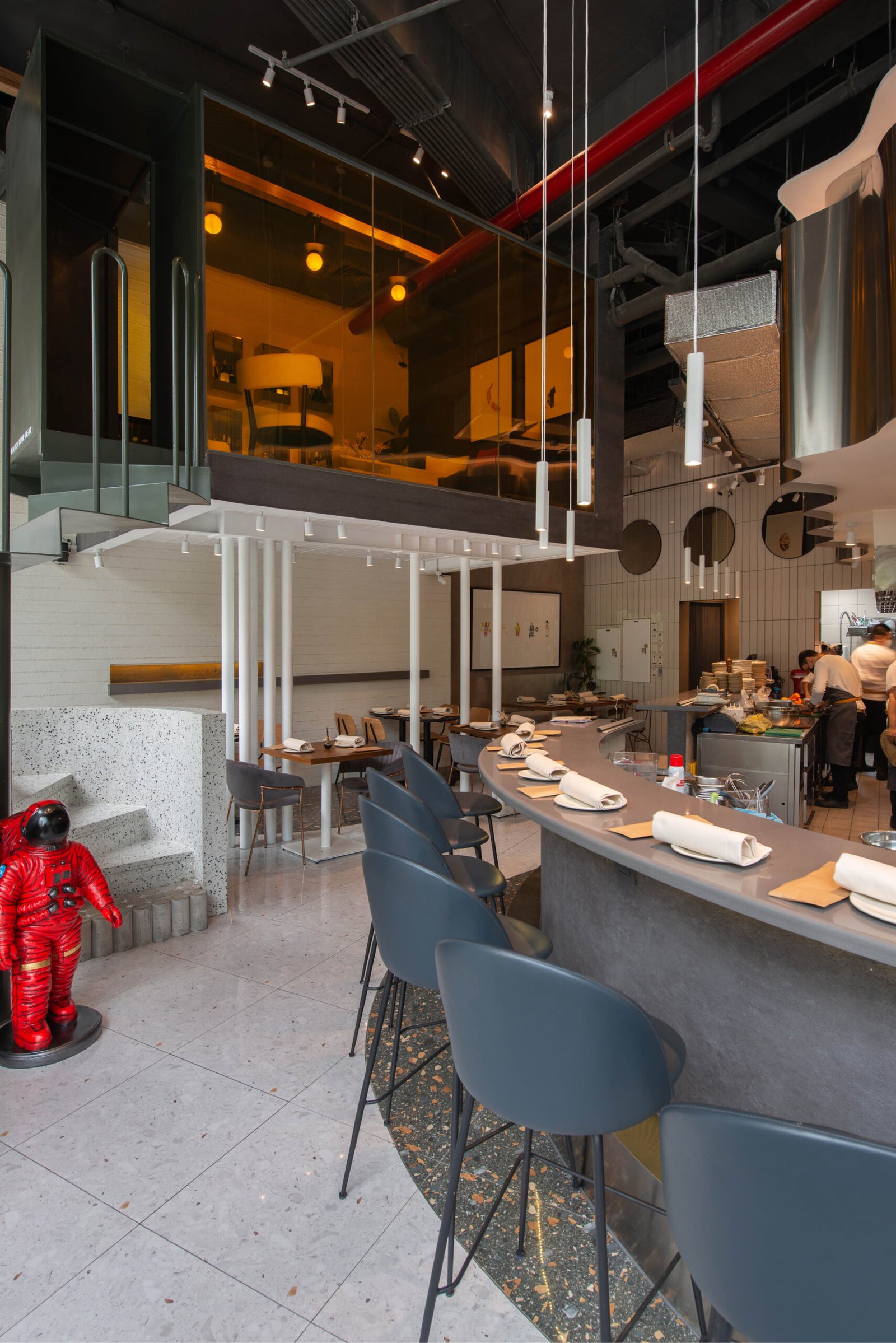
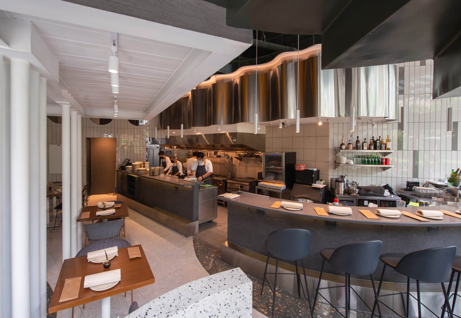
Upon entering Ember, which occupies a modest 110-square meter mall space with lofty 5.5-meter-high ceilings, one would almost certainly take a moment’s pause. For the design-trained eye, it’s what a deconstructivist kitchen would probably look like, sort of what Kandinsky or Gehry would pen after a good night’s drink. Not that the space looked like the product of drunken debauchery of course, but the space embarks on a good-natured play on perceptions of scale and texture. Every corner brimmed with color and activity. The space’s piece de resistance is undoubtedly its gravity-defying private dining space, a freestanding glass and metal box raised 2.4 meters off the floor on stilts. An olive-green spiral staircase, which starts out with a terrazzo base before metamorphosing into wafer-thin metal steps 1/3 of the way up, is sure to be a hit with the Instagram crowd.
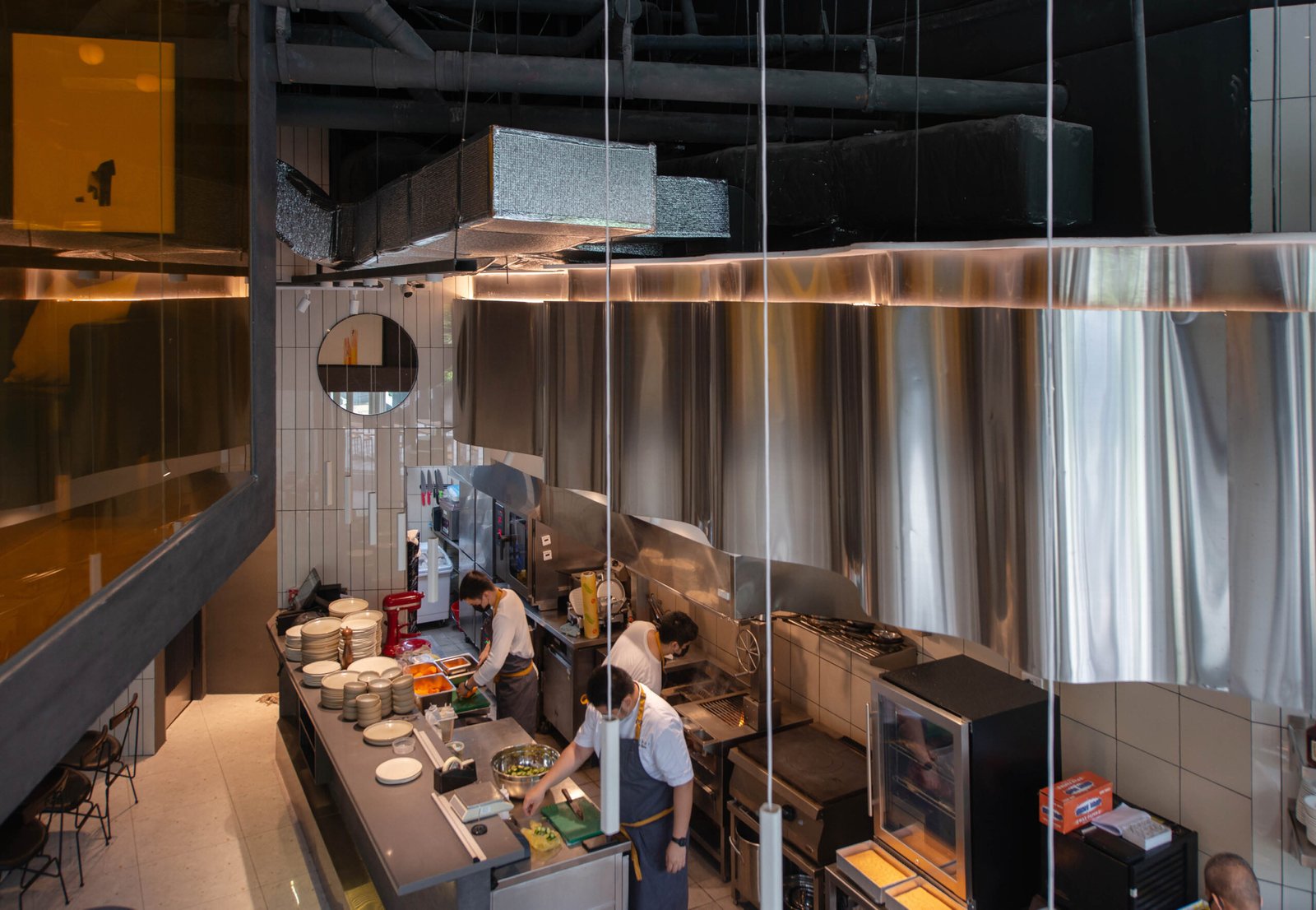
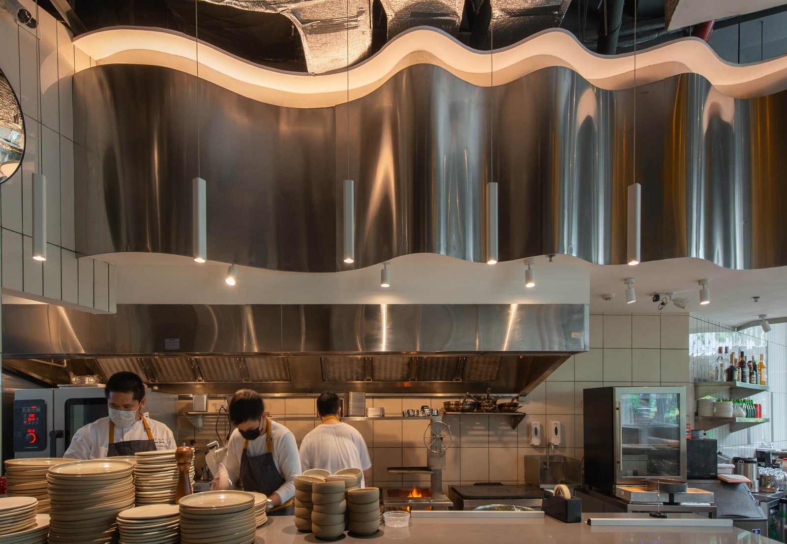
The open kitchen, a fixture in Josh Boutwood restaurants, is set apart from the dining space by a broad, arching counter finished in greyscale and topped with quartz. A scalloped dropdown ceiling finished with bent stainless-steel sheets crowns the area, a design gesture that Headroom describes as “frozen smoke.” The seating came with midcentury modern silhouettes, the slate blue and wood-textured headrests contrasting perfectly with the restaurant’s predominantly white-tiled walls and porcelain terrazzo floors. Natural light streams in generously through the restaurant’s lofty glass frontage. The space could be described as whimsical, wondrous, but also strangely familiar.
“If you observe the shapes and textures we used, they will remind you of stuff you see in your house’s kitchen. Only deconstructed, or supersized.” Trinidad explains. When asked how they would describe the space’s resulting aesthetic, the duo chuckles: “We don’t know what to call it!” Nieves admits. “Our process for the space was improvisational and emotional, like jazz. We tackled each corner as we went along, decided which nooks will sing and which areas will keep the rhythm in check…The last thing we wanted was a clichéd design response. We were happy everything gelled well together in the end!” It seemed the public acquiesced as they came in droves during opening day last May 14, with both the food and space sharing the spotlight. “We had an average of about 157 diners per day thus far,” Boutwood shares with a weary grin.


A tough chew
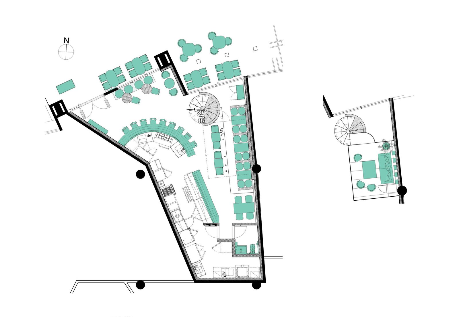
Putting up Ember’s whimsical space, however, was far from child’s play. On top of its laundry list of challenges is the punishing timeline that effectively meant the restaurant had to be designed and opened in a little more than two months (and in a pandemic at that). Headroom quickly got to work with KBL Structural Engineering Consultancy to revamp what was previously another restaurant space that closed during the pandemic. The tiny real estate and its bent funnel shape proved a challenge when it came time to decide on kitchen placement. In the end, the resulting open kitchen ate up 50% of the space, but is still, according to Boutwood, one of the smallest kitchens he’s had to work with. “We had to get creative in trying to fit in the kitchen equipment needed,” Boutwood shares. “This is the first time I got to work with dual-stacked ovens because of the squeeze.”


To increase diner capacity indoors, Headroom pushed for the inclusion of a suspended mezzanine level, for use of diners in need of more privacy. Resembling a futuristic Teronobu Fujimori teahouse, the private dining space is housed within a glass ‘aquarium’ whose yellow-tinted glazing favors the open kitchen below. Equally arresting is the shape-shifting spiral staircase that connects the mezzanine to the ground. Starting as a carved set of terrazzo steps, the staircase sheds mass and turns skeletal by the seventh step, its 2-cm thick olive-green treads ribboning up with calculated precarity to the mezzanine space, which can host a total of eight diners. Structural engineer Kevin Lucero considers the metal staircase one of his more challenging assignments on-site: “The geometry, material and welding workmanship had to be precise in order to achieve the intended structural response, particularly in terms of deflection and vibration,” he shares.
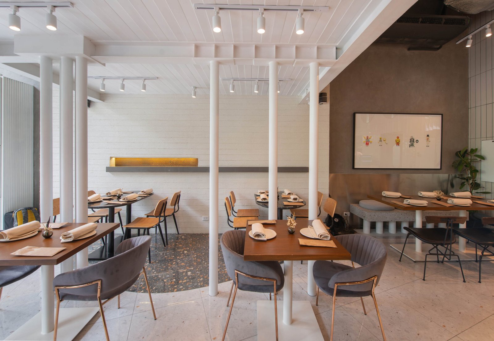

While at first glance the suspended 3-by-5-meter volume appears to cantilever out of the restaurant’s wall, it is in fact a freestanding structure supported by wide flange columns with narrow widths, sitting flush on the restaurant’s new walls. Mall rules prohibit the attachment of structural members to its walls to avoid undue stress. With the help of the hidden flange columns, Lucero added more structural support by way of eight slender rods measuring 150 millimeters in diameter, variedly positioned underneath the mezzanine. The move heightened the space’s visual drama without sacrificing user safety and comfort.


Breaking the mold
In talking about the firsts he encountered while putting up Ember, Boutwood called out the elephant in the room. “Well, this was the first restaurant I got to start within a pandemic,” he shares, then turns pensive. “Talking about firsts…I would say Ember is the first out of this new chapter in my culinary exploration, a sort of Gen 2.0.…it represents a drastic evolution, not a continuation, and it’s come out at a time like no other.”
The team at Headroom also had some small victories to crow about as far as their long-time client is concerned: “There was nothing wrong about how The Bistro Group is running the show, but we think it pays to experiment and stray away from one’s winning formula once in a while. I am glad to say that with Ember, they did not take a tentative first step; they made a decisive one and went all out! I am happy that our team was able to push Bistro to go the extra mile!” Nieves says.
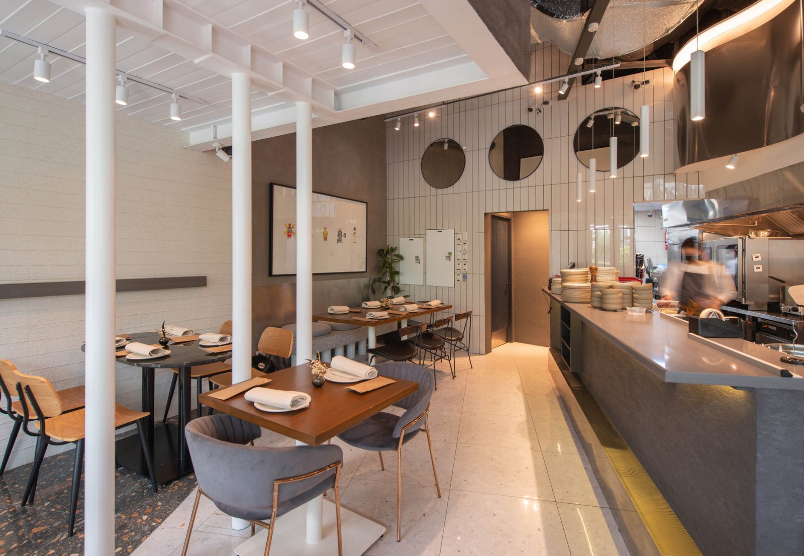

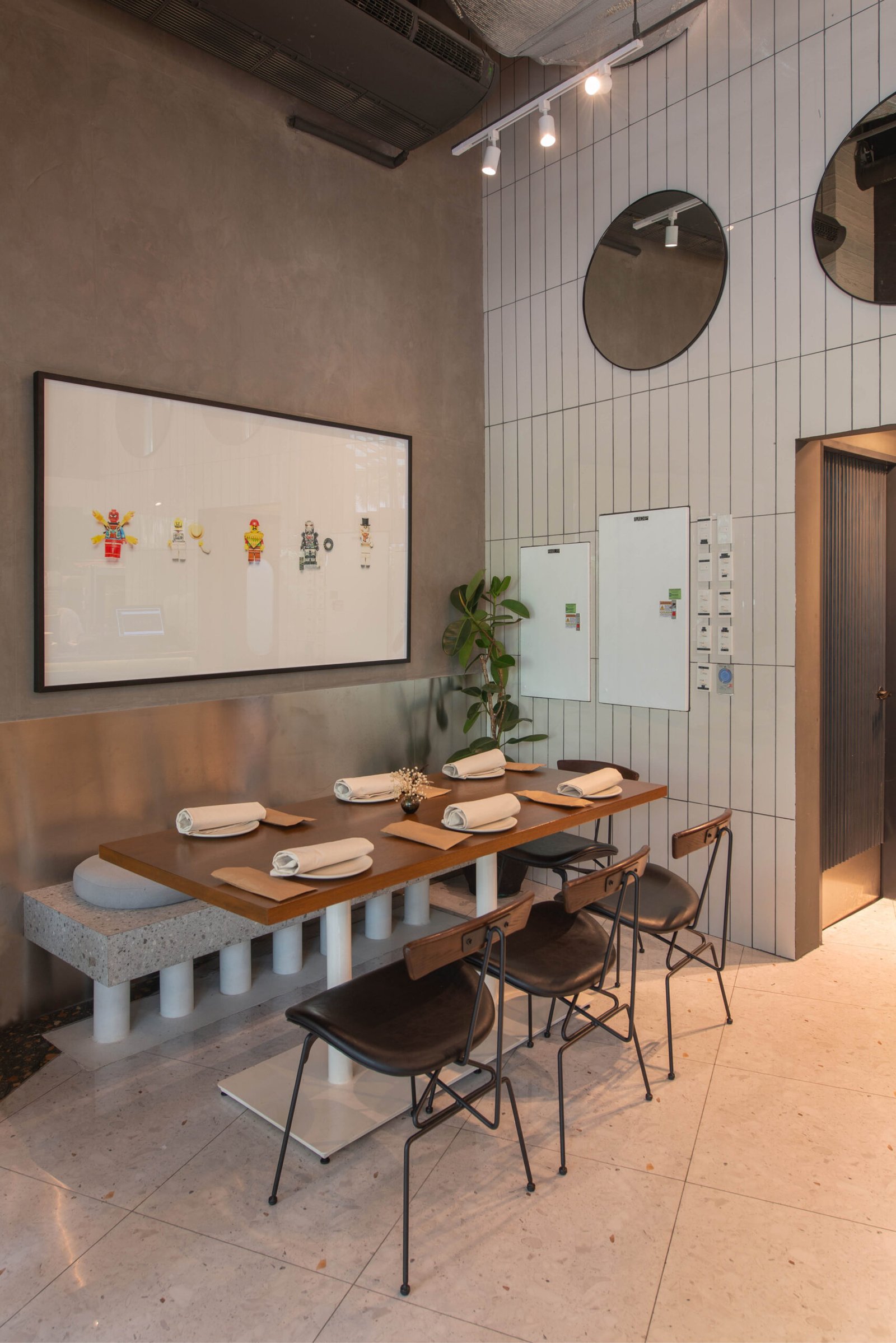
Boutwood shares with us his favorite corner in the restaurant, located at the far end of the dining space, where one gets a cinematic view of everything that transpires in his little culinary kingdom. The afternoon crowd was just beginning to trickle in and restaurant staff are scurrying across the space in preparation for the deluge of diners. I catch sight of a nearby photograph by Boutwood himself depicting a row of broken Lego minifigs (upon closer inspection, the one at the center is the only one in tiptop shape). It belonged to a series of framed prints within the restaurant that the chef shot, depicting random broken objects found in his house. It was a fitting set of images to complement Ember: for Boutwood, it signifies breaking into a new culinary chapter. For the renegade team at Headroom, it was a vote of confidence for their instinctive, emotional, and experimental design process, giving birth to an unforgettable, standout space. •



2 Responses