Words Miguel R. Llona
Images Jorge Yulo Architects and Associates and Patrick Kasingsing


Editor’s Note: Equilateral House has been shortlisted at the World Architecture Festival 2022 under the House and Villa, Urban and Suburban category.
Tessellated patterns are a common presence in Jorge Yulo’s works. Often coming in the form of polygonal shapes, they bring a sense of order and calm to the space, their rhythmic flow giving the impression of texture. They come to the architect in moments of serendipity, and he sketches and applies them as different elements in his projects, whether as the pattern of a ceiling, an impression on a wall, the grooves of a door’s surface, or even the layout of a space. One can say this is merely his way of creating retinal activity in his designs, but there is a deeper reason beneath this fascination.
“I use them to play with positive-negative juxtapositions, so when you experience the place, you feel this magnetism that the patterns should fit together,” he says. Playing with positive and negative juxtapositions—or forms and voids, to put it another way—could be an apt summation of his philosophy, which he remains hesitant to put into words. In any Yulo project, the immaterial is treated with the same importance as the built form, exemplified in the poetic conversation of architecture and topography in his Hacienda Community House and La Cabaña de Resurección. His architecture lulls users into a state of contemplation and reverence, inviting them to fill the space with their presence.

Despite its fortress-like appearance, the Equilateral House teems with these liminal spaces that Yulo carves out in his architecture. The two-story house is on a 1,300-square meter property and is designed for a family of four, who have been residing in the house for a year as of this writing. Its name, which sounds like a misnomer due to the incongruence of its exterior form, is a reference to the equilateral triangle that served as the inspiration for the house. The irregular cut of the lot—“as wide as it is deep,” Yulo describes it—sparked his idea of designing a house that was “not all 90 degrees. So I chose a basic geometric form, in this case, the equilateral triangle which is equal on all corners, and it became the basis for the layout of this house.”
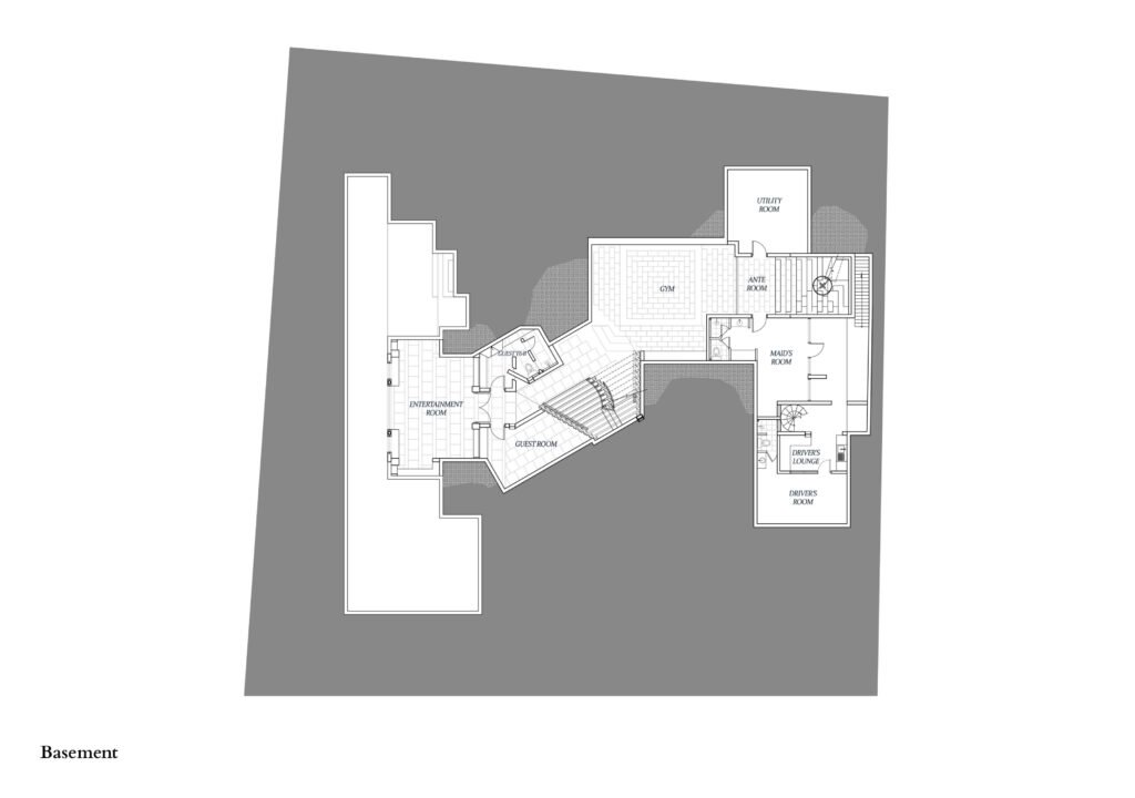
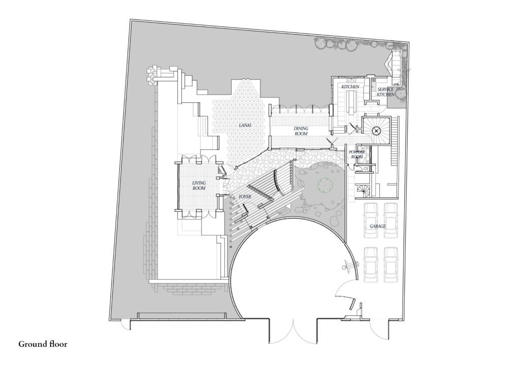
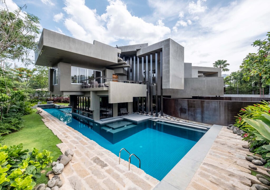
The site and floor plans reflect Yulo’s commitment to this geometric shape. The corners of this triangular layout are designated on the west, northeast, and southeast points of the lot, and this opened up space around the peripheries for gardens and courtyards. Because of the house’s unconventional footprint in the lot, a wide frontage was created, longer than the 10 meters required in the village. Since this would have been too large for a driveway, the frontage was divided into three sections: the driveway at the center and the garage to its side, and a portion that is part of the garden inaccessible from the main gate. The driveway is bordered by a circular wall that contrasts with the sharp and angular forms of the house. “It sort of coils the house and becomes the podium for it,” says Yulo. The wide frontage and the surrounding garden provide ample space for the house and its many façades to be admired from any angle.



From the street, the house is defined by cantilevered concrete forms of varying lengths, splitting into different angles. It may seem like the architectural language of a madman, but order comes into focus once the massive concrete forms are seen as brise soleil, as they were designed to be. The lot faces south, making the house vulnerable to the sun’s east-west path due to its diagonal orientation, so Yulo extended roofs and walls or let the edges of the cantilevered forms drop down to protect interior spaces from sun and rain. The longest cantilever spans 9 meters, creating a canopy that directs people to the main door and blocks the western sun, providing an impressive sense of entry. As one would expect, the house is a contractor’s nightmare, with construction lasting for nearly five years.
While the exterior is all concrete, the interior spaces overwhelm with a wealth of materials and textures. Certain walls pique one’s interest with their intricate patterns until they’re revealed to accommodate the grills of a gate or the tessellated surface of a door. Entering the main door leads to a narrow foyer that functions as a transitional space towards the lanai, the two spaces demarcated by the ara-al flooring of the corridor connecting the living room on the west side and the dining and kitchen spaces on the east side of the property. The theme of equilateral triangles remains present in the lanai, with the hexagonal floor tiles that are then mirrored by the three-dimensional ceiling treatment in the seating area by the pool.

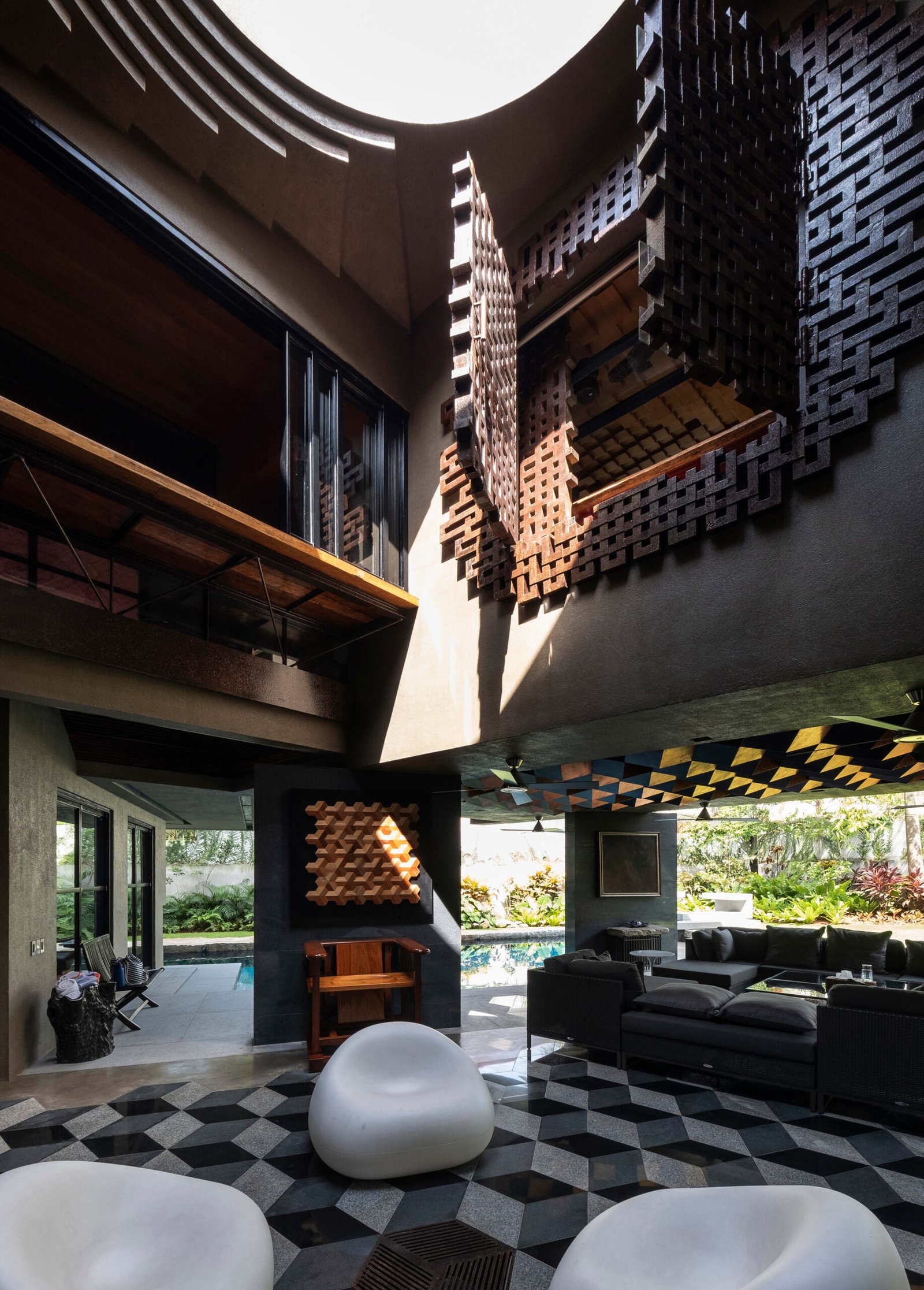
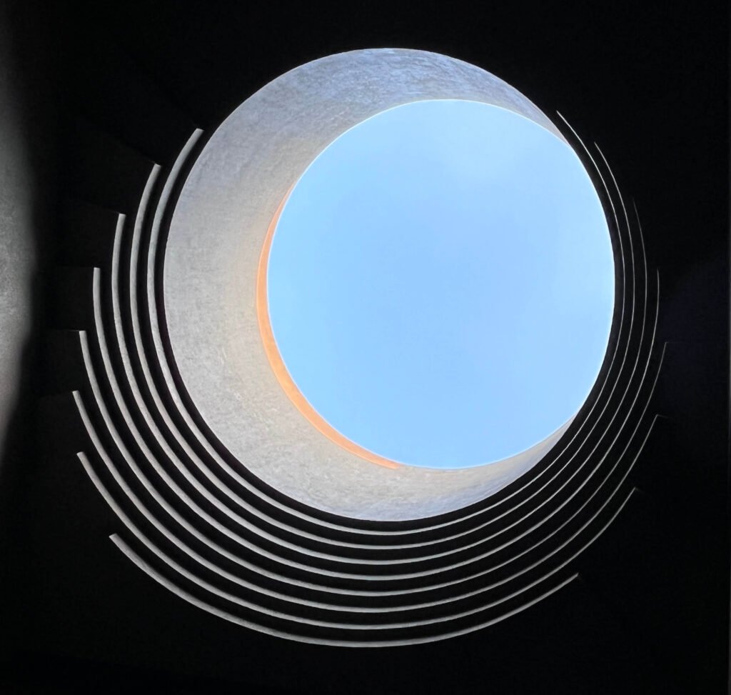
What looks like a sculptural brass wall accent below the oculus is actually a window for the master bedroom. 
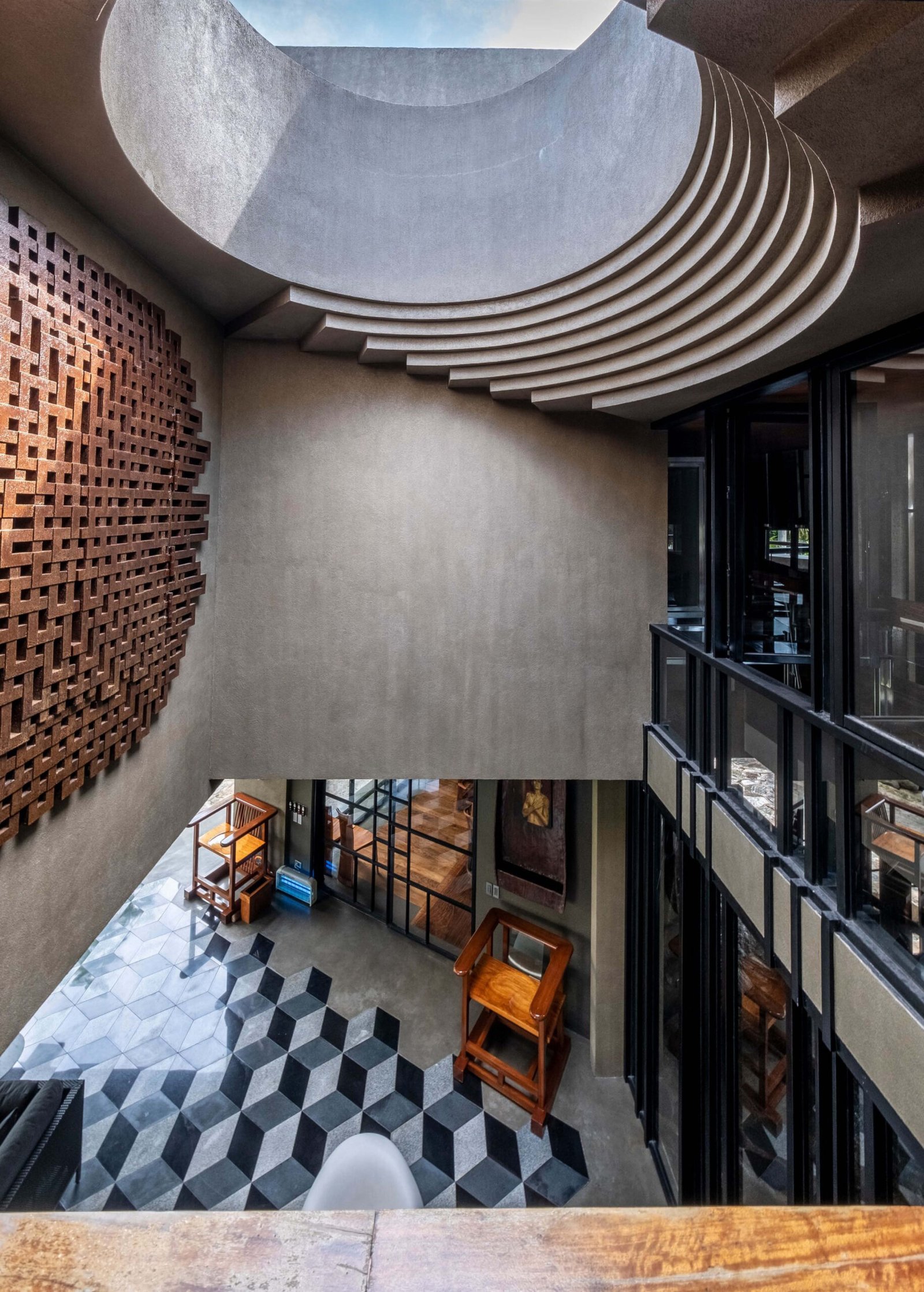
The windows can be opened from inside the bedroom, from which you’re given the impression of having entered “a chapel or a religious place.”
“Shadows cast through the oculus vary as the day progresses, serving as a natural marker of time.”


The lanai area is crucial to the air circulation around the house. Ceiling fans were installed over and beside the 25-meter pool bordering the lot’s western wall to help spread the water’s cool temperature throughout the house. To further improve ventilation, a 7.2-meter high void was opened up at the center of the lanai, topped by a 2.7-meter wide oculus that is an obvious reference to the Pantheon, Yulo’s favorite work of architecture. Apart from acting as the outlet towards which hot air is pushed out, this central atrium essentially serves as a light well that suffuses the lanai and certain sections of the second floor with light. Shadows cast through the oculus vary as the day progresses, serving as a natural marker of time.
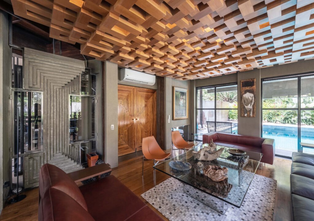
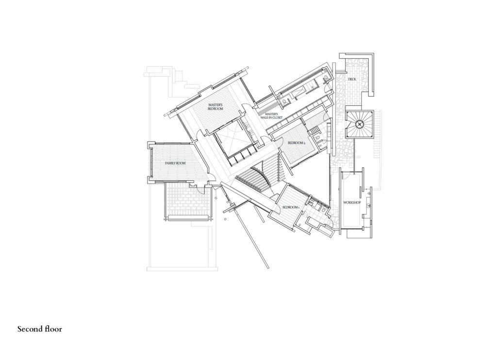
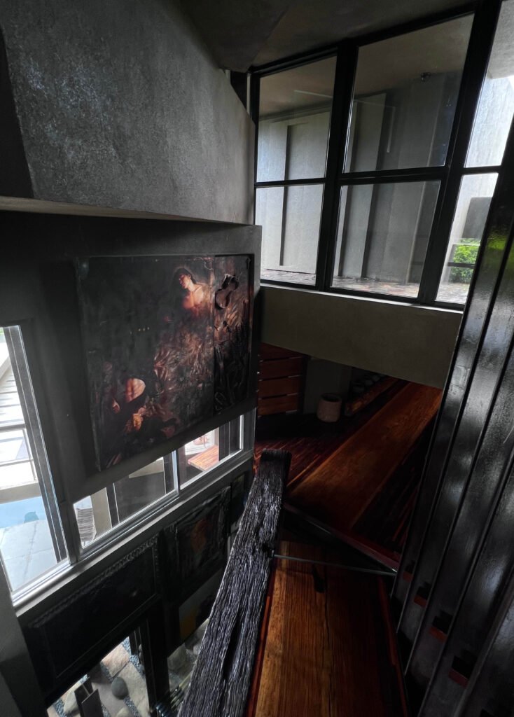
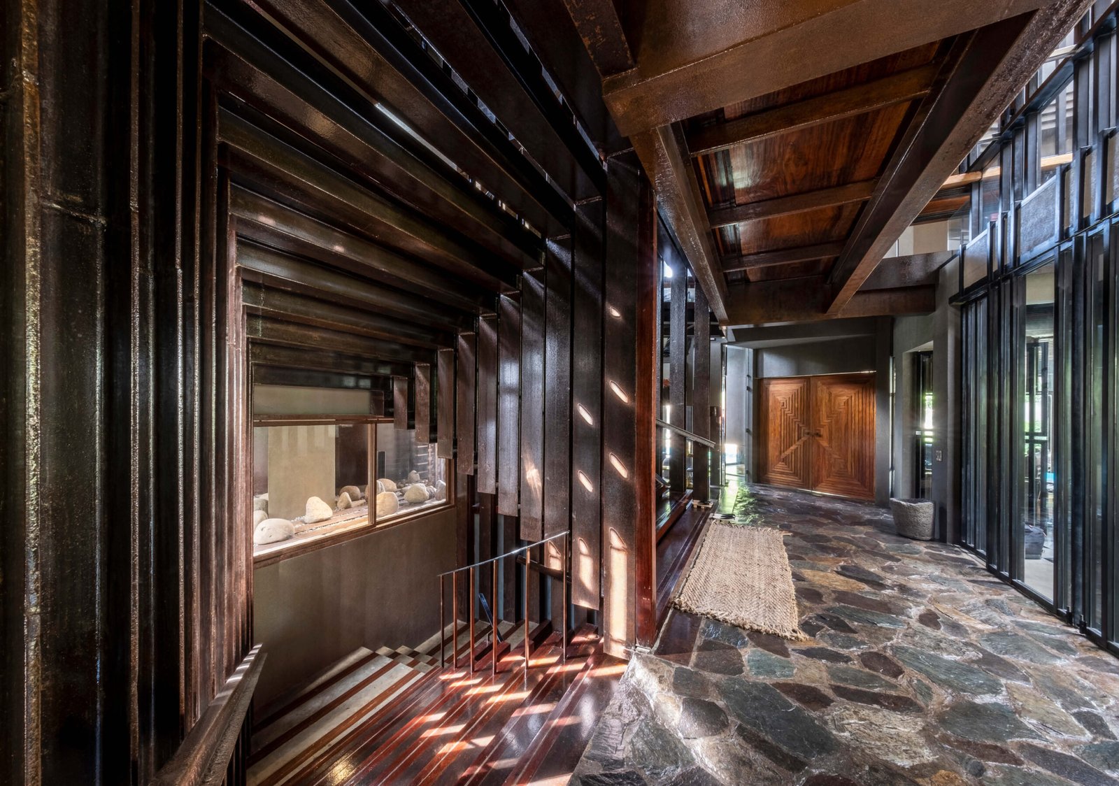
The staircase is of similar design to the one in the Hacienda Community House, with its gestalt-inspired treads and risers. As one ascends the stairs, the wealth of material used for the interiors becomes even more palpable. Yulo’s fondness for wood is felt most in the corridors connecting the rooms of the second floor, where he used a combination of dao, narra, mangkono, kamagong, yakal, and keyaki, a Japanese wood. The ceilings of the master bedroom and family room are clad with almaciga, cut into different widths, and arranged in varying heights and elevations to form another tessellated pattern.
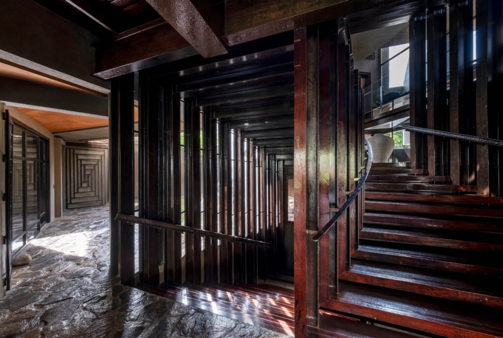

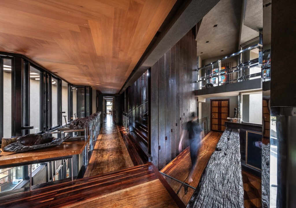

The material palette of the Equilateral House can be overwhelming—each nook and cranny arrests the eye, inviting you to admire the grain of the wood or feel its surface with your bare hands and feet. Yulo sees this material maximalism as a necessary contrast to the dull hues of concrete that make up most of the house. “I have a wabi-sabi sort of system,” he says of choosing the materials. “Concrete is the yoke that keeps it all together—it’s this gray, subdued color, and I try to put something subdued yet contrasting with it. That’s why I capitalized on wood for the interiors, to warm it up inside.

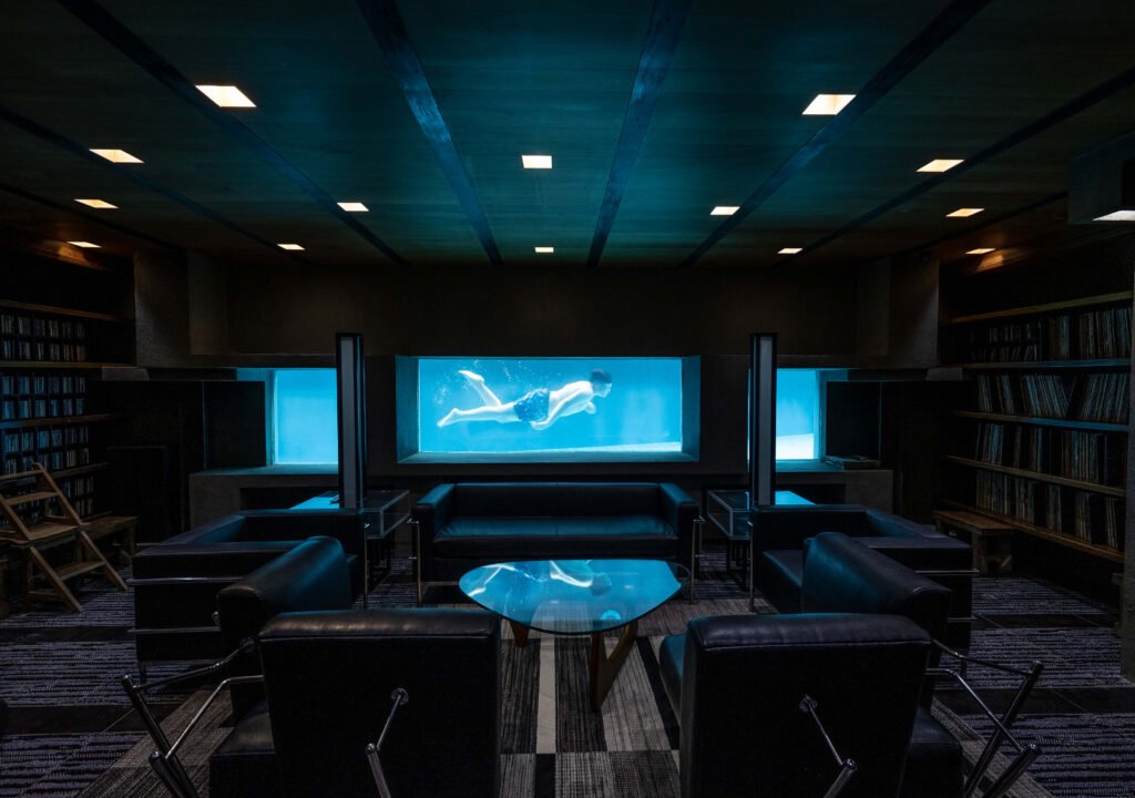
Yulo likens the Equilateral House to an open yosegi puzzle box, in that certain parts and elements refer to other parts of the house. Connectivity between spaces is emphasized; rooms have different points of entry and exit, providing the user with a different dimension of the space in relation to the house. The three bedrooms on the second floor are oriented along the eastern side, all with back doors that lead towards a terrace area that Yulo calls the “inner sanctum.” This hind space is only accessible through the rooms, making it an intimate place among the family members and any friends they bring into the house and became an ideal spot for isolation when one of the family members got COVID. The listening room in the basement has a glass wall looking into the pool, making for an ethereal space that also conforms with Yulo’s idea of connecting spaces.


The sequencing of spaces on each floor is irregular, due to the house’s triangular layout. “I made it a point that none of the sharp corners [of the house] are in play in circulation like there are no rooms you have to go through,” says Yulo. This approach led to voids and gaps being created in some areas, through which wind passes to form wind tunnels. Furthermore, the intersection of architectural elements that form these voids creates more equilateral triangles or at least the suggestion of it.
The Equilateral House is a staggering work of architecture, so it’s no surprise that Yulo likened it to “a tiger I had to hold by the tail” when discussing his design process. It is both an exercise of restraint and a challenge of articulation, defying description and inducing awe. It reinforces the power of architecture to excite and stir the soul, with its interplay of forms and voids, materials and textures, light and shadow. Yulo considers himself fortunate to have found a client that gave him free rein to express his bold ideas, thus further cementing his reputation as a master of his craft. •

Miguel Llona is a writer who has written for numerous print and online publications. He was a former editor at BluPrint magazine, and currently serves as marketing consultant for an interior design firm and a structural engineering company.

6 Responses