Interview Judith Torres
Photography Marc Heinrich Go, Eric Beltran and Kevin Evora
They met at the University of Melbourne and had been dating for two going on three years, she an architect, he, a civil engineer. Finally, it was time to meet his family in Manila. And while making the rounds of family and friends’ places, without her knowing, she came upon their future home.
“So, I first came here as a guest. I remember thinking, ‘Oh, this is beautiful! What a gorgeous lot this is!’ The homeowner back then made it very warm, very natural, very open. Little did I know, many years down the road, we would be living in this very lot. It was serendipitous and surreal.”

The house
She collaborated with architect Ed Calma to reduce planes and columns to the minimum. Doors disappeared into walls and in some areas, visitors would guess which part of the wall to push to enter a room.
“I was fortunate to work with Ed, who was very aligned on the aesthetic we were trying to achieve—not just of clean lines, but also the way the lines meet each other, how the lines intersect, how the ceiling terminates to the floor and to the cabinets. That was very important to me. This idea of suspension was a language I wanted to carry from the building to the actual pieces in the house.”
By suspension, the wife refers to the cantilevers she and Calma introduced to the house, such as second-story decks overlooking the swimming pool and the Scavolini kitchen’s cantilevered countertop. “I wanted everything to be cantilevered and my husband informed me, hey, Manila is a quake zone. So, I said, okay, okay, and we trimmed back some cantilevers.”


The kitchen
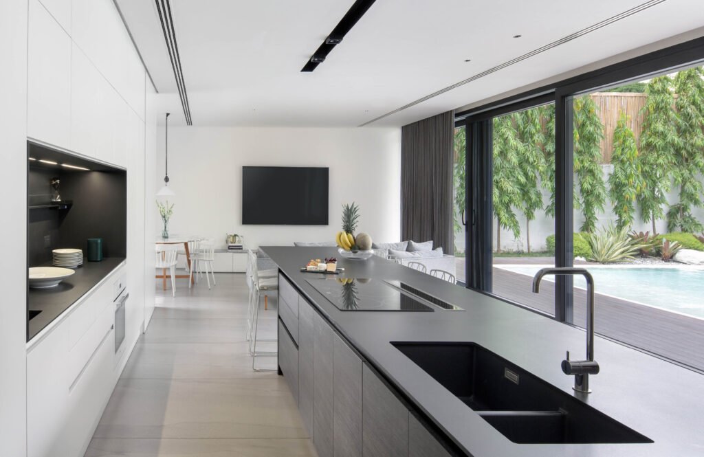
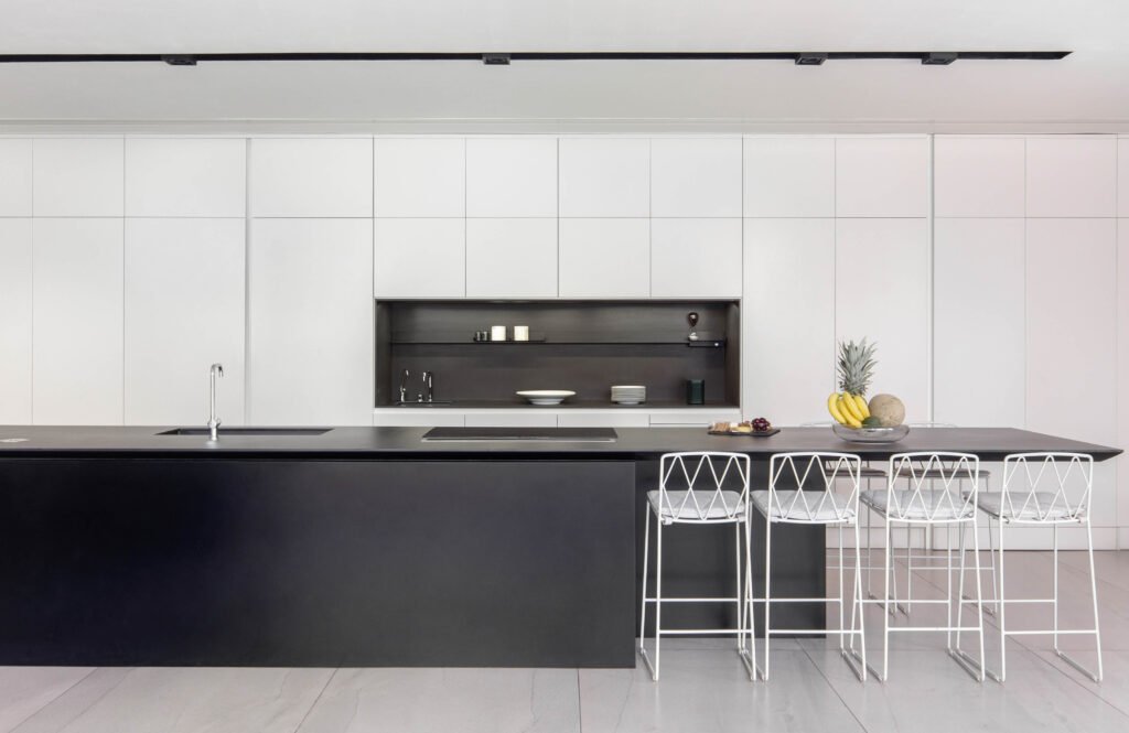
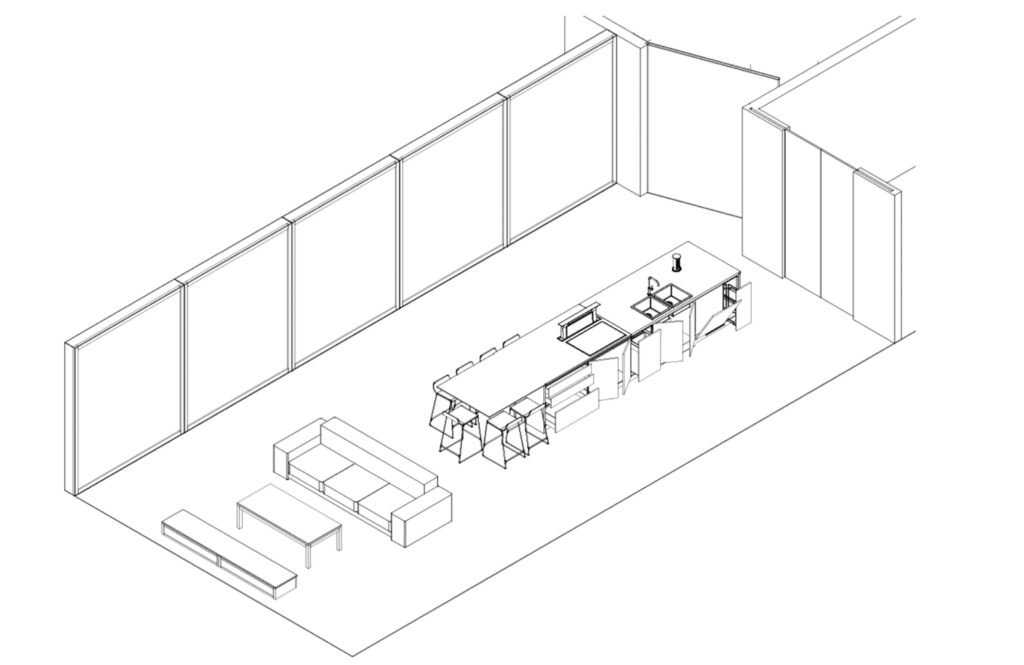
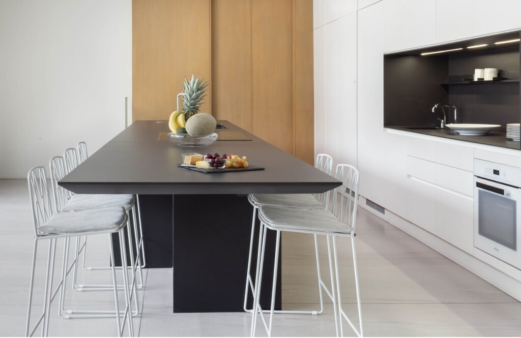
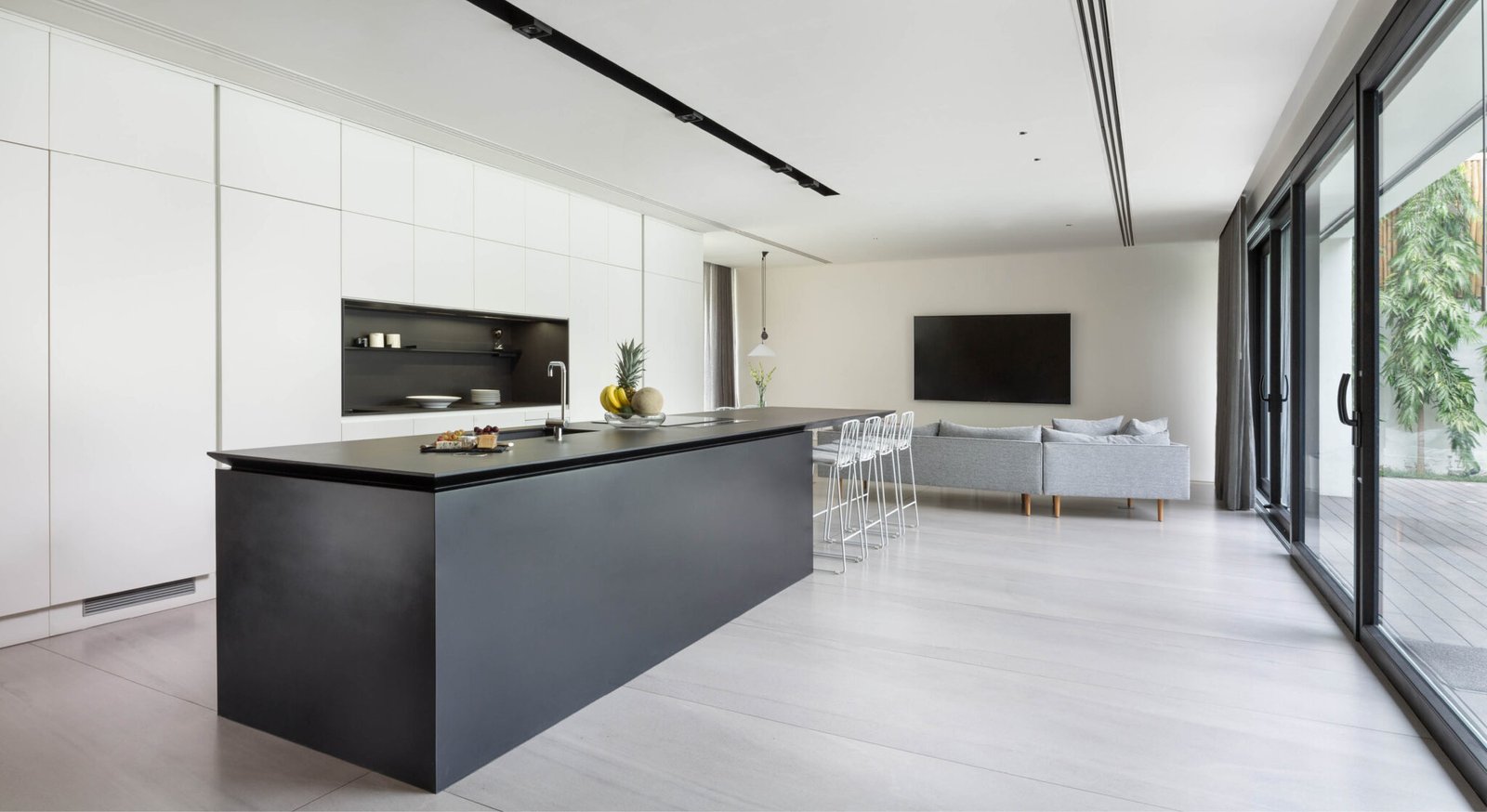
When not in use, the Scavolini kitchen is a pristine white space with a sleek black island that stretches 5.27 meters long. The island cabinetry takes up 3.27 meters while its countertop cantilevers 2 meters out to serve as the family’s kitchen table, where they eat every day.
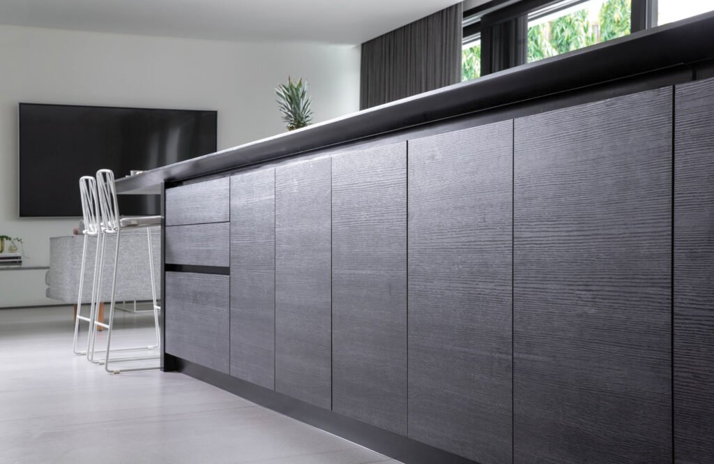
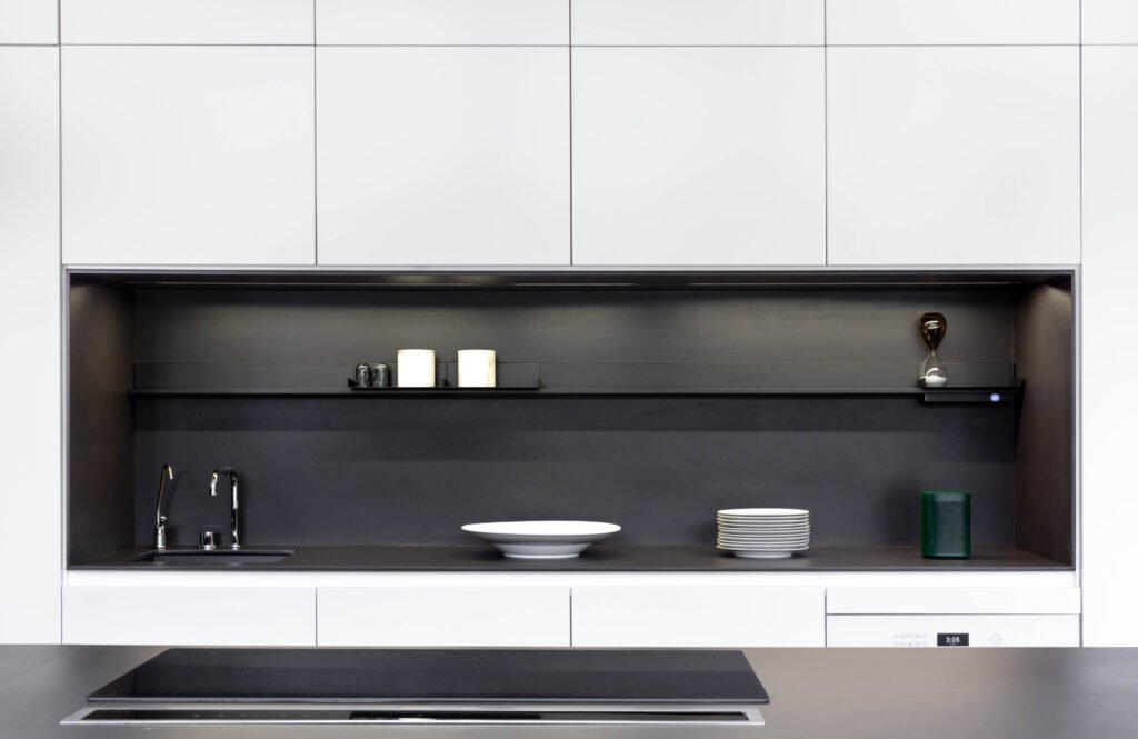
She chose Scavolini’s LiberaMente model, which offers a range of materials, textures, hues, and dimensions, allowing freedom to mix, match, and customize. Still, she stuck to two tones: matte lacquer in Prestige White and Smoke Oak.
“I love, love my kitchen,” she says. “It’s the shadow line. I really wanted the black part to peel from the white. I didn’t want it just sitting next to it; it had to breathe. The space in between the materials was important because I love having tone on tone and texture on texture.”
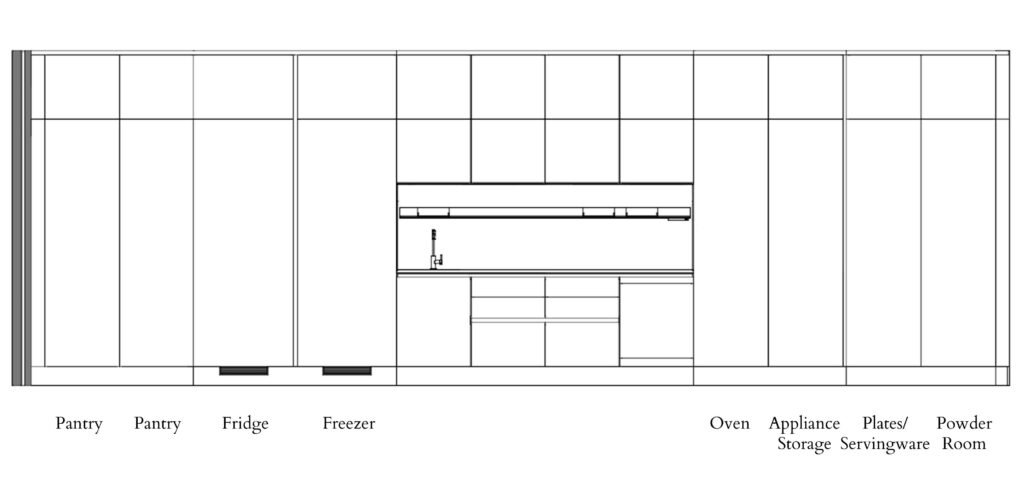
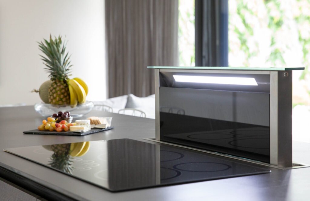
Everything, absolutely everything, in the kitchen is hidden or tucked away when not in use. Unlike most, this couple chose different brands for their appliances, all of which are concealed or blend into the kitchen’s black and white surfaces. The white oven, for example, merges with the field of white cabinet doors, while the black induction cooktop recedes into the dark Domoos Dekton countertop.
“I like this kind of client because they researched on each and every appliance,” says Brian Hontiveros, general manager of Modularity Home, which distributes Scavolini. “For example, there’s an Elba dishwasher and an Elica downdraft range hood hidden in the island. Instead of an exposed range hood in the middle of the ceiling, you press a button, the rangehood goes up, and the exhaust goes down a pipe through the basement. Then, they used a different brand of refrigerator and freezer because they wanted a specific size and wanted them fully integrated.”

Kitchen location
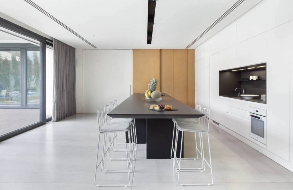
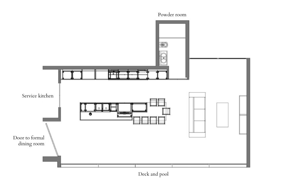
The kitchen and formal dining room form an L bordering a swimming pool in one corner of the lot. The brown sliding door leads to the service kitchen. To the left, the white panel opens to the formal dining room. At the opposite end of the space is a cozy living area with a couch and TV for the kids.
“Honestly, I just needed to fit my family in the kitchen and cook with my family there—please don’t tuck me away at the back! That’s how it was in my previous kitchen.
She shares a story about the service kitchen’s sliding door: “My husband and I were at a Robuchon in Tokyo. So, we’re eating this amazing mashed potato and, out of the blue, he goes, ‘So what happens if we’re carrying lots of things and can’t open the kitchen door?’ He goes, ‘Look at that.’ Robuchon’s staff were going in and out of their kitchen through an automated sliding door. I said, ‘Isn’t that a little, like, excessive?’ And he’s, like, ‘We need it.’” And so, the service kitchen door is automated.
One clever suggestion from architect to architect: “Ed knew how important it was me for to have an efficient kitchen. So, I don’t have two sets of spices or sauces. Everything is one set, stored in a stainless-steel caddy that I roll out of the wet kitchen when I need it and return when I’m done.”


Kitchen layout
All the white cabinet doors are operable and open to shelves, drawers, and storage for appliances. The last two doors on the right, however, are actually just one door that opens to—surprise—a powder room. She laughs as she recounts how guests must guess where the powder room is. She adds, “That door doesn’t have a lock. So, the joke is, whoever goes to the washroom uses it on trust.”
Hontiveros grins. “We don’t usually do room doors, but we did it for this project to complete the concept.”
The nifty storage spaces have also helped the wife raise her kids the way she would if they were living Down Under.
“They each have shelves at their height, so they can reach for their own plates, get their own spoons, and set up their places at the table. This kitchen is set up so that should I not have any help, I will survive. And, if they choose to work and live in Australia, they are self-sufficient.
“So, the workability of the space is so important. I’m fortunate my children are very, very respectful of the kitchen. They know when I’m taking something out of the oven, I’m going to be swinging around with something hot.”



Materials
The couple debated “for a long time” on what material to use for the 5.27-meter-long worktop and, in the end, chose Dekton because, as the wife cites other materials, “they have stained on me.” Five years later and she is still in love with their choice.
“I absolutely love the counter. I don’t have to be precious about it. If something is meant to be used, it’s to be used. It’s not something I have to think about. In fact, it supports me in my cooking. I can put a hot pan on it, I can put a hot plate on it, it’s all good.”
Of course, smudges are much more noticeable on white surfaces. Fortunately, they’re all easy-wipe finishes. And, nowadays, with people more aware of the dangers of viruses and bacteria than ever before, conscientious cleaning is a welcome routine in the household. Has the white kitchen made the kids more diligent about keeping their hands clean when they were little?
She laughs: “Let’s just say I could see where they’ve been. I know which child is touching what!”


Kitchen cantilever
“I have pictures of my husband sitting on the cantilevers in the house. Making sure that, yes, the tensile strength is there. He’s a very good engineer, he tested and checked the flex on everything, even our glass railings!”
To ensure the countertop’s strength and flex, Hontiveros says Modularity worked with a structural engineer to design the 52-millimeter-thick worktop with three layers of steel plates inside. “We did not want it to be like a diving board where if you apply weight, it bounces up and down.”
Choosing the material to encase the steel plates and serve as the base for the Dekton top layer was also a crucial decision. It had to be very strong, flexible, and sexy in black.

Lighting
She was very hands-on when it came to the lighting layout. “It plays a critical role in the sense of wellbeing, especially when the house transforms from day to night. I wanted a lot of it to be very subtle. So, I had options between the linear lights which was between the cove, a working light which is within the niche, and what I like about Scavolini is they have shelf lights.”
The kitchen specialist
“We chose Scavolini primarily based on the partnership,” the lady architect explains. “Out of the few kitchen suppliers we spoke to, they felt the warmest and the most collaborative to me, personally. I enjoy working closely with a good supplier who really wants to explore. Scavolini had an approach where they were happy to help me with what they had and happy to adapt. I liked that flexibility.
“I think the project might have been different from their regular client-supplier relationship. I gave pegs, the feel, the intention, how I plan to store my things and use the kitchen. I gave that to Scavolini, then they sent me a proposal and we worked through that.”
Hontiveros says the collaboration was so much more technical than the client has let on: “Her typical questions were about interior dimension, distance from the bottom of the carcass to the floor, the height of the feet—very, very technical. We customized the countertop detail, worked on the angles, the thickness of the profile, the 45-degree angle of the edge. Again, very, very detailed for something that’s super minimalist, right.
“But I enjoyed this whole process because we accomplished what the client wanted to do. Modularity was able to create this system outside of Scavolini’s catalogue, I’d say at a level higher than the already high standard. You won’t find this kitchen in any catalogue—it’s that customized.”
Learnings
After five years of living in the house and working in this kitchen, if she had to do it over, what would she keep and what would she change?
“Ed Calma has a real joy for trying new materials and a joy for clean lines. There was a synchronicity in that he understood what we were trying to achieve. And it was a good working relationship because his team also understood—there was an overflow of that philosophy to his team, so that was the joy of working with Ed.
“In the kitchen, I love my induction cooker. I can’t live without it. I love, love the sink. I love that if I need to plug my laptop in, we have one underneath the table and my husband can work there while I cook.
“Scavolini did a really good job. It’s very easy to maintain. During installation, I loved that Scavolini were ready to mobilize anytime we were ready. And the after-sales service—hey, I’m not endorsing, okay—it was great.
“What would I change? Perhaps the space between the cooktop and the sink. I could have had it a bit wider because when I wash something, I put it there. But it’s okay, really, it’s a nominal detail.
Otherwise, she pretty much wouldn’t have the kitchen any other way. •




One Response