Interview Patrick Kasingsing
Images Jeremy Smart for Design Anthology


Hello! Kindly do introduce yourselves.
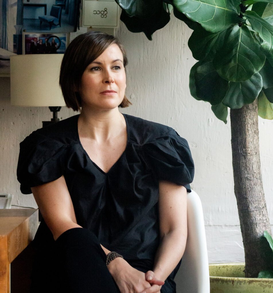
Hello, I’m Suzy, editor-in-chief of Design Anthology magazine and co-founder of Fifth Black Media.
The design world is not lacking for publications and sites but you persevered with Design Anthology, now a six-year-old print title with a readership of 80,000 in 30 countries. How did it all start?
It’s quite a long story, longer than the six years we’ve been around.
I came to Hong Kong in 2005 with a company I’d previously worked for a few years in Tokyo. The role wasn’t as fulfilling creatively as I’d hoped so I started writing a design blog in my spare time. The blog readership grew over the years, which is always a surprise to me as it was meant to be something just for me. This was before Pinterest, so who knows what would have happened if I got hooked on that instead! But that whole idea of sharing content likely started then.
I had been working as an interior designer until I co-founded the magazine. I had been frustrated with the lack of good design magazines in the region, online or in print. It was a conversation with two friends at an event where they suggested that I start something new. I scoffed at the idea and thought (rightfully so) that it was a crazy idea. But it got me thinking, and I guess that’s when the seed was planted. I started to do a bit of research and realized maybe it wasn’t such a crazy idea, especially if we published digitally. We started planning in late 2013 and published our first issue in April 2014. The rest, as they say, is history.
It was not entirely difficult. There was a lot of paperwork to get through in setting up the company and registering a new publication in Hong Kong. When the timing is right, things fall into place and generally, that’s how I felt in those early days. It was just myself for the first year until our first employee joined us, and then we steadily grew to where we are now. I was warned by a number of people in the industry that starting something new in media was not advisable, but the more I spoke to designers and the rest of the design community and after some advice from a PR friend in the know, we finally bit the bullet and decided we had to print.
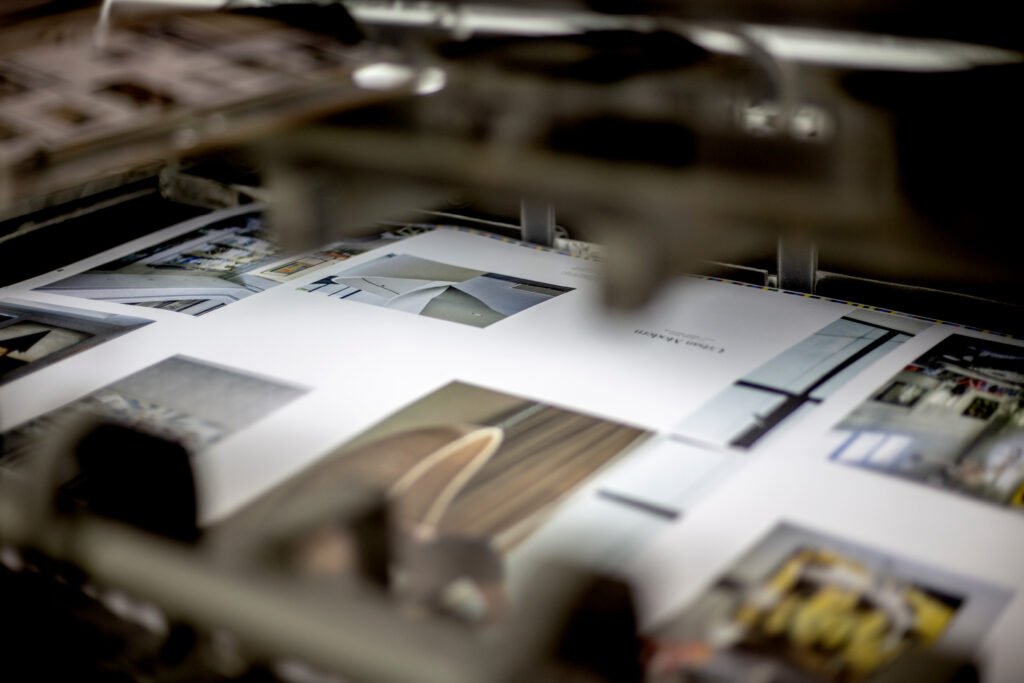

Can you tell us a little bit about the scope of Design Anthology? What informed the decision to cover these topics?
The topics we cover in the magazine were curated really to appeal to my reading habits. I was looking for something that was not low-brow but also not highbrow or too academic. I am interested in topics as broad as urban planning and the issues that come with city living, along with architecture to interior design, art, and product design. Essentially its design and urban culture from the macro to micro. I always get asked about the travel section as most people don’t see the connection, but designers and architects travel frequently. It’s one of the best ways to be inspired and to think outside of the everyday. Adding that section (including design-related hotels and destinations) was a no brainer for me.
What are the needs and issues the magazine was created to address? Like with regards to Asian representation in the field of design, was Design Anthology created to champion more Asian designers?
Absolutely. I mentioned my blog earlier. That was a good experience but when we started the magazine, we realized it would have an entirely different audience. We realized that there really was no other title focusing entirely on design in this region. Many of the design magazines I had seen in Asia were spending as many pages delving into projects in Australia, Europe, USA. It seemed the right time to launch something that could become a regional platform.
The other reason was that we could see the design community in Europe was just that—a community. That despite language differences they had the benefit of geographical proximity. Asia is larger and more spread out and often separated by bodies of water. So the other outcome of creating Design Anthology would be to foster a sense of community across the region and to encourage dialogue. We noticed that the arts, architecture, and design groups weren’t really talking, despite their shared interests.
In the beginning, though it was a bit of a struggle, we didn’t know anyone and it took a while to dig out the creative people to showcase. At first, we were worried that maybe not much was happening but, if anything, we’ve realized there is so much going on, and so much of it great, that we simply can’t keep up. I think one of the greatest compliments we receive about the magazine is when readers say they didn’t realize it was an “Asian” magazine or didn’t notice the connection. To me that says the quality of work we publish from the region is as good as what is being published by designers elsewhere in the world. Our hunch paid off.


What made Hong Kong the ideal place to start Design Anthology? Why wouldn’t it have worked anywhere else?
Hong Kong worked for me because it was just me at the start, for a good year. It’s a small, dynamic, fast-paced city with people who are open to meeting each other, connecting, and collaborating. In the first year, I was not just editor-in-chief— I also sold advertisements into the first issue (if not more), did all our accounts, dealt with the legal set up. The size, pace, and work culture meant I could get a lot done in a day. I’m not sure anywhere else would have compared.
What would you say makes Design Anthology’s perspective and coverage of design distinctive? We’ve seen a slew of publications with the same sparse design aesthetic and niche content e.g. Kinfolk, Cereal, etc., and you have clearly found its market. What compels its readers to buy and turn its pages?
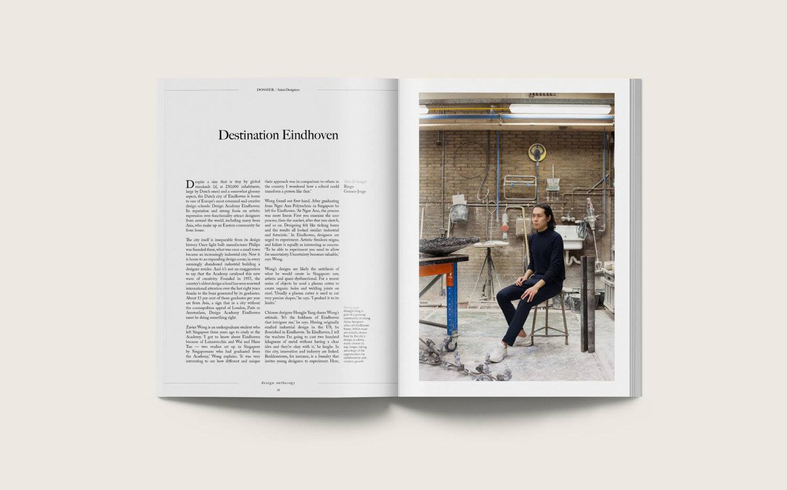
For us, it’s about people. It’s about spending time to get to know them and their work. I have met a number of the people we’ve featured, as well as our writers and photographers. Many of whom trained as designers or architects before changing their profession. I like to think this comes through in the stories and images we publish. I’d rather be known for that than any kind of visual aesthetic, to be honest.
We have never, and will never, rewrite a press release. We like to take the time to meet new people and uncover emerging talent. We’ve never been just about publishing stories about “big” names that sell magazines or are good clickbait. I’d like to think that we have more integrity and are more democratic. If their work speaks for itself, then we are interested. I think that sense of discovery is definitely one reason why people continue to buy and read the magazine.


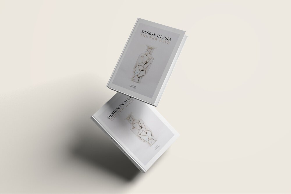
The Design Anthology brand has grown to include coveted tomes such as Design in Asia: The New Wave 
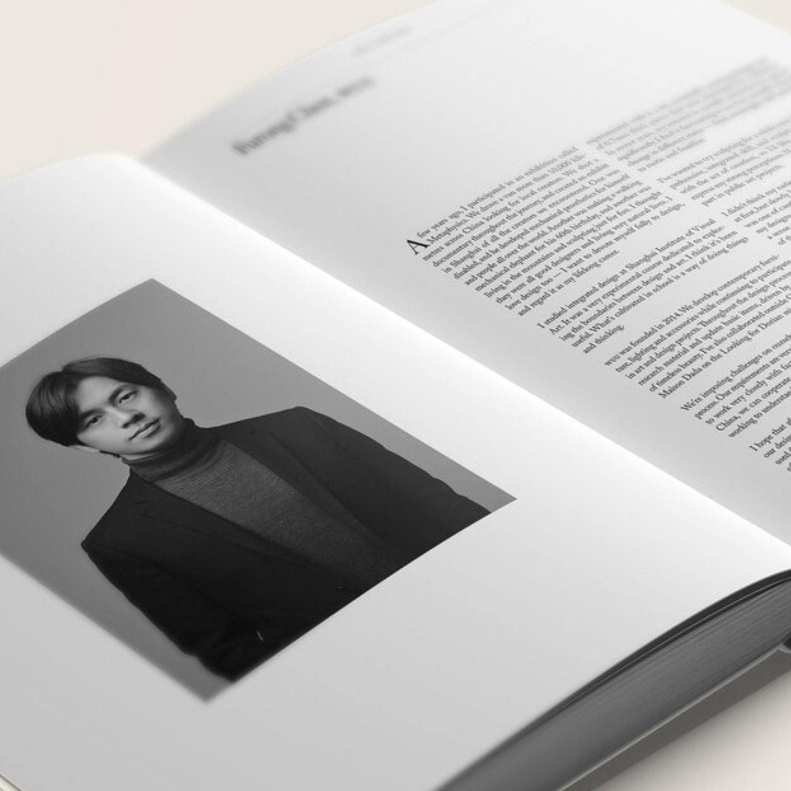
The brand’s first book is a survey of 100 of Asia’s brightest design talents, published by Thames & Hudson
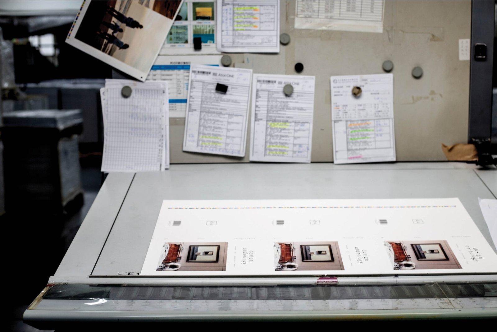
What informed the minimalist branding and design for the magazine and how does this emphasize or highlight its contents?
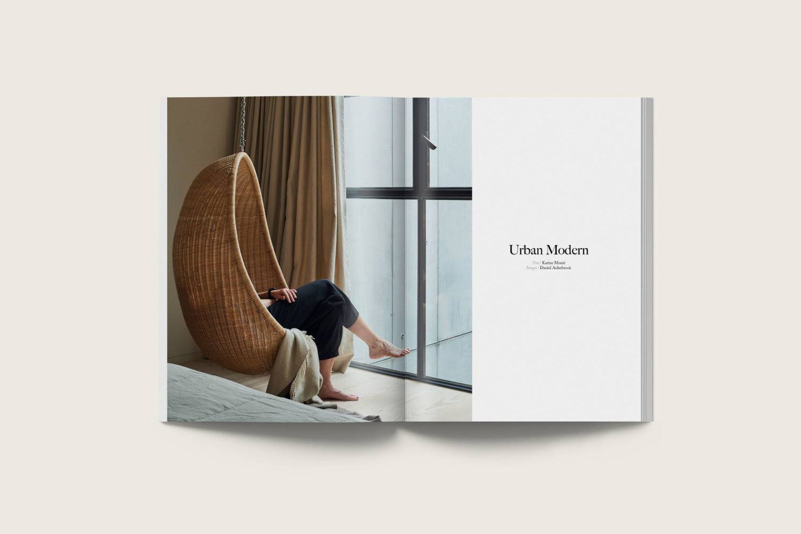
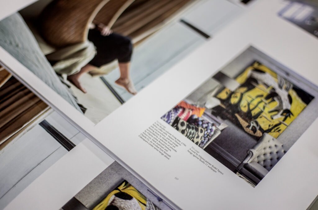
Having grown up an avid magazine reader, I wanted to create a design magazine that catered to my taste. Rather than it be about a certain aesthetic, it was about creating something that was clean and uncluttered where the images could really take center stage. I was tired of design magazines that showed tiny images, images that didn’t relate to each other except on the page, and cheap-looking glossy paper. So it was a bit of a selfish endeavor, but I had a hunch that I wasn’t the only one feeling this way.
What convinced you that the magazine can better serve its mandate in the form of print? Years on from the first issue, would you say this is still the best medium for Design Anthology?
One of the early pieces of advice that I received, which I mentioned earlier, was that no one would take us seriously if we were just online. And I agreed with that. To be honest, I have noticed across the world that our readership especially (designers and architects) still buy books and magazines. People will say print is dead, and they’ll tell you that people in Asia don’t read print, or that Millennials don’t buy books and magazines. It’s simply not true. So while I still think it’s the best medium for Design Anthology, it’s not the only medium for us.

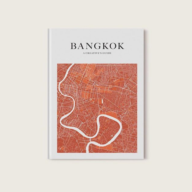
The Design Anthology team has also produced a travel guide. 
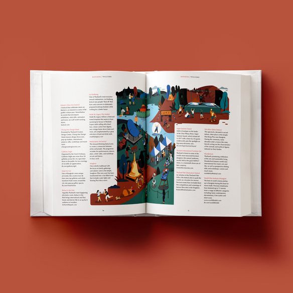
Their maiden volume is on one of Asia’s most-visited cities, Bangkok, Thailand
What has running Design Anthology revealed to you about design that proved elusive when you worked as an interior designer? How has this shaped the way you think and do design?
That’s a really good question. Sadly, I don’t really do any design work these days, I simply don’t have the time. Maybe my days as a designer shaped how I think about the magazine. It informs the type of photography we commission, the images we chose and the way we layout a feature on paper. We are always trying to show the designer’s work at its best but also allow the reader an experience akin to seeing the space in 3D, or as close as we can in a 2D format. It’s an emotional journey, not a factually documented space that we’re interested in. It’s all about lighting, angles, close-ups, details, etc.
What are some of the exciting developments we can look forward to in Design Anthology?
First of all, we launched a new edition for the Australian/New Zealand market in late 2019. You can look forward to seeing that on newsstands in select places in the future. We will launch a book on young Asian designers in early 2020, the first of what we hope will be many in the coming years. We also hope to continue with the D/A Awards that we launched in 2019 with a follow-up event, hopefully in 2021. In the meantime, we will be forging more of a digital presence for the brand, in a way that makes sense for us, which likely means more video and perhaps podcasts. Stay tuned. •

Keep abreast on the best of Asian design (and beyond) at designanthologymag.com.
Originally published in Kanto No. 1, 2020. Edits were made to update the article.
