Interview Patrick Kasingsing
Images Light Plan Inc.

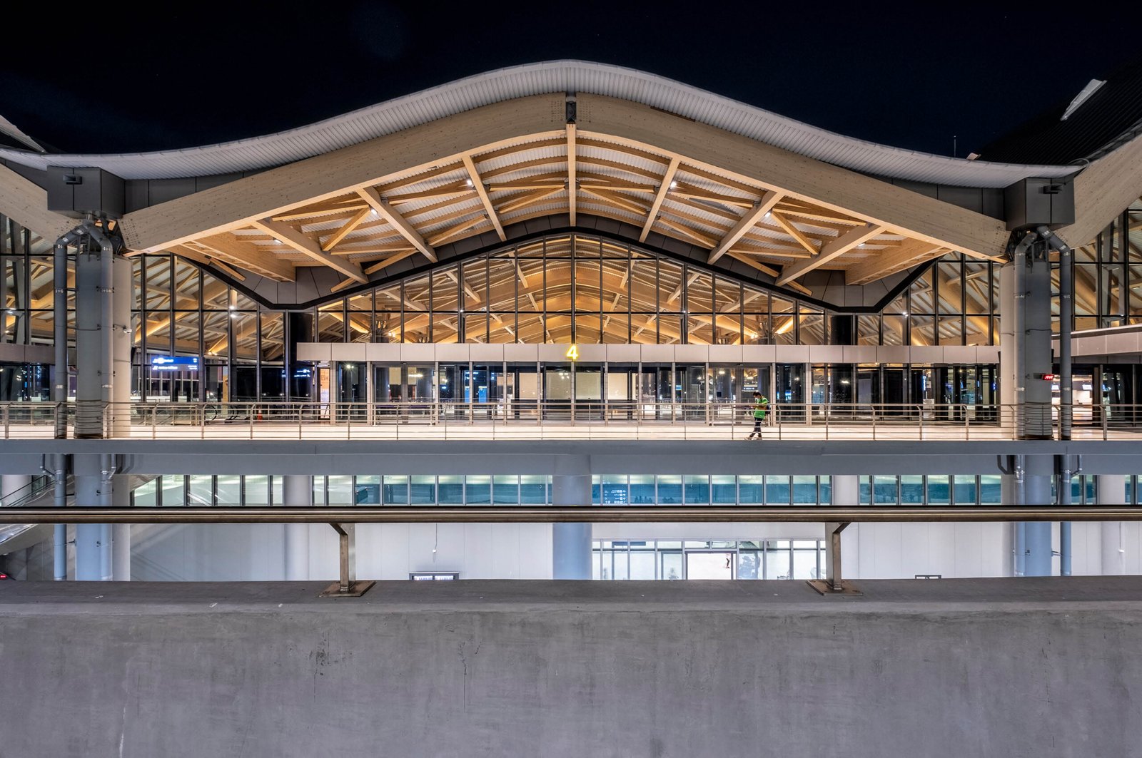
Clark International Aiport
by Light Plan Inc., edited for brevity
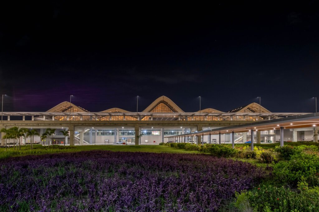
The terminal’s exterior was done by GMR-Megawide but the interior fit-out and operations were awarded to LIPAD, a consortium among Robinson’s, Filinvest, and Changi Airport. We worked with Populous Singapore as the lead designer and CASAS Architects as the Architect of Record. Inspired by the views of the mountain range seen from the departure halls of the airport, the task at hand for the lighting designer was to create a distinct lighting identity that was uniquely CRK. The cool colors used throughout as well as the majority of specifications in matte finish worked to our advantage. There were no messy reflections coming from glossy finishes and the lighting effect was clean, polished, and elegant. We were also instructed to follow the set of lighting standards from Changi’s airport operations. Average lux and uniformity ratios were clearly identified for both horizontal and vertical surfaces and they turned out to be the right balance. We just had to tweak areas adjacent to windows since the prescribed level was a bit dim when too much daylight would come in.
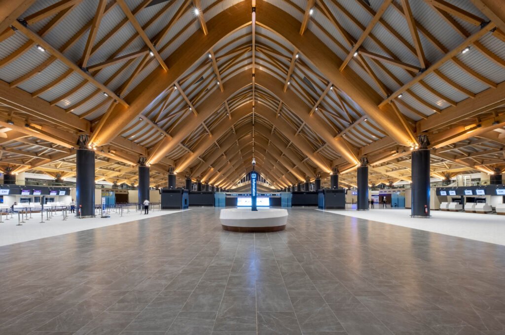

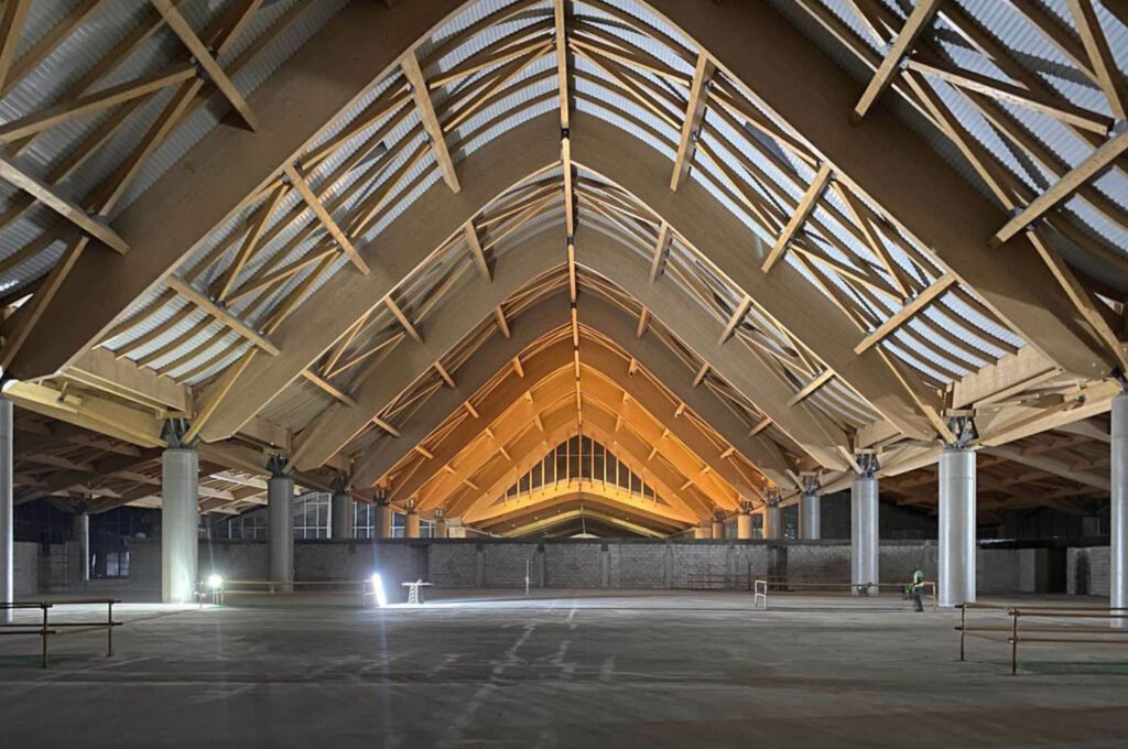
The main lighting feature is in the departure hall where the large glulam arches are illuminated with narrow beam uplighters showcasing the warmth of the ceiling material. The general lighting we specified had a high glare cut reflector; this means that the light source is pushed back slightly from the lighting fixture’s trim, shielding it from direct view to the eyes and bringing more visual comfort to the passenger. The lighting objective is to create an enjoyable experience for passengers with every process and section they go through. Showcasing the materials was also critical so we specified high-quality lighting fixtures with great color rendition. This made the space feel upscale but also warm and approachable.
Sustainability and energy efficiency are also top priorities since the terminal is designed for LEED Gold certification. The objective was to use as little lighting as possible to get the job done. A minimum of 3-meters inter-distance between the lighting fixtures was applied throughout the facility so only a few fixtures need to be maintained by the client during operations.


There are a lot of structural and architectural similarities between your previous project, the Mactan International Airport, and this; how did you give the Clark International Airport a distinct lighting persona? How would you describe this resulting persona?
Jinkie de Jesus-Tiaoqui, Principal Designer, Light Plan Inc.: This was also the concern of our client specifically for the departure forecourt since the two terminals look similar. To create a distinct identity for Clark we envisioned having a passenger terminal that feels exciting and luxurious. If the objective for the Mactan was a resort feel, Clark imbibes quiet elegance, and this can be reflected in the lighting. Both terminals have an impressive ceiling but for Clark we went for a less-is-more approach. We had access to great views of Mount Arayat and too much lighting will conflict with the view, so we were careful not to over light and be mindful of where to put the lights. For example, putting them close to the windows will cause unwanted reflections so we always tried to create some distance from the glass to the lights so our passengers can enjoy views outside.
For our lighting strategy, only the larger wooden arches are uplit. Larger surfaces to light up equal larger impact. For the general lighting, we minimized the quantity to do the job. We were careful not to have bulky fixtures that would ruin the ceiling feature. The lights were also powder coated in a specific RAL color to match all steel and metal elements. We refrained from the use of any colored lighting to keep it timeless. I would say the persona feels very put together, and polished.
What were some lighting strategies you employed to humanize the scale of the cavernous departure areas?
Selecting the proper color temperature was critical in humanizing the space. Typically, airport lighting would use cool white or daylight (around 4000 – 5000 Kelvin) since this is the norm, check out our NAIA terminals. Daylight would be functional for security and reading tasks but would make the space feel clinical and flat. For Clark we wanted to make the cathedral ceiling feel more friendly, so we opted to bring out the warmth of the wooden ceiling by utilizing uplighting. After testing several types of warm white, we decided on 10-degree 2700 kelvin projectors, a white light with orange/brown undertones. This showcased the arches’ beautiful wood grain and the narrower aperture allowed us to reach its apex. For general lighting, we used 3500 Kelvin, one of our favorites at Light Plan, which we often use for offices or retail. The color is between cool and warm white. Under this light, it is comfortable enough to carry out tasks without straining your eye and renders interior finishes elegantly in a warm vibrant tone. These strategies made the space feel friendly and comfortable.
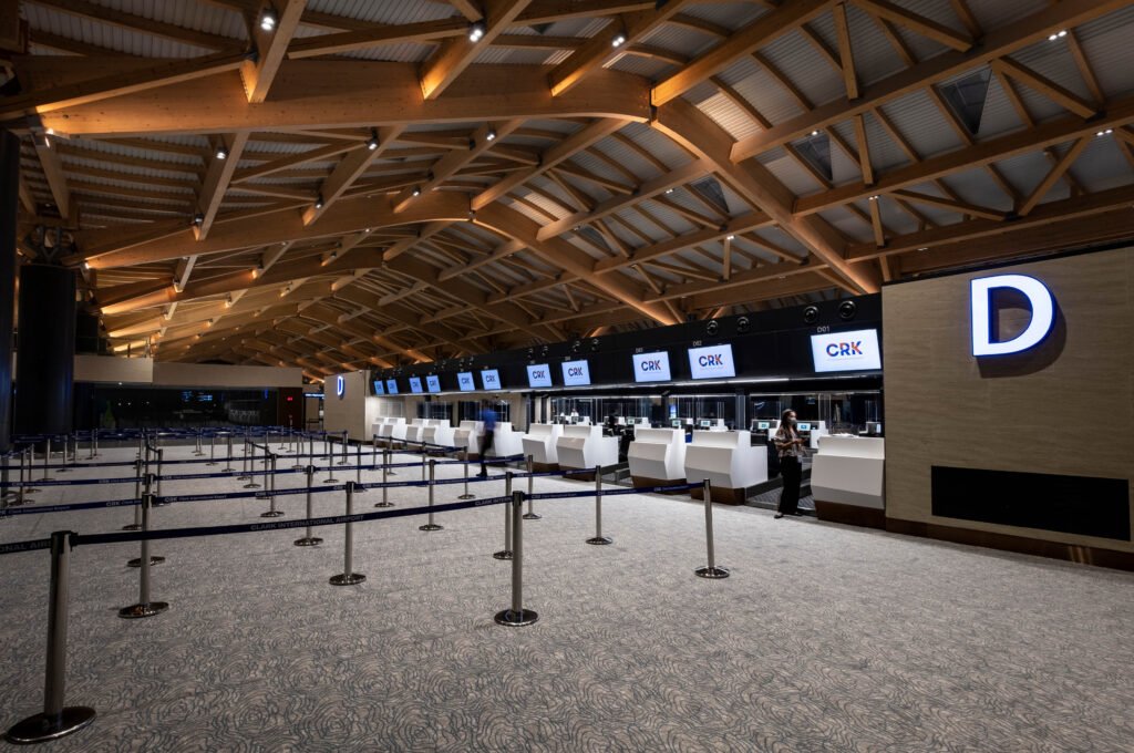
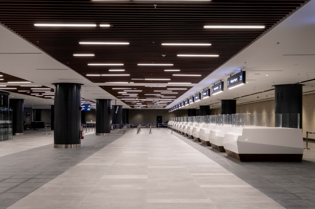
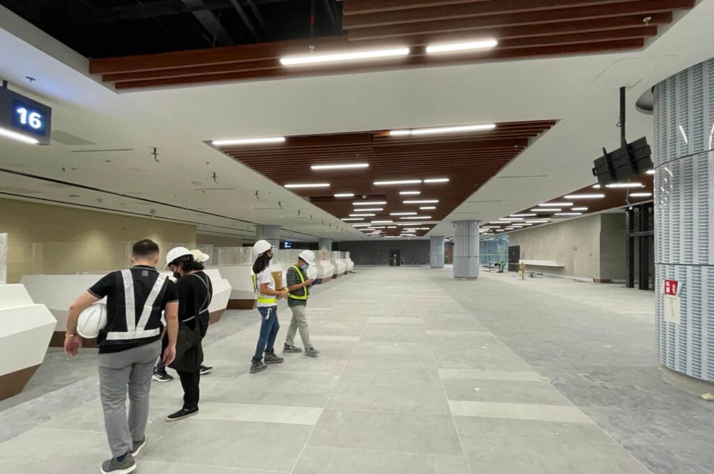
Aside from this, continuous linear lighting is integrated with the check-in kiosks and immigration counters so passengers and airline personnel can transact comfortably. These types of integrated lighting helped us humanize the scale of the space and bring the light closer to where passengers and airport personnel need it.

What would you say was the most challenging lighting execution you had to implement for the airport? Where is this located?
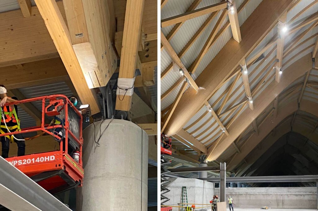
Several spaces were challenging. One would be the uplight accent lighting for the departure hall which we had to revisit several times to get the right aiming and fixing detail since there are several versions of the glulam arches in terms of size and angle. We had to pin down the perfect focus for each type of arch so, in the end, we have this beautiful rhythmic pattern of light that greets you in the departure hall.
Another is the arrival corridors whereby the architect wanted to have a staggered lighting arrangement for the general lighting yet at the same time, we had to meet strict uniformity levels. In short, the lighting had to be homogenous even if the arrangement was random, staggered. But we did it!
The airport desired LEED Gold certification and your studio responded by using the least amount of lights possible. Can you tell us how you accomplished this? How did this impact placement and what lighting fixtures to use?
When designing for LEED certification, we use a similar approach throughout our projects. First, we put the light points where they are needed the most. For example, we integrate lights at check-in counters before the flow spaces. After plotting and calculations are made, we determine if we still need to add more lights or will the ambient light cover for circulation lighting. Most of the time, we need not put too many lights. Lighting technology has advanced so that we can reduce lights and still comply with illumination requirements. If we are designing with this mindset, we are already saving versus putting the lighting layout on a grid that does not consider what’s underneath. We end up putting too much light which will result in higher energy consumption and discomfort for users.
Second, we selected highly efficient lights that will yield high lumens but have low wattage and power consumption. This is what sets quality fixtures apart from mid-range or low-end products. The process of selection is very important since it ties up to complying with the lighting power density, a prerequisite for LEED compliance. The rule requires us to use the least number of lights while meeting the required illumination levels depending on the function of the space. Selecting wide aperture lights was the obvious choice since they can cover a larger area per square meter. We had an in-house rule of thumb that the minimum inter-distance between lights would be at least three meters apart. Our client was concerned about the maintenance aspect, so we helped them by minimizing lighting points in this massive floor area space; they do not need to replace and maintain too many lights.
CRK (like many new international airports) is located outside city limits and often in still rural, natural surroundings. What moves or methods were deployed to ensure that the lighting effect of such a massive development is not harmful to local flora and fauna?
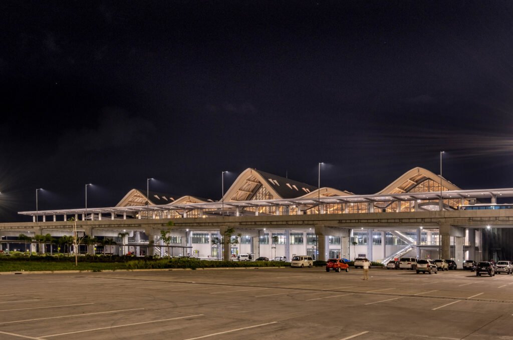
Correct. The airport really pops out in the middle of the surrounding vast fields. We were supposed to have façade lighting, but after deliberation, we did not push through with it anymore since the glow emanating from the departure hall was already sufficient to create an impact. Approaching the terminal from SCTEX, the structure is imposing in scale but since the lighting is subdued, it does not look like overkill. For the interior lights, we specified fixtures with a high glare cut; this means that the light source is not flush with the ceiling, reducing glare and providing visual comfort to passengers. Most of our lights are directed downwards and have the perfect aperture to bring light only where it is needed, avoiding light spills or pollution.


What cultural traits or attitudes of Filipinos towards light informed your lighting strategy?
Light culture is different in each country and is something we consider with intensity in our designs. Generally speaking, Filipinos love and gravitate toward bright spaces. In my years of working here, whether it’s for retail, offices, or homes, most of us feel more comfortable and safer under bright lights. Thus, when we were reviewing the Changi airport lighting standards, we recommended increasing lighting levels in some areas where we felt it would feel dark. One of our objectives was to create a lighting scheme that Filipinos will enjoy and feel comfortable in so the decision process in setting the lighting standards was very important.
Aside from the striking glulam arches and cavernous quality of the departure hall, what other qualities or elements of the airport’s interior spaces did you wish to enhance or highlight?
For one, the carpet at the departure gates, a play of blue, greens, and cool grey colors worked well with the 3500-kelvin color downlights; it enhanced and brought out the carpet’s rich patterns. Second, the check-in halls had continuous linear lighting at the counters which is for the task, but also enhanced the structure’s sleek and modern design. The duty-free corridor lighting was kept to a minimum so that storefronts would pop out. Perhaps the most stunning view is the airport viewed from the lower level/parking area where we see the undersides of the ceiling and how it is evenly washed with light. This was deliberate since during the design stages, we also studied how the general lighting would bounce back from the floor and up to the ceiling to create this even wash. It is nice to see it come to fruition.
Your team was asked to follow Changi’s lighting standards; how are these standards implemented in CRK?
The standards are specific to illumination levels (lux) on the horizontal and vertical plane regardless of design or ceiling height. So, as long as we met the standards, we are good. Changi also provided very reasonable uniformity requirements. Uniformity refers to how even the lighting is on the floors and walls. Some airports would require higher uniformity, but I think that is what made Clark feel high-end. You feel the space has subtle shadows and this enhanced the interior materials more, so despite Changi’s different interior architecture, Clark feels like Changi in some ways, does that make sense?


Which lighting execution caused the most headaches in terms of implementation? Why so? What was the most daring lighting execution you pushed for in this assignment?
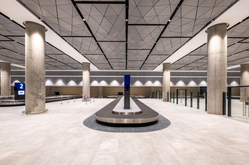
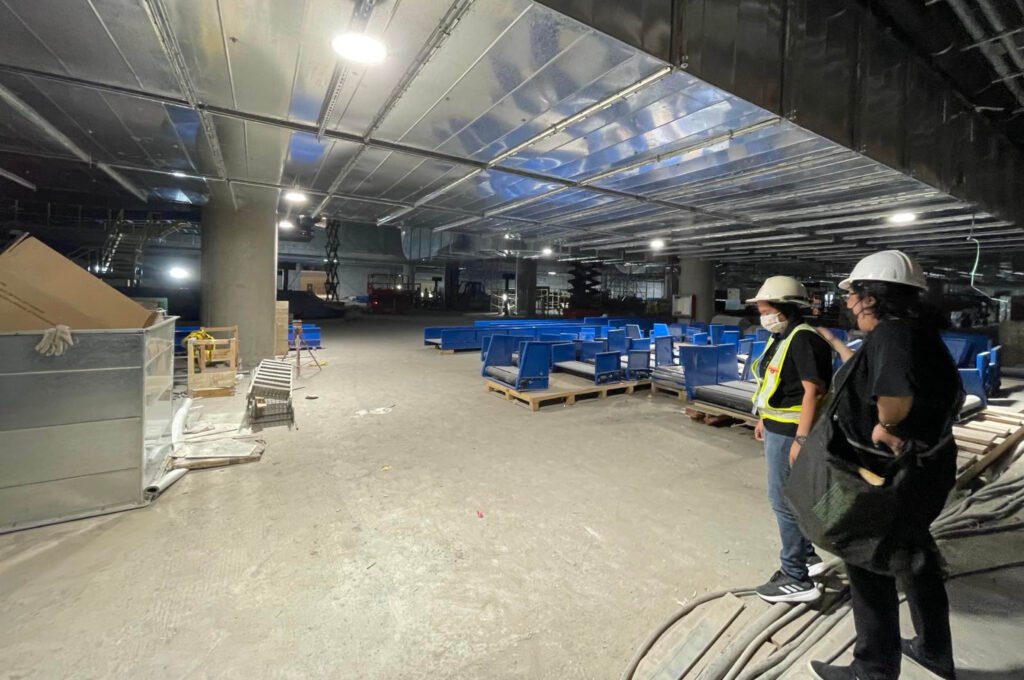
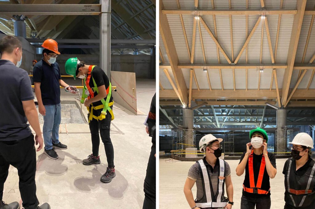
Would daring include strapping on a harness and going up cherry pickers to adjust and aim lights weighing about 5kg? I think these would be the most daring thing we’ve done for the project! (Laughs) Well, our client and lead designer had a specific vision and aesthetic, colors and moving lights were never on the table for example. Nothing really outrageous for this project but since we were gunning for maximum efficiency on the lighting plan and finding the best specifications to meet the budget we had to go through numerous calculations and scenarios to meet the target lux levels, uniformity, and effect. We studied and considered so many brands in the market. Aside from this, there was the lengthy process of coordinating the MEPF on the feature ceiling in the baggage reclaim hall. We had to go over several revisions together with our co-consultants to ensure the ceiling services looked neat while having a high uniformity of light on the floor below. This may seem simple but the location where we could install lights was limited to the slots in between panels which were spaced randomly and far apart. We were happy we achieved even lighting after all these obstacles.
What is one aspect of lighting in airports that a lot of people take for granted but is vital to its operations?
I think the ability to design lighting efficiently and beautifully is at times taken for granted. The balancing act of using fewer lights while meeting the proper lighting levels so operations do not have to keep a huge attic stock for replacement is a big contribution we have on offer. Lighting is what renders the interior at night, the space feels so pleasant when you walk along the passenger areas. There is so much technical work behind that actually and I know people think, it’s just lighting.
Massive infrastructure projects such as this require a lot of collaboration and close coordination with multiple stakeholders as well as layers of approval. How much of your original lighting vision made it to the final product? Are you happy with the outcome?
Yep, you know it. Massive project, massive project team, massive coordination. Add to that the fact that we were completing and constructing the fit-out in the middle of the pandemic. Our team lucked out since we had good chemistry with the client and our co- consultants. Our team worked hard on this project since it is a landmark job for LPI and we also fought for the design to be followed. The outcome was so uncertain at times since the stakeholder’s decisions were changing. But in end, we are very happy with the outcome. I would say we are 80% there as compared to our original design, not bad at all. So yes, big smiles were on our faces when the project was completed.


Budget is always a constraint, especially in government projects, but would you say that the team was able to maximize the costs and get most of what was on your lighting wishlist?
We got most of the items on our wishlist, yes. We had to do value engineering but luckily, we were also involved in the VE process, so we were able to keep the quality and integrity of the design even as we considered lower-cost alternatives. We are happy cause we met the budget of the client and received positive feedback from them as well. So, I think in this way we really got to maximize both effect and budget.
What part/aspect of the assignment did you and your team enjoy the most? What achievement in the project are you most proud of? What would you say is distinctly LPI about how you worked on the project?
The most enjoyable part was seeing the terminal completed during the last few visits before the terminal was inaugurated. The lights were all switched on but there was still work going on. You know the hustle of the site when we are nearing opening. The excitement we felt was immense as we could already imagine what it would look like upon completion. We also enjoyed the mock-ups we would do to test the lights we specified to verify our design and countless calculations done in our studio. We are proud to have completed our third airport project in LPI and to make our clients happy and satisfied. In true LPI form, we had great teamwork even those not directly in charge of the project pitched in, a lot of hard work and stress, many revisions, and a lot of fun.
What has the experience revealed to you about the state of lighting design and how it is understood and regarded in the country?
I am excited because first we did Mactan Airport and that set a precedent for airport lighting design; we broke away from the boring airport norms. Then we did Clark and that set a different tone and made a big mark. I am excited cause things are looking up and I am sure it will only get better for the next project since stakeholders, our allied professions, and the public is getting to have a better understanding of how lighting can transform a space. If ten years ago, lighting design was in its infancy stage in the Philippines, today we can see more spaces lit up beautifully; it is common to have façade lighting in our buildings, and local lighting designers are getting hired for special jobs only previously offered to foreign lighting designers. LPI hopes to keep this fire alive and help promote and elevate good lighting design practices in the Philippines. •

Project Team
Client:
LIPAD Corporation
Project Management:
Tenman Project Managment
Architecture and Interior Design:
Populous
CASAS Architects
Lighting Design:
Jinkie de Jesus-Tiaoqui
Engr. Jackie Beringuela
Ar. Julie Ann Maureen Dairo
Supplier:
Quazar Lighting
Signify
Brands:
ELR
Linea Light
Intralight
Signify
