Interview Gabrielle de la Cruz
Images Aaron Quinto of Nicer Café
Nice to meet you, Aaron! Please introduce your team and your space.
Welcome to the café, Gabbie! I am Aaron Quinto, an architect, photographer, and now barista. With me is my partner Ares Loresto, one-half of Nicer Café. I open the café daily while he takes the closing shift. Ares has a background in sales and marketing, so we worked on the business model together.
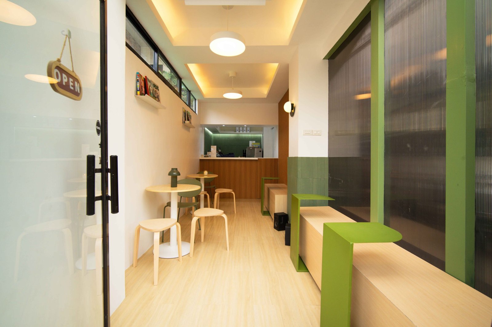
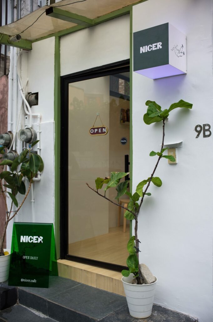
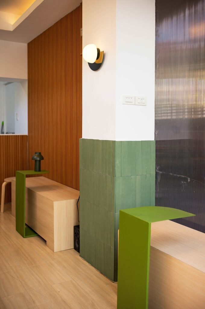
Our humble space is the realization of my lifelong coffee shop dream. I designed it all on my own in one day! The existing space used to be a café as well, so we were able to open immediately. We named it “Nicer” because we wanted to introduce a new concept in the Filipino coffee scene, one that is laid back and relaxed. The grander vision for the brand is a coffee shop and design studio where I can also introduce “nicer” ideas, or a café plus magazine or print shop. We decided to work with what we can for now. We hope you find it nice!
I do! If you could have any person, living or dead, visit the café, who would it be and what would you serve them?
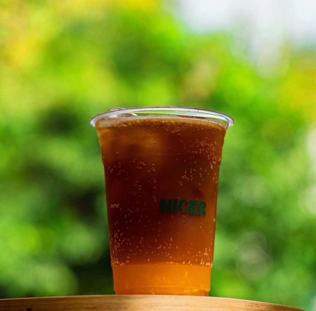
I’m going to be real and say any K-pop artist! I think that would be hilarious and out of the ordinary. I’m going to serve them our signature Orange Sparkling, a combination of tonic and espresso. It’s a funky drink and it’s not for everyone, but I’m sure that it will give them a new experience.
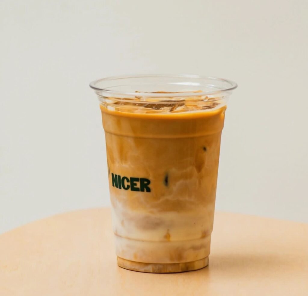
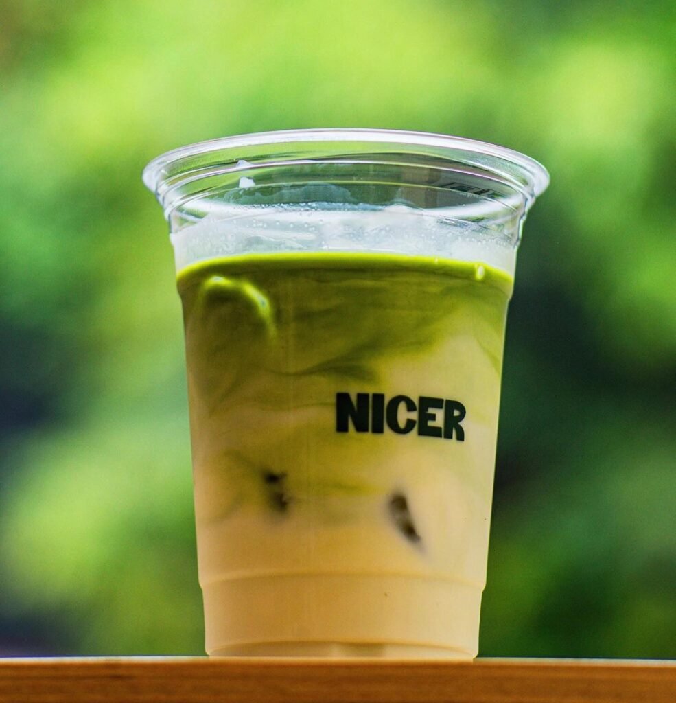
Nicer Café’s menu includes their signature Orange Sparkling, Iced Latte, Nicer Mocha, and Nicer Matcha
You are obviously passionate about coffee. Can you recall your earliest coffee memory? How has your relationship with the drink changed over the years, and what does it offer you that other drinks don’t?
I started early during my teens trying out ground coffee, which was the only thing available at home. Of course, Starbucks and other commercial brands were already available then.
When I was in college, architecture and coffee became pretty much inseparable. We always needed that kick whenever we had to pull an all-nighter, and it was also the time that third-wave coffee was starting to pick up, so I started to be a little particular about what I drank.
Yardstick Coffee in Makati was my proper introduction to specialty coffee. It used to be my go-to and the experience it gave me changed how I consumed coffee. I became aware of what I wanted and what I didn’t want in terms of taste. As time passed, I would say that I learned to appreciate plain black coffee more and my sensibilities got sharper.
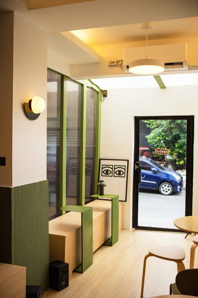
An open layout was decided on to maximize the café’s size. The sunroof came with the existing space.
Another thing that you love is architectural photography, which you discussed during your first conversation with Kanto in 2016. How has your exploration of spaces and places shaped you into who you are now? What have your adventures taught you about going after the things you want?
Traveling to different places and living abroad for six years changed my appreciation of things. I worked in Hong Kong—a very global and compact city where everything works and is on time, so that gave me a new sense of order. I would say that I am more straightforward and assertive now. I waste no time and make sure my plans materialize.
What inspired you to finally pursue your dream of opening a café?
I would say that experiencing the pandemic in a foreign country completely changed how I value things. This led me to envision a space that will be an extension of myself, not just as an architect and photographer but as someone who loves coffee.
Social media also contributed a lot because my algorithm kept feeding me with videos showing how people started their own coffee space and that inspired me. I thought that if they can do it, so can I! It feels nice now that I get to take care of a space that I carved on my own.
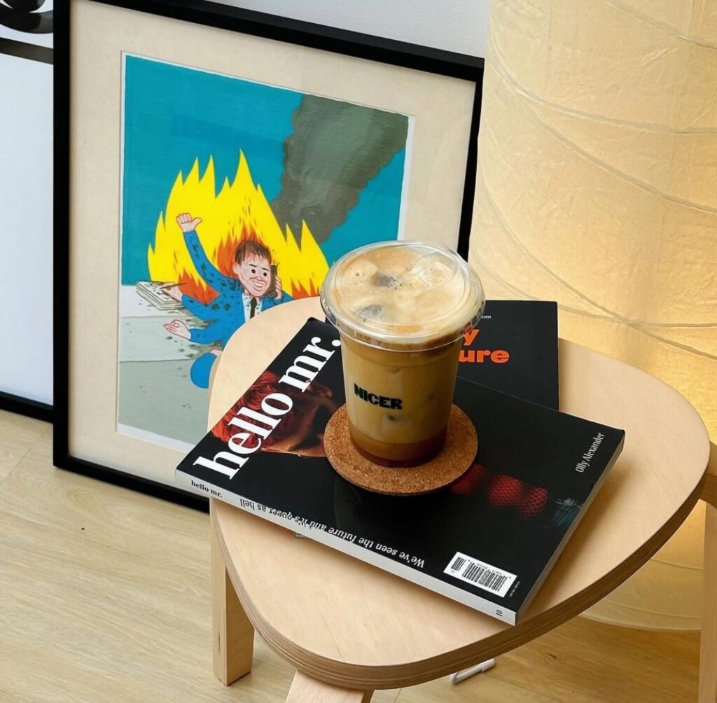
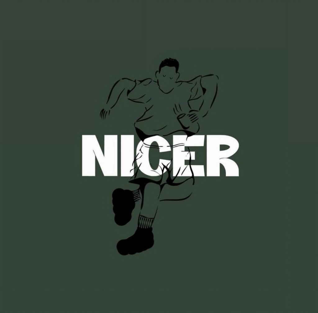
Quinto commissioned Pete Roxas to illustrate the café’s quirky branding elements.
You stayed in Hong Kong for quite a while and started Nicer Café as soon as you got back to the Philippines. How would you describe the coffee culture in Hong Kong? Did any part of it influence your work for Nicer Café?
The coffee culture in Hong Kong is very competitive. Business is business. Sometimes it’s too rigid that it becomes hard to relate to. Some of the best coffees I have tried in Hong Kong are the ones that don’t take themselves too seriously. They have some of the best craftsmanship I’ve seen. Their cafés are well designed; they tend to play more with forms and are experimental in articulating the design language of their spaces.
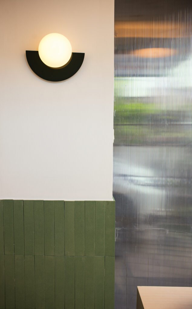
I would say that my experience influenced my design process for Nicer Café in the sense that we didn’t want anything too serious as well. For example, we landed on the café’s shade of green when we were doing the typeface. It was the color that complemented the name “Nicer” best, so we went with it. It all boiled down to whatever we were comfortable with at the time.
What aspects did you consider in looking for a location? What made this space stand out, aside from the fact that it used to be a café as well? Were you looking for a place to simply get started or a permanent home for the brand?
We wanted a space that offers accessibility to main roads but is also kind of tucked inside. We wanted to start small, and we saw potential in this space because it is within a perfect, sleepy neighborhood with an existing customer base that we want to cater to.
At first, we just wanted a place with a decent rent that could help us get started quickly and efficiently. I wouldn’t say this is our permanent location, but we want to grow with the neighborhood. We want them to know that it’s possible to get good coffee in an unlikely place. The goal is to create a dialogue with the people around you through coffee.
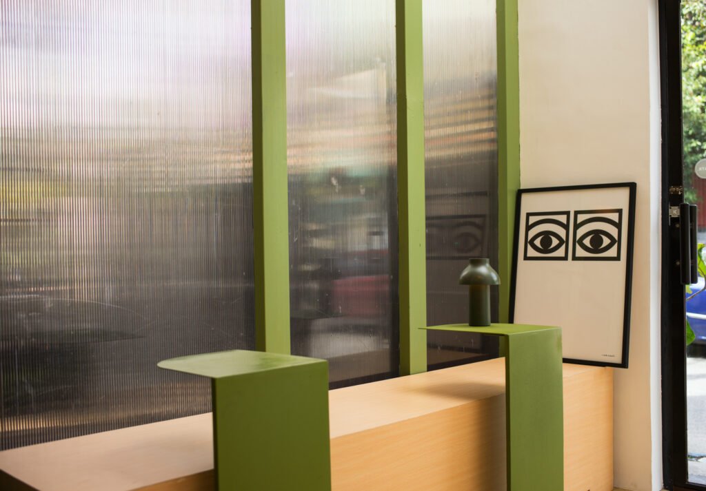

You mentioned earlier that you came up with the design of the café in one day. Can you tell us more about your architectural concept? What measures did you take to avoid falling into tired café tropes?
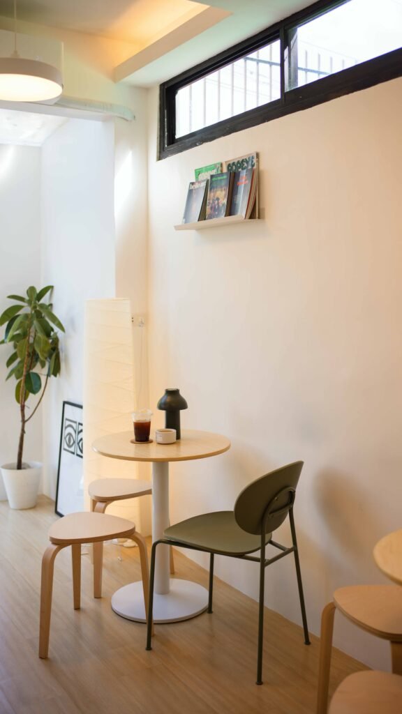
It only took a day to finish the design because I already had a clear vision in my head. This will come as a surprise, but there was no profound concept that informed the way I designed the space. The design process for Nicer Café is the opposite of what I do when I design as an architect. When people ask me what the design concept is, I laugh because there is no complicated thought process behind it. All I knew was that I wanted it to be a respite of some sort, a quick “sanity break” from one’s daily routine.
The wooden wall panels near the café bar came with the existing space. Quinto and Loresto decided to keep them as they blend well with the new palette.
We cannot deny that aesthetics has become an important factor in the café scene. What is your take on cafés that make this a priority but seem to compromise on coffee quality? What about coffee shops with impressive menus but poorly designed spaces?
It’s good that people are emphasizing the aesthetic of their cafes. It’s a sign that they are aware and have a solid vision. Some business models still put experience above all else.
I’m a big fan of spaces designed with intent; carefully curating what goes in and how it adds to the whole narrative of what you are trying to sell. Coffee quality is a different story. If you are serious with your coffee, of course, you’d put in the work to make sure that it tastes good. I’ve been to unassuming cafes that serve remarkable coffee, and they made their mark on me.
I am hoping that Nicer Café delivers on both aspects.
I’m not an expert on either coffee quality or design, but I think Nicer does not disappoint in both! Let’s talk about the café’s design further. Framed photographs and print magazines add to its spatial personality. How has your experience as a photographer affected the way you design and see spaces? What image did you envision for Nicer Café?
Thank you! One thing that I made sure of is that the café should look good for a wide-angle shot. There had to be elements to soften the layout because it’s a plain rectangular space. We also want to continue filling it up with objects that make it look like home. The mirror towards the left side of the door is an added feature that guests seem to love. It made the space feel more open and fun.
A friend told me that Nicer Café is becoming cozier every time he visits, and I think that’s part of the vision. We want this space to become a home for the community around it.
I like how the café is currently laid out like an open hallway for conversations between guests and owners alike. Can you share some of the most notable exchanges you’ve had in the space, particularly those that relate to your various fields of work?
I had a biker visitor who turned out to be an interior designer whose work was featured in the famous YouTube channel for interior design, Never Too Small. We had a good conversation about the struggles and the fulfillment of being a designer in this country. We talked about how sometimes the work that we do outweighs the pay and how there are times when feel like our chosen profession is not sustainable anymore. It’s sobering to talk about these things with someone your age because they understand your gripe.
It’s also nice whenever we get visitors who know the same designers or even people we do. Sometimes people who know each other also coincidentally meet in the café. It’s all just a big chain of interaction.
Nicer Café is currently growing its community. What is the general observation by patrons so far? Any memorable moments you’d like to share?
“May ganito pala dito” (I didn’t know that a café existed here)—which I think is rewarding for a neighborhood café. It means they consider this as a place they could frequent whenever they are tired of their usual routine.
We want our guests to pick up the same warmth and curiosity from day one. We love engaging with new customers because it’s fun to hear their stories about discovering our place.
Thankfully, we keep getting compliments about our coffee. There was also a time when someone who we believe to be a coffee expert or critic went to the shop and ordered two shots of espresso. He just finished the shots and left without talking. We hope he liked our coffee!
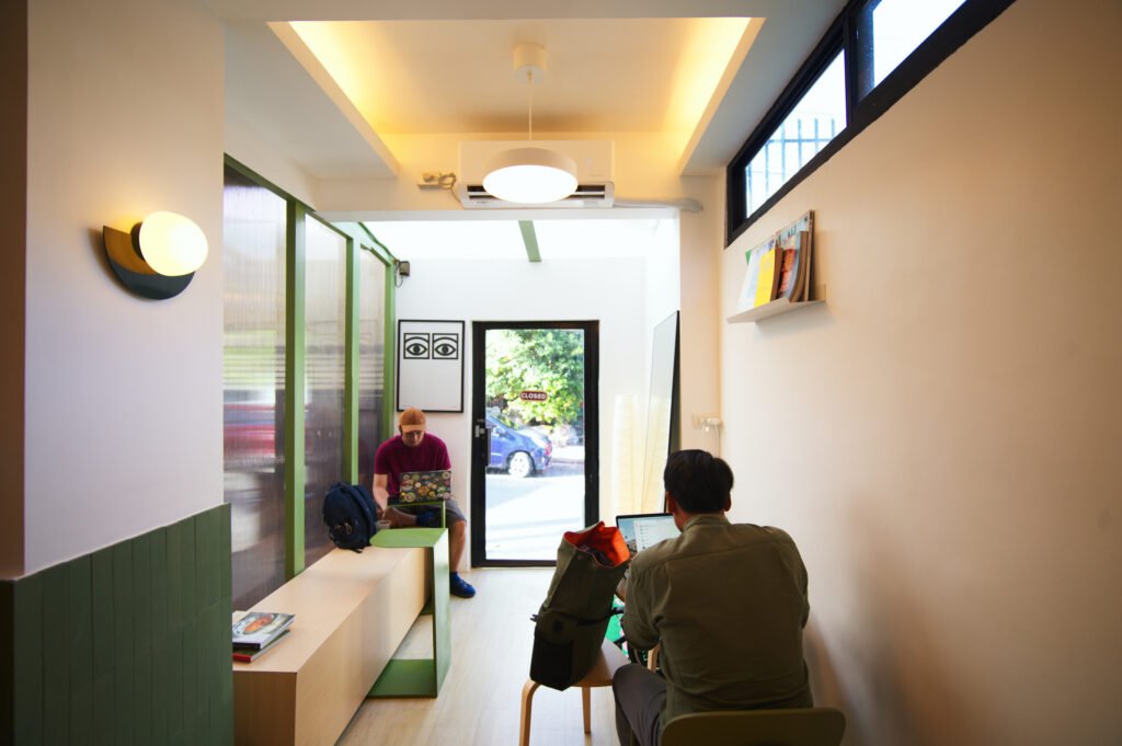

A bigger location is one of your dreams for Nicer Café. At what point will you consider moving, and is there anything that you would add or remove for the new space? How happy are you with how things have turned out?
We’re giving ourselves at least a year before we decide if we are ready to move because moving would mean reconfiguring our business model. If given the opportunity or square footage, I would love to have a conversation pit! I think that would elevate the space.
So far, we’re happy with the steady flow of our regulars. We are still operating in a limited capacity. It’s just the two of us who manage everything, from the accounting to social media. We also hope that we can start staging small events to attract different groups of people.
A lot of things have happened since you opened in November! What did the experience teach you about pursuing one’s passion, especially when it requires you to step out of your comfort zone? What advice can you share about this?
There’s no rulebook telling you when you are ready, so just go for it! I never would have found out if people liked our idea of a café if I just kept it on the drawing board. Put your work out there and let people help you shape your vision! You will never be completely ready and there will always be setbacks. You just have to find creative ways to keep up. •
Gabrielle de la Cruz started writing about architecture and design in 2019. She previously wrote for BluPrint magazine and was trained under the leadership of then editor-in-chief Judith Torres and previous creative director Patrick Kasingsing. Read more of her work here and follow her on Instagram @gabbie.delacruz.
