Words Patrick Kasingsing and Miguel R. Llona
Images Arkisens
The suave, confident appearance of the MR Residence belies a history marked by frustration and perseverance. Despite its crisp, no-nonsense geometries, the house’s construction spanned five years, borne out of challenges with a previous contractor, complex site restrictions, and the inevitable delays brought by an unforeseen pandemic. Rather than derailing the project, however, these setbacks became the foundation for innovative design thinking on the part of Arkisens, who had to pack the programming of an originally three-story home into a two-story one.
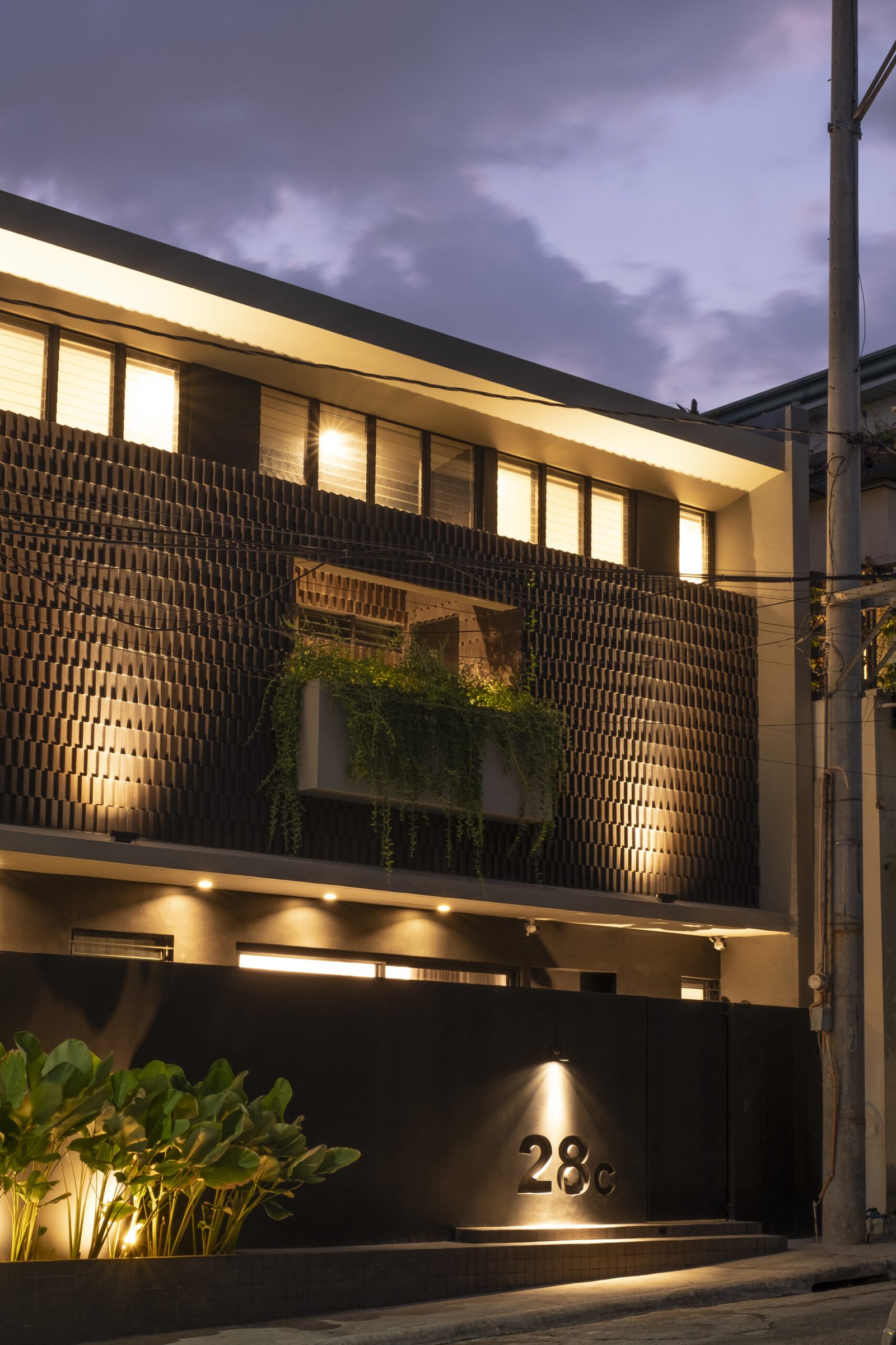
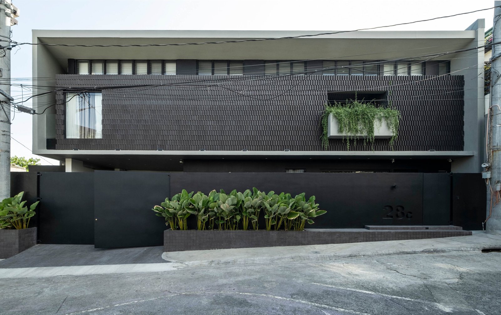
Designed for a family of three—the husband, a young entrepreneur, the wife, a business executive, and their infant child—MR Residence was created based on the husband’s vision for a concrete home that prioritized simplicity. “I want to live a simple, quiet life like we’re living in a box with small windows,” he shared. After perusing multiple architect portfolios, his search led him to Arkisens, a firm known for its minimalist vernacular. “When we were doing design development, we wanted the outline of the house to pop out,” says Eds Rivera, co-principal architect of Arkisens. The result is a monochromatic, rectilinear form that contrasts sharply with its neighboring houses, many of which are from the 80s and 90s, characterized by their pitched roofs and strambotic color schemes. MR Residence is a well-pressed suit in a sea of Hawaiian shirts.

There was, however, nothing breezy about the structure’s journey to completion. A bungalow with a similar style to the surrounding homes existed on the modest 145-square-meter lot when the client purchased it, which was soon torn down. What remained was a site with a trapezoidal shape located near a creek. These irregularities posed design challenges, particularly in applying standard three-meter setbacks, which would have reduced the already limited buildable space. As a response, Arkisens decided to adhere to the 1.5-meter setback of the original house, a move that shaped much of the building’s design, particularly the façade.
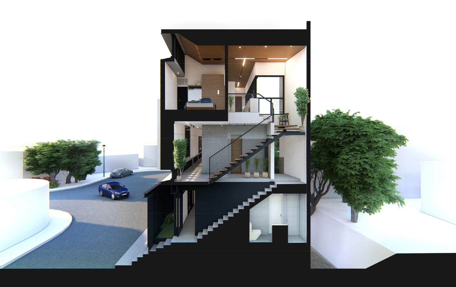
Given the house’s busy location, straddling the end of a cul-de-sac, privacy was needed, prompting the design team to introduce an enclosed façade. Originally, Arkisens had planned for a three-story house that would have measured 12 meters in height. Still, due to complications with the existing structure and the desire to avoid further delays, the design was scaled down to two floors, reducing the height to nine meters. “A big part of [the design process] was problem-solving for the client,” Rivera shares. “They wanted to maximize the property, but we had to inform them about what was feasible, especially when downsizing it from three to two floors.”
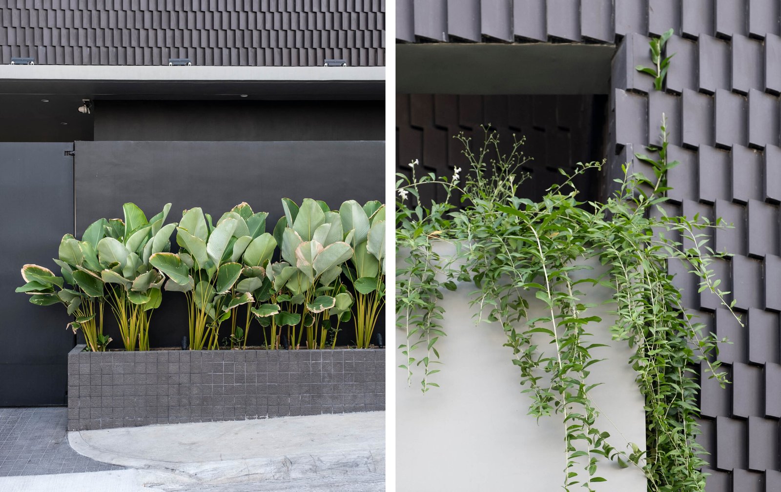
Although restrictive, the downsizing led to more thoughtful space planning and increased efficiency. The client requested that the design avoid “wasted space” and ensure every nook and cranny served a purpose. While this approach could have easily resulted in a mechanical, lifeless home, Arkisens eked out ‘moments of delight’ through the incorporation of green pockets with low-maintenance planting, cozy lookout spaces, and subtle design details like the usage of jalousie windows and angular tiles to bring texture and implied movement to what would have otherwise been a rigid space.
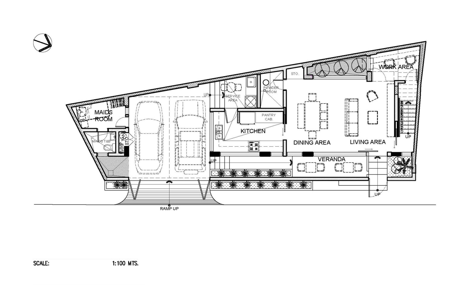
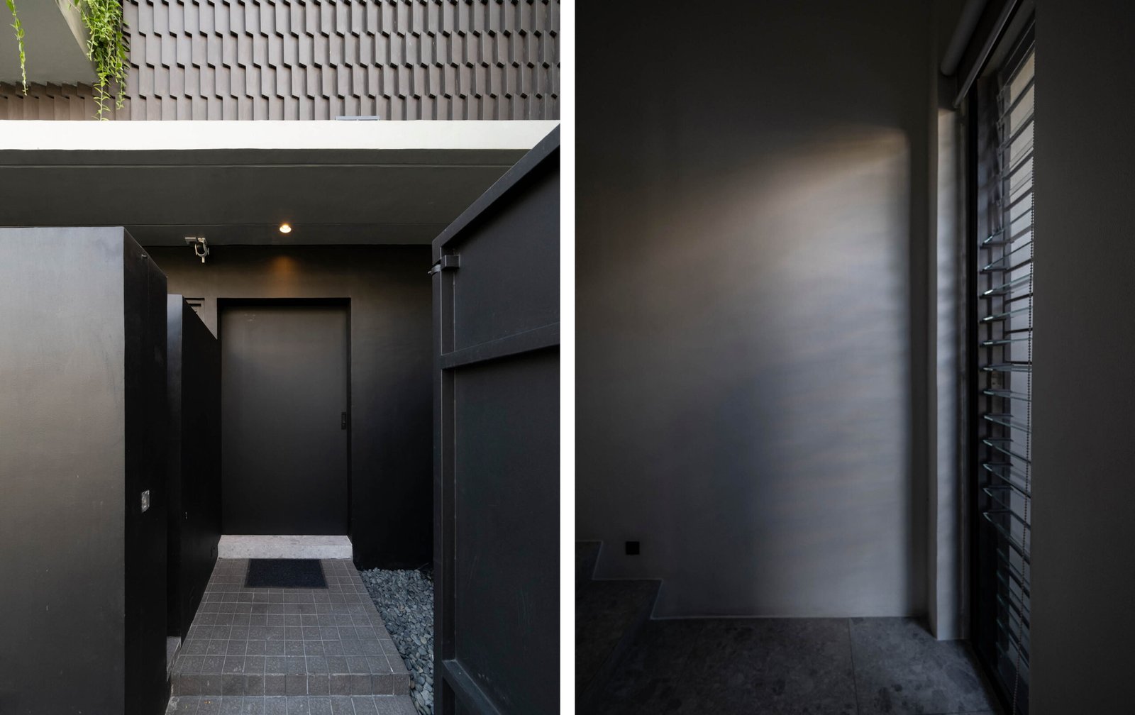
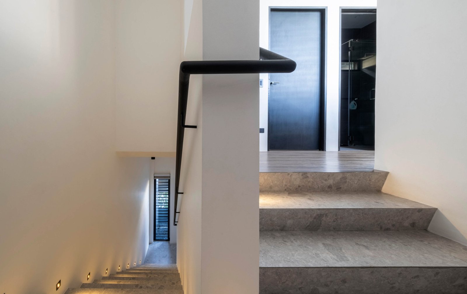
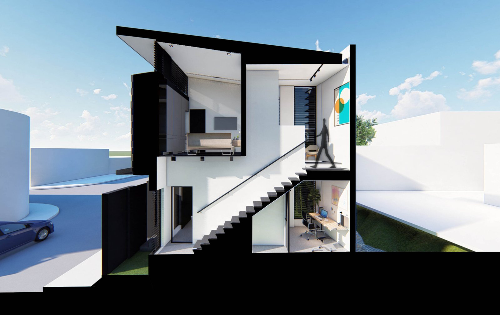
The house’s spatial programming holds no surprises, the lack of an entry sequence both surprising and strangely refreshing. The main entrance opens straight into a combined living and dining area, with the kitchen located just beyond the dining space. To the right, a stairwell leads to the second floor, where the private rooms are situated. Beneath the stairs, a small office nook was carved out for the husband’s work-from-home setup, providing a quiet workspace connected to the rest of the house but offering privacy.

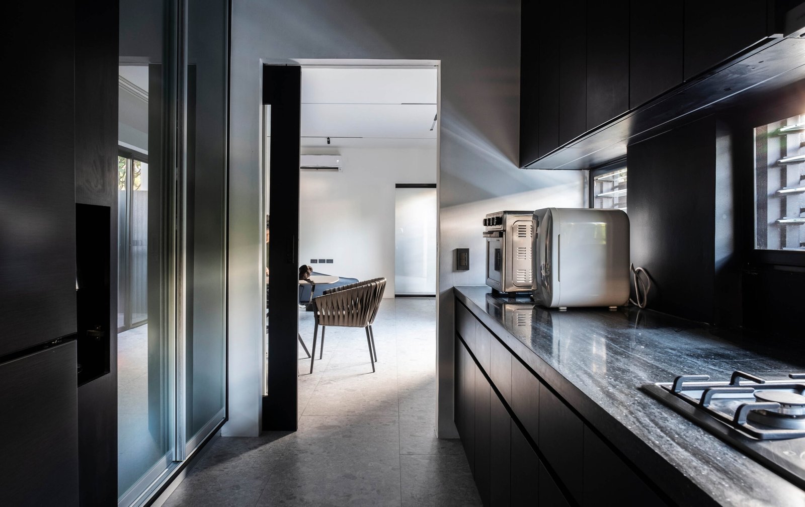
Despite the constraints, Arkisens emphasized natural ventilation, achieved through strategically placed sliding glass doors at both ends of the living and dining spaces, ensuring airflow that helps keep the interiors cool. In keeping with the client’s request for a minimalist aesthetic, the interior’s color palette is dominated by shades of white and dark grey, which did wonders in visually expanding the spaces in tandem with available openings. This choice also aligns with the client’s preference to avoid warm colors and wood finishes, which he finds too high maintenance. He, however, relented to using wood-textured flooring on the second floor to offset the abundance of monochromatic textures.
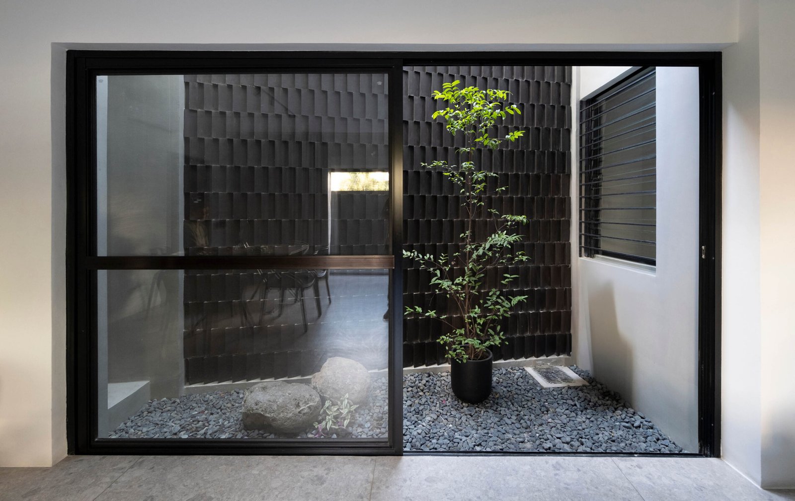
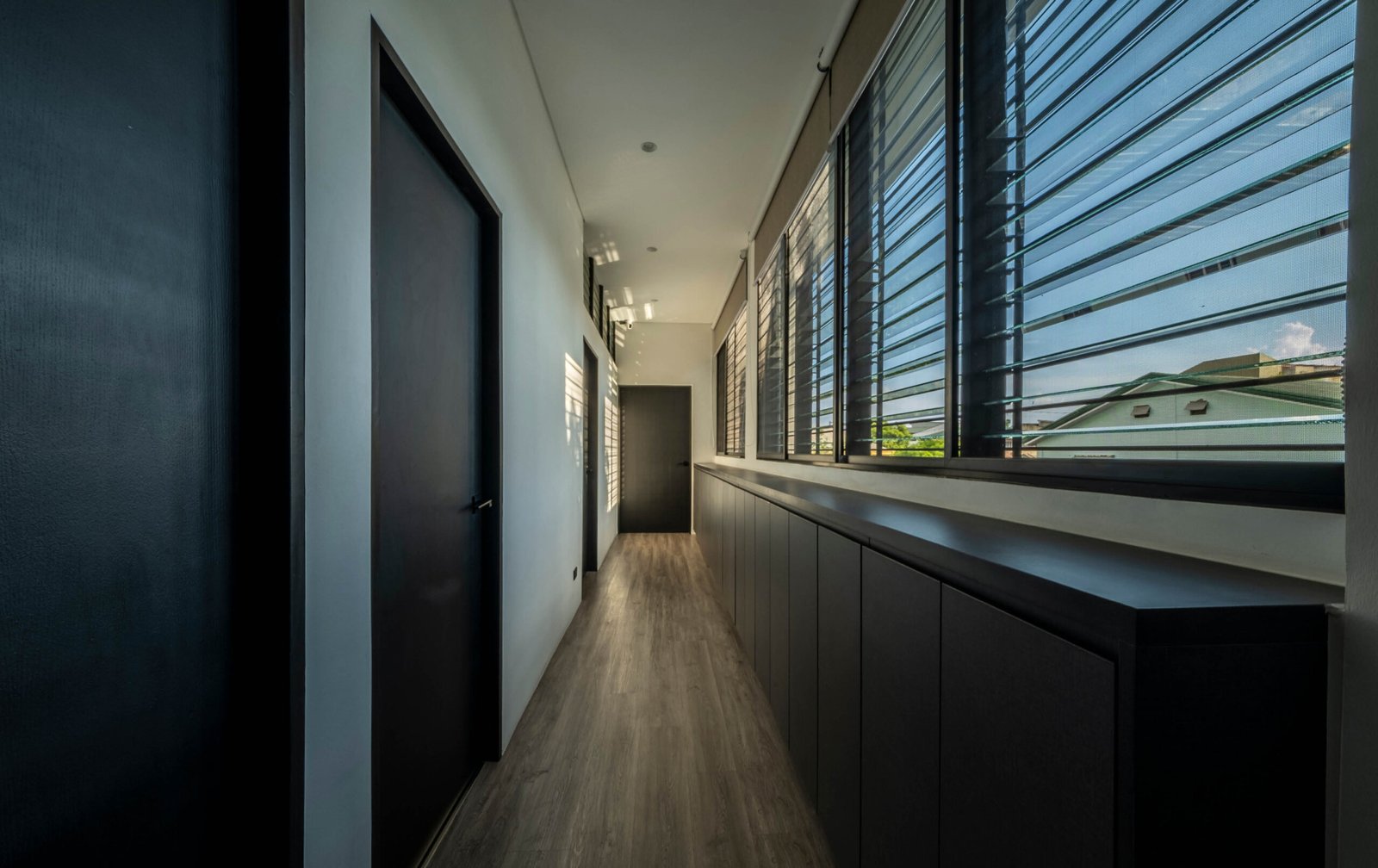
The boxy form of the house, while aesthetically aligned with the client’s preferences, posed significant challenges related to heat retention, a common concern in houses of this design. Furthermore, the house’s proximity to the creek—particularly during humid conditions or summertime—presented another challenge due to unpleasant odors. Arkisens incorporated a system of strategically placed openings and jalousie windows to address both issues. These windows allow warm air to escape and cool air to circulate, facilitating natural ventilation and minimizing the impact of the heat from the sun. The vertical window facing the stairs to the second floor allows air to flow through the space and provides a view of the pocket garden outside. More jalousie windows are placed along the interior wall of the second-floor hallway, which connects the two children’s bedrooms and the master bedroom, allowing fresh air and natural light to circulate freely.

These ventilation solutions also affected the house’s exterior design. In the original three-story concept, Rivera had hoped to incorporate “floor” windows in a vestibule, not unlike ventanillas in a traditional bahay-na-bato-at-kahoy, to establish a stronger connection with the street while maintaining privacy. However, due to the necessity of reducing the setbacks, the house was pushed closer to the street, forcing the team to enclose the façade. As a result, the façade became more introverted, with smaller windows and a narrow balcony for the master bedroom. While this was a compromise, it ensured that the house would still maintain a connection to its surroundings without sacrificing the privacy the homeowners desired.
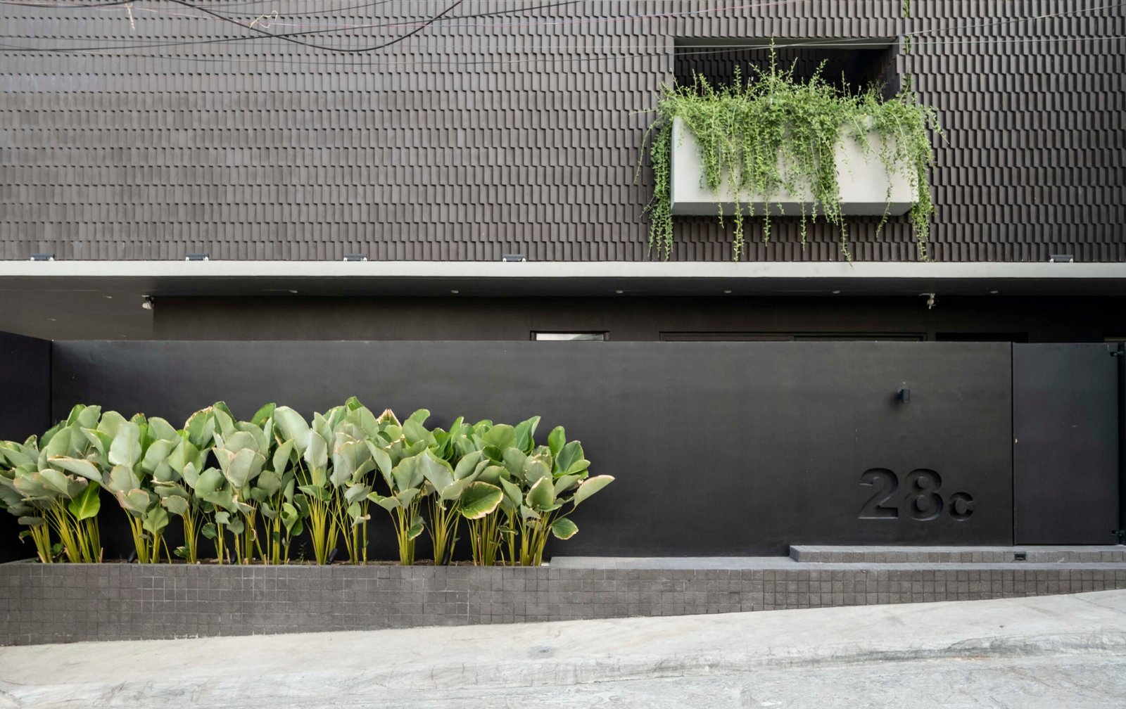
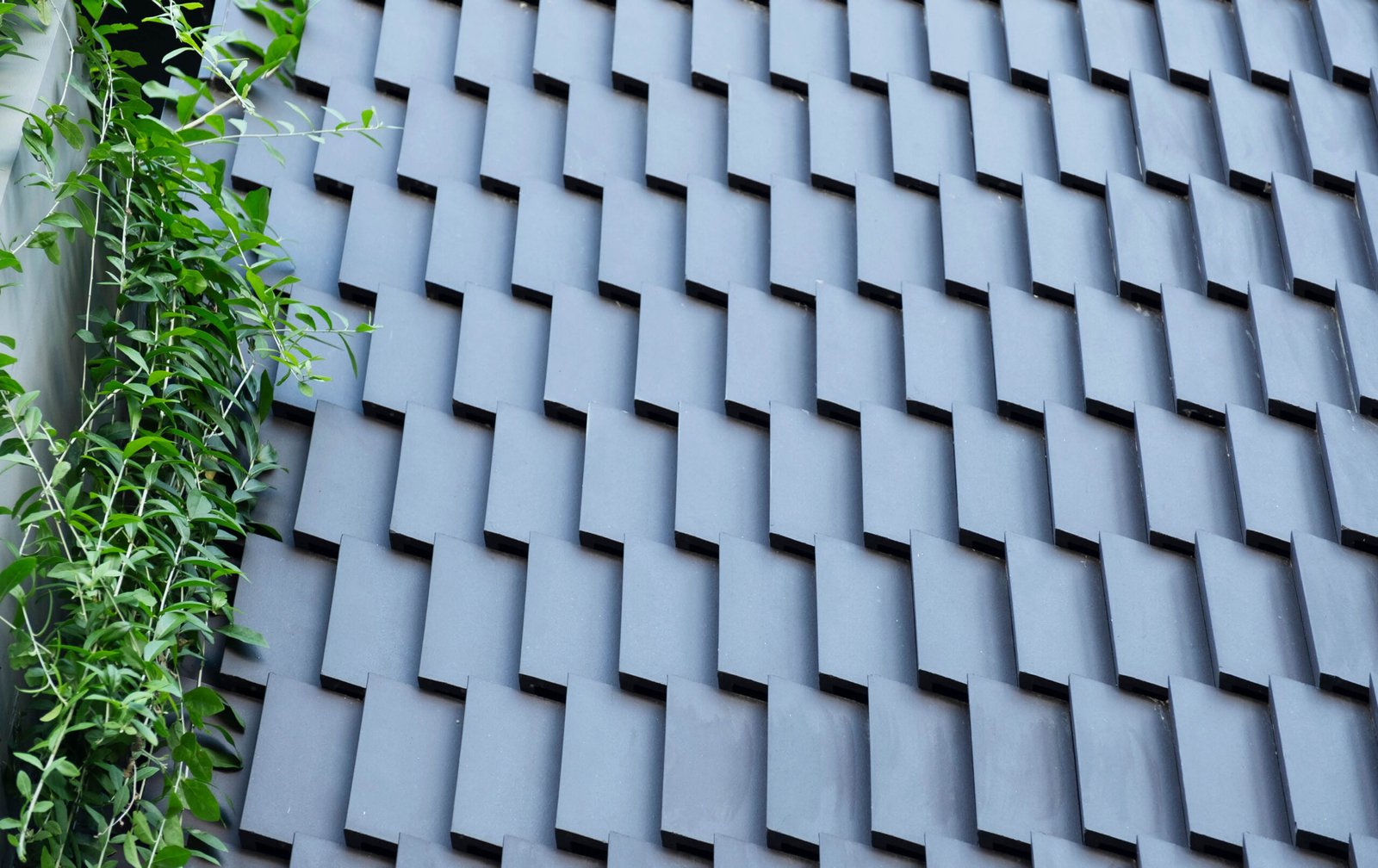
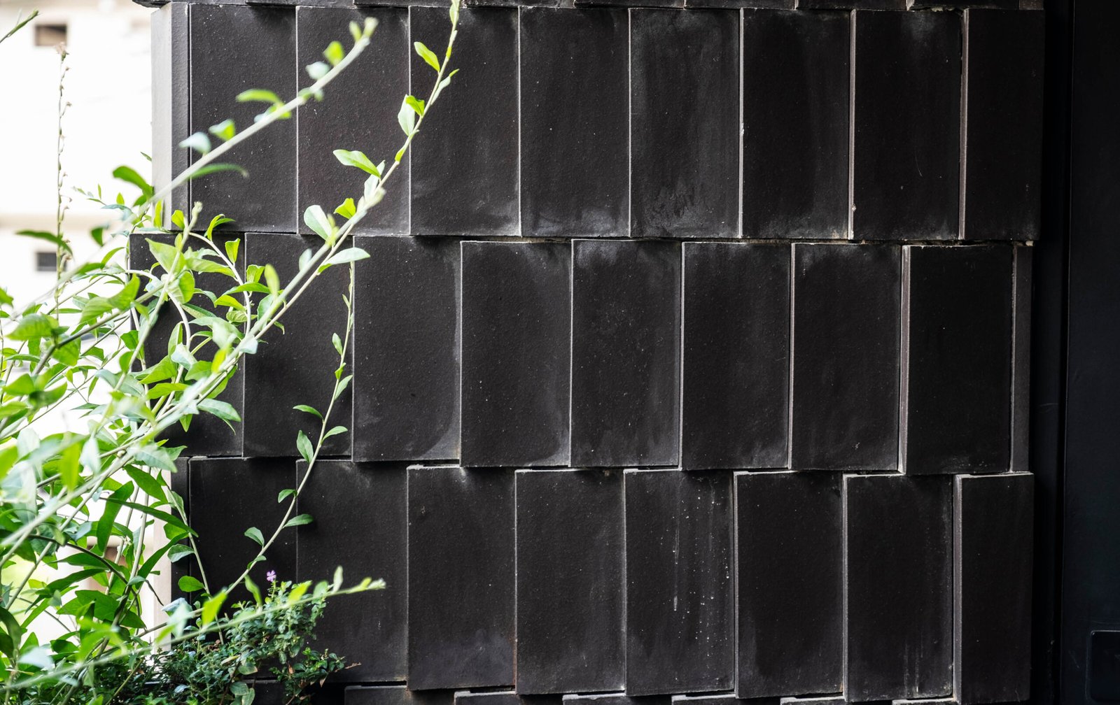
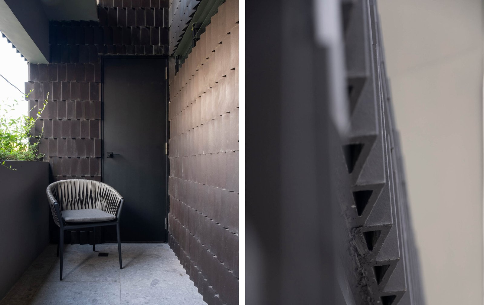
A key feature of the MR Residence is its use of matte thermal tiles, which clad the façade and appear as an accent wall in the indoor garden. “We’ve never used this material for a façade before, but we wanted to add texture to the boxy form and the interior spaces,” says Rivera. The tiles’ triangular shape not only serves an aesthetic function but also provides thermal benefits. The air gaps created by the tiles help dissipate heat, preventing heat gain and improving the home’s energy efficiency. Initially, the client had concerns about the tiles’ appearance and maintenance, but the practical advantages of the material persuaded him. The dark grey color of the tiles aligns with the client’s preference for understated design while adding a subtle texture to the façade that contrasts with the solid, clean lines of the house’s form. At certain times of the day, light falls in and spills across the tiles, animating its dark surfaces and making the façade shimmer and ripple.
Despite its reclusive nature and absence of traditional tropical design elements like expansive eaves and large openings, MR Residence embodies tropical architecture. Its design breathes and adapts cleverly to the site’s constraints, whether the trapezoidal lot, the creek, or the need for privacy, while making the most of every inch of space. The minimalist interiors are a godsend for the busy parents, offering a respite with their clean, distraction-free walls and neutral color scheme, just the thing to counterbalance their daily number-crunching and spreadsheet battles. The project’s unexpected downsizing and budget cuts threw a wrench in the works, but the finished home does not feel or look like a victim of compromise.
From the street, one would hardly imagine the setbacks MR Residence by Arkisens overcame to come to life. Its unperturbed ebony surfaces and the subtle gleam of the tiled façade, like a knowing wink, suggest that those challenges are firmly in the past. •