Interview Patrick Kasingsing
Images Bien Alvarez (8X8 Design Studio)

Hello 8X8! Welcome back to Kanto! The PK House’s spare, no-nonsense form may suggest otherwise, but simplicity often requires the most effort! Please walk us through the client brief. What were the owners’ non-negotiables? Can you paint a general picture of your clients for our readers?
Pearl Robles-Alfonso and Adrian Alfonso, co-principals of 8X8 Design Studio: Thanks for having us! PK House was our second project for the same client in Calatagan, Batangas. The Wellness Pavilion was the first structure on an in-land property, while PK is on a separate property about 30 minutes away. We started in late 2021 when he brought us to a newly acquired hilltop property at the eastern edge of Calatagan, which allows for beautiful wide-angle views of Balayan Bay and surrounding mountain ridges.
Our client brief is to design a serene weekend house that seamlessly integrates with the lush environment and offers a panoramic view. The property is oriented towards the east, and our client is particularly interested in capturing the unobstructed sunrise view as much as possible. He desires a peaceful haven away from the busy urban realm of Metro Manila, where he can indulge in his hobbies of photography, collecting rare books and automobiles, and providing a welcoming space for family and friends amidst the natural bounty of Calatagan.
Your site location is anything but average. Can you describe it in more detail and discuss its challenges and opportunities for the build?
8X8 Design Studio: The three-hectare property is on hilly terrain with picturesque views on all sides. The decision to build the house at the center of the property was easy, as it is a plateau clearing at the site’s highest elevation. By building it at the center, it will act as a focal point for future developments on the edges of the property and take advantage of the best views of the sea and mountains.
Our initial challenge was deciding what to construct on top of the hill, surrounded by nature. We were given a list of space requirements, but the design was a blank canvas. Our only reference points were the scale of the natural surroundings and the materials found in nature. It was an unusual and exciting challenge with many potential solutions.
We began the project with the concept of a nipa hut, or bahay kubo, as our main inspiration. The goal was to create a self-sustaining structure amidst nature. We analyzed the essential qualities of the kubo, such as its raised platform and protective features that shield its inhabitants from the tropical climate. Additionally, we examined how it served as a functional space for the owner’s lifestyle and livelihood, acting as a collector for their various needs.
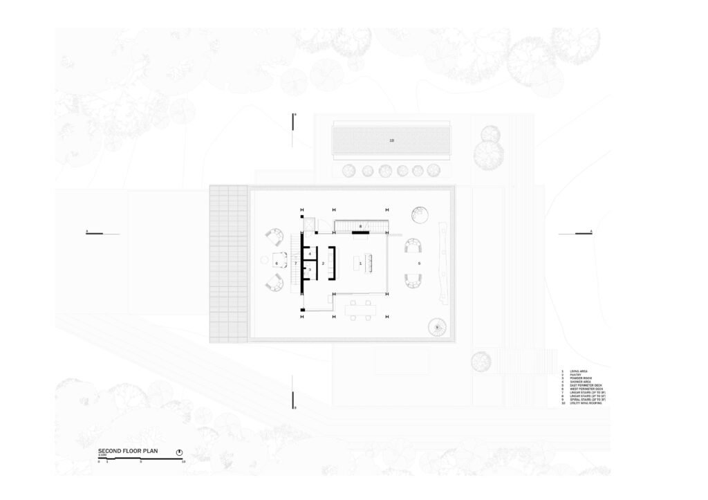
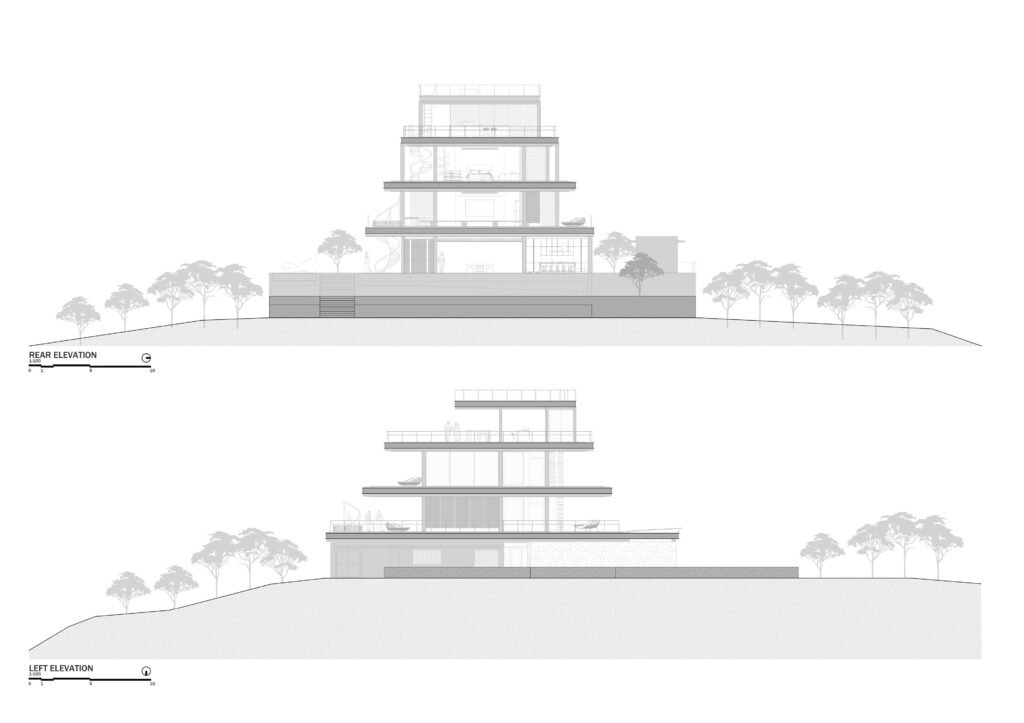
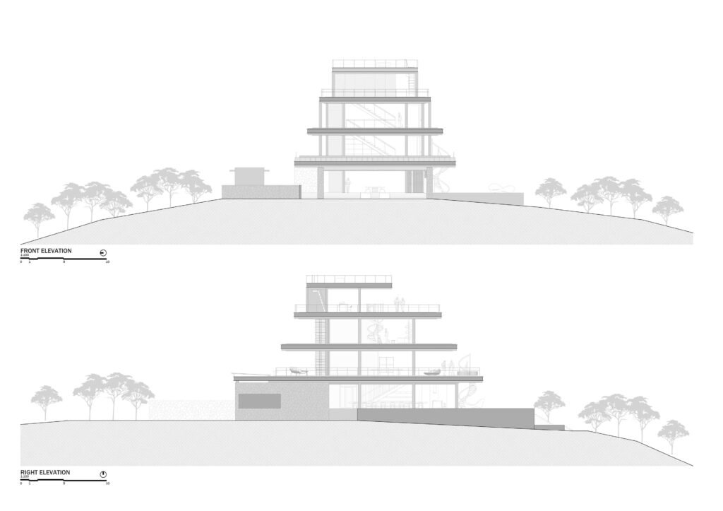
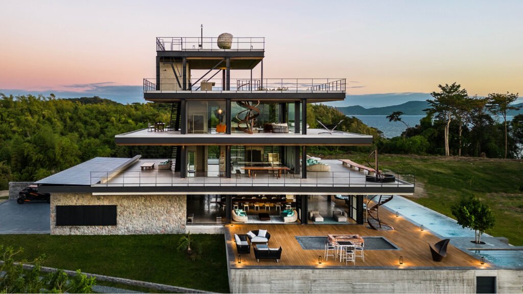
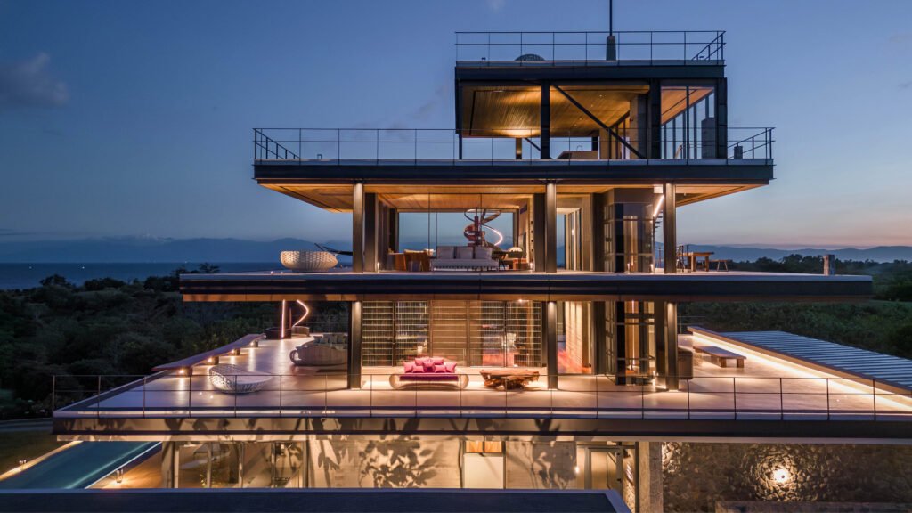
We reimagined the essence of the traditional bahay kubo using modern technology to create new solutions. The PK House features layered planes that gradually rise upward, mimicking the natural progression of a hill. These planes create open spaces with varying degrees of privacy, similar to the traditional silong (basement), bulwagan (hall), and silid (room) areas of a bahay kubo. The result is a unique interpretation of this vernacular home, with an open-plan space that seamlessly integrates with nature.



For PK House, the structure is also the architecture: What materials, technologies, or elements demanded bespoke attention to bring the project to life?
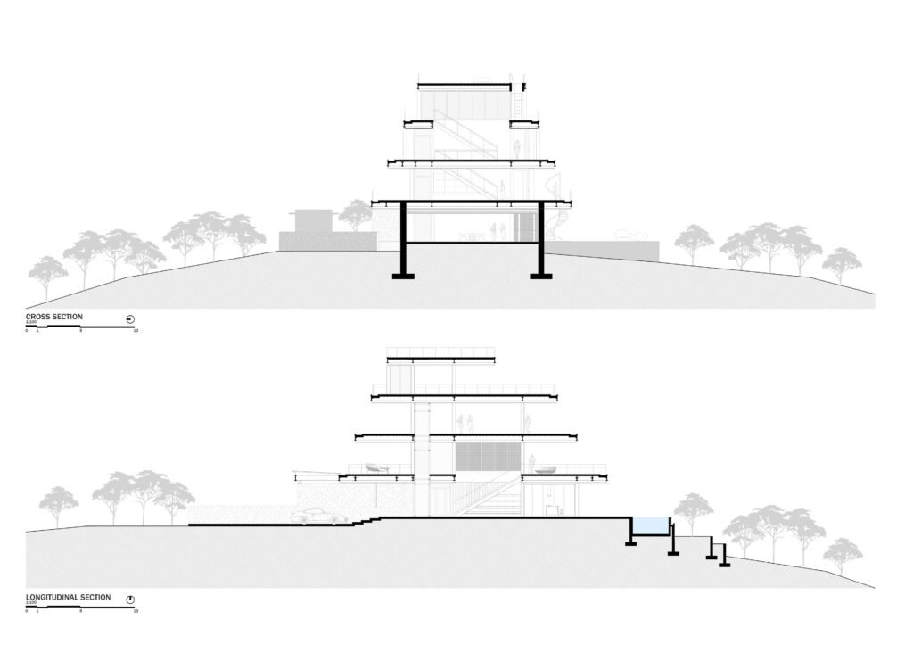
8X8 Design Studio: The structural design incorporates planes and stilts while minimizing opaque partitions, creating an open feel. The planes were extended to create an expanded space around the building, and slim and elegant stilts supported the planes structurally.
The house has three levels and a roof deck. It was constructed using steel framing to simplify the construction process. Because it is located near the sea, all steel members were sandblasted and sealed to prevent corrosion. The building’s levels are layered to create a tapering upward profile to cap the hill it is on.
The design of PK House highlights the value of open space. It offers a variety of atmospheric conditions against the backdrop of sea and mountain views. Its structure forms a porous silhouette, blending seamlessly into the surrounding landscape.
You mentioned sandblasting to protect against steel corrosion. How else did you incorporate defense against natural elements in designing the copiously glazed house, considering its open location makes it susceptible to high winds, heat, and rain?
8X8 Design Studio: PK’s layout is designed to be extroverted, with core spaces located at the center of the home and circulation paths at the edges. The perimeter decks and walkways serve as a filter of protection for the house’s interior spaces. They are extended and profiled to act as layered eaves, shielding the home from direct sun exposure and seasonal extreme weather conditions.
To maximize scenic views, we utilized a glazing system from Vitrocsa. This system features minimalist aluminum profile sections with wide panels of tempered glass. The glass panels are operable, allowing them to be slid and stacked to combine interior and exterior deck spaces. The glazing system is also designed to withstand high-velocity winds during extreme weather conditions. The bottom track of the glass sections includes a rainwater collection trench, which helps reduce stormwater runoff to the perimeter decks.
How else is the house outfitted for the long run, especially in terms of maintenance?
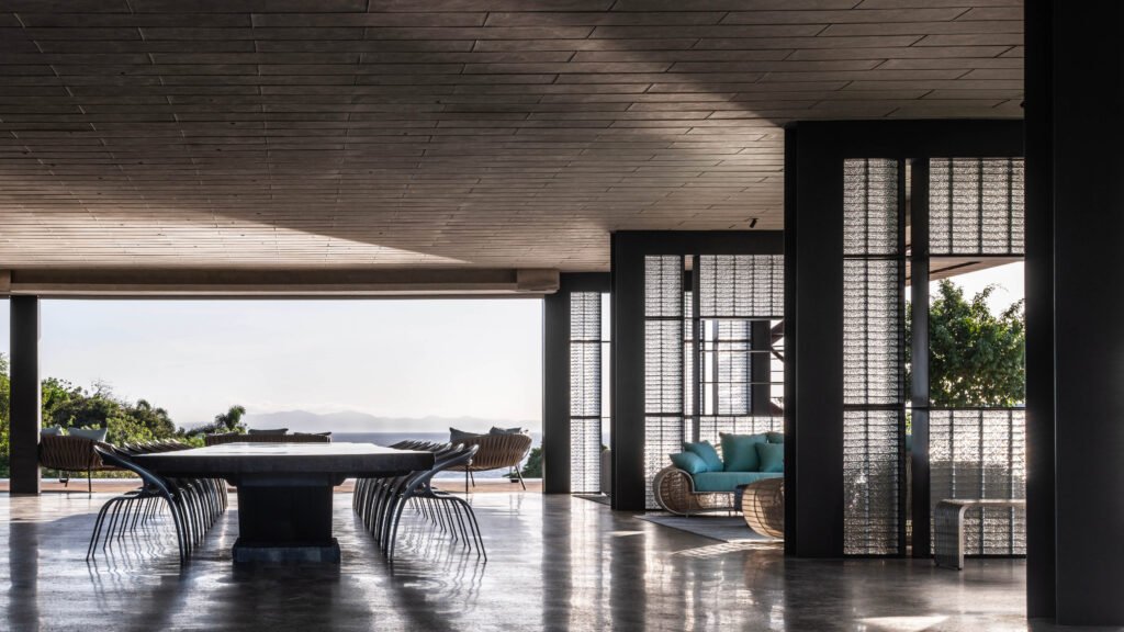
8X8 Design Studio: We used an industrial selection of finish and material palettes for the home, combining Sleek (steel), Coarse (stone and concrete), Warm (wood and micro cement), and Polished (glazing system and glass blocks) materials. This minimalist palette was applied to the different interior spaces of the house.
We opted for steel structural framing to simplify the construction process. We ensured thorough sealing with specialized marine paint to prevent corrosion. Using concrete and stone as wall components allows the materials to age well with patina over the years.
Regular maintenance is necessary for any house. However, we ensured that the building envelope resists direct and extreme weathering.

I remember you mentioning that the bahay kubo was the primary source of inspiration for the house’s design. However, the house’s spare, tropical-centric form also seems to draw inspiration from Palm Springs modernism and Case Study Houses. Were there any other factors or inspirations that influenced the resulting design?
8X8 Design Studio: We began with the idea of a bahay kubo occupying an open field. However, due to the site’s natural features, we wanted to make the most of the concept of an open space.
In our previous project for the owners, the Wellness Pavilion, we used Miesian references to focus on the clarity of lines, planes, and volumes as active architectural components that establish the scale recognition of the space. With PK House, we were able to expand on this approach on a larger scale. The lighting design enhances this approach by emphasizing the cantilevered planes’ edges and the steel stilts’ slimness during nighttime. The furniture selection also aligns with this approach, with careful and minimal placement of distinctive pieces. This allows users to move around the space freely, interacting with architectural components and other pieces that are intentionally composed to be in conversation with each other.
We’ve been applying shell tactics as our signature approach for previous projects. This approach integrates the building envelope (wall, floor, ceiling) as a seamless volume in composing spaces.
PK House follows an anti-shell approach that prioritizes openness over enclosure. This strategy highly depends on the site conditions and the client’s preferences. As architects, we can only design in response to the environment presented to us, but we always strive to deliver our ideals to the final build.


The owners were committed to maximizing their enviable views. What challenges and insights did you gain from designing a house meant to be nearly invisible while serving as both a viewing tower and gallery?
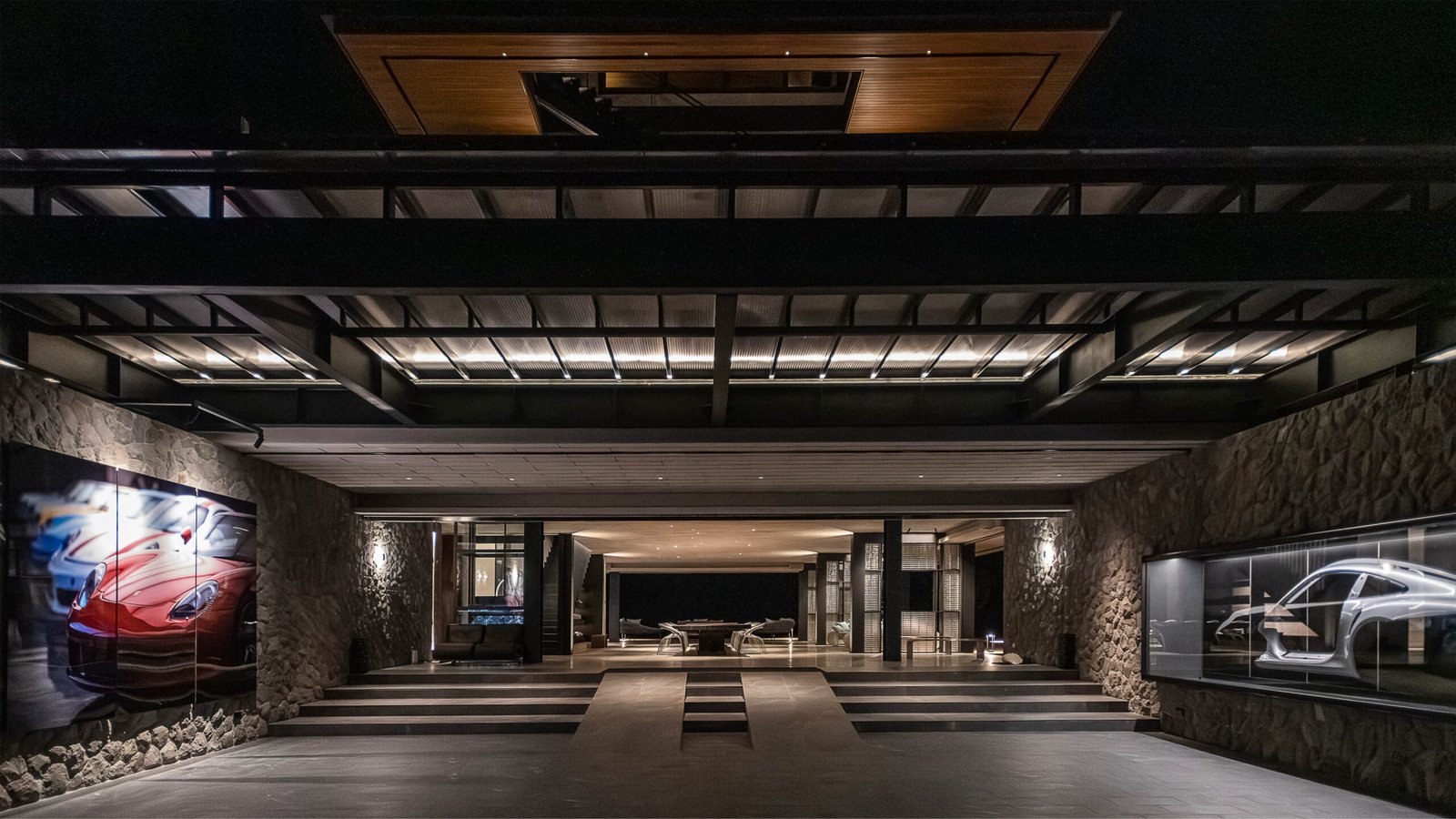
8X8 Design Studio: PK is a unique home that stands out from typical residential architecture. From a distance, it may appear to be a utility structure, but upon closer inspection, it exudes a serene and peaceful atmosphere, much like a temple. The interior spaces are designed to provide a luxurious resort-like feel, while the upper decks offer spectacular views of nature, reminiscent of being on a boat. Inside, the framed features of the sea and mountains create an art gallery-like atmosphere, making it a versatile gathering space for various experiences. During the day, it is a bright and airy space, and at night, it transforms into a soft and comforting lantern.
Was the house initially meant to be this tall? Aside from mirroring the hill, what other factors led to the house’s tapering profile?
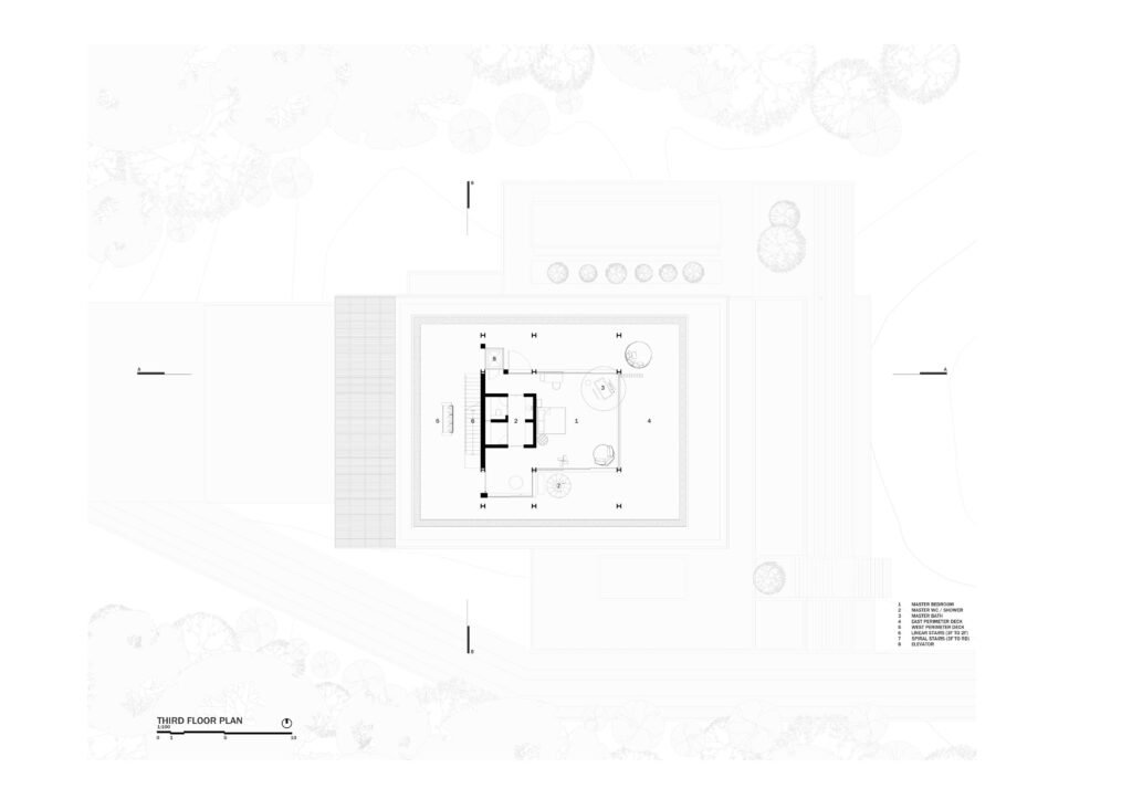
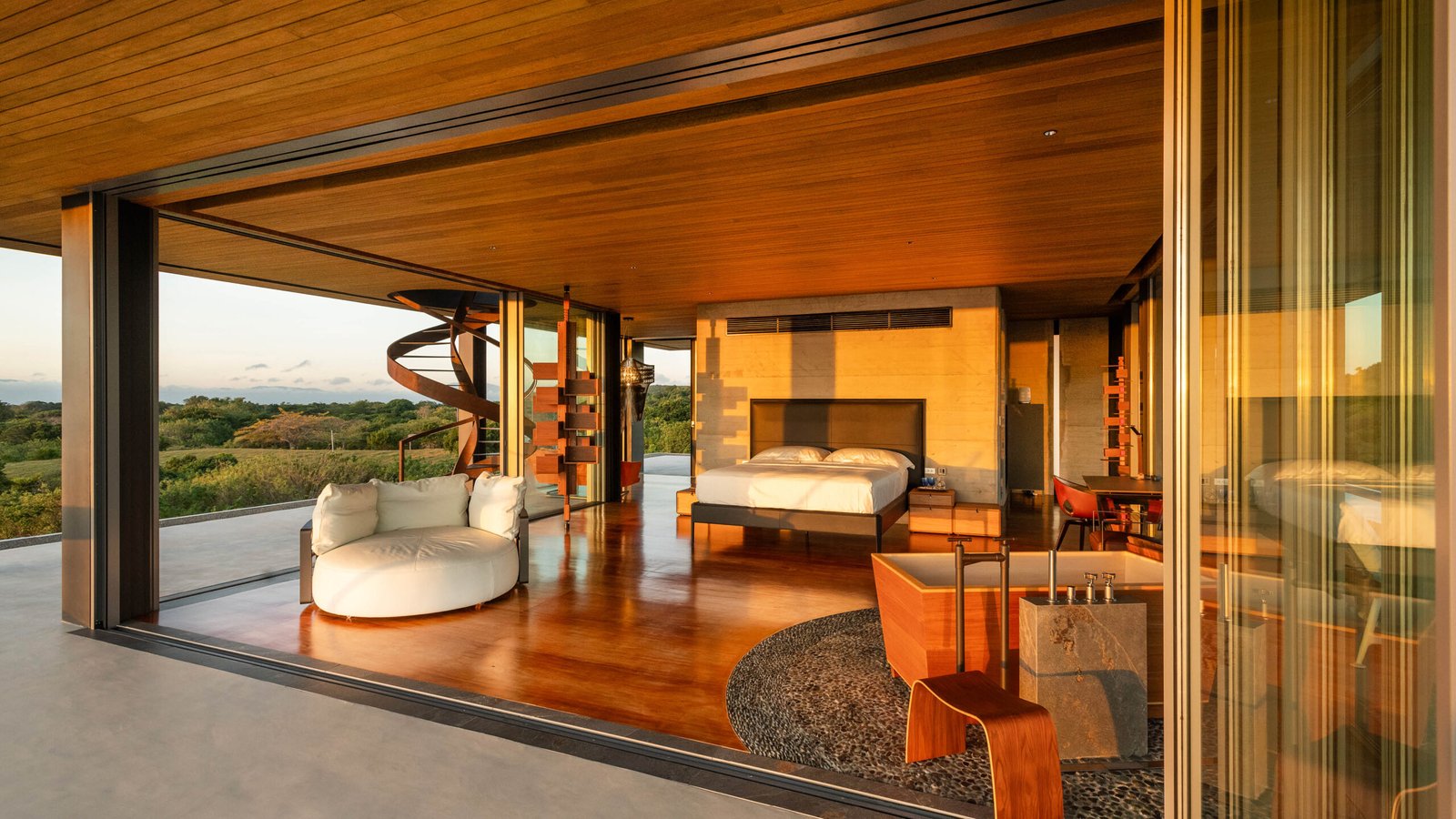
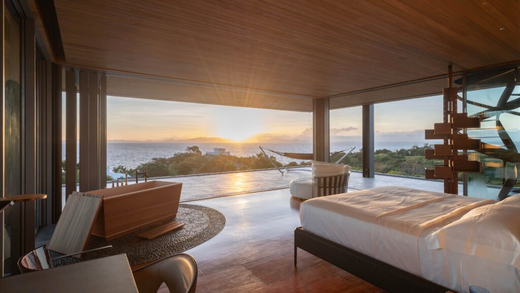
8X8 Design Studio: The client’s non-negotiable request was to capture the sunrise view overlooking Balayan Bay for the master bedroom. In the initial stages, we used a drone to review the elevation and determine the ideal height for the view. Based on this information, we located the master bedroom on the third floor to ensure the view could be easily seen.
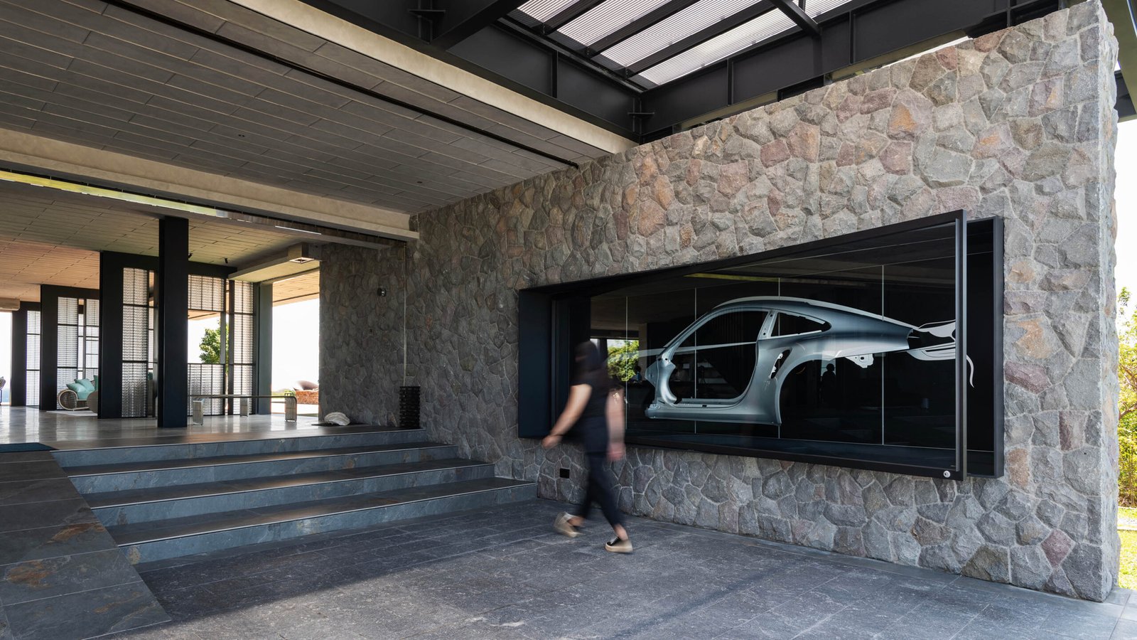
For privacy, we implemented a gradient distribution system across the floors. The ground floor is a communal area for larger groups, while the second floor offers a more intimate setting. The third floor, where the master bedroom is located, was designed to be a private space with no other rooms nearby. The tapering of the interior spaces’ footprint also coincides with the intended use of each space. The first floor is the widest to accommodate more users, while the third floor is narrower as it is solely dedicated to the master bedroom.
I see. Now, were there features, rooms, or design elements from the original vision that did not make it to the finished product?
8X8 Design Studio: We had multiple design concepts before finalizing the model for the structure.
Initially, we planned to construct a rectangular tower with a bold look to complement the hill. However, we abandoned this approach in favor of a design harmonizing with the site’s topography. Initially, we planned to have operable brise soleil panels on the upper levels to provide an additional layer of security and privacy. However, our client prioritized an open and spacious feel over added privacy.
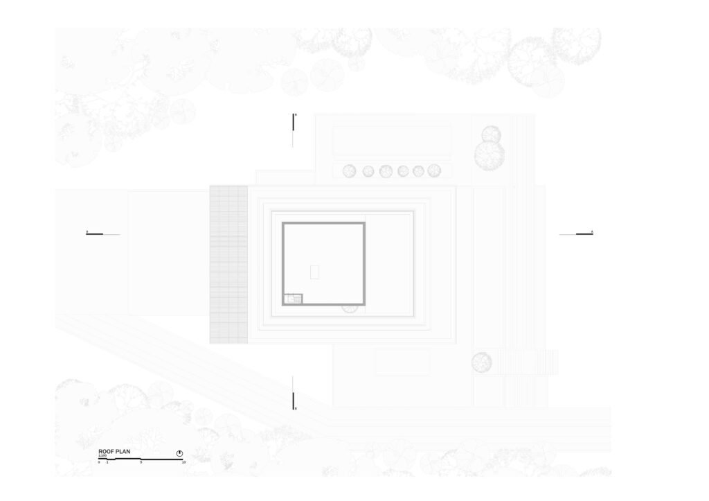
We also considered having a projected roof profile over the structure to cap the kubo but ultimately decided this would be unnecessary and removed it from the design.
Given the opportunity to alter anything in the final design, would you?
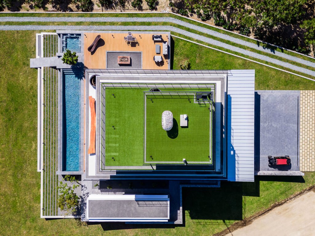
8X8 Design Studio: We believe that the structure was executed perfectly as it is. However, testing an entirely different model with curvilinear profiles would be interesting if we were to make any modifications. If we had to make partial modifications, perhaps widening the pool would better suit the scale of the first-floor bulwagan.
Let’s now talk about the house as a living space. How does the design account for moments when there might be too much view and inhabitants seek some quiet or privacy?
8X8 Design Studio: On the ground floor, we integrated roller shutters to enclose the perimeter of the bulwagan. These shutters, a stainless-steel chain-link gate, are embedded in the ceiling and rolled down when the home is not in use. This is more for security on the first floor than for privacy. The shutters prevent access to the house but still provide transparency.
The upper levels, though, feature wide-span block-out roller blinds concealed in the ceiling (although these are still in fabrication and yet to be installed). These blinds filter the interior spaces of the second and third floors for privacy. We also applied a Lutron lighting automation system, which has a Stealth mode option; this turns on only essential pathway lighting and dims the home for privacy.
Your team has spent quite some time in the house—perhaps second only to the homeowners! What is your favorite space in it? What moment or time of day brings PK House to life or brings out its best side?
8X8 Design Studio: Our favorite part of the house is the Inoki bath in the third-floor master bedroom. This serene space features a Japanese wooden bathtub positioned to capture the breathtaking sunrise view of Balayan Bay. The sliding glass doors can be opened to let in fresh air and sunlight, and the bathtub base is detailed with a stone inlay pattern of river stones. Although this luxury is for our client to enjoy, we are proud of how remarkably it has turned out.
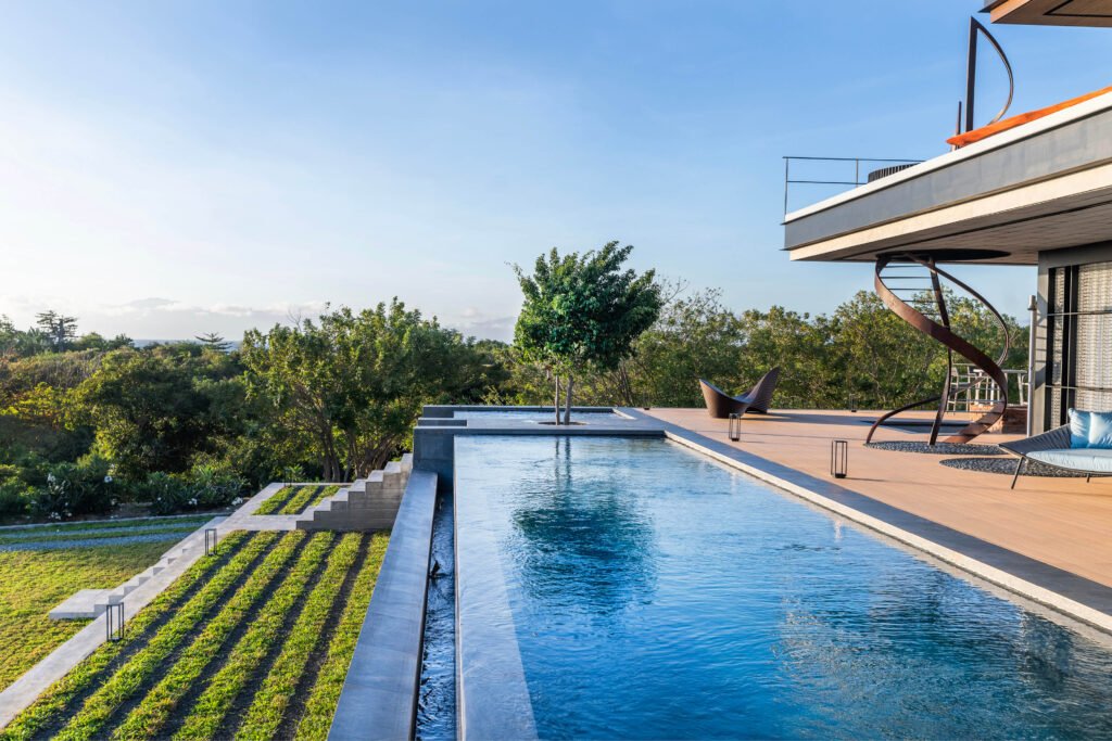

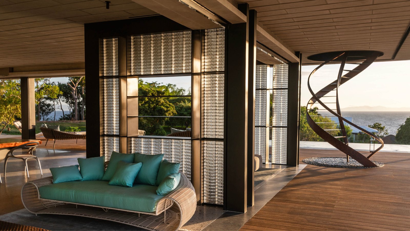

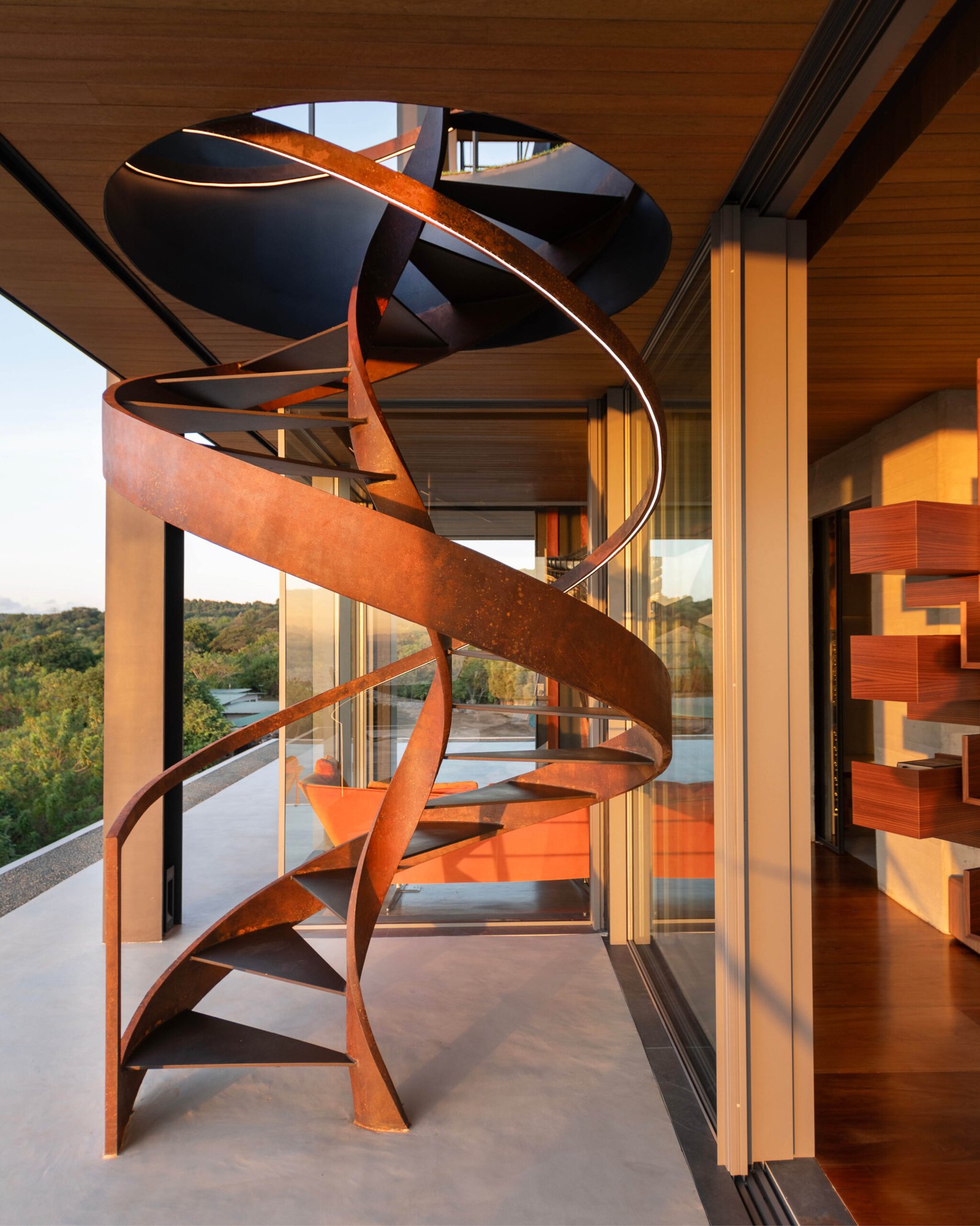
The beautiful spiral staircase serving the first, second, and third floors contrasts with the house’s orthogonality and harmonizes with its light form. Can you tell us more about the design decisions and inspiration that led to its creation and inclusion? Was executing the staircase challenging?
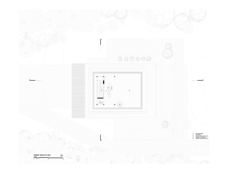
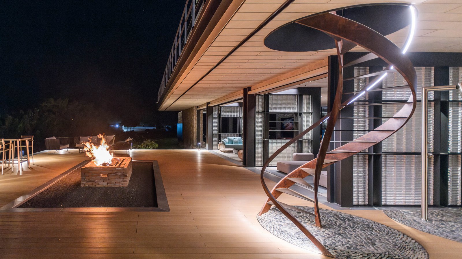
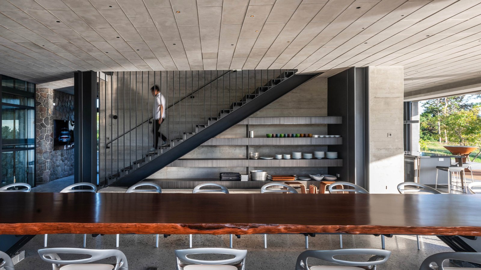
8X8 Design Studio: Two spiral staircases were incorporated into the home’s design at the client’s request during construction. These staircases provide direct access between the first-floor pool deck and the second-floor living area and between the third-floor master bedroom and the roof deck bar.
As an additive component, we wanted to create a contrasting element to the rectangular planes and a sculptural element that would match the slimness of those planes. To achieve this, we designed a spiral cantilever made of steel. The main challenge was to make the profiles as slim as possible without compromising their stability. Fortunately, we had a steel contractor who was up to the task. We began by simulating bare profiles of the frames and then worked on proper reinforcement on-site.
Although it was like a side story exploration to the rest of the project, the spiral staircases ultimately came out as essential pieces to the home.
Lovely. How long have the homeowners lived in the space? What do they love, and what do they think needs improvement? I’m sure you have quite a grasp of their sensibilities now as a repeat client.
8X8 Design Studio: The project was completed in late 2023, and we have received positive feedback from our client and their guests. The residence has become a popular gathering place for family and friends, especially during holidays and weekends.
What aspect of the build do you consider the most challenging, and what would you say is the easiest to achieve?
Initiating the design process is consistently challenging. We begin by visiting the site and envisioning the optimal structure. It’s akin to starting with a blank canvas and proceeding cautiously to avoid errors.
The construction phase posed additional challenges, mainly due to the site’s remote location and the tight deadline. Despite some delays, we completed the project before the holidays.

Okay, to close off this interview, let’s do a summary of sorts, one that encapsulates both your approach to the project and the lessons you’ve gleaned from the PK House experience. What has the project done for 8X8 Design Studio?
8X8 Design Studio: We were fortunate enough to work with a client open to creative experimentation, allowing us to explore new materials and details. Though minimalist compositions may seem sparse and bare, creating profiles that harmonize the space requires meticulous attention to detail. For example, we experimented with custom steelwork for the linear and spiral stairs, radial patterns for stone inlay, exposed concrete finishes, and glass blocks as light filters.
Our project had a generous budget, but both we and our client agreed that extravagance was not the goal. Instead, we aimed to create a space that blended with the surrounding environment and offered a unique experience. This type of luxury is centered around connecting with nature and discovering new ways of living. The enthusiasm of everyone involved, from the client to designers and builders, is crucial for successful execution.
We crafted the house with an open and transparent layout to foster a connection with the natural surroundings. While this design may not suit everyone’s preferences, it aligns with our client’s introverted nature. To accommodate his and the family’s needs, we created various nooks and corners throughout the house that offer different vantage views and serve as quiet spaces for reading and work. As designers (and fellow introverts), we value these areas as they provide an opportunity for quiet contemplation and inspiration.
Despite its visual simplicity, the project proved to be an overwhelming experience. We aimed to make the spaces as livable as possible, using the fewest elements necessary. This required us to be selective about what we kept and what we let go. However, we believe that this makes the place, and architecture in general, beautiful and memorable—the careful curation of a series of experiences that can be drawn in. •


