Interview Vincent Ong
Images Jo Malinis

Hi, Jo! Let’s start at the very beginning. What inspired you to create Type63?
I started Type63 in July 2020. I’ve been experimenting with creating typefaces and fonts for a few years now, but I’ve only embraced the label of being a type designer last year. As my interest and passion for type grew, I tried looking for inspiration and knowledge online. I noticed that most of the people that I looked up to were from abroad, and that the designers that I knew locally who focus on type were just people within my network—like Mike Parker and Myka Arnado—and a few creatives whose work blew up online—like Aaron Amar when he released Cubao Free and Jad Maza when he made Maragsa available for download.
Social media was the easiest tool for me to consume this type of content, but while we have a lot of Instagram and Facebook accounts dedicated to promoting art and design in general, there weren’t any—or much that I was aware of, at least—that focused on typography or showcased Filipino type-centric work.
Now that you’re one of the names immediately associated with Philippine type design, It’s curious that you hesitated to call yourself a type designer. What was holding you back?
I always thought I needed to release and sell a font of my own first—which might actually be a requirement for some. (Laughs) I’m not sure—but at that time I was already creating custom type for work, so it felt… weird? Awkward? To be in the middle.
Maybe it was also imposter syndrome? I honestly still doubt myself from time to time. (Laughs) I guess it comes with the fact that I didn’t grow up knowing anyone who claimed to be one, so now I don’t know how to compare myself to the pros—or if I even should. It’s tricky!
What did you hope to accomplish with Type63?
The Philippines has always had a good number of lettering artists, calligraphers, and type enthusiasts who are already known online. Type63 was just able to highlight who the type designers are and how their works look like. I’m not sure if other people also share this assumption that these disciplines used to get lumped together—hopefully, through Type63, people are now able to differentiate them.


And how has it lived up to your expectations? How has it surprised you?
The reception has been great so far. In terms of numbers, I thought the Instagram account would only gain around 500 to 1,000 followers. But as of today it already has 4,511, and it is steadily increasing. Hopefully this doesn’t jinx it, but I’ve also never had a problem when it comes to sourcing content because designers are always willing to contribute their work. I’d also get a lot of messages from different people asking about local typeface recommendations or designers that they can get in touch with.
Another unexpected outcome is the willingness of people to partner with Type63. I’ve had the privilege of working with Design Dialogues at Home, an initiative by And A Half Design Studio, to produce video content about creating type. I’ve also been invited to talk about Type63 in different events, and I’m always grateful for every opportunity.
Personally, I never expected to be this committed to it. I always thought it was just going to be an online dump that I would have to manage and curate, but it’s become bigger than that. It’s a cause to champion—for me at least!
Type63 is on Instagram for the whole world to see. How has it changed foreign designers’ perceptions of Philippine design?
Hmm… Well, my personal objective for Type63 is for Filipinos to know that there are Filipino type designers and that these designers produce great work to be proud of. The reaction of foreigners would just be a result of this showcase and isn’t something that I’m actively seeking. Don’t get me wrong, it would be nice to know what they think, but my main goal is for this platform to be known among fellow Filipinos.
And how about locally? How has Type63 changed the way Filipino designers approach typography?
Apart from knowing who and what Type63 champions, I noticed that a lot of Filipino graphic designers now consciously choose typefaces made by Filipinos for their projects, especially the cause-oriented ones.
There’s also this wonderful sense of community where everyone supports each other’s work. It’s always nice to see people cheering each other on whenever they spot someone’s typeface being used. I remember how a lot of people got so excited when Alli Cunanan’s font called Ladybird Light was used by a Kpop artist named Baekhyun for his promotional materials. It was fun to scroll through Instagram stories of different people going “wow, that’s Alli’s font!” There’s a sense of pride and belonging even if it isn’t your work.


How are people using the typefaces they download from Type63?
It’s easier to spot the Filipino-themed ones because they’re always used whenever the topic is related to the Philippines, especially for advocacies. Just recently, Aaron Amar’s Cubao Free and Lloyd Zapanta’s LL Karatula typefaces were used for the signages of the Maginhawa Food Pantry and eventually used for community pantries in locations around the country. But we also see these typefaces in the most unexpected places. Cubao Free was sewn on clothes for a student’s fashion show and Maragsa was used for a K-pop group’s dance cover video.
The element of play is very common and very strong when it comes to local type design. But when it comes to making type usable, the discipline is pretty rigid. There’s only so far you can push the alphabet before it turns into dingbats diba? So how do you feel the community of local designers approaches and balances these opposing principles?
I think as long as the designer’s intent for their typeface is clear, then whether or not they go wild with their designs will depend on that goal. “The discipline is pretty rigid” when you have the intent to be legible; otherwise, type is an open playground.
Legibility and usability are cultural, just like how the handwriting of one person can be understood by a certain group of people, then misconstrued by another. To a non-user, the Ñ can just be a letter N with a squiggly line on top of it, but we pronounce it differently because we know what it is. I think this can also be applied to type aesthetics.
Because we have a wealth of inspiration here in the Philippines, a lot of designers gravitate towards using local references for their work. The Philippines is such a diverse country with our traditions, values, and even political leanings, so it isn’t surprising to see fonts that reflect the culture. If the forms turn out to be more “playful” than western typefaces, then that isn’t necessarily a bad thing. Display fonts are not inferior to text fonts.
Of course letters are still symbols, and since we primarily use the Latin script, we have to adhere to a set of rules if we want our typefaces to be understood. Filipino type designers are aware of this yet aren’t afraid to explore different forms.
It’s interesting that you cite the breadth of diversity within our own culture in the Philippines. How does type reflect this?
One good example is Bawal Sans by Together We Design (TWD). Bawal Sans is a variable font that averages the look of the DIY signages that TWD saw around their home base, Cubao.
A variable font is one font file or type system that allows the user to morph between a wide range of stylistic variations without the need to install so many font files. The technology is fairly new in the type world, created to solve the problem of choosing the right font weight or height for a given space, but our signmakers have already been doing this for so long because they had to work with the limitations of their materials.
TWD explained, “Proper typesetting is a luxury… Bawal Sans is the DNA of the DIY signs we see everywhere: a no-nonsense font that is as loud and clear a statement as the message itself is, a font that gets the job done now, fast, period. Niceties? Maybe later.”

That’s a really exciting example, because its jumping-off point doesn’t come from the lens of “learned” designers in air-conditioned offices, but real people who need to communicate through type. There’s a sense of democratization, which I see in your work as well.
Earlier in the interview, you named Myka Arnado from Cebu and Jad Maza from Iloilo; there’s an effort to be inclusive—abandoning the ivory tower—and decentralize Manila in the narrative of Philippine design. How else can we empower designers in the regions?
It can be as simple as reaching out to them or including them in our conversations. Recommend them and their work to clients and/or publications whenever we’re asked. We have to acknowledge that design exists everywhere and that creatives from Manila are in no way superior to anyone else. So if it’s easy for us to celebrate designers from Manila, then we should be able to do the same for designers from other regions, too. Especially if we have the privilege and responsibility to organize initiatives, events, and projects for creatives. Include these designers in your roster of speakers or in your project collabs. Kung nakakakuha nga tayo ng speakers mula sa ibang bansa, edi kayang kaya rin natin kumuha mula dito diba? If we can get speakers from other countries, it should be easier for us to get local ones, right?
Overall, how can the Filipino designers be more participative in the Type63 community?
They can always submit their work for a feature or message me for any ideas that they might have! Or it can be as simple as sharing work posted on the Type63 feed so that the people within their circles can also be introduced to Filipino talent.
How has all of these affected your own practice/approach to type and design in general?
It’s been my motivation to be a better type designer. I can’t help but feel a bit of pressure—the good kind—whenever I see designs posted and it keeps me going with my own work. Type63 has also encouraged me to explore local inspiration for my typefaces as well, that is why I am currently working on a font named “Terno” inspired by the Philippine terno.
I also find myself being more conscious with the typefaces that I use for projects. Whenever I get the opportunity to work on brands, both local and foreign, I try to make use of Filipino typefaces.

Personally, what are your metrics for “good type”?
I’m very attracted to typefaces with interesting stories behind them, so “good type” for me is whenever a good concept is extracted from an inspiration, then executed well. Less about the look or forms and more about the process behind them. Untitled Sans and Untitled Serif Klim Type Foundry and Digestive by OH no Type Co. are some of my favorites.
On the opposite end, what are some telltale signs of a bad typeface? What are some red flags that would cause you to reject a submission?
I try to keep Type63 limited to typography as much as possible since there are already accounts like Type Kita for lettering and calligraphy. Whether it’s an actual typeface or a design with applied type, the minimum requirement would be that the design should be type-based.
It’s hard to remove my personal bias when it comes to selecting designs to feature, but—at least at this point—I don’t want to be too strict about the curation. I want everyone to feel like it’s okay to submit because I will post their work eventually so that I don’t exclude anybody.


In a previous interview, you mentioned that Type63 was born out of a gap in the industry. What are the remaining gaps that need to be filled?
Type63 regularly gets questions about licensing and pricing. These are things that I cannot answer by myself, because I personally do not have enough knowledge on these topics. So it would help a lot to have more open conversations about the business side of things. This is also the case for graphic design. I think it would benefit everyone to talk about these things more.
Where do you see yourself taking Type63?
In the future, I’d love to host events like talks, type critiques, or panel discussions. Right now, I wish that I had more time to devote to Type63 projects like Type Talks Tuesdays where type creatives talk about letters, projects, and processes every 4th Tuesday of the month, and the creation of more informational posts to help the community. Moving forward, I’d love to find a team to help me run this operation! •
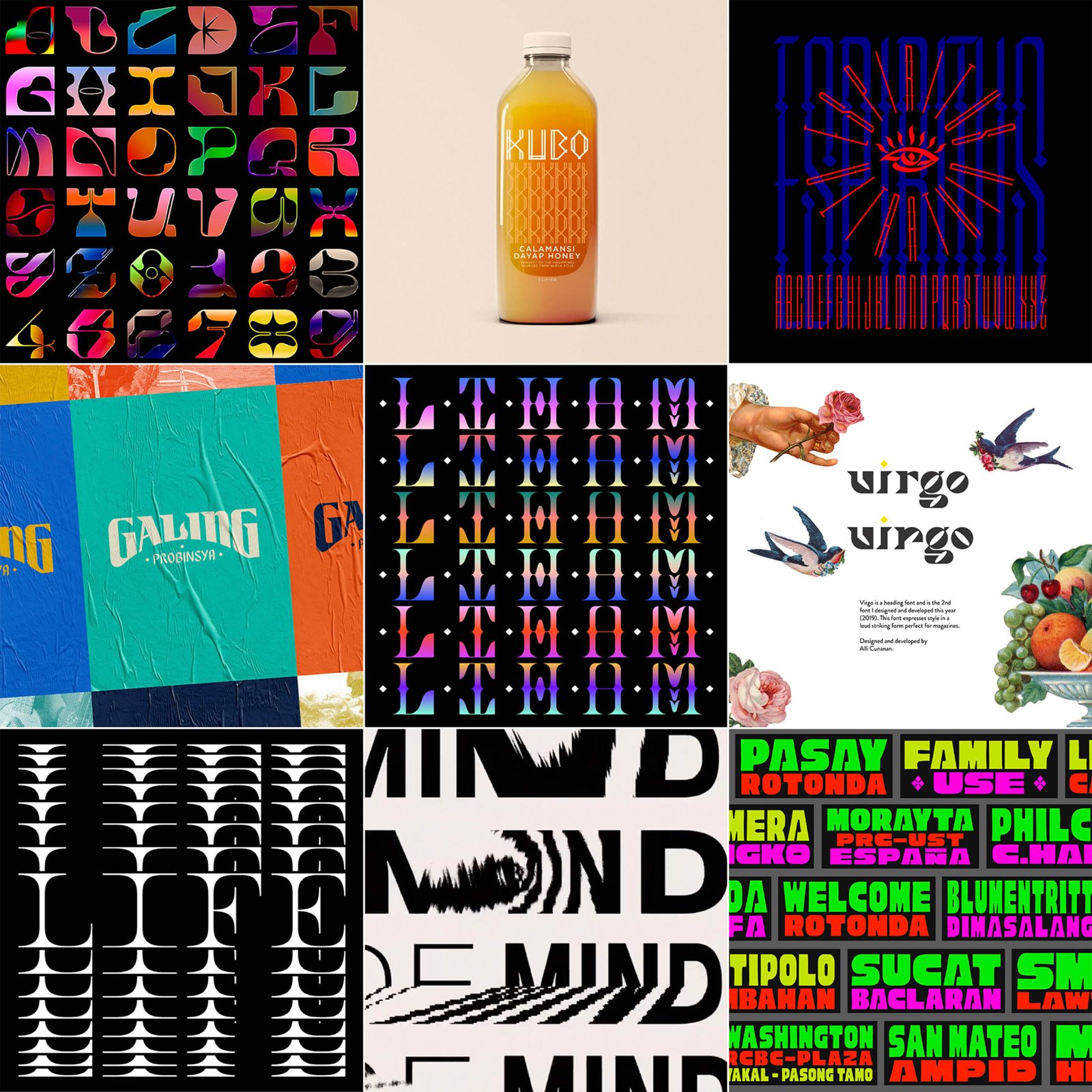
Lovely letters from the Philippines at @type63_
2 Responses