Interview The Kanto team
Images Philippine Logos


Hello, Philippine Logos team! Thanks for indulging Kanto with an interview! What led you to start collecting Filipino logos and brand marks? Did you identify a particular gap or need in the design community that this project addresses?
Philippine Logos: Thank you for reaching out! As graphic designers focused on visual identity, one challenge we often face is ensuring our logo designs are unique and distinct from existing ones. We triple-check, researching extensively online and through physical design books. One book we frequently refer to is Logo Modernism by Jens Müller and Julius Wiedemann, published by Taschen. It’s a compilation of approximately 6,000 logos from 1940 to 1980 and serves as both a design resource and a testament to the importance of archiving work.
In 2016, the closest thing we found to a local “archive” was a vintage magazine called Ermita, part of Team Manila Graphic Design Studio’s research on Philippine graphic design, led by creative director Jowee Alviar. The February 19–March 20, 1976 issue of Ermita featured some of the era’s best designers, such as Frey Cabading, Manuel Ongpauco, Papu Leynes, and Eddie Cheung, alongside their stunning logo projects. It even included insights into their design processes and perspectives on logo design.
(Source: Ermita Magazine Post)
Seeing these resources made us realize how important documenting our existing and historical logos is. To the best of our knowledge, there was no comprehensive archive of Filipino logos at the time, so we decided to create one ourselves.
Thank you for taking on the task of archiving our logos. As the name suggests, Philippine Logos’ core mission is researching and archiving logos of local brands. How else do you hope this archive will contribute to the understanding of graphic design in the Philippines?
Philippine Logos: Our main goal is to create a publicly accessible resource for the design community and future generations while properly crediting the designers behind these remarkable works. Just as we honor Filipino painters, sculptors, and architects, it’s time to celebrate our graphic designers.
Visual identity, especially logo design, is a crucial aspect of graphic design. Through this archive, we aim to contribute to the study and understanding of Philippine graphic design by identifying trends and aesthetics from different periods.


How have you seen the field of brand identity in the Philippines evolve since you began your archive? Are there particular shifts or developments that have stood out for you?
Philippine Logos: Designers and agencies in the 1970s kicked off the movement with visually appealing and functional logos—hallmarks of modernist design. Based on our research, which includes some speculation due to the lack of archives, architects and visual artists created many great logos from this era.
Since then, the field has evolved significantly. Today, design studios and independent graphic designers produce high-quality work, pushing boundaries in brand identity. We’re seeing custom logotypes paired with bespoke typefaces, illustrative yet functional logos, and uniquely Filipino designs without relying on clichés like flag colors or stars and suns.
On the other hand, some challenges persist. For example, government agencies often undervalue brand identity. They rely on design contests for rebrands, which usually result in poorly received logos due to a lack of understanding of design principles. Additionally, some creatives charge unrealistically low rates, negatively impacting the design community.
What recurring design elements or approaches do you notice when reviewing the Philippines logos you’ve collected? Are there any prevalent themes or messaging across the logos you’ve encountered?
Philippine Logos: Recurring design elements include 1. repetitive lines, 2. circular forms, 3. geometric shapes, 4. symbolic representations, and finally, 5. the sun and stars.
Many logos incorporate these elements to reflect Filipino identity, often using symbols like the Philippine sun, stars, and rays to signify progress. However, some logos are so abstract that they defy straightforward interpretation. These are just our observations based on the collection.


Let’s digress a bit and talk about logo design per se; in your opinion, what makes a logo effective or memorable? Can you share examples from your archive that best demonstrate these qualities?
Philippine Logos: An effective logo must 1. work well in one-color or black-and-white formats; 2. be legible at small sizes, such as favicons or app icons; and 3. possess a unique personality while being visually appealing—whether simple and geometric or intricate and illustrative.
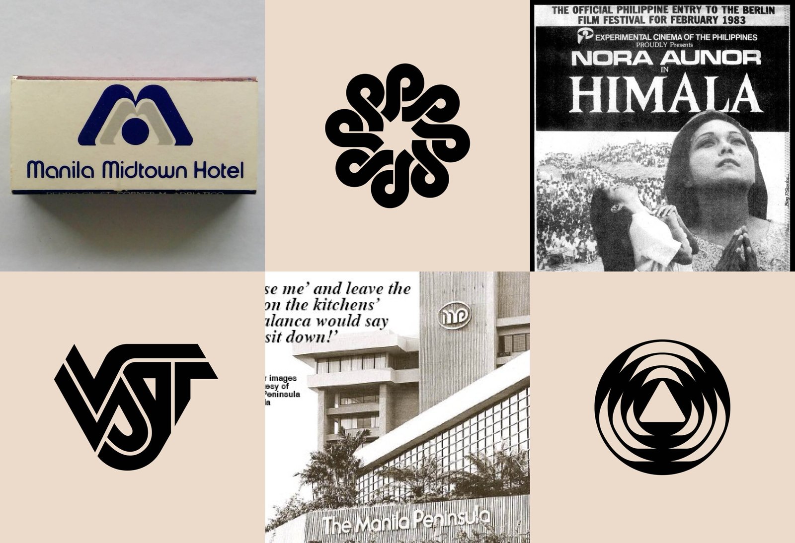
Some examples from our archive that embody these qualities include PLDT, PAGCOR, VST & Company, Philippine Airlines (1968), and the 1975 Metropolitan Film Festival (now Metro Manila Film Festival) logo.
Rebranding is becoming more common now. Do you think rebrands typically achieve their goal of refreshing a brand’s image? Are there examples, positive or negative, that stand out?
Philippine Logos: Rebrands are naturally subjective; some succeed while others miss the mark. Here’s an example from both sides of the spectrum:
Negative: The PAGCOR rebrand. Many, including us, feel the new logo falls short compared to the old one. While we respect the agency-designer behind it, we believe it could’ve been executed better.
Positive: The SM rebrand. Their updated design system, including a custom typeface, successfully modernized the brand while preserving its identity and history as a retail conglomerate.


I’m curious—what challenges do you face in curating and maintaining this collection? How do you decide which logos are significant enough to include?
Philippine Logos: The biggest challenges would be 1. finding high-resolution versions of logos (physical or digital) and 2. identifying the designers and the year the logo was created.
Some logos remain unpublished because we’re still gathering resources or better-quality images.
To be included in our archive, logos must align with modernist principles that underpin all timeless designs. Jens Müller’s criteria resonate with us: 1. a logo should work well in black and white; 2. it should be simple enough to draw by hand; 3. it should be based on geometric forms. (Source: Wired Article).
Technically, we prioritize logos with high-resolution copies and one-color versions, especially if sourced directly from a brand’s website or printed materials. Identifying the designer and creation year is secondary but still significant.
Are there any logos in your archive that are personally significant to you? What qualities do these logos possess that resonate with you?
Philippine Logos: The VST & Company logo is one of them. Beyond being a well-designed logo, it brings back memories of family reunions and Sunday mornings.
The original PLDT and Meralco logos are also personally significant. These are two of the most iconic logos in Philippine history, both design-wise and in cultural relevance. They were created by Systembrand, where one of our team members used to work. He considers himself fortunate to have learned from the creative team and founders there—legends in the industry—everything from design thinking and logo creation to developing brand guidelines and applications. Seeing those logos and their detailed guidelines regularly, and even speaking with their creators about these projects, was an incredible learning experience.


Social media platforms like Instagram and TikTok have transformed how brands present themselves. How do you think the rise of these platforms has influenced logo design, even for older logos you’ve archived?
Philippine Logos: Social media has indeed revolutionized how brands showcase themselves. It’s driven brands to refine and expand their design systems, often making their logos “responsive.” Responsive logos are primary designs with scalable and adaptable variations, ensuring they remain effective across different formats, from web to print.
We’ve also seen brands explore motion graphics to bring their logos to life, adding dynamism and engaging their audiences in new ways. This shift has encouraged even traditional logos to adapt to the demands of a digital-first world.
Now for a biggie—how do you view the role of AI (artificial intelligence) in logo design today? Do you see it as a beneficial tool, or are there concerns about its potential impact on creativity and originality?
Philippine Logos: We haven’t used AI in our logo design practice and don’t plan to. That said, its role depends entirely on how it’s used. AI could be useful for tasks like reverse research or double-checking logo originality. However, we currently see AI leaning toward the negative side, particularly regarding issues of creativity and originality.


How do Filipino logos reflect the country’s broader cultural and societal changes over time? Are there specific logos that capture significant historical or cultural moments?
Philippine Logos: Filipino logos have mirrored the country’s cultural and societal shifts. During the Spanish colonization, designs were often ornate, featuring intricate seals and crests. By the 1950s to 1970s, logos became more functional. We also observed a parallel between the rise of brutalist architecture in the Philippines and the emergence of modernist logos, reflecting broader cultural changes.
One standout logo is Alfredo Roces’s CCP (Cultural Center of the Philippines) logo. It draws from ancient Tagalog script and Katipunan symbols while complementing the brutalist design of the CCP building itself.
Roces explained its meaning: “When I worked on this logo, I researched a speech by Mrs. Imelda Marcos, the founder of CCP, where she defined the arts as ‘the good, the true, and the beautiful.’ In Filipino, these translate to Kabaitan, Katotohanan, and Kagandahan. This reminded me of the Katipunan’s KKK, so I used the original script ‘K’ from Bonifacio’s Katipunan flag and arranged three K’s in a dynamic triangle to symbolize Truth, Beauty, and Goodness—the attributes of arts and culture and thus the CCP. It links our nationalist heritage seen in the ancient Tagalog script and Katipunan logo while reinterpreting them in a contemporary, abstract form.” (Source: Alfredo Roces Interview)


Let’s zoom out a bit! How do you think your work in archiving logos impacts the broader Filipino graphic design community? Do you see it as a form of critique, education, or something else?
Philippine Logos: The primary goal is to create a massive resource of Filipino-made logos and to credit the design agencies and designers behind them, especially those from earlier decades.
The response from the design community has been overwhelmingly positive. Many designers appreciate having this resource, discovering the creators of certain logos, and even contributing by sharing old materials they think should be archived. Some have given us constructive feedback on how to improve the archive’s presentation. There’s also interest in turning this archive into a physical book, which excites us.
To close: As stewards of the Philippines’ best logos, what key considerations do you see shaping logo and brand design as the industry evolves with technological advancements and globalization? How do you envision the role of designers adapting to these changes?
Philippine Logos: Intention will remain a crucial consideration—for the designer or agency, the client, and the project itself. The intention behind a design must always be positive.
While we all aim to create logos that are visually striking, functional, and meaningful, we must also think about their impact on society. Designers should strive to be part of positive change, using their work to contribute to meaningful causes and solutions. As the industry progresses, designers will need to balance creativity and ethics while adapting to emerging technologies and evolving design trends.
Here’s to that! Thank you for your time! •

