Interview Patrick Kasingsing
Images Uncurated Studio and Oro Design Collective


Hello! Kindly introduce yourself.
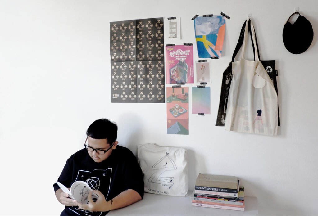
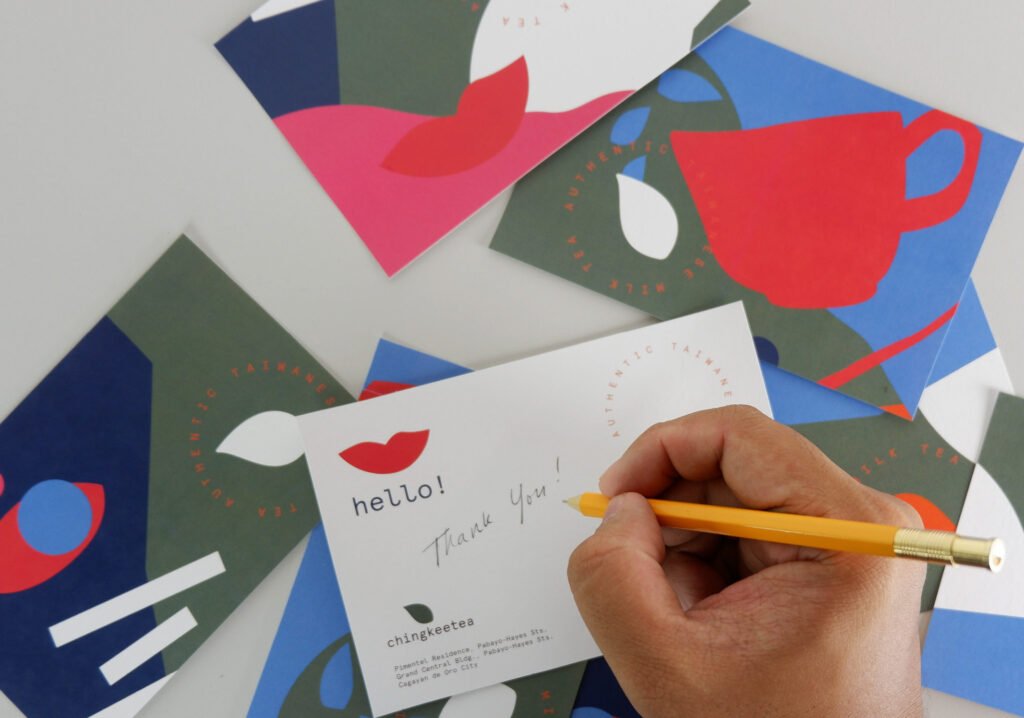
Hello! I’m Karl Adrian Aguro, a graphic designer from Bukidnon currently based in Cagayan de Oro City (CDO). I run Uncurated Studio, a one-man graphic design studio that focuses on brand identity and print design. I also have a hyperactive pug named Mambo.
How did you find yourself in the world of graphic design?
I got into graphic design while I was taking up an engineering course at Xavier University. Back then, I was part of a school program called STREAMS – Pathways to Higher Education where I was appointed as a communications head. I had to learn basic Photoshop and later on realized that I can do illustrations with it. Long story short, my interest shifted to graphic design and convinced my parents to enroll me in a design course at the University of San Carlos in Cebu City.
What about the creative scene in Northern Mindanao encouraged you to start Oro Design Conference? Why a design conference?
I went back to Cagayan de Oro in 2017 because I got a call from a university colleague asking if I’d like to join her company as an Art Director. I was fresh from university life and briefly worked in advertising in Cebu City. I thought it would be nice to go back to CDO and see if it works since it’s near to my hometown (just an hour’s bus ride!). During that time, the company was starting its design department and encouraged everyone to be involved in the local design community.
We initiated the first Behance portfolio review and was quite surprised by the turnout. It was also a great event to get acquainted with the network of designers in CDO. After the event, I talked to my workmates that time about the possibility of hosting a design conference not only limited to CDO but extend it to the northern Mindanao region. I decided to resign after 10 months and tried pursuing running a design studio (which is doing great, surprisingly! Haha!) so the idea of the design conference has been floating around for two years.
Since I am alone in the studio, I had to gather some designer friends and asked them if they would be down to pursue the event we initially planned. I’m very lucky to have very supportive and talented designer friends who collectively share and believe in the same vision we set for the conference.


“Our vision is to give a platform for local and national designers to inspire, motivate and further the knowledge of graphic design in Northern Mindanao.”
Can you tell us how it was like setting up the first installment of the conference in 2019? What were the challenges you and your collaborators faced?
When I was in college, I did have experience being in a team that puts up events. However, these events were usually small-scale and most of the time under the university organization so the venue and financial support were not an issue. This time was a bit different. We had to figure out the logistics, financial backup, marketing and most importantly the venue. Last year, our timeline got messed up because of a last-minute venue change which is something that we have a high priority of correcting this time around. We also had to seek help and advice from peers in Cebu who are experienced in organizing events like TedX, Ignite Talks, etc.
We noticed that most of the designers in the area were not as informed on the type of format that a graphic design conference has so we also had to strategize a marketing plan that will introduce and educate them about the event.
Ultimately, what do you want to achieve with Oro Design Conference? What is your long-term mission-vision for the event?
Our vision is to give a platform for local and national designers to inspire, motivate, and further the knowledge of graphic design in Northern Mindanao. The idea of a design conference is nothing new. There are a lot of design conferences held each year in different parts of the country. But no matter how many events are out there, there has always been that one common denominator: to bring people together to understand what it means to have good design and how it can influence a new generation of designers. It’s also important to encourage a healthy dialogue about how can design bridge cultural tradition and the future.
How did you curate your roster of speakers for the conference? Do you prioritize homegrown Mindanaoan talent?
The team is quite diverse, comprising of talented designers who do amazing motion, graphic, and sound design works. We all have different influences (both locally and internationally), and it’s always great to hear them share their points of consideration while we curate the speakers. We take time in curating a balanced roster of speakers, not isolating the region from talented designers around the country. (Hopefully, internationally!) We all have a common understanding that in as much as we want to highlight talented designers in the region, we can also learn a lot from designers in different parts of the country who are doing amazing and impactful works.


Photography by Van Erik Pacamo 

Photography by Christian Loui Gamolo
The country is undoubtedly filled with creative talent, but locally, the artistic field is often seen as an unprofitable calling in comparison with more lucrative careers. What is your take on this? Would you say Oro is established to help debunk this industry myth?
I think this is what makes design conferences great in general. Aside from the inspiration and the right motivation you get from the speakers, it also fosters an environment for insightful conversations with designers alike and gets advice from designers who make a living doing design. Living in CDO for three years, I’m a witness to its fast progress. I’m also aware of what putting up a design studio entails—having friends who also started theirs in the past. There’s definitely a short lifespan, but what made me still pursue it was the potential I saw. I was interested in what we can create and come up with.
A couple of years ago, businesses here do not see branding or design as an important aspect of amplifying their businesses. It has definitely changed over the years. There are a lot of companies hiring designers and illustrators nowadays which is really a good thing and a sign of great progress because CDO designers now don’t find the need to fly to other cities to get a job in the creative field.
As the lead of the branding studio working on Oro, what was the concept and persona behind the branding established for the conference? Who were your other collaborators?
It’s easy to slap a geometric weave pattern and brand it as a Mindanao event. [Which ironically is what we are doing this time around but done tastefully. We hope so!] I won’t deny, this was the case during my first initial brainstorming and exploration with my best friend and frequent collaborator, Nikko Tan, who is a talented motion and graphic designer. However, we have always seen this type of approach everywhere and there are actually a lot of other things that you can get references and inspiration.
Since the first installment is happening in CDO, we were inspired by its tagline being the “City of Golden Friendship” and the literal translation of Oro which is gold. We made sure that the gold finishing extends to all touchpoints from the ticket to the tote bag print. And because we wanted to introduce something fresh and new, we decided to make it type-based since it’s not often that you’d see an event around the area that is type-driven. We made sure that the typeface we’re going to use is wavy and organic to pay homage to Cagayan de Oro river flowing at the center of the city.


“As a designer, it’s always exciting for me to engage in conversations about the Filipino design identity.”
While the conference is still in its infancy, is there feedback and anecdotes that you wish to share that makes you hopeful about its future? Of the future of the Philippine design industry?
There were a lot of things to improve that we prioritized this time around. I’d say we all did great on the first one but as an organizer, there were also a lot of things that we wish we did. Everything was a learning experience for all of us in the team and I’m just really fortunate to be in a team that understands the vision we set for the conference, which is to bring like-minded individuals around the region and celebrate what we have here and start a conversation about things we need to nurture and improve. While it’s great to show support to talented local designers, we also understand that we can learn a lot from designers all over the country, even the world.
What surprising thing did working for Oro reveal to you about being a Filipino graphic designer?
In the early phases of marketing the conference, there definitely was an undeniable doubt on whether the event would gather enough participants and meet our expectations. In fact, we set our expectations low (Haha.) But we were quite surprised by the interest shown and seen a lot of talented local designers participate. It’s great to see them engage in discussions about the state of graphic design in the region. Does it make it Filipino? Probably not. It’s hard to put in a box or even pinpoint what makes Filipino design because historically, our country was a melting pot of different cultures having different foreign influences.
So as a designer, it’s always exciting for me to engage in conversations about the Filipino identity through design because I personally think it’s ever-evolving. The recent typography exhibit I joined at Escolta was proof of that. Typefaces were getting inspiration from the current state like traffic and commute situations, local street signs, etc. But if there is something that I’ve seen and witnessed during the conference [that stuck with me], it was the talent that shone through the whole experience and the good sense of rapport among creatives, which I think is something great to embody as a Filipino designer. More than the body of work we put out was the celebration of skills and talent in the pursuit of good design. •


Keep posted on future installments of Oro Design Conference by following them on Instagram at @orodesigncon. Follow Karl Aguro as Uncurated Studio at @uncuratedstudio
Originally published in Kanto No. 1, 2020. Edits were made to update the article.


