Interview Patrick Kasingsing
Portfolio Hanken Design Co.
Team Hanken: Marco, Hans Kendrick, and Arlene Pradil
Good day, Team Hanken! Arial or Calibri?
Marco Pradil, Hanken Design Co. typeface designer: Good day to you as well 🙂 Cool first question! As we deal with type every day, I think the best answer is—it depends on the usage. They are both good typefaces and have considerable readability/legibility. Arial’s letterforms have less consistency compared to Calibri having very consistent stroke widths. However, Arial’s performance in body text—especially online, is pretty good! Calibri is great for smaller typesetting because of its slightly increased letter spacing, which is good for small-sized text. For web usage, Arial is an excellent choice as it exists in most—or maybe all computers.
Sadly, with Microsoft ditching Calibri as a default font for its applications, we might not be seeing it a lot in the near future. So going back to your question…the one with the most usability and the fact that it is a grotesque sans serif (my favorite type), I choose Arial.
One rarely hears of local type foundries here in the Philippines which illustrates how young typography is as an industry locally; what drove you to establish Hanken Design Co.? Have you had prior experience working for other type foundries before setting out on your own?
I have always had an affinity for typefaces since I was a child. I would use different types of pens, markers, chalk, and brushes to do some lettering. At primary and secondary school, I was one of the bulletin board letterers. It felt really natural to do all of that.
When our son was much younger, we noticed that he is very interested and keenly observing letters and numbers. This inspired me to create my very first typeface and I named it after him (Hans Kendrick). I kept making fonts after that which are mostly inspired by life-changing moments and events that we experienced as a family. And with our (me and my wife) empowered vision, I founded a company called Hanken Design Co. (HDC) which came from our son’s first name.
I did not have prior work experience with a type foundry, nor did I have any formal typeface design training. I happened to have met good people along the way who gave me some guidance and help which led me to where I am now. I am very grateful for every learning and challenge that came our way.




What’s it like running a family-owned type foundry? What’s a normal day like at Hanken Design Co.?
Running a family-owned company is cool! I don’t think it is for everyone, but it works for us. My wife, Arlene, is the manager and I am the designer. We would start talking about improving a typeface or planning on creating a new typeface after being inspired by some random thought or experience. We may start discussing typefaces or designs in the car, over lunch in a restaurant, camping inside a tent, over coffee in a café, while traveling abroad, or while going for a walk. It is pretty much integrated into our life as a family. So much that even when our son writes some obscure word, it becomes an inspiration for a solution, an overlooked kerning pair, a brilliant typeface idea, or simply fuel to keep us going. Arlene would be reminding me of the schedule, deadlines, and proposals. She mostly talks to our clients, arranging legal documentation and font licenses. As for me, I am the one handling the design work—font design and development. I’d be working on updating fonts, developing new typefaces, designing type specimens, and communicating with other designers/agencies we collaborate with.
Being a small and lean company, we realized that decision making is easier, we can do pretty much whatever we want and with no higher-ups/bosses to get in the way of our mission. It feels liberating and keeps everything fun!
Typography is an exacting art and requires hours to perfect; aside from the husband-and-wife team are there other team members part of the foundry? How do you mentor your employees?
Aside from me and my wife, we have amazing people (most are also family) who help us with the business side of things. In the design aspect, we are grateful to have collaborators who have tremendous typography talent and skills.
I honestly have not mentored anyone intentionally. However, if I have—I would have told them how I approached problems, talk about new ideas on how to craft type in different ways, pointing out the right industry terminology, and always urging them to have fun doing it. So far, I think I have only done most of that to my son who was able to use Glyphs and make his own font at age seven, and to my wife who does not have any design background but can now engage in conversations about fonts.
What would you regard as your metrics for success in the business? Any anecdotes or memorable feedback from users of your typefaces that you’d like to share?
Success is a state of mind. Some might say that success for them is making a lot of money selling fonts, being super popular on social media, or being influential enough to partake in political and social movements. However, our vision for success is quite simple—seeing our typefaces being used and knowing that we were able to provide a better reading experience is what we regard as being successful!


Our issue is dedicated to the function of beauty in various creative fields; Beauty comes in many forms of course, but what quality or characteristics of typefaces can make you stop in your tracks? What for the team are the hallmarks of great typography?
Type is beautiful for us when it fulfills its function in communicating through language while leaving a sense of intellectual satisfaction that only our brains can understand. A typeface that can be easily read and elegantly rendered will definitely stop us in our tracks. The characteristic of great type design and typography for us is unobtrusive elegance. Clear and easy to read type that leaves a feeling that the reader of the written work would only attribute to the message and not to itself.
There are the workhorse fonts and the fonts meant to be the star of the show; your body of work contains both in equal measure; which do you have the most fun doing? Which are more challenging both in aesthetic and technique?
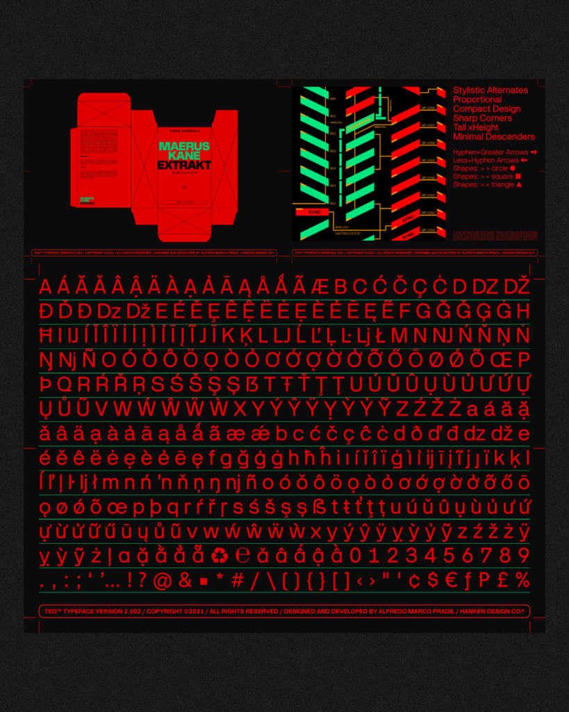
I had the most fun with workhorse typefaces. They are like puzzles able to perform in different situations and conditions. I am not saying that designing something that is imposing, obtrusive, and decorative is not fun or challenging—display type has its own set of challenges. But designing typefaces that will be consumed for a long time (long-form reading) presents a challenge that is quite intriguing. A challenge to figure out is how to optimize the reading experience, to improve the darkness or contrast of a text box. Creating a balanced text spread without a character or letter standing out as a result of unbalanced stroke weight distribution is a great challenge and puzzle to solve.
With workhorse typefaces, the goal is to forge synergy and interconnectivity between the characters, more than having a consistent form across the character set. The characters may seem inconsistent up-close but together they form a beautiful connection that makes the printed word feel natural.



What would you say are the must-have skills budding typographers need to develop to succeed?
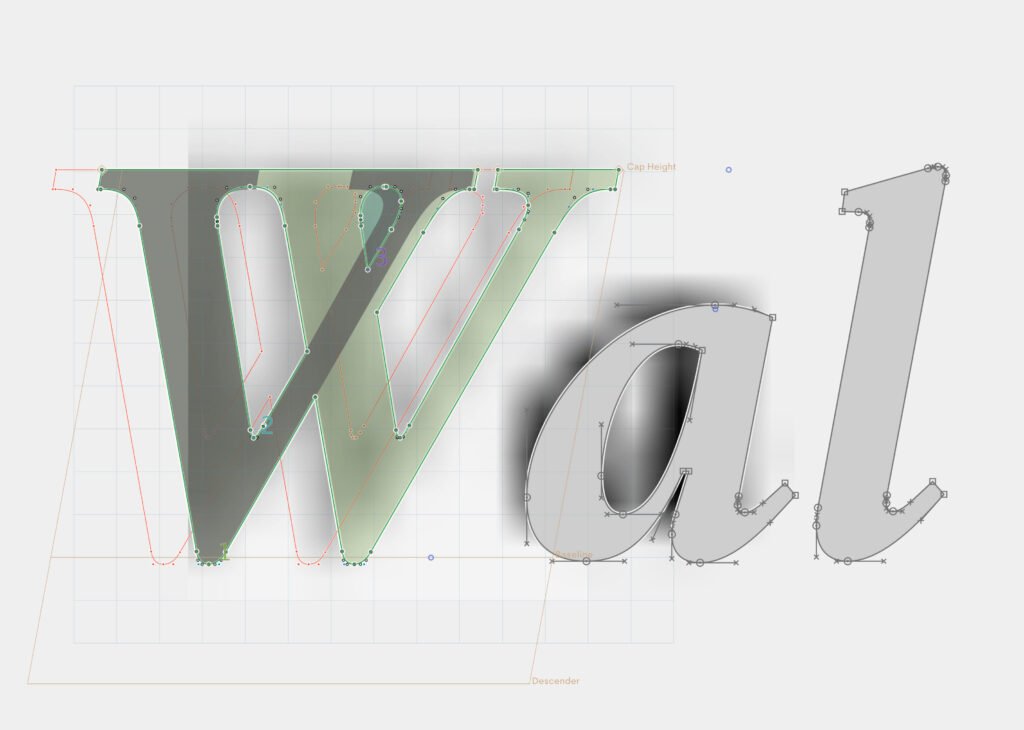
Observation. That is the most important skill that I think needs to be developed in type design. How the ink fills the “ink-traps,” to the amount of linear contrast needed to make type readable at small points is up to us designers to decide. All of those points came from observing how the letterform is displayed, printed, distributed, and consumed. The drawing follows the solution we imagine from observation. The more we observe, the clearer the solution 🙂
While there is a lot more attention being given to local typographers now, there’s still so much to do before it can grow as an industry; what would you say are the things typography practitioners need to push for to assure growth and wider recognition by the public?
A lot of very talented local designers are getting massive attention and we are happy that this is finally happening in the Philippines. Growth and recognition will happen for us the more we increase the quality, usability, and viability of the fonts we make. The Swiss did not make typefaces based on being Swiss—they just made something that they think works and looks beautiful. After the first typefaces, they were copied and replicated by foundry after foundry—evolving, improving, and eventually creating a national collection of similar-looking typefaces that were attributed to their makers—and were profiled as Swiss-type.
Regarding the assurance of growth and recognition…two things come to mind which are:
First: I think we need to strive to create the ultimate typeface—something that provides a solution to a problem…an invisible problem. Is that going to be a sans serif? serif? display? monospaced? Who knows, maybe we will come up with a new category/type class. Let us urge everyone in our country to use typefaces made by local designers and get our voices heard in the global type design community.
Second: Collaboration. This is very helpful especially for designers who are new in the industry. Collaborations are a way to gain more experience, learn from other disciplines, and create new connections. Next time you think of a project, and you are missing something that another designer already has experience with, just ask—team up and work on the project together! An example of some collaborations we did was the Mobilo animated typeface project. I designed the Mobilo typeface with Animography (Jeroen Krielaars) and 236 animators around the world. The typeface had to be designed in such a way that it would be easy for the animators to break it down and create cool animations. Each animator brought a single character to life in his/her signature style. The result is a wide variety of styles and techniques. Working with other designers in a different or even a relative field is very enriching and beneficial to one’s career— we highly suggest it!



Notably, you give out a lot of free typefaces from your website; why do you do so, and how would you say this is good for business?
In business, I believe that financial gain isn’t always the most important. We offer some of our fonts for free because we want them to be accessible to more people. Being free does not mean that they are of lesser quality than the premium ones as we put a lot of effort into creating them as well. It is very rewarding to see our fonts being used on posters, books, signages, apps, etc.
I can say that it greatly helps the business as we receive valuable feedback and suggestions from more people who have used our typefaces. These give us a lot of insight into how we can better develop our fonts.
As a young industry, font pricing is a dicey topic, and more often than not, locally produced typefaces are still priced lower than foreign counterparts; what is your stance on this, and what do you think can be done to motivate local practitioners to price their work competitively and at par with global standards?
Tricky one indeed as there is no pricing standard with fonts and we can always price the fonts as high or as low as we want. Some companies that have been in the international scene for a long time now still keep their fonts low cost while keeping the quality high. However, if we are going to be sensible in approaching the global scene, we should at least match the completeness and quality of the fonts that are available before we start raising the price because if customers will have to choose between quality vs price—lasting customers always choose quality.
What would you say are the design principles that underpin Hanken Design Co.’s body of work?
When designing typefaces, readability and usability are the two things that we consider the most important. Even when creating display typefaces, we make sure that we don’t sacrifice functionality for the sake of making an obvious visual relationship with what inspired us. We want the readers, typographers, and other users of our fonts to have a seamless experience as much as possible. And Frank Lloyd Wright once said, “Lack of clarity is the number-one time-waster.” •


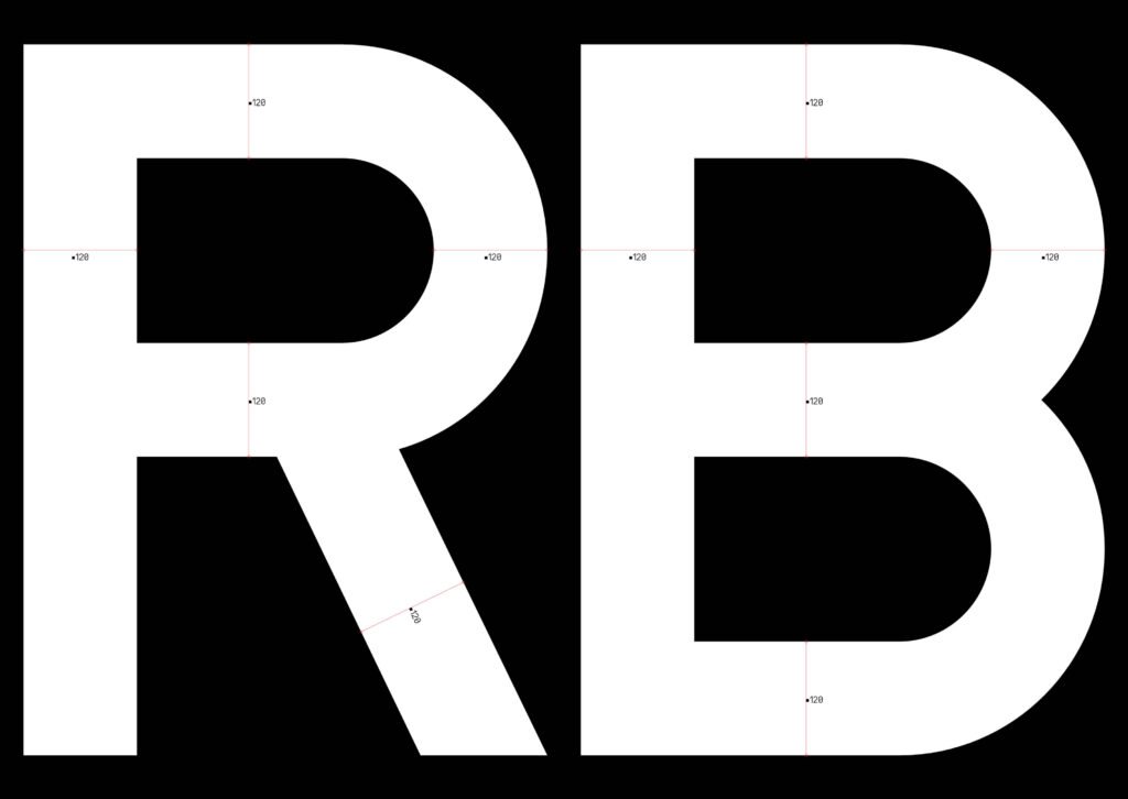

Fresh type handcrafted locally at hanken.co


