Interview Patrick Kasingsing and Gabrielle de la Cruz
Images Jeric Rustia (Everything’s Fine)
Kanto: Nice to talk to you again, Lando! Can you walk us through all the furniture pieces you designed here at Everything’s Fine?
Lando Cusi, co-principal of GRAAR: Hi Patrick! Thanks for your time. All of the furniture here at Everything’s Fine, from the shelves to the tables and benches, was designed and fabricated with CNC (Computer Numerical Control) in mind. Initially, the owners, Katrina [Santiago] and Oliver [Ortega], were deciding on whether they would ask us to customize pieces for them or to just purchase pre-made, minimalist shelves.
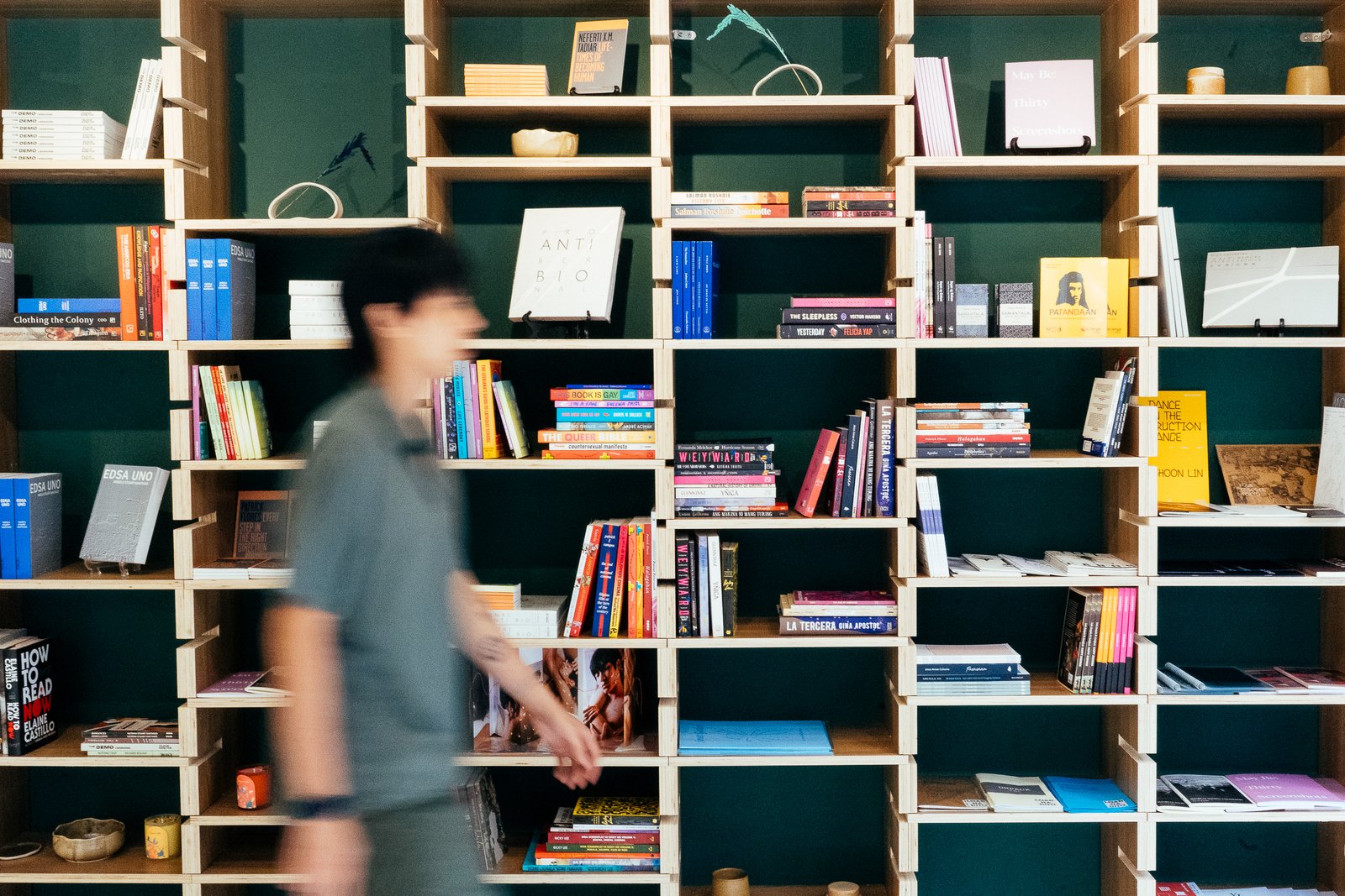
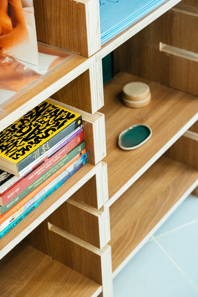
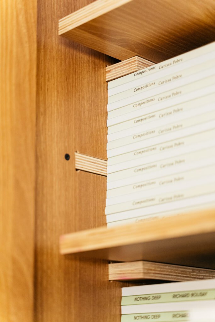
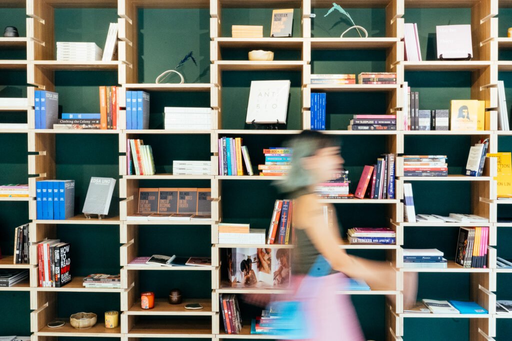
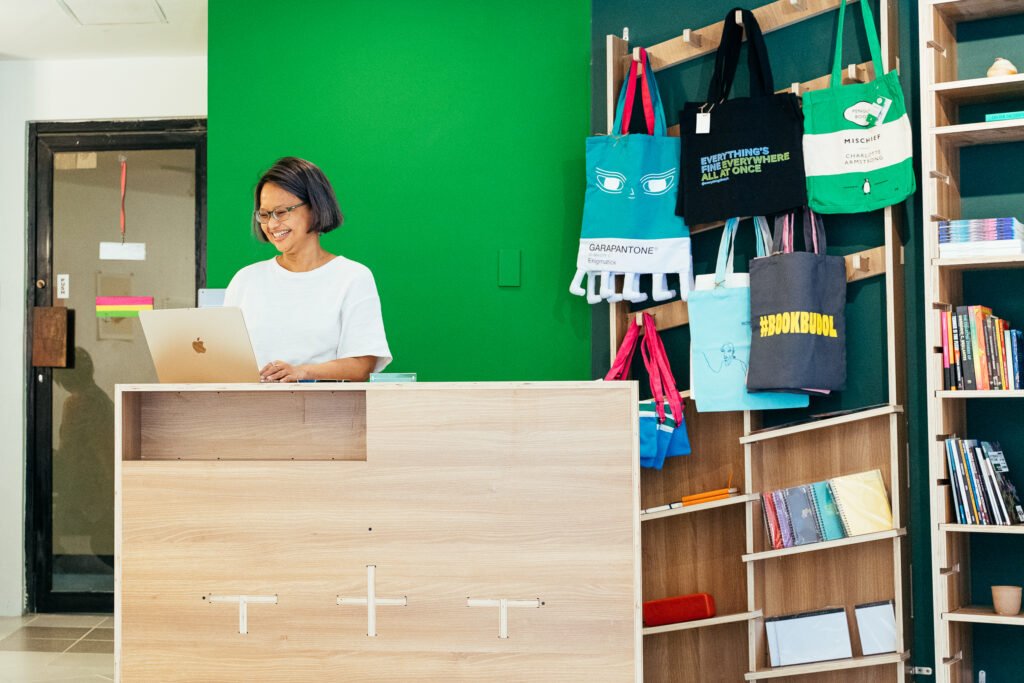
Our designed pieces proved to be a more convenient choice as they were able to save on costs due to its modular components. The flexibility of each piece allows them to rearrange and switch things up every now and then, creating new pieces out of the same components. The clients recently shared with me that they play with the leveling of the main bookshelf at least every week, allowing guests and users to see something new and fresh every time they visit.

Did the owners specify what furniture pieces are to be fabricated? Or did you also offer suggestions on what to build for the space?
Cusi: When the clients first approached us, they only wanted shelves and storage cabinets. Those were the only requirements. When they saw how things were progressing and liked what they saw, we were asked to design a counter and even mobile bookcases. The moveable bookcases are the same ones they use for pop-ups in events and fairs.
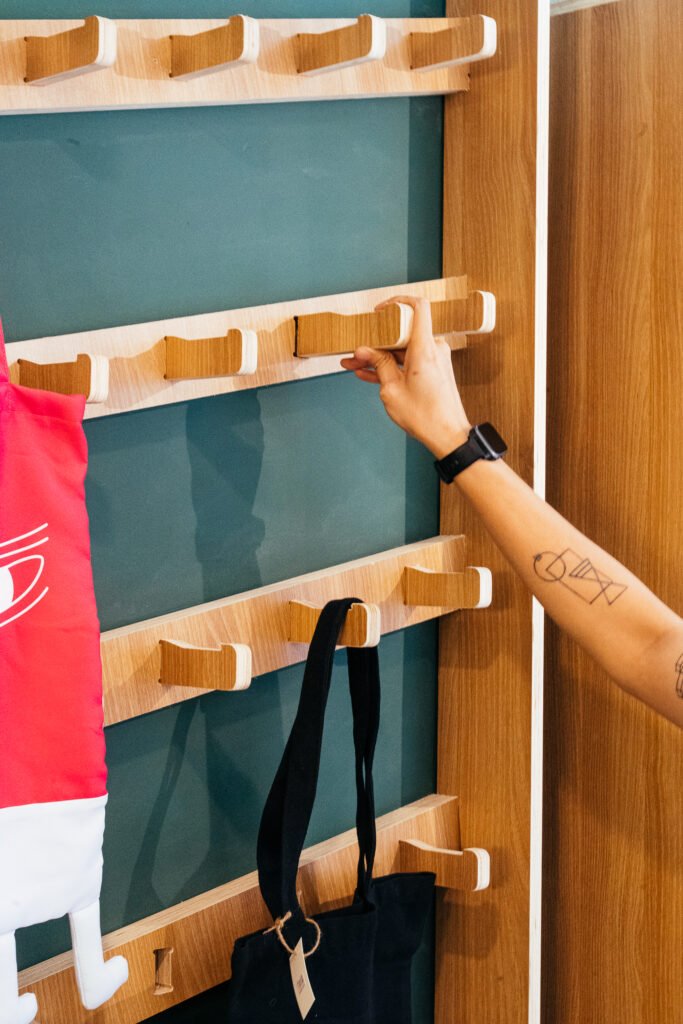
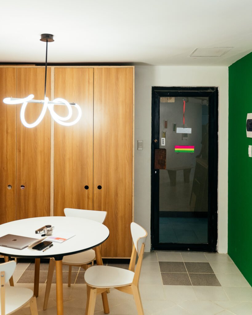
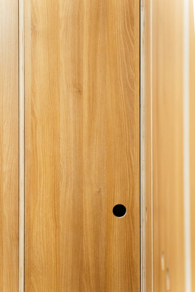
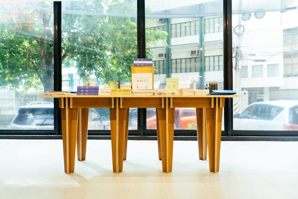
In terms of the overall design, we made all the pieces in the same wood finish to make everything look organic and neat. Nearly everything is customizable, as requested by the client, so they can personalize or alter the pieces once in a while. This meant having movable ledges, legs, and surfaces. For example, the inclined bookshelf here was inspired by a photo they saw online wherein the books were inclined. We took after the effect they wanted but gave it our GRAAR touch.
Apart from the bookshelf design you mentioned, were there other specific design elements that were inspired by the owners’ vision or the bookstore’s desired branding?
Cusi: In terms of their overall vision, I think it’s more on flexibility. Their idea for the space is for it to be ever-changing. They want to host events such as exhibit openings, workshops, and other events here. So that’s how we approached things. We worked to make everything movable and not fixed to walls or the floor to enable the multifaceted use of the space.
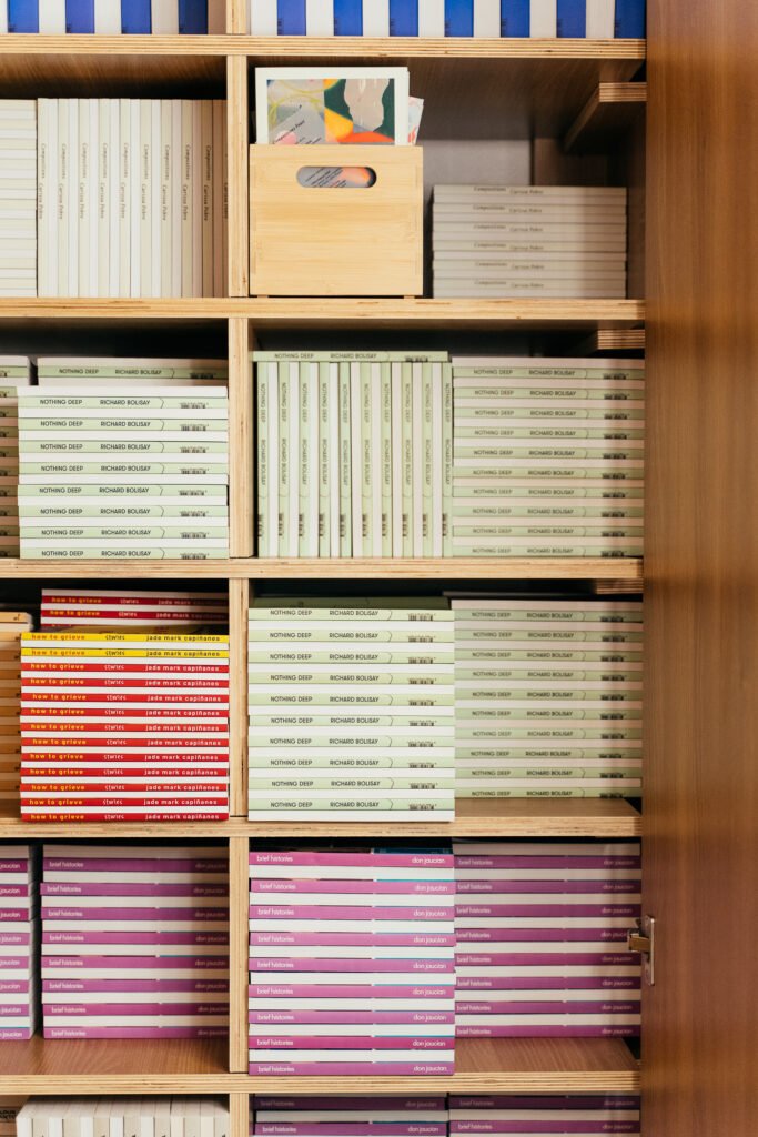
They also mentioned to us upfront that they have green walls. Early on, we were debating if we wanted to add a backing to the shelves, but when they told us about their wall color, we decided to leave that out as the wood textures complemented the forest green shade of the walls very well.
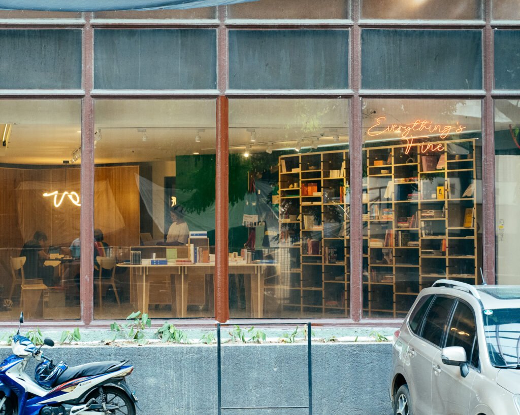
Everything’s Fine is not just a bookstore. Books may be the anchor but it is a community space that also serves as an art gallery, hosts workshops, and others.
What would you consider your biggest challenge for this multi-faceted space?
Cusi: This was our first CNC project where we weren’t the actual users. For our previous projects, we were quite okay when things didn’t turn out as we planned as we know we can still adjust. But here, we were designing for someone else. We were nervous as to how things would work and fit together.
One challenge was to work with the weird, angled configuration of the walls. The space used to be a convenience store hence the size, but we were able to make it work through modular pieces.
The timeline was also quite tight. From our initial conversation to the actual installation, we only had less than two months. Still, we enjoyed the experience. It also helped that when we presented the initial design, the clients were very receptive and only gave out minor revisions. They were also clear in what they wanted so we were able to deliver right away.
One thing we also discovered as we were fabricating the furniture was that there were components that were a bit hard to find so we had to adapt and improvise at times. A lot of the wooden parts look the same at first glance, but they are not. We spent more time looking for the right parts to assemble than we did assembling the furniture!
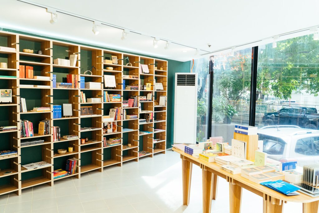
I like how there’s a balance of sharp and curved edges in the space. The rectilinear and edgy pieces are countered by the round-edged tabletops and benches. It’s the right balance of simple but also playful.
Cusi: Yes, and you’ll notice, particularly in the case of the bookshelves and table that the pieces don’t take the spotlight away from the books. They were designed to physically enhance the space while highlighting the books.
I also see some non-bespoke pieces here, but their presence does not jar…
Yes, it’s actually great how even the furniture pieces purchased from outside work well with the bespoke ones. For this project we felt how we had to put our egos in the backseat and concentrate on design that works hard and is a team player. If you look at the shelves, we actually tailored the spacing and sizing of the components to accommodate the standard book size Everything’s Fine specified.
Can you briefly run me through your experience working with CNC? What appealed to you about this digital fabrication approach?
Cusi: My interest in CNC started in 2019. I joined the Design Center’s “Digital Artisans” program back then, where they were teaching designers about digital fabrication techniques. Aside from CNC, we were also exposed to 3D printing, laser cutting, and the like.
CNC particularly stuck with me because I immediately found an application for it when we were starting Studio Kapitbahay. Our grid shelves in Studio Kapitbahay were actually our first foray into CNC designing furniture. Katrina and Oliver saw these shelves and wanted something similar, which led to our collaboration.
What I like about CNC is that it is a lot like woodworking without the physical labor. You get to spend more time on the computer than actually cutting your pieces. I wouldn’t say it’s easier; it’s just a different approach to furniture design. I personally don’t have the tools or even the physical skillset to perform woodworking the traditional way, so I like how CNC allows me to execute furniture design despite my limitations.
For the uninitiated (like myself), can you give us a brief run-through of how furniture pieces can get fabricated through CNC?
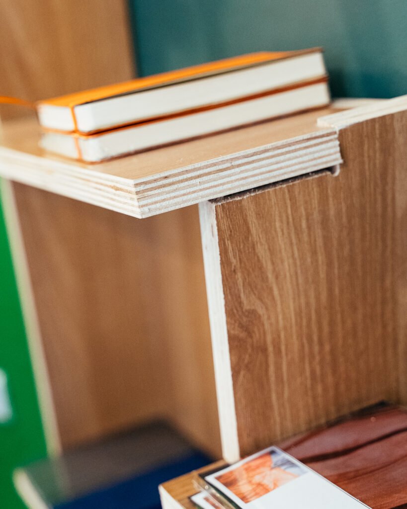
Cusi: It starts off with how you design any other furniture piece. You look for forms and shapes. CNC comes in when you start to think of how everything will fit. You must think about the slots, the interlocking mechanisms, and even your tolerances so that you can piece things together. Admittedly, you also need a bit of technical or CAD knowledge because you’re basically drawing what you want to cut physically later.
I would encourage designers who are used to working with vector files to try this. Essentially, any vector file is a path that your router will follow. You can draw any vector shape and that shape will get cut exactly how you draw it. That’s what I like most about it—how accurate it can be, and how one can go wild with the shapes.
One other thing to mind about CNC fabrication is being mindful of tolerances; you have to bear in mind the optimum gaps required for pieces that are built to welcome customization, or those that require a tight fit for components for structural integrity.
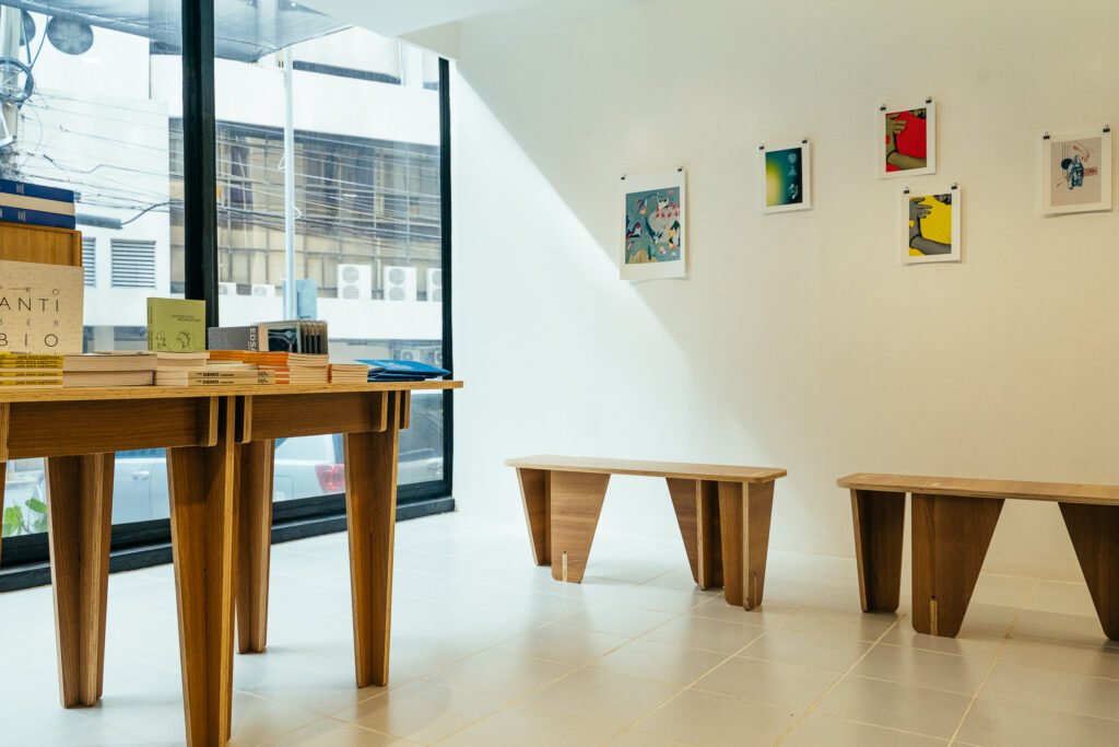

You worked in Japan for a while, and I have to say that it shows with how you designed these pieces and the look you gave them. They exude Japanese Zen simplicity but with a whimsical slant because of the asymmetry…
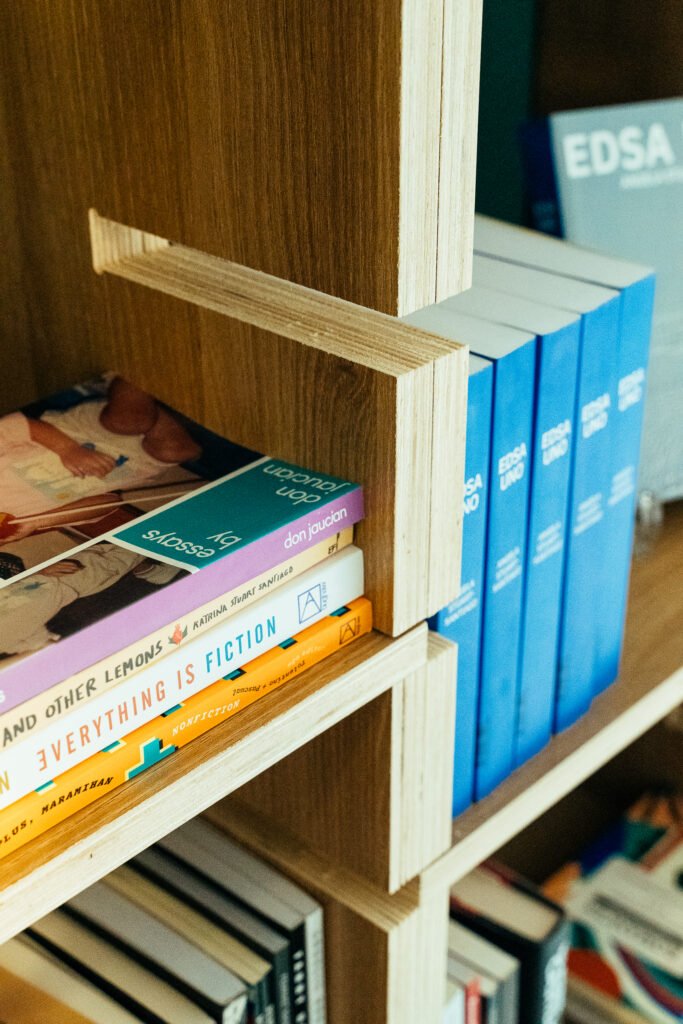
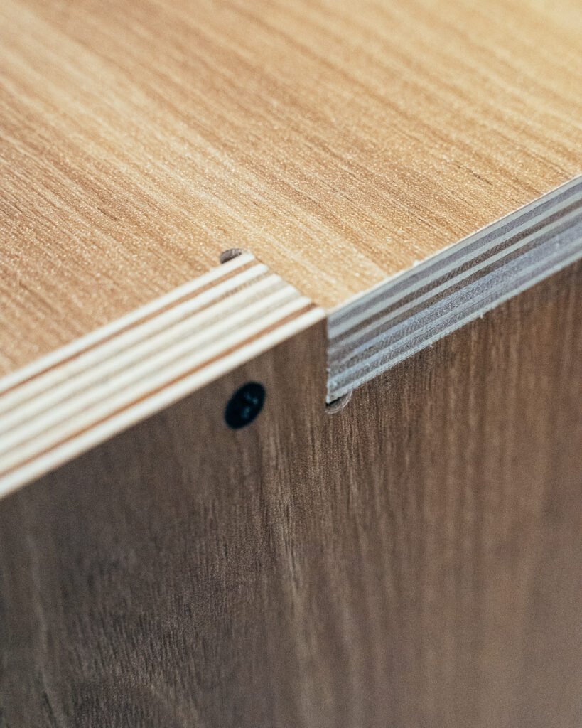
Cusi: Yes, have always been a fan of Japanese design; I like it when things are clean or minimalist. I wouldn’t shy away from crazy shapes though as you’ve seen in our previous work. But, in terms of material, for example, I like sticking to one. If I can avoid hardware, I do so. I think that comes from how much I’ve always been a fan of Japanese design and how they have always been big on joinery.
Ah yes! the Japanese has made an art out of joining different components together! And what makes the Japanese approach different is that the connections are exposed and celebrated.
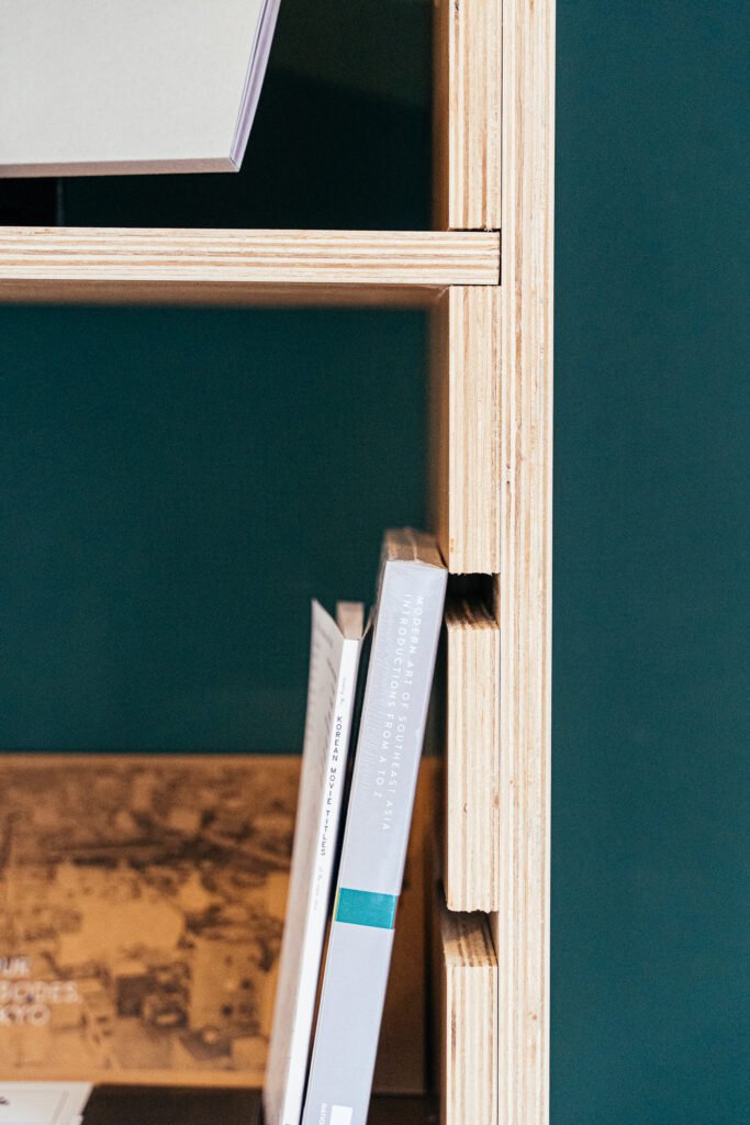
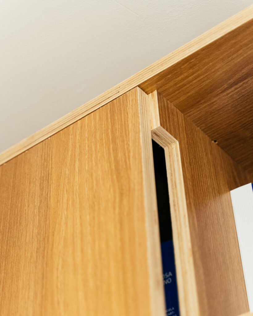
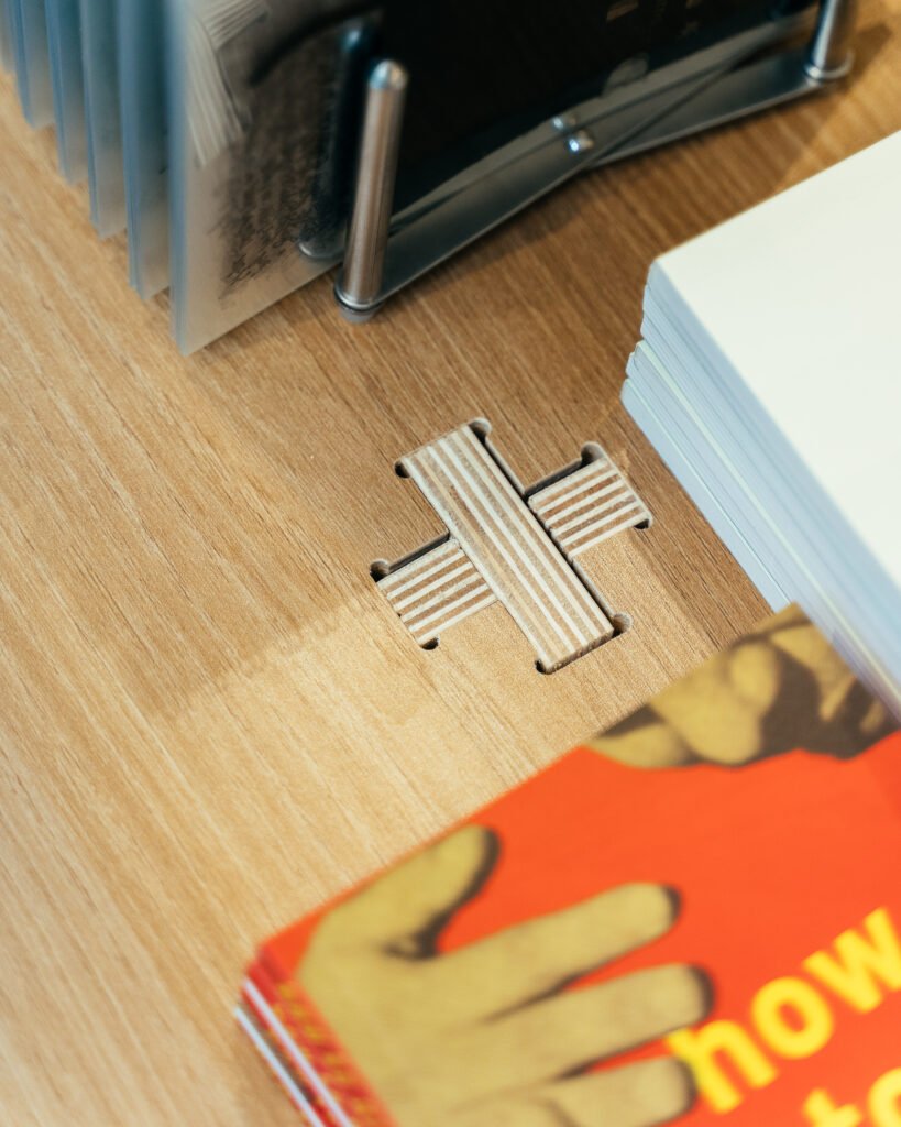
Cusi: Yes! I like showcasing how things are put together. I want the process of forming each piece to be easily understandable, contrary to how connections and other configurations in furniture are often concealed. I like trying to, sort of, reverse engineer how something is built or assembled.
Exposing how the shelves fit together becomes an added aesthetic. It allows you to play around with how it can be assembled, or to adapt the shelf to the object it holds.
Displaying honesty and truthfulness in how things are put together…there is beauty in that!
Cusi: Indeed! If you can appreciate how things are built or how they are put together, then you can see the amount of effort that goes into creating something and that adds to an object’s aesthetic value for me.
Was it challenging designing for a physical bookstore, especially in our so-called digital age?
Cusi: For me, the biggest challenge in designing for a physical bookstore is how you’re going to present something. How are you going to show your product? Our generation is used to big book businesses or chains, far from the setup in smaller, independent book shops.
In terms of the available space, I think the flexibility of the shelves helped to achieve the goal of being able to highlight the books in a different way than usual. This also allows other items that are not books to have their own spotlight.
What else? This isn’t more of a challenge but an observation in terms of the target market. One interesting insight we had is that Gen Zs may be bigger on physical books now.
Interesting! Why do you think so?
Cusi: Gen Zs grew up having access to digital technology. My guess is that they are curious as to the traditional way of doing things, that certain nostalgia of looking for something that was a thing for previous generations.
Right now, there are young groups that are into cassettes or CDs, even long-playing records. I guess physical books or even bookstores fall under the same category.
Yes, and I guess it also boils down to the intimacy and relative lack of distractions reading a physical book brings; I mean, you wouldn’t have to worry about notifications getting in the way or distracting you from a good chapter. A physical book also demands your undivided attention, which must have been refreshing to young people used to being bombarded with so much content and imagery on their screens.
Cusi: Right. It’s the intimacy, the immediacy but also the tactility. There’s texture. There’s the smell of a new book or the feel of the pages.
Now that we are in the topic of books, the owners of Everything’s Fine are far from being your only clients. The books are also effectively your clients. How did the experience, if it did, enhance your relationship with books or reading?
Cusi: To be frank, I’m not really a bookworm. I do consume a lot of Manga comics! Working on this project, I have learned to appreciate the art of what they do at Everything’s Fine. They are very pro-creative in terms of how they curate their books, carefully deciding on which books to carry and which local authors to build and nurture connections with. They read the books and make sure they like each of them before they decide to bring them into the store.
They also carry a lot of art books like zines that highlight authors from different regions of the Philippines. I just appreciate their approach. If you think about it, most books carried in stores are more about the commercial and less about craft. It makes me happy that there are platforms like Everything’s Fine ready to support creatives in their own pursuits of beauty, be it through the printed page or art.
I am just happy to have been given the opportunity to support such a cause; you can say I’m a design narrator of sorts, helping the client communicate what they want to say to users of the space.
What would you consider your proudest achievement for this project?
Cusi: I am very appreciative of my clients’ response. Katrina and Oliver were really happy and grateful with our work that it has spawned new collaborations such as what we had during this year’s Purveyr Fair. We’re planning another pop-up and booth with them! How these collaborations just organically flowed out of a good working relationship, I think that’s what I’m most proud of. •
