Interview Danielle Austria
Images The Unusual Network


Tanya Wilson, global PR and comms manager, welcome to Kanto. Great to have you on our pages. How are you feeling today?
Great, thanks! I just had a great conversation with a wonderful teacher as part of my design thinking-led research for EYEYAH!
I was introduced to The Unusual Network at the 2019 IMMAP Digicon, where you were a speaker. You have an incredible portfolio that we will unpack later. But for those who are still strangers to your work: a quick origin story?
Steve [Lawler, co-founder] is an artist (Mojoko) and creative director, and my background is in PR and communications. We started working together in 2015 on a global campaign for Tiger Beer that involved highlighting some of Asia’s best-emerging artists. We soon discovered that many other brands wanted artists to create work for them, and that’s where we found our niche. We launched Kult Gallery – Singapore’s underground gallery that sells the work of young Asian artists in 2018.
The Unusual Network is the coming together of our expertise and network to create artist-led experiences and content for brands, government bodies and the education sector.
The Unusual Network is based in Singapore but has done plenty of work around Asia. What are your observations on how design is approached or accepted in different parts of the region? Are there common threads or mainly differences?
We find that places like Indonesia, Thailand, Philippines have a much greater appreciation of the visual arts, design and photography than we do in Singapore. It is quite limited, possibly by the size of the population but also by fault of education. Having said that, there are so many great artists here and from all over the region, and many of them are friends.
We are a network built up from community. Our previous magazine, Kult, connected us to hundreds of great underground artists and that network continues to grow as we travel and meet friends within the network.



Nowadays, design conversations and output are centered on digital. Most of your work are ambient, outdoor and experiential. Is this a conscious decision on your part?
There is something magical in the physical representation of great work. It can be digital in nature, but when applied onto a huge outdoor screen, or in an exhibition, it suddenly takes on a life of its own and can be appreciated as you would a painting in a museum. We feel great work should be taken out of the digital realm as celebrated in the “real world”.
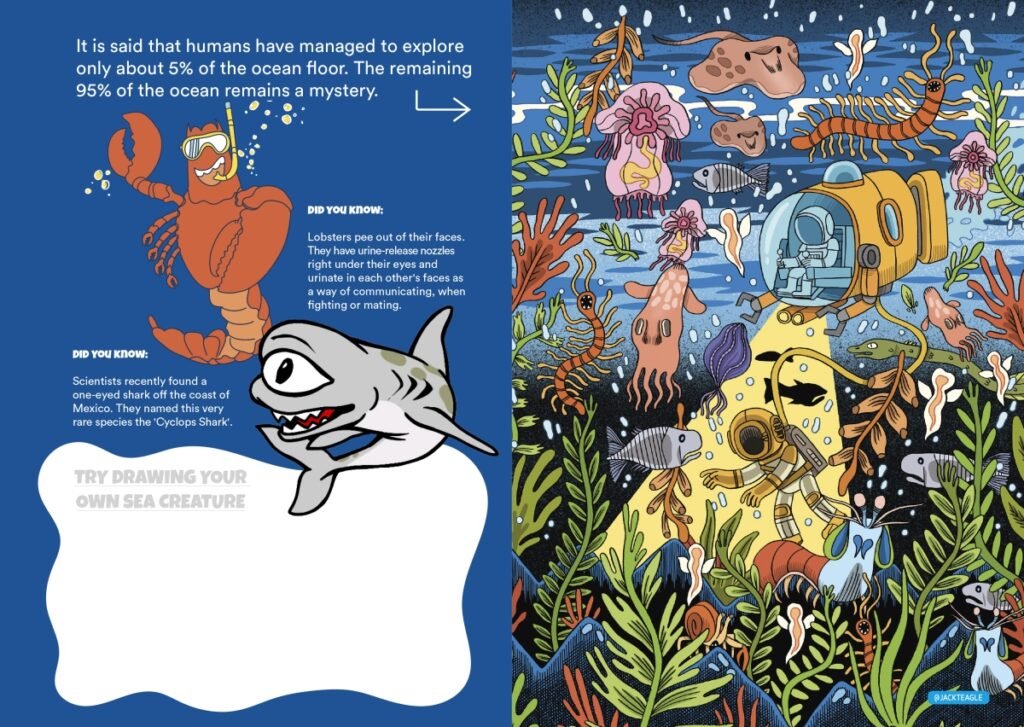
Let’s talk about EYEYAH!. It’s a series of ad-free activity books that introduce social issues to children via art and design. What sparked the idea?
We published Kult magazine for many years and see the way it still lives on bookshelves and in ad agencies as a source of reference and inspiration for many years later. We wanted to apply this same approach for children—exposing them to high-quality professional graphic design and illustrations and demonstrating the power of creative thinking in action. Being parents to young children definitely sparked the idea.
How important is it that children be exposed to (and not sheltered against) the problems of the world? How young can they be to start education on heavy issues like internet addiction and waste?
EYEYAH! tackles topics that we feel should be part of every school curriculum. Starting from primary school, children can start to learn about almost every topic and not feel “heavy”. For example, did you know that primary schools are some of the biggest producers of waste? What can you do in your school to reduce waste? Those are some of the questions that EYEYAH images are used to spark discussion about.
We feel every child should be exposed to media literacy education, starting from primary school. We have toolkits to provide teachers with ongoing age-appropriate content to spark discussions and learnings about many issues.
We’ve come across many designs for kids that seem to have come out of the impression that all we have to do is “dumb down” what works for grown-ups, but kids are actually a lot smarter than we give them credit for. How should designers approach content-making for kids? What’s important to get right, and where can we be more open to taking risks?
Not sure it’s about risk-taking, but we certainly find it harder to make work that truly engages a young audience. Kids are exposed to so much garbage these days that they become quick at filtering quality.
Try and make the content appeal to as many ages as possible. This means you need to work a bit harder but chances are if a teen likes it, then a pre-teen will too. Universal good design is a lot harder to make than hyper-targeted content.

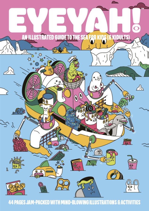
Cover of EYEYAH’s the Sea issue © The Unusual Network 
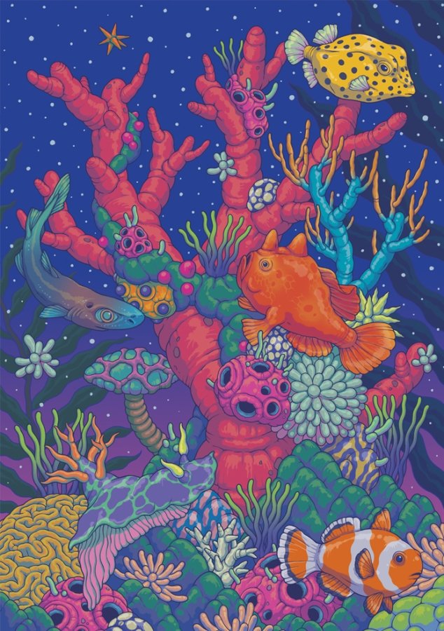
By South Korea-based Bang Sangho for the Sea issue © The Unusual Network
For the grown-ups in the room: What can we learn from kids when it comes to social awareness and action?
Use your imagination. Have an open mind. Have crazy ideas, draw them. Be brave, and have the confidence to express yourself!
We’d like to end the interview with a cliché question. Can art and design save the world?
Absolutely! And it already has. Have a look at our Trash issue for some examples. •
Empower the youngins with art and design; download and buy EYEYAH! via eyeyah.com.
The story first appeared in the Action issue.
