Words Patrick Kasingsing
Images Greg Mayo for PXP Design Workshop


It started with an Instagram post
My visit to the dermatological clinic With Grace began with a compelling Instagram post by the Poblacion-based PXP Design Workshop, much like my discovery of their earlier project, House of Screens. Greg Mayo’s captivating photography highlighted the curvilinear design language of the space, adorned with an earthy palette of grey stucco, warm woods, and creamy marble, evoking the tactility and suppleness of human skin. Glimpses of alluring vignettes: a curved, marble-countered alcove for skincare products, a plush corner featuring a custom ribbed sofa, and the striking sight of an indoor tree bathed in light under a dome, piqued my curiosity but left me wondering about the space’s broader context and intent.
I reached out to PXP co-founders Patrick Espiritu and Spencer Sy for a viewing, drawn by how the imagery recalled the context-driven, experiential retail spaces of Australian skincare brand Aesop. The images suggested a space designed for lingering and respite, far beyond a mere transactional experience.
However, upon stepping inside, it was clear the space was neither as expansive nor idyllic in context as the photos suggested. This is not criticism but rather a testament to PXP’s adept handling of the constraints of size and setting. The intimacy of the clinic—tucked into the corner of a mall, no less—led to a deeper appreciation of PXP’s ability to turn limitations into opportunities, transforming what could have easily felt confined and humdrum into an an architectural experience that is layered and stimulating.


From breakouts to breakthroughs
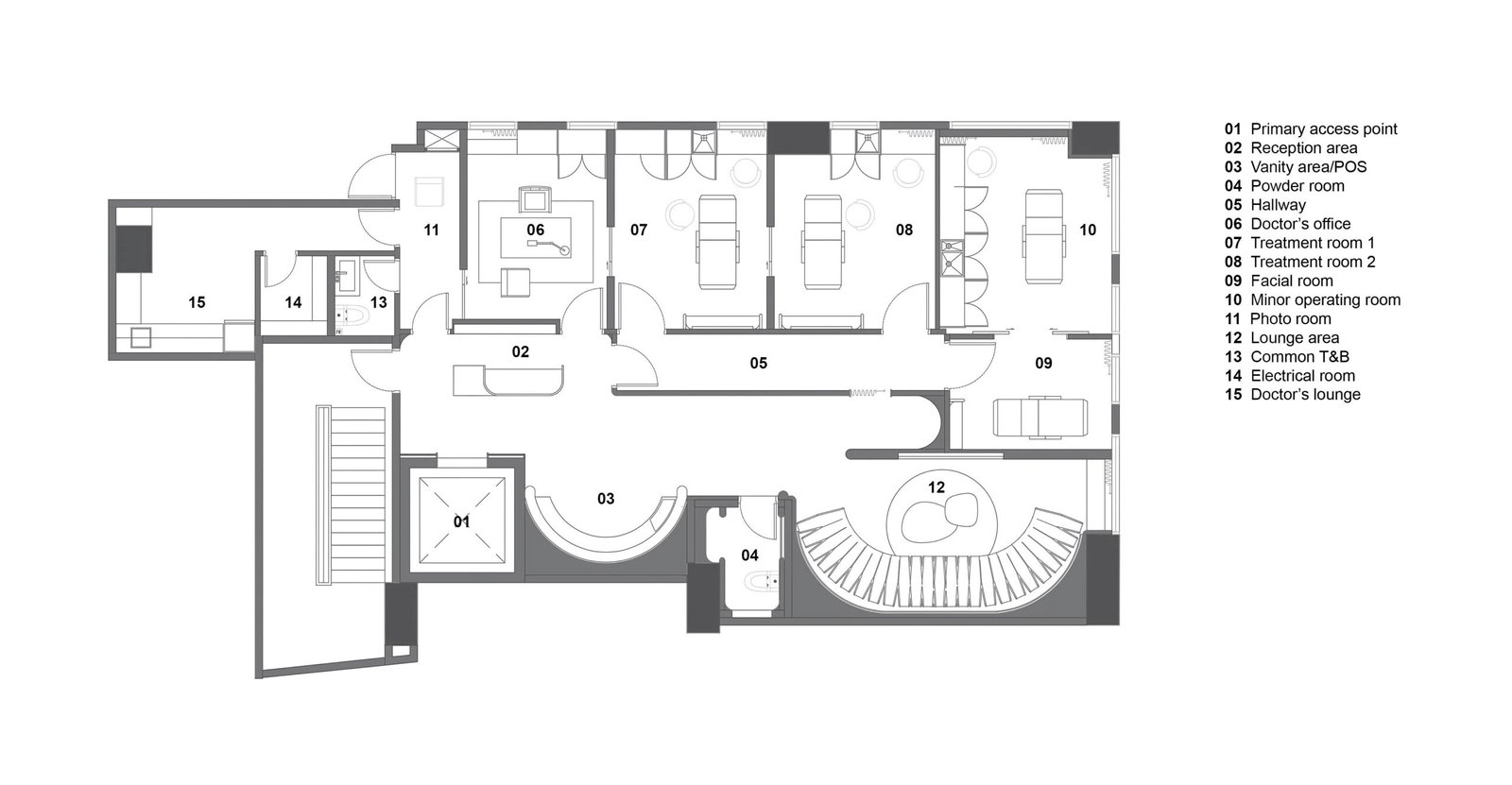
With Grace, a clinic founded by a mother-and-daughter-in-law duo, occupies a compact 141.28-square-meter corner space on the second floor of an upscale mall in Makati. This was not the PXP team’s first dance with the client; they had previously worked on a residential fit-out for the daughter-in-law and her husband. However, this project was distinct in its retail-medical blend, with a focus on natural skin, wellness, and body care. While the familiarity helped, the typology shift from residential design to healthcare required the designers to adopt a thoughtful, sensory-driven approach that was more ‘urgent,’ given the distinct functional and experiential needs of a dermatology clinic.
Aside from the modest real estate, the space came with a laundry list of challenges distinct from typical derma clinics in The Philippines, which often lean towards gold, glitz, and glamor. While keeping to an upscale brand, the clients wanted a more natural, calming environment for their space, one whose lavishness rests in spatial poetry and organic textures, far from the de rigueur luxury trimmings of its local skincare peers. “The clients wanted a space that encourages a feeling of release and respite, a place where you can be comfortably yourself, a ‘sanctuary’ in the middle of the city,” Espiritu shares.
The clinic’s size and lack of a traditional storefront, coupled with an array of windows facing uninspiring views (one side faces the hind façade of a neighboring building), meant that while available, natural light was severely limited. Coupled with a low ceiling height of 2.3 meters, a hardworking lighting strategy was necessary to attain both clinical functionality and a spacious, inviting atmosphere.
The entry experience is also admittedly abrupt, as the elevator deposits visitors directly in front of the reception, giving the design team, led by PXP interior designer Jemima Beatx Almirañez, little room to transition into the space gradually. This makes the resulting design even more admirable, as one’s entry lands gentler and, by effect, feels more welcoming, thanks to the calming tones, organic materiality, and curvaceous sweeps that instantly mask the space’s orthogonality and narrowness.


A journey of wellness through light and touch
“The journey starts from outside,” Louie Kiu, PXP project architect, tells me as we step off the elevator. “You’re coming from a concrete jungle, through this cramped, dark space. Then the doors open, and suddenly, you’re in a bright, warm environment filled with light and natural textures. The contrast is immediate.”
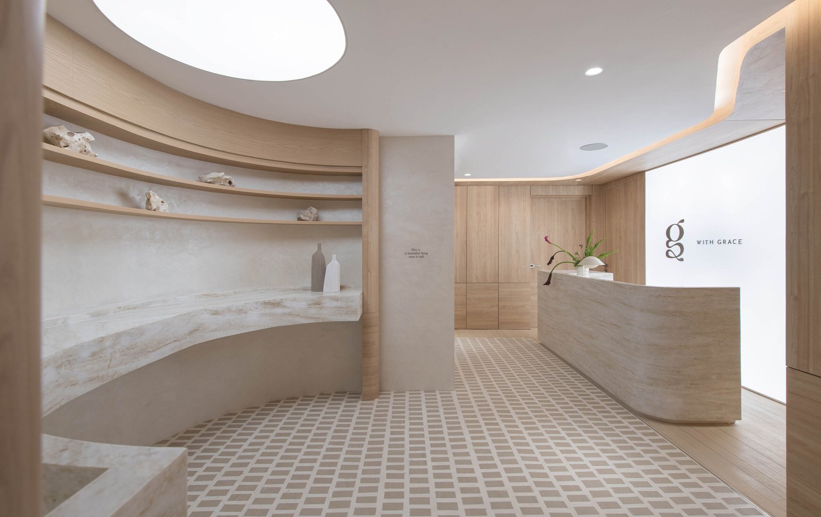
The reception area is an open invitation. An illuminated wall panel featuring the clinic’s logo emits a soft, ambient glow across the space. The eye is drawn to the marble-faced front desk, the vigorous swirls of its veins and chamfered corners leading your gaze further into the space. “The curves act as both prompts for pause and play,” PXP architect Karizze Vendivel explains, “We wanted the architecture to feel alive, like it’s breathing with you.”
As you progress through the space, you’re surrounded by softly curving walls and muted lighting, which appear to billow and pulse as if in a rhythmic dance. Nearly every sharp edge, be it a wall corner or the rims of light recesses, has been smoothened over, transforming the clinic’s former rigid, angular layout into something far more inviting and organic. “We wanted to establish a natural, almost skin-like softness, using our material palette to evoke a sense of ease and comfort,” Sy explains. The company’s fit-out arm, XPX Design Workshop, was responsible for the supple feel of the otherwise hard walls and surfaces, with cabinetry handled by subbrand Banguerra.
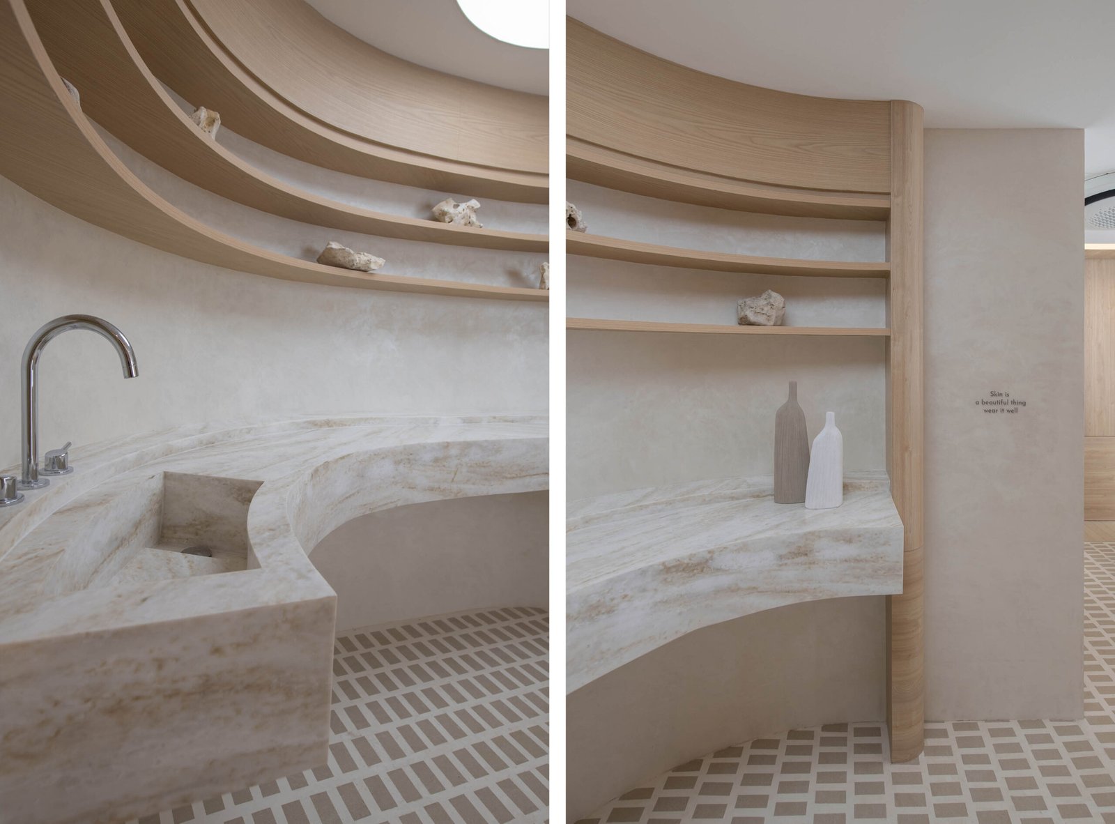
Among the first things that truly catch a visitor’s attention is the intricate tiled-inset flooring, a nod to Carlo Scarpa’s revered work at Negozio Olivetti. Hand-cut and 12-15mm thick, the tiles are rough-hewn to emphasize their imperfections, with metal strips interwoven to bring a sense of order to the organic patterns of the stone. “The stone was constantly cracking during installation because of how intricate the cuts were,” Vendivel tells me, “But it was worth the challenge. It completes the look we were going for.”
A color palette of nudes, grays, and natural tones subtly underscores the clinic’s connection to wellness and skin care. Soft finishes, natural stone, and warm textures combine to create a space that feels alive and tactile, while strategically placed plants and flower arrangements soften the edges further, lending a natural balance. Although there was a budget to adhere to and the 6-month timeline was tight, the design choices never felt compromised. “We were focused on achieving the right balance of soft and rough, polished and raw,” Espiritu shares. “Even though nearly everything here is man-made, the space still imbues a natural feel thanks to that textural symmetry.”
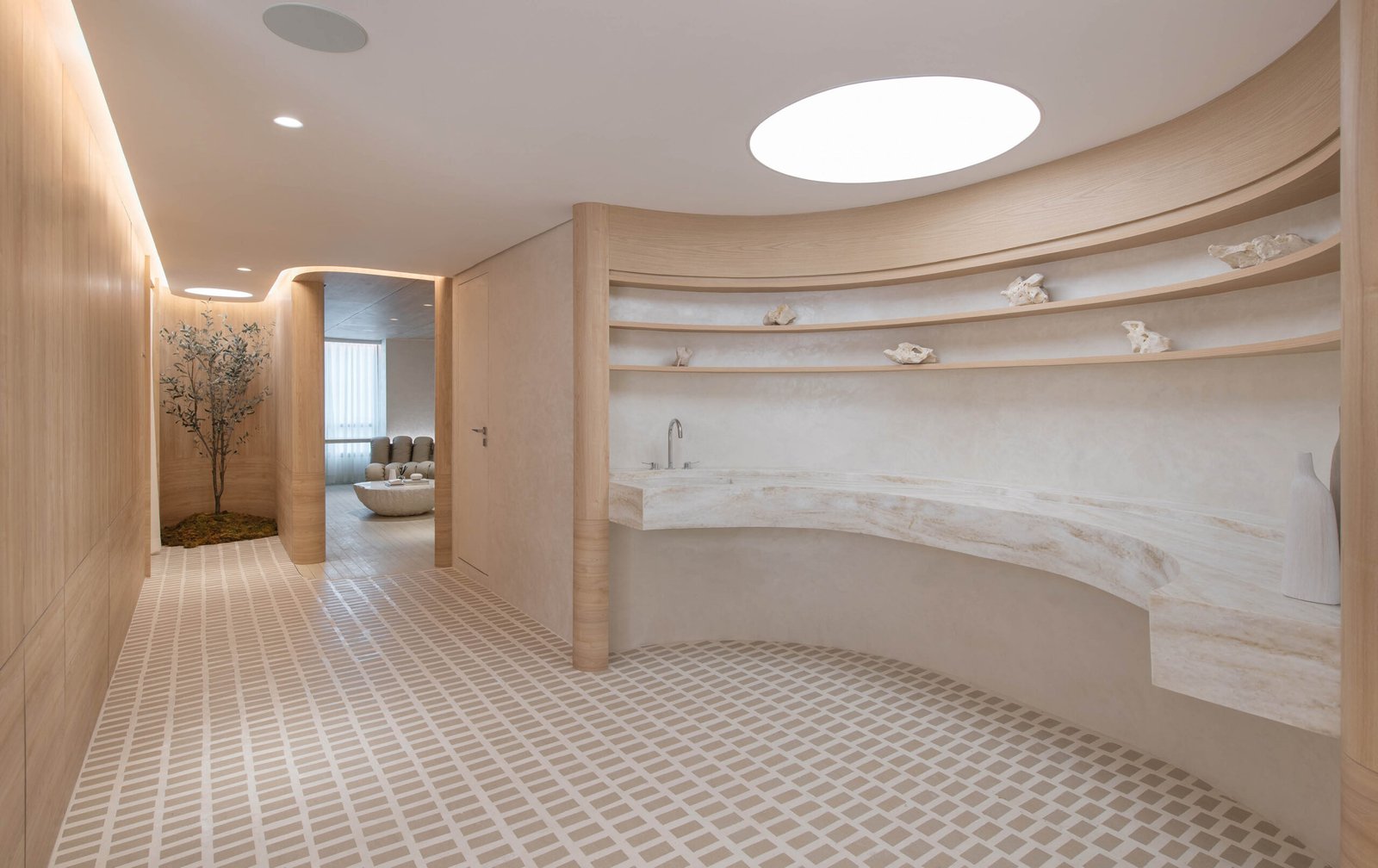
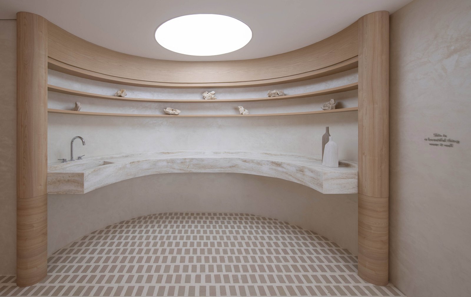
The retail nook, situated between the reception and lounge, is a prime example of this careful equilibrium. “This spot is one of the key design moments of the clinic,” Vendivel notes as we approach. Here, the marble counter, wooden shelving, and egg-shaped light dome overhead combine to create a space that feels both intimate and sculptural. It’s not just a display area, too; it has a working vanity and sink for visitors to try out future skincare products the clinic is developing.
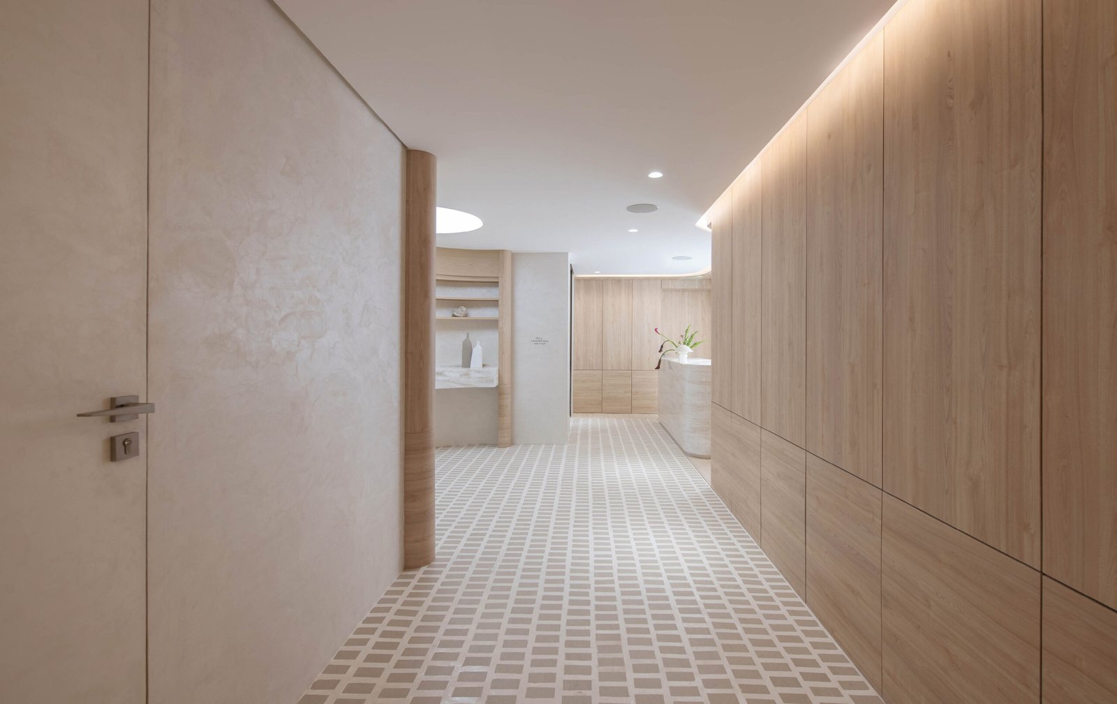

“We were focused on achieving the right balance of soft and rough, polished and raw,” Espiritu of PXP Design Workshop shares. “Even though nearly everything here is man-made, the space still imbues a natural feel thanks to that textural symmetry.”
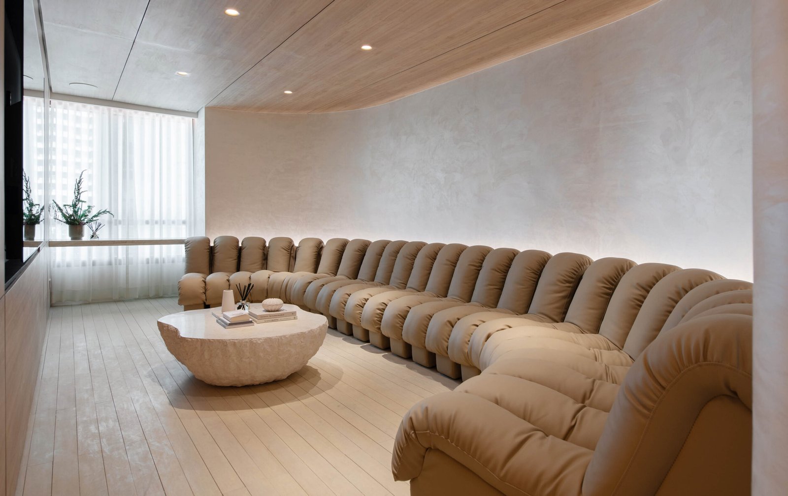

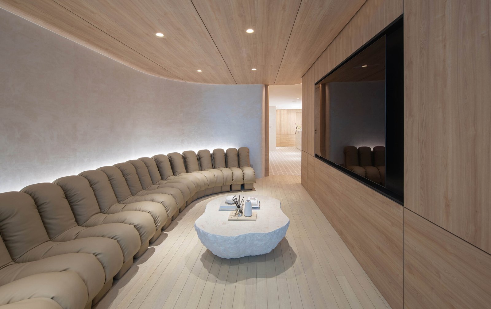
After the reception area, visitors are ushered into the lounge, a 20-square-meter space anchored by a large, custom-built sofa, its ridged, modular form allowing it to perfectly hug the room’s curved walls. “It wasn’t easy finding pieces that fit this space, so we had to go custom,” Sy explains. “This required considerable investment, but the guests and the client loved it!”
The lounge feels less like a clinic’s waiting area and more like an aesthete’s sitting room, with pale wood surfaces, skim-coat textures, and a coffee table fashioned out of a shaved-off boulder. “The lounge is my favorite space,” Kiu confides. “You sit on that sofa, and you forget you’re in a clinic. It’s just comfortable.”
Just next to the lounge, a small indoor ‘tree’ marks the junction between the public areas and the more private treatment rooms. Nestled in a light-filled alcove, its artificial branches stretch toward the ceiling, while its ‘roots’ rest on a lush bed of moss. Although the client initially envisioned a real specimen for this statement corner, practicality dictated using a faux option instead.


The business of care
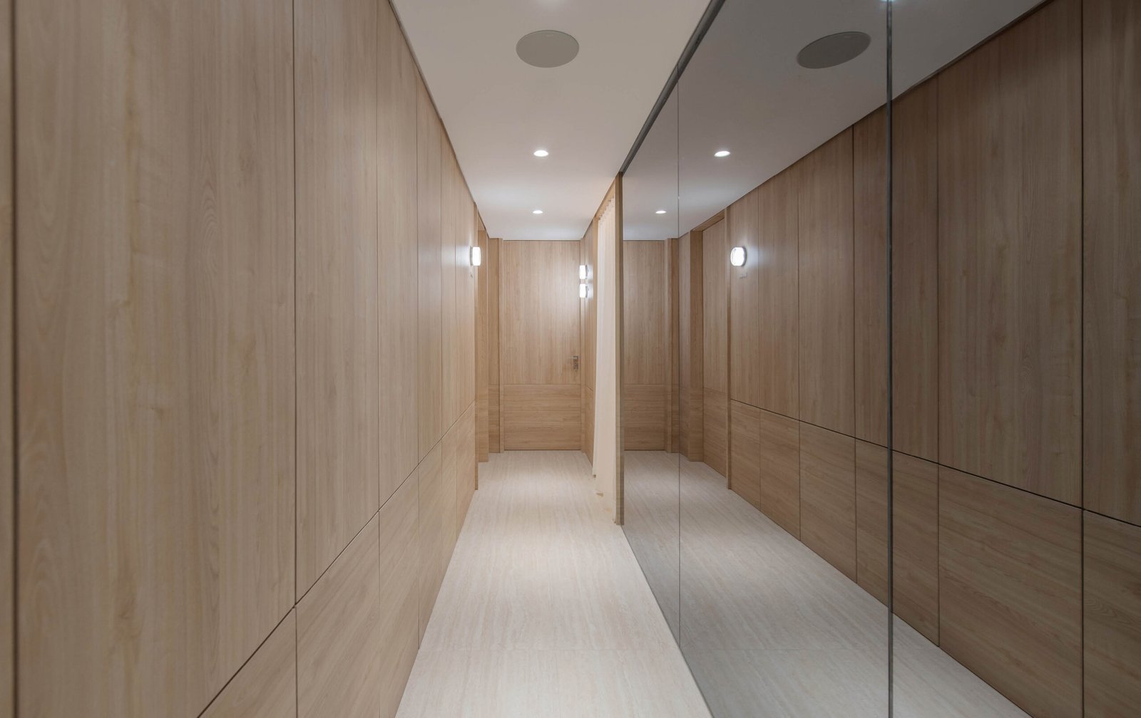
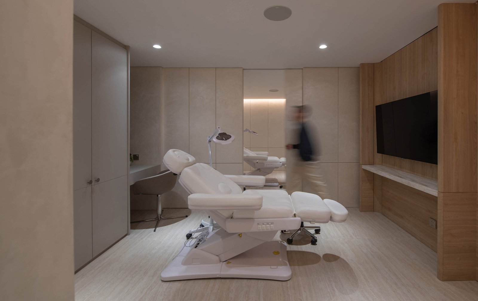
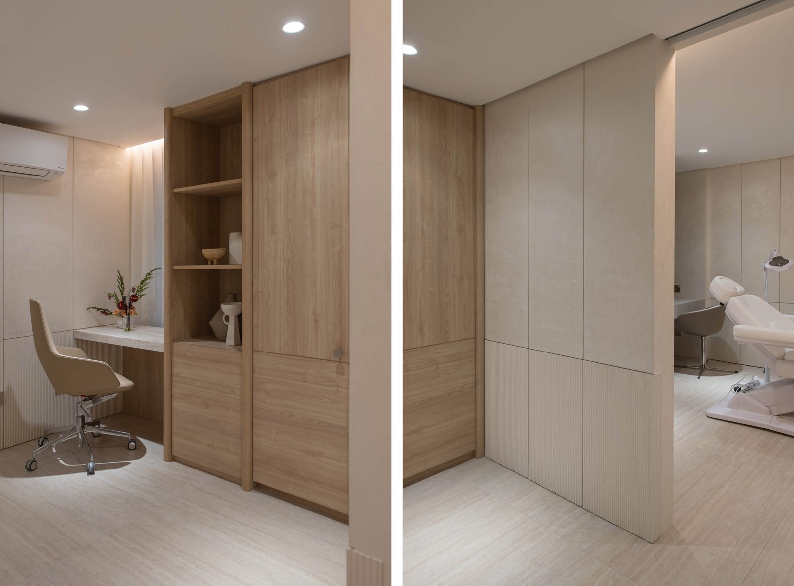
The private treatment wing, comprising two treatment rooms, a minor operating room, a facial room, and an office, is also imbued with the same velvety, nature-infused touch, despite the limitations medical and hygiene requirements posed. Separated from the public wing by a 150-mm thick wood-veneered wall, these rooms are accessed via a corridor lined with mirrors that subtly expand the space.
“The spaces here have to be clean, easy to maintain, and functional,” Vendivel explains, “but we softened that clinical edge with curved consoles, rounded edges, warm lighting, and wooden accents to make the patient experience calm and comfortable. It’s all about finding a balance between technical precision and human warmth.”
This harmony is reflected in details like the white and nude-toned movable furniture, with tapered legs to minimize visual weight, as well as the use of marble flooring paired with wooden wall panels in the treatment rooms. A particularly clever design move is how the wood grain orientation expands the visual dimensions of the space. The bottom wood veneer panels are installed horizontally to imply wideness, while the upper panels emphasize the vertical wood grain, drawing the eye upward and imbuing a sense of height.
As a final touch, the treatment rooms are named after the formidable women in the client’s family, adding a personal dimension and human warmth to the design.



Light touch
Lighting design was crucial to the success of With Grace’s spatial narrative, and the studio took pride in this aspect. “We treated the space like a black box,” Kiu explained. “Once you illuminate key areas—like the indoor tree, the retail space, and the reception—it not only brightens the environment but also guides people through it.” The accent lighting anchors the clinic’s layout, with each illuminated area serving as a marker that gently leads visitors from one space to the next. Reflective surfaces were strategically incorporated to amplify available light, creating an illusion of openness even in the more confined sections. Alongside the gentle 3000 Kelvin lighting temperature, the shape of the lighting fixtures also contributes warmth, predominantly featuring circular forms that emit a diffused glow, an inviting alternative to the harsh, cool glare often found in traditional clinics.




A space that celebrates you
The design of With Grace, A Skin Sanctuary, deftly captures the dual nature of skin—strong yet delicate. Like well-nurtured skin, the space feels radiant and inviting, instilling a sense of trust and calm that’s invaluable in a high-anxiety environment like a clinic.
As the designers reiterated during my ocular, their goal was seamlessness: no single element dominates in creating this calming, nature-inflected atmosphere; rather, they are part of a cohesive whole. Balance is also key, reflected in the curated mix of polished and raw, artificial and organic, loud and quiet elements. For the unsuspecting visitor, stepping into With Grace is akin to entering another world, one that gently encourages you to slow down and pause. It is no surprise that feedback from both owner and clientele has been quite positive.
When asked about his favorite aspect of designing the clinic, Kiu reflects, “I liked that we were able to succeed in designing a space that’s about making people feel good—whether they’re here for a treatment or just passing through. I think we’ve really achieved that.” •
