Interview Gabrielle de la Cruz
Images Greg Mayo
“The work began with a simple question: how do we create a multifaceted space for stillness amid a bustling external environment?” opens Studio Yang founder and principal architect Kay Yang on the experience of designing Nāda Concepts, an interdisciplinary space that highlights the ceremonial and mindful aspects shared by yoga and coffee. The 220-square-meter space is a collaboration between childhood friends JP Campos and Gerard Alzate, who saw a mutual opportunity to turn their hobbies into a passion project.
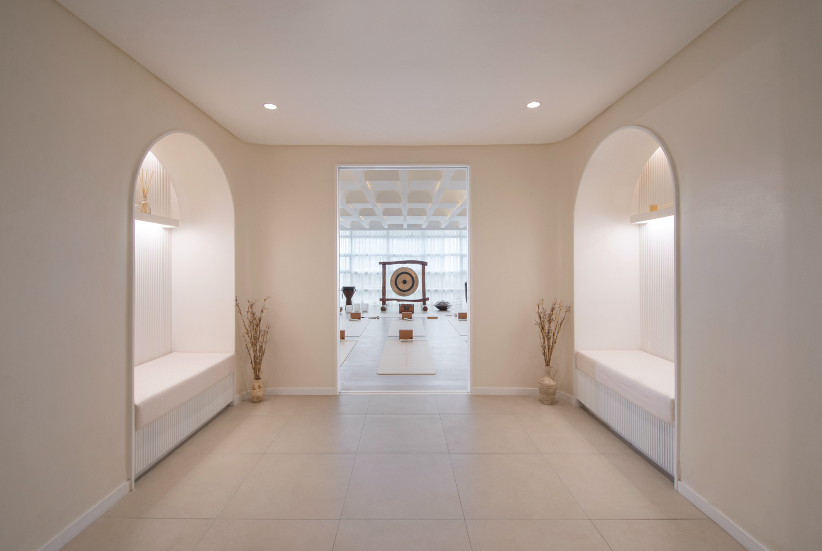
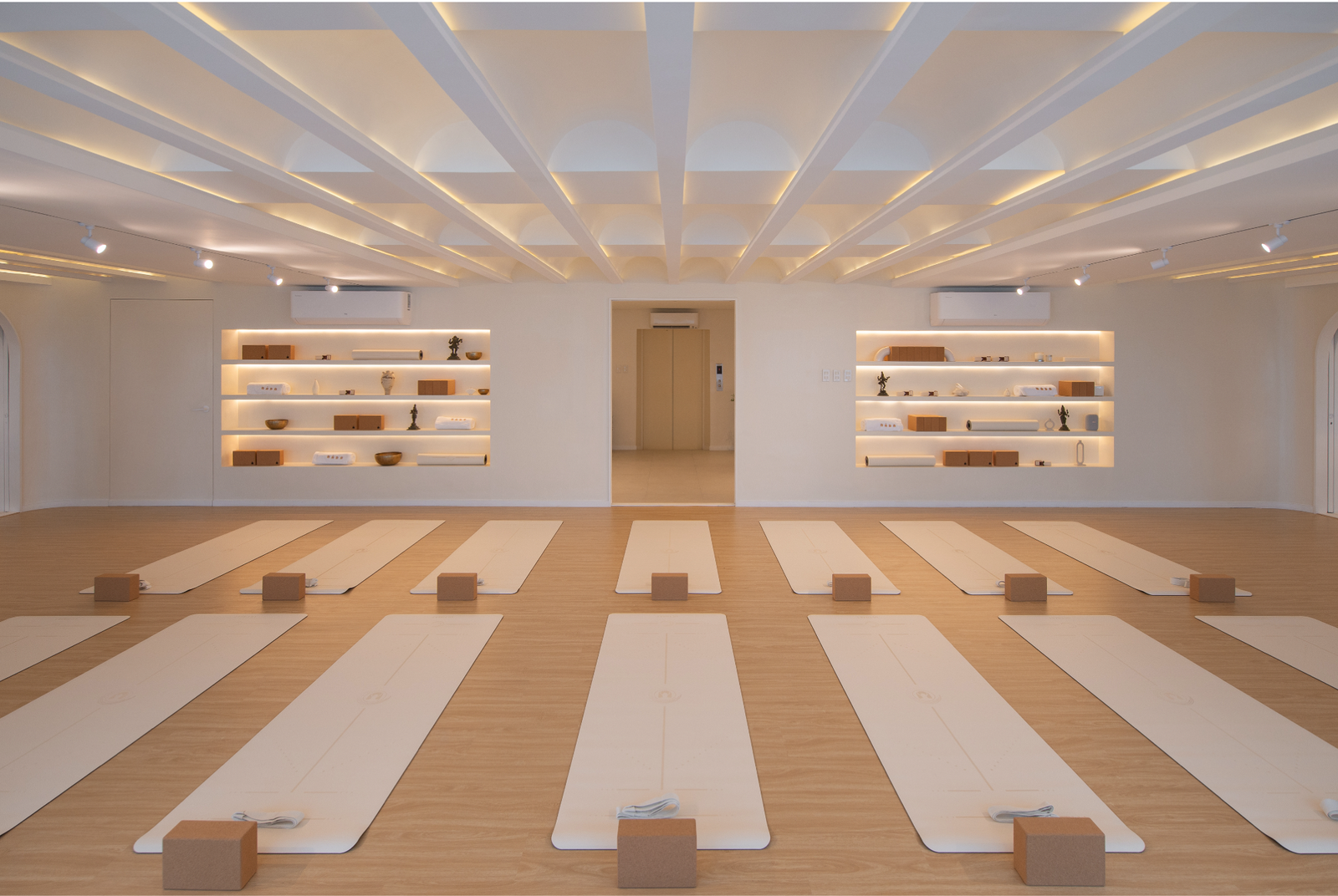
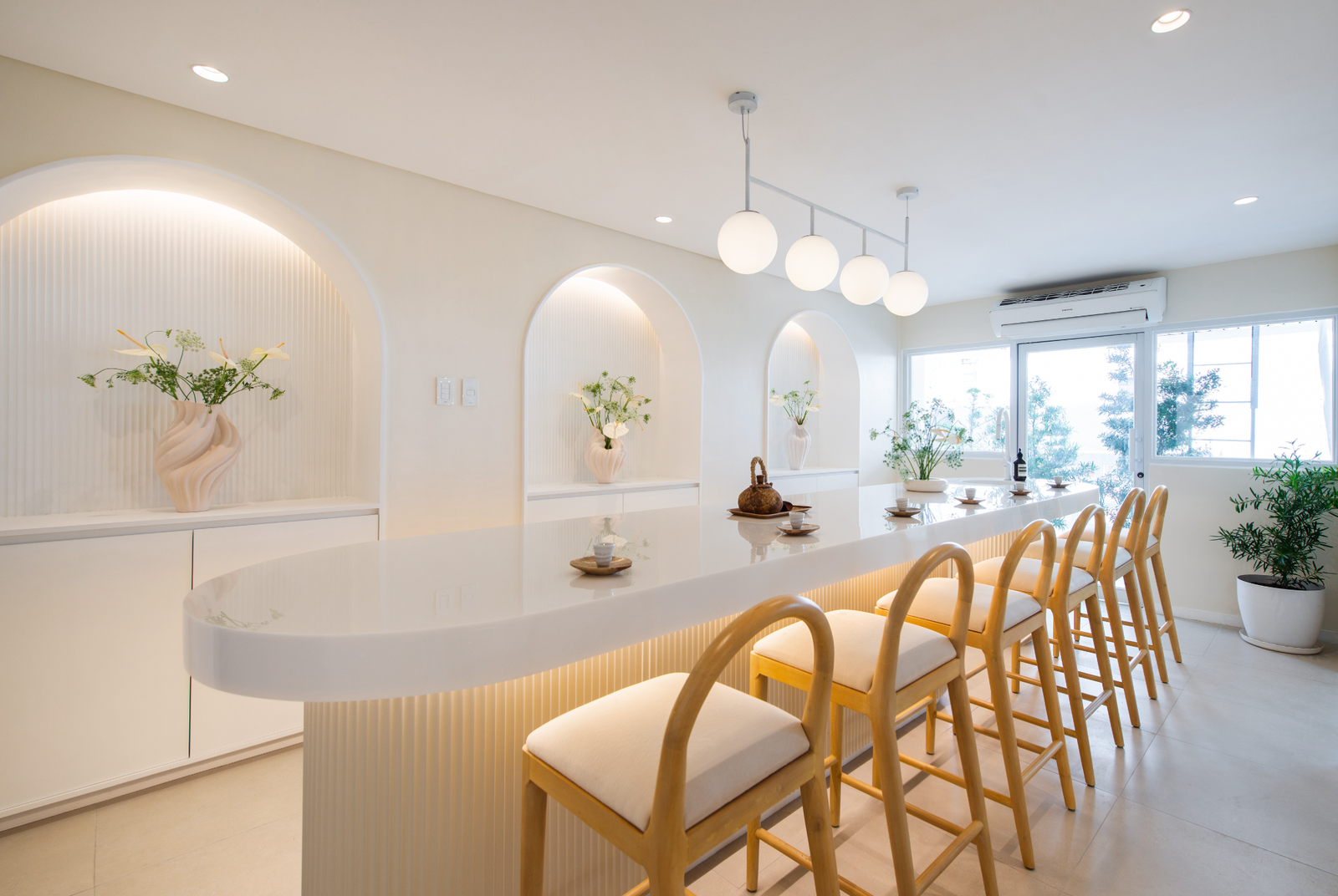
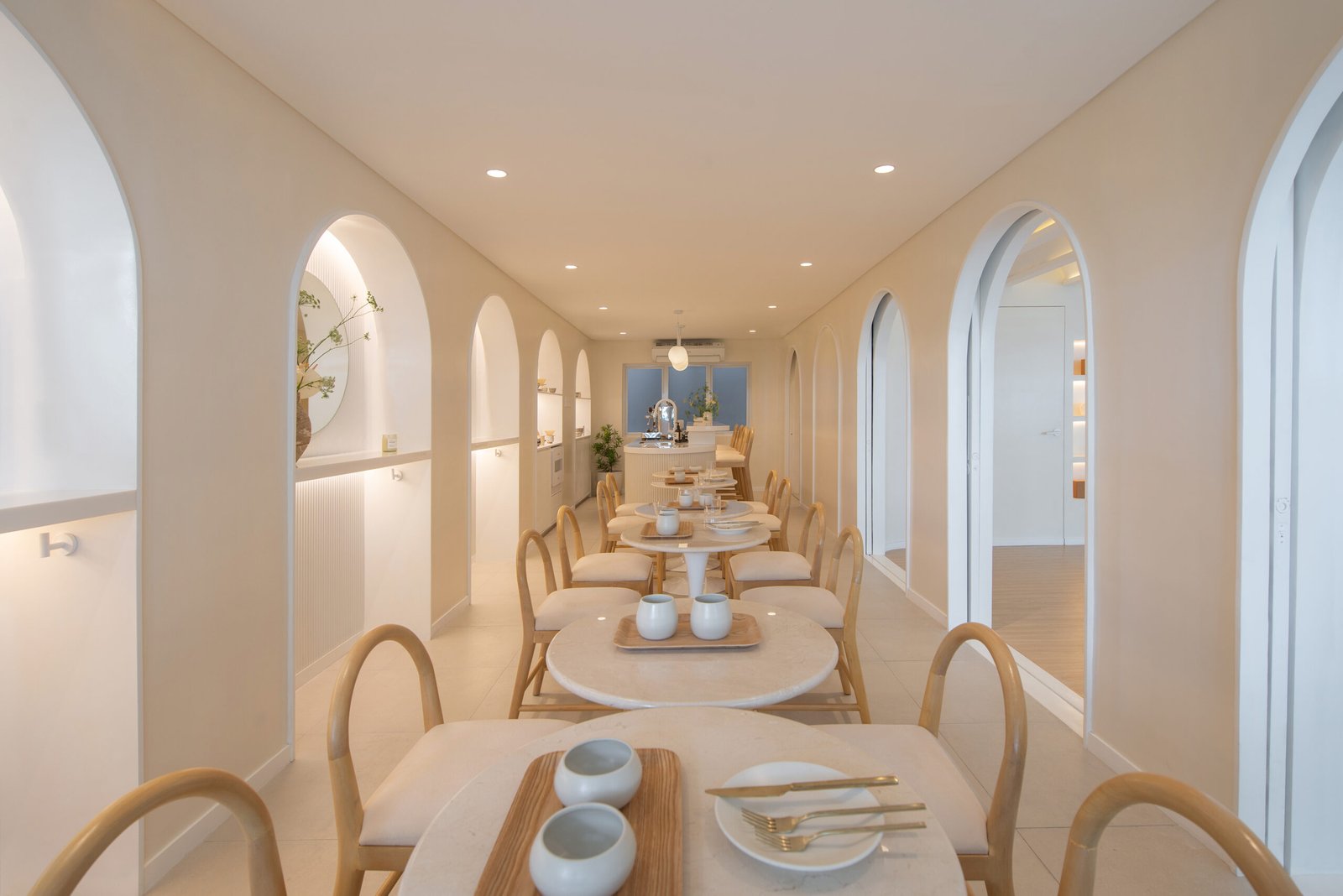
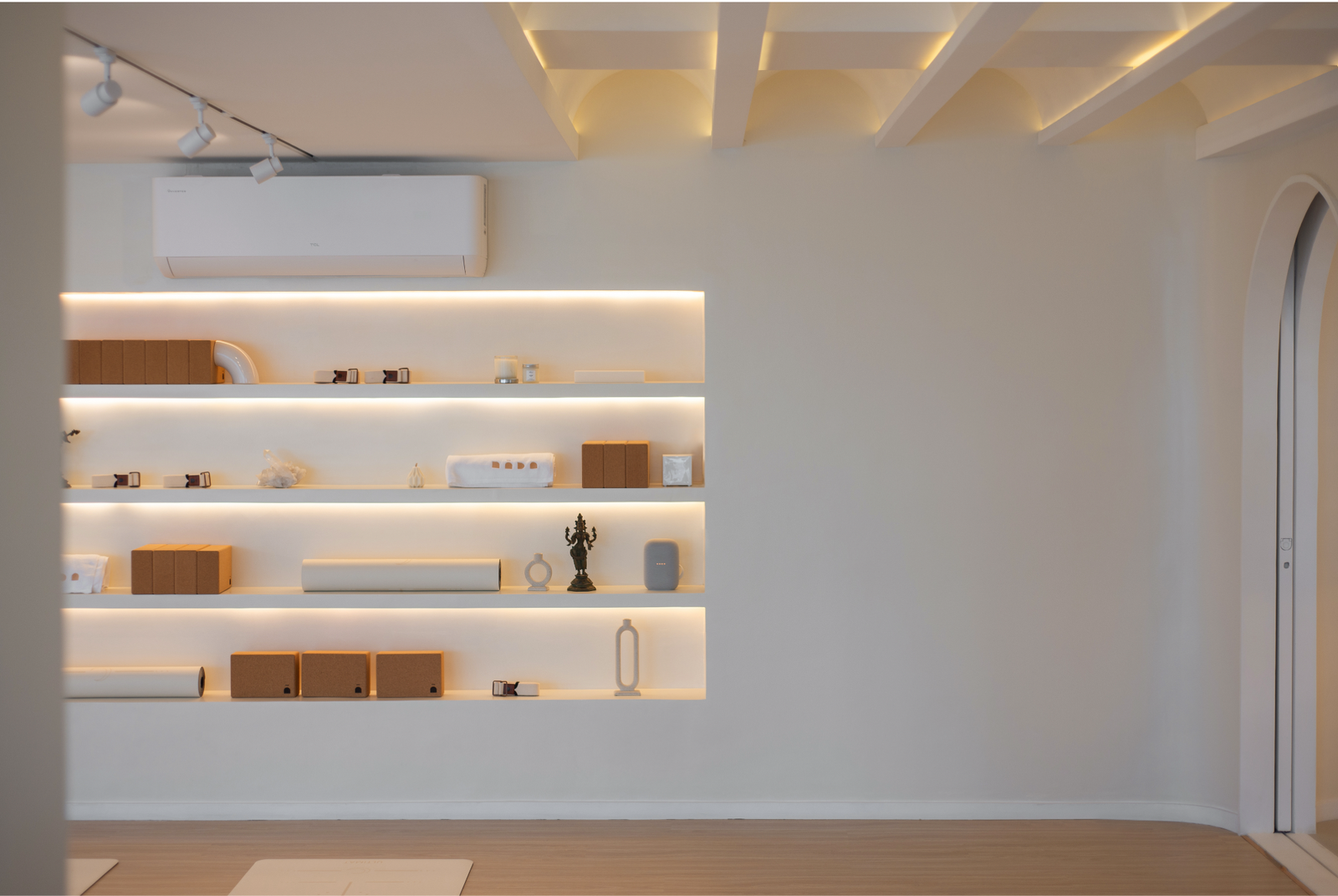
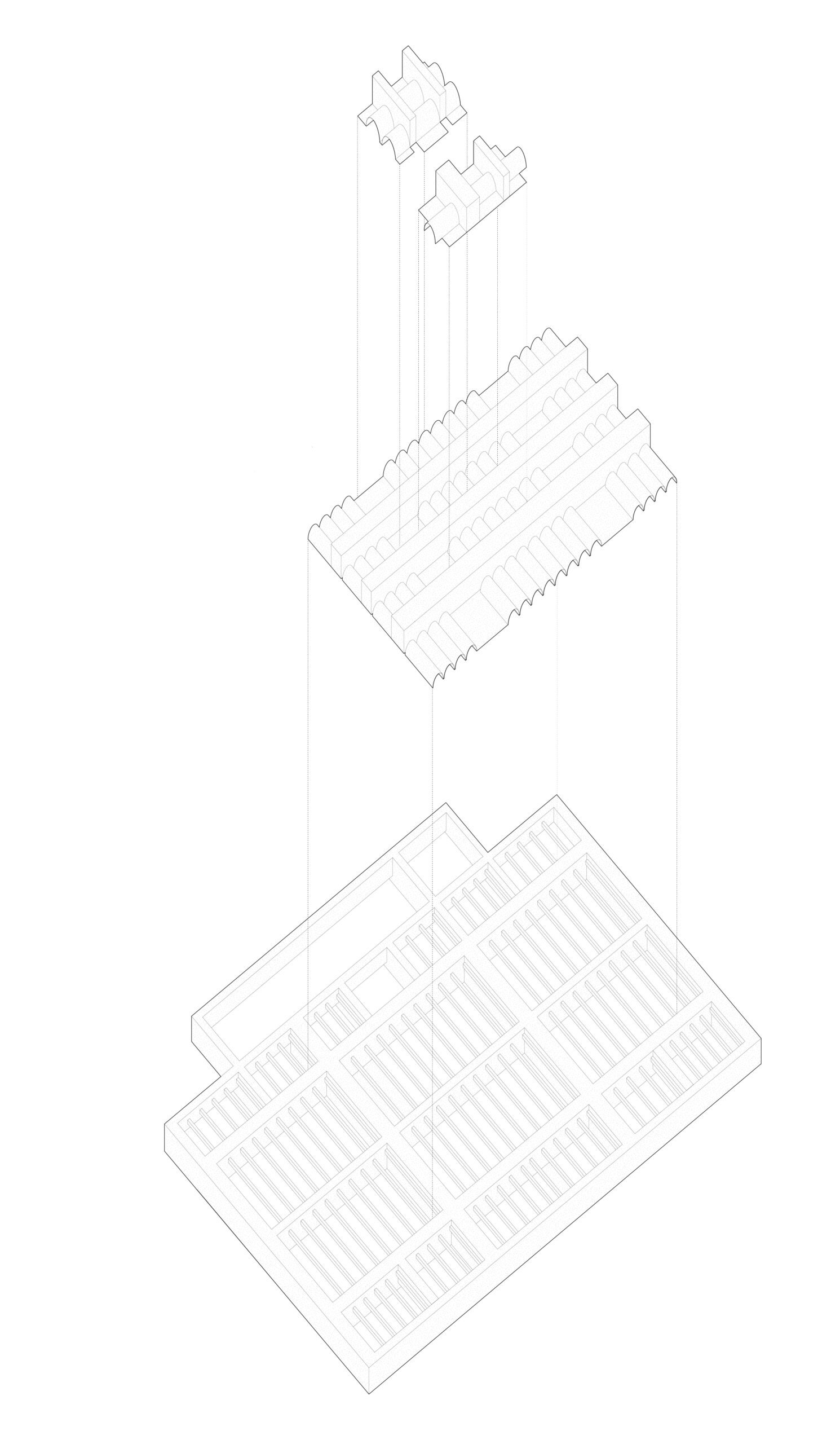
Nada Concepts sits on the fifth floor of Six Axis in Poblacion, Makati, a neighborhood known for its array of bars and restaurants that are often frequented at night. The owners describe stepping into the space as a “change in pace, volume, temperature, color, and scenery.” Soft curves, muted neutrals, and mood lighting characterize the interiors, creating a breather from the outdoors. A textured ceiling assists in the overall acoustics of the space, alluding to the yogic philosophy that believes the entire universe consists of sound vibrations called “nāda.”
For International Yoga Day 2024, Kanto sat down with the minds behind the vision for and spatial design of Nāda Concepts. Our conversation on the multi-concept space’s beginnings, reception, and future follows:

Happy International Yoga Day, JP, Gerard, and Kay! Let’s start by recalling the client brief. Can you walk us through some of the non-negotiables? What did you set out to do with Nada Concepts?
JP Campos and Gerard Alzate, owners of Nada Concepts: Hello, Kanto! Thanks for having us. Our brief specified that Nada Concepts had to be a multi-concept space with designated areas for coffee, tea, and yoga, all while maintaining the flexibility to transform into a private events venue. We noticed that some of our favorite places were multi-concept, so we drew inspiration from that to combine our hobbies.
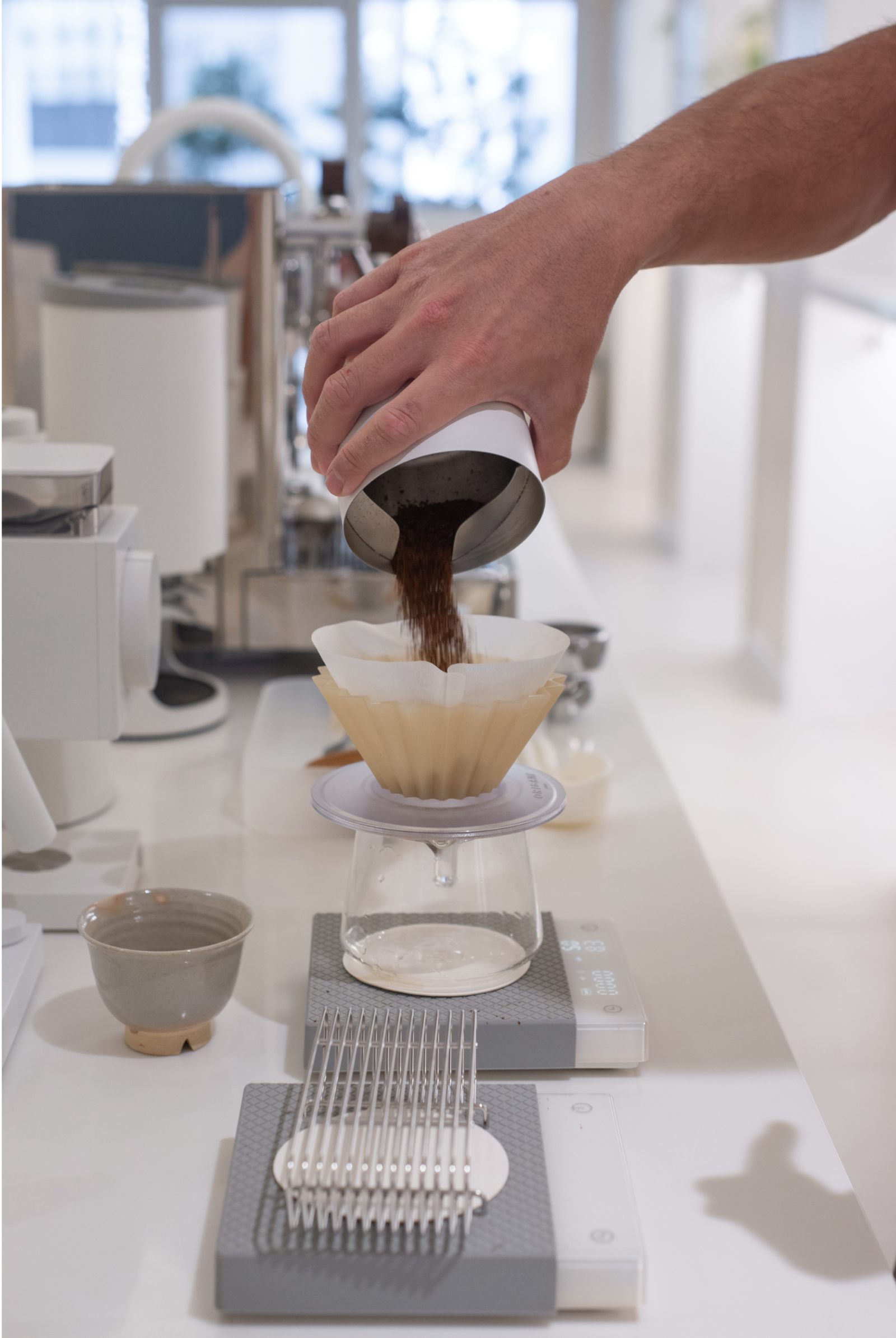
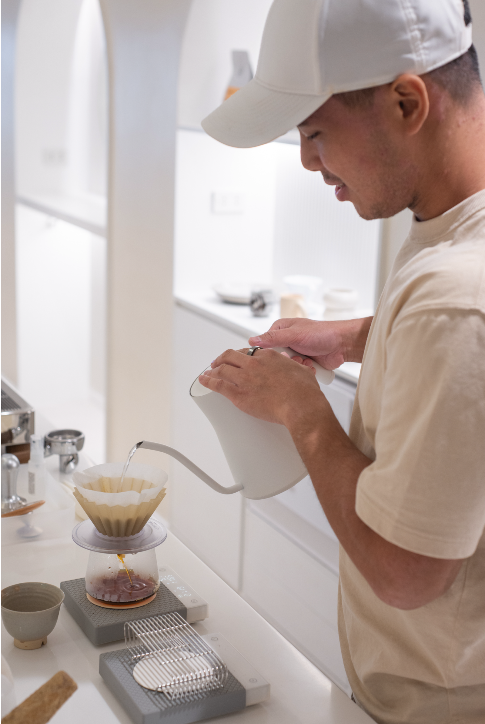
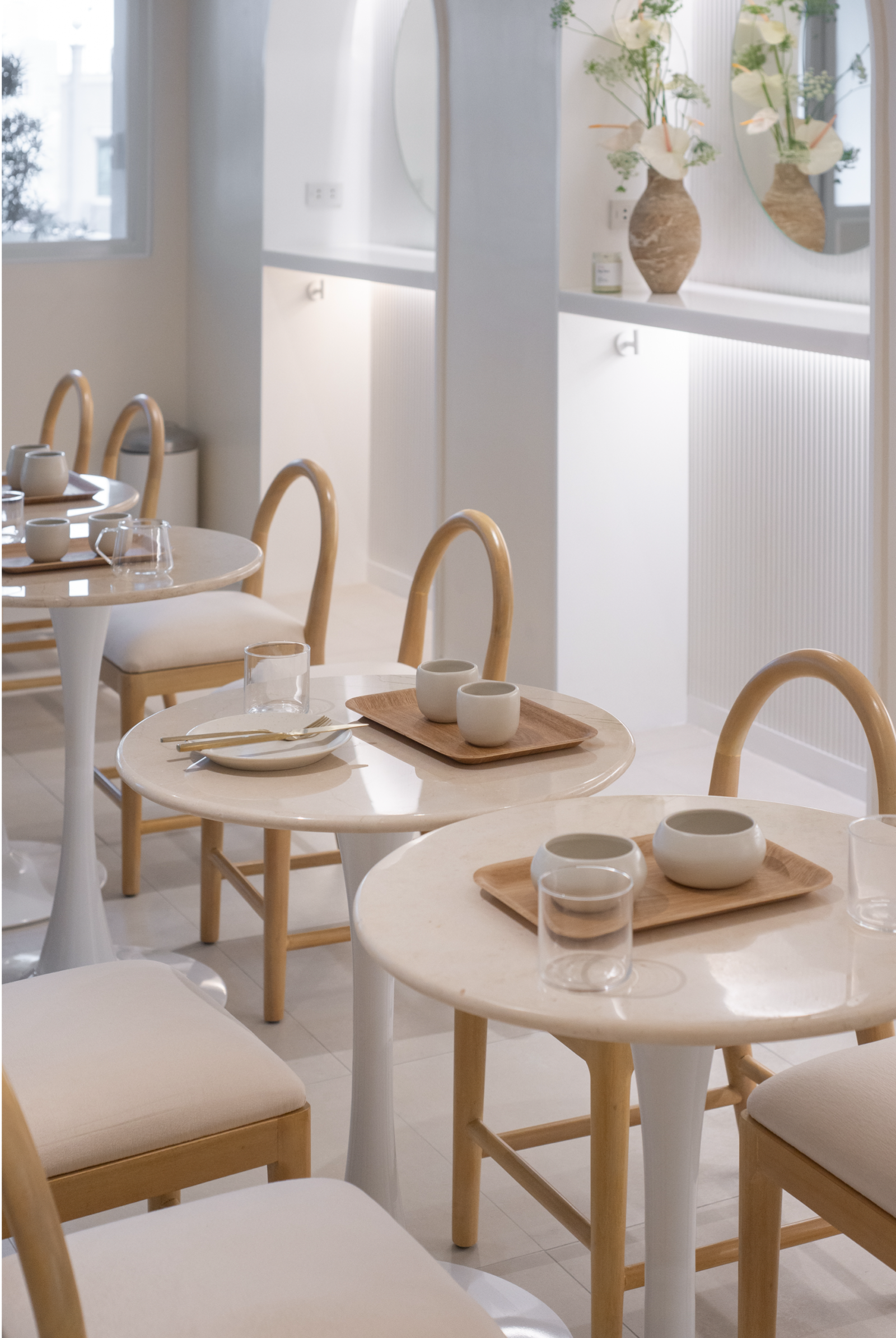
We had specific areas in mind. An omakase-style bar was critical for the more intimate sessions such as private events as well as tea ceremonies and coffee tastings, whereas the cafe was important for the more approachable neighborhood walk-in atmosphere or a change in scenery during the day.
We also wanted to add a personal touch since this idea was primarily a passion project. We wanted the space to encourage us to share our personal experiences with coffee, tea, and yoga. We pictured ourselves as occasional baristas behind the bar connecting with customers who are interested in learning more about the space, and yoga and coffee and tea ceremonies.
Kay Yang, founder and principal architect of Studio Yang: Glad to chat with you again, Kanto! The clients were always incredibly clear about what they sought to achieve. After our first meeting, I received a detailed, 100-page PDF from JP with visuals of the spaces that inspired him from his travels and experiences. This was my first client who had such a strong and clear vision for the design of their space; the initial exchange of ideas revealed that our vision was very much aligned.
100 pages, wow! Can you tell us what parts of the brief and project typology excited you? What were some of the key elements of the client brief that influenced the design decisions for this project?
Yang: Yoga was a reprieve for me over the pandemic, so I was excited to create a holistic space that would enhance one’s practice, in a way that would nurture the mind, body, and soul. Sound healing as a subset of Nada Yoga was going to be held as one of the main offerings, and so the acoustics of the space needed to enhance, not detract from the overall experience. This was particularly challenging given that we had to integrate three distinct spaces—a cafe, a tea room, and a yoga studio—each with their own needs, into one floor. We had to balance the diverse needs of these interconnected spaces and create an environment where each function could thrive without compromising the others.
Before we jump to the space’s design details, can you talk a bit more about the project site? Was there anything about its size or surroundings that contributed to the final design?
Campos and Alzate: Poblacion has gained its reputation as a hub for nightlife offerings without much to do in the daytime. We wanted to incorporate Nada Concepts here to introduce something new to the community. The space is intentionally on a higher floor of the building to provide the feeling of lift and airiness. We want guests to feel like they are taken away from the hustle and bustle of the city and work through a minimalist space.
Yang: In the last ten years or so, small businesses seeking spaces outside formal establishments have flocked to Poblacion, where entrepreneurs have capitalized on the neighborhood’s rich history. For me, the charm of the neighborhood lies in its ability to house traditional forms of locality with modern twists.
We conceived a second life for the building/Six Axis Center, as the first of a larger phased plan to transform the site into a more intentional destination. After our first visit, it was mutually decided that Nada was to be housed on the 5th floor, away from the street and directly below the penthouse. In the upper floors, the noise of the streets below starts to fade, although not entirely. A church nearby rings its bell every hour, and the sound of motor vehicles and neighboring construction persists. We decided to use this to our advantage.
It’s important to note that one of the clients lives above the space, in the penthouse. We wanted it to compliment his minimal taste, as Nada was going to be an extension of his practice and home. The idea is that once the elevator doors open, we get to capture a total contrast from the area, directing the focus of the studio towards a more conscious core.


You describe the experience of entering Nāda Concepts as stepping into an alternative, calm environment. Can you tell us more about how the design highlights this aspect? Any particular initiatives from both parties that demonstrate this?
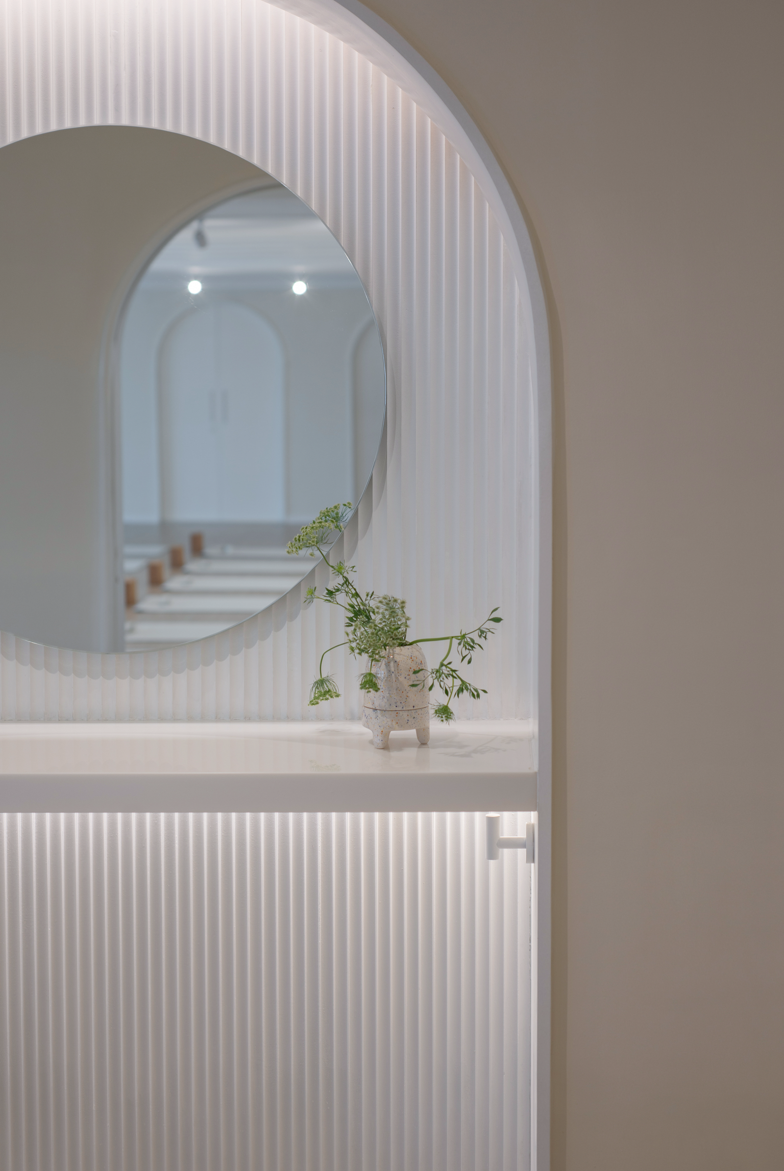
Campos and Alzate: A lot of our inspiration was taken from a combination of Japanese and Nordic architecture and interior design. The color palette was chosen to maintain a Zen aesthetic, ensuring that the senses are not overly stimulated. There is also a distinct focus on roundedness, soft curves, and arches, which imbue a feminine and yin energy to the space. This is supportive of the mindfulness and restorative yoga practices we offer and conveys a nurturing feeling as if you are held safely in a bubble. We focused on allowing subtle aspects such as textures, shapes, contours, and lighting to demonstrate modern and functional design in a very elegant way, veering away from using various colors and decorative furniture.
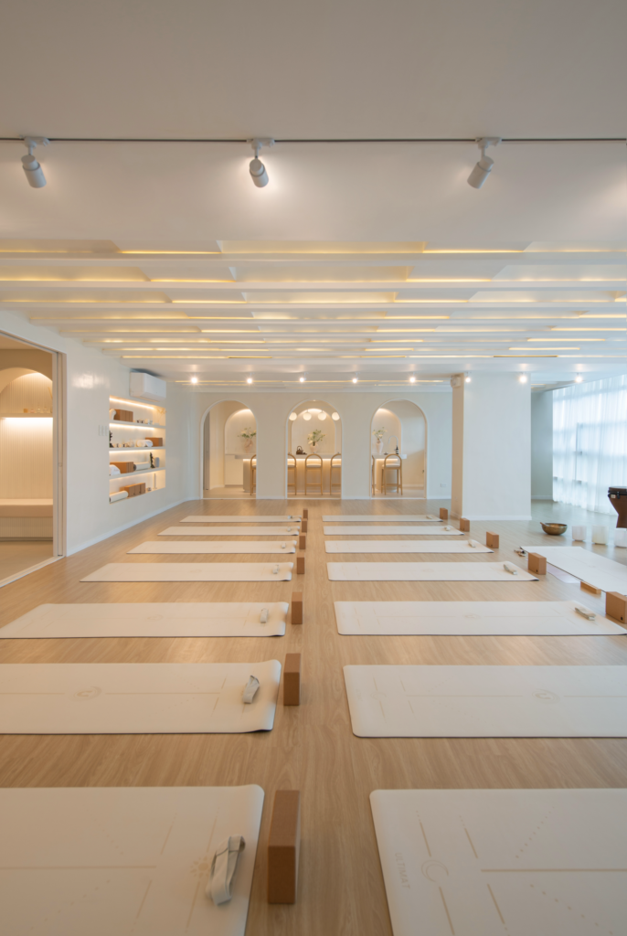
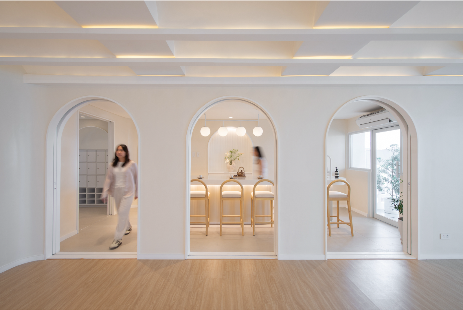
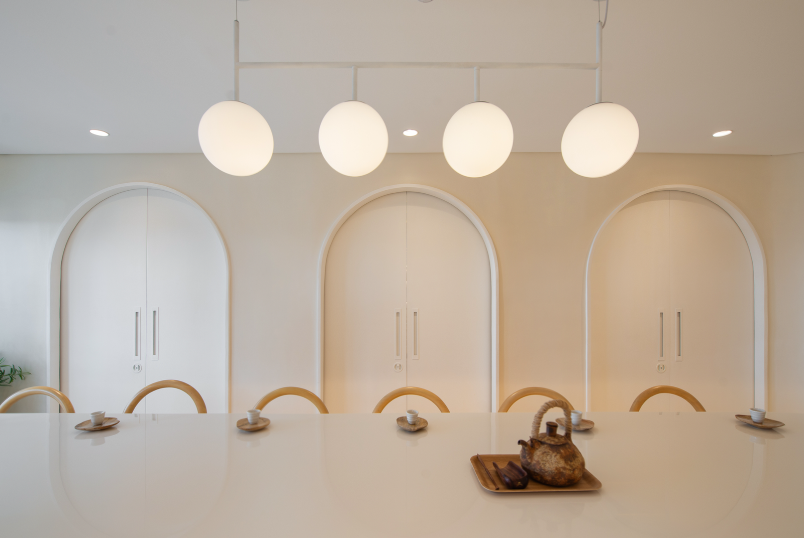
We appreciate how Ar. Kay designed beautiful and functional pocket doors that allow the space to easily be compartmentalized and seamlessly integrated for the flexibility of having private events and multi-concept offerings. The ceiling of the yoga studio was also her idea, featuring visually striking arches that add texture to the space and not only optimize the acoustics of the studio but also set the stage for mood lighting.
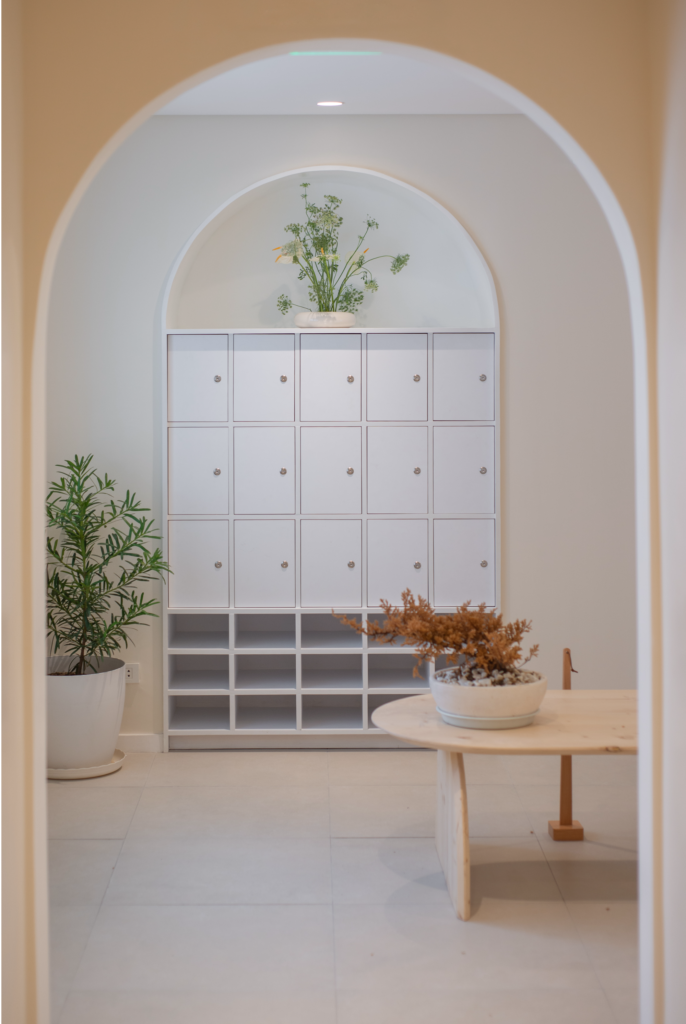
Yang: Within our studio, we asked ourselves how to create warmth and variation with a limited palette. While the entirety of the space initially appears to be a singular shade of white, our design decisions reveal themselves in the slower moments. While stark, the choice of materiality manifests a conscious restraint. We created bespoke features to define the space; highlight intimacy and privacy; and integrate the millwork, storage, and displays into the walls. Different shades of white and off-white embody warmth through diffuse lighting and texture, visible in the niches, coves, and seating.
In yogic philosophy, it is believed that the entire universe consists of sound vibrations called nāda, which is the hidden energy at the core of one’s soul. Through practices like meditation and nāda yoga, it is possible to unite the individual consciousness with that which is far greater than one’s self. This is a place where you are encouraged to listen to those sounds.
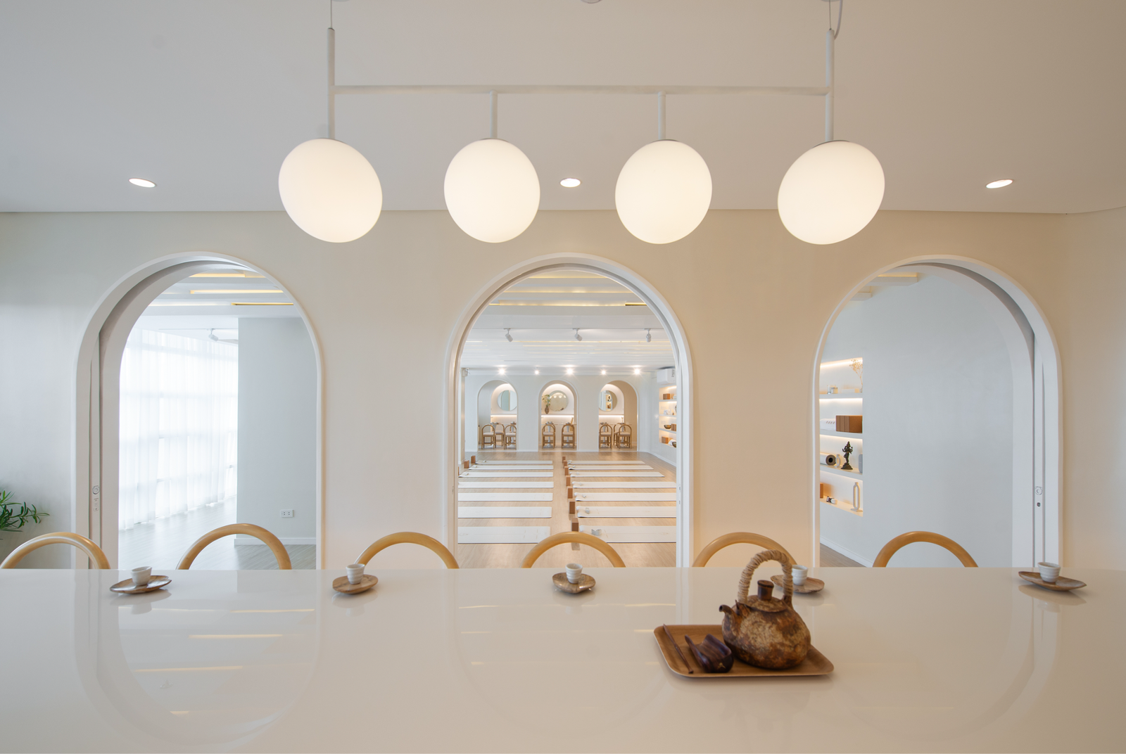
The arches mentioned by the clients act as visual symbols of fluidity between movement and stillness. These facilitate seamless transitions between different zones within Nāda Concepts, fostering an interdisciplinary space for contemplation, activity, and indulgence.
Walk us through the division of spaces. What considerations did you take into account? How does the space account for moments of solace and socialization?
Yang: Nada was always intended to be a slow space. While our typical understanding of a café is loud and filled with energy, we wanted all areas to blend into one another when used together.
We designed a bespoke double pocket door system where each door leaf slips past the other. When they are open, the space feels like a whole, and the arches appear as a design feature. These visually expand the space while also serving as functional divisions, effortlessly concealing or revealing areas such as the tea room and cafe, ensuring privacy without compromising unity.
I understand that what sets Nāda Concepts, aside from combining a café and yoga studio in one, apart from all the businesses that are coming out in the industry is the tranquil experience that it creates for patrons. Can you share some of the efforts you extended to ensure that this is properly executed?
Campos and Alzate: All our offerings are centered on the concept of mindfulness. Whether preparing and sipping on coffee, practicing yoga, or having a sound bath session, the common thread is about being present with one’s self. Everything, from the music to the lighting, the design of the space, the curation of the menu, the choice of materials in the cups, and the yoga equipment, was chosen and designed to fit this philosophy. We view our offerings as having a ceremonial nature to them because they are done with presence and intention. We hope our visitors find time to pause and consider how being more present and intentional can serve their own lives as well.
It was evident from the beginning that you guys are hands-on clients! Is this your first time working with a designer? How would you describe the overall experience?
Campos and Alzate: Yes! We were very optimistic about working with Kay because we understood her design inclinations and could tell that there was a great fit between our ideas and her expertise. The blending of aesthetics with functionality came more naturally.
As the founders of the space, we were directly involved in everything that has to do with the space—from the day-to-day operations to connecting with customers on a 1:1 level, to managing the back-end logistics, maintaining the upkeep of the space, and more. It is through this deep involvement that we can know the ins and outs of everything. We immersed ourselves in understanding the details of our products, sourcing materials, and the process of creating and maintaining the space and equipment, down to the tiny bits! We believe that these were instrumental in offering customers a more personalized and personable experience.
Yang: Thanks for the kind words. JP and Gerard! Bringing the space to life was a pleasurable experience. I’d also like to share that I recently had the opportunity to experience my first private sound healing class at Nāda. After over a year of planning and overseeing its execution, using the space myself in the way we intended was rewarding and humbling. The session involved lying down with eyes closed, engaging in a deeply passive and restful state. Guided meditation was followed by a sound bath using instruments such as gongs and crystal bowls, aimed at inducing relaxation. The overall experience felt like a peaceful transition between wakefulness and sleep, offering a profound sense of rejuvenation. I was particularly moved by the stillness I found.
“My favorite part is the central yoga studio and its ceiling, which we spent a lot of time trying to figure out, in terms of detailing and execution,” Yang shares. “The undulating ceiling, with its diffuse lighting, is designed to guide visitors on a visual journey during the restorative practice of yoga, and invites them to immerse themselves in a realm of tranquility and self-discovery during their practice.”
How nice of you to share that, Kay! Have you heard any memorable anecdotes from visitors who have experienced sessions in the space as well? How has the reception been since Nada’s opening?
Yang: Reception has been overwhelmingly positive! One patron on social media mentioned that the space is a great example of how minimalism can feel warm and inviting. I was pleasantly surprised by an unusual common response to entering the central studio that our team did not anticipate: many people felt like they were in the clouds.
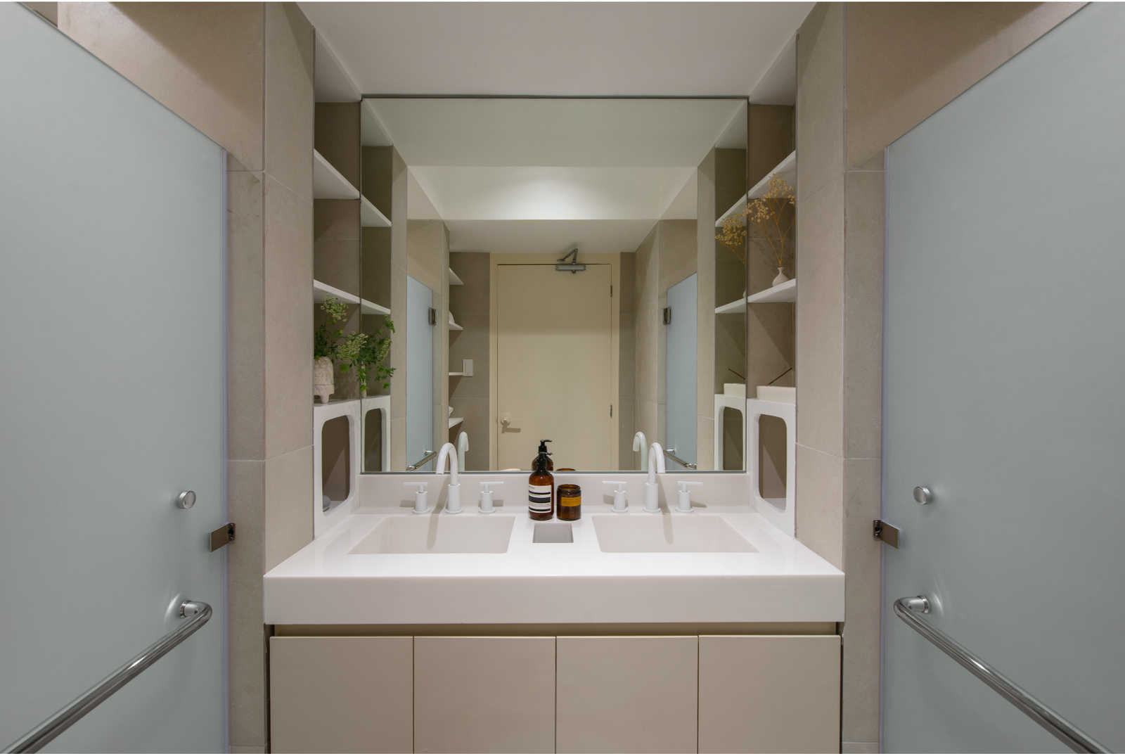
People also appreciated the smaller details we designed, even asking us where we sourced the white fixtures in the restrooms. I was most comforted to hear people compliment the acoustics of the central studio while the various instruments were being used, noting the clarity of the sounds. This feedback was particularly gratifying, as the execution matched our intentions during the design process.
Campos and Alzate: One prevalent comment we receive is that people did not expect that a space like Nada exists in Poblacion, which proves that we are successful in delivering the atmosphere we planned! Visitors say that the opening of the elevator doors often presents a pleasant surprise that eventually transports them into a contemplative environment. Ultimately, we just hope that people feel a sense of calm and contentment, enjoy the coffee and tea, and be encouraged to do yoga classes while making themselves feel at home.
You all say that working on Nada Concepts was a generally smooth process. Any challenges that you can recall and share with everyone, especially for those who wish to start their projects soon? How did you work through these obstacles?
Campos and Alzate: The only thing we can think of was the allotment of spaces. We had to make sure that there was enough area for each segment of the floor and design the flow of foot traffic around the space in a way that was still organized and conducive to the purpose of Nāda. This was solved by the design of the pocket doors that allowed for flexibility to compartmentalize and integrate. It allowed us to expand and contract as needed.
Yang: I would say construction. Most of the details and elements we designed were bespoke, and they took a significant amount of time to properly execute. Just as our curved ceiling was finishing up, a leak in the penthouse patio resulted in water damage to our studio ceiling. As a result, construction had to be halted for two months to address and repair the waterproofing issues.
Additionally, working with a white material palette presented its difficulties. Any imperfections, such as elements that were not straight or slightly off, were highly visible. These challenges required careful attention and adjustments to ensure the final design met our original design intent.
Nāda Concepts is slowly being recognized by the yoga and coffee community. JP and Gerard, any other dreams for the space?
Campos and Alzate: We want to leverage the multi-functionality of the space to lean more into private events, product launches, workshops/talks, photo shoots, and others. We intend to collaborate with groups or brands that align with our values to cultivate more intentionality and presence for others. We also hope to host interdisciplinary events that blend domains like music and art, food and beverage, fashion, retail, and the link in innovative, sensory ways.
Interesting! I hope you get to make all those happen. For now, are there any lessons from this experience that you think would be valuable to share? What would you like to share with individuals or groups who are considering starting their passion projects?
Campos and Alzate: Always stay true to what you want to offer, and your community will eventually form around that. Building anything takes a lot of time and patience, so it’s always worth looking back at what inspired your journey in the first place.
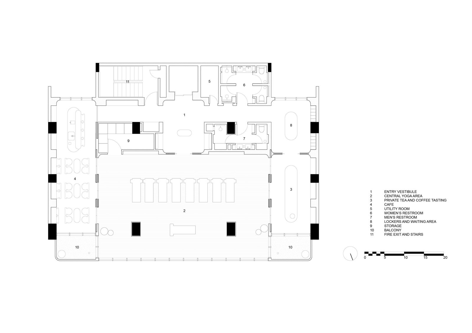

“The floor plan of the existing building is almost entirely symmetrical. The building had a ribbed slab system that had curvature between each rib, running perpendicular to the length of the building. The underside of the beams also contributed to the building’s fairly low floor-to-floor height,” Yang explains.

Sound advice! To end this conversation, I’d like to ask Studio Yang how the principle and design of Nada Concepts speak of the studio’s current body of work. The space is generally calm and comforting, something that is also evident in your portfolio. Would you say that this is a continuation or an evolution of your design approach/philosophy as a studio?
Yang: I have always been interested in context-driven methodologies that engage with daily life and the everyday. I find beauty in finding domesticity in one’s space, and our studio strives to enhance these moments through an overarching design concept, supported by the smaller details.
In an oversaturated world, we aim to create spaces that are honest and unpretentious, allowing for genuine connections to its users. Honesty in design is crucial to us. We believe that design should foster a conducive environment and provide refuge from external chaos. Our work is about more than creating an aesthetic; we aspire to create spaces that are genuine and authentic, seeking balance and fostering a dialogue between warmth and minimalism. This project continues our journey of evolving and refining our philosophy, always aiming to create environments that resonate on a deeper, more personal level. Through our work, we hope to create experiences that elevate everyday moments. •
Project Team
Studio Yang
Kay Yang
Eliza Cristobal
Bella Gironella
Heidi Samson
Contractor: Ferdie Abella
