Interview Patrick Kasingsing
Images Relja Ivanic and Blue Crow Media
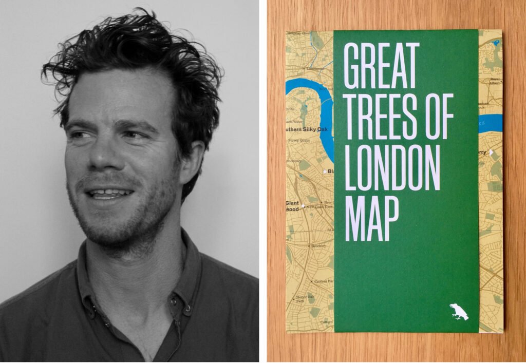

Hello! Please introduce yourself.
My name is Derek Lamberton. Originally from Washington, D.C., I now live in London, and I am the founder of Blue Crow Media.
What got you into the mapmaking industry? Have you always been fascinated with maps?
My family has moved around quite a lot for a number of generations, and my mother worked at National Geographic, so I was lucky to grow up with piles of maps and stories of living in interesting parts of the world.
What prompted the idea of creating architecture-themed maps? What were you hoping the users would take away from your work?
I originally began in 2009, publishing map-based, food and drink-oriented iPhone apps. Around 2012, I shared an office studio with a book designer named Jaakko Tuomivaara, and we began working on the maps together. The Brutalist London Map was the first architecture map, and it was really inspired by the lack of quality information and research available about late modernist architecture in London. For the reader or user, I wanted to present an often ignored or reviled style as something of significant aesthetic value, and to encourage people to reconsider their view of the style and to visit the buildings with an open mind. From a personal perspective, it was to design and publish something with Jaakko that was worthy of the subject matter. Not many people like Brutalism and buildings from the era are being razed regularly. The value of the maps is quickly shifting from exploration to documentation.


Museum of Aviation, Surčin, Belgrade, Serbia, photographed by Relja Ivanic 

Pionir Sports Hall, Belgrade, Serbia,photographed by Relja Ivanic
What other styles, typologies, and locations have you done architectural maps for?
I’ve published a few others including a Constructivist map of Moscow, an overview of 20th-century architecture in Berlin, and maps of concrete architecture in New York and Tokyo. Recently, I published the first in a new series featuring the design of transit systems with the London Underground Architecture & Design Map.
What factors inform your selection of cities to create maps for? I really think you should consider Manila for your Brutalist maps series as we have quite a collection.
I’m up for it! Obviously, margins are thin in map publishing and some maps do well while others take a loss. It’s a matter of balancing this to keep the business afloat but also to ensure that the titles are interesting. I look out for cities with a robust number of independent book shops (the maps do not sell in chains) and interesting, under-appreciated architecture.


Speaking of financial margins, tell us a little bit about the business side of this niche venture; would you have done anything differently when given the chance to restart?
The financial insecurity when starting a business is really hard, so I have been very focused on keeping costs to a minimum from the start. I was lucky in that I had some great friends who helped with advice and skills. I suppose I would have spent less time building up the social media side of the business early on. I think that side of things is pretty overrated and extremely distracting.
Did the idea of architecture-themed maps generate your desired figures on the first try?
I’d been publishing as Blue Crow Media in a few mediums and with a variety of subject matters before the architecture maps, so I knew what I was doing by the time I published the first Brutalist map. It’s taken a while to build up to a place where I don’t have to constantly check my accounts, but I’m aware that what I am doing is very niche and could easily stop generating revenue one day. So I have to stay on my toes and ahead of the curve.
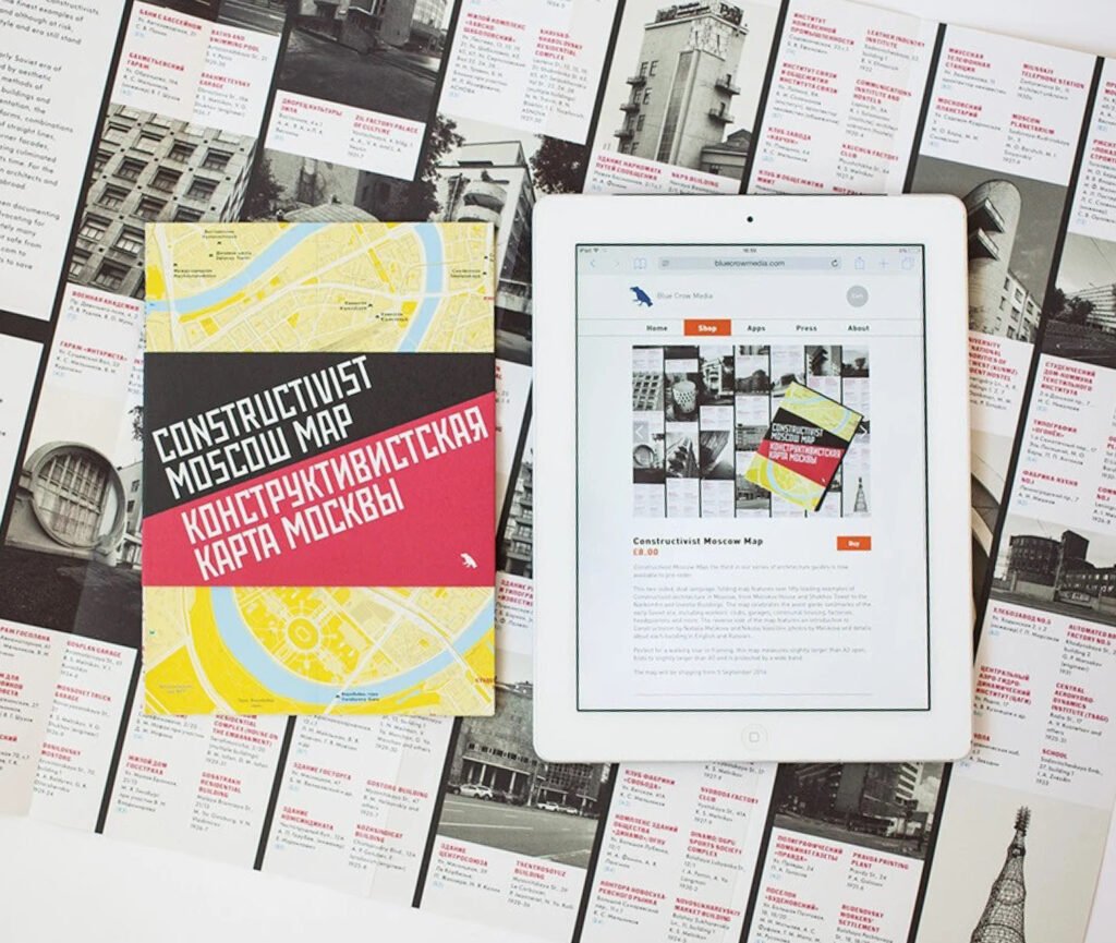

“I think we’ve come to a point where print is the preferred medium for quality or distinctive work.”
Tell us about the process of putting an architectural city map together. How do you create the maps?
Once I’ve decided on a title and found an editor, we discuss the buildings to potentially go on the map, the editor does her research, and I commission a photographer to shoot a selection of buildings. Meanwhile, Jaakko works on the design. If sales are good from the previous map, we’ll visit and explore the city with a rough draft of the map and tweak appropriately. Then, it’s all off to the printer!
In this age of digital maps and GPS, what pushed you to make the decision to create printed maps? What quality do printed maps possess that enables it to stand toe-to-toe with digital ones?
I’m comfortable publishing in print and digital, but I think we’ve come to a point where print is the preferred medium for quality or distinctive work. Digital lacks longevity, and that is unappealing when you are putting a lot of effort and care into something.
What more can we look forward to from Blue Crow Media?*
The second title in the transit design series will be out soon, Moscow Metro Architecture & Design Map. I’m particularly excited about that one. And I have four North American maps out next year, including Chicago, Toronto, another New York map, and others. Plenty to come! •
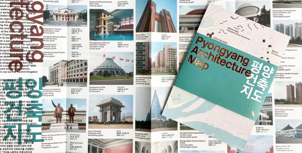

Go on architectural treasure hunt and view the rest of Blue Crow Media’s map portfolio at bluecrowmedia.com
*Originally published in Kanto No. 1, 2018. Edits were made to update the article.

