Words Gabrielle de la Cruz and Riken Yamamoto
Information Riken Yamamoto & Field Shop and The 2024 Pritzker Prize

Japanese architect and professor Riken Yamamoto “deliberately engages with the widest range of building types as well as scales in the projects he chooses. Whether he designs private houses or public infrastructure, schools or fire stations, city halls or museums, the common and convivial dimension is always present,” says the 2024 Pritzker Prize jury. “His constant, careful and substantial attention to community has generated public interworking space systems that incentivize people to convene in different ways.”
Throughout his five-decade career as an architect, Yamamoto has consistently demonstrated that even the most private of buildings have public functions, and that transparency in form, material, and philosophy is essential. Below are five selected projects by Yamamoto and his practice that garnered the respect of the 2024 Pritzker Prize jury, all of which exemplify the architect’s belief that “to recognize space is to recognize a community.”

1. GAZEBO, Yokohama, Japan, 1986
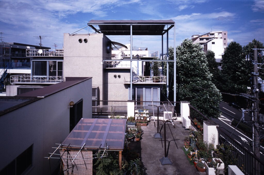
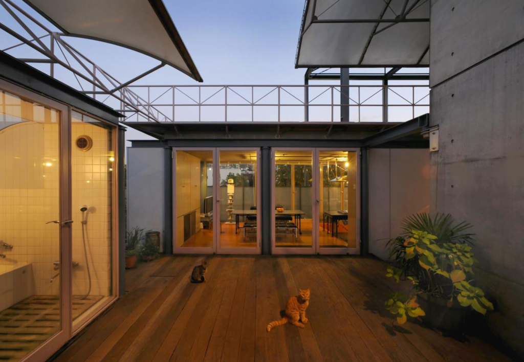
The design story of GAZEBO, Riken Yamamoto’s own home, is pretty simple. In 1954, the area in which the house now stands, started to become populated by tall, mixed-used buildings. This led to reduced opportunities for small homeowners to communicate with one another. Hence, Yamamoto designed an open plan for his residence. The result is a 664 square meter reinforced concrete structure with generously distributed terraces and rooftops, allowing Yamamoto to interact with his neighbors and vice versa.
Yamamoto beautifully writes his everyday experience of the house on his website: “I always wake up around 6:30 in the morning. I feed the goldfish and clean the cat litter box. I make juice with apples, oranges, and cabbage. I can see the rooftop of the house across the alley when I feed the goldfish because the goldfish bowl is on the fourth-floor terrace. The rooftop of the three-story building across the alley is filled to the brim with various plants. I exchange morning greetings with the old lady who is watering those plants or hanging wash on the rooftop. It’s getting quite warm, isn’t it? While I am at it, I greet the old lady who is hanging wash on the rooftop two houses away as well. The everyday life of the local community takes place about four floors above ground level.”
2. Pangyo Housing, Seongnam, Republic of Korea, 2010
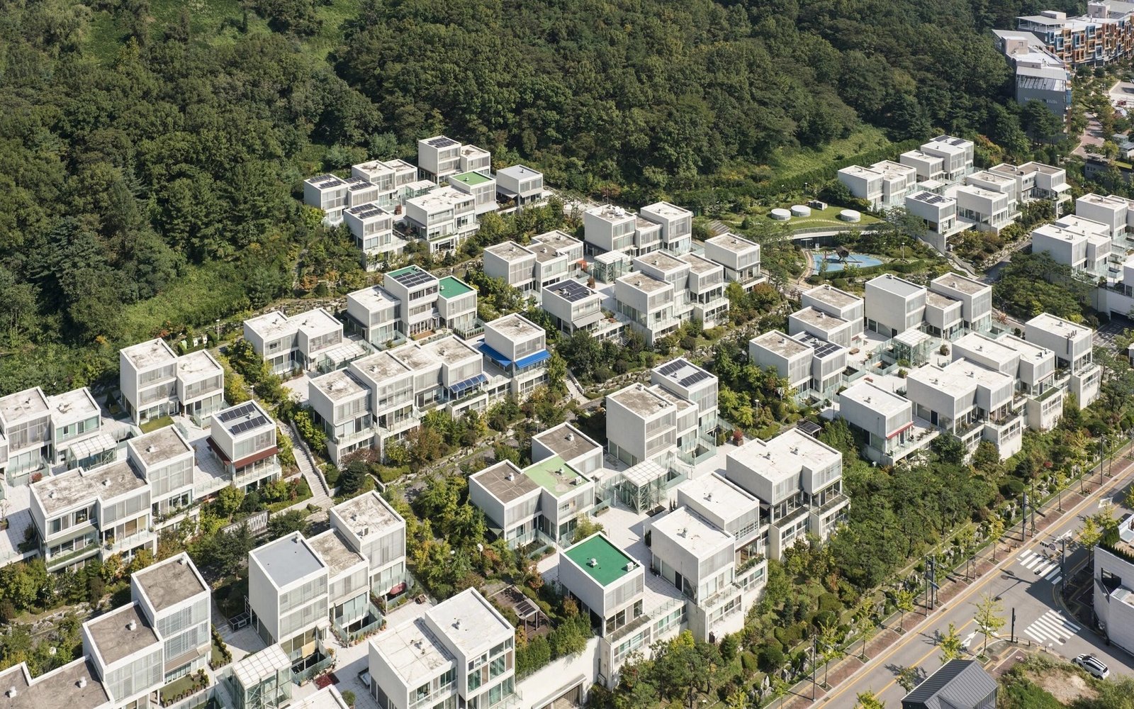
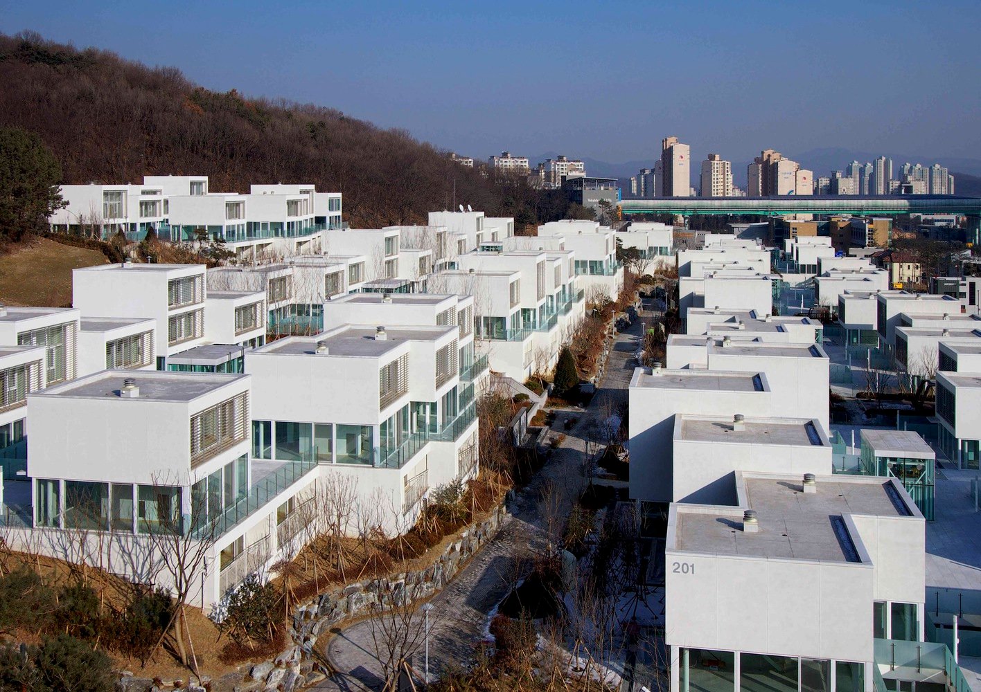
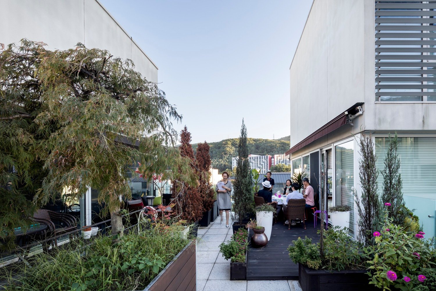
Larger housing projects by Yamamoto do not stray away from his philosophy of connecting a community, with the 2024 Pritzker Prize announcement saying that they “also embody relational elements, assuring that even residents who live alone don’t dwell in isolation.” The announcement singles out Pangyo Housing in Korea as an example, a low-rise multi-family housing project in the new town of Pan-Gyo that Yamamoto’s firm, Riken Yamamoto & Field Shop, won in February 2006.
The international competition by the Korea National Corporation was by invitation, calling for a “creative and environmental-friendly” design. “Pekka Helin (Finland), Mark Mack (U.S.A), and us were selected as the final architects,” Yamamoto narrates. “We proposed two ideas, siting the whole architecture in clusters, and making a communal deck.” A total of nine clusters sit on the 29,135 square-meter site, with each cluster consisting of nine (9) to 13 residential units. The 2024 Pritzker Prize says that the nonprescriptive transparent ground floor volumes “catalyze interconnectedness between neighbors.” Yamamoto adds that the “communal deck on the second level connects the transparent space in each housing unit called Shiki,” which he likens to a huge porch that can be used as a drawing room, home office, atelier, and more. Through these transparent elements, the design of the project can connect one housing block to another, its users with each other, and the entire structure to its environment.
3. Hiroshima Nishi Fire Station, Hiroshima, Japan, 2000
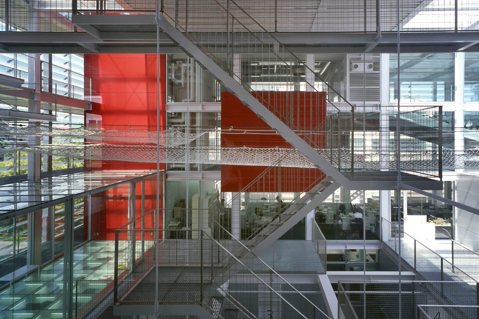
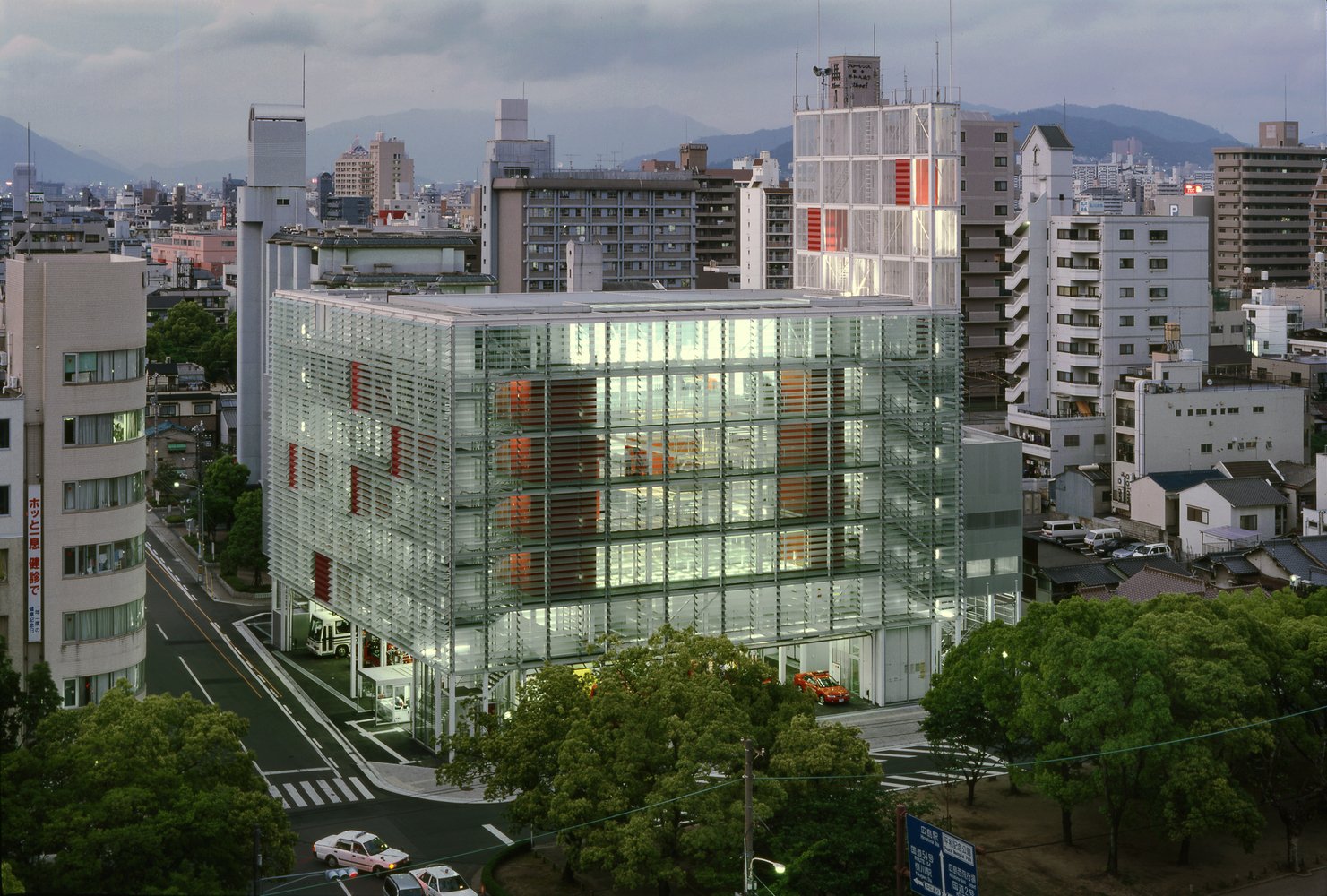
Yamamoto’s civic buildings achieve specific functions and “affirm public purpose and assurance,” according to the 2024 Pritzker Prize. The jury citation mentions the Hiroshima Nishi Fire Station as one of his projects that showcases “his belief in the concept of transparency as a reflection of the functionality and accessibility of the space for users and viewers alike.” The building acts not only as a fire station but also as an education center for the community. The glass façade allows people from the outside to witness the day-to-day activities inside, and the public is welcome to step inside the building to observe firefighters complete their tasks and training.
An exhibition lobby and a visitor terrace on the fourth floor act as free spaces for everyone. Yamamoto says that these areas “overlook training activities, firemen’s work, lectures at the auditorium (which has a movable floor), practices at the emergency education center, and so on.” He adds that a “transparent volume covered with glass louvers” was their firm’s “consistent vision” for the project, and that having seen firemen guiding and explaining their work to local people now made them “feel deeply that a fire station should shoulder a very important role in shaping a local community.”


4. Saitama Prefectural University, Koshigaya, Japan, 1999
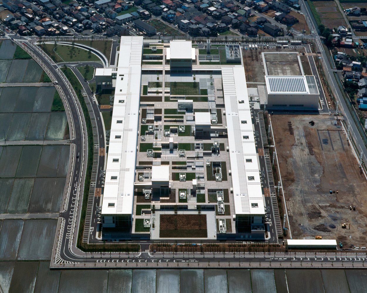
Saitama Prefectural University specializes in nursing and health sciences, and, as said by the the 2024 Pritzker Prize jury, is a building space that is “conceived as a community.” Yamamoto & Field Shop proposed a single volume, saying that the “aim of its education is to develop the talent who will take leading roles within local communities, where close mutual cooperation will be essential.” So, instead of creating a separate and closed space for each department, the architects opted for nine buildings connected by terraces that transition into walkways. These walkways can also act as communal spaces for students and faculty alike, and the transparency of the structure permits views from one classroom to another, or even one building to the next.
The building can best be described as a rectangular complex disguised as a single block, especially when viewed from a certain angle above. It’s safe to say that the architects were successful in traversing “the framework of conventional faculties and departments.” Yamamoto ends: “Starting from one volume, the plan had many problems to be solved with regard to each specific area, but our solution makes the correlation of each element of the whole architecture seem as clear and systematic as possible. As a result, the architecture becomes the landscape as if the foundation of a city appears as architecture.”
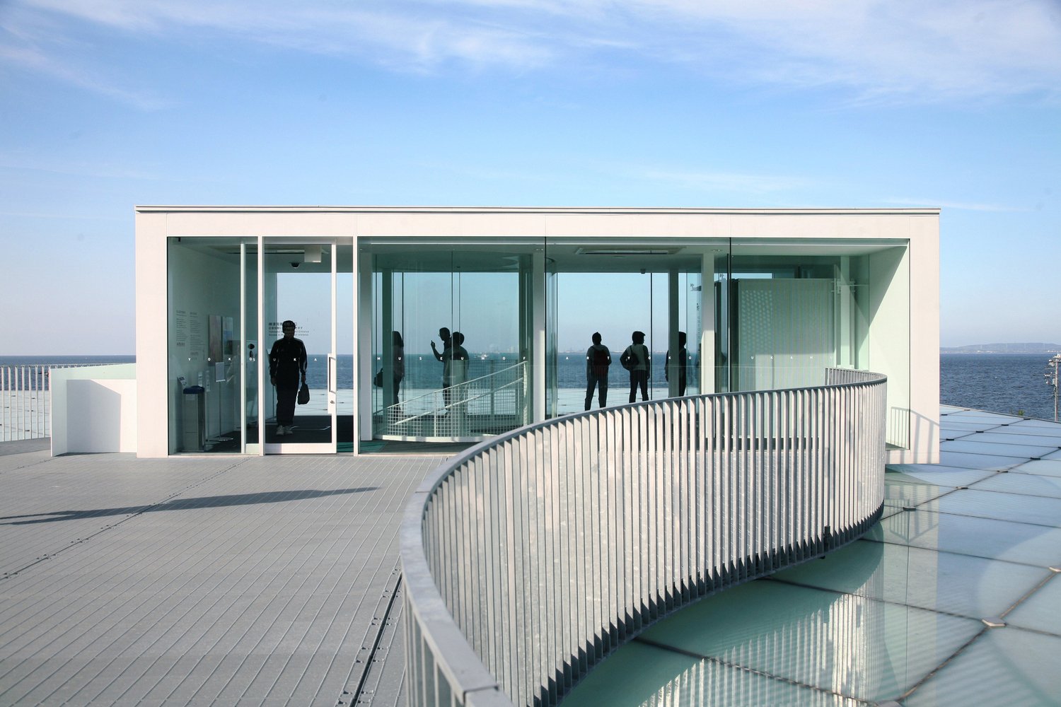

5. Yokosuka Museum of Art, Yokosuka, Japan, 2006
A Japanese destination for tourists and locals, the Yokosuka Museum of Art is a shining example of how Yamamoto considers the user experience first. “While the inviting serpentine entrance evokes the surrounding Tokyo Bay and nearby mountains, many of the galleries are underground, providing those who approach with a clear, undisturbed visual experience of the natural geography,” the 2024 Pritzker Prize announcement reads. Yamamoto & Field Shop was chosen to plan the museum through a “Quality Based Selection in 2002, which was the first trial run by the city of Yokosuka as a Japanese municipality.”
What furthers the communal aspect of the museum is how the design started from scratch, and “was developed through discussions with many people, including museum curators, for over 2 years.” Careful considerations were made to solve the environmental problems associated with the seaside site, and the buried architectural volume allows visitors to bask not only in art but also in the activities surrounding and connecting to it. “The interior space is planned as nested boxes: the edge part is for open public facilities such as restaurants and workshop rooms; the central part is for sensitive facilities for exhibition and collection,” Yamamoto reveals. “The double skin of roof and wall, consisting of glass plate outside and iron board inside, covers the area for exhibition and collection, and is a system to control sunlight.” With a well-thought-out plan, magnificent site, and varying exhibitions, there’s no denying the Yokosuka Museum of Art is an experience in itself. •
