Words Judith Torres
Images Wen Studio
Editor’s note: This is part two of our exclusive recap of Atelier Tao+C co-founder Chunyan Cai’s keynote presentation for B+Abble, an annual conference on contemporary Philippine architecture and design organized by Buensalido + Architects.
Will they win again? After winning Interior of the Year at INSIDE 2021 and the Old & New category of the World Architecture Festival (WAF) 2021 for their Capsule Hostel in a Rural Library, eyes are on Atelier Tao+C’s latest adaptive reuse project, the WAF 2022-shortlisted ZIIN Exhibition House in Beijing.
Invited to talk at Buensalido Architects’ B+Abble 2022, Chunyan Cai, the ‘C’ of Atelier Tao+C, speaks of the joy of working on the ZIIN project. She discusses why the interior structures they built inside a 50-year-old textile warehouse are angled just so, the materials they used, and how each can be read in the final outcome.
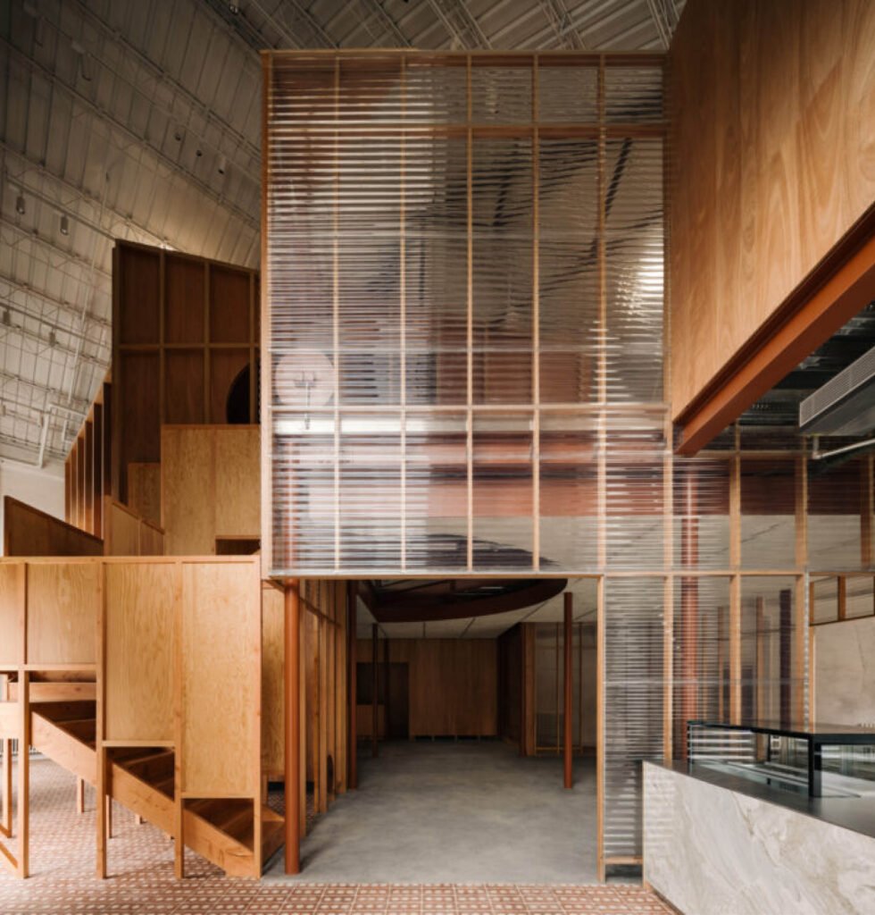

Box in box
By nesting two ‘houses’ inside the warehouse, the firm preserved the silhouette and temperament of the 1970s heritage structure, which is one of 30 warehouses in the Chaoyang District currently being renewed into a public cultural and leisure center.
The client for this particular warehouse is ZIIN Life, a Chinese furniture brand; the total floor area 186 square meters.
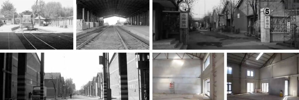

Chunyan, who calls herself CC, recounts to the Filipino audience of architects and designers why the project is designed like a box in a box: “I always try to do adaptive reuse that does not interrupt too much of the existing building…all the projects I have done are like structures as furniture, [so] when a new function and a new request [arise], the design I put in can be easily taken out.”
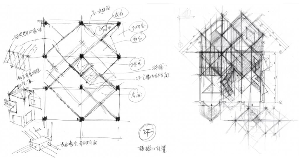

Spatial intervention
In her talk, Furniture, Room, and Pre-Existing Structure, CC mentions several times that housing units in China almost always measure 3.5 meters in width. So, to create a realistic setting for the furniture, Atelier Tao+C created a grid of two 7×7-meter overlapping squares, each made of three 3.5-meter squares and one shared square.
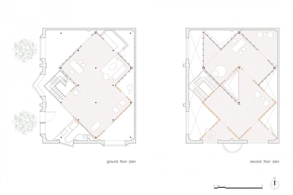

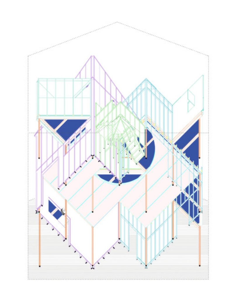

CC explains the floor plan using a cursor. “The light comes in from this direction. So, we made this house in transparent material and this house in wooden material so the light can come in and go into the depths of the [second] house.”
The designers rotated the structure 45 degrees diagonal to the warehouse walls. Had the two sets of walls been parallel, visitors standing at the entrance would immediately see where the showroom starts and ends. Gesturing with the cursor, CC says the visit would be straight and short—and boring. Laying out the interior structure diagonally, however, “creates an exploratory experience.” It also creates multiple triangular and dynamic spaces that are “semi-inside and semi-outside,” a spatial intervention Atelier Tao+C employs to give interior spaces a sense of vitality.



Mundane materials
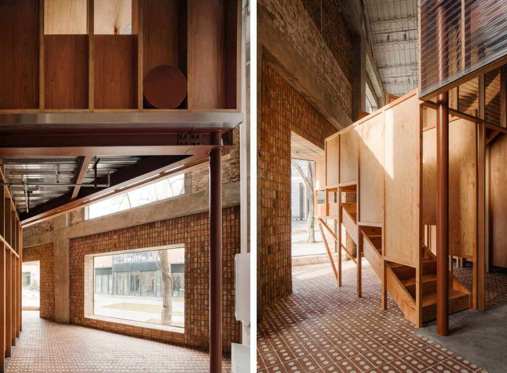
As with most of their projects, the atelier happily bares in the ZIIN showroom the true textures of the materials they use, usually the most mundane of construction supplies—MDF or maple board, bricks, pavers, concrete, polycarbonate panels, and aluminum frames. If the pre-existing structure is made of rammed earth, they learn to work with it. If made with old stone, the rocky relics remain undressed. When the structure needs reinforcement, supporting columns and I-beams proudly stand where they are, holding their loads aloft.
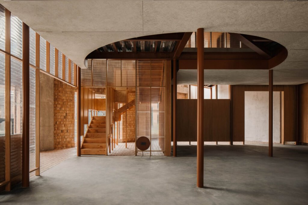

At the juncture where the two houses overlap, the atelier punched a triangular hole in the ceiling to open up a double-height space where one can see straight through to the old warehouse’s roof and skylight. The opening in the ceiling also reveals a confluence of the materials that went to making the second floor: wood, gypsum board, steel, aluminum, and marble. The marble is there for contrast. CC finds the combination of cheap and expensive, warm and cold, and smooth and rough materials engaging.
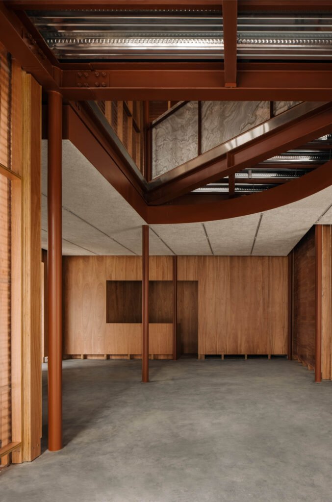

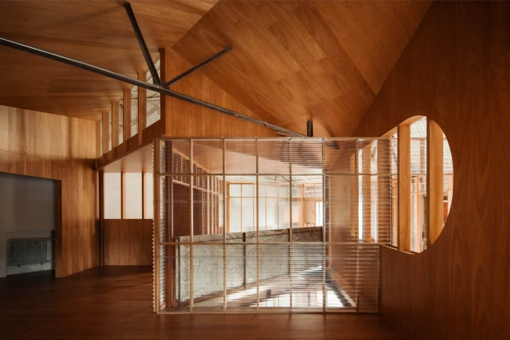

“When we come up to the second floor, you see how the house works with the existing roof, which is why it has a lot of sloping [ceilings].
“What we try to experiment here is the experience of the new framework, the new building that all the layers of materials and how you put the structure inside, the substrate, and the baseboard, every layer can be seen. Every detail and every material is exposed, not hidden or polished. So, it’s a joy for us that we did this project. You see the steel columns and the I-beams we put to make the house stand inside the building. And all the sheets for the floors, the concrete, the cladding, and the gypsum—every layer can be read.
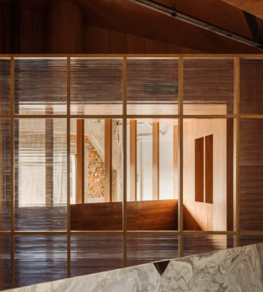
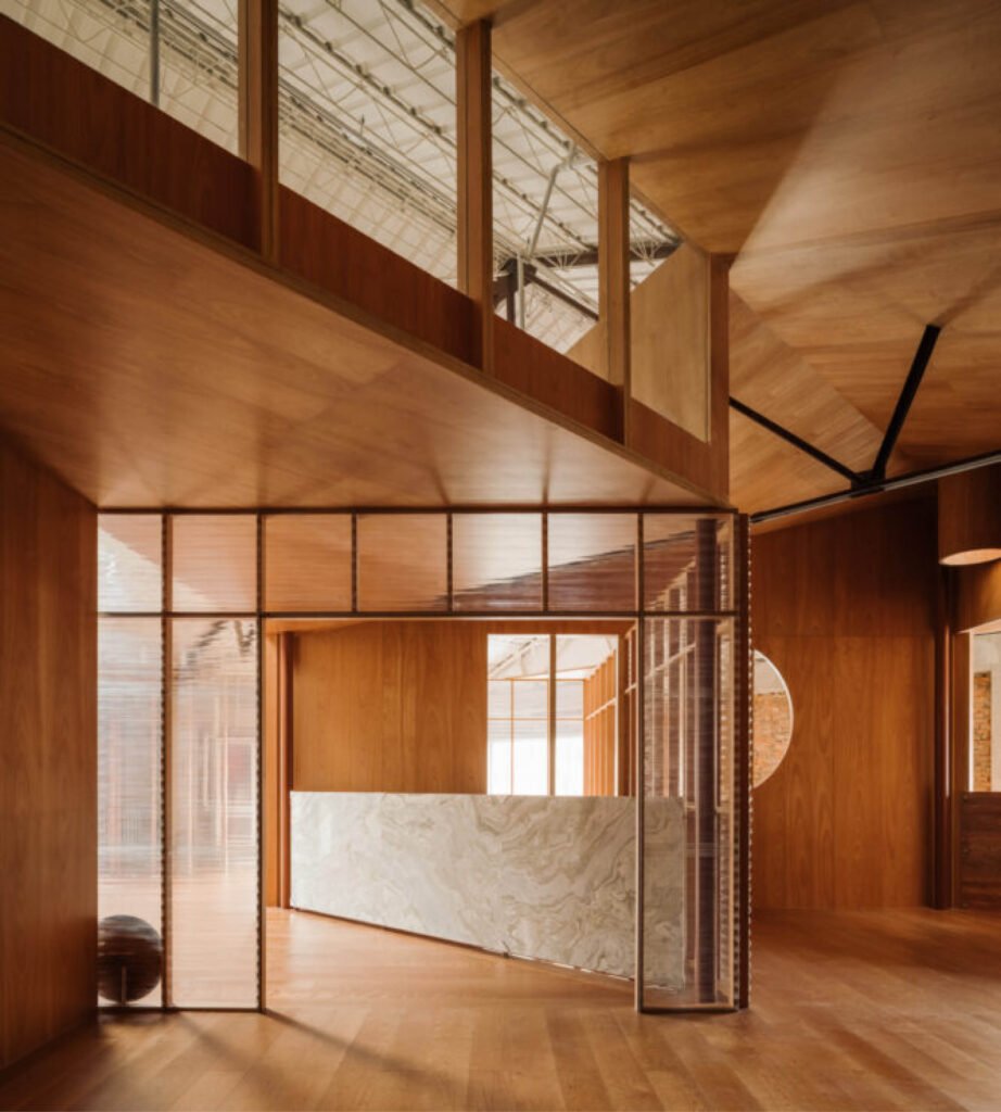
“It’s a project [where] we show the materials, the details, and the process. How we made the building is very clear.” Apart from reading the layers of materials, CC says one can almost read the construction sequence. CC goes through the process, showing how they reinforced the column base, erected the steel columns and the beams, prepared the floor slabs, and put in the mechanicals, electricals, and finishes. She also shows the best spot in the building to observe how everything came together.
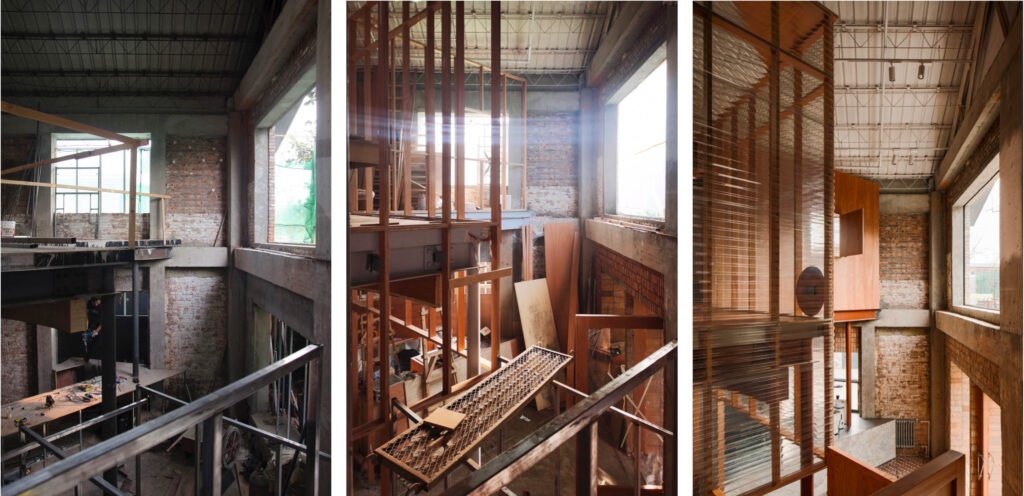

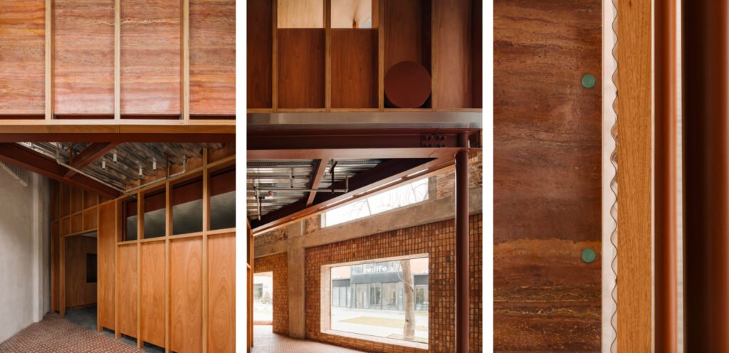

CC points to photographs of exposed material and construction details. Most are apparent what they are, some not. For example, the round brown plates scattered around the building are for electrical sockets. One section shows how wood, steel, polycarbonate, and marble come together. “Marble is a costly material to be celebrated,” CC remarks. “But we treat it here like the other materials—expensive or cheap, they are all celebrated in this space.”
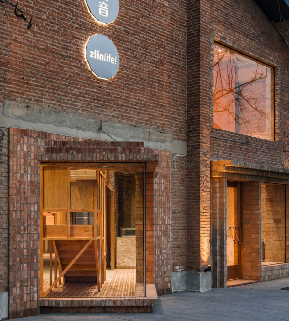
Finally, she shows what the building looks like from the outside, and how, just like the Rural Library and Capsule Hostel, the exterior of this project reflects the interior.
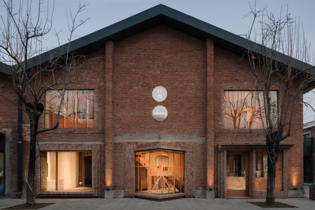

“The stair was sticking out of this building, so we made a triangular window to [house] it. This is the detail of how we made the brick frame. Now the window has become itself a reflection of the interior.”

Atelier Tao+C’s WAF submission
Formerly known as a Beijing textile warehouse, a factory with red-brick walls and a pitched roof built in the 1960s has been transformed into a new showroom for a young domestic furniture brand, ZIIN. The architect sought to balance the relationship between the existing site with the new function: exhibition and sale, background and objects by placing two intersecting square frameworks, which were rotated 45 degrees to detach from the original four walls, and formed independent nested buildings in a building.
The original site is a nearly square warehouse with a dimension of 15 meters in length and 12 meters in width. We first applied two sets of overlapping grids with circular columns inside—each set consists of 9 columns with 3.5 meters spacing defining a 7 meters wide square two-story framework. With columns as the clues, marked 4 square units. The crystal-like structure formed by the interlacing of two identical columns also forms a continuous sequence of rooms.
Each unit becomes a universal and homogeneous space, which is permeable and interlinked to each other, introducing the possibility of flexible activities. In terms of vertical direction, from the clearly visible steel framework, the wooden column framework in the construction layer of the auxiliary wall, to the installation surface layers, every component is visible, and the structure is the accomplished dimension.
In the structure of the horizontal floor and dropped ceiling, from profile steel sheet used on the ground floor to I-steel beams, ducts, and wirings and dropped ceiling, the practice of implementing the layering method is exposed as soil layering. Each node is described, components are exposed, and the attribution of components is clearly identifiable.
Surface materials such as corrugated polycarbonate panels, wood-cement boards, timber, and stone pieces also honestly reveal their thin sheet cross sections as overlaid materials. The combination of components is both a union and a separation, with each material presenting its independence and relevance. The accomplished framework demonstrates the design process, construction, and assembly process as well, narrating how the structure has been constructed.
The whole project adopts commonly used products that are familiar, industrially-produced materials. Bar sections, structural materials, wood, stone, and red brick cement make no distinctions in this project. By recombining ordinary everyday materials and placing them on one facade, a warm, comfortable, and fun scene is established. Similar to ZIIN’s original intention of “affordable good design,” this is an effective cost-control project that uses basic formal logic, direct everyday materials, and construction techniques to translate into a deep expression of space and detail. •
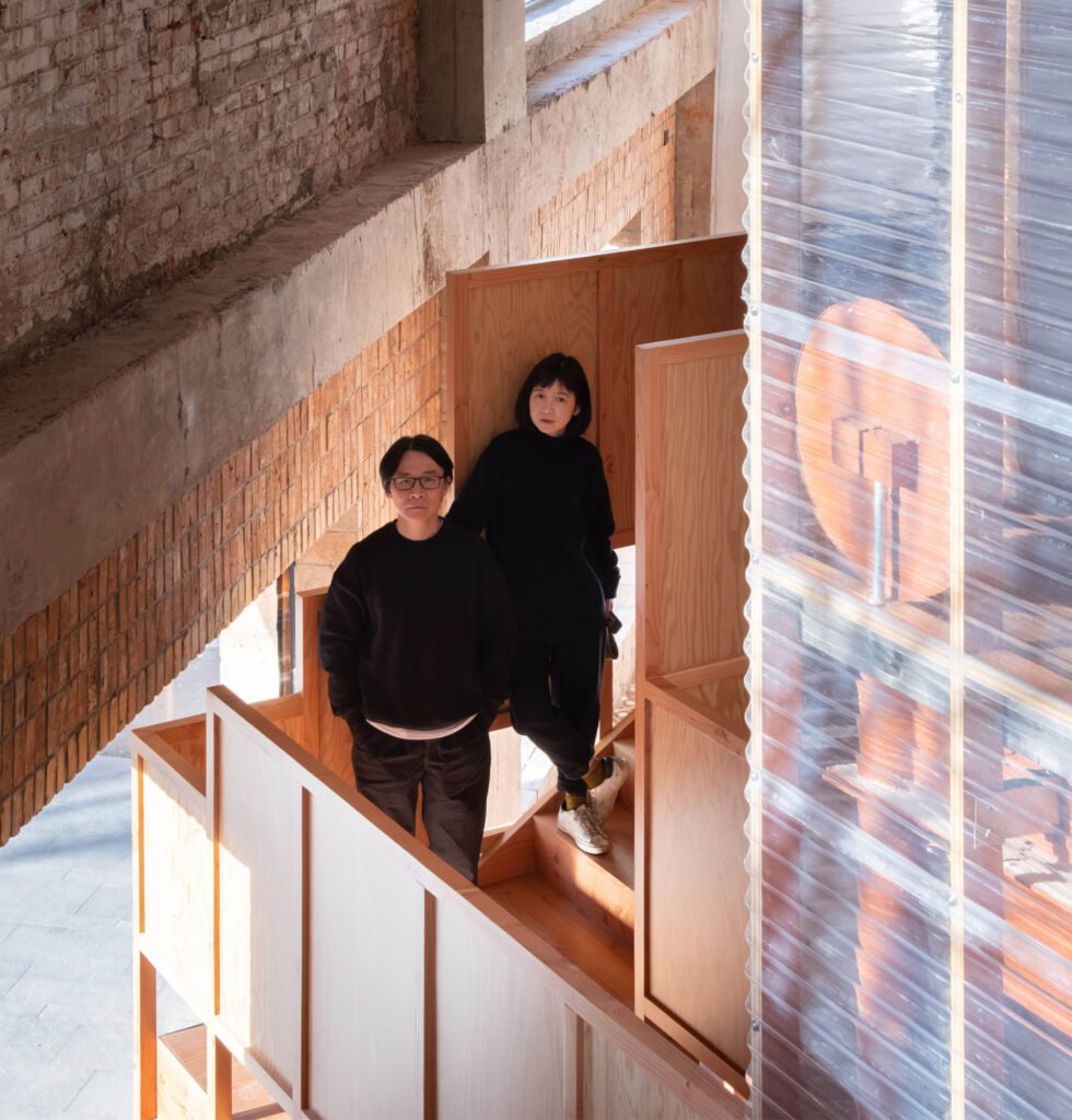


B+Abble is an annual creative conference organized by Buensalido+Architects. At B+Abble, “…movers and shakers from various creative fields share their wisdom and learnings from their respective journeys and experiences, challenging and inspiring the creative community to think differently and create positive disruptions in their own practices.” For inquiries, email Buensalido+Architects at design@buensalidoarchitects.com, or send a message to Buensalido+Architects on Facebook or Instagram.
Kanto.com.ph is a proud media partner of B+Abble 2022.


2 Responses