Columnist Judith Torres With Isabella Robles Go
Images EDG Design (The Chinese National)
Project Rating:
Judith Torres: ![]()
![]()
Isabella Robles Go: ![]()
![]()
The Chinese National, designed by EDG Design, is the primary restaurant of the five-star Swissôtel Jakarta, owned by Agung Sedayu Group, one of the largest developers in Indonesia. The hotel is located atop PIK Avenue, a six-story premium lifestyle mall in an upscale residential and commercial area known for its culinary pleasures, party crowd, simmering bars, and trendy dance clubs.
The four-in-one project
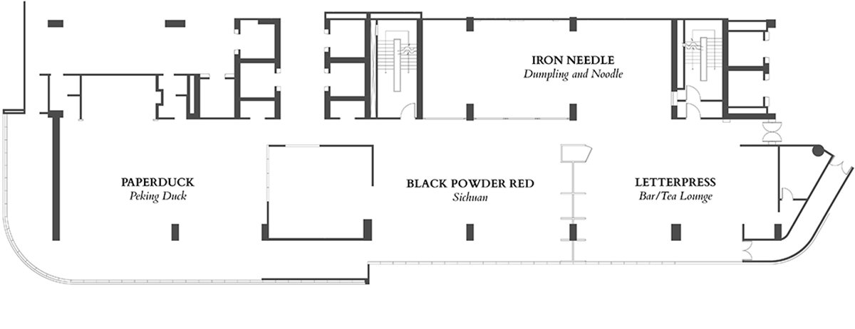
At 885 square meters, not counting the back-of-house, The Chinese National seats over 260 hotel guests for breakfast. It could easily have become a raucous sea of Chinese banquet tables, but EDG saw fit to divide the roughly 16-by-55-meter-area into four distinct spaces, enabling the hotel to offer four (actually, five, but more on that later) different culinary experiences after breakfast hours.
Each of the four has its own design story, each an ode to one of China’s four most significant inventions. They are Letter Press, a refined tea lounge, an homage to printing (invented in 800 CE); Iron Needle, a casual dumpling and noodle shop, a nod to the compass (200 BCE); Black Powder Red, a fiery Szechuan cuisine experience, in honor of gunpowder (900 CE), and Paper Duck, a luxury Peking Duck restaurant, a tribute to paper (200 CE).


The Chinese National’s hotel foyer has two sets of double doors. One of them opens to a hallway to Iron Needle, Black Powder Red, and Letter Press. 

At the very end of this gilded hallway is the foyer accessible to mall-goers.
My co-critic
Isabella Robles Go is the founder and Principal Interior Designer of Living Innovations Design Unlimited, Inc. (LiDU, Inc). She is one of the youngest awardees of the Asia Pacific Property Awards, winning the Residential Interiors category in 2020 for her work on the WW House in Iloilo City, Philippines. She graduated magna cum laude from the University of Santo Tomas and placed tenth in the 2007 interior design board exam. Her family owns a well-loved seafood restaurant in Iloilo, which I felt would give her an informed perspective on EDG’s work, as they specialize in designing restaurants.
Robles Go: Ambiance and efficiency profoundly affect the restaurant business, so I was excited to interview EDG and ask about their design methods. I was intrigued because the EDG people are interior designers, restaurant owners, chefs, and F&B strategists. On receiving your email, I just wanted to dive in and touch the materials and embrace the feel of the space. But sadly, we’re limited to photos at this time of COVID-19.
Art Deco spine
A jaw-dropping 47-meter-long hallway decked in Art Deco geometric patterns is the spine that holds the four restaurants together. Orbicular luminaires hang from the 4.6-meter-high coppery vaulted ceiling, glistening down opulence and glamour. Meanwhile, black scissor gates on both sides of the long passageway provide an air of informality and cultural context. It speaks of Chinatown with its rows of shophouses—exciting, alive, chockfull of scrumptious delights to be discovered and savored.
Robles Go: The hallway is a breathtaking space that will draw your eyes upward and transport you to a different era with its well-curated pieces and designed luminaires, textures, and repetition of forms and patterns. It’s an effective spine that ties the four restaurants together like four chapters in a story.
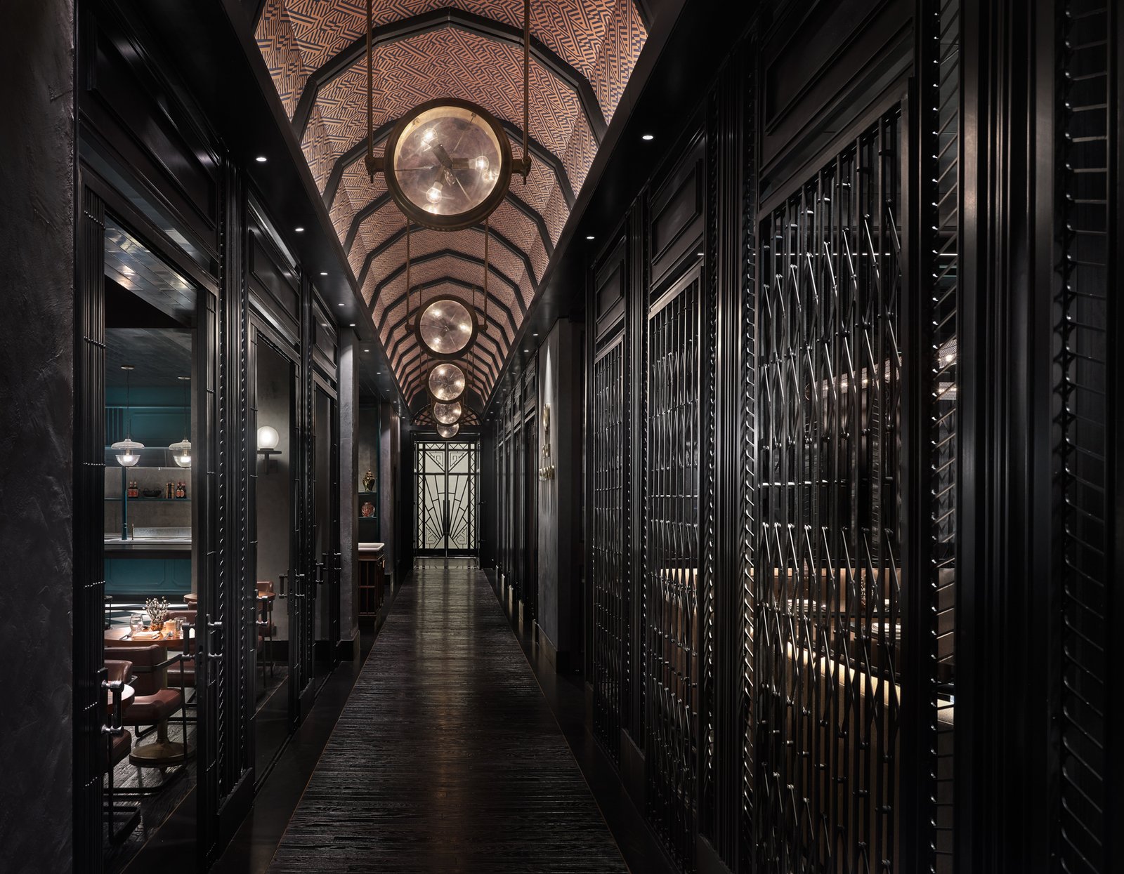

One accesses the Art Deco spine two ways. Hotel guests descend from their rooms to the seventh-floor lift lobby, where a set of double doors opens to a foyer softly lit by luminaires—the same as those in the hallway, but bundled in fours. Here, you’re blown away by the sight of chefs working woks over blazing fires behind a three-meter-wide glass window. It is Black Powder Red’s show kitchen. The mouthwatering view makes you long for a taste, but you can’t have one just yet. The 3.5-by-5-meter foyer is bound by two sets of Art Deco double doors. Those on the left open to a 31-meter hallway to Iron Needle, Black Powder Red, and Letter Press, whereas those on the right reveal a 16-meter passageway exclusively for Paper Duck.
On the other hand, guests from PIK Avenue Mall may ascend to the seventh floor and enter The Chinese National through a foyer next to the lift lobby.
Letter Press
A third and discreet guest entrance, further away from the mall’s lift lobby, provides access only to Letter Press and only after dark when the tea lounge converts into a bar.
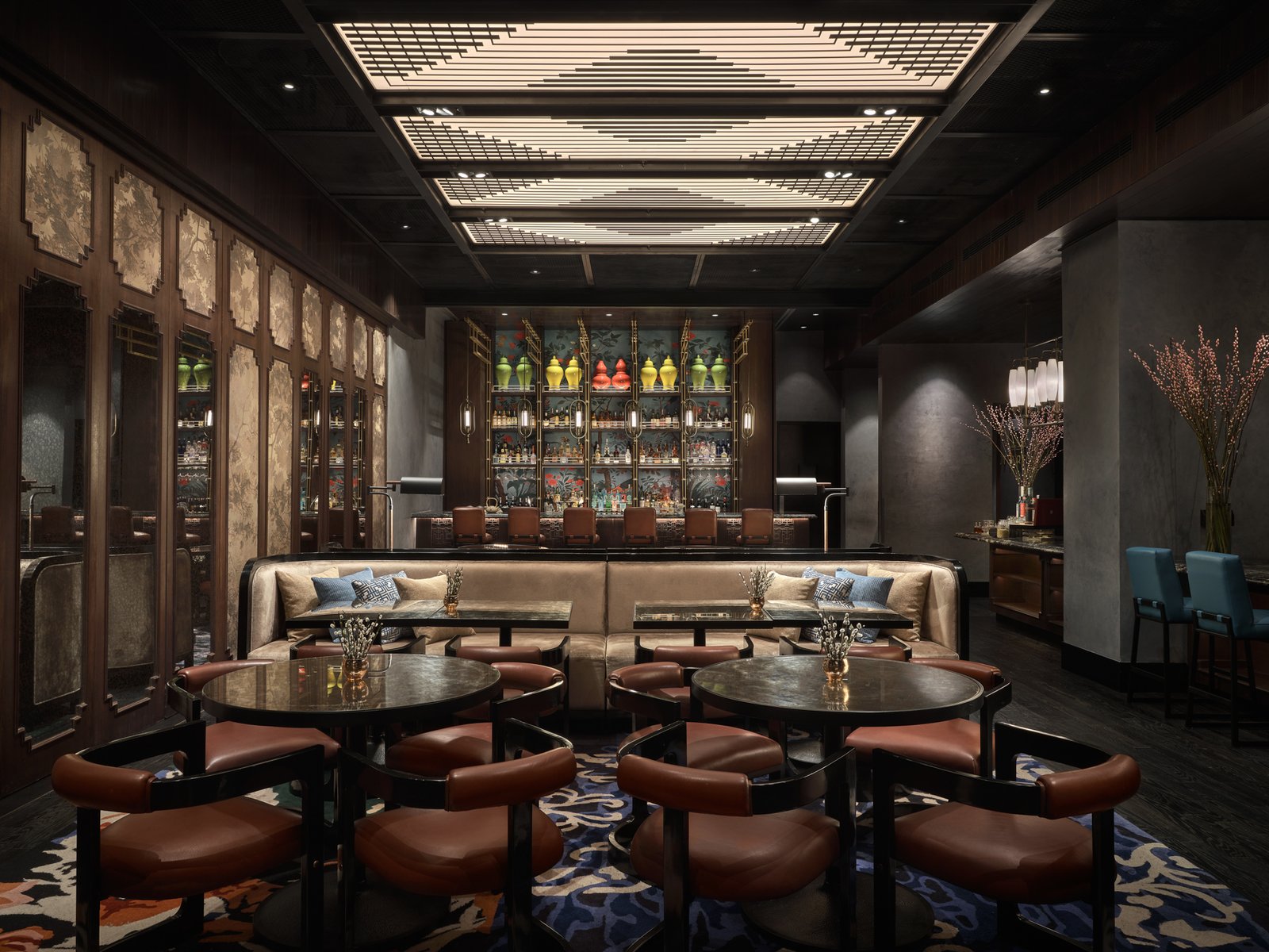

In the daytime, Letter Press is the first establishment mall-goers encounter when they step into The Chinese National’s gorgeous Art Deco hallway. Through the scissor gates, glimpses of chinoiserie in cheerful hues beckon to ladies to come cool their heels after shopping. “It’s a new and affluent neighborhood,” says Piya Thamchariyawat, principal of San Francisco-based EDG Design and creative director of the Singapore office that worked on the project.
Thamchariyawat, who has worked with Ritz Carlton, Four Seasons, and Wolfgang Puck in her 20 years at EDG, envisioned a setting to enchant the hotel owner and her girlfriends to sit for an afternoon of vivifying Pu’erh tea from the ancient forests of Yunnan Province. “We enhanced the femininity of the palette, the textures, and patterns. We went for a plush feel for the settee and the pillows, a velveteen type of cloth, antique mirrors for tabletops, leather for the chairs.”
Robles Go: Letter Press is rich and vivid in detail, yet not overpowering. The ceiling treatment made of black metal and backlit acrylic art deco panels balances all the intricacies in the eye-level perspective while effectively masking the acoustics behind it. In the photo, it resembles a sun-roof with natural light softly gleaming. It would have been really dramatic if the client had allowed them to execute the initial intent of making it operable.
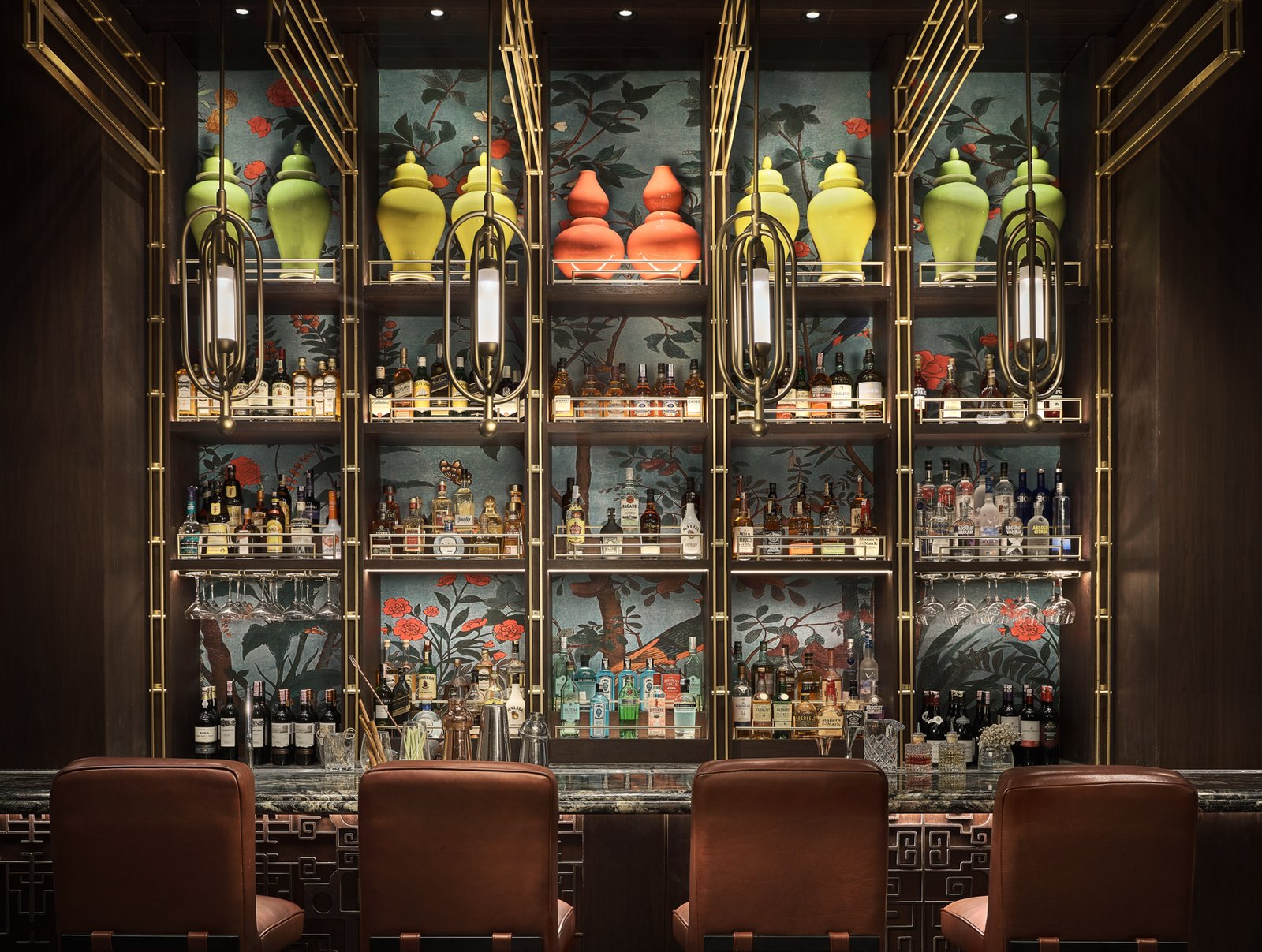

Inspired by Shanghai’s belle époque in the late 1920s to 1940s, when the city enjoyed unprecedented prosperity, the Art Deco expressed in Letter Press can be rightly called Chinese Deco.
The wallpaper backing the bar shelves is a Chinese tableau of pomegranate trees festooned with peacocks, birds, and butterflies. The chair armrests’ glossy finish mimics black lacquer, and the bronze metalwork on the face of the bar counter follows the square scroll patterns of Chinese openwork on antique wooden furniture. The wooden panels are upholstered with fabric depicting a Chinese landscape. “It’s manufactured by Rubelli in Italy for Casa Armani—one of only two items the client bought from all that we specified,” reveals Thamchariyawat. “Everything else we sourced in Jakarta.”
Robles Go: I always balance the use of textures and patterns. But I adore looking at the bar counter of Letter Press with all the metalwork intricacies set against the chinoiserie and shelf display’s vibrant hues. It is superbly detailed, representing the Chinese invention of movable type printing, where characters are carved on individual blocks attached to iron plates. The color and proportion of the metalwork make everything we see beautifully complement each other.
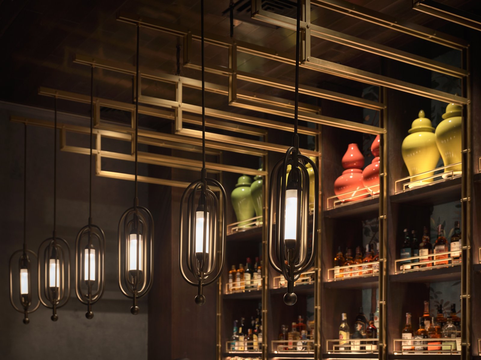

Robles Go: When designing, I focus on functionality, efficiency, and the durability of materials, whether in commercial or residential projects. But I am very mindful of how the design feels and the emotion it evokes in people because the user’s emotional reaction spells the design’s success. What emotions would Letter Press make me feel? Fancy and ultra-feminine! I would most definitely enjoy teatime and dessert afternoons with my girlfriends here!
Iron Needle
Noodles, another one of China’s creations, have been embraced, assimilated, and have evolved in cuisines the world over, so it’s fitting that the dumpling and noodle shop, Iron Needle, pays tribute to the Chinese compass.
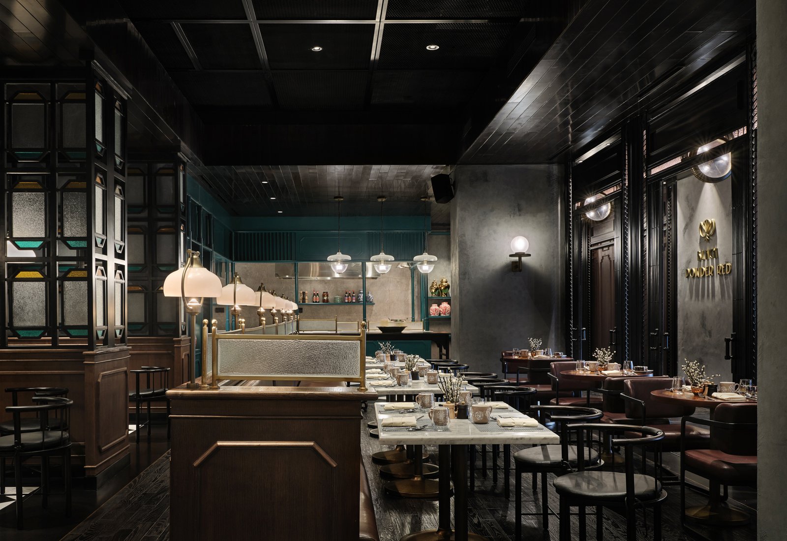

While the three other restaurants enjoy sunlight coming in from the hotel’s floor-to-ceiling glazing, Iron Needle is located away from the windows, on the opposite side of the hallway. It is the most casual of the four restaurants.
The white marble dining tables, wood banquettes with leather seats, and frosted glass panels recall the old English tea houses of Hong Kong, with the teal paneling and colored glass dividers taking inspiration from the colorful tenement buildings by Quarry Bay.
Robles Go and I can’t get over the workmanship of the Indonesian contractors, particularly when we found out that the dividers, some of the furniture and decorative pieces, and even some of the lighting fixtures were fabricated in Jakarta.


The intersections and terminations of the interior architecture are ultra-clean. No lines are out of place, unsightly cables zero. And according to Thamchariyawat, that’s not because of Photoshop. “Oh, we figure all that out super early on with the MEP people. For example, you need the air coming out of the aircon, and you need the return. How will those interact with our design? They need to propose to us, and we just need to say, ‘No, you need to move six centimeters away because we have this pendant coming down.’ Same with wiring and ceiling access panels. There’s a lot of coordination back and forth.”
The contractor is pretty resourceful too. Iron Needle’s glass dividers were supposed to be made with stained glass but to cut costs, the contractor suggested they use ordinary glass panes covered with frosted and tinted film (like the tint used on car windows). “I was so worried, but when I saw the mockup, it was alright!” exclaims Thamchariyawat.
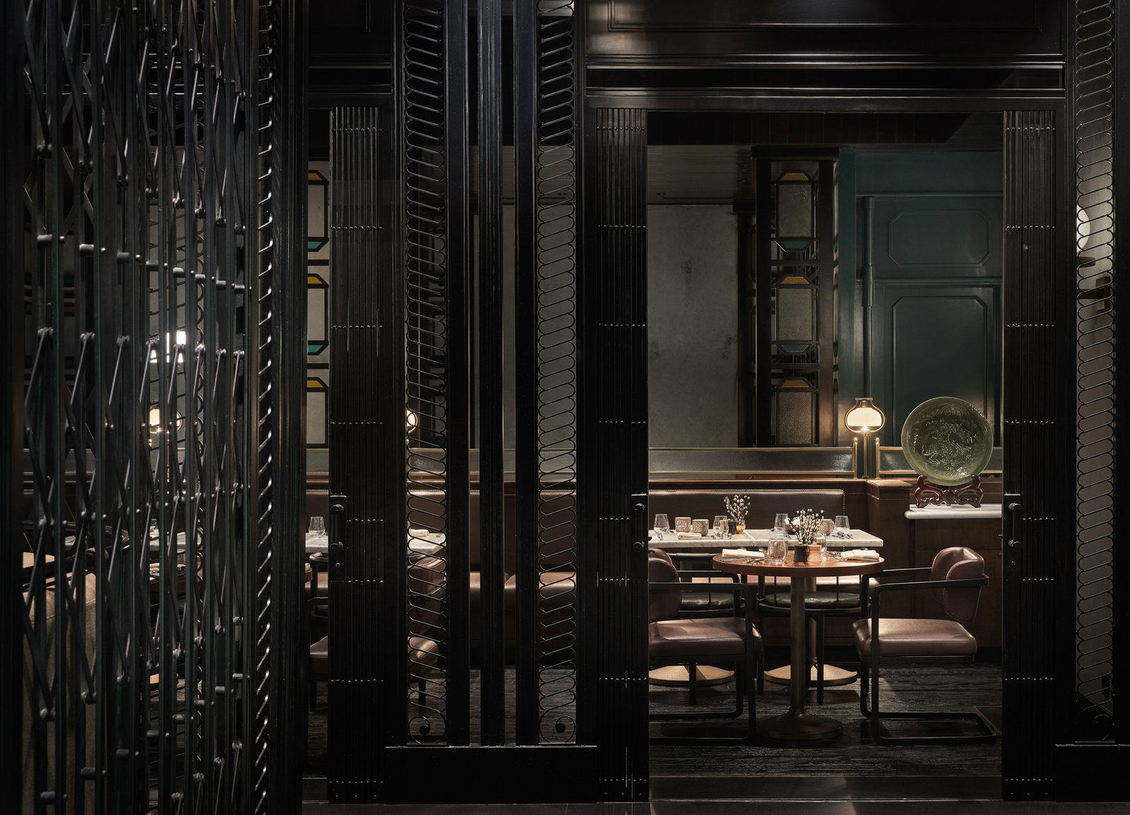

Robles Go: If I were a visitor wanting to eat at The Chinese National, I’d be drawn to Iron Needle. It has the friendliest vibe of all the restaurants, and I won’t be conscious of eating my heart out, enjoying a hearty dim sum meal with my husband or a friend. The design is suitable for families with small kids. When we dine out with our children, we are very particular about space planning, furniture comfort, and ambiance because these heavily affect our family’s dining experience. I see ourselves having an enjoyable meal in the semi-private space enclosed by those beautiful (value-engineered) stained glass partitions.
Black Powder Red
Black Powder Red is across the hallway from Iron Needle and is sandwiched by Letter Press and Paper Duck. It uses minimal color, its palette taking cues from gunpowder and gunmetal, highlighted by shades of copper. How does red come into the picture? Via the explosive flavor of Szechuan’s potent red chilies and garlic, in liberal amounts.
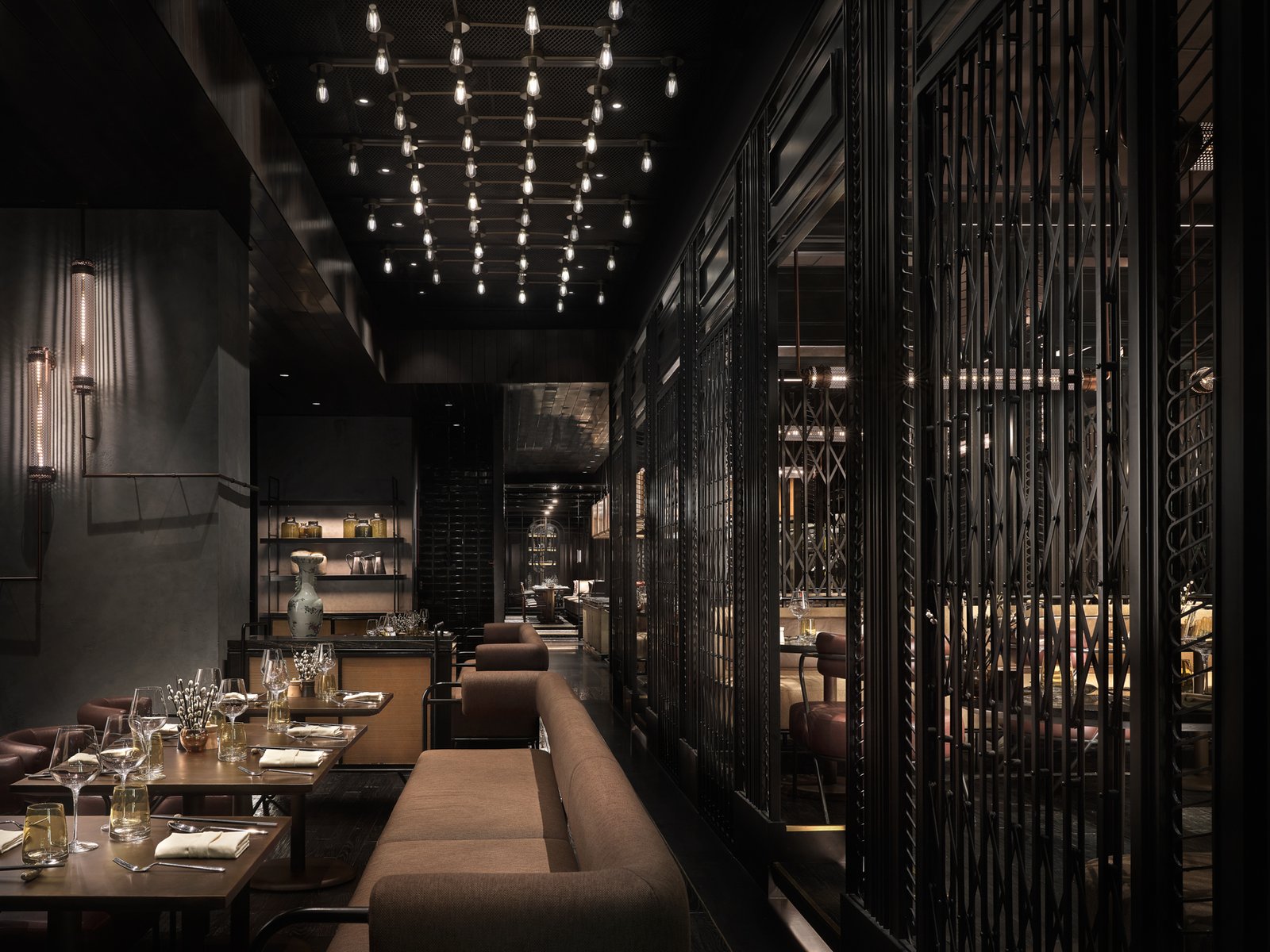

It’s dark and smoky and lives up to its name and the invention it’s paying tribute to. Exposed gray concrete pays homage to gunpowder. The amber-colored water glasses reflect the warm hues of the coppery and rich brown textured leather upholstery. Black metal mesh, exposed light bulbs, and metallic lighting fixtures add to the raw industrial feel of the space.
Robles Go: The sexy and mysterious ambiance of Black Powder Red! The predominance of black scissor gates exudes a very masculine and sensual vibe to the restaurant. The use of the scissor grills is an elegant solution dividing the restaurants without obstructing the beauty of each space. I love that it is operable, so come breakfast time, everything opens up into one expansive room.


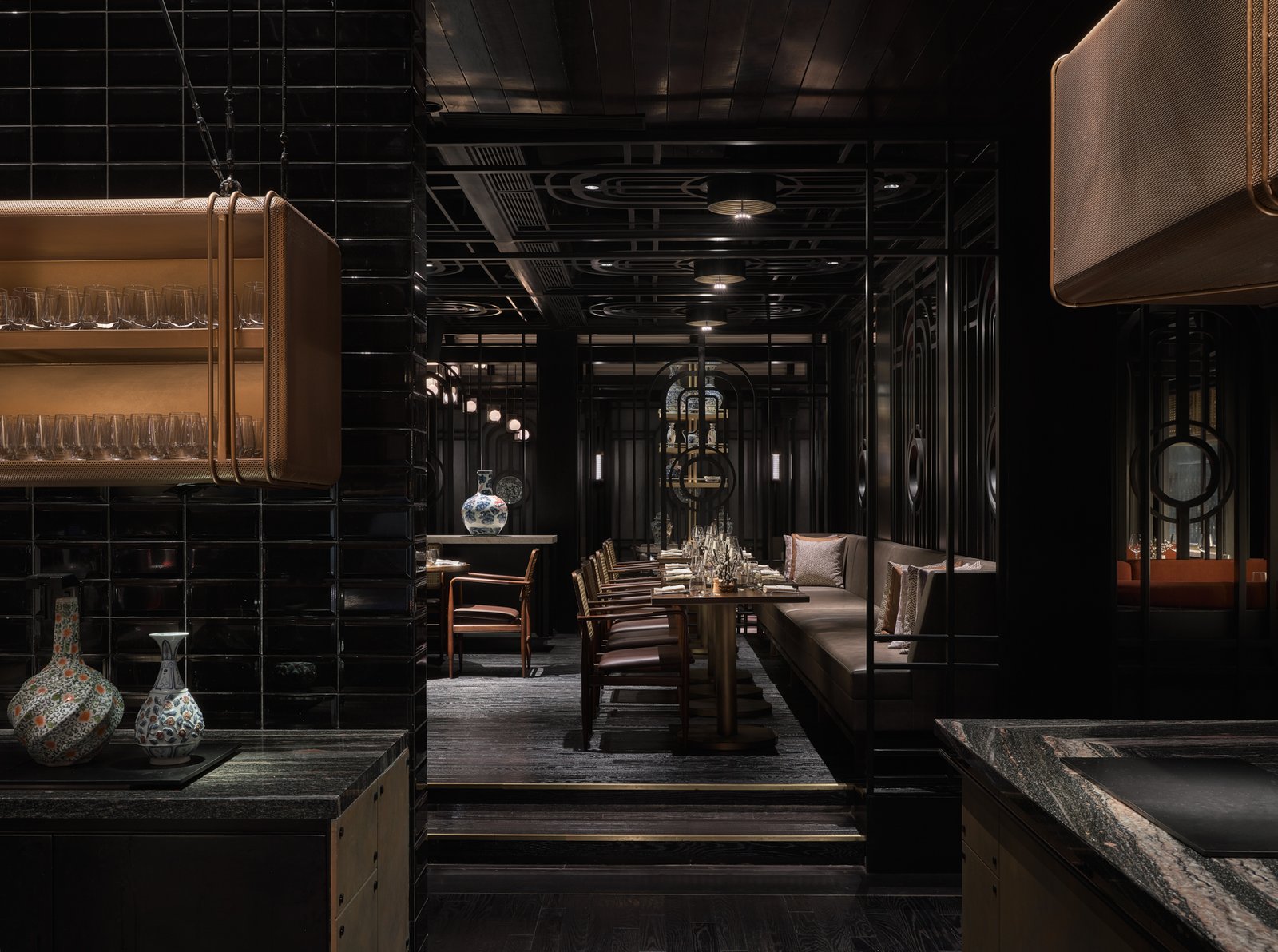
Black Powder Red’s layout is the simplest among the four restaurants. However, the use of different floor and ceiling heights and the scissor gates add interest and serve to demarcate a variety of seating arrangements. For example, the scissor gates form two 3.9-by-5.25-meter “rooms” adjacent to the Art Deco hallway. Both enclosures are raised on a platform about 26 centimeters high, elevating the guests from the corridor and giving them sightlines to views outside the hotel, over the heads of the customers seated closer to the window glazing. Overhead copper light fittings and the corroded textured ceiling do their part to distinguish each enclosure from other parts of the restaurant.
Robles Go: This space exudes so much sexiness and mystery. I can imagine myself having a well-deserved date with my husband after the quarantine in our best-dressed selves. But then I might be too self-conscious because the tables, I feel, are too close to one other, and people can overhear each other’s conversations. I’d choose a corner table outside the enclosures, near the glazing instead. The platform area might be better suited to one large group than several small groups.


You may have noticed by now that apart from the running theme of Art Deco, the ubiquity of the black scissor gate, black timber floor, and black metal mesh ceiling within The Chinese National helps unify the distinct concepts of Letter Press, Iron Needle, Black Powder Red, and Paper Duck.
While Thamchariyawat and the EDG Singapore team chose these unifying design elements, the impetus to do so came from their managing director and EDG partner, Michael Goodman, who calls himself “the big-picture guy.”
“We wanted to have a tiered experience financially, of different market segments of what people wanted at different times of the day. (But) we needed to make sure that as guests walk through the space, they didn’t feel like it was jarring in any way. We wanted you to enter one story, and you’re just in different chapters of the same book, right? Unlike in a mall, where each store is an entirely different book,” Goodman explains.


Goodman continues: “And so, to make sure that everything was not jarring, we set a rule for ourselves—the floor, wall, ceiling for the main architecture is the same in all venues. That way, as you went through the space, you saw a repetition of floor, wall, ceiling that brings it together, like a thread that ties it all together.”
Goodman needs to be the firm’s big-picture guy with the incredible depth of EDG’s scope of services. They don’t just do interior architecture and design. They provide much of the pre-design groundwork—market study and strategy, identity design, brand development, and brand positioning, going so far as to even conceptualize the F&B offering, including the naming of the restaurants and each dish.
Goodman is eminently positioned to oversee the firm’s “vertical approach” because he was an executive chef before he went into interior design, and now that he is based in Singapore runs three restaurants in the Lion City while heading the EDG office.

For her part, Thamchariyawat says her family owns a restaurant in Bangkok, and she grew up waiting tables and helping out.
As the managing director and creative director both love food, love restaurants, and are intimately aware of how restaurants operate, both Goodman and Thamchariyawat are passionate about creating for customers and staff the best possible experience while dining and working at each of the establishments they design. To that end, in addition to interior, graphic, furniture, and fixture design, EDG also conceptualizes and designs the tabletops, uniforms, and other accouterments that go into creating a complete guest and staff experience.
Robles Go: While interviewing Michael (Goodman), I was moved and got goosebumps as I could feel his incredible passion for what he creates. It was so infectious I could feel it coming off the screen! More than passion is his ability to articulate and cultivate the same mindset to his team through their values. His sincere appreciation for Piya (Thamchariyawat) and their working relationship dynamics is something I’d like to emulate in my firm.


Paper Duck
As both Thamchariyawat and Goodman have told us, the client gave EDG the barest of briefs for The Chinese National. “She asked for an all-day dining restaurant for the hotel with a certain number of breakfast seats… And she wanted something exciting and hip and cool. That was pretty much it,” says Goodman.
While it was EDG that strategized and rationalized having a tea lounge, bar, noodle house, and Szechuan dining in The Chinese National, and it made complete sense to add Peking Duck fine dining into the mix, there was one compelling reason for its inclusion. The crispy and aromatic imperial roast duck is the favorite dish of the client’s father-in-law, who is also the Agung Sedayu Group chairman. Naturally, the paterfamilias wanted to have the best Peking Duck in town.
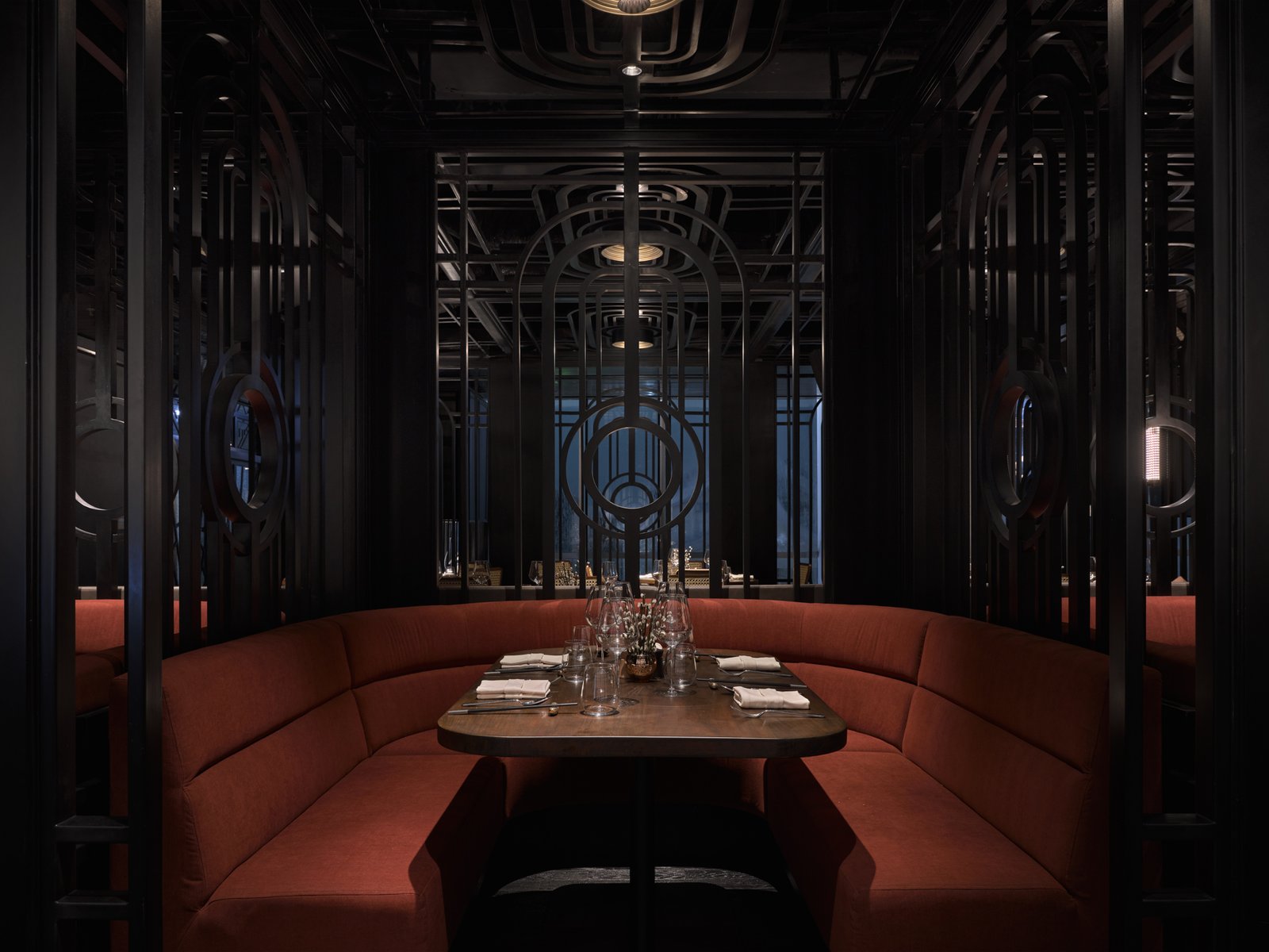

To get to Paper Duck, visitors coming from The Chinese National mall foyer must traverse the Art Deco hallway’s full length and then walk through the two sets of double doors of the hotel foyer (the one with the window to Black Powder Red’s fiery show kitchen). On crossing the second threshold, a host waiting in Paper Duck’s dedicated hallway leads guests to their table.
Three tables for five line the hallway, each ensconced in a booth formed by black metal grills. To sustain the red-hot energy of Black Powder Red’s show kitchen, EDG amped up Paper Duck’s dusky pink and parchment color palette by swathing the booth couches in roast duck red fabric. Then, they supported the toasty hue with warm walnut timber tabletops.
Robles Go: I understand why EDG placed Paper Duck closest to the back-of-house or main kitchen since it is the restaurant with the bulk of the cooking. Being at the very end sets it apart as it is the most high end and luxurious dining space.
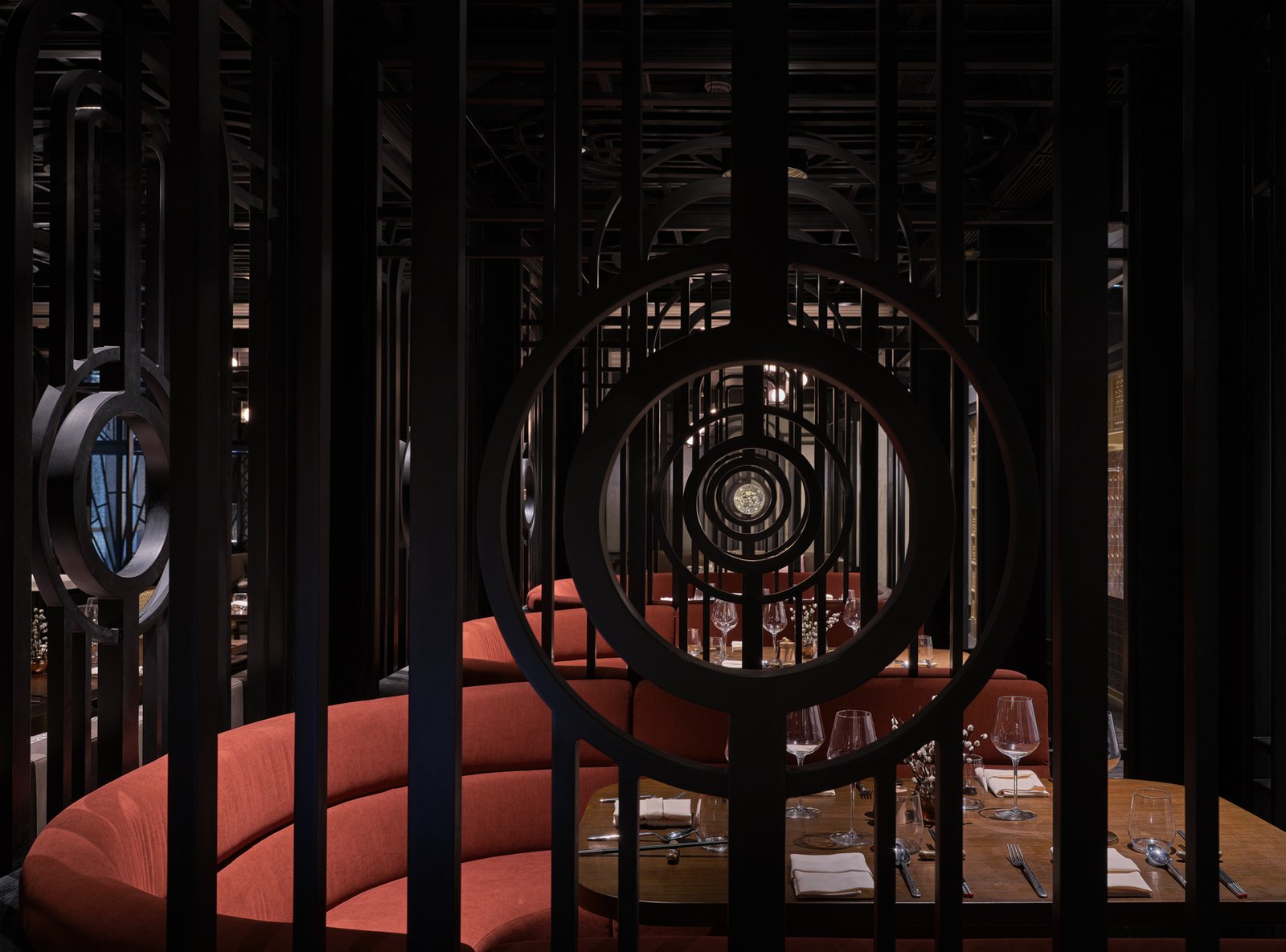

As one continues walking down the hallway, another tantalizing sight beguiles—two traditional wood-fired ovens with golden red-brown ducks hanging neatly in rows, glistening in the heat.
Facing the duck ovens is the restaurant’s most refined dining area, an eight-by-eight-meter space bound on four corners by curving L-shaped couches and crowned by a 4.6-meter-high triple-vaulted canopy.
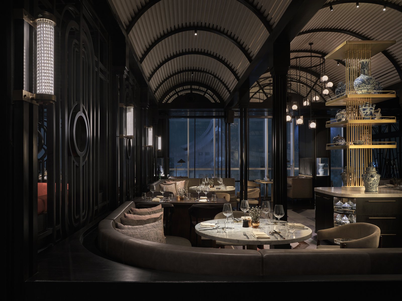

Robles Go: An ideal space for celebrations and milestones! Luxurious but not too intimidating, and I appreciate the privacy and spacing of each dining space. It is perfectly spaced, where one can enjoy a scrumptious Peking Duck meal. I am not sure, though, what the market there is like. But here in the Philippines, Peking Duck restaurants use lots of large round tables for big groups and families.
At this point, one must mention what an ideal client EDG had in The Chinese National. “It’s not very often that you get your schematic design approved on the first submission without comments or requests for revision,” Thamchariyawat shares. While much of the original metalwork design was simplified and less expensive substitutions were made during construction and fit-out, the client was supportive throughout and respectful of EDG’s design intent. “To the owner’s credit, the two of us went together to factories in Jakarta to personally pick the accessories—ceramics, glassware, and lots of other things.”

While Thamchariyawat credits the client for being dedicated to the project, Goodman credits Thamchariyawat for everything beautiful about it: “One hundred percent of what you see in the project is Piya, Piya, Piya. I’m pure story, concept, emotion, big picture. But all those beautiful details—and they are stunning—are all her.”
Robles Go: That comment blew me away. I appreciate how Michael professionally unearths Piya’s best, and she responds by contemplating solutions sans ego. As Michael pointed out, “We try to envision what space is like, her from a design perspective, me from a strategy and operations perspective.” I’m awed that they have this tremendous respect for each other, and they humbly acknowledge their limitations too.
Thamchariyawat interprets Goodman’s concepts and design stories into interior design with intelligence and finesse. How, for example, does she translate the story of papermaking into Paper Duck? In the olden days, plant fibers were pounded, mashed, and washed into pulp. A framed silkscreen was dipped several times into the pulpy water to collect fibers one fine layer at a time until the fibers formed a sheet. Then, the screen was hung to dry until the sheet could be peeled from the screen.


The chairman of the board’s private dining room. The curtains on the left open to views of North Jakarta’s trendy Pantai Indah Kapuk district. At the far end, the cabinet hides a doorway to a dedicated pantry, which has another door leading to The Chinese National’s main kitchen. 

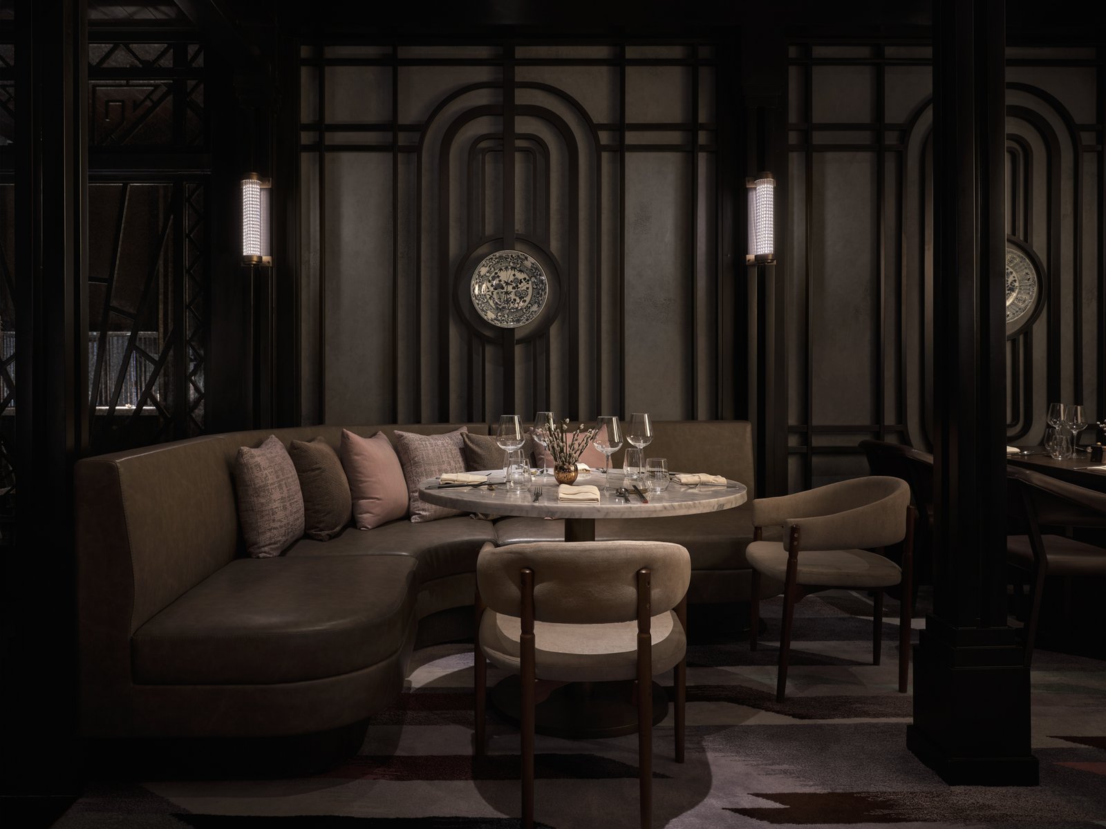
EDG Design’s manic attention to detail: Everything, from the wall art, furniture pieces and, even the design of the lighting fixtures were carefully crafted in service of the restaurant’s four distinct dining narratives.
I see the repetitive process of layering in the succession of Art Deco grills forming the booths and platform seating. I see the silkscreens hung to dry along the chairman’s private dining room’s wire mesh ceiling. (You have to see the photos of the papermaking process in our interview with Goodman!) And I see more layering in the laser-cut wood screens at the counter fronting the duck oven station.
Robles Go: EDG beautifully translated the process and preparation of layering paper-thin slices of crispy Peking Duck skin onto paper pancakes to the story of papermaking in their interior design narrative. The elegant layering applied in the screen dividers with art deco patterns, the intimacy and sophistication in the refined materials used, and the modern approach to classic through innovative materials like the acrylic tubes forming the vault.


Custom-made lighting fixtures from Black Powder Red and Paper Duck 

These select fixtures are just some of the several fabricated in Jakarta. 

EDG kept a tight grip on the design direction for almost every aspect of the restaurant.
Then there’s the effort to produce creative fittings rather than simply purchase inexpensive knockoffs. The round wall sconces, for example, in the chairman’s dining room were fabricated in Jakarta, using frosted seeded acrylic. The mural, one of the very last design elements executed, was hand-painted by a local artist using acrylic paint on vinyl. EDG described what they wanted, showing the artist pegs for inspiration, which they had adjusted in color and composed on Photoshop. Big-picture-guy and strategist Goodman and the sensitive, detail-oriented Thamchariyawat are a collaborative match made in design heaven!
Robles Go: I am honored to do this interview and critique. Conversing with Michael opened my eyes and validated some design ideas I had, which I have been hesitant to present to our clients. I learned so much about the vertical approach’s effectiveness, the importance of a design story in anchoring the design and strategy, and not being afraid of putting our ideas out there and being shot down. Best of all, I had a front view seat to their inspiring company culture and values, making EDG a remarkable and successful firm. •

Isabella Robles Go is the founder and principal interior designer of Living Innovations Design Unlimited. She is one of the youngest awardees of the Asia Pacific Property Awards, winning the Residential Interiors category in 2020 for her work on the WW House in Iloilo City, Philippines. She was a nominee for the 2018 Haligi ng Dangal Awards, Interior Design Category and a finalist of the 2017 Kohler Bold Design Awards for Prodigy: Rising Star Category. She graduated magna cum laude from the University of Santo Tomas and placed tenth in the 2007 interior design board exam.
Judith Arellano Torres is the former editor-in-chief of BluPrint magazine, which she led for ten years. She edited four books, Blueprints for 2050, Design Better, Tropical Architecture for the 21st Century Books 1 & 3, and co-wrote the latter two. Before BluPrint, Judith worked for 17 years in television in a variety of roles, including COO of the ABS-CBN News Channel (ANC); COO, executive producer, and editor at Probe Productions, Inc.; and producer for CNN International, covering the Philippines, Indonesia, Malaysia, and Singapore.
