Words Miguel Llona
Images PIID and WAF/INSIDE

Since 2014, Filipino architecture firms have been making waves at the prestigious World Architecture Festival, taking home the top prize for some categories or getting high commendations from the jury. Each year has seen more firms shortlisted than the previous year, with 2021 proving to be the most successful yet with 9 projects from 6 firms shortlisted in over 11 categories. It’s a reflection of Filipino architecture gaining more recognition internationally and has encouraged more and more architects to join each year.
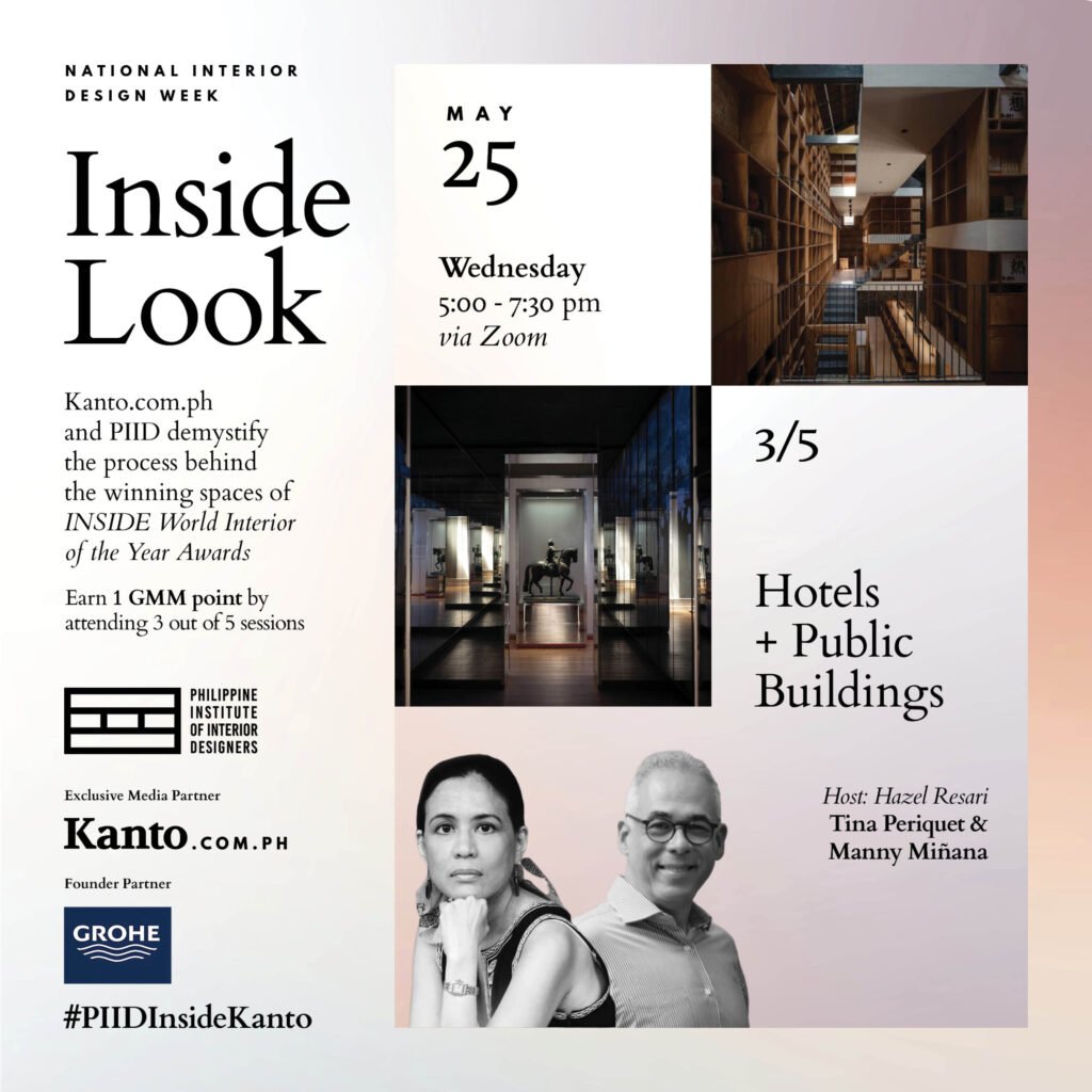
But what about interior designers? In contrast to the Philippines’ strong presence at the WAF, the country has barely made a dent in INSIDE, the WAF’s counterpart for interior design. There have only been two Filipino projects shortlisted for INSIDE, and both were done by an architect (Jorge Yulo, for Mecha Uma and La Cabana de Resureccion). It is a global opportunity that has yet to be maximized by the local interior design industry, despite the abundance of talented designers in the country. To address this, Kanto partnered with the Philippine Institute of Interior Designers (PIID) to host online watch parties of the winning entries from last year’s INSIDE, in the hopes of preparing and inspiring interior designers to join the competition. With Kanto having exclusive access to the boards and crits from last year’s competition, professionals and students alike had the opportunity to see how designers defend their work in front of a three-man jury, or simply be exposed to innovative designs from around the world. Guiding the audience throughout the watch parties are pairs of architects and interior designers for each day, with the former being a past WAF finalist to provide a firsthand perspective of the competition.


Day 3: Hotels and Public Buildings
The winning entries from the Hotels and Public Buildings categories of INSIDE 2021 were the focus of Day 3. Tasked to be mentors for this session were IDr. Tina Periquet, principal of Periquet Galicia Inc., and Ar. Manny Miñana, principal of Emmanuel A. Miñana Architects, with the discussion facilitated by IDr. Hazel Resari of Resari Architects and Interior Designers (RAID) and Kanto’s EIC, Patrick Kasingsing. Drawing from their experiences, either as a WAF finalist or simply as a veteran in the interior design field, the mentors provided invaluable insights on elevating presentations through story, practicing intentionality and clear-mindedness, and ennobling spaces through design.
Hotels
Capsule Hostel and Library by Atelier Tao + C
Winner – Hotels category, World Interior of the Year
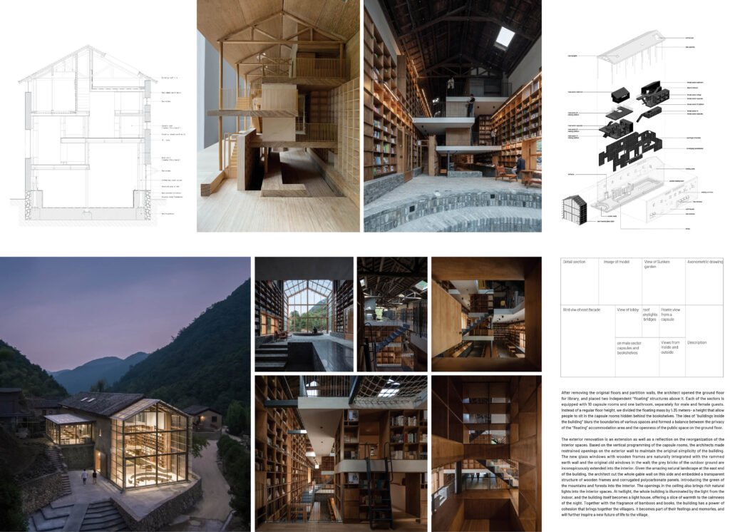
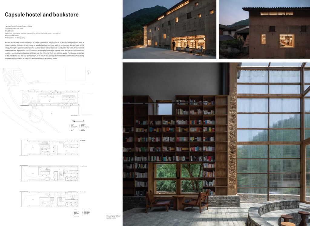
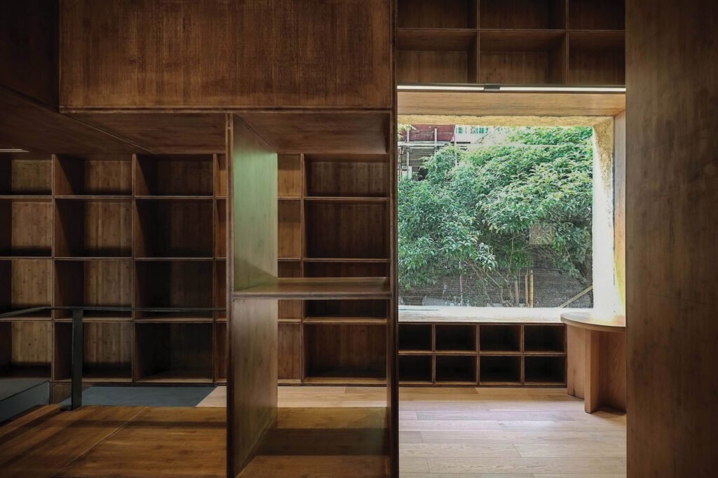
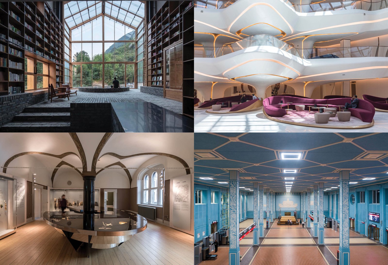
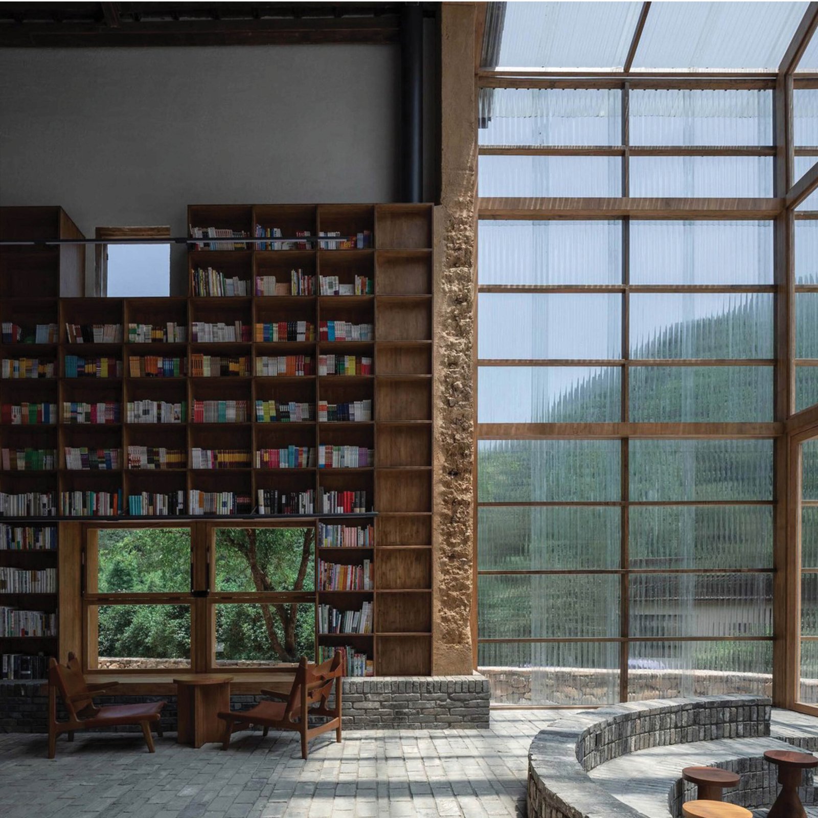
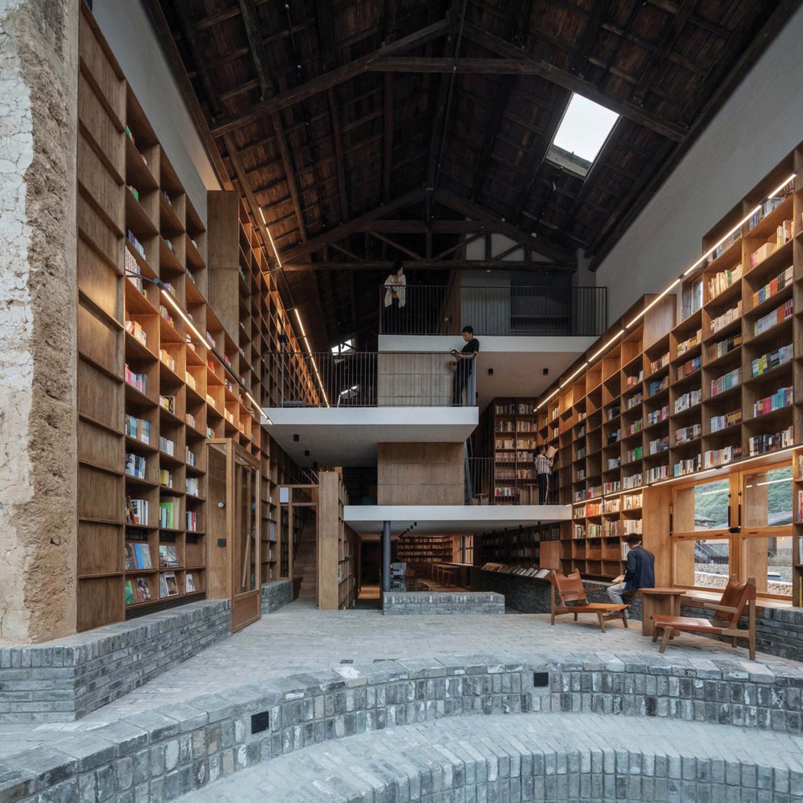
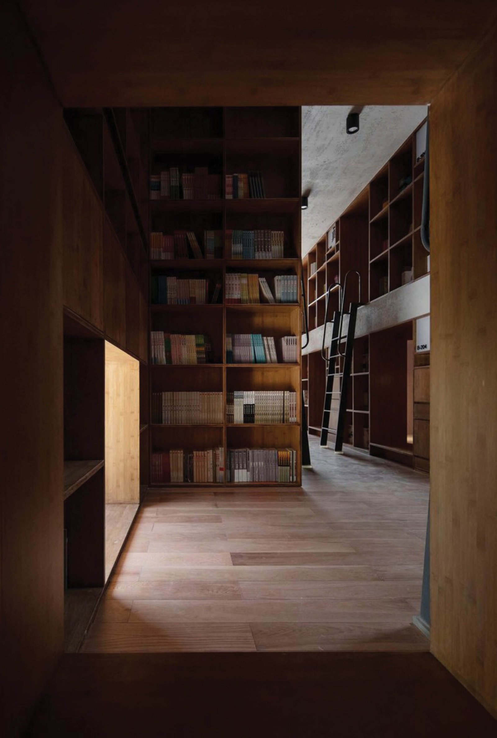
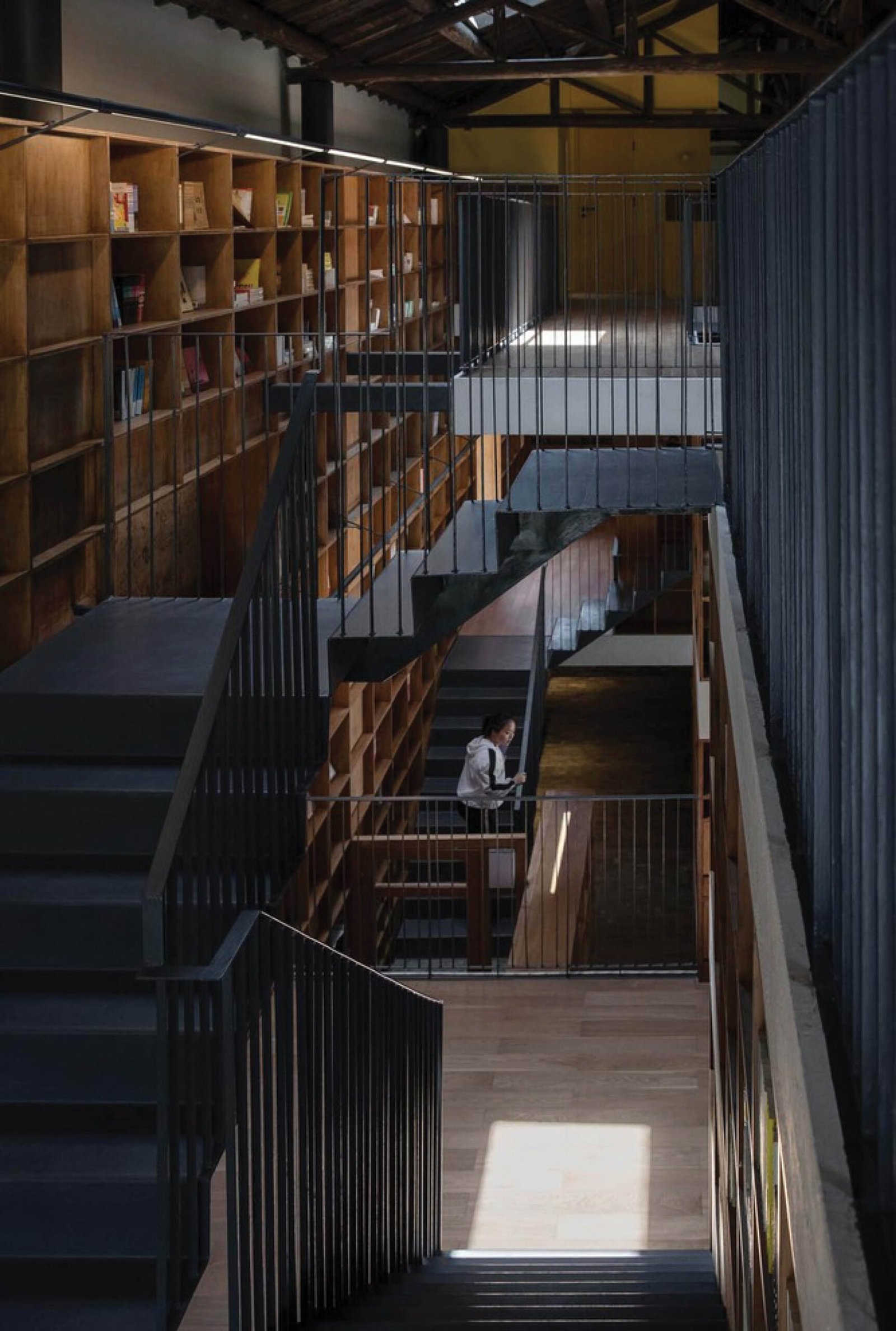
The unassuming Capsule Hostel and Library by Atelier Tao + C was declared the winner of the Hotels category in INSIDE 2021. The firm redesigned a 232-square meter house located deep in the forests of Tonglu in China’s Zhejiang Province, transforming it into a capsule hotel and a community bookstore/library. The architects’ main challenge was how to provide privacy for the accommodation areas, which could accommodate 20 people, while giving openness and continuity to the public areas. Their solution to this problem and the resulting design merited the firm not only a win in the category but also as the World Interior of the Year, beating out higher-profile projects for the top prize of the competition.
The composition of the project’s boards reflects the balance that the architects achieved for the public and private areas of the hotel. For Periquet and Miñana, the inclusion of sectional views and axonometric diagrams together with the actual photographs give the judges a clear picture of the project’s concept and execution. “What [jurors] want all the entries to feel like is that you’re telling a story, like a narrative, where you’re trying to unveil the design concept in photos and floor plans,” says Miñana. An important point raised by Periquet is the boards’ focus on the project’s architectural qualities more than its interiors, noting that INSIDE is going to be judged by designers with a strong architectural background. “This is something to note for these boards, we don’t see colors, swatches, material samples, or whatever. We’re seeing images of large scale, and diagram and narrative,” she says.
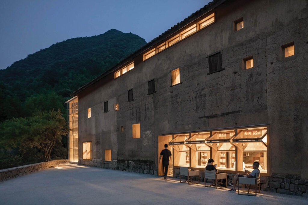

The viewing of the crit elicited many insights from Periquet and Miñana, with the former pointing out an aspect that interior designers excel over architects: the study of human scale, or ergonomics, which she believes is the key to why the entry won. In Atelier Tao + C’s presentation, the designer had gone to great lengths explaining their process for the interior spaces, where they measure ideal heights and lengths to ensure comfortability for its users. “You see how she is intensely focusing on these very, very small details and measurements to enable her objective of compressing the space to accommodate the number of users, sometimes even going lower than standard,” says Periquet. She goes on to lament how Filipinos tend to be fearful of going away from standard, playing it safe rather than deviating to create spaces that truly benefit users like what Atelier Tao + C did for this project.
By the end of the crit, Periquet and Miñana are in awe of the project and its social impact. Both extol its focus on authenticity, environmental responsibility, and response to the community, rather than simply adhering to the classical principles of beauty. “It’s a really inspiring example of how creativity can elevate and transform an unassuming little building into something amazing,” says Periquet, further noting that the jury’s questions were slanted towards lessons the designer learned from the community and the collaborations that made the project possible.
“[The designer] ennobled the community…and she ennobled her ambition and her design,” adds Miñana. “She also explored, as Tina said, a very vigorous, very exciting new quality of space. So that’s also what juries are looking for.”
The designer’s intentionality in both her boards and presentation is lauded by Miñana all throughout the session. How she was able to clearly explain her concept, her intended use of space, materiality, and even her design ambition were important things for interior designers to remember not only for competitions, but for their practice. Clear-mindedness about what you want to present, whether to a jury or a prospective client, is a trait that any designer should inculcate in themselves if they want to succeed in their field.

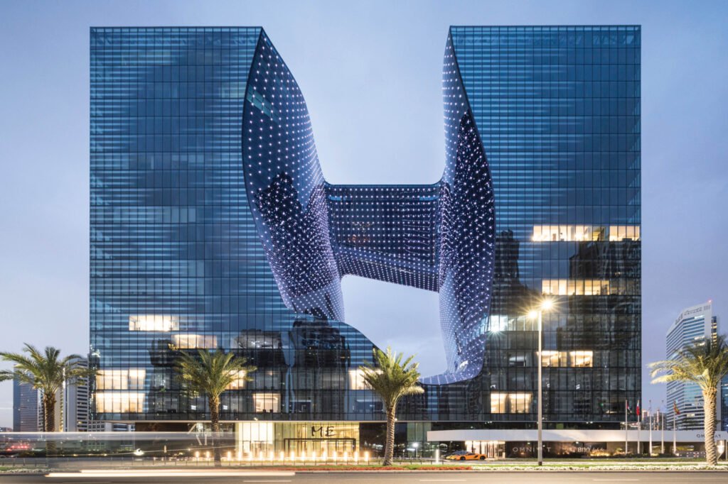
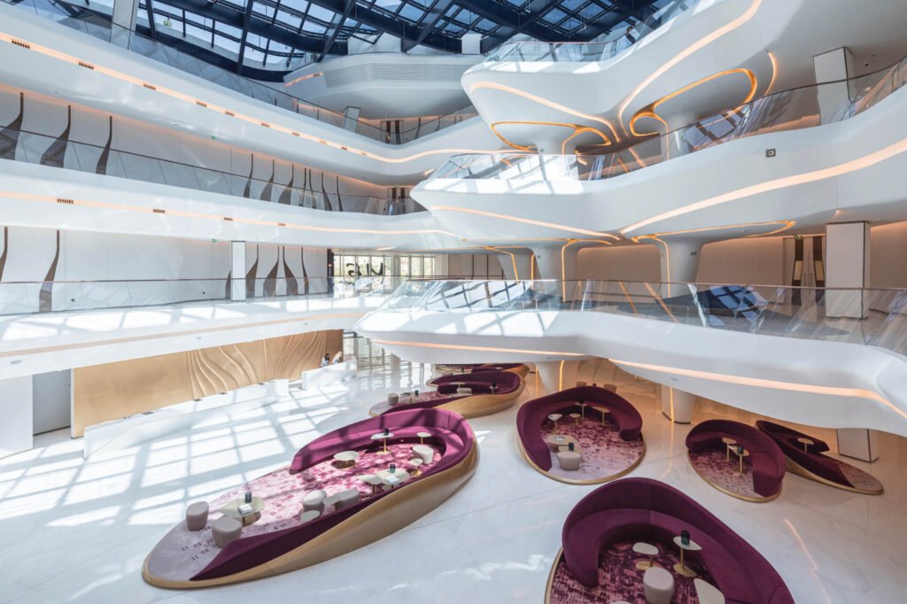
Opus by Zaha Hadid Architects
Finalist – Hotels Category
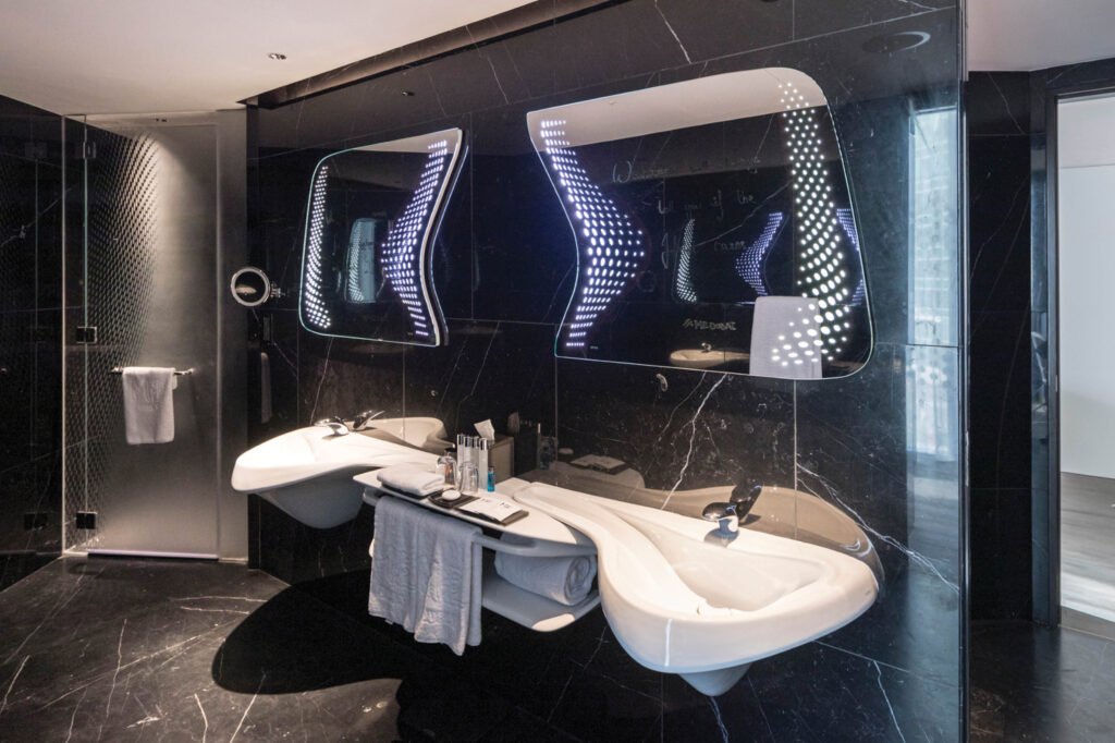
There was no Highly Commended entry chosen by the jury for the Hotels category, a surprising decision considering that most of the shortlisted designs were aesthetically beautiful and lavish. This prompted the question of why the humble Capsule Hostel rose above the field to claim the top prize, and the watch party’s hosts thought this would be an interesting point of discussion for the next crit. How could a village hostel made with rudimentary materials beat other hotels designed with sky-high budgets by more recognizable firms? To bring this discussion about, the hosts chose Zaha Hadid’s Opus Hotel as the next crit to be shown, as it was a clear contrast to the category winner.
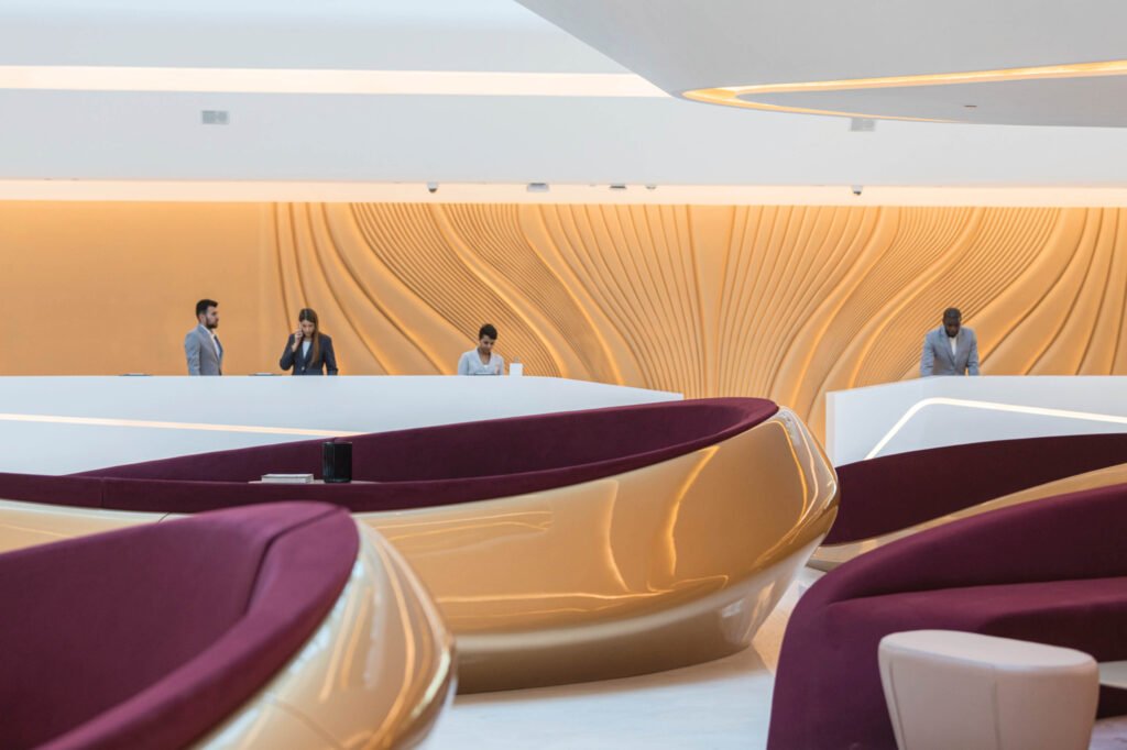
Located in Dubai, the Opus Hotel was described as a monument for the Dubai skyline, one whose conceptual narrative deals with issues of contrast such as light and darkness, reflection and transparency, and physical presence and absence among others. “This was a project that made us think very hard about what makes a building iconic,” says Chris Purcell of Zaha Hadid Architects, who was presenting the project.
That statement was a sticking point for the mentors. Periquet called the Opus Hotel the “dramatic opposite” of the Capsule Hostel, in that it’s a case of operating under unlimited budgets and opportunities as opposed to the latter being a response to constraints. “This is designed as art. This is interior design with a focus on the richness of experience of colors, palette of materials, and beautiful forms,” says Periquet. She admits the project succeeded to a certain degree, and would’ve won had it been in a competition that didn’t value authenticity, creative problem solving, and social responsibility. (“It should’ve joined an architecture competition!” says Periquet.)
For Miñana, entries that change human values are what INSIDE judges are looking for. Projects should ennoble the human spirit by being inclusive, sustainable, and creative, and Filipino designers should learn to espouse these values more in their work. The Opus Hotel’s design clashes with these values, due to its failure to distinguish itself as nothing more than a glamorous and luxurious project, a box existing in isolation.
The challenge presented by the comparison of these two projects is summed up by Miñana: “How do you ennoble the world with a design you create?” Enriching the community where your design is located in should be the major focus of designers today, and it starts with ennobling the quality of spaces they design.

Public Buildings
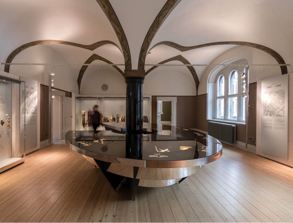
The New Museum of Copenhagen by JAC Studios
Winner – Public Buildings category
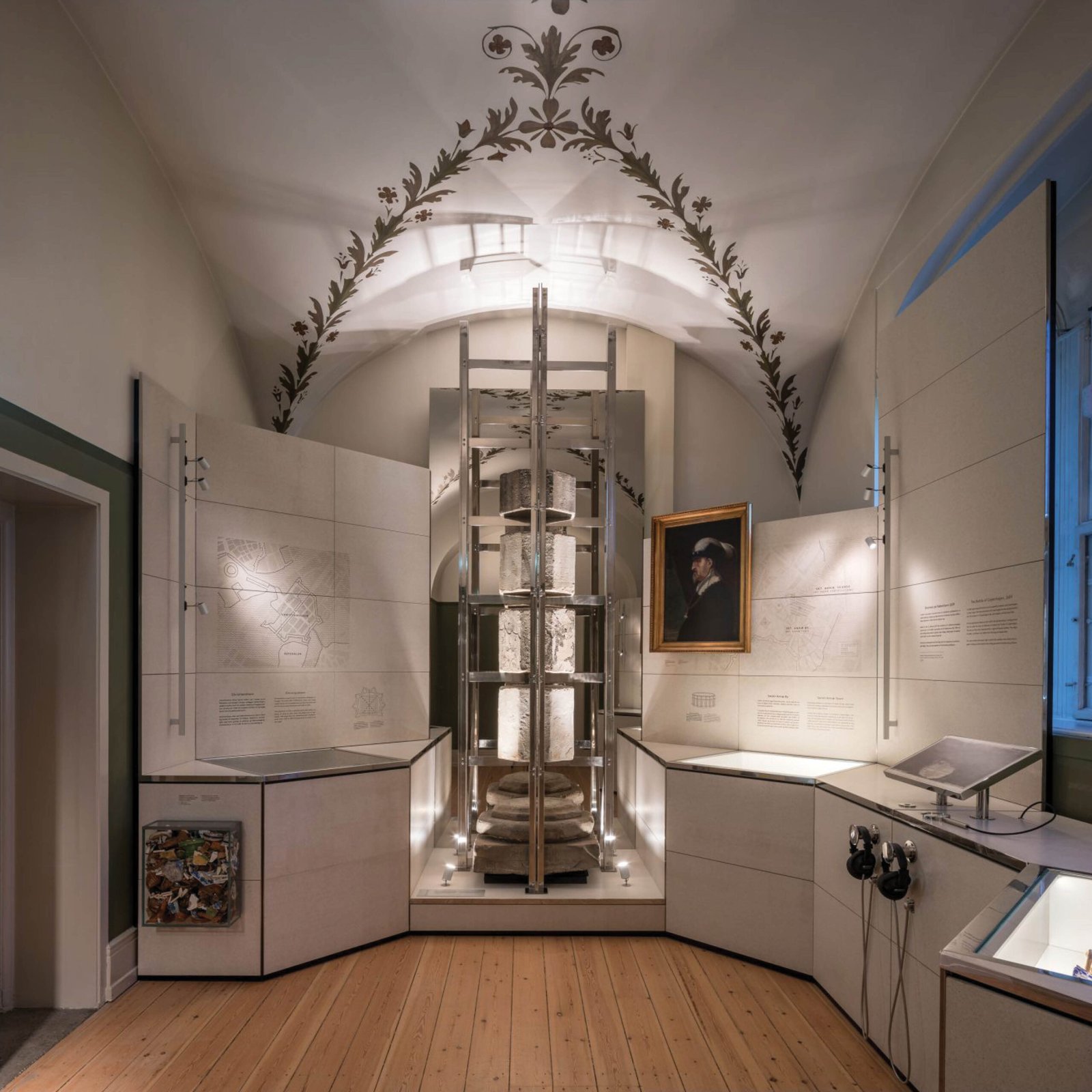
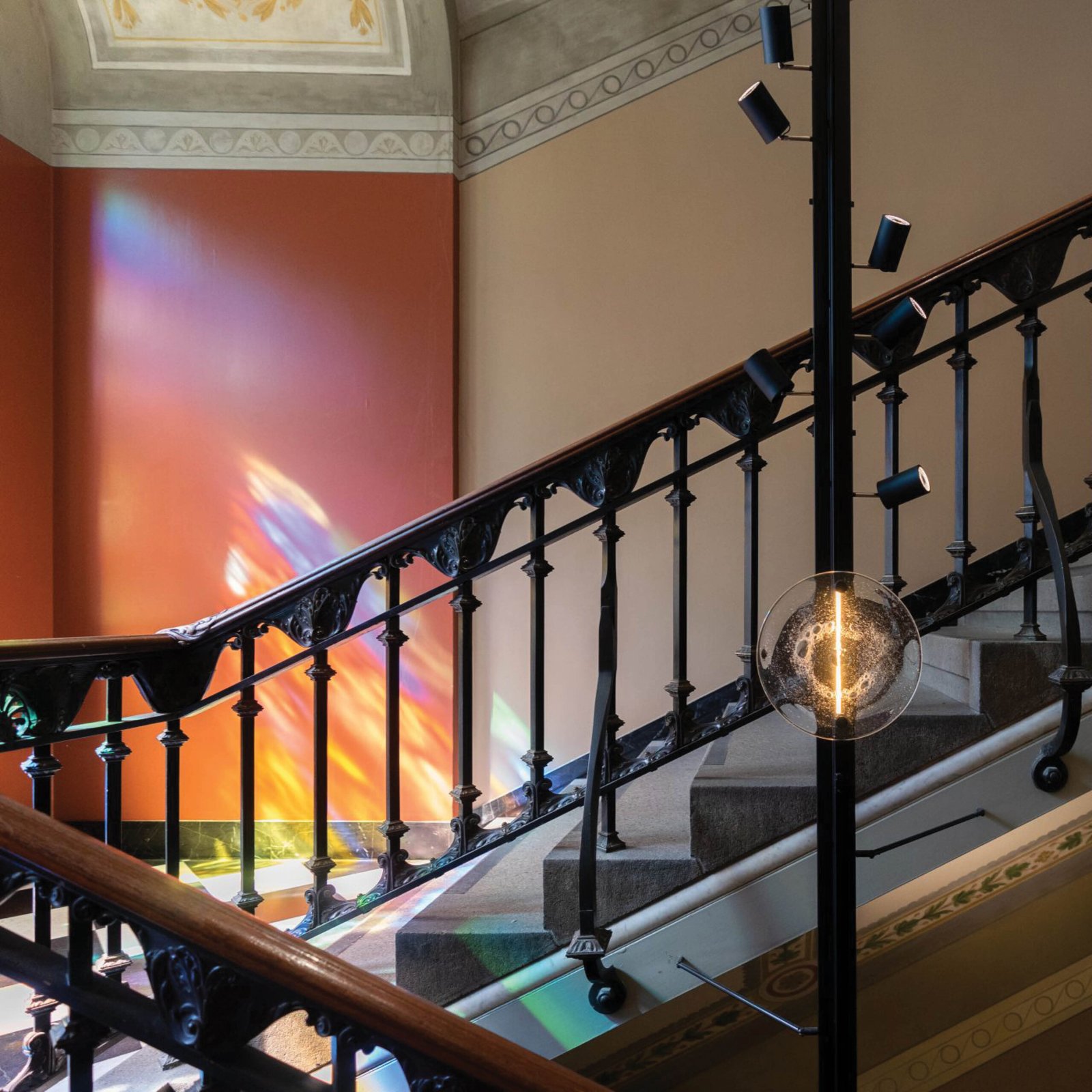
JAC Studio’s winning entry is a transformation of a historic building’s interiors in Copenhagen, designed by a famous Danish architect. Originally built as an institute for taking care of orphans, the building was to be converted into a museum, with three levels designated for this new function. The design for the exhibition spaces is conceived as “communicative collages of objects, light, color, and people,” with the display cases, fixtures, and other ornaments having minimal intervention to the structure due to their lightweight nature. Reflective surfaces and clean materials predominate the design, complementing the rich ornamentation of the original interiors.
According to the mentors, the designers are trying to communicate on the boards the different values guiding them in their projects. Photos paying respect to the historical context of the building are juxtaposed with the modern interventions and detailing they did for the design. “Your board must be balanced. What is the quality of the built environment you wish to achieve? What are the different priorities you are bringing to the table? You must be able to articulate that in photos,” says Miñana.
Because the New Museum of Copenhagen is an adaptive reuse project, the designers’ emphasis on their sensitivity to the context was a critical aspect of their presentation, and aided in their win for the category. It’s all about the story and how you tell it, according to Miñana. He observed that JC Studio focused on how the project interfaces with the city, as well as its materiality. Finding the right angle and details to focus on for your presentation is as important as the design itself.
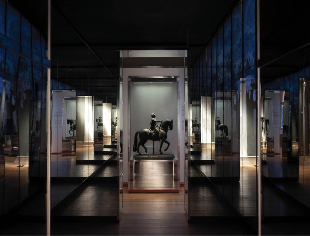

Periquet builds on this point by suggesting that designers formulate their presentations by thinking in 3D terms—in X, Y, and Z, or height, width, and depth. The height and width represent a designer’s panoramic vision and focus, meaning “you need to be able to go all the way to the big picture to have an amazing story to tell, and be able to carry that down to the minute details,” says Periquet. The last dimension, depth, refers to going beyond surface richness and delving into social issues that one’s design can address, which is what the Museum of Copenhagen was able to accomplish.

Train Station as an Epoch by Faber Group
Highly Commended – Public Buildings category
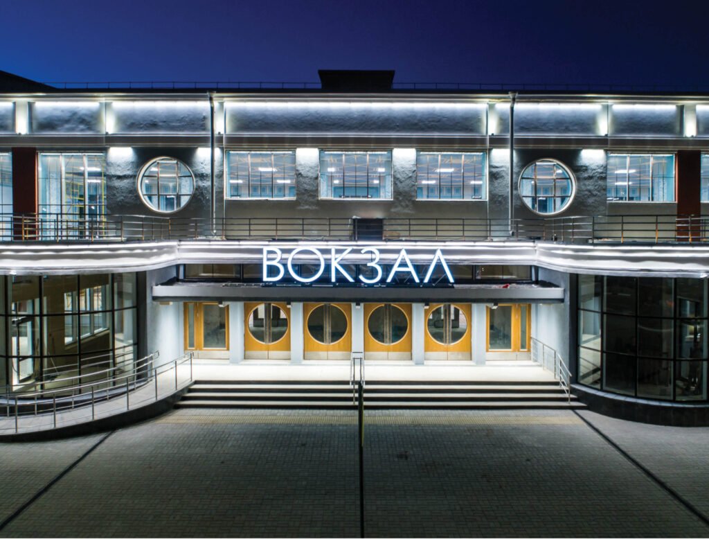
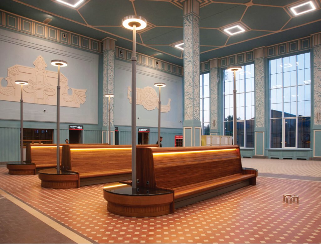
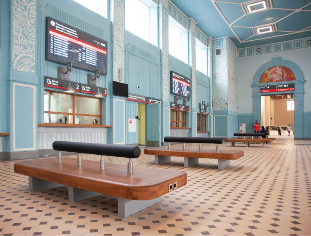
Described by Periquet as the most traditional interior design project of the crits she’s seen, the Train Station as an Epoch is a heritage conservation project, a renovation of a railway station in Ivanova, Russia. The train station has undergone multiple reconstructions over the years, resulting in it having a hybrid aesthetic of avant-garde constructivism and Soviet modernism. Faber Group preserved its hybrid character and drew inspiration from the city’s status as the country’s textile capital, introducing ornamental designs inspired by textiles throughout the interiors. Apart from being a train station, several spaces were reimagined to hold public events such as exhibits or forums, so it functions as a vital hub for the city’s transportation infrastructure, and as a center for art, culture, and public events.
The project’s emphasis on patterns, textiles, and wallpapers is what prompted Periquet to call it a traditional interior design project. Its focus on surface finishes and innovative application of materials are aspects that the watch party audience could readily relate to compared to the other architecture-inclined entries. “The variegated materials contribute to the delight of this presentation, which I think is quite strong and excellent,” she says. She surmises that the jury probably had a difficult time choosing the winner between this project and the Copenhagen Museum, and this one ultimately lost because of its conservative use of the existing spaces. “They did not transform the contours of the space, they respected it. And in doing so, they might have missed the opportunity to create something new, and bring something new to the table,” says Periquet.
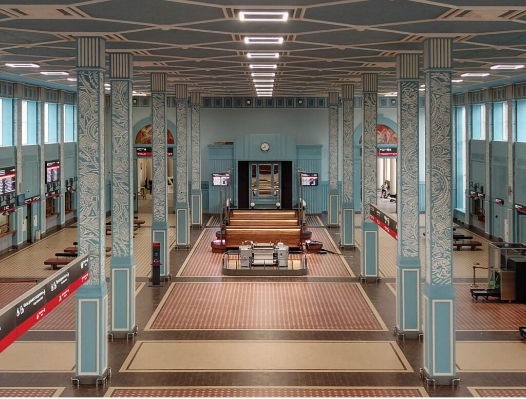

Competitions like INSIDE and WAF value designs that “challenge and extend our present mindsets to embrace possibilities for the future built environment,” says Miñana. He reiterates the value of storytelling to bring out the worth and relevance of the project you’re presenting, no matter how humble or glamorous it is. The Train Station’s presentation illustrates the journey of the designers and managed to capture the difficulty of their process, which made the end result more rewarding not only for themselves but also for the INSIDE judges.
The issue of heritage conservation, a topic that is both thorny and inspiring in the Philippines, made its way into the discussion, as the mentors were asked how it was best to present such projects. Conveying the significance and relevance of what makes the heritage conservation project excellent is the key. “It should be something that should transcend current needs,” says Periquet. Make the jury see how you transformed the outdated building or space into something that serves the needs of today, and your chance of winning becomes favorable.
Final Takeaways
The discussions throughout Day 3 of Inside Look were rich and varied, but they all gravitated towards a common theme: the power of storytelling. Having a great story behind your project is a point brought up again and again by the mentors, as it can elevate your design from the realm of mere aesthetics and beauty to a more altruistic one. It’s a lesson that Miñana wishes to impart whenever he is mentoring WAF finalists or hopefuls, a role that he has never turned down. “We want to help in creating self-awareness, and how we can improve and uplift each other,” he says. “Education and sharing with one another is key, and also, if we can cascade that to the different islands in the Philippines…it would be wonderful.” Hazel Resari, the host for the night’s watch party, found Minana’s takeaway a welcome one, hailing from Davao herself.
Periquet found herself inspired the most by the Capsule Hostel’s win, as its victory over a more renowned firm like Zaha Hadid Architects affirms the design industry’s shift towards addressing essential values and social issues. “We don’t need to have an unlimited budget to succeed. We can have homegrown talent and creativity, and still make it past those star architects and designers,” she says.
While inspiring, the crits of the INSIDE 2021 winners also made her realize the enormous gap between the local and international scenes for interior design. She admits there might be a long way to go before our local interior designers can compete with the world’s best, but she knows they will eventually get there. “This is a long game,” says Periquet, in a defiant tone rallying her troops to battle. “This is something that we need to build our strengths toward. And when the time comes, we hit them with what we got, and I’m pretty sure we’re gonna come out very strong.” •

One Response