Words Miguel R. Llona
Images Greg Mayo (Nazareno Architecture + Design)


One of Anthony Nazareno’s frustrations as an architect, which he shares with many colleagues, is how risk-averse clients could be when it comes to the design of their house. They tend to stick to what’s safe or in vogue, an understandable choice considering their residence is too important to surrender entirely to an architect’s brazen ideas.
In his role as principal architect of Nazareno Architecture + Design, Nazareno has often had to open clients’ eyes to new things, particularly when it comes to materials. He shares that it remains a struggle to convince clients to let materials breathe in their natural state, especially concrete. “It’s a challenge because it’s so humble a material. Clients will usually want a concrete surface clad or painted over because if you’re living in a gated community, of course you want to show off a bit,” says Nazareno.
The homeowners of Casa 39 seemed to fit this profile—they come from a family observant of feng shui traditions that often restrict design decisions. But when initial meetings made Nazareno realize they would be more open to experimentation than their background suggests, he seized the opportunity to convince them of casting their house in board-formed concrete—a more labor-intensive process, but whose results are more rewarding. “[Anthony and I] were both in agreement that we wanted to build something totally different,” says the client.
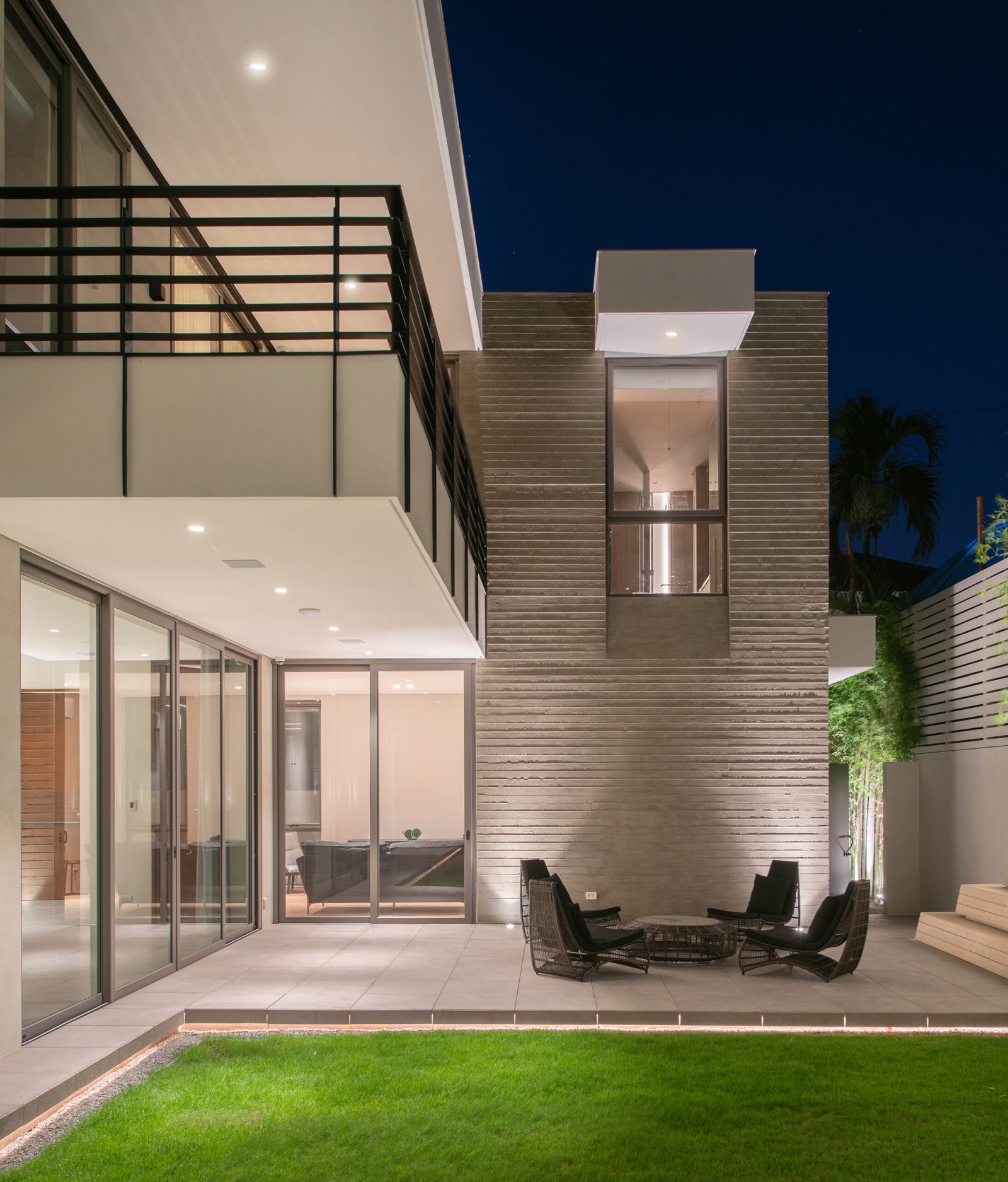
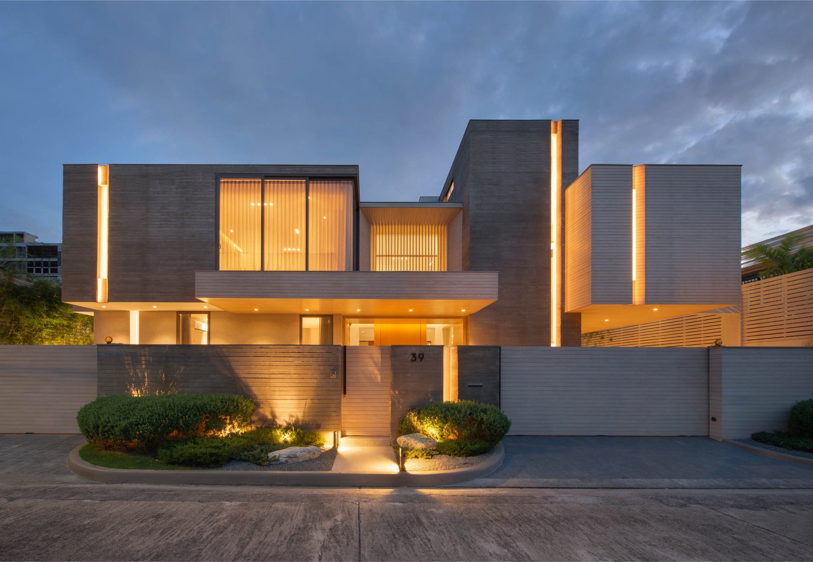
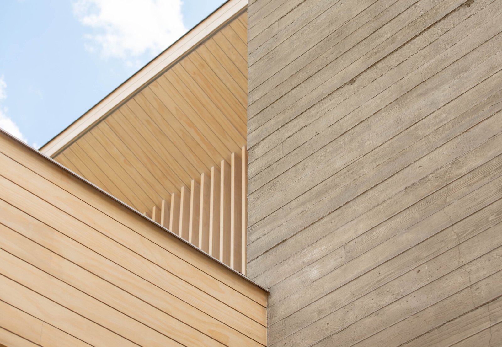
Board-formed or off-form concrete refers to the process of patterning a concrete surface with a wood grain image, done by adding an additional layer of wood beneath the plywood formwork to imprint the pattern on the wet concrete. The effect is a softer and less cold surface compared to ordinary concrete finishes and lends more character and texture. This process has seen numerous applications in countries like Malaysia and Indonesia in recent years, and Nazareno had been itching for the opportunity to implement it for a house’s entire façade. “I could only convince my clients to do it for their garages because that’s where they think off-form concrete is best suited for,” he says.
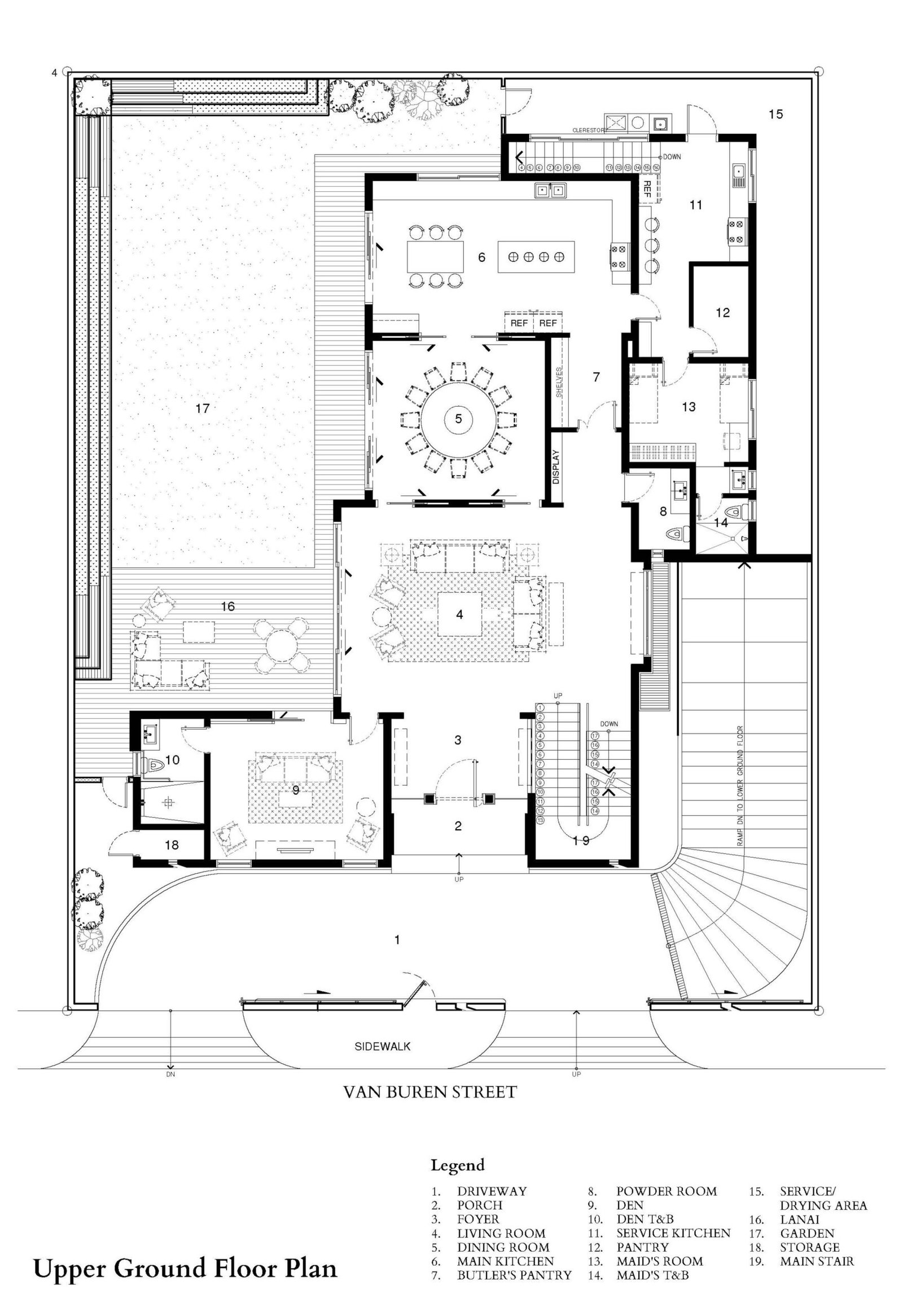
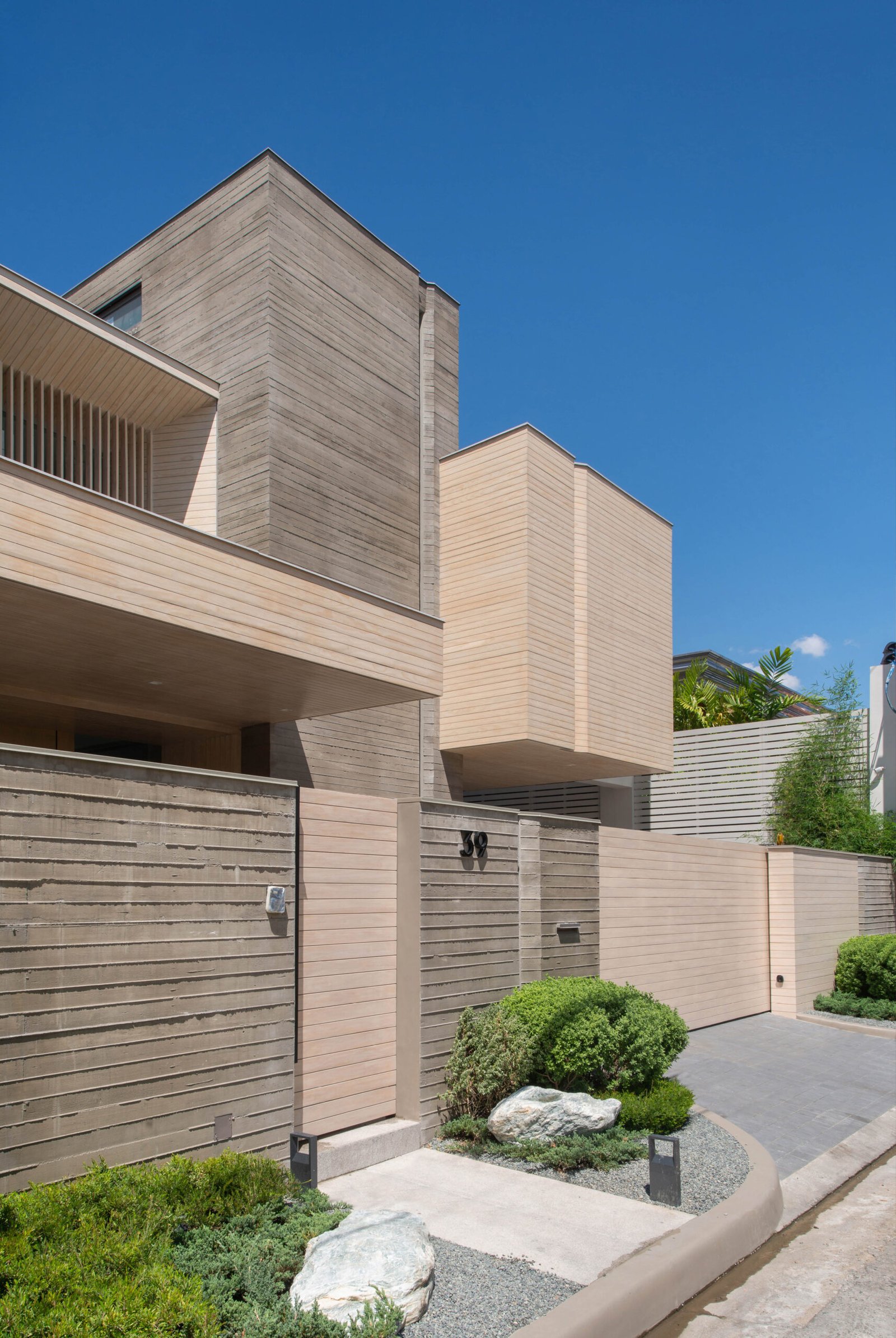
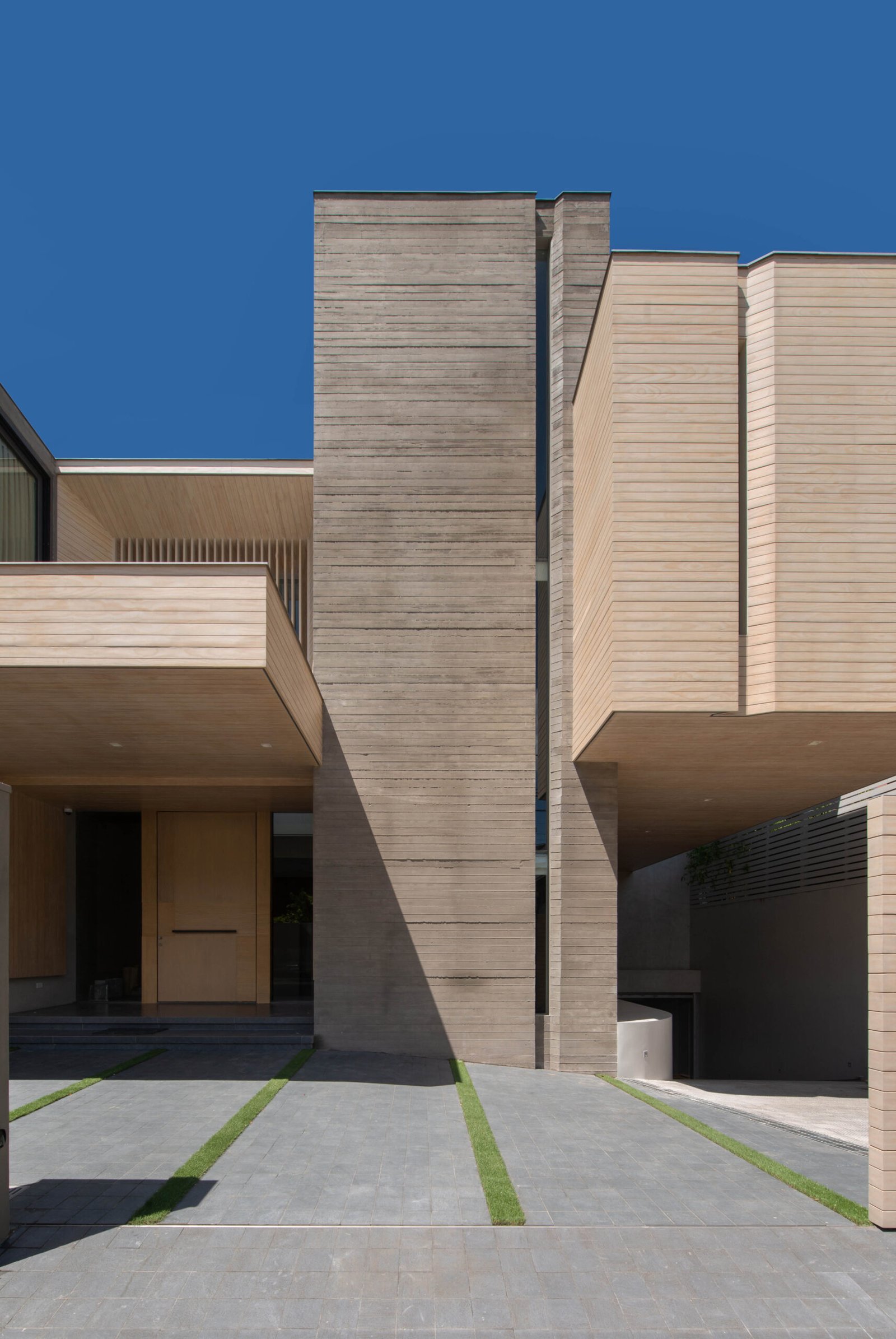
Contrary to just fulfilling a personal achievement, his insistence on board-formed concrete had to do with the architectural form of Casa 39. The house is composed of volumes of varying heights and depths, creating the impression of floating blocks. The spatial programming dictated this volumetric nature, with the volume for the foyer pushed back between the volumes for the staircase and the bedroom on the second floor, creating a cavity that acts as the visual center of the house. The horizontal lines of the board-formed concrete accentuate the orthogonal nature of the house, and vertical slits for windows counteract the horizontality and bring balance to the composition.
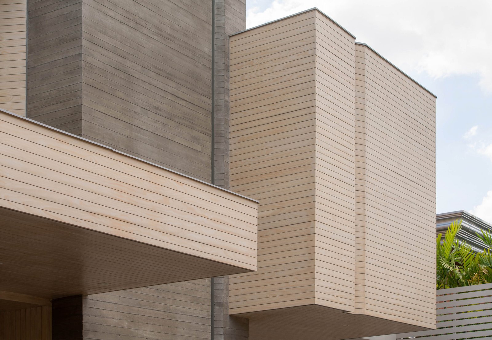
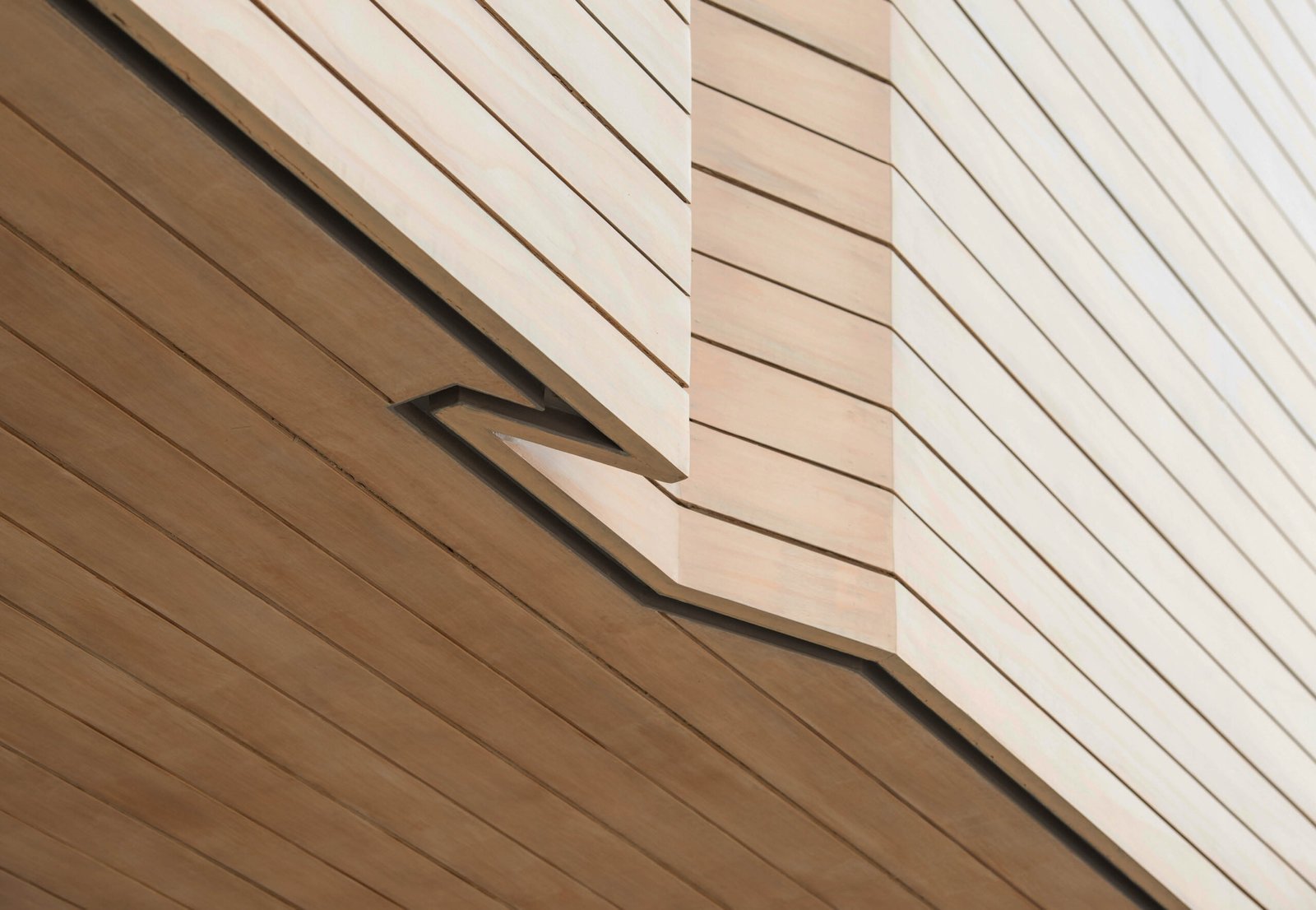
The rawness of the exterior reflects his fondness for materiality, as well as his sensitivity regarding the effect that textures have on people. Rather than going ham with the board-formed concrete for the façade, Nazareno balanced it by cladding certain volumes with Accoya wood, an outdoor wood engineered for durability and rot resistance. “[The façade] could have easily been all board-formed concrete. It could have worked. But I also wanted that richness of material in being able to create architecture beyond just forms,” he says. The driveway canopy, the foyer volume, and the cantilevered volume beside the staircase were clad with Accoya wood, creating a dialogue of contrasting materials that softens the heaviness of the concrete surfaces.
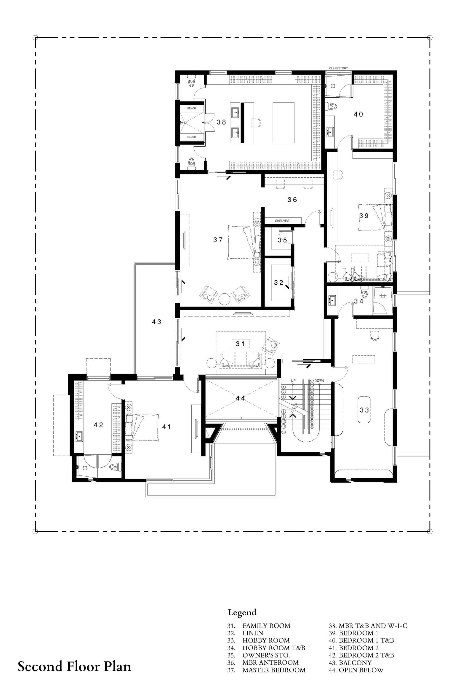
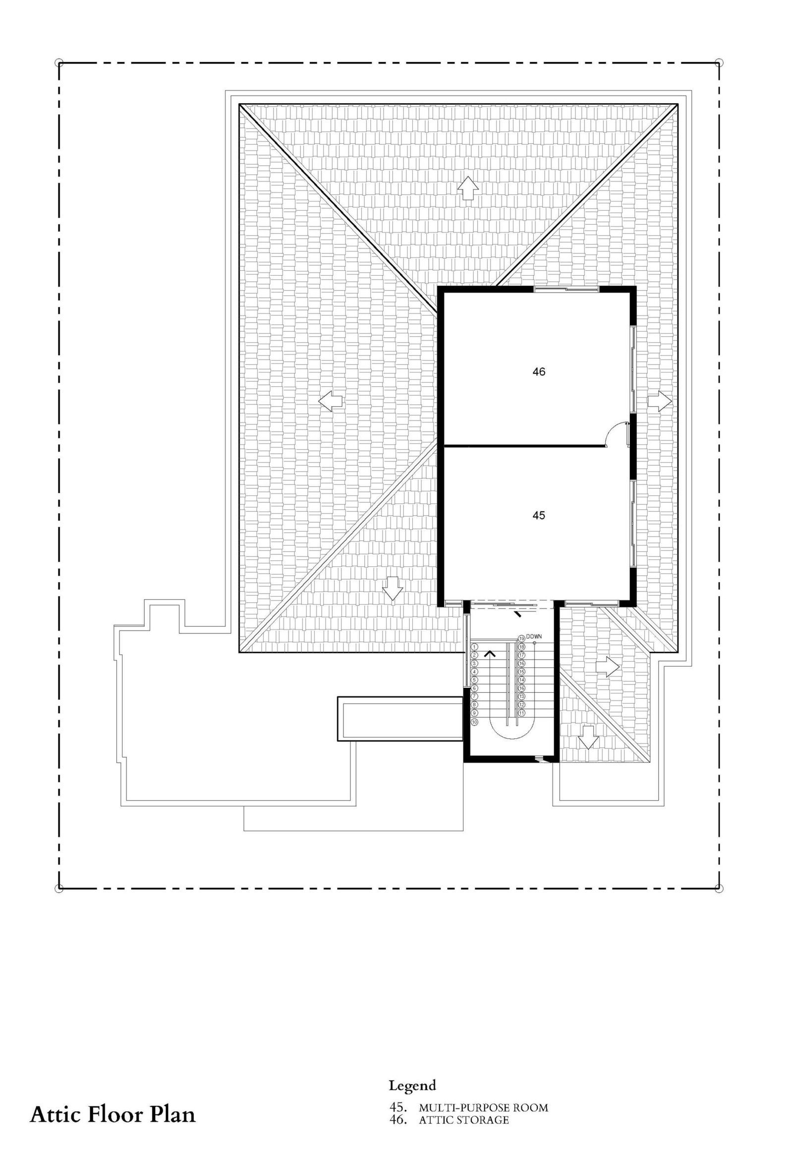
Because of the façade’s composition, the number of levels isn’t immediately apparent. The house has two floors with the exception of the volume for the staircase, which contains an additional floor at the client’s request. The latter forms part of the main requirement to allocate possible storage spaces for the house since the client collects toys and various collectibles that needed to be displayed or stored away. The husband is also an avid lover of cars, so a garage had to be excavated 2.5 meters below ground level that could accommodate up to six vehicles.



“The rawness of the exterior reflects Nazareno’s fondness for materiality, as well as his sensitivity regarding the effect that textures have on people.”
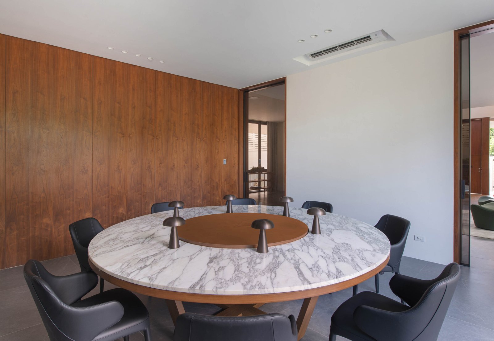

The concrete textures also make it indoors, particularly in the double-height foyer designed to be a transitional space from the outside to the inside. One wall is cast in board-formed concrete, bringing in the linearity and horizontality seen in the façade. However, the board-formed concrete doesn’t go beyond the foyer and is terminated right at the boundary of the living area to which the foyer leads. “When you’re inside the main house, it has to be different. I didn’t want the concrete expressed that much inside,” says Nazareno.
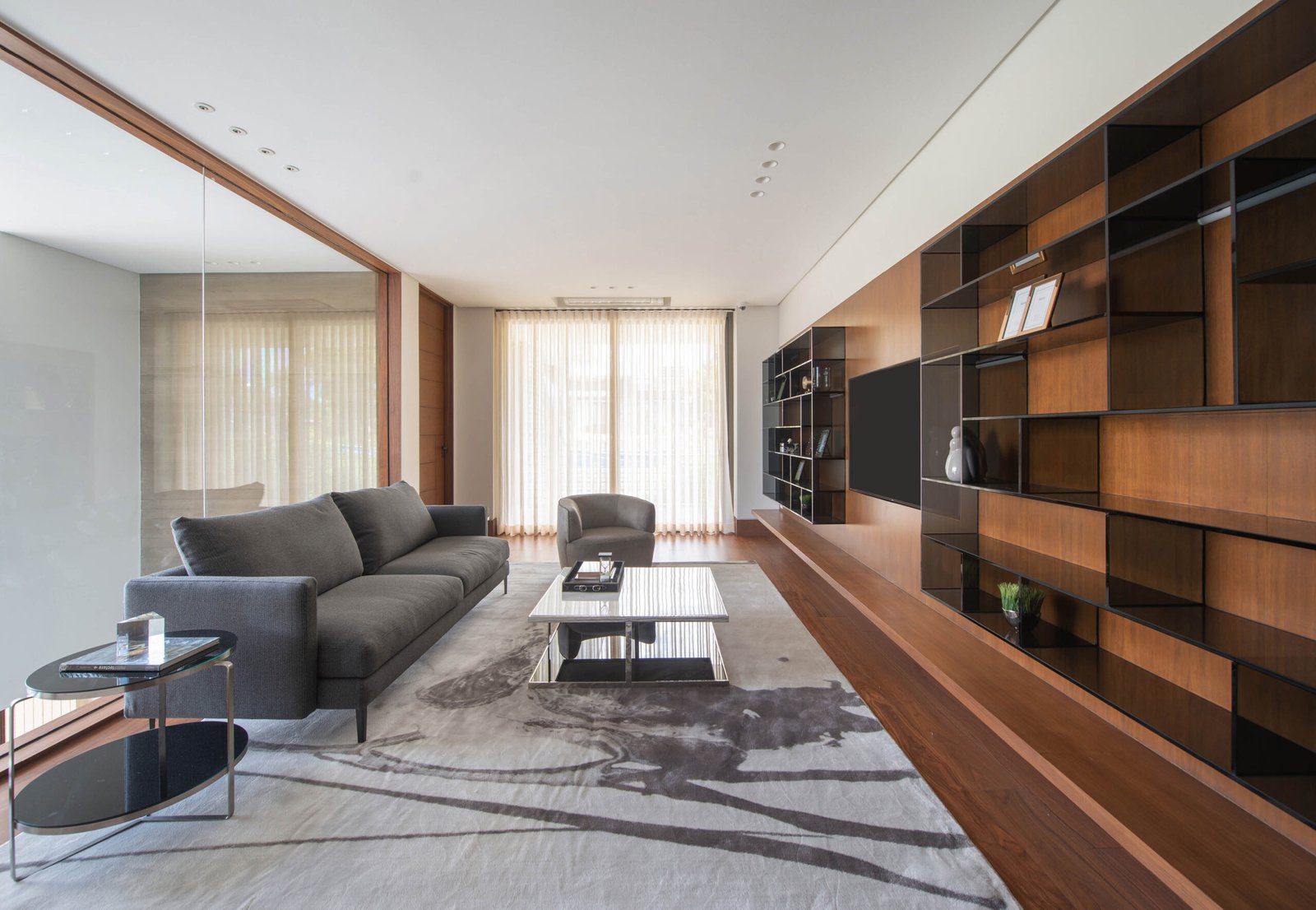
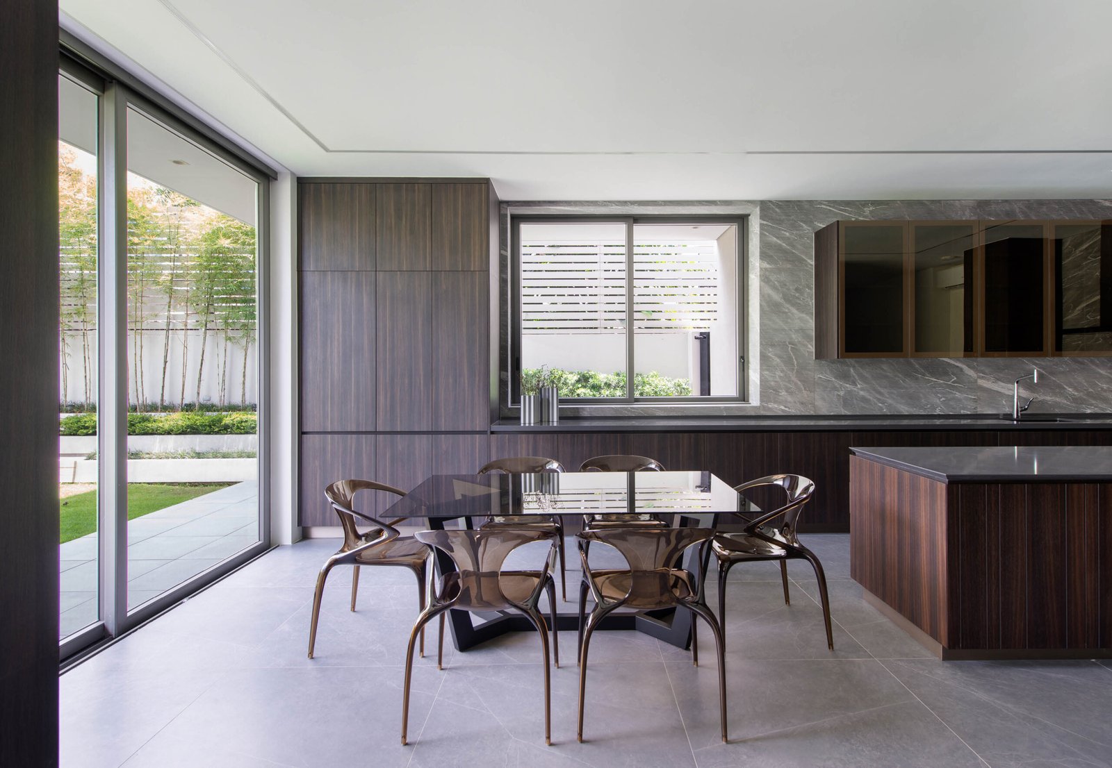
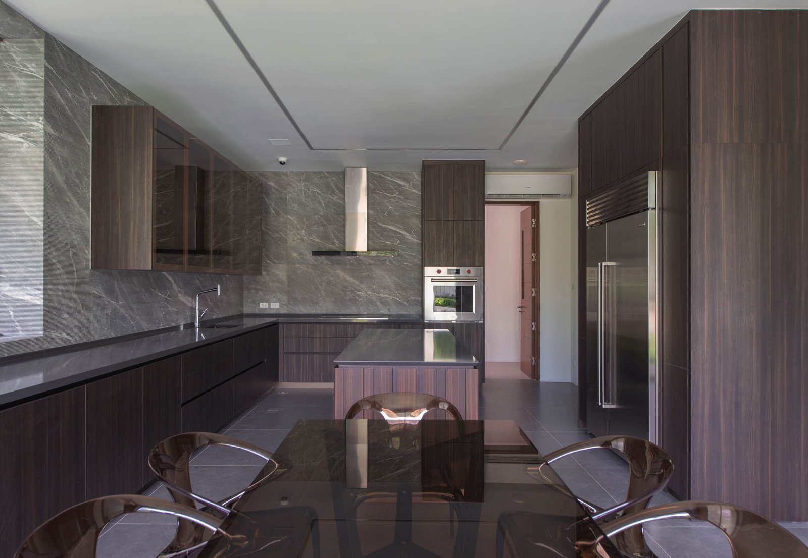
Marking this difference is the selection of more refined materials for the rest of the interior spaces that still echo the rawness of the exterior. These are seen through the slate grey tiles of the living room floor, the leathered stone for the treads of the stairs, and kitchen wall tiles customized with horizontal grooves for a tactile quality. By expressing the board-formed concrete through color and texture, there is a sense of architectural cohesion throughout the house, leaving one’s initial impressions from the outside fulfilled.
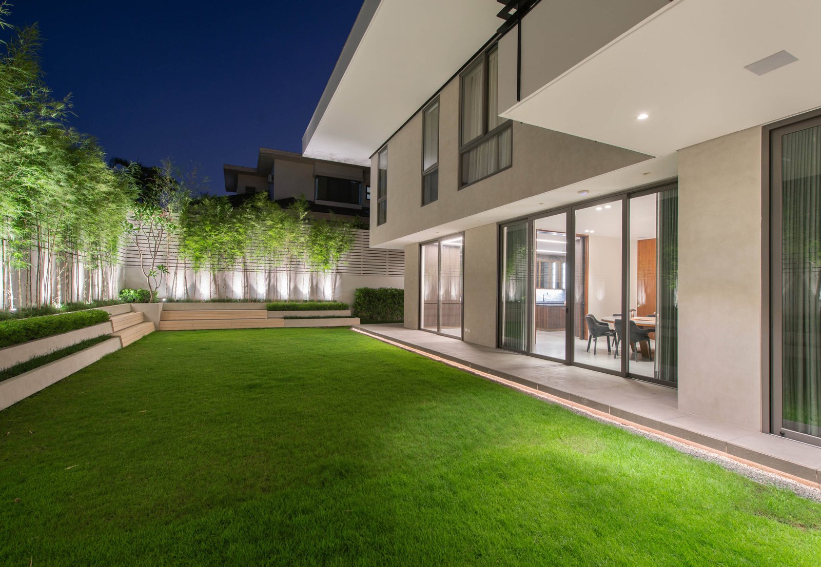

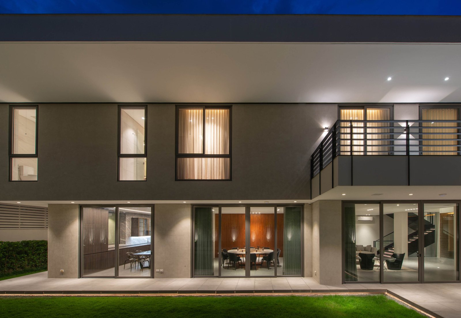

The cohesion extends to the landscape design of the garden, which makes up the southeast portion of the 750-square meter lot. Horizontal lines are expressed once again in the arrangement of the Roman planter boxes, which transition into seating at the corner of the property. Nazareno and his team worked closely with landscape firm Plontur, who carefully studied the concept for the house so their design intents would be aligned. “We didn’t want to create a garden that felt separate from the house,” says Erick Yambao, Plontur’s design director.
The integration of the landscape design with the architecture is an essential aspect of the house, and is appreciated by the family as their meals and gatherings are made more refreshing. There is an overriding sense of connectivity with nature in the gathering areas, as floor-to-ceiling glass opens up the living room, dining room, and kitchen to views of the greenery of the garden, which consists of Kyoto grass, Japanese bush, pole bamboos, and a kalachuchi tree. Walnut wood cladding the walls or floors further brings the impression of nature inside.

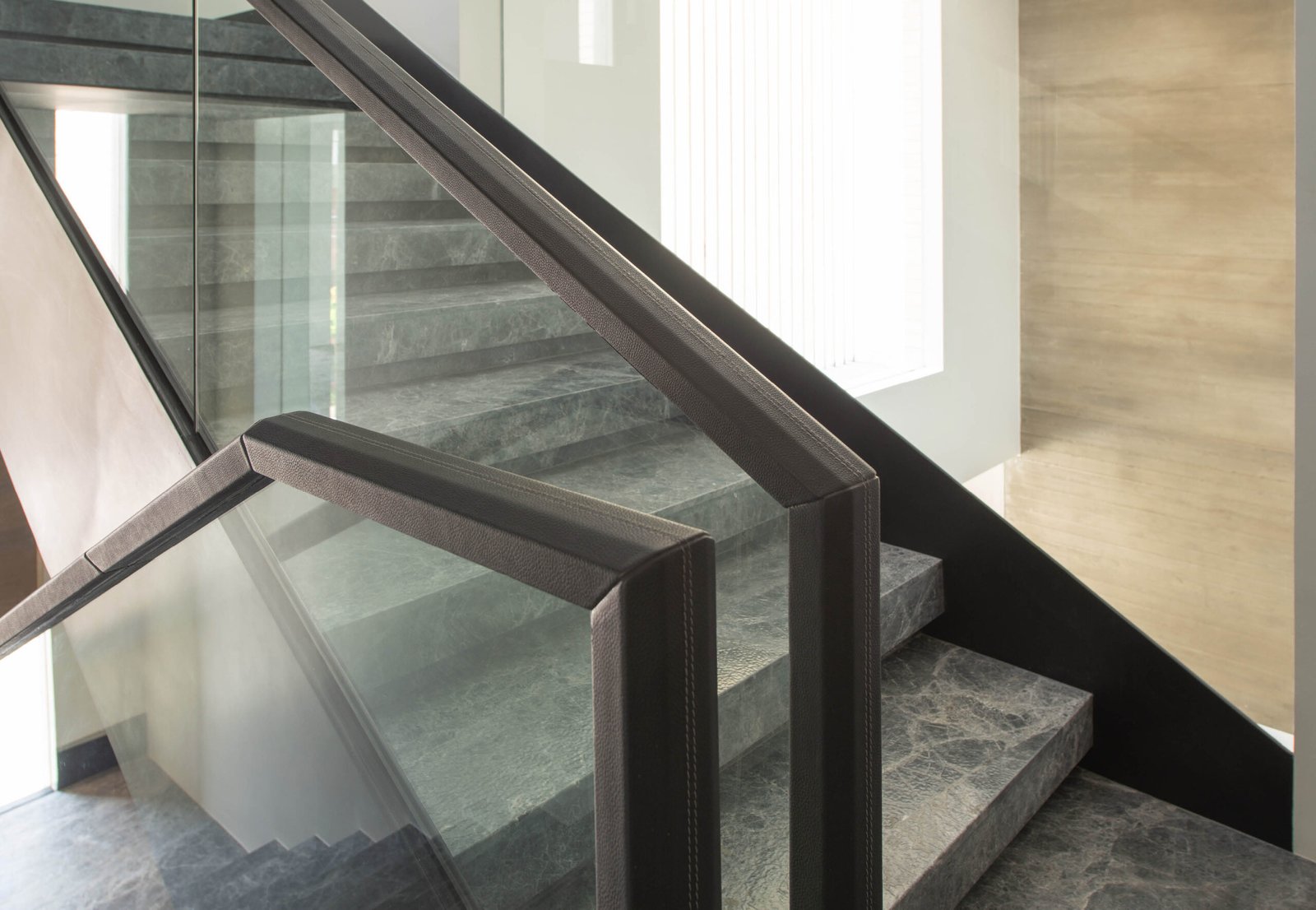
The theme of connectivity not only applies to the openness of spaces and the blurring of lines between the indoor and outdoor, but also to the smallest details along the surfaces within the house. Nazareno’s intent was for the visual and tactile nature of materials to ripple throughout the house, most apparent in the staircase. Inspired by the client’s love for cars, Nazareno had the railings customized with leather to mimic the interior surfaces of a car, which is also echoed by the leathered texture of the stair treads. “It provides a hint of surprise because visitors will expect the railing to be smooth until they realize it’s a different texture,” says Nazareno. “I find it enjoyable to do little details like that, to give the design a visual and tactile quality.”
This tactile character of Casa 39, from its façade surfaces to the feel of its interiors, is what gives it a vibrancy that runs counter to its understated design. The lines of the board-formed concrete cast different shadows throughout the day, and the stains and cracks on its unpolished surface lend it a natural, unblemished beauty that few houses possess. If the house’s walls could speak, they would be exclaiming what Nazareno and every architect worth their salt always say—that materials are what give life to good architecture. •


Project Team
Architecture and Interior Design:
Nazareno+Guerrero Design Consultancy: Ar. Anthony Nazareno, Ar. Chris Guerrero, Ar. Peter Pagulayan, Ar. Isabel Bayani, with IDr. CJ Marquez
General Contractor: Joel Gironella of Intergiro Builders
Landscape: Plontur
Exterior wood cladding: Accoya
Kitchen: Poliform
Fluted stone splashboard: EuroAsia Marble & Granite Inc.
Veneer work and millwork: VLF Wood Veneers
Cabinetry: Space 2000
Staircase leathered stone: Eprayim Granite & Stone Corp.
Leather handrail: Intergiro Builders
Exterior doors & windows: Kenneth & Mock
Miguel Llona is a writer who has written for numerous print and online publications. He was a former editor at BluPrint magazine, and currently serves as marketing consultant for an interior design firm and a structural engineering company.




2 Responses